
Neumorphism, or ‘soft UI,’ is one of the prevailing trends in contemporary user interface design.
This new trend, characterized by its dim highlights, soft depth, and cleanliness, has gained recognition for its ability to balance aesthetics and functionality within minimalistic designs.
Neumorphism is gaining traction in the design world, reflecting the rapid shifts in popularity and acceptance of styles.
Key Takeaways
- Neumorphism blends flat and skeuomorphic design using soft shadows and rounded shapes.
- It creates a clean, modern, and tactile look in UI elements.
- Works best with simple layouts and subtle color palettes.
- Common components include buttons, cards, and input fields.
- Low contrast and shadow overuse can hurt accessibility.
- Best used alongside other design styles for balance.
- Tools like Figma and Adobe XD support neumorphic design.
- Its future looks promising, especially in VR and AR.
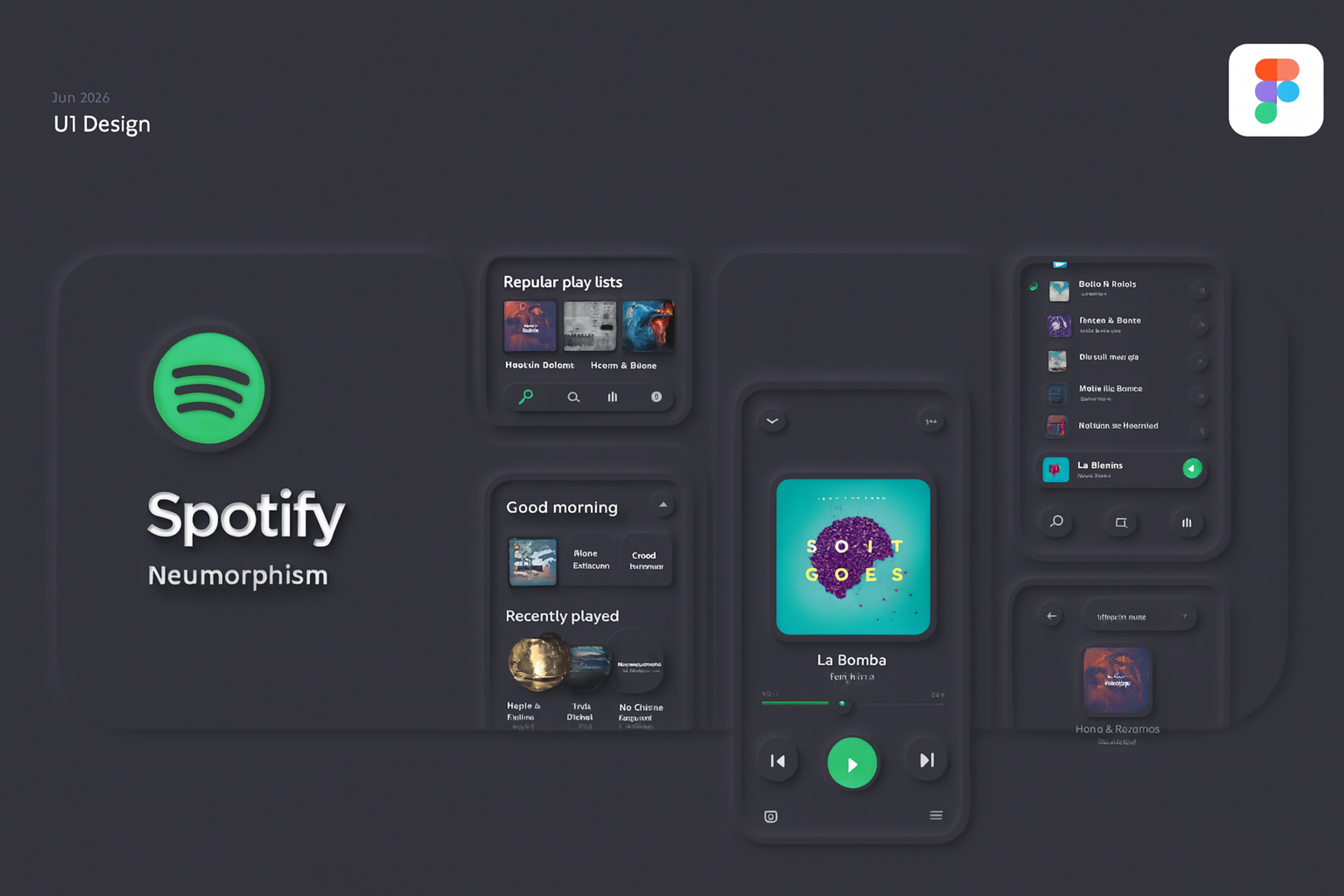
Neumorphism in UI Design
What Is Neumorphism?
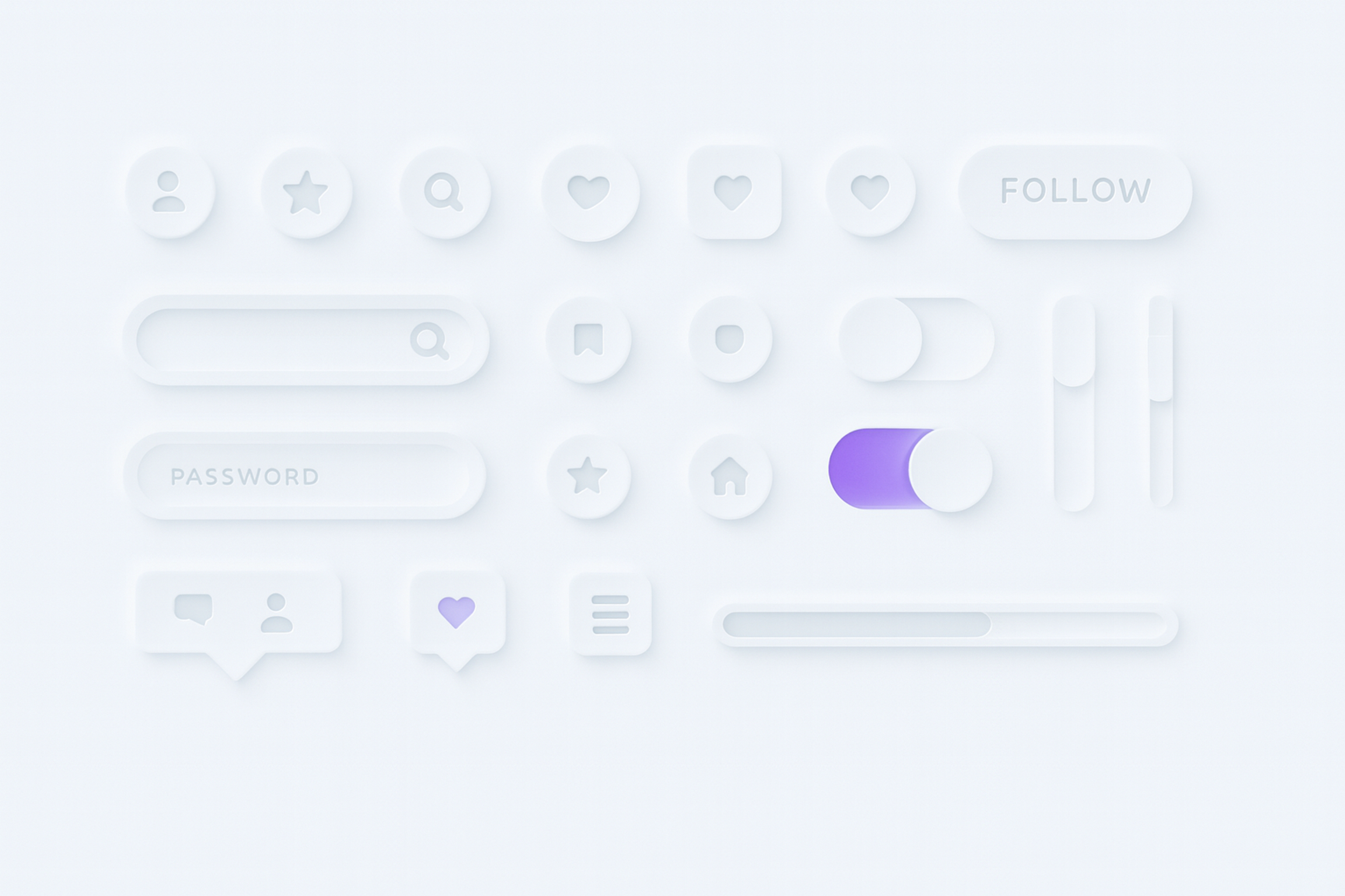
Neumorphism blends flat design with subtle depth. It uses light and shadow, soft rounded edges, and outlines to make UI elements look slightly raised or pressed.
It became popular around 2020 as an alternative to strict flat design. Neomorphic interfaces focus on buttons, cards, and inputs that have a soft shadow and clear sense of volume.
Neumorphism in UI Design
Key Principles of Neumorphism
Neumorphic design, which sits in the visual design realms of physiology and skeuomorphism, aims to achieve the illusion of soft, extruded plastic through shadow and highlight mapping.
Elements feel tangible because the design uses very realistic elements. The sharp, clean lines of neuromorphic design juxtapose the elements, ensuring the entire frame is a borderless canvas. The result is a polished and contemporary design.
Shadows and Depth
Inset and outset shadows create the depth effect in neumorphism. Keep them subtle so they don’t distract.
Inset shadows make elements look pressed into the surface. Outset shadows make them look raised above it. The effect comes from pairing a light and a dark shadow in the right positions to add depth while staying minimal.
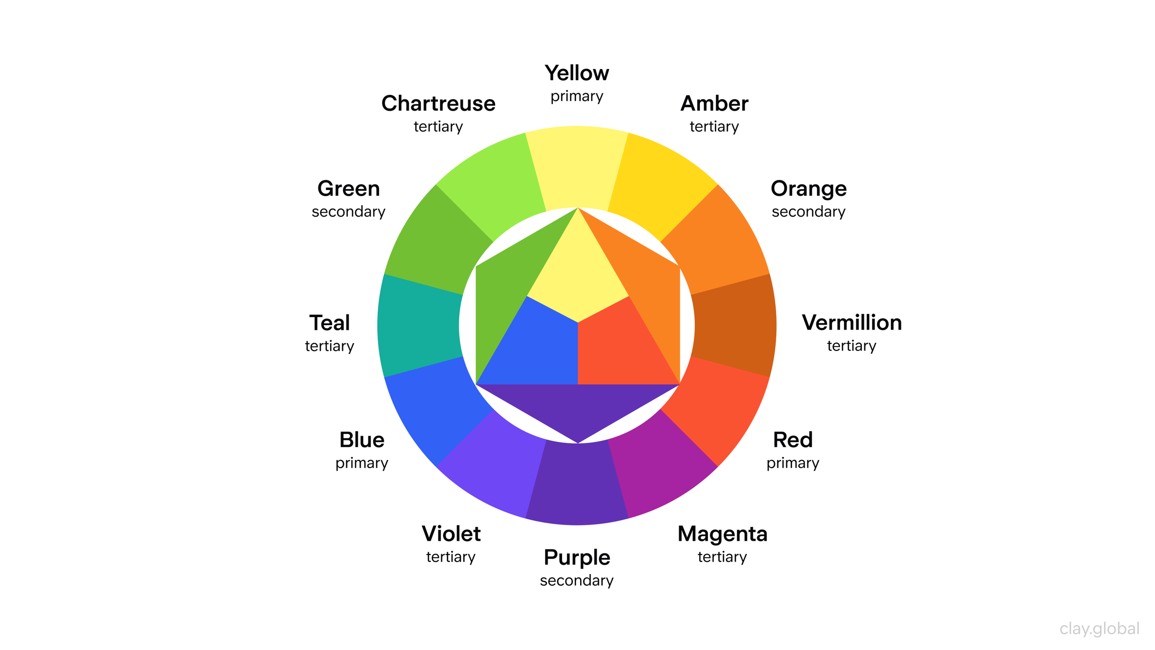
Color Palette
The most common palette of metamorphism is a simple one that contains soft pastels, muted colors, and off-whites.
The aim is to sustain a peaceful and uncluttered appearance that does not take the attention away from the content.
To achieve balance within the design and avoid feeling cluttered, a monochromatic or analogous color palette is ideal for aiding harmony within the design.
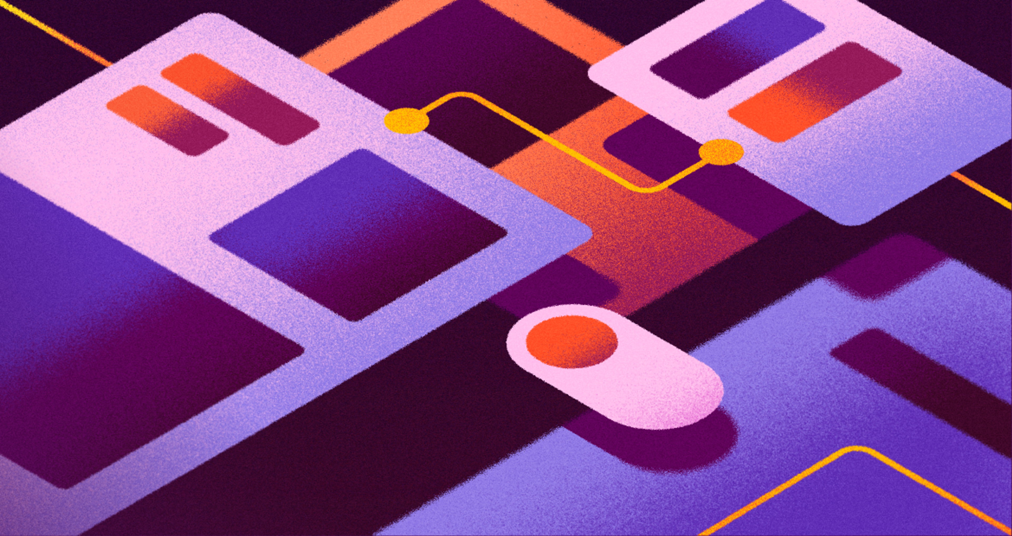
Color Wheel Illustration by Clay
Rounded Corners and Soft Shapes
Neumorphism focuses more on rounded corners and softer organic shapes. These designs tend to avoid harsh lines and instead prioritize curviness and gentleness.
Sharp edges create harsh contrasts that detract from the desired soft and gentle appearance, while rounded corners improve usability, especially for touchscreen interactions.
This makes the design more appealing and easier to navigate, which is better for the user. Buttons, cards, and containers with rounded edges give the design a soft, touchable aesthetic that enhances the overall design.
Focus on Light and Shadow
In neumorphism, light and shadow create the most prominent visual features. The shadows mimic soft gradients, creating an illusion of smooth, three-dimensional projection.
This enhances the feeling of softness and realism and also contributes to the interface’s interactivity.
A consistent light source is crucial in creating effective neumorphic designs, as it ensures visual cohesion and harmony by simulating real-world lighting with shadows and highlights.
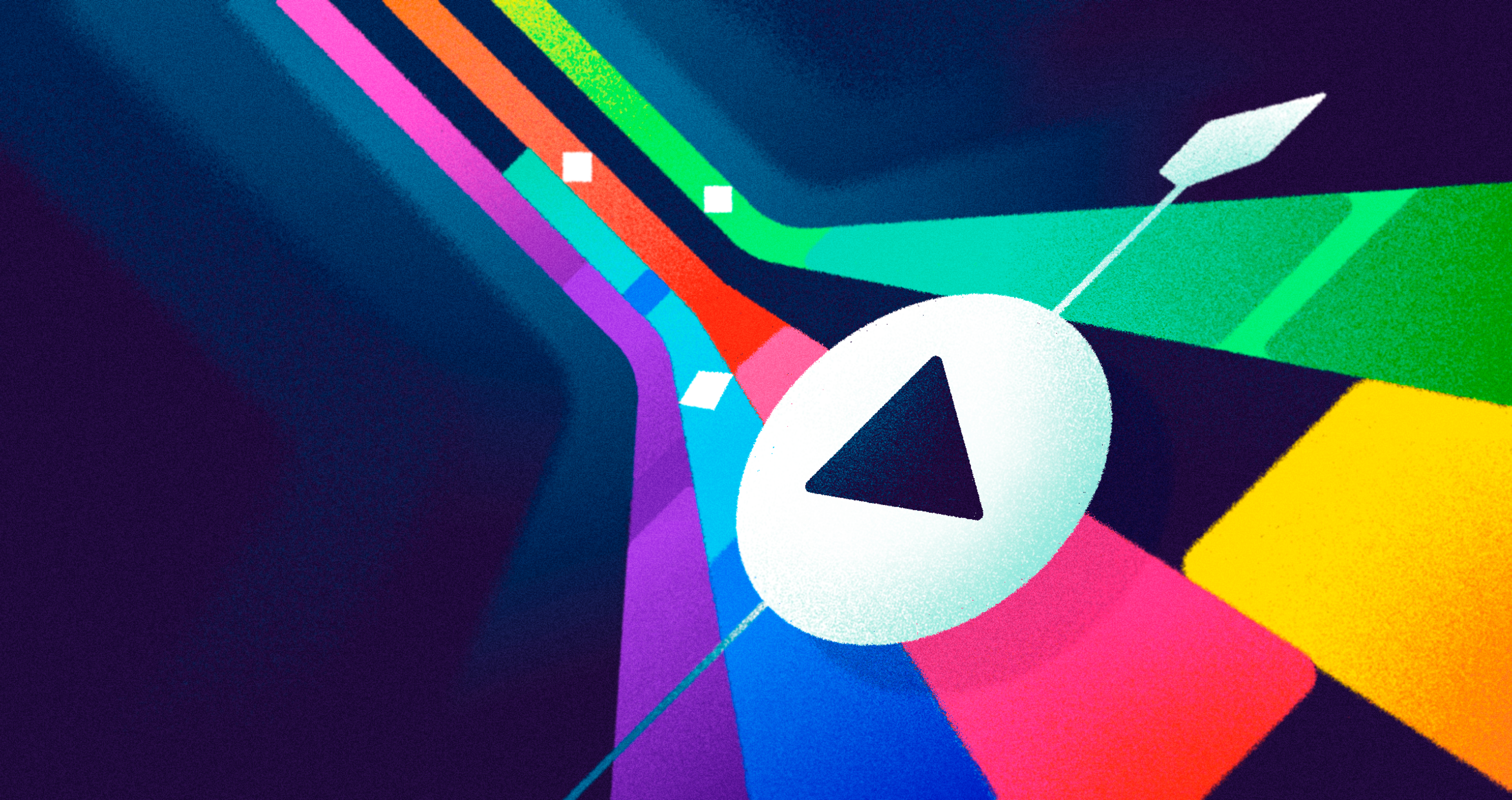
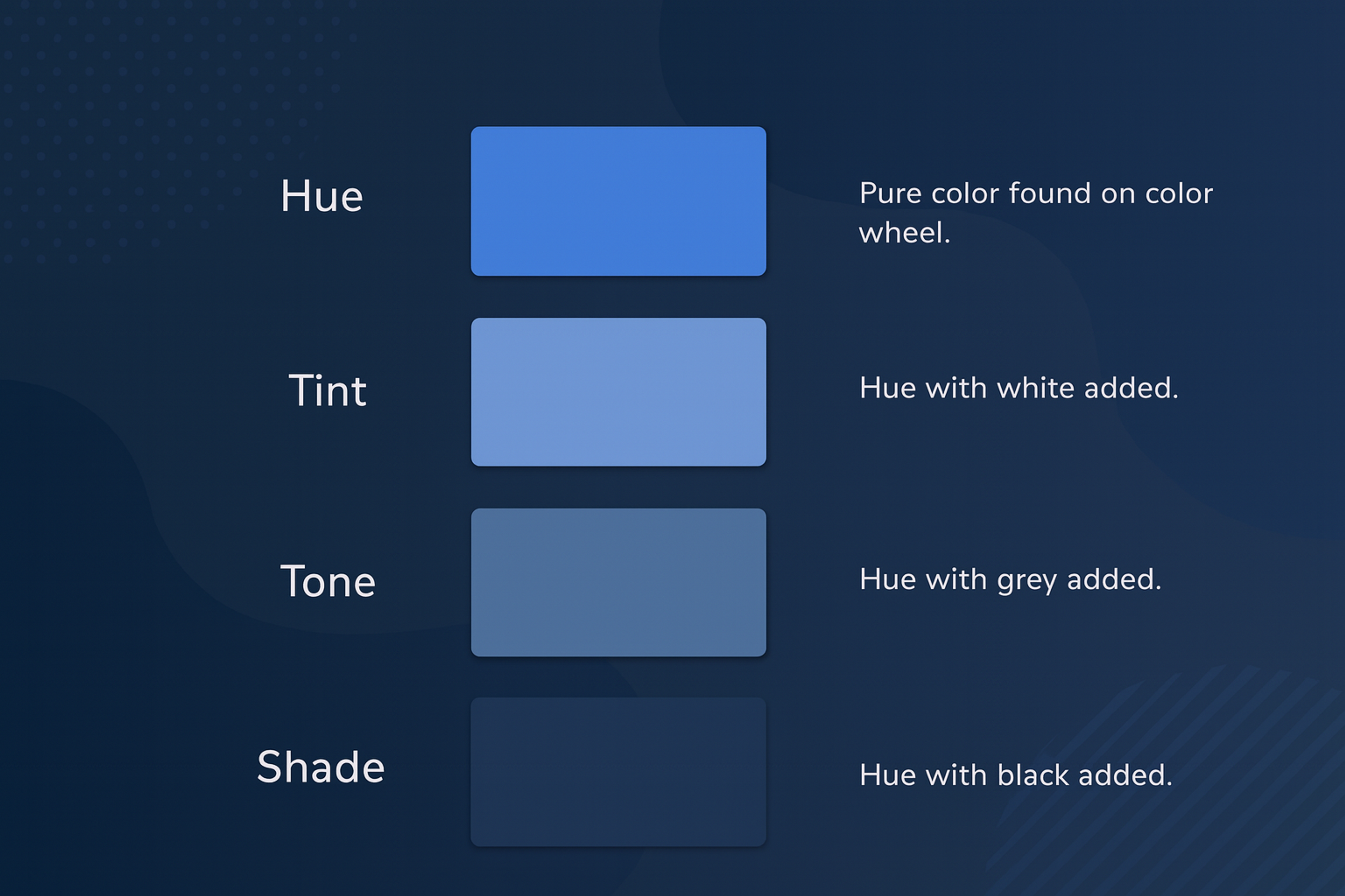
Effects of Hue, Tint, Tone, and Shade
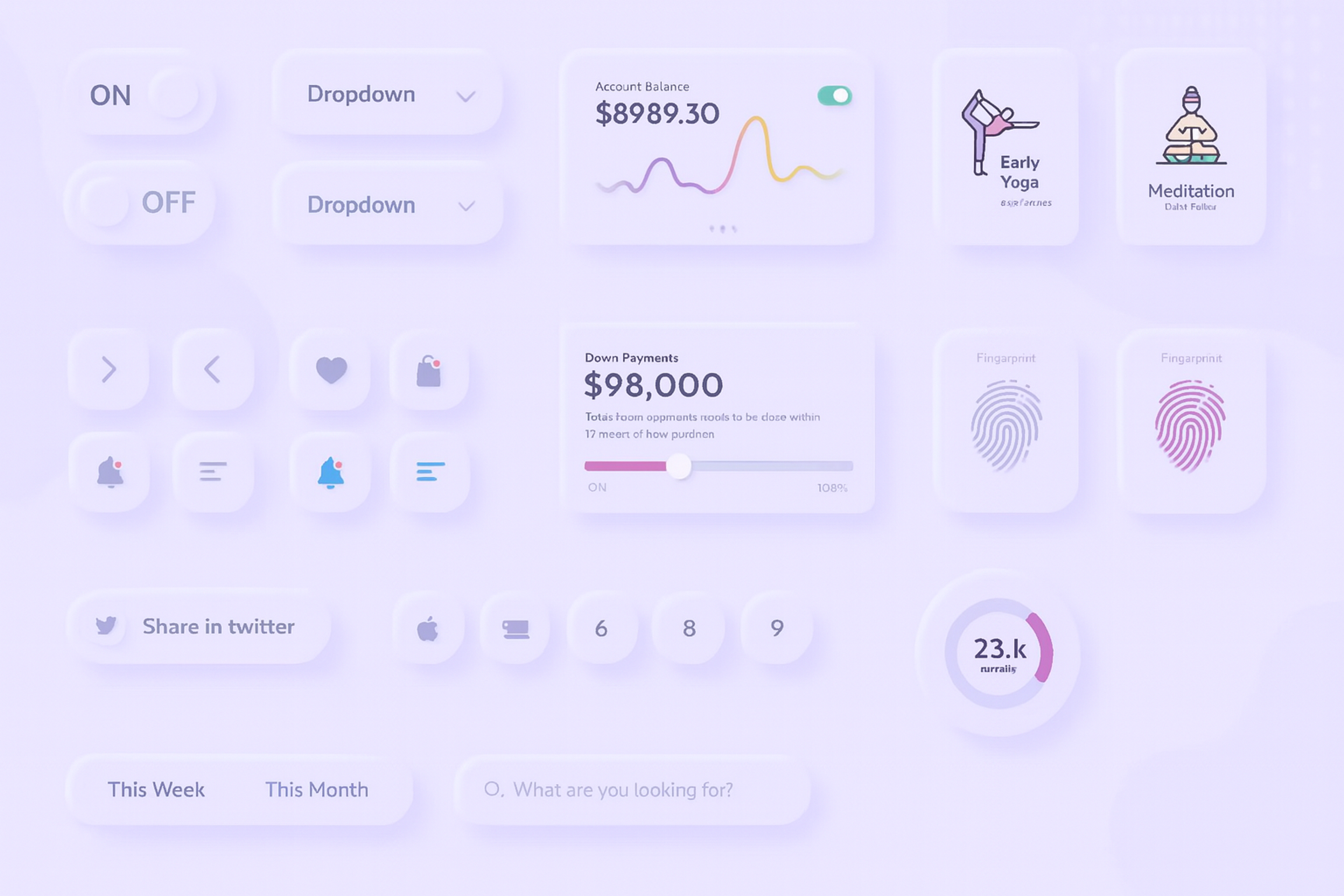
Neumorphic UI Components
Neumorphism applies to more than just stylish buttons. Although these are the easiest design components to start with, this style can be used for various interface elements, enhancing their depth and dimension.
Let’s consider the effects of neuromorphic UI components on user experience. Neumorphic buttons are a key component in neumorphic design, ensuring usability and visibility within user interfaces.
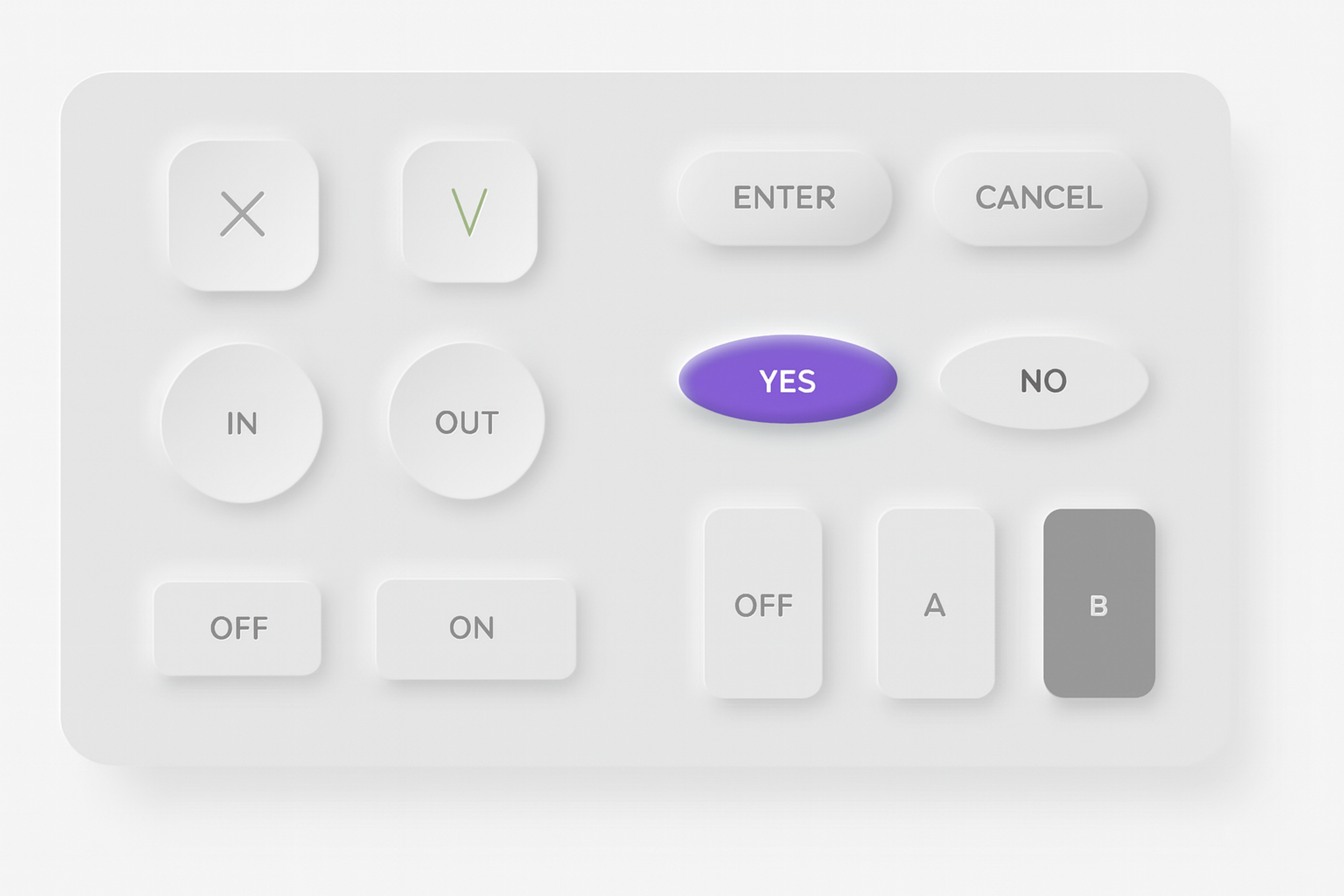
Buttons
In modern interfaces, aesthetics must support usability. In neumorphism, this means clear outlines and enough contrast to separate elements from the surface. Overly detailed shapes often hurt clarity.
Buttons are everywhere, and their state changes matter most. A button must clearly show hover, pressed, and disabled states through noticeable shifts in brightness and color.
Low contrast is a common neumorphic trait, but it’s a usability weakness because states become hard to distinguish.
Neomorphism UI Button
Cards
Neumorphic cards don’t look like they float in space. Instead of a strong base shadow, they feel “extruded” from the surface, as if the surface itself is pushed up.
This effect can look fresh, but it often reduces contrast. To show hover or selection, adjust the light and dark shadow pair: place the lighter shadow on the side facing the light source and the darker shadow on the opposite side. Shifting these shadows slightly can also suggest different viewing angles.
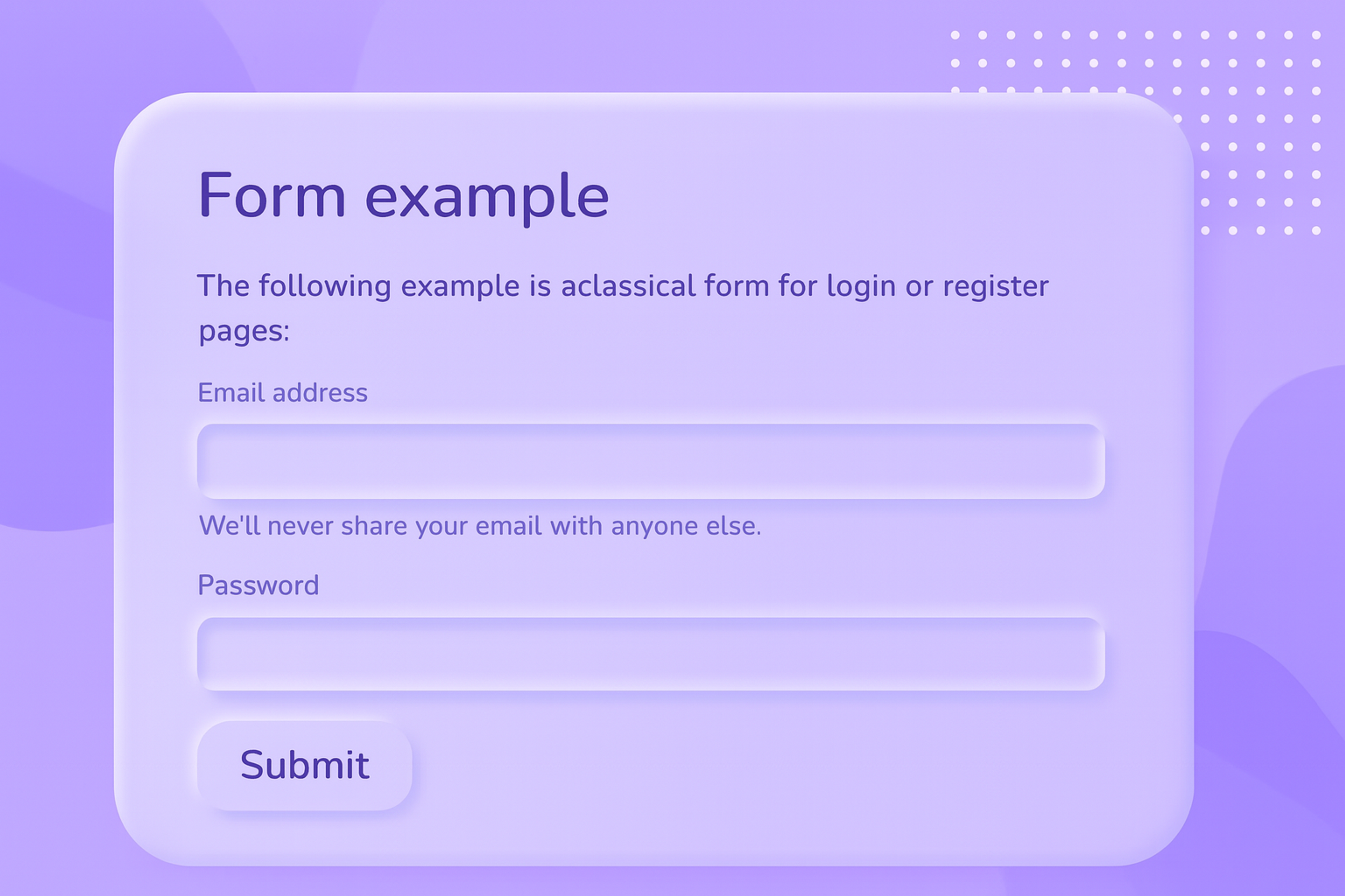
Input Fields
Neumorphic input fields should look slightly recessed. Use soft inner shadows to create the “sunk in” effect.
The field still needs a clear frame so users know where to type. A subtle inner shadow can do this without overpowering the layout.
Don’t match the field color to the background. A borderless style can work, as long as contrast and the inner shadow clearly separate the input area. This depth cue helps users spot the target faster and interact with it more easily.
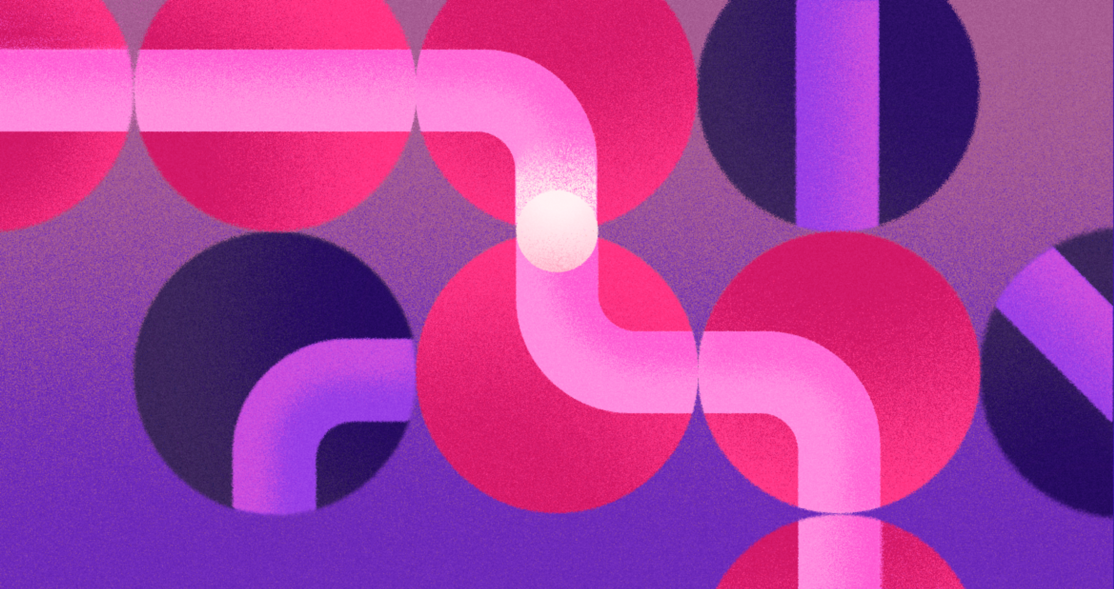
Neumorphism Example
Pros and Cons of Neumorphism
Like any design trend, metamorphism features benefits and drawbacks. Let’s polish and look deeper into these.
Pros:
- Ease of Admiration: Neumorphism, with its subtle polish of light and shadow, creates a modern, sophisticated aesthetic.
- User-Centric: Users have commented that the design's soft, rounded edges and tactile impression make it easy to engage with.
- Creates Depth: Neumorphism conveys a minimum dimension level while keeping the details low without overwhelming the user with massive textures or details.
Cons:
- Accessibility Issues: The lack of contrast among elements remains an issue for those with visual implications, making it challenging to use the interface.
- Overuse May Cause Design Fatigue: Heavy use of metamorphism may lead to unclear design principles and cluttered or difficult-to-navigate interfaces.
- Performance Concerns: Neumorphism's overdependence on shadows and gradients starkly contrasts older devices or those with limited graphical processing power. How to Design with Neumorphism
How to Design with Neumorphism
To master neumorphism in your designs, follow these best practices:
Avoid including too many elements in your layout to maintain clarity and usability.
Use Subtle Shadows
Light shadowing is one of the most critical aspects of metamorphism. You want shadows that bring Depth. However, deep shadows that dominate are to be avoided at all costs. The ideal scenario is soft, light shadows that create sufficient Depth to enable interaction.
Keep It Simple
Follow the principle of minimalism with neumorphism. Allow the colors and shadows to take center stage, as any complex interface dulls the dim, featureless design face of metamorphism. Cards, buttons, and input fields are the focal points that truly deserve attention.
Neumorphism UI Design
Maintain Good Contrast for Accessibility
Even though a fully 'dim' approach is favored, sufficient differences in coloring level should still be guaranteed in the structure. Icons, buttons, and even messages have to differ sufficiently to allow for useful, easy recognition and access.
Tools and Resources for Neumorphism
Several design tools and resources can help bring neumorphism to life:
- Figma: A popular design tool with neomorphic-friendly plugins and UI kits that simplify the process of adding shadows and depth to your designs.
- Sketch: Another widely-used tool for creating neumorphic elements, with libraries that include ready-made neumorphic components.
- Adobe XD: Offers tools to create neumorphic effects, including subtle shadow features and customizable UI kits.
These tools can help a designer create effective neumorphic designs by providing the necessary resources to craft visually appealing and functional user interfaces.
If you’re looking to speed up your process, many UI kits and libraries are available that focus specifically on neumorphism. These provide templates and components that can save you time while you experiment with this design style.
Impressive Neumorphic Examples
Now that you’ve mastered the essentials of neumorphism, let’s check out some real-world samples that show how striking this design trend can be. Each combines clever thinking with the cozy curves we love, proving that a soft edge can grab attention as quickly as a bold square. Please look, and let them spark the creative dream inside you.
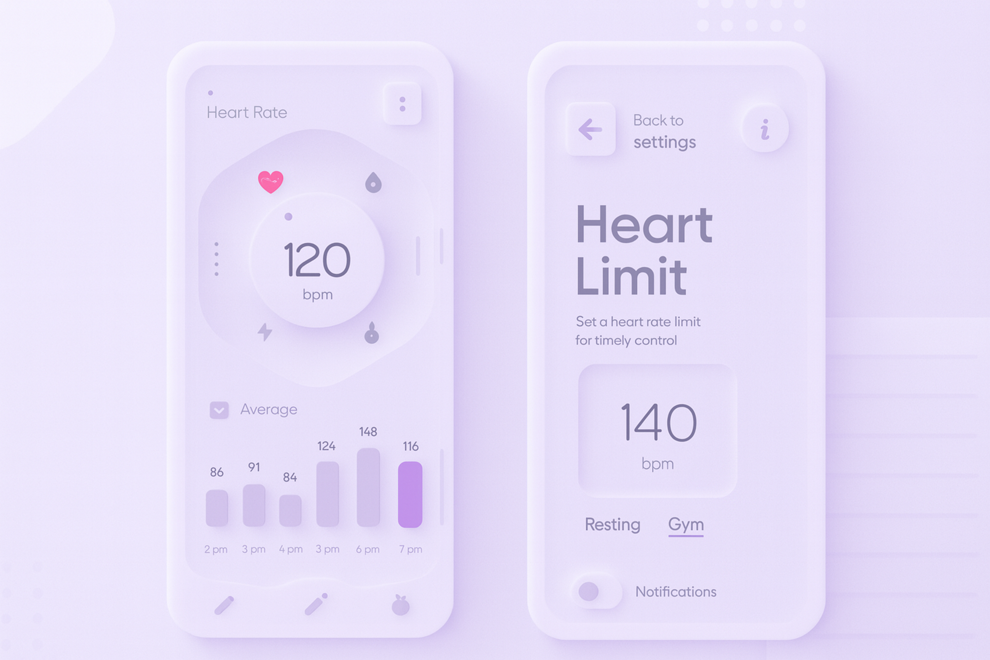
Fitness Device App
This heart-rate screen leans hard into neumorphism. The heart icon, dial, and buttons look like they’re molded from the same smooth surface. Soft inner shadows make them feel pressed in or gently raised, like a tactile button.
The background is deep midnight, with one sharp accent: a small red pulse that draws your eye. Heart rate, steps, and the red highlight feel clean and fluid, with subtle “glassy” fills that add depth without clutter.
Neomorphism UI Example
Neumorphic Bank Redesign
This mobile banking UI uses neumorphism in both light and dark themes. Soft shadows, gentle gradients, and rounded shapes create a subtle 3D look. A cash-availability meter sits in the center, and the buttons feel pressed in or raised depending on the light direction.
The layout stays readable: it shows totals, expenses, and a small chart clearly. Cash is highlighted in green and expenses in soft red. In dark mode, some controls may have low contrast, which can hurt visibility, but the overall interface still feels clean and modern.
Common Mistakes in Neumorphism and How to Avoid Them
As with every design style, metamorphism has advantages and disadvantages. Here are some mistakes you need to be aware of:
To avoid these common mistakes, consider combining neomorphic with other design styles, such as flat design, to achieve a functional and aesthetically pleasing interface.
Lack of Contrast
Due to the soft gradients and gentle shadows, text, icons, and backgrounds may blend together. Ensure all active elements are clear and readable, especially for visually impaired users.
Overusing Shadows
Shadows are significant in neuromorphic design, but overusing them can make it too busy and complicated. Restrain your use of shadows to maintain the clean look that neumorphism offers.
Misapplying Neumorphism
Not every app benefits from using neuromorphic designs. Soft and subtle metamorphism may not work with heavily loaded data dashboards or complex interactivity interfaces. Use neumorphism to enhance the experience and simplicity, not everywhere.
The Future of Neumorphism
We’re too early to crown Mig shape design, which is the one true path of the decade. Variables — device upgrades, SVG adoption, user habits — are still on the chessboard. Give whispers of VR and AR screens, and interest is guaranteed to bubble.
Perfect textures and glowing edges might lure a crowd, but only if we don’t sacrifice usability and empathy for the glow. Make thoughtful prototypes, and the impact may ripple — hat scrolling, delight scrolling — through every pixel.
FAQ
Q: What Are Alternatives to Neumorphism?
Alternatives to neumorphism include flat design, material design, glassmorphism, and skeuomorphism, each offering different visual styles and usability strengths.
Q: What Is the Difference Between Skeuomorphism and Neumorphism?
Skeuomorphism mimics real-world textures and objects, while neumorphism uses soft shadows and minimalism to create a modern, tactile look.
Q: Why Did Apple Get Rid of Skeuomorphism?
Apple moved away from skeuomorphism in favor of flat design to create cleaner, more modern interfaces with faster performance.
Read more:
Conclusion
Mastering torso UI design requires depth while being subtle, accessible, and balanced. Use creativity with light, shadow, and color while considering the primary principles, and trust me, interfaces will be intuitive and delightful.
While any project may not be fitting to incorporate, it is guaranteed that when crafted carefully, it can boost the level of your designs by adding touchable elements.
Now, tackle your next project with zeal, focusing on accessibility, and get the best results out of UI designs while experimenting with neomorphic. Remember, maintaining a modern aesthetic in neumorphic design is crucial for enhancing user experience while ensuring visual clarity.

About Clay
Clay is a UI/UX design & branding agency in San Francisco. We team up with startups and leading brands to create transformative digital experience. Clients: Facebook, Slack, Google, Amazon, Credit Karma, Zenefits, etc.
Learn moreAbout Clay
Clay is a UI/UX design & branding agency in San Francisco. We team up with startups and leading brands to create transformative digital experience. Clients: Facebook, Slack, Google, Amazon, Credit Karma, Zenefits, etc.
Learn more