Flat design didn't win by accident. When Apple stripped iOS 7 of its skeuomorphic chrome in 2013 and replaced it with clean surfaces and bold color, millions of people noticed, and almost all of them adapted immediately. That's not a coincidence. It's evidence that flat design works with human perception rather than against it.
The style has outlasted countless trend cycles since then, not because it's fashionable but because it solves real problems: information overload, inconsistent rendering across screen sizes, and the cognitive cost of cluttered interfaces.
In 2026, flat design remains one of the most widely deployed visual frameworks in web and app development - refined, yes, but structurally the same discipline it was at the start.
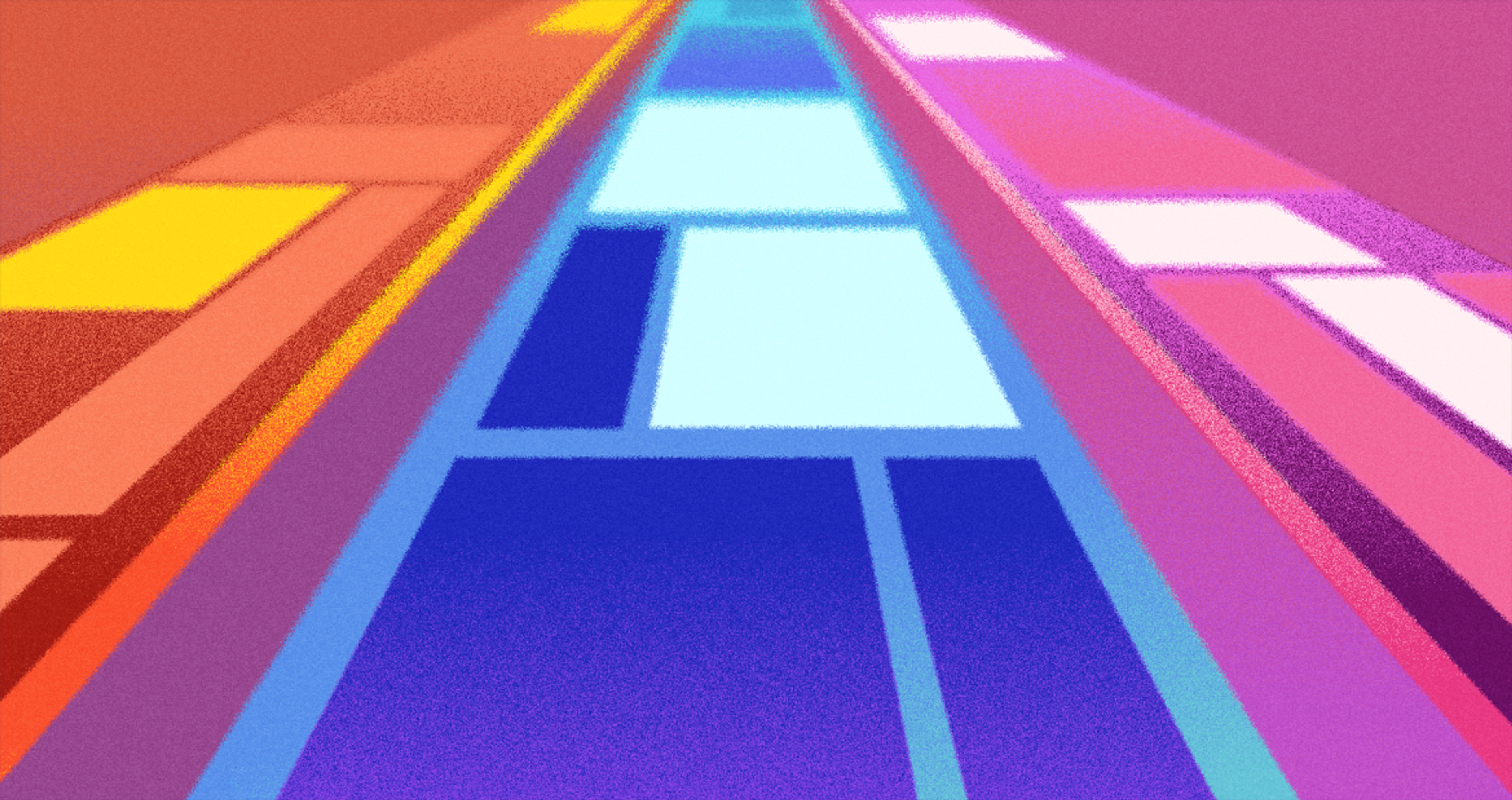
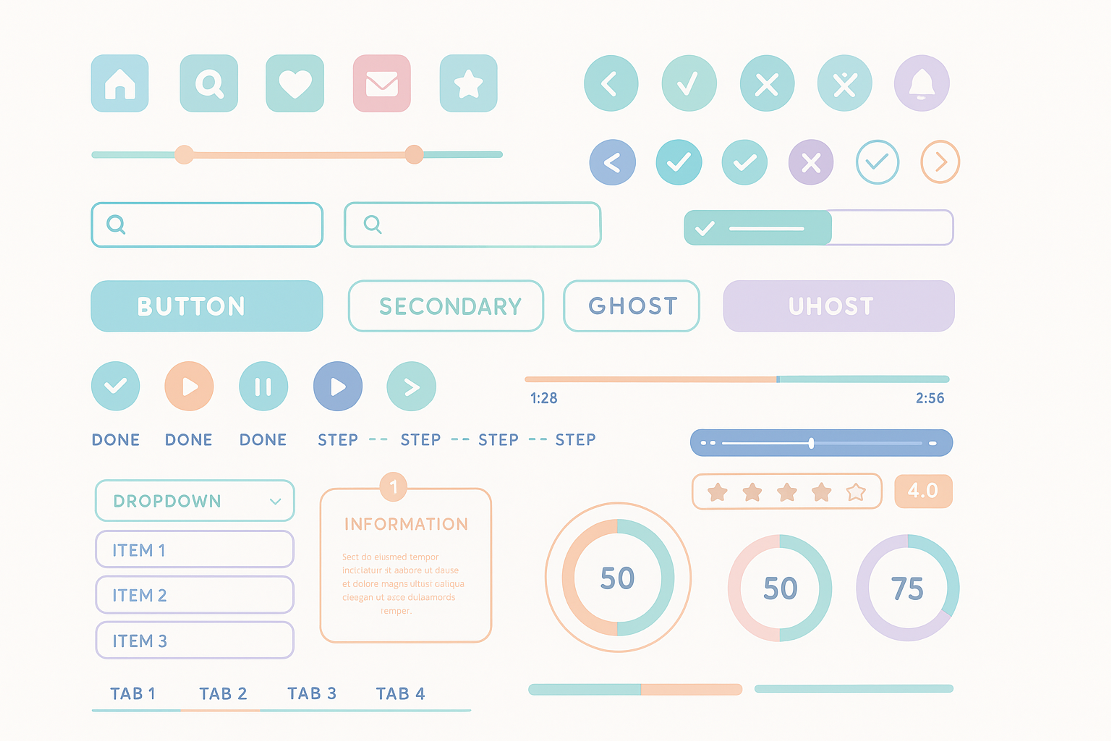
Flat Design Example
Key Takeaways
- Flat design removes decorative elements (shadows, gradients, textures) and relies on color, typography, and whitespace to create structure.
- Apple's iOS 7 (2013) and Microsoft's Windows 8 (2012) were the pivotal moments that brought flat design into mainstream UI development.
- Visual hierarchy in flat design depends entirely on contrast, size, spacing, and color, not depth cues.
- Flat design loads faster and scales better across devices than heavier skeuomorphic or heavily textured alternatives.
- Material Design is not a replacement for flat design: it's a layer on top, adding motion and depth for more interactive contexts.
- Pure flat design can obscure clickable elements; subtle interactive cues (underlines, hover states, minimal shadows) are often necessary.
What Flat Design Actually Means
The term gets used loosely, so it's worth being precise.
Flat design is a UI approach that eliminates three-dimensional visual effects: no drop shadows, no gradients, no beveled edges, no textures that simulate physical materials.
Instead, it uses two-dimensional elements: solid colors, geometric shapes, clean typography, and generous whitespace.
What it does not mean is minimal content or stripped-back functionality. A flat interface can be rich in information. The goal is to present that information without visual noise that competes with the content itself.
The style drew heavily from the Swiss International Typographic Style - the mid-20th-century movement that prioritized grid-based layouts, sans-serif typefaces, and mathematical clarity of composition. When digital designers began applying those same principles to screens, flat design emerged as a natural result.
Swiss International Typographic Style Example
The contrast with skeuomorphism explains why flat design resonated so strongly. Skeuomorphic interfaces (think early iOS, with its leather-textured calendars and wooden bookshelves) tried to make digital elements feel familiar by mimicking physical objects.
That worked in the early days of consumer touchscreens, when people needed visual metaphors to understand what a button was. As users became fluent in digital interfaces, those metaphors became baggage, in other words, a visual complexity that added nothing functional.
Brief History Worth Knowing
Microsoft moved first. The Metro design language, introduced with Windows Phone 7 in 2010 and refined into Windows 8 in 2012, was the first major flat design system deployed at scale. Its tiled, typographic interface was a deliberate departure from the icon-heavy, gradient-laden status quo.
Apple followed in 2013 with iOS 7, designed under Jony Ive. The update was polarizing at launch (some users found the thin fonts and minimal chrome jarring), but it established flat design as the new baseline for mobile interfaces worldwide.
Apple’s Flat Design Example
Google's Material Design arrived in 2014, a year later. Where Apple went purely flat, Google introduced controlled depth through shadows and a clear z-axis - an approach that became its own influential standard, and a useful point of comparison.
The significance of this timeline: flat design wasn't a startup aesthetic or a niche movement. Three of the largest technology companies in the world adopted it within four years of each other. That consensus shaped every major design system that followed.
Flat Design vs. Material Design
These two are often conflated. They share a commitment to clarity and clean typography, but they're built on different assumptions about how users understand interfaces.
Flat Design vs. Material Design
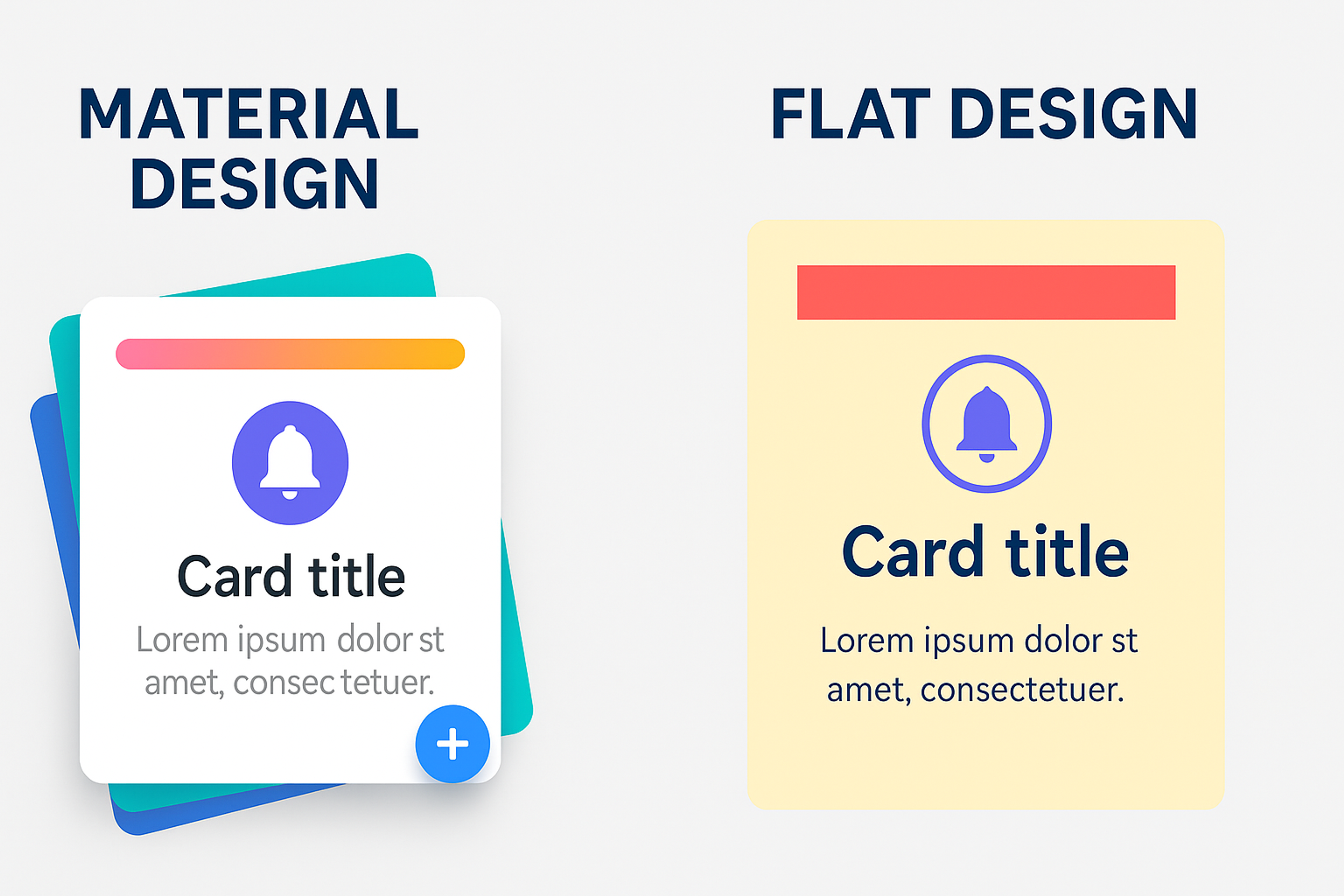
Flat design treats the screen as a single, undifferentiated plane:
- Elements sit on that plane
- Their importance is communicated through size, color, and position, not through their apparent elevation above the surface
- There is no implied physics
- A button looks like a button because of where it is and what it says, not because it casts a shadow
Material Design introduces a z-axis:
- Elements exist at different heights above the surface, and light sources cast shadows that communicate those heights
- A floating action button sits visibly above the card beneath it
- A modal dialog appears to rest on top of the page
- Motion reinforces the elements, so they move in physically plausible ways
The practical difference is interactivity signaling. Material Design makes it easier to communicate that something is clickable, draggable, or dismissible, because it can use shadow and motion as feedback.
Flat design requires more discipline to achieve the same clarity, which is why many interfaces labeled "flat" actually use what designers call "flat 2.0" or "semi-flat": the same clean aesthetic, but with subtle shadows or color shifts in interactive states.
Flat UI vs Material Design UI
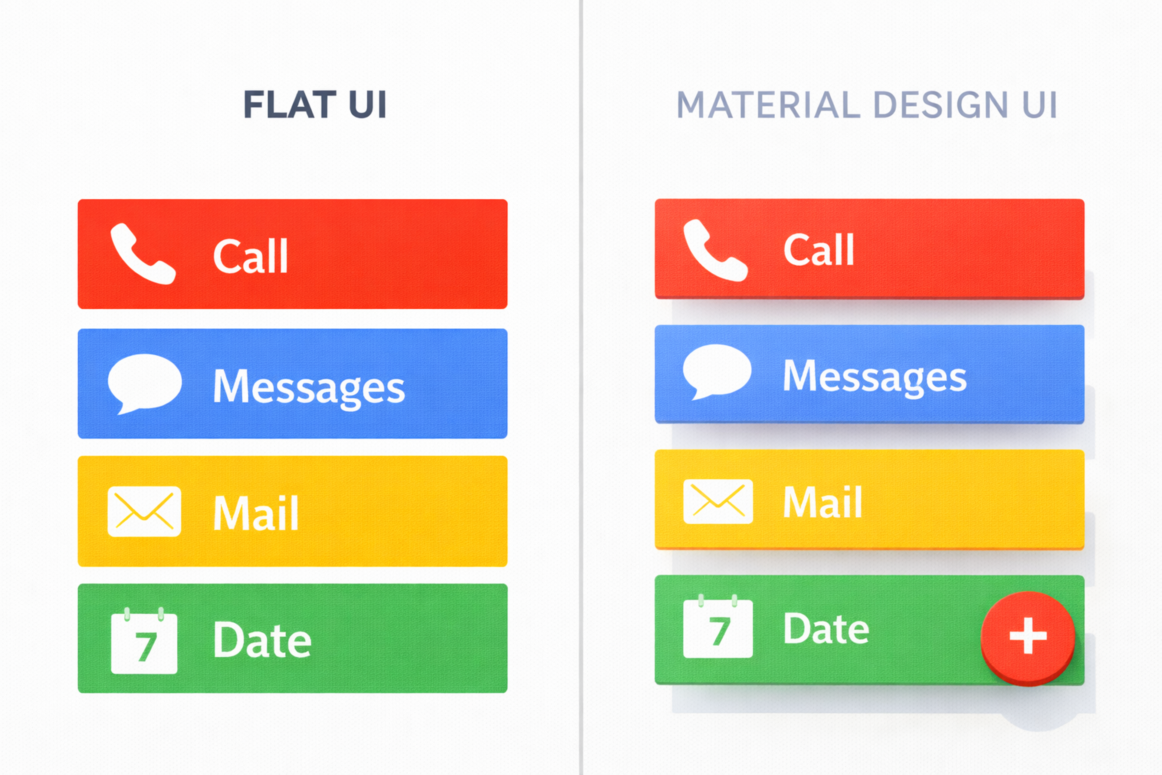
Neither approach is universally superior. Material Design is generally stronger for complex, interaction-heavy applications where users need constant feedback about what they can do. Flat design is often the better choice for content-forward interfaces (editorial sites, portfolios, dashboards, landing pages) where the visual system should recede and let the content lead.
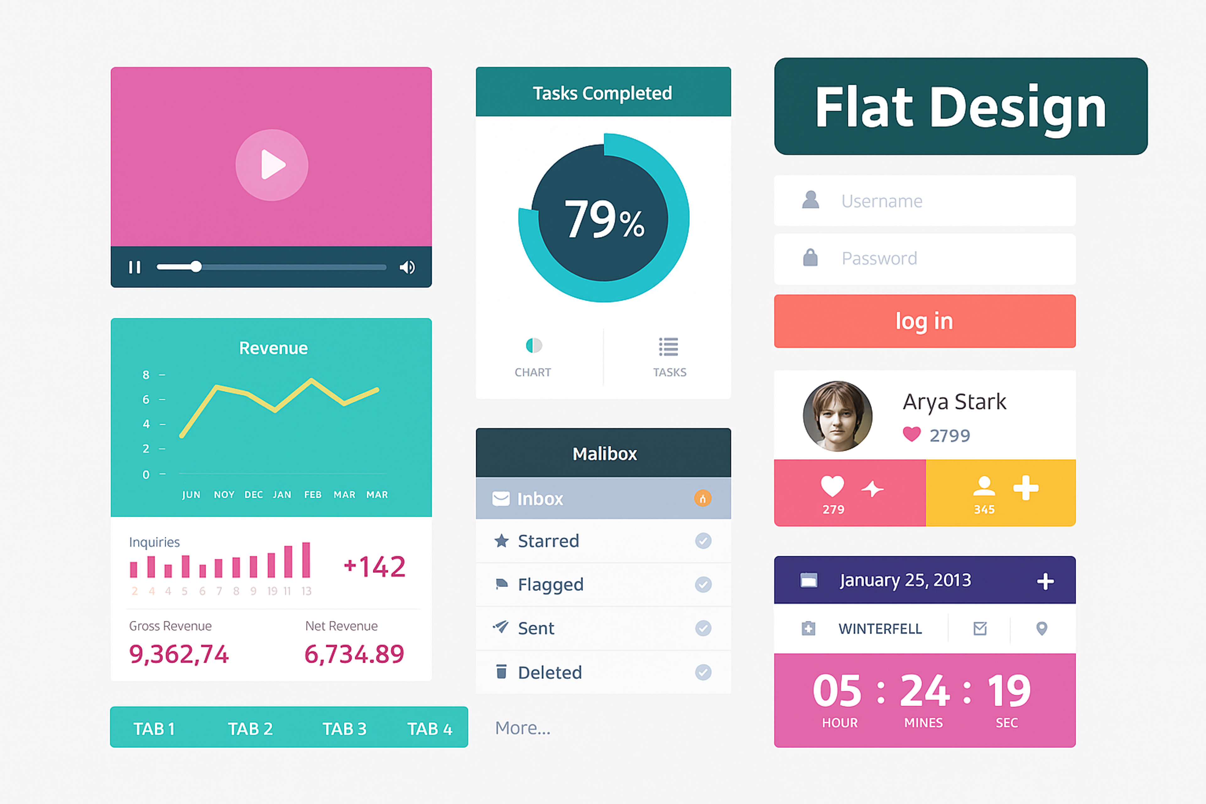
The Core Principles of Flat Design
Visual Hierarchy Without Depth
Removing shadows and gradients doesn't remove hierarchy. It just changes how you create it. In flat design, every signal that guides the user's eye must come from contrast, scale, or position.
Scale is the most powerful tool. Large elements read as important, while small elements read as secondary. It sounds obvious, but applying it consistently is harder than it appears. Every headline, subhead, label, and body copy block needs to exist within a deliberate size system, not a collection of arbitrary choices.
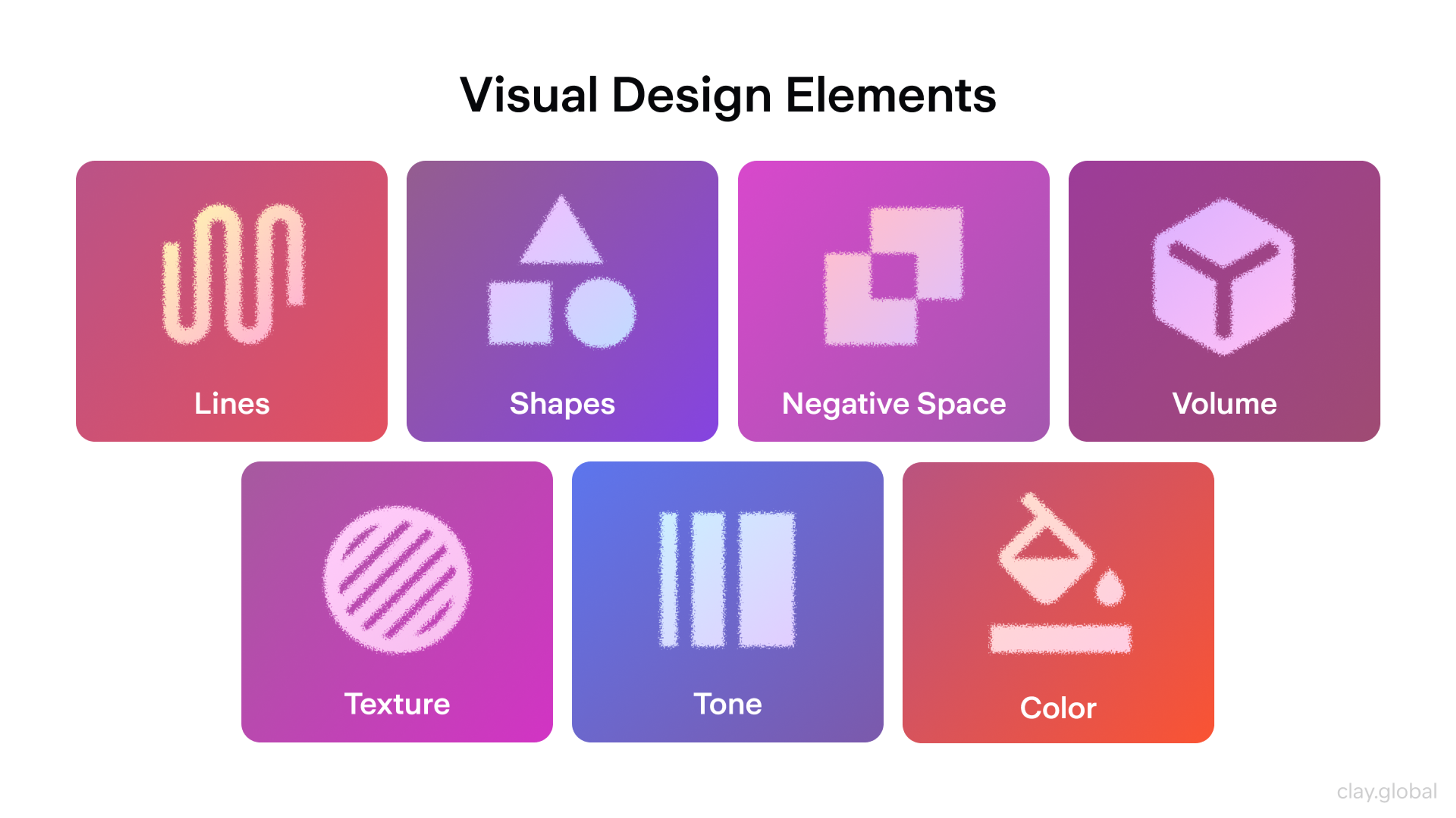
Visual Design Elements by Clay
Color contrast carries the next layer of meaning. Dark text on light backgrounds, high-contrast calls to action, muted backgrounds behind primary content - these decisions establish what the user should engage with first. According to WebAIM's 2024 accessibility analysis, color contrast remains one of the most commonly failed accessibility criteria on the web, which is a significant problem in flat design, where contrast is doing more work than anywhere else.
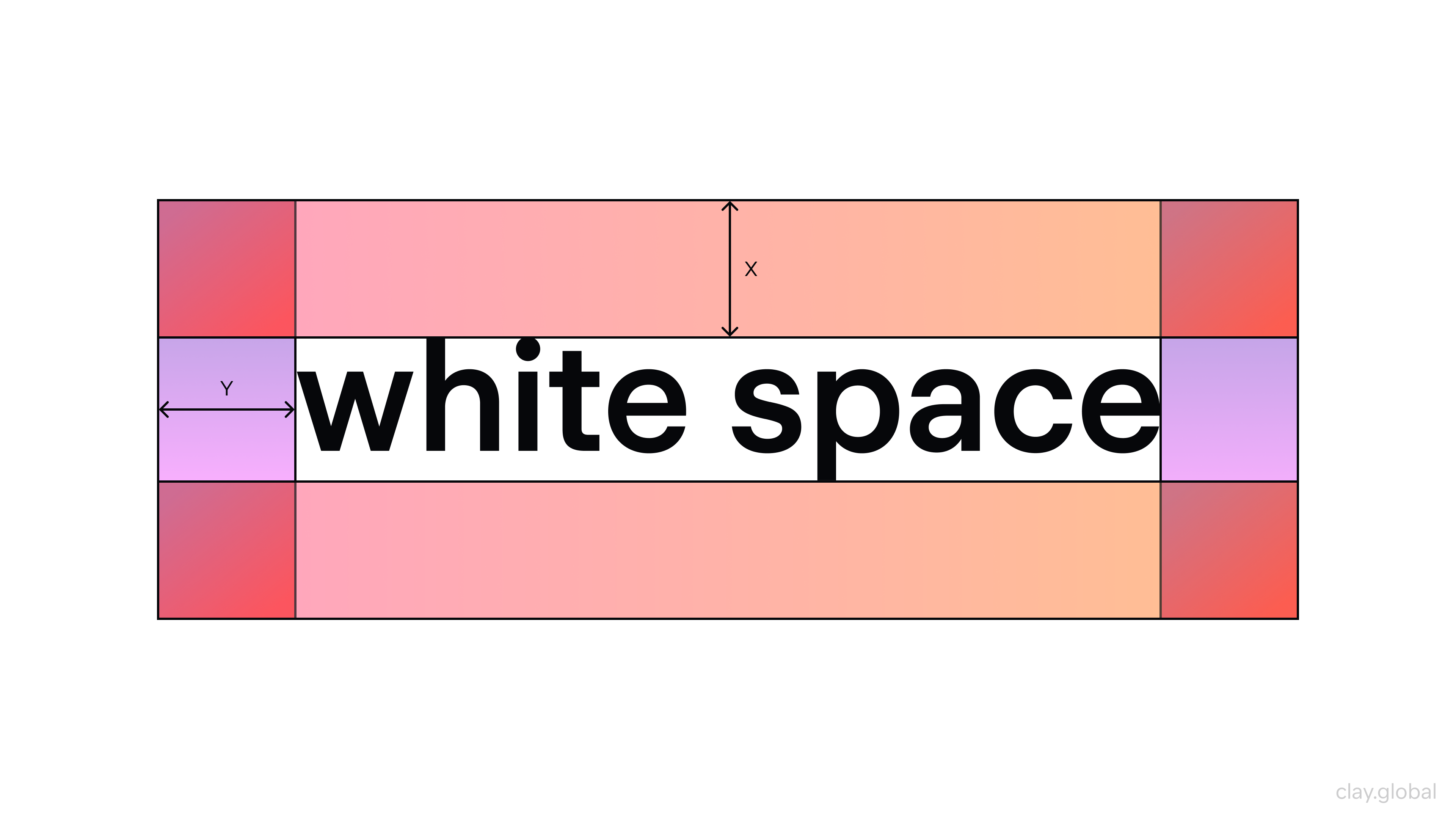
Whitespace is structure, not absence. The gaps between elements communicate grouping: things that sit close together belong together, things separated by space are distinct. Flat design tends to use whitespace more generously than skeuomorphic interfaces, partly because there are no decorative dividers to lean on.
White Space Example by Clay
Typography as the Primary Visual Element
In many flat interfaces, typography is the design. When there's no ornamentation to carry visual weight, type choices become load-bearing decisions.
This means thinking carefully about typeface selection, weight variation, and size hierarchy. A well-executed flat design typically uses one or two typefaces, relies on weight (regular vs. bold vs. light) to create variation within those families, and establishes a clear scale (a dominant display size, a readable body size, and a discreet label size).
The Google Fonts team's usage data consistently shows that the most-used typefaces in production are clean, highly legible geometric sans-serifs: Roboto, Inter, and Open Sans. These families were explicitly designed for screen legibility at the sizes and weights flat design demands.
Typography Example by Clay
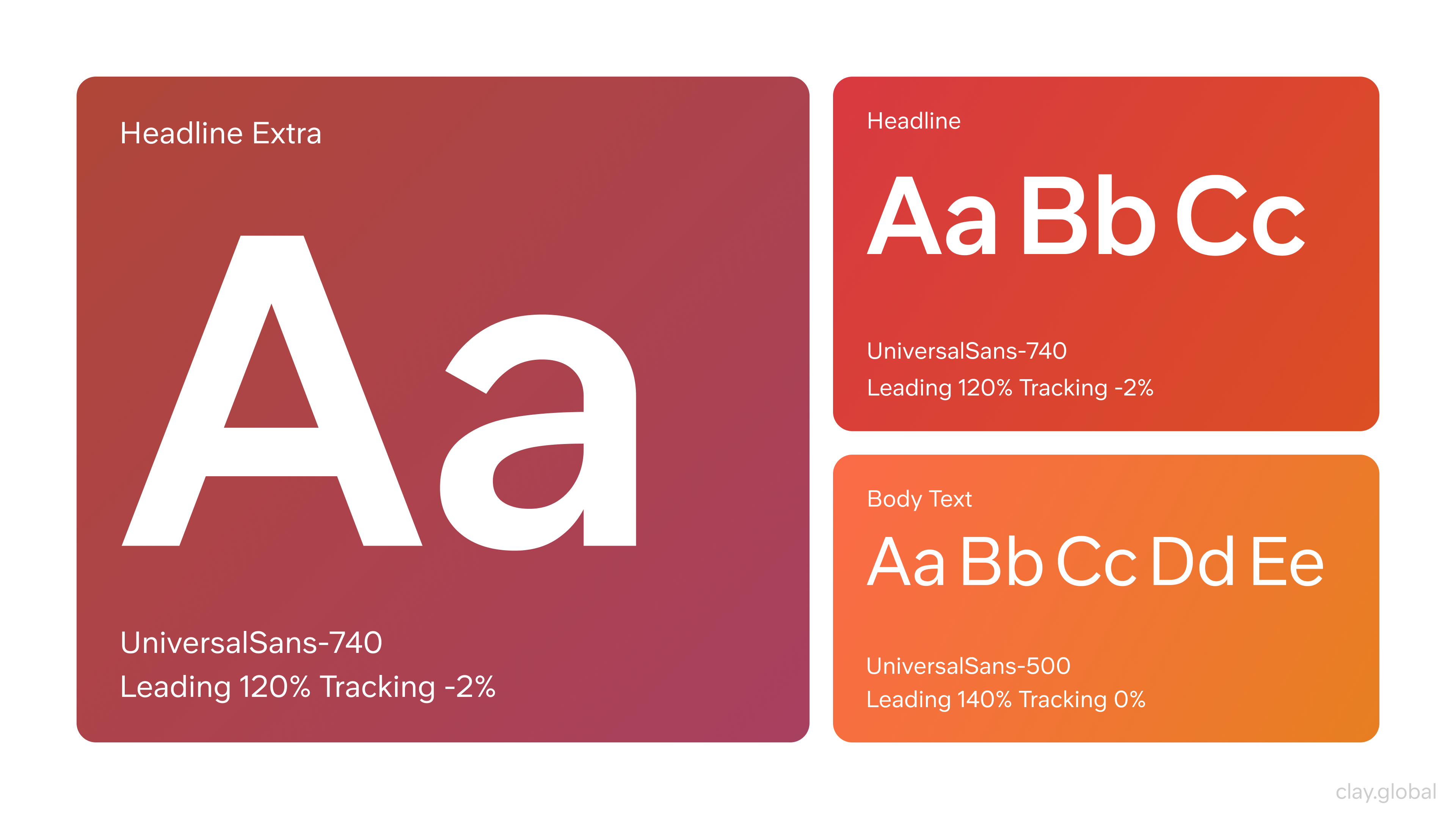
Avoid decorative typefaces for anything functional. Flat design earned its reputation for legibility partly because its practitioners took type seriously. A highly styled script font undermines the entire discipline.
Color as Communication
Flat design often uses bold, saturated color as a primary organizational tool. Where a skeuomorphic interface might rely on a textured button to signal interaction, a flat interface uses a vivid fill.
This creates both an opportunity and a risk.
The opportunity: color systems in flat design can be expressive, memorable, and brand-building in ways that textured interfaces rarely achieve. Think of how immediately recognizable the color systems of Spotify, Duolingo, or Google's product suite are.
The risk: if color is doing structural work (signaling links, grouping related items, indicating states), it can't also be purely decorative. Every color decision needs a functional rationale, and the system needs to stay consistent across all states and contexts.
Color Wheel by Clay
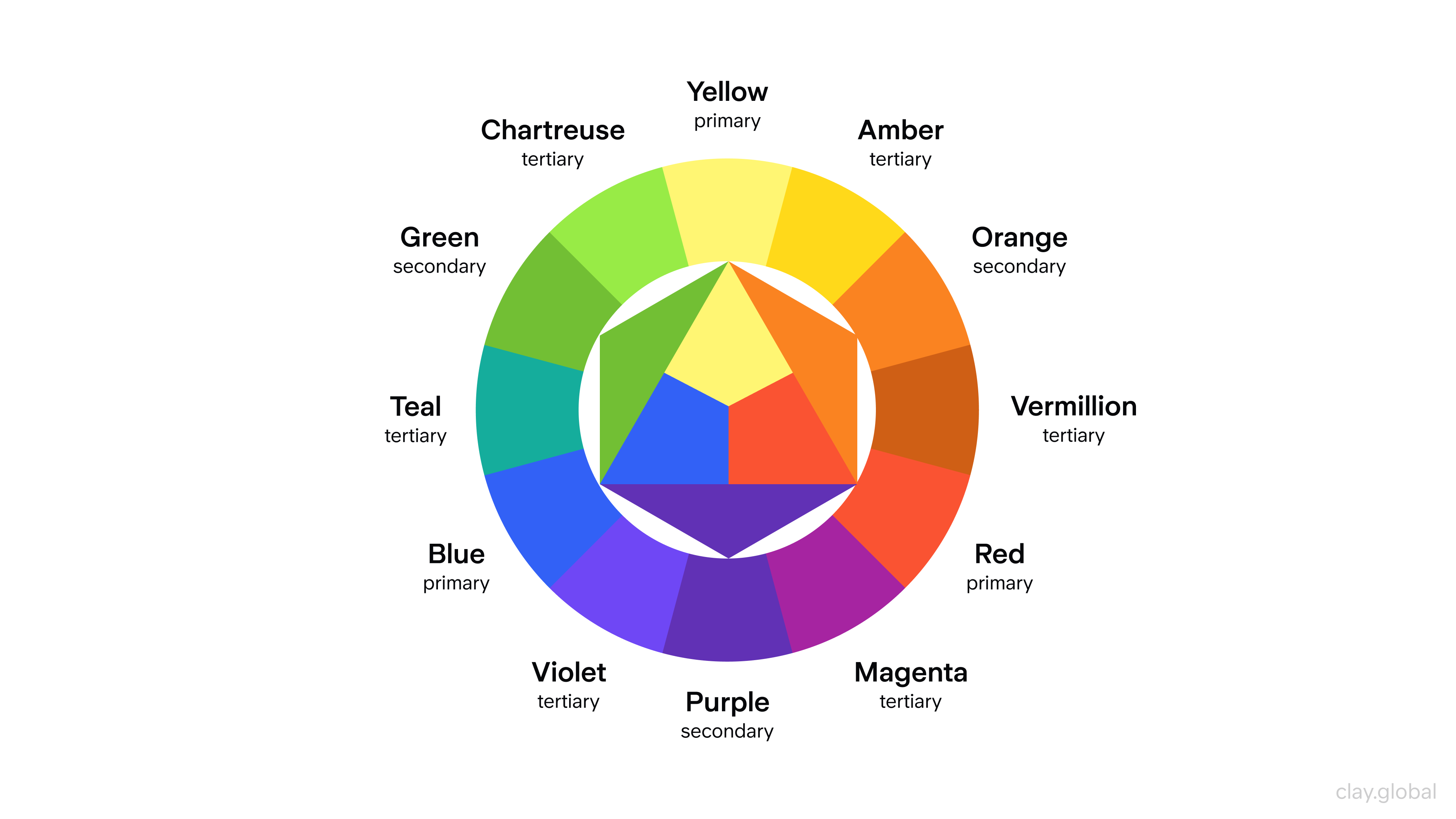
Color accessibility deserves special mention here. Flat design's reliance on color means that color-blind users are disproportionately affected by poor choices. Approximately 8% of men and 0.5% of women have some form of color vision deficiency, which means color alone is never a sufficient signal. It must always be reinforced by shape, label, or position.
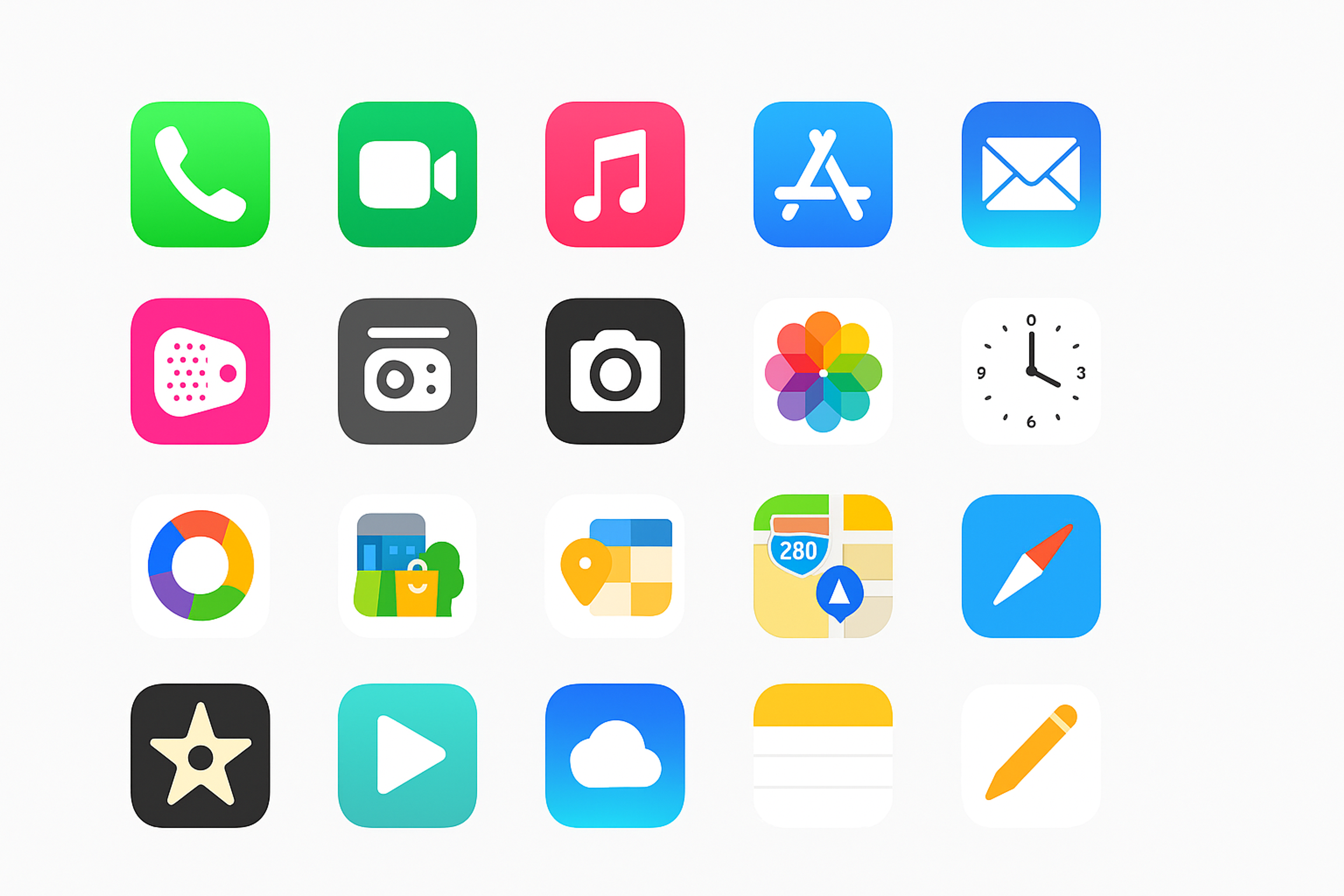
Iconography
Icons in flat design serve a specific purpose: they aid recognition and reduce the need for explanatory text. They're not decoration. A flat icon should communicate its meaning at a glance, even at small sizes, without shading or dimensionality.
The practical guidelines are straightforward:
- Use a consistent stroke weight across your icon set
- Keep shapes geometric and simple
- Avoid icons that only make sense with a label. If an icon requires explanation, it's not earning its place
- Test icons at the actual sizes they'll appear, because a glyph that reads beautifully at 48px can become illegible at 16px
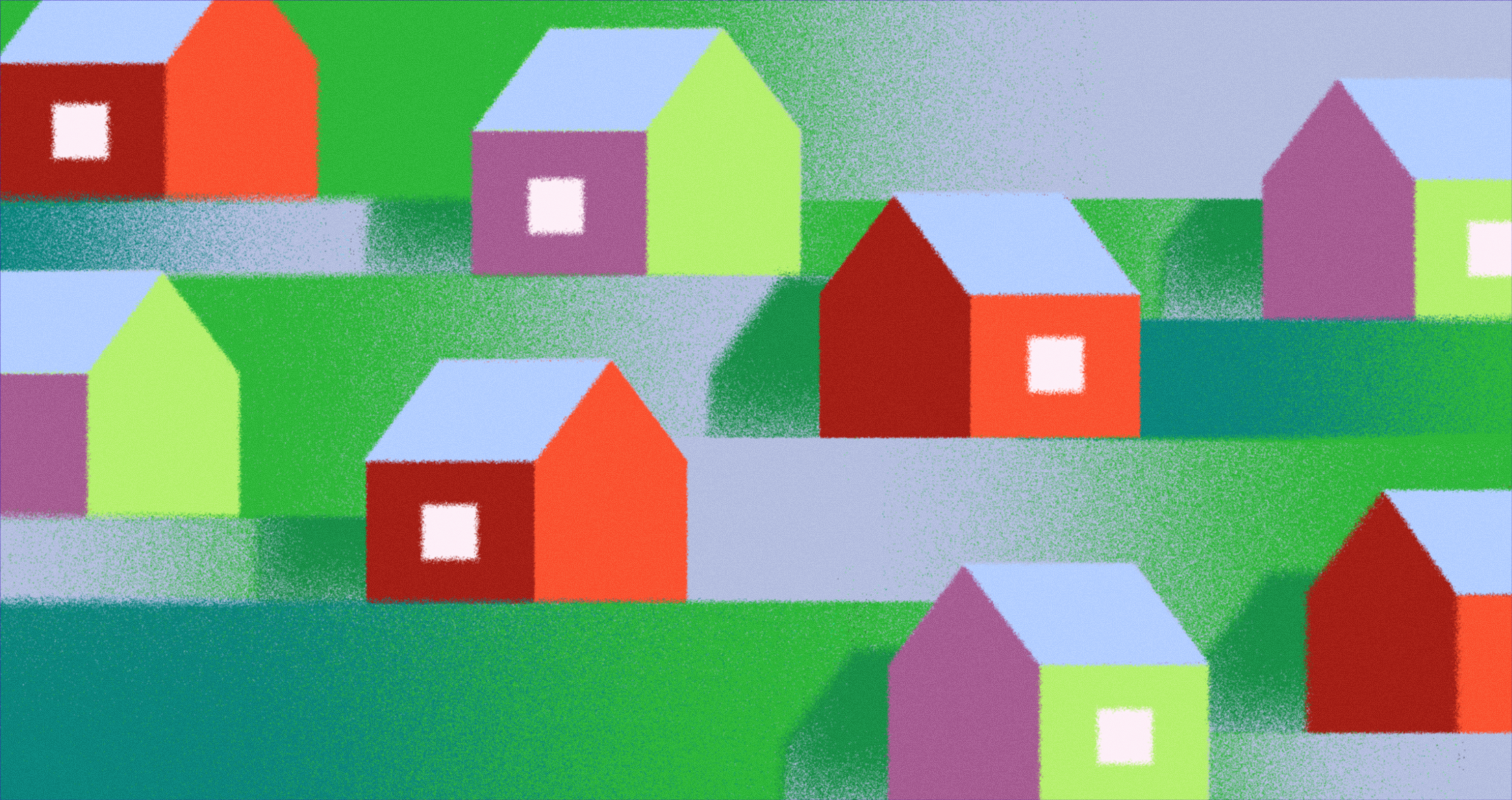
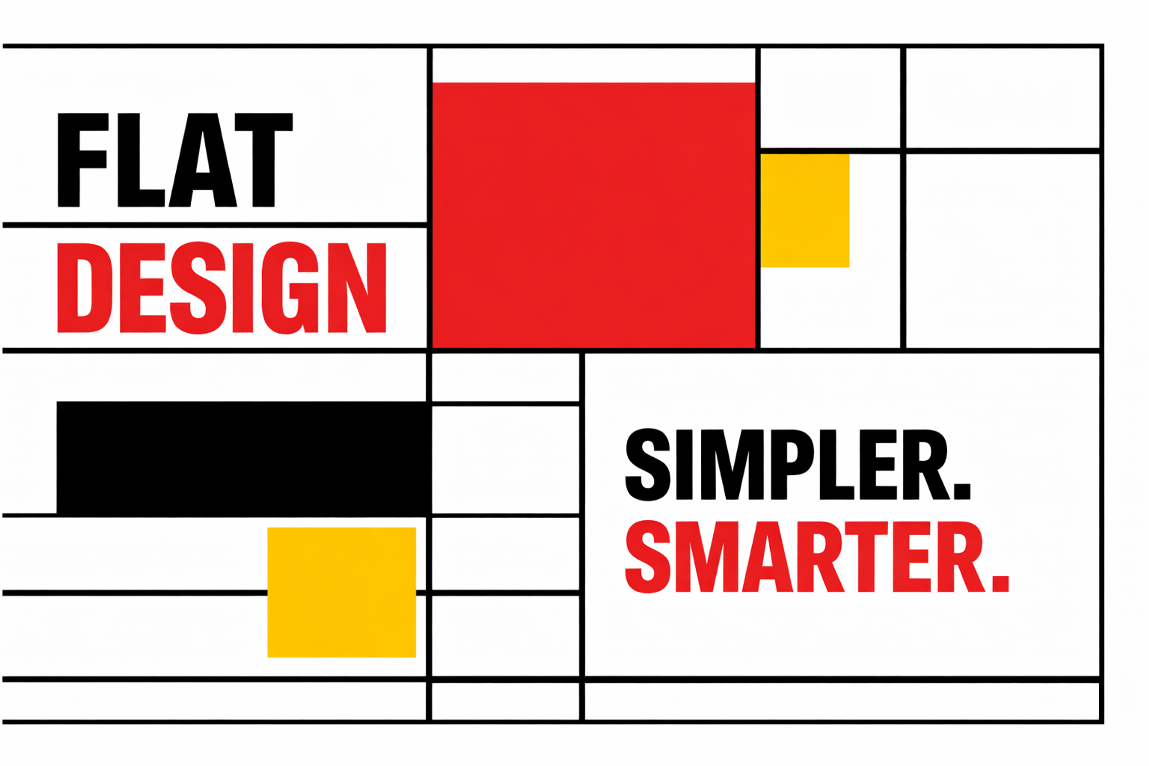
Flat Design Example
Interactive States and the Affordance Problem
The one genuine weakness in flat design is affordance signaling: making it obvious what's interactive without resorting to shadows or bevels. This is where flat design sometimes stumbles in practice.
The solution isn't to abandon flat design's principles, but to use the tools the system allows:
- Underlines on text links are low-cost and universally understood
- Color changes on hover states communicate interactivity without adding depth
- A clearly labeled button with adequate padding reads as a button
- A tight, borderless, shadow-free design can make everything look equally non-interactive. The fix is thoughtful spacing and deliberate color hierarchy, not a return to gradients.
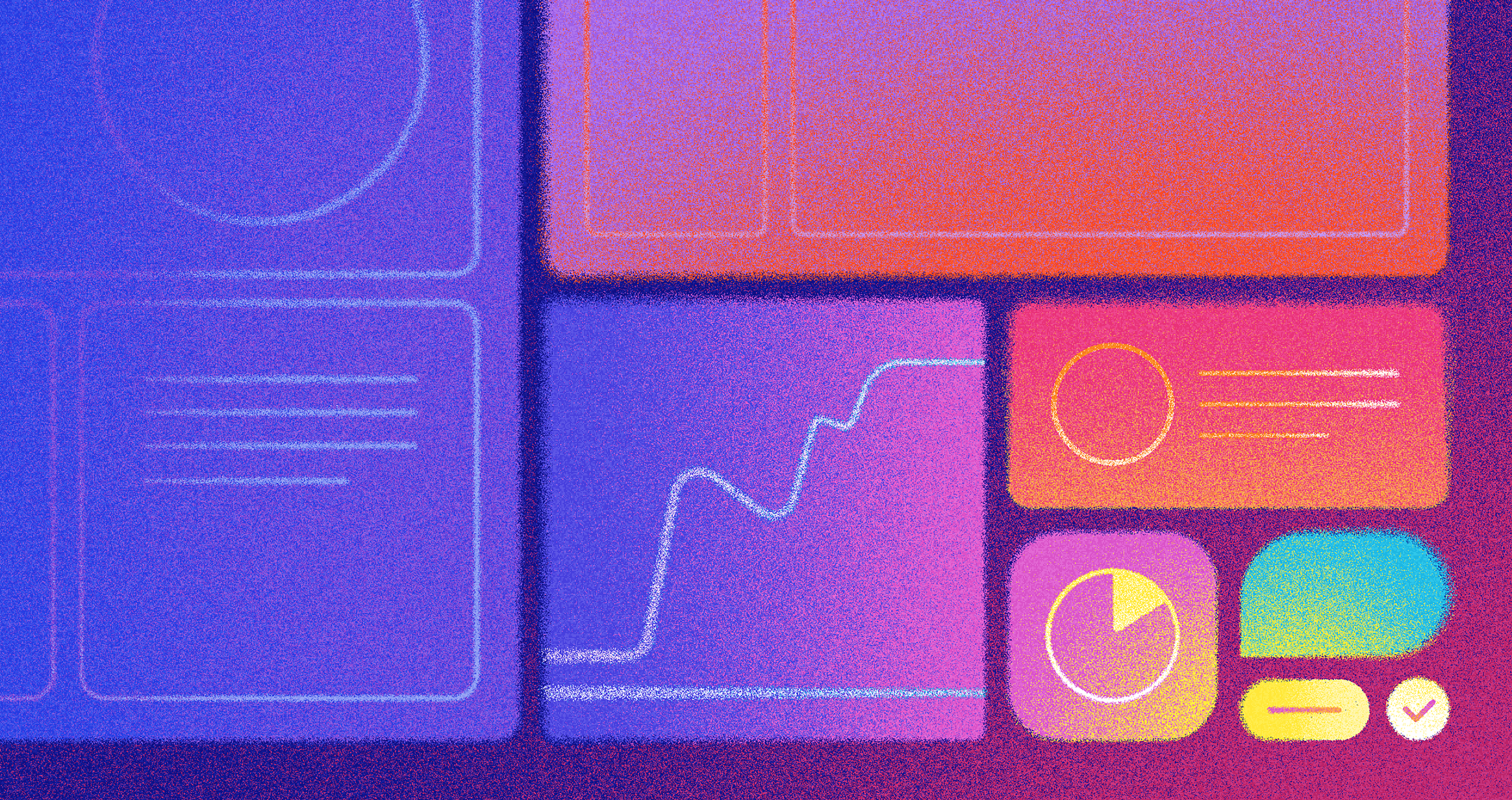
The app we created for JOKR includes interactive features alongside animations to improve the grocery shopping experience. The app also features easy navigation, delightful icons, and specialized personalized "smart baskets," which bolster the app's dynamic and usability.
JOKR Mobile App Design by Clay
Three Strong Examples of Flat Design
Instagram is one of the clearest examples of flat design maintaining visual discipline at an enormous scale. The interface recedes almost completely as there are no decorative elements competing with the photographs.
Instagram Flat Design Example
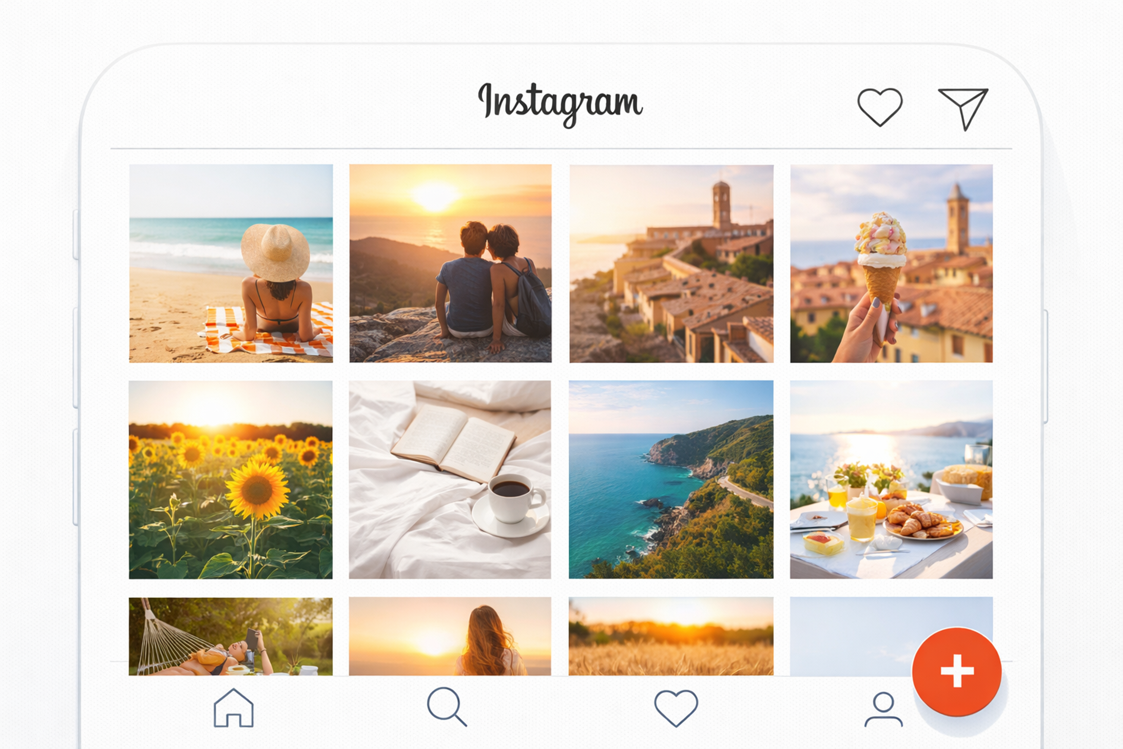
Navigation is iconic and minimal, typography is restrained, and the entire visual system is designed to make user-generated content look as good as possible. That's not accidental. It's a deliberate hierarchy where the product serves the content.
Microsoft's Fluent Design System, the evolution of Metro introduced with Windows 10 and refined further since, applies flat principles with carefully integrated depth. Acrylic backgrounds and directional lighting are used sparingly, and only where they communicate hierarchy rather than add polish. The underlying discipline is flat, but the added dimensionality is purposeful rather than decorative.
Spotify demonstrates how flat design can be expressive rather than austere. Bold typography, high-contrast color, and album art do all the visual work. There's no decorative ornamentation.
Spotify Flat Design Example
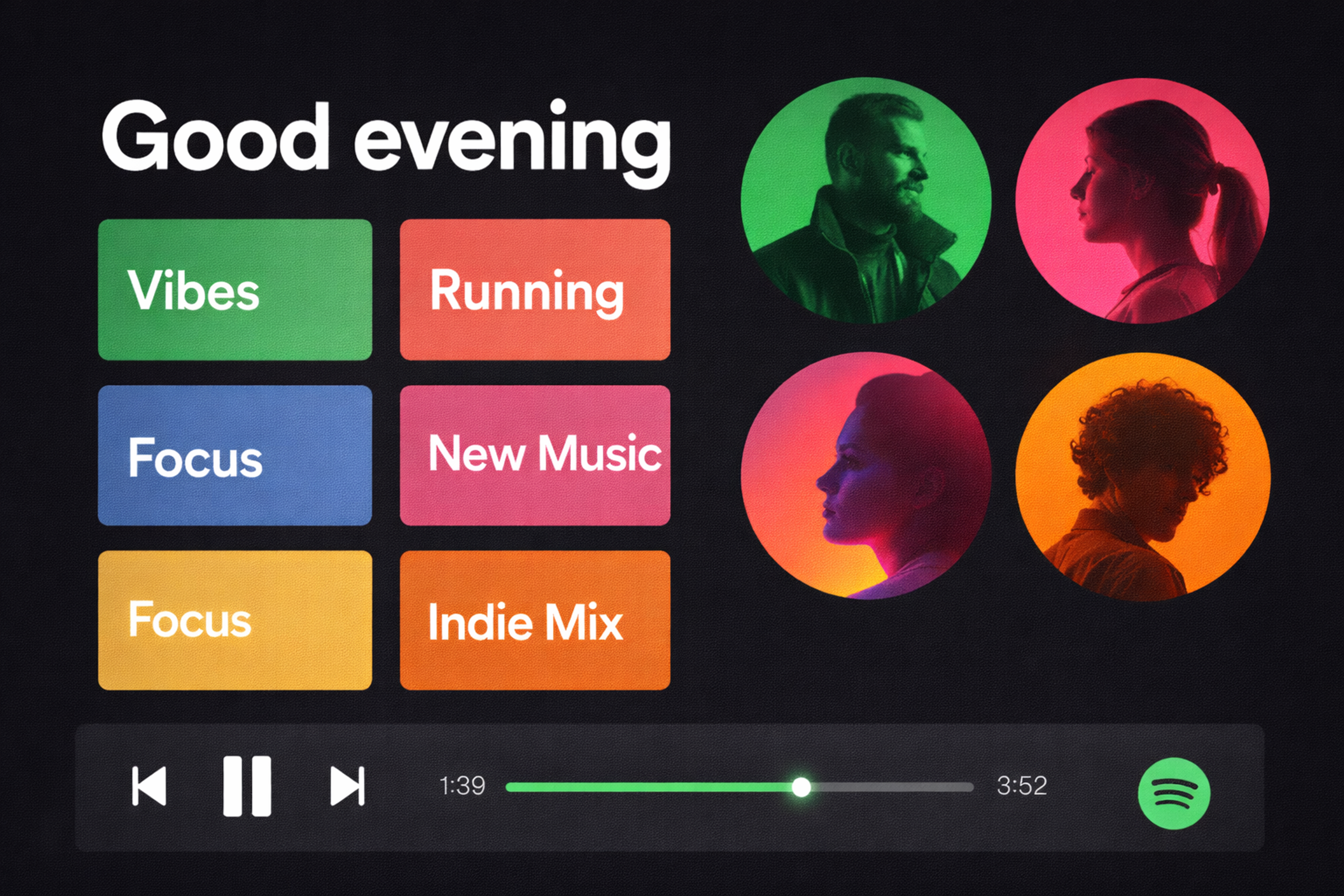
The interface changes character dramatically based on what the user is listening to, yet the underlying structure remains consistent. That flexibility is a flat design advantage: because the system relies on color and type rather than textures and chrome, it can shift tone without structural changes.
When to Use Flat Design (and When to Think Twice)
Flat design performs best when clarity and speed matter most. Content-forward sites (editorial platforms, portfolios, documentation, marketing pages) benefit from interfaces that don't compete with the content.
Applications where the user needs to process a lot of information quickly (dashboards, analytics tools, admin interfaces) also benefit from the reduced visual load.
Think twice about pure flat design when interactivity is central to the experience. Gaming interfaces, highly transactional flows with many distinct states, or interfaces for first-time digital users may need more explicit affordance signaling than flat design naturally provides. In these cases, a semi-flat or Material Design approach is worth considering.
Also consider your user's context when creating a website. Desktop users have hover states as an affordance tool, while mobile users don't. Flat design on mobile requires extra care that every interactive element is visually distinct without relying on hover as a cue.
FAQs
Does flat design still hold up in 2026?
Yes. The principles (clarity, hierarchy through contrast, purposeful color) haven't aged. What has evolved is implementation: most production interfaces now use "semi-flat" systems that allow subtle interactive cues without returning to full skeuomorphism.
What's the difference between flat design and minimalism?
They overlap but aren't identical. Minimalism is about reducing elements to the essentials. Flat design is specifically about eliminating dimensional visual effects. A minimalist design might use shadows; a flat design won't.
Why did skeuomorphism fall out of favor?
Users became fluent in digital interfaces quickly, which made visual metaphors (leather textures, fake stitching) feel redundant rather than helpful. They also added rendering complexity and slowed load times, which are practical problems that flat design avoided.
Can flat design be accessible?
Yes, but it requires extra discipline. Because flat design relies heavily on color and contrast, WCAG compliance on color ratios is non-negotiable. Interactive elements must be distinguishable through more than color alone.
What fonts work best in flat design?
Geometric sans-serifs dominate: Inter, Roboto, IBM Plex Sans, Neue Haas Grotesk. The key criteria are high legibility at multiple weights and strong performance at both display and body sizes.
Is flat design faster to load?
Generally yes. Removing textures, gradients, and shadow layers reduces the visual complexity the browser needs to render, and typically reduces asset file sizes too. Lighter interfaces also feel faster to users, regardless of actual load time.
How do I signal that a button is clickable in a flat UI?
Use a combination of signals: clear labeling, sufficient padding, a distinct background color, and a color or opacity change on hover/focus. Never rely on color alone. If users aren't clicking your buttons, the problem is usually insufficient visual contrast between the button and surrounding elements.
What's the relationship between flat design and responsive design?
Flat design's grid-based, asset-light approach is naturally well-suited to responsive layouts. Elements that rely on texture or complex shadows are harder to scale across screen sizes; flat elements resize predictably.
How do flat design and brand identity interact?
Flat design is brand-forward in a way skeuomorphic design is not, because decorative elements are removed and color and typography do more of the brand work. Your color palette and typeface choices will define your brand more directly in a flat system.
What's "flat 2.0"?
The informal term for flat design that adds subtle depth cues (light shadows, slight color gradients on buttons, gentle layering) while maintaining the overall flat aesthetic. It addresses the affordance signaling problem without abandoning the underlying principles.
When did Material Design launch, and why does it matter?
Google released Material Design in June 2014 as a unified design language across its products. It matters because it provided a comprehensive, documented system for adding controlled depth and motion to flat interfaces, becoming one of the most referenced design systems in the industry.
Does flat design work for e-commerce?
Yes, with caveats. Product photography and a clear call-to-action hierarchy are critical in e-commerce; flat design can serve both well. The risk is that interactive elements (add-to-cart buttons, checkout buttons) are made too understated. These CTAs need strong contrast and clear visual weight.
What role does whitespace play in flat design?
Whitespace is a structural element, not empty space. It creates grouping, breathing room, and emphasis. Flat design tends to use whitespace more deliberately than decorated interfaces, because there are no dividers, textures, or depth cues to separate sections.
How does flat design perform on dark mode?
Well, with intentional adaptation. Dark-mode flat design inverts the light hierarchy but uses the same principles. Light typography on dark backgrounds, vibrant accent colors, and clear contrast ratios all translate. The risk is insufficient contrast - dark surfaces require careful testing.
What's the best way to learn flat design principles hands-on?
Study existing systems rigorously: Google's Material Design documentation, Apple's Human Interface Guidelines, and Microsoft's Fluent Design resources all explain the reasoning behind their decisions, not just the rules. Understanding why a principle exists is more transferable than memorizing what it is.
Read more:
Final Thoughts
Flat design endures because it solves a persistent problem: human attention is limited, and interfaces that compete with their own content lose.
Strip away what doesn't serve the user, use color and type with intention, establish hierarchy through contrast rather than decoration, and the result is something that loads fast, scales across every device, and gets out of the way.
That's not a trend. That's just good design.

About Clay
Clay is a UI/UX design & branding agency in San Francisco. We team up with startups and leading brands to create transformative digital experience. Clients: Facebook, Slack, Google, Amazon, Credit Karma, Zenefits, etc.
Learn moreAbout Clay
Clay is a UI/UX design & branding agency in San Francisco. We team up with startups and leading brands to create transformative digital experience. Clients: Facebook, Slack, Google, Amazon, Credit Karma, Zenefits, etc.
Learn more