Gradients make websites more interesting. Gradient websites are great examples of innovative and visually appealing web design, using gradients in backgrounds, text, and animations to create a modern aesthetic. They add depth and catch the eye without overwhelming your design. This guide shows you how to use them effectively.
What Are Gradients?
A gradient transitions smoothly from one color to another. You’ve seen them everywhere, from Instagram’s logo to Spotify’s album covers. They work on backgrounds, buttons, text, and images.
Modern CSS makes creating gradients simple. You don’t need image files or plugins. Design tools like Figma and Adobe XD include gradient builders. Frameworks like Tailwind CSS offer preset gradient utilities.
In any design tool, you can use the gradient tool to create gradients by mixing two or more colors for custom effects. Select the gradient tool, then add and adjust color stops along the gradient slider to control the transition between colors. You can save your favorite gradients as a swatch in the swatches panel for easy reuse.
To apply a gradient fill to objects or text, simply select the object and choose your desired gradient. Creating a new gradient involves mixing colors and adjusting the color stops and midpoints. Double click on a color stop or swatch to open the color picker for precise color selection and editing.
Gradients flow in different directions. You control the angle and position to match your design vision.
Source: Codioful (Formerly Gradienta) on Unsplash
Why Gradients Work
Gradients draw attention to key design elements. They create visual hierarchy without adding clutter. Breaking up large text blocks makes reading easier.
Gradients can be used to highlight important content or features, making them stand out to users. Color transitions reflect brand personality. Soft pastels feel calm and welcoming. Bold combinations bring energy and excitement. Stripe uses subtle blue gradients to convey trust. Instagram’s vibrant blend signals creativity.
Gradient design tools offer customizable features such as blending modes, opacity, and the ability to adjust light sources, allowing designers to fine-tune the look and feel of their gradients. Gradients help users with color blindness distinguish between page elements. Multiple color values provide more visual cues than flat colors alone.
Responsive designs benefit from gradients too. They scale smoothly across devices and screen sizes.
Types of Gradients
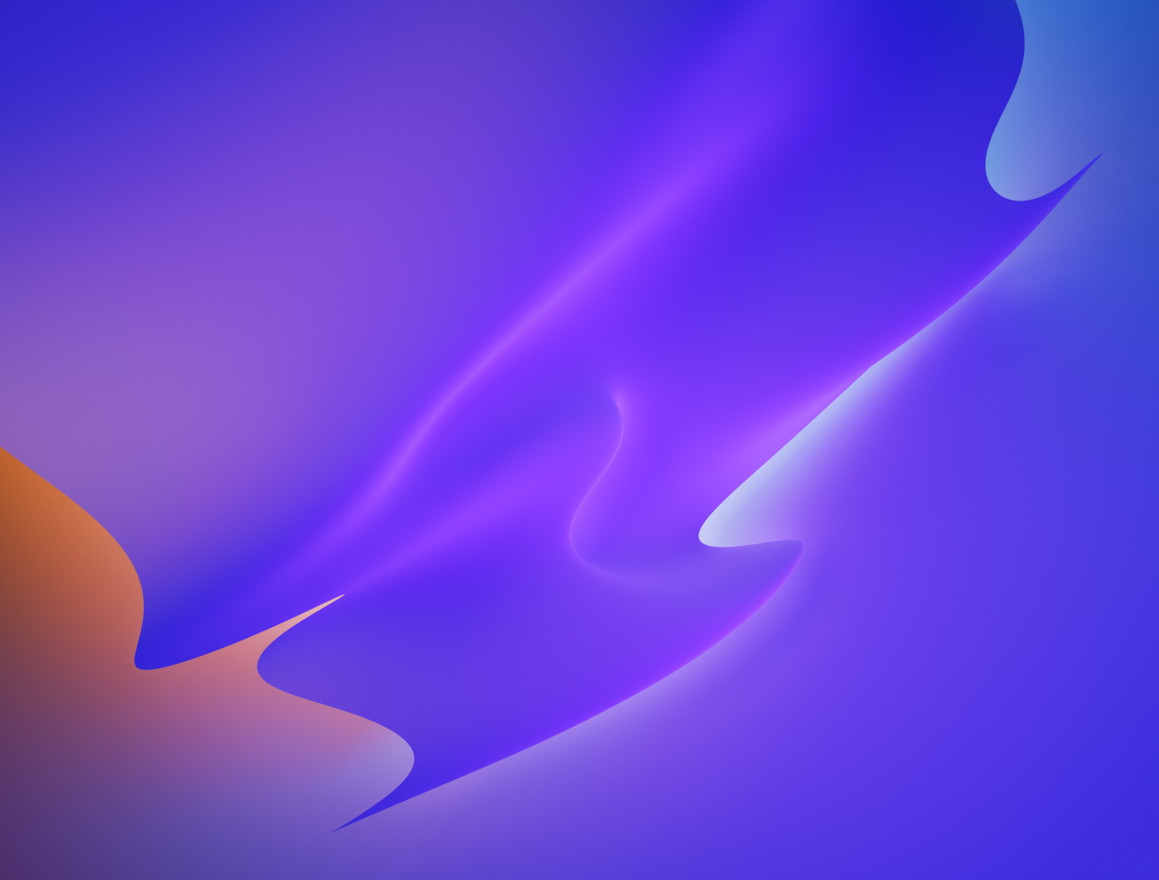
Linear Gradients
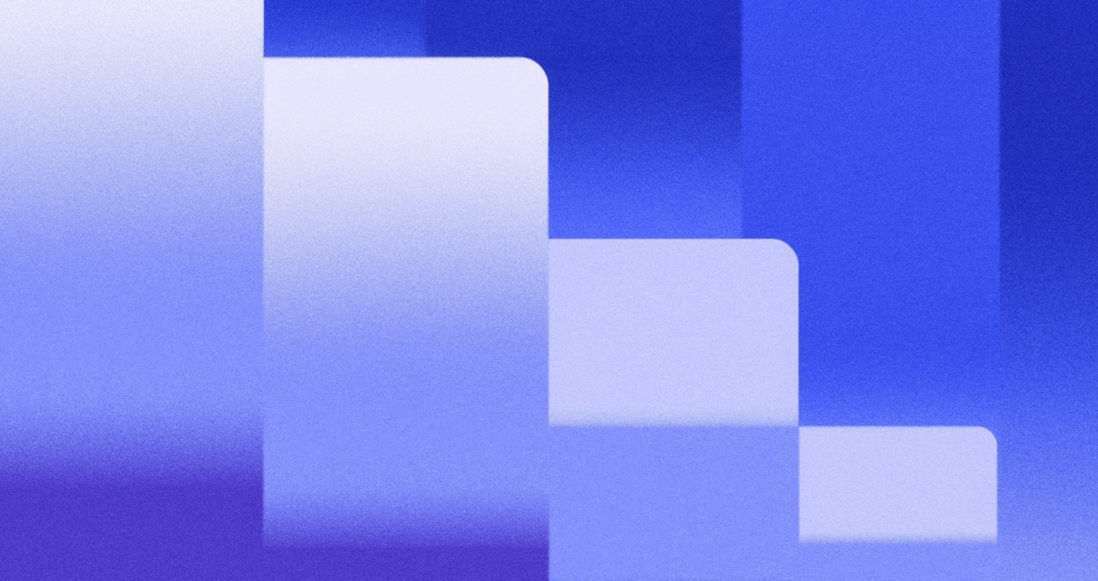
A linear gradient is a type of gradient that transitions colors along a straight line and allows you to control the direction of the color flow. They’re the most common type you’ll see. Two or more colors transition horizontally, vertically, or diagonally.
Place lighter shades at the top and darker ones below for a natural look. Or reverse it for drama. Side-to-side gradients work well for wide sections.
CSS lets you set exact angles for linear gradients, giving you precise control over the direction. A 45-degree angle creates diagonal flow. Experiment until you find what works.
Linear gradients improve accessibility. Multiple shades help users identify different sections without relying on color alone.
Source: César Couto on Unsplash

Radial Gradients
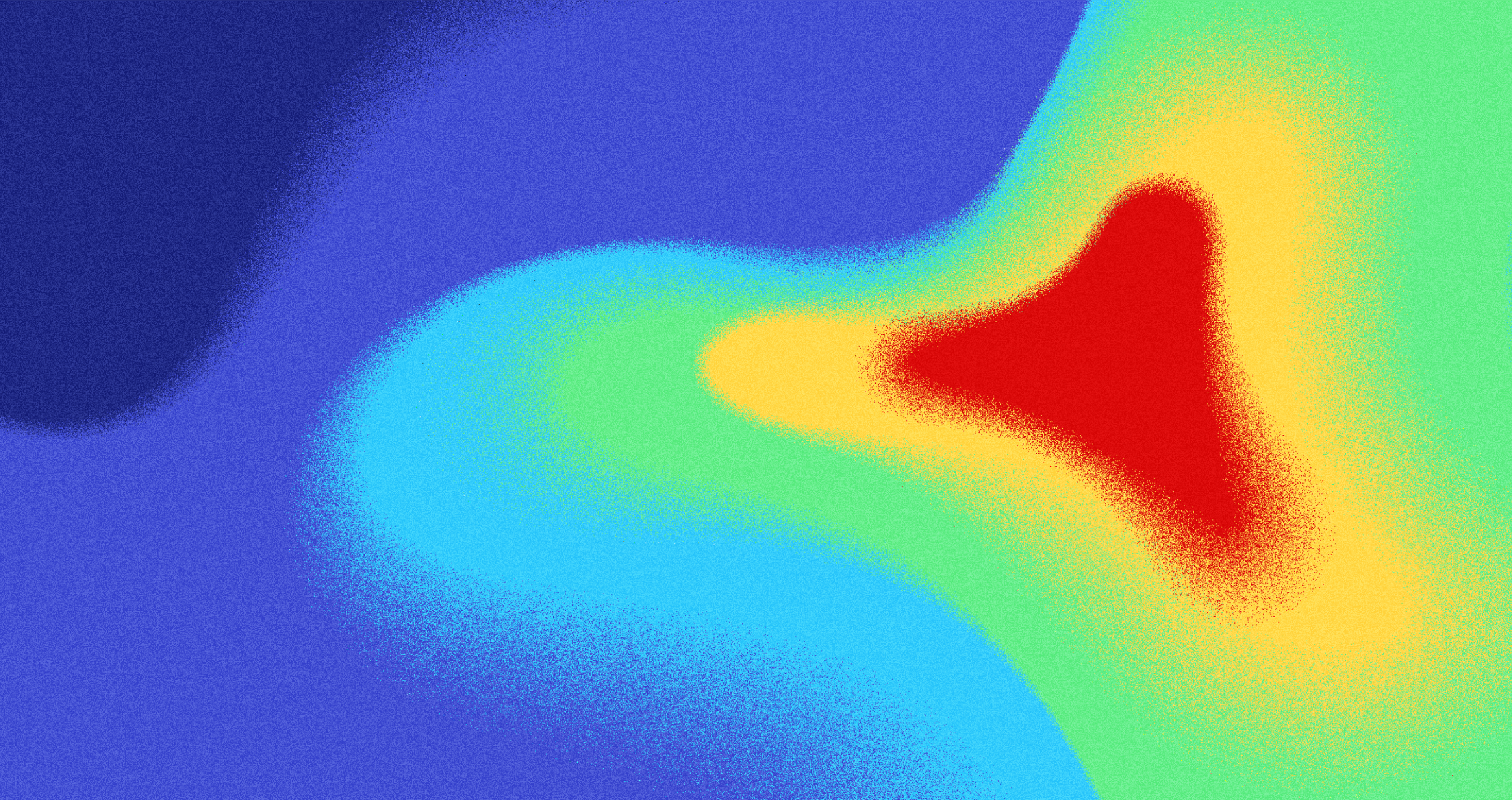
A radial gradient is a type of gradient that radiates colors outward from a central point. Colors radiate outward in circles or ovals. Think of a sunburst or ripple effect.
These work best with plenty of white space. The effect needs room to breathe. Use radial gradients to draw focus to specific elements like call-to-action buttons.
Position lighter colors at the center and darker ones at the edges. This creates natural depth. Too many colors dilute the impact.
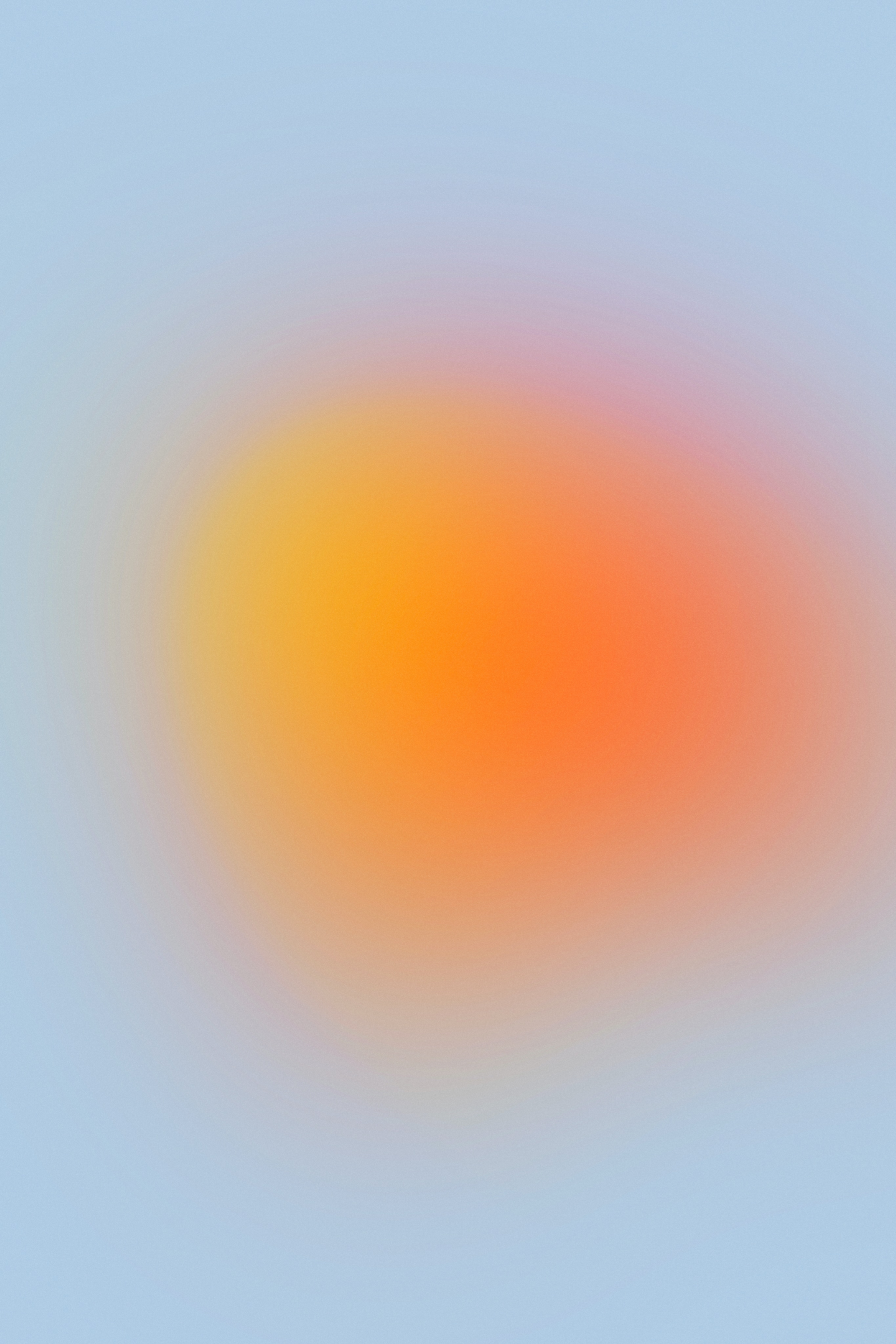
Radial gradients add visual interest where designs might otherwise feel flat. They create focal points without complex graphics.
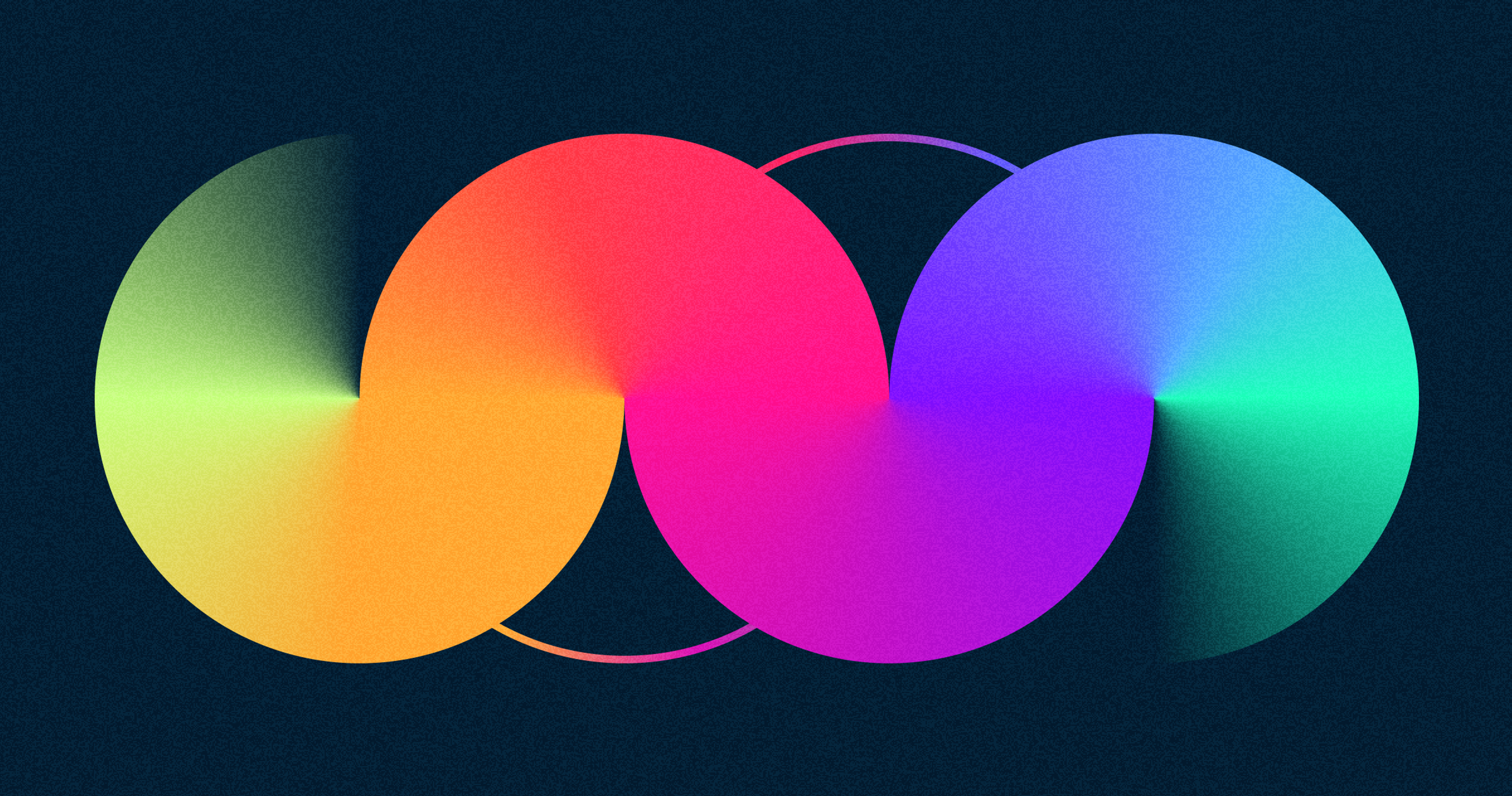
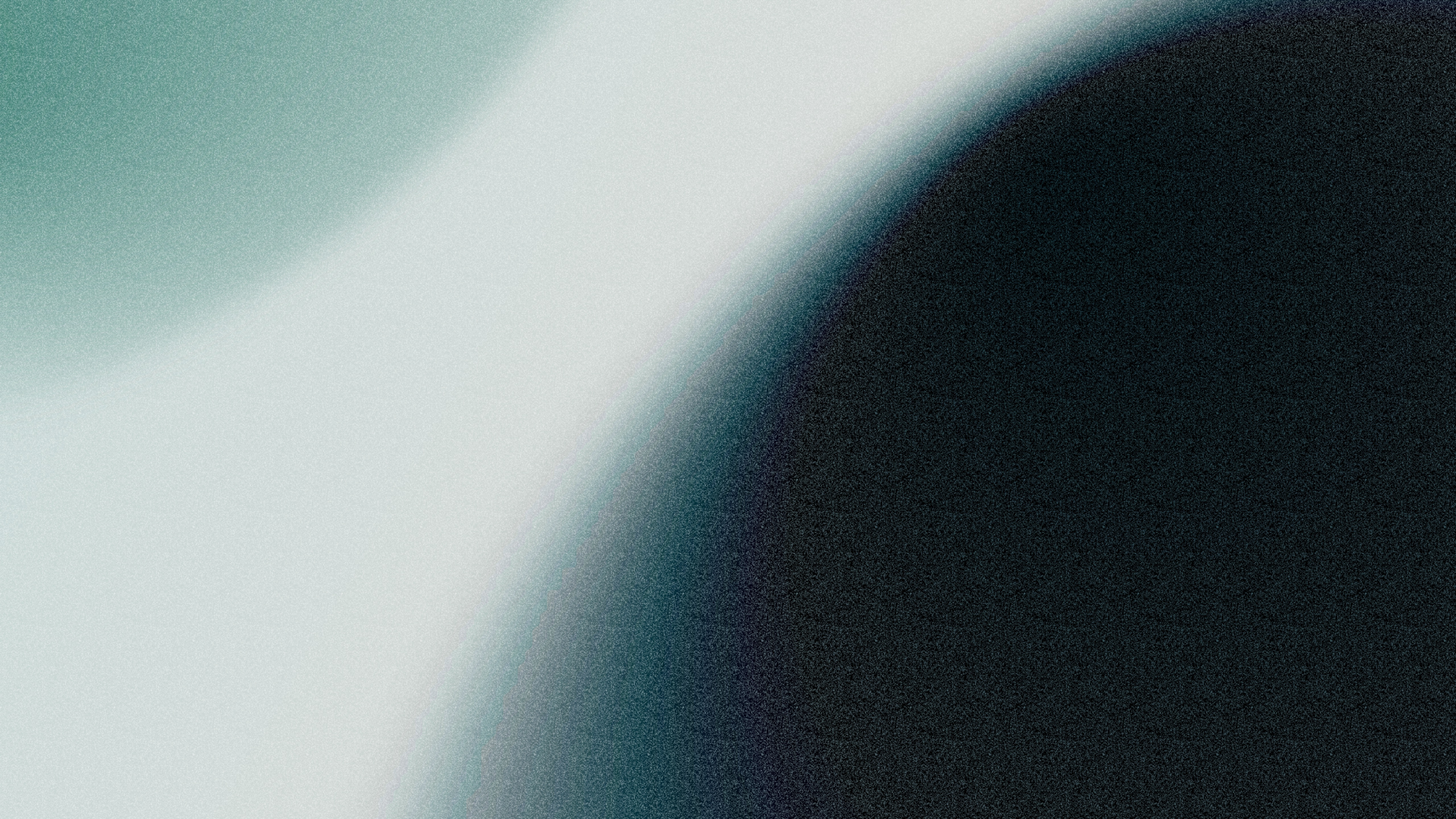
Angular and Reflected Gradients
Angular gradients use triangular or diamond shapes. Colors meet at corners and blend across angles. This creates distinctive geometric effects that reinforce brand identity.
Reflected gradients mirror colors to create optical illusions. Light appears to bounce across the element. This adds dimension without 3D software.
Place colors carefully at shape corners for smooth transitions. These gradient types shine in minimalist designs where subtle effects matter most.
Both improve accessibility by helping users with color vision differences distinguish between page elements.
Source: Milad Fakurian on Unsplash
Using Gradients in Your Designs
Background Gradients
Gradient backgrounds create atmosphere without busy patterns. Linear and radial gradients blend multiple colors smoothly across the screen.
For example, using a dark blue gradient background can evoke trust, calmness, and reinforce brand consistency.
Choose colors that create enough contrast with your text. Dark text needs light backgrounds. Light text needs dark backgrounds. Test readability at every gradient point.
Gradients adjust automatically to different screen sizes. They reduce eye strain compared to stark white backgrounds. Users spending extended time on your site will appreciate this.
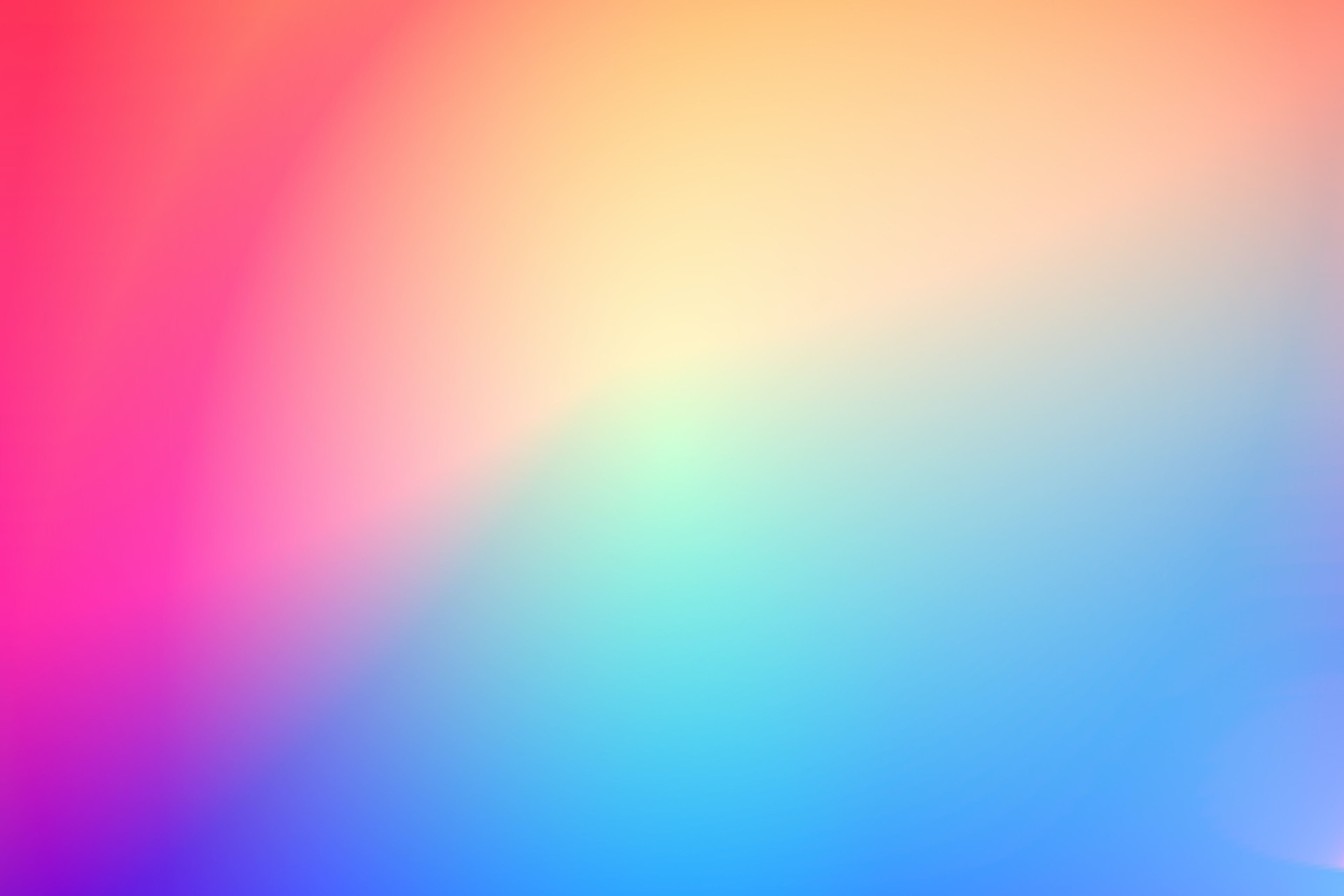
Background Gradient

Text and Graphics
Gradients make typography stand out. Apply them to headlines or key phrases. Angular gradients work especially well here, using geometric shapes for emphasis.
Gradient animation can be used to create engaging and modern visual effects in text and graphics, making your designs feel dynamic and innovative.
Logos and icons gain depth with reflected gradients. Two colors “reflecting” off each other create dimension. This technique replaces complex shading and textures.
Design systems from companies like Airbnb incorporate gradient guidelines. This ensures consistency across products. Your brand can do the same.
In the Streetbeat project, gradients were employed in isometric illustrations to add depth and realism, making the visuals more immersive. These techniques help convey complex investment data clearly and engagingly, aligning with the brand’s modern and dynamic identity.
Similarly, at Clay, we embrace the power of gradients and dynamic design elements to craft immersive crypto experiences. In the fast-paced world of cryptocurrency, where understanding is key, our designs transform complex concepts into visually compelling interfaces.
By using smooth color transitions and thoughtful visual layers, we help users easily navigate the intricacies of crypto platforms, ensuring a seamless and engaging journey from start to finish.
Streetbeat Illustration System by Clay
Creating Effective Gradient Designs
Pick Compatible Colors
Choose colors that complement each other. Two to three hues usually work best. More colors can muddy your design.
Warm colors like red and orange pair well with cool blues and greens. This contrast creates energy while maintaining balance.
Use the color wheel to find complementary colors. These sit opposite each other and create vibrant combinations. Check how your gradient looks at different brightness levels.
Thoughtful color psychology matters. Colors trigger emotional responses. Blue builds trust. Orange excites. Green soothes. Yellow, when used in gradients, can create vibrant and memorable backgrounds that enhance visual interest. Match your gradient to your message.
Source: MagicPattern on Unsplash
Balance Brightness and Contrast
Adjust brightness so all content remains visible. Text should never disappear into the background. Objects need clear separation from each other.
Test contrast at the gradient’s lightest and darkest points. Both extremes must meet readability standards. Tools like Contrast Checker verify this automatically. It is important to make precise adjustments to gradient colors to ensure accessibility and maintain optimal readability.
Place bright and dark colors at opposite gradient ends. This creates contrast while allowing smooth transitions between shades. The middle values handle the blend.
Complementary color gradients naturally balance brightness. The color wheel opposition creates visual tension that works.
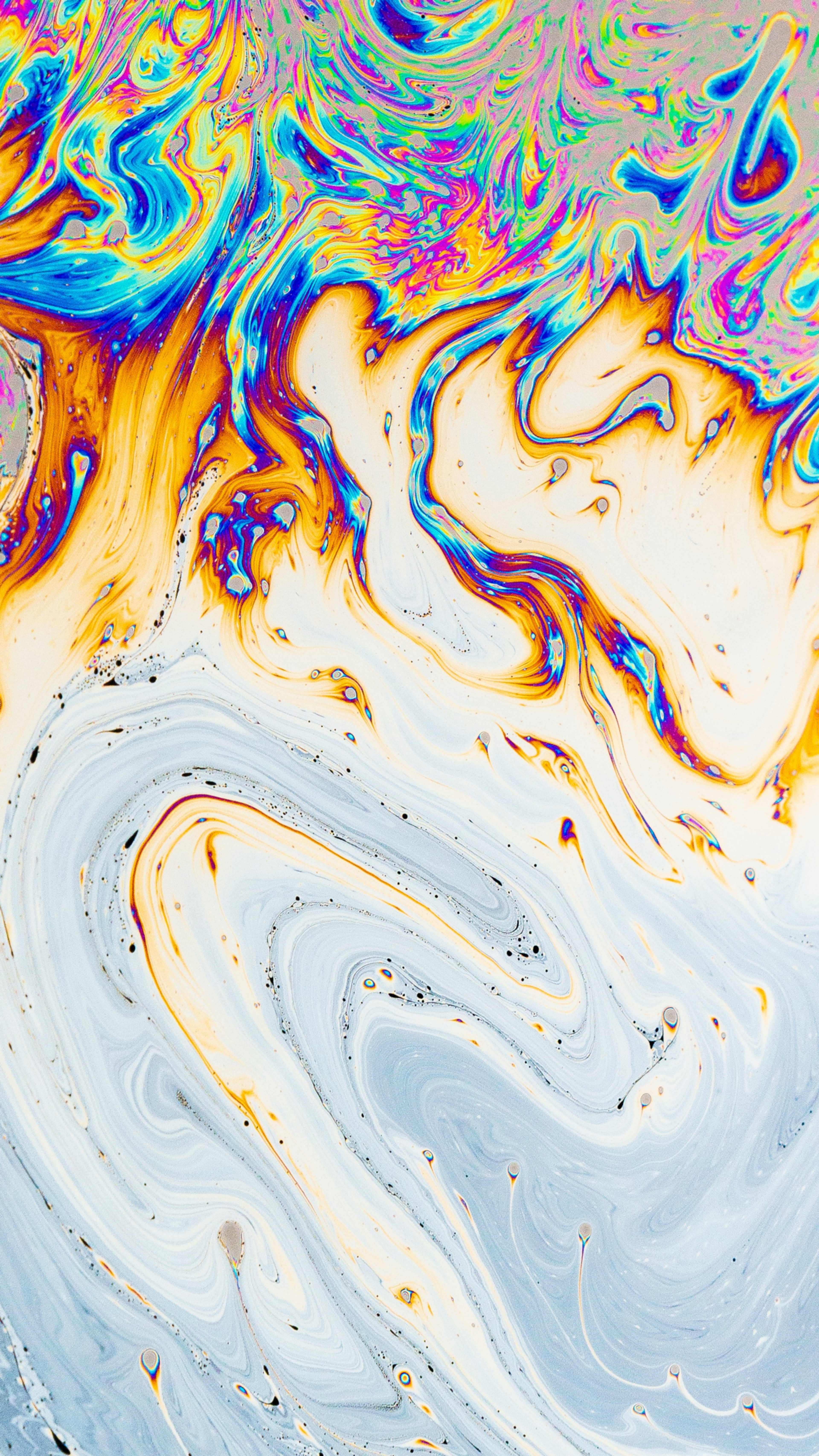
Trendy Gradients

Use Gradients Sparingly
One or two gradients per page prevents visual overload. More than that clutters your design. Each gradient should serve a purpose.
Position gradients thoughtfully. Angular gradients belong at shape corners for seamless transitions. Reflected gradients need careful placement to maintain their optical effect.
Gradients work best as accents. Apply them to card edges, button backgrounds, or section dividers. For best results, use a subtle gradient for accents to maintain balance and visual appeal. Let white space balance the color.
Source: Daniel Olah on Unsplash
Current Gradient Trends
Modern gradients evolved from the dated rainbow blends of early web design. Today’s approach favors subtle transitions and sophisticated color combinations, contributing to the dynamic and lively nature of current web design trends.
Designers create immersive experiences with gradients. They appear in illustrations, UI components, and full-page backgrounds. Modern interfaces often utilize popular gradients and even multiple gradients within a single element to enhance visual appeal and provide design flexibility. The trend works across design styles from minimal to maximalist.
Major brands embrace gradients strategically. Spotify uses them in album art and playlists. Stripe applies subtle gradients to build trust. For inspiration, designers often look to the best gradient websites and design examples that showcase effective and creative uses of gradients in web design. These applications show restraint and purpose.
The best gradients enhance without dominating. They add personality while supporting content and functionality.
FAQ
What Are Gradients In Web Design?
Smooth color transitions used on backgrounds, buttons, text, and images to add depth, focus attention, and express brand mood.
For example, the Stripe website uses gradients in its hero section and backgrounds to create a visually engaging and modern design.
Why Do Gradients Work So Well?
They create visual hierarchy without clutter, break up long content blocks, and signal personality (e.g., calm pastels vs. energetic brights).
You can use the CSS linear-gradient() function to create gradients—just that can be done directly in your stylesheet or with a gradient generator.
Which Types Of Gradients Should I Know?
Linear (directional blends), Radial (center-out focus), Angular/Conic (around a pivot for geometric accents), and Reflected (mirror blends for dimensional feel).
There are also free online tools available to experiment with different types of gradients.
What Makes A Gradient Accessible?
Maintain readable contrast at every stop behind text, test with WebAIM’s Contrast Checker, avoid over-saturation on text-heavy areas, and never rely on color alone for states.
Read more
Conclusion
Gradients add visual depth to web designs when used thoughtfully. Balance matters more than complexity. Two well-chosen colors beat five random ones.
Choose compatible colors that complement each other. Control brightness and contrast so everything remains readable. Use gradients as accents rather than overwhelming your entire design.
Modern tools make gradient creation simple. CSS handles the technical work. Design applications provide visual controls. The creative part stays in your hands.
Test for accessibility throughout your process. Everyone should enjoy your design regardless of vision differences or devices used. Follow WCAG guidelines and use checking tools regularly.
Start small with your gradient experiments. Try one gradient background or button. See how it feels. Adjust and refine. Your design sense develops through practice and iteration.

About Clay
Clay is a UI/UX design & branding agency in San Francisco. We team up with startups and leading brands to create transformative digital experience. Clients: Facebook, Slack, Google, Amazon, Credit Karma, Zenefits, etc.
Learn moreAbout Clay
Clay is a UI/UX design & branding agency in San Francisco. We team up with startups and leading brands to create transformative digital experience. Clients: Facebook, Slack, Google, Amazon, Credit Karma, Zenefits, etc.
Learn more