
A UI kit used to mean “a tidy file with buttons, inputs, and a few templates.” In 2026, a good kit is closer to a lightweight product platform: it still speeds up screens and keeps visuals consistent, but it also needs to support theming, accessibility, and smoother designer–developer handoff - often with AI-assisted workflows in the mix.
This article explains what a UI kit is, how it differs from a design system, why teams still need it, and how to build one that will survive absolute product scale.
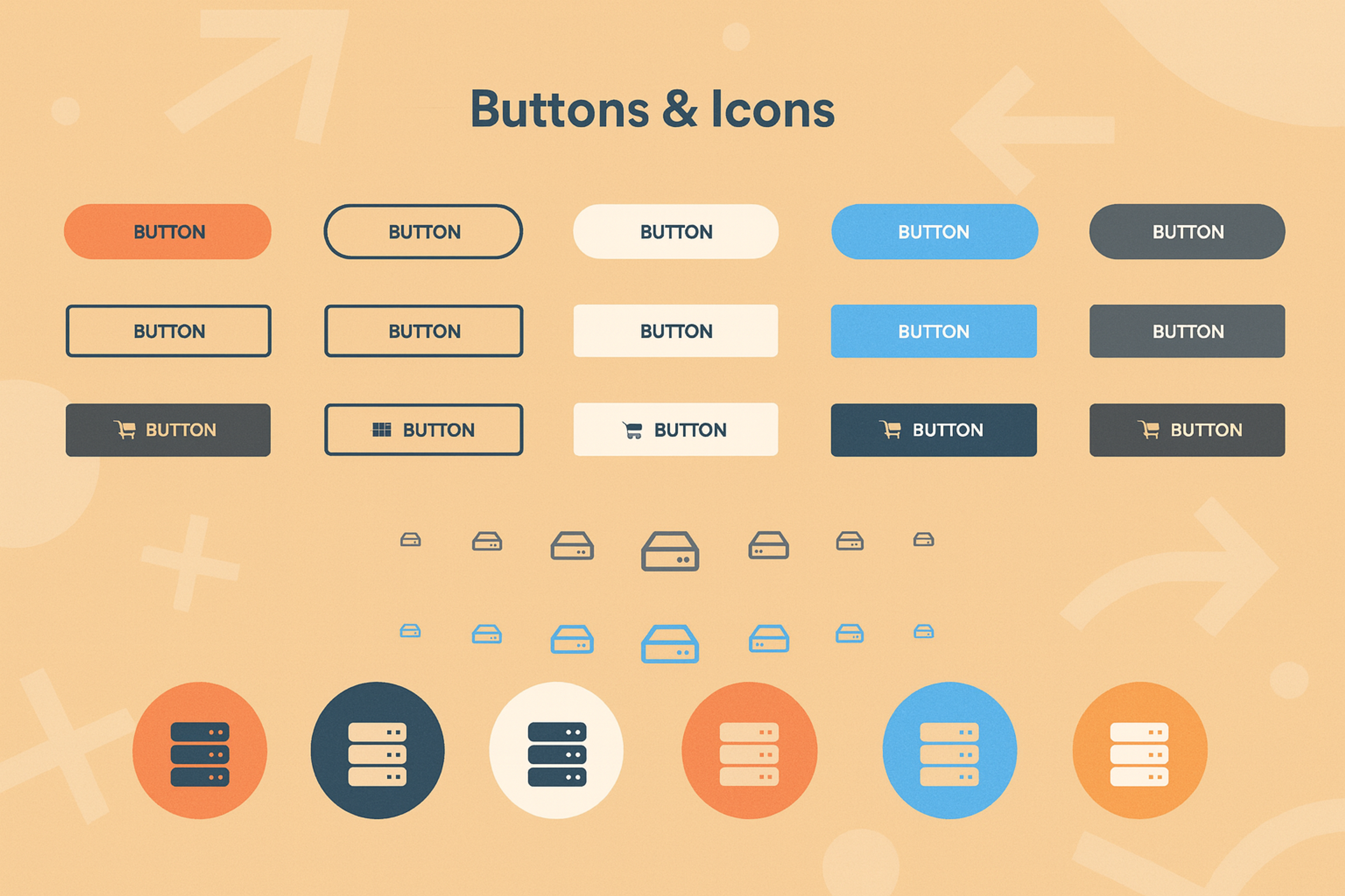
Design Elements
What Is a UI Kit?
User interface kits (UI kits) are sets of pre-designed elements like buttons, icons, typography, and navigation components used to create consistent and efficient user interfaces. They speed up design workflows, ensure brand consistency, and reduce repetitive work.
UI Kits can range from basic templates to fully interactive design systems and are commonly used in tools like Figma, Sketch, and Adobe XD. They help designers focus on user experience rather than building elements from scratch.
What Is a Design System?
A design system is broader than a UI kit. It includes the UI kit - but also the rules, governance, and implementation guidance that keep multiple teams shipping consistent experiences over time: principles, content style, accessibility standards, code references, contribution workflows, release notes, and ownership.
If a UI kit is your “parts library,” a design system is the “operating model” that keeps those parts reliable at scale.
UI Kit vs. Design System: Key Differences
The quickest way to choose:
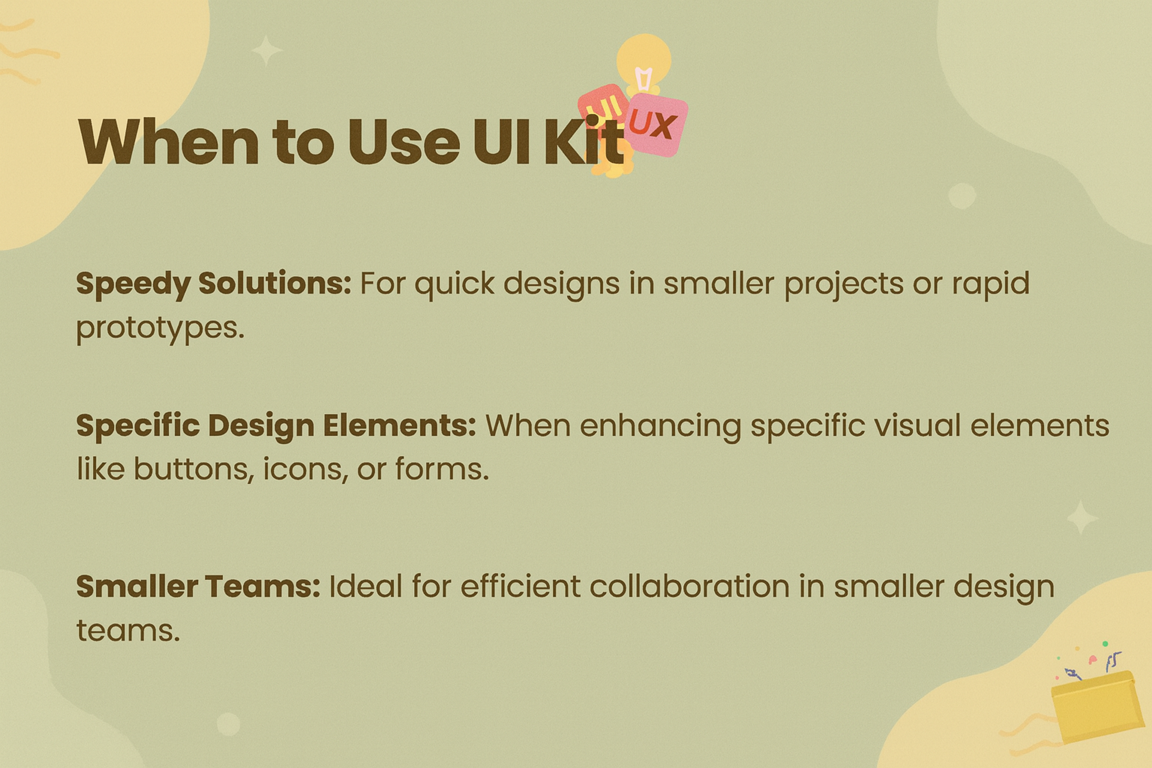
A UI kit is enough when:
- you’re prototyping or moving fast with a small team
- the product is early, and patterns are still stabilizing
- you mainly need consistent UI and faster delivery
When to Use UI Kit
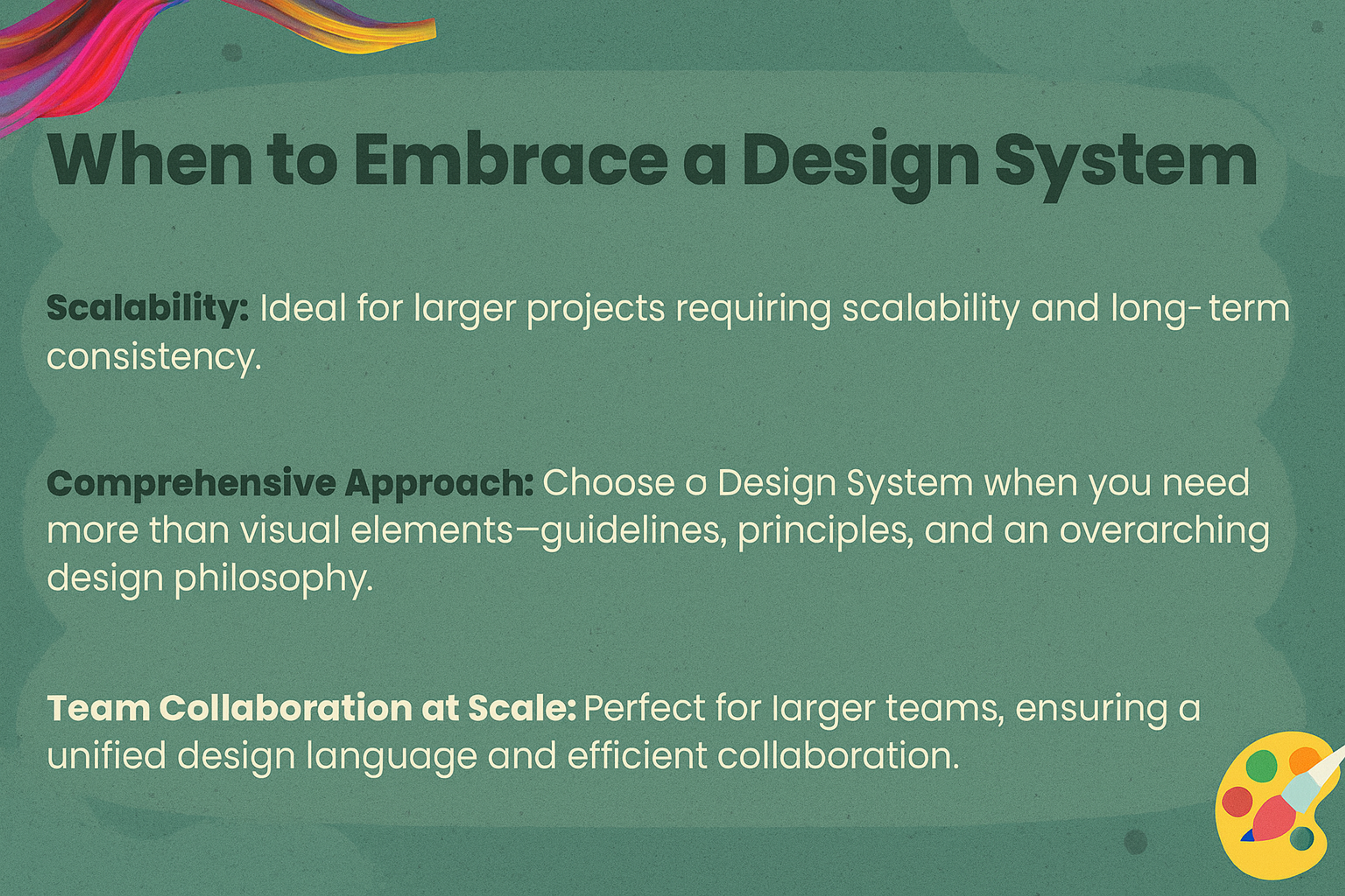
A design system is worth it when:
- multiple teams or products share UI
- you have theming (brands, regions, light/dark) and need strong governance
- you must reduce design–dev drift and maintain a single source of truth
In practice, many teams build a strong UI kit first, then progressively “wrap” it with system-level documentation and governance as product scale demands.
When to Embrace a Design System
Usability
- UI kits: fast prototyping with pre-built components/templates. Suitable for testing ideas and early concepts.
- Design systems: built for the whole product team (design + dev + stakeholders); provide rules and frameworks to keep the product consistent as it grows.
Project scope
- UI kits: best for small or short-term projects, quick, lightweight, minimal documentation.
- Design systems: best for large, long-lived products or multiple audiences, maintain cohesion and scalability over time.
Updating
- UI kits: updates are usually local to a prototype/project.
- Design systems: updates are complex, and must align design, documentation, and code to keep everything in sync.
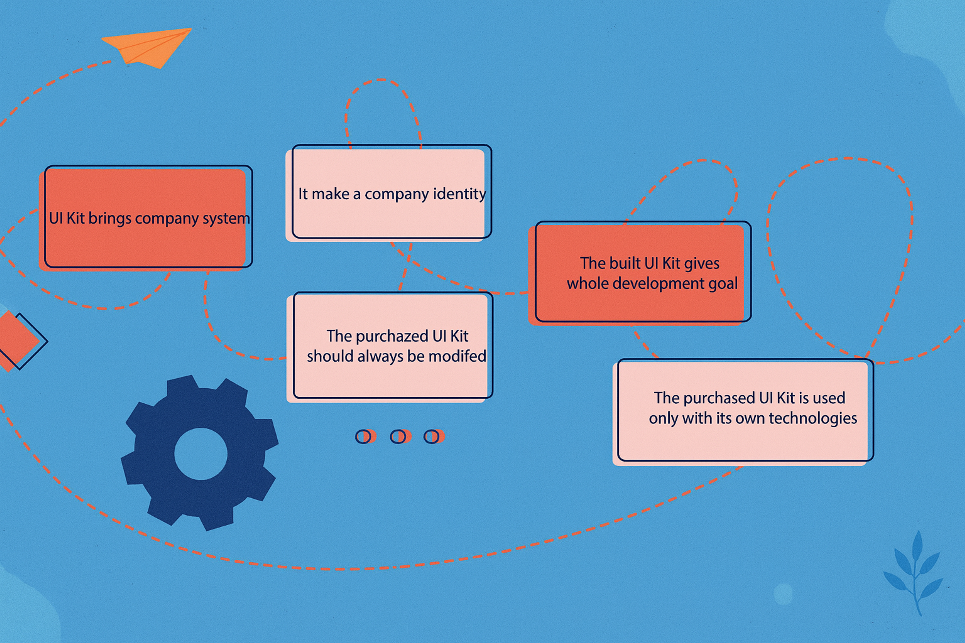
Why Do You Need a UI Kit?
Even with better tooling and AI, UI kits matter more - not less - because they provide structure and constraints.
Reasons to Build a UI Kit
1) Speed without visual entropy
Teams move faster when components are reusable, and decisions are pre-made. Without a kit, velocity becomes inconsistent.
2) Theming and multi-context UI are now baseline
Light/dark, density modes, responsive layouts, accessibility variants, and sometimes multi-brand setups are standard. This pushes kits toward variables/tokens and structured foundations.
3) Better designer–developer handoff (especially with AI in the loop)
Modern workflows increasingly connect design data to code generation and agentic coding tools. Cleaner component architecture, naming, and tokens make these workflows far more accurate and less “guessy.”
4) Accessibility expectations are clearer
WCAG 2.2 is a practical baseline for many teams, and it emphasizes what UI kits should encode by default (such as target size and focus visibility patterns).
How to Create Your Own UI Kit
A UI kit is more than just a collection of buttons and icons — it's a foundational tool that helps you design faster, stay consistent, and scale your design work efficiently. Whether you're designing solo, collaborating in a startup, or building a product for others, a well-built UI kit will save you hours of work and bring professionalism to every project.
Here’s how to build a powerful and reusable UI kit from scratch, complete with expert advice and actionable steps.
1. Define Your Purpose
Before you begin designing, identify the purpose of your UI kit. Ask yourself:
- Who will use this kit — just you, your team, or external clients?
- Is it for mobile apps, websites, dashboards, or all of the above?
- Are you creating this to sell, or as a tool for personal or internal use?
Clarity from the start will help you determine the level of detail, complexity, and flexibility your kit needs.
2. Choose the Right Tool
The most popular choice for building modern UI kits is Figma. It offers powerful features like auto layout, variables, smart variants, and live collaboration, which make it ideal for creating scalable design systems. Other tools like Sketch or Adobe XD can also be used, but Figma remains the industry leader for collaborative UI design.
3. Establish a Solid Foundation
Before creating components, define the visual and structural rules of your UI system. This step will shape the consistency and usability of everything that follows.
Key elements include:
- A consistent color system (including semantic colors)
- A type scale and font hierarchy
- Spacing rules (using a 4pt or 8pt system)
- Grid layouts and breakpoints
- Shadows, borders, and elevation styles
These foundational styles should be defined clearly and stored in one dedicated page or section of your file.
4. Build Modular UI Components
Once your foundations are in place, start creating the core UI components your projects will need. Focus on reusability and responsiveness.
Examples of essential components:
- Buttons in various styles and sizes
- Input fields, dropdowns, checkboxes, toggles
- Navigation elements such as headers, footers, and sidebars
- Cards, badges, modals, and alerts
Use Figma’s auto layout and variants to make components adaptable to different content lengths and states.
Source: Tran Mau Tri Tam on Unsplash

5. Add Interactivity
To enhance the utility of your kit, build in interaction states. This can include hover effects, pressed states, disabled styles, and prototyping connections between screens.
This not only speeds up your workflow when prototyping but also provides a more realistic view of how the design will behave during user interaction.
6. Organize Your File Structure
Clear organization is critical, especially if your UI kit will be used by other designers or developers.
Consider this file structure:
- Foundations
- Components
- Layouts or Templates
- Documentation
Use clear naming conventions and separate frames or pages to keep your kit easy to navigate. Group elements logically so others can quickly find and reuse them.
7. Write Basic Documentation
Even if your kit is for personal use, document how components should be used. If you’re creating a team or client-facing kit, documentation becomes essential.
Include guidance on:
- Component usage
- Layout spacing rules
- States and interactions
- Accessibility notes
Clear documentation helps teams stay aligned and ensures design decisions are easy to understand and implement.
8. Test in Real-World Projects
Test your UI kit by using it in a real design project. This will help you uncover missing components, identify areas for improvement, and fine-tune your components for better usability.
Watch for:
- Gaps in the component library
- Inflexible layouts
- Inconsistencies in padding, font sizes, or color use
Use the feedback to improve the kit over time.
9. Update, Share, or Scale
A UI kit should evolve with your design needs. Make updates as new patterns or requirements emerge. If you're using the kit in a team, consider turning it into a shared library for seamless access and updates.
If your goal is to sell the kit, package it with documentation, file structure overviews, and usage licenses. Consider creating starter templates to show its flexibility and value.
Building your own UI kit is one of the most effective ways to improve your workflow and elevate the quality of your designs. It’s an investment that pays off every time you start a new project, prototype a feature, or collaborate with a team.
Start simple. Build strong foundations. Iterate with real use. The more thoughtfully your UI kit is designed, the more powerful and practical it becomes.
If you'd like help organizing your Figma file, naming components, or creating documentation templates, feel free to ask. I'm happy to help you refine your kit further.
Examples of Excellent UI Kits
It’s now time to look at some of the most famous UI kits. Unlike most UI kits, these UI Kits are a benchmark in the design industry because they are accompanied by incredible features and, more importantly, buildable frameworks to aid in developing accessible and effective digital interfaces.
Lulo Bank
Lulo Bank’s UI kit, combines a minimalist, user-friendly interface with customizable components and interactive elements. It prioritizes accessibility, with clear typography and color contrast, and features flexible layouts and data visualizations for easy financial tracking. Consistent with the brand’s identity, the UI kit creates a seamless and engaging digital banking experience.
Source: clay.global
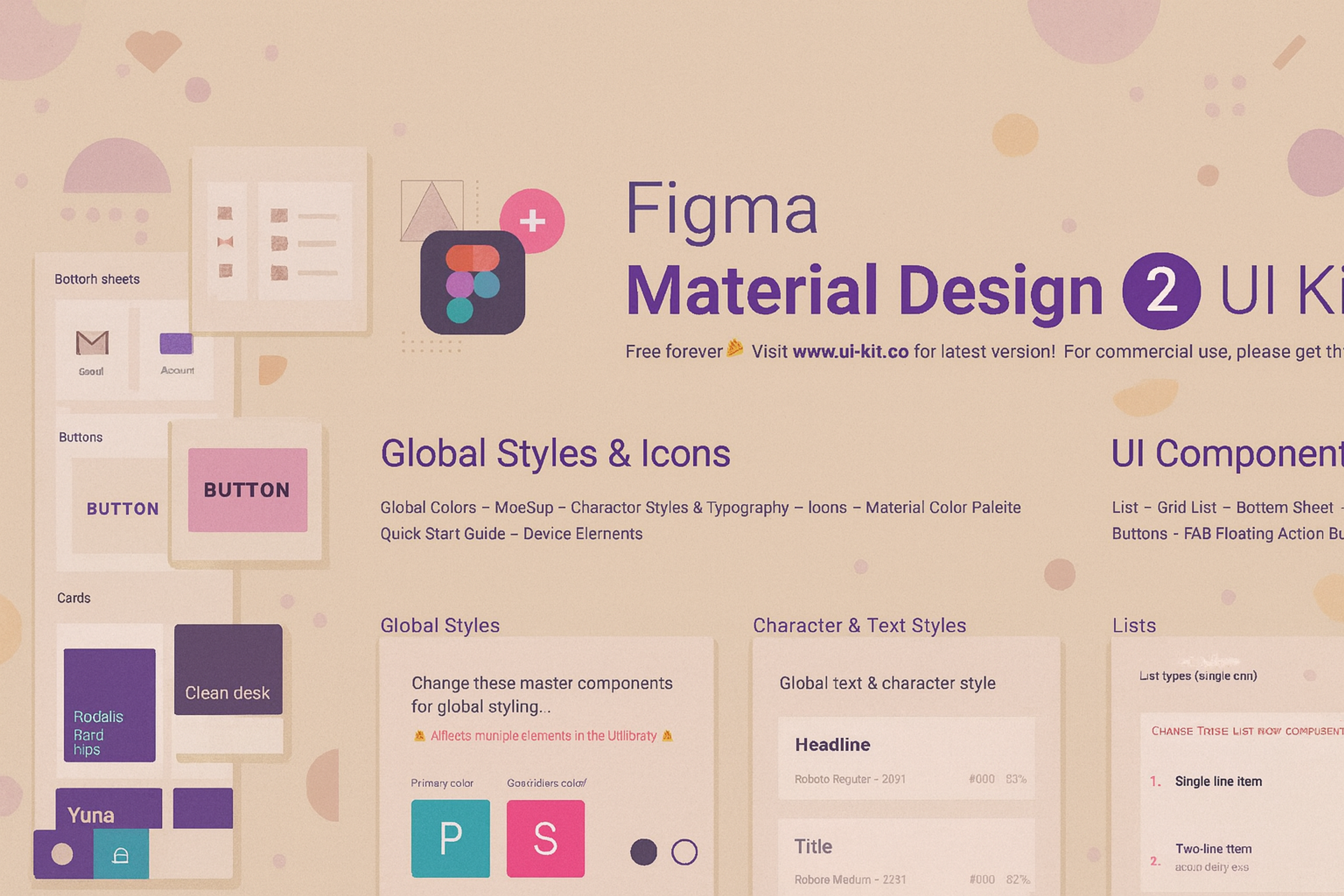
Material Design
Material Design is known for its solid visual communication and its significant role in UI design, particularly in its ability to shift between platforms. Material Design focuses on uniformity, scalability, hierarchy, and user-friendly experiences.
It provides responsive designs, motion projects, and vibrant colors for creating sophisticated and aesthetic combinations. It taught the importance of a smooth guideline that communicates and allows users to interact with visual elements effectively.
Material Design
Foundation
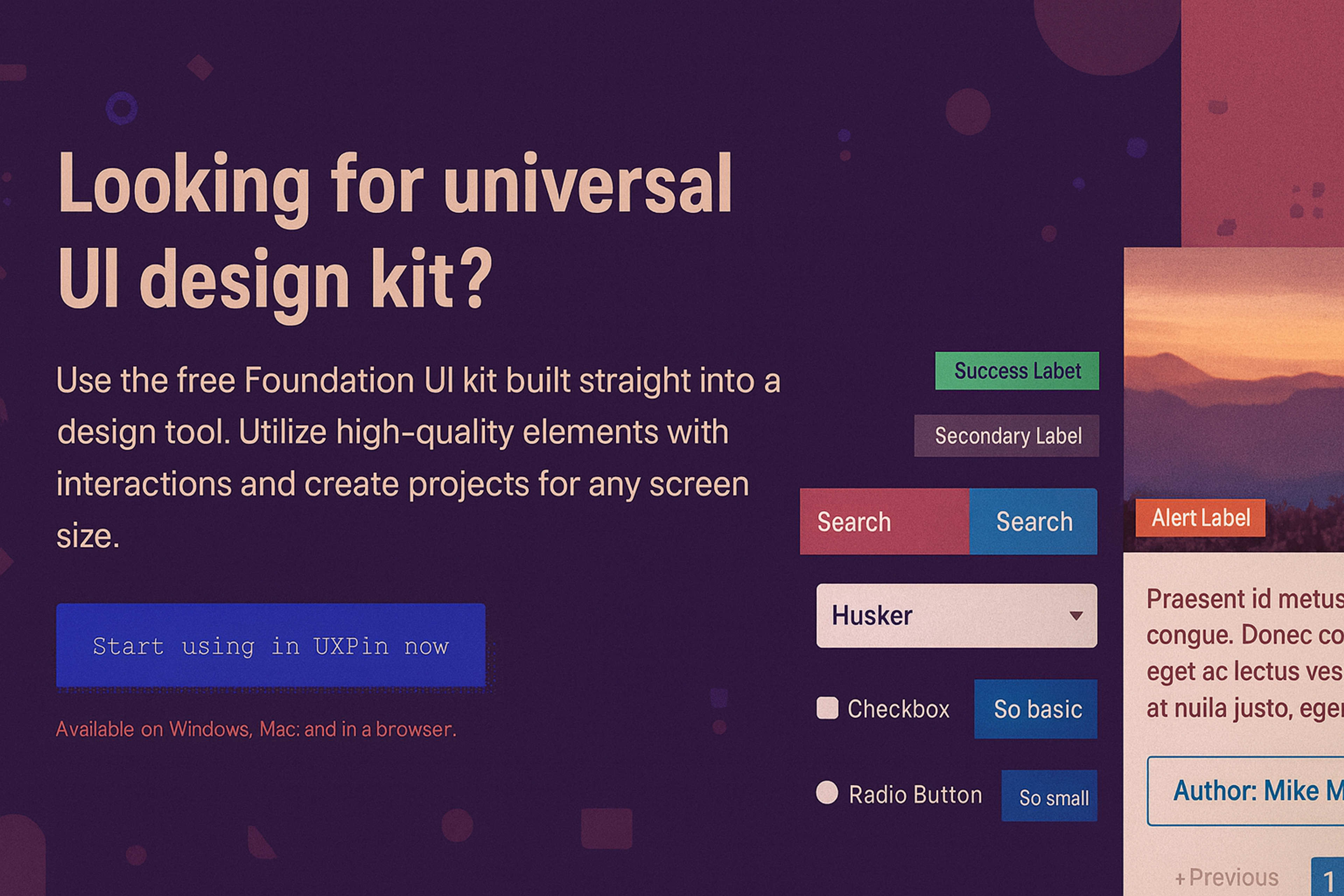
For responsive design, Foundation provides a mobile-first UI kit complete with pre-built components and templates, making it ideal for both websites and mobile apps.
Developed by Zurb, it also guarantees strong accessibility support. Due to its cross-device compatibility and adaptability to user requirements, Foundation is the go-to toolkit for user-friendly scalable projects.
Foundation
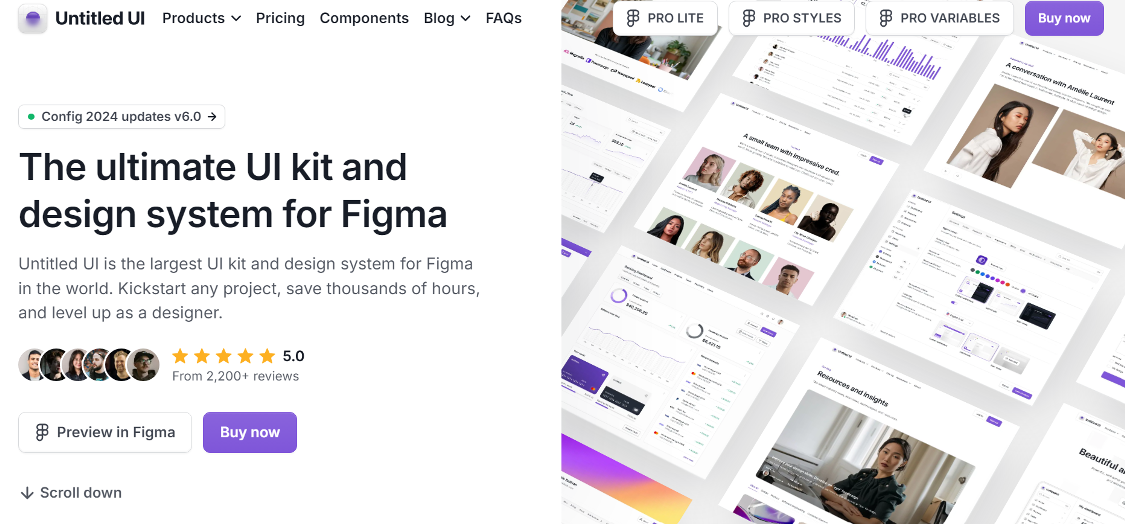
Untitled UI
Untitled UI remains one of Figma’s most extensive and intricate UI kits and design systems, making it one of the most popular UI kits available. Its built-in Auto Layout, advanced variants, and the latest Figma features make the design system efficient and easy to use.
Untitled UI is acknowledged as the gold standard of Figma design systems and is one of the most-rated UI kits online.
As an out-of-the-box solution, it is compatible with everything from simple marketing landing pages to sophisticated dashboards and web applications, providing designers with all the necessary components without additional effort.
Source: untitledui.com
FAQ
What Is UI Kit Design?
UI kit design is a collection of pre-made user interface components - buttons, icons, forms, and styles - that help designers build apps or websites faster and more consistently.
What Is A UI Toolkit?
A UI toolkit is a package of ready-to-use design elements and code frameworks that simplify creating user interfaces across platforms.
How To Use A UI Kit?
Import the kit into your design tool (like Figma or Sketch), customize styles to match your brand, and assemble screens using the provided components.
What Is UI Design In Simple Words?
UI design is about how digital products look and feel - arranging buttons, colors, fonts, and layouts so users can interact easily.
Does UI Design Need Coding?
Not always. Designers focus on visuals, but knowing basic HTML, CSS, or front-end principles helps collaboration with developers.
Read more:
Conclusion
Dedicated audience research, strong emphasis on consistency, and thorough planning for a design to work on multiple platforms are critical in achieving successful user interface designs.
For more details, please refer to the links on design systems and UI kit best practices. What's next in the pipeline? Do you wish to commence designing your kit, or do you want to ask something? Let us know your priorities!

About Clay
Clay is a UI/UX design & branding agency in San Francisco. We team up with startups and leading brands to create transformative digital experience. Clients: Facebook, Slack, Google, Amazon, Credit Karma, Zenefits, etc.
Learn moreAbout Clay
Clay is a UI/UX design & branding agency in San Francisco. We team up with startups and leading brands to create transformative digital experience. Clients: Facebook, Slack, Google, Amazon, Credit Karma, Zenefits, etc.
Learn more