Great UX still comes from the same place: how people perceive, decide, and act. What changed in 2026 is the environment around those decisions. Interfaces are more cross-device, more personalized, and increasingly shaped by AI suggestions. Users move faster, trust is harder to earn, and small frictions get punished quickly.
The “laws of UX” are useful because they keep you grounded. They help you design for real human limits, not perfect attention or endless patience. Below are the core principles and what they look like when you apply them to modern product experiences.
Fitt’s Law
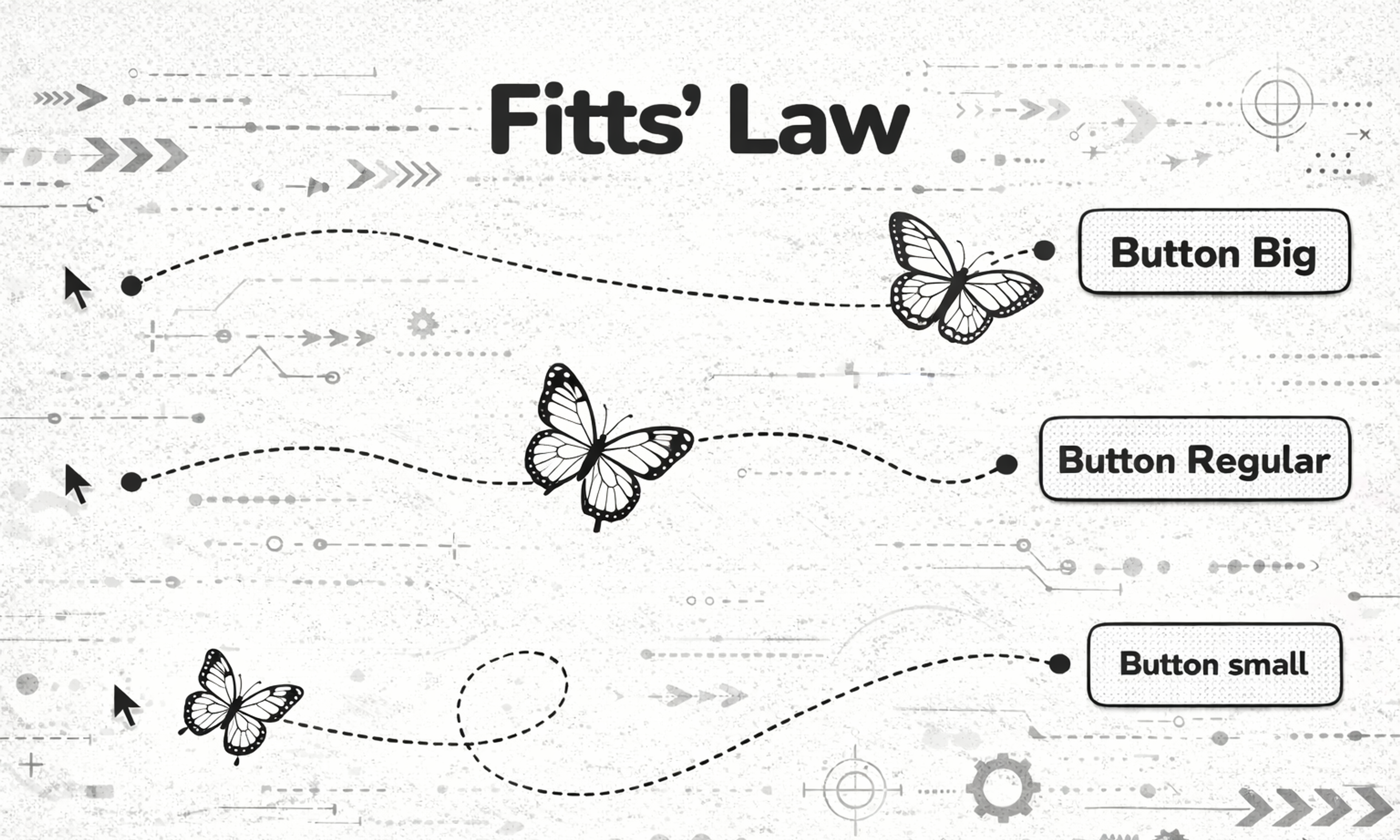
Fitt’s Law Fitts’s Law says that the time it takes to hit a target depends on how big it is and how far it is. In practice, important actions should be easy to reach and hard to miss.
In 2026, this is less about “make the CTA huge” and more about placing actions where hands and eyes already go. Thumb-friendly layouts, reachable navigation, and clear hit areas matter even more when your experience spans mobile, desktop, and embedded surfaces. If a critical action requires precision or multiple micro-movements, you are creating accidental drop-off.
Fitts Law
Apply it in 2026: Make primary actions both visually obvious and physically easy to interact with. If you add AI-driven controls (smart replies, suggested edits, recommended actions), they should be as easy to undo as they are to trigger.
Hick’s Law
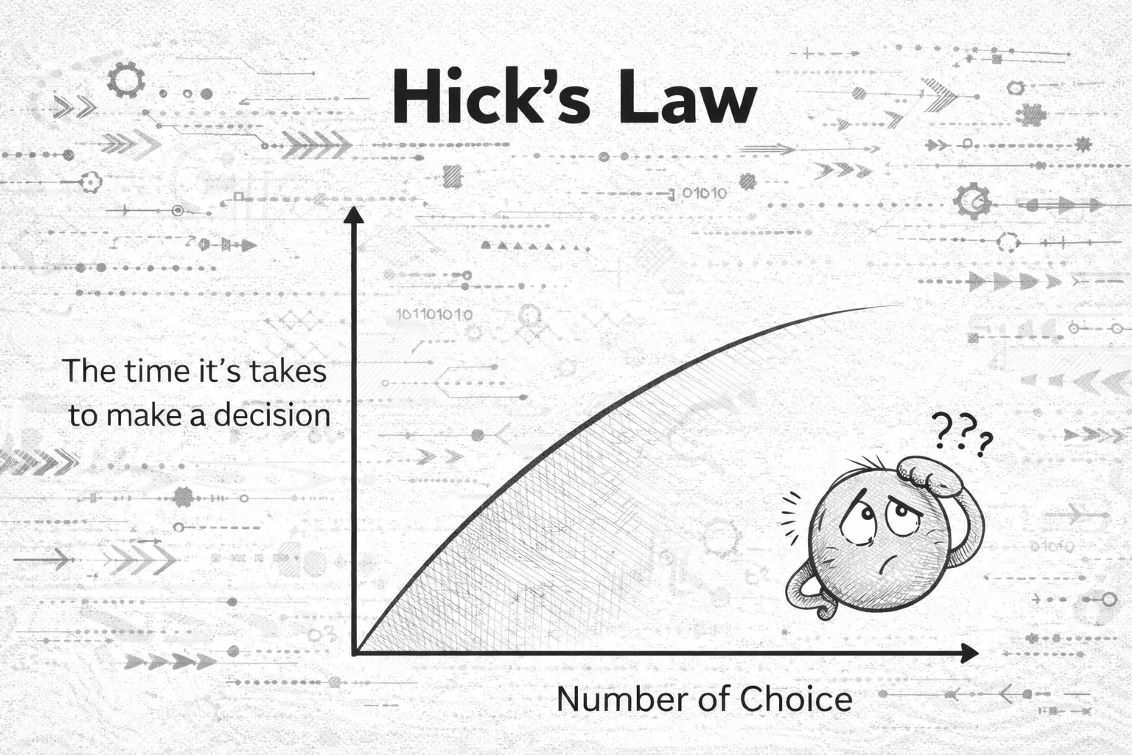
Hick’s Law is simple: the more choices you present, the longer it takes to decide. Too many options create hesitation, fatigue, and abandonment. Modern products often address this by adding personalization and recommendation layers.
That can help, but it can also backfire if users feel pushed or confused by “why am I seeing this?” logic. Your job is to reduce choice without reducing agency.
Hick`s law
Apply it in 2026: Don’t show everything at once. Start with a small set of clear paths, then let users refine with search, filters, or progressive steps. When using AI suggestions, label them clearly and keep the “manual” path visible.
Goal-Gradient Effect
People speed up as they feel closer to finishing. When progress is visible, motivation rises.
This is why good onboarding feels like a series of small wins, not a single long form. It is also why checkouts that feel “almost done” convert better than ones that feel endless.
Apply it in 2026: Use honest progress indicators, short milestones, and clear next steps. Do not fake progress. Modern users spot manipulation fast, and trust is expensive to win back.
Jakob's Law
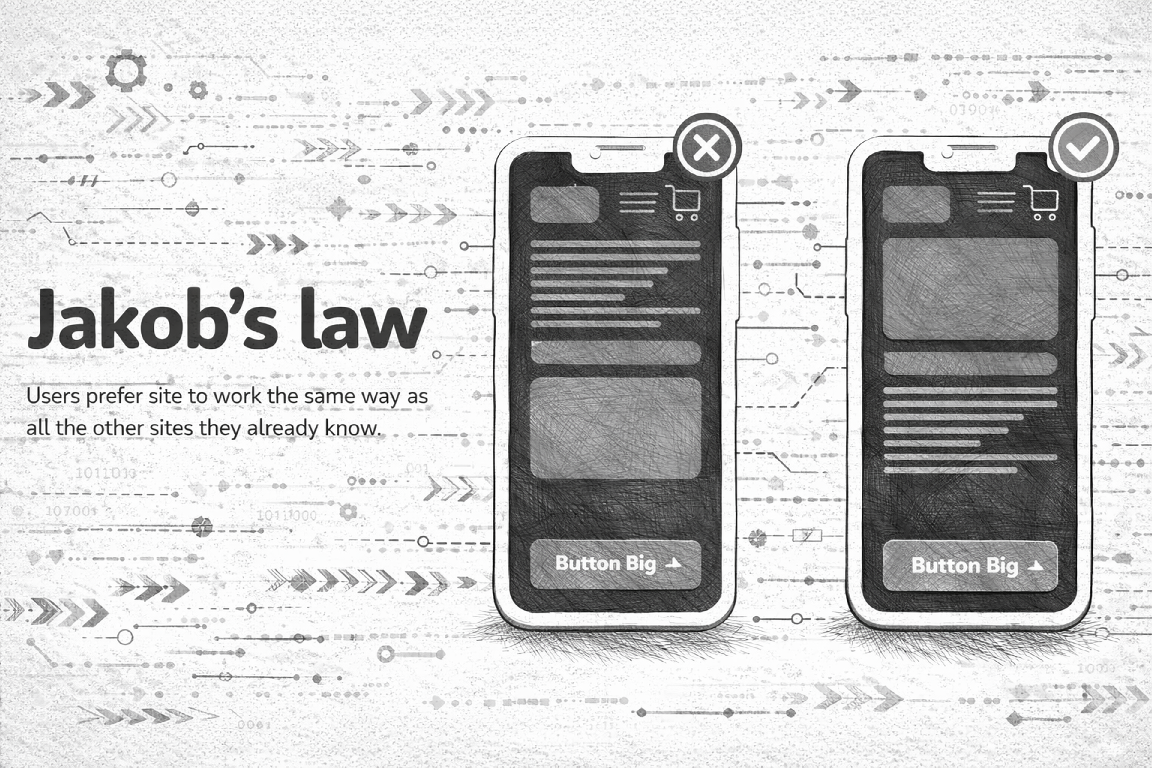
Users prefer interfaces that work like the ones they already know. They bring habits from other products, platforms, and patterns.
In 2026, Jakob’s Law is basically an argument for design systems and predictable interaction models across devices. Novelty can be great, but only when it is earned and when it improves outcomes.
Apply it in 2026: Keep core patterns familiar (navigation, forms, search, account settings). If you introduce a new interaction (gesture, AI assistant, command palette), teach it quickly with lightweight cues, and keep a familiar fallback. For a UX designer, understanding and applying Jakob’s Law is crucial in creating familiar and user-friendly designs.
Jacob`s Law
Miller's Law
In 1956, psychologist George A. Miller proposed a theory best known as Miller’s Law. People can only hold a limited amount of information in working memory at once. The exact number is not the point. The point is that overload is real, and it happens faster than we think.
Dashboards, pricing pages, and settings screens are the usual offenders. When everything is “important,” users remember nothing and act on less.
Miller`s law
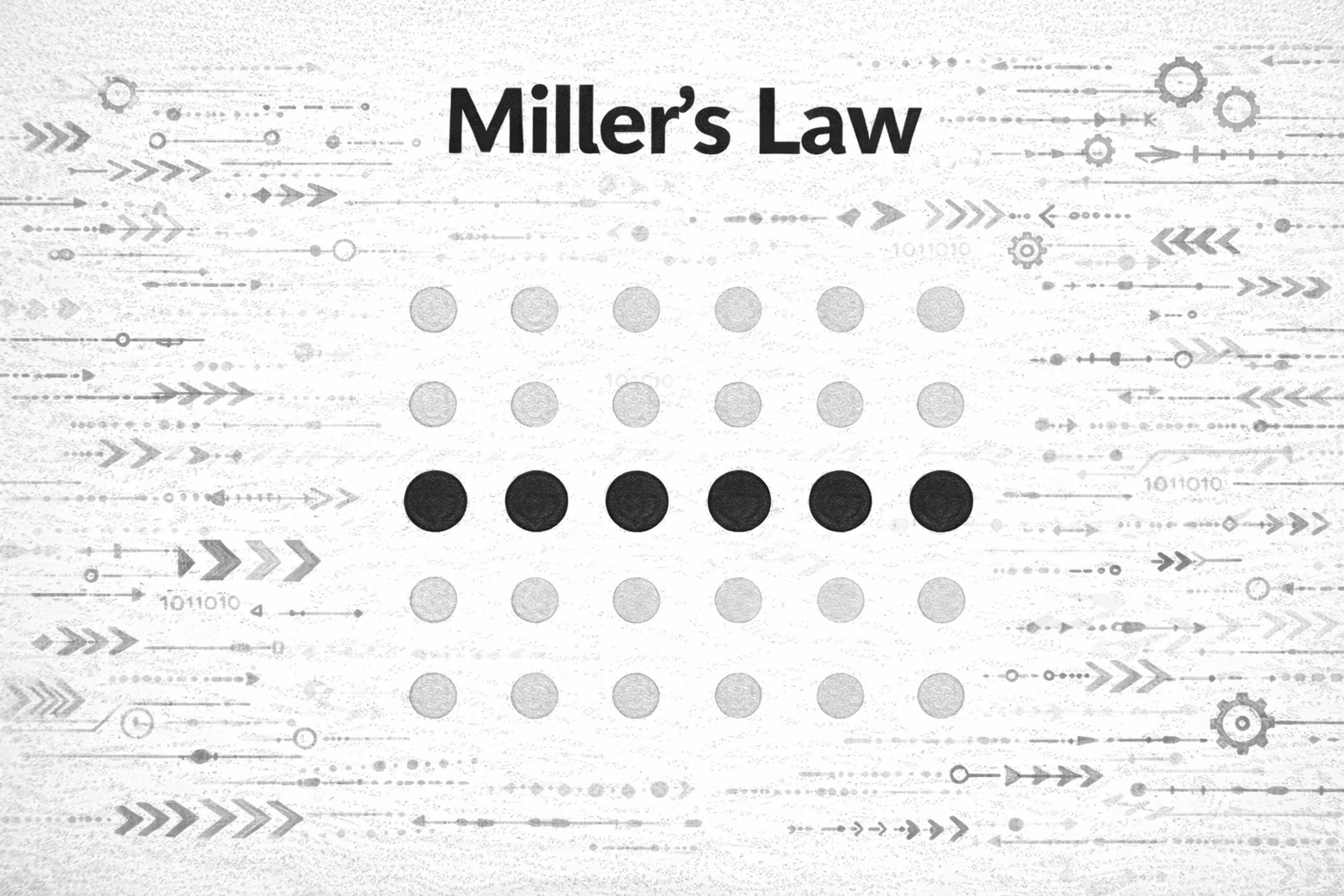
Apply it in 2026: Chunk content into meaningful groups, reduce simultaneous demands, and design “recognition over recall.” If users have to remember rules, steps, or codes while navigating, your UI is doing too much work for them.
Zeigarnik Effect
In psychology’s realm, the tendency to remember interrupted or incomplete tasks better than those that are done is dubbed the Zeigarnik Effect.
We remember unfinished tasks better than finished ones. Unclosed loops create mental tension, which can pull attention back.
This can be used positively: drafts, “continue where you left off,” saved carts, and gentle reminders all reduce effort. It can also be used badly: anxiety-driven notifications and endless “incomplete” nags.
Zeigarnik Effect
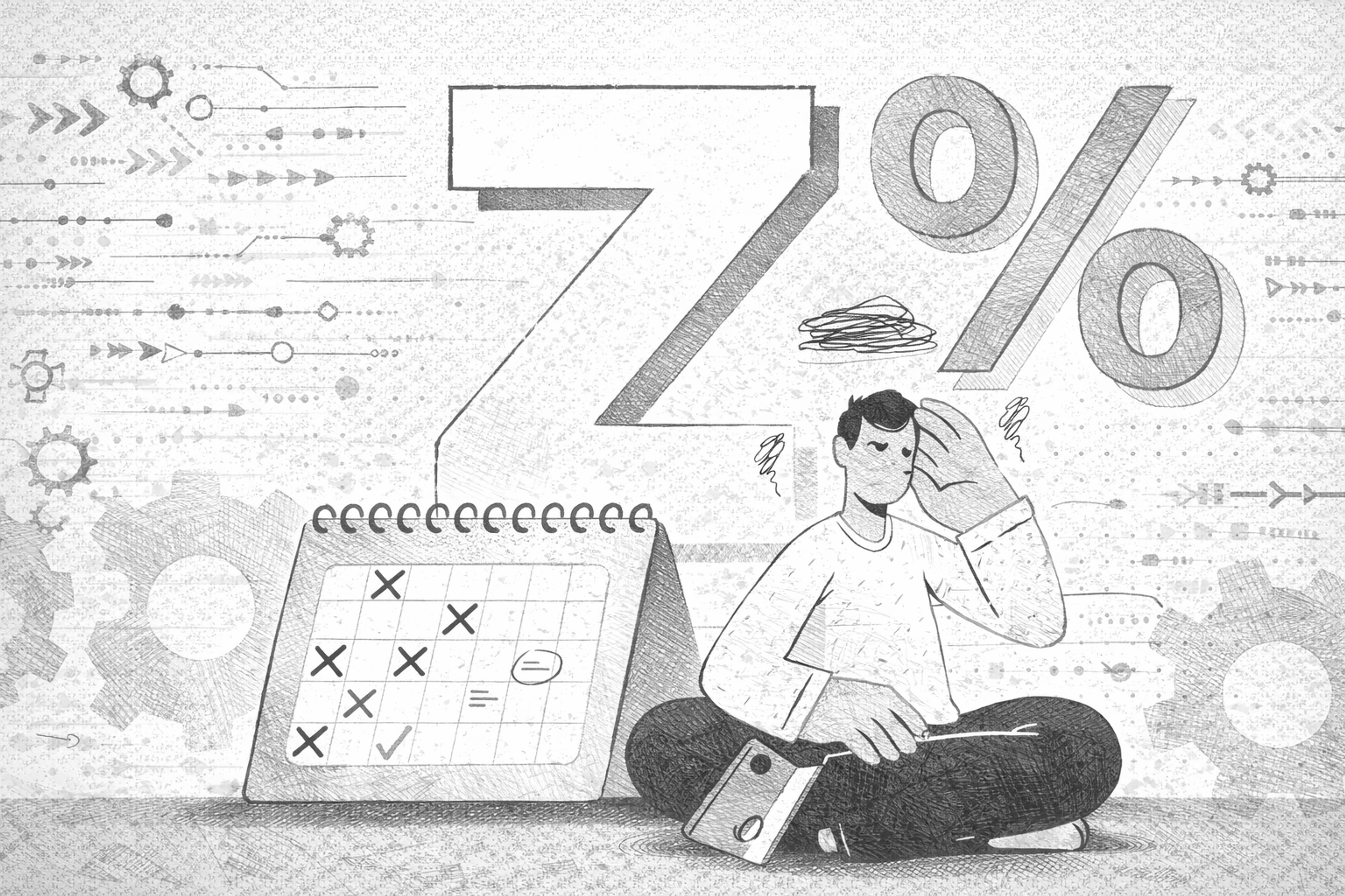
Apply it in 2026: Use open loops to help users complete meaningful goals, not to pressure them. If you create reminders, make them controllable, snoozable, and respectful.
Pareto Principle
The Pareto Principle, commonly called the 80/20 Rule, is how 80% of results come from 20% of the set work inputs.
A small part of your product usually drives most value. Most users rely on a few core flows, and most friction tends to cluster in a few key steps.
In 2026, analytics makes this easier to see, but it also tempts teams to over-optimize metrics while ignoring long-term trust and usability.
Pareto Principle
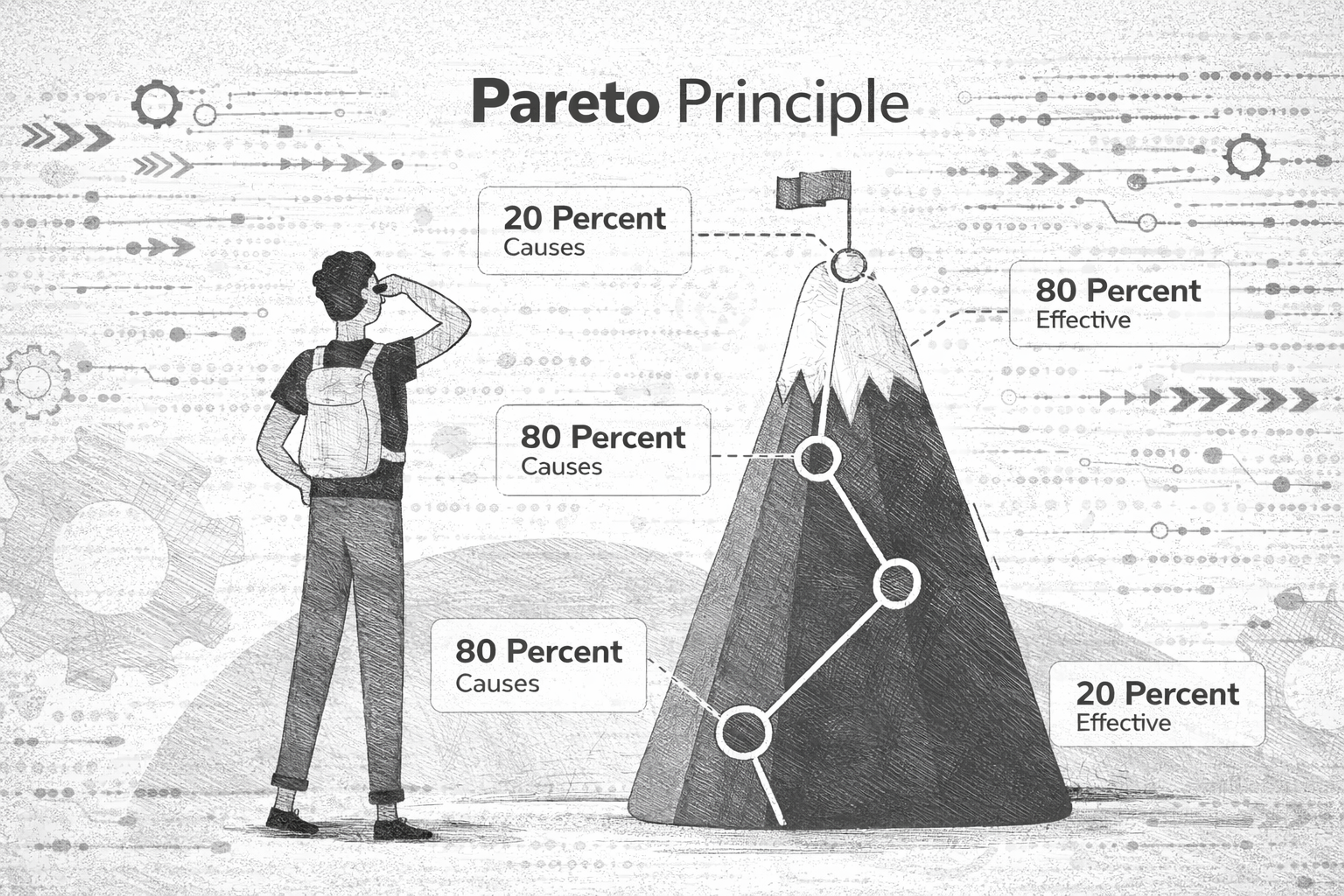
Apply it in 2026: Identify the handful of journeys that matter (activation, search, checkout, core task completion) and make those excellent first. Then simplify everything else around them.
Von Restorff Effect
The Von Restorff Effect, commonly called the “isolation effect,” is a psychological concept that describes how an unusual item is more likely to stay in mind than one that blends in with its surroundings.
People remember what stands out from the surrounding context.
In interface design, this is why a single primary button works. If everything screams, nothing is heard. A standout element should be rare, meaningful, and consistent.
Van Restorfs Effect
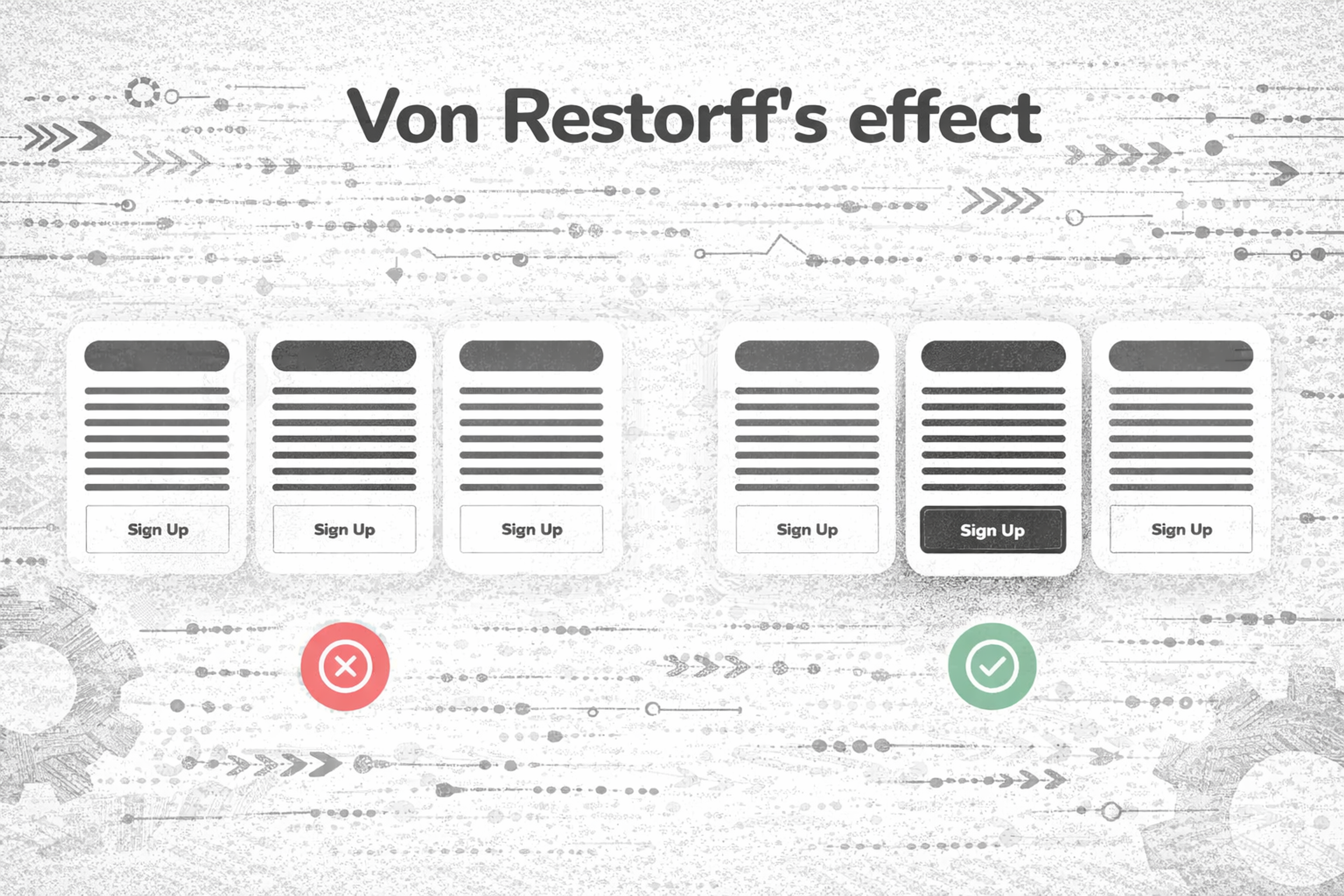
Apply it in 2026: Use contrast and emphasis as a budget. Spend it on the one action that truly matters. Avoid competing highlights like multiple “primary” CTAs, overloaded badges, and constant animated elements.
Aesthetic-Usability Effect
The aesthetic-usability effect refers to how a person perceives a system as more usable when it appeals to them visually, regardless of its usability. Aesthetically pleasing designs can enhance perceived usability, making users overlook usability issues when a design is visually appealing. Positively emotionally charged designs evoke better user experiences, no matter the severity of any usability problems.
A user comes in contact with an interface and form, or the interface is visually appealing. Any issues they may face within the interface feel much easier to solve.
Users generally tend to be more accepting and forgiving of errors in a design they emotionally feel more attached to. On the other hand, cluttered, antiquated, or dull-looking interfaces tend to face much more user resistance, irrespective of how functional they are.
The Aesthetic-usability Effect
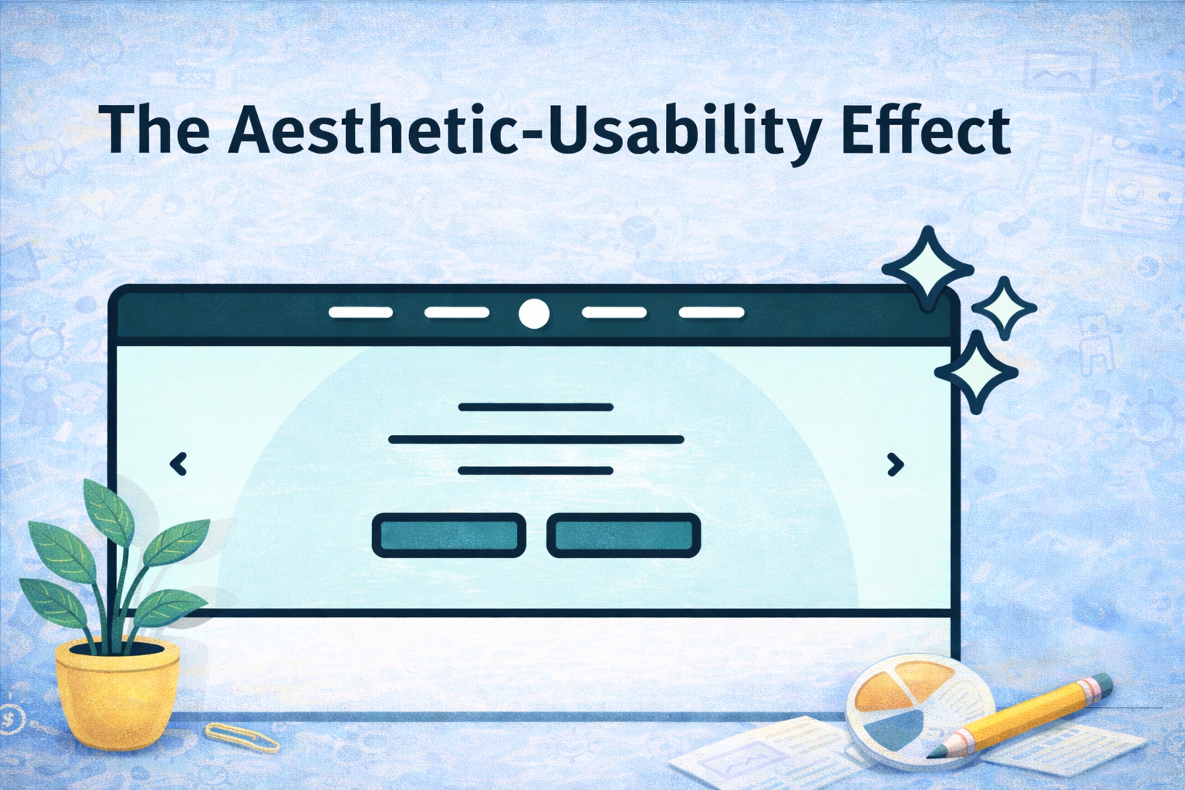
Apply it in 2026: Treat craft as usability. Make your UI calm, consistent, and readable first, then add brand personality without sacrificing clarity.
Serial Position Effect
People remember the first and last items best. Middle items get lost.
This matters for onboarding steps, feature lists, pricing tables, navigation menus, and any “top options” layout. It matters even more in infinite scroll environments where “first” and “last” are shaped by how you structure screens.
Two Designers Sitting at a Table

Apply it in 2026: Put the most important information where memory and attention are strongest: the beginning and the end. Use summaries, sticky tools, and clear sectioning so users do not drown in the middle.
Familiarity Principle
The more we see something, the more we tend to like it and trust it. Familiarity reduces mental effort.
This is why consistent microcopy, consistent UI patterns, and consistent interaction states matter. Users don’t want to relearn your product every time you ship an update.
Source: Ryoji Iwata on Unsplash

Apply it in 2026: Build repeatable patterns. Keep labels stable. When you do change something, keep the old mental model intact, or guide users through the new one with empathy.
Progressive Disclosure
The term “disclosure” means revealing or uncovering something, and when it comes to “progressive,” it indicates something gradual. Progressive Disclosure is a blend of two concepts, which means revealing something in parts.
In simpler terms, Progressive Disclosure is defined as a UI method that focuses on providing relevant information to users according to their needs without overwhelming them initially.
Progressive Disclosure balances UI information with the design - complex features of the service or website are hidden with drop-down options within the Advanced Section. By using a clearly defined boundary, visual clarity is enhanced, helping users quickly understand relationships between different elements.
Apply it in 2026: Design a “default path” for most users, then offer advanced depth through expandable panels, secondary screens, and clear “learn more” affordances. Keep advanced features discoverable, but not in the way.
Read more:
Conclusion
The laws of UX are not rules to memorize. They are lenses that keep you honest about how people actually behave.
In 2026, the best experiences feel fast, familiar, and trustworthy. They reduce choice, guide attention, respect cognitive limits, and reveal complexity only when it helps. If you apply these principles consistently, your product will not just look modern. It will feel effortless, which is the real benchmark users care about most.


About Clay
Clay is a UI/UX design & branding agency in San Francisco. We team up with startups and leading brands to create transformative digital experience. Clients: Facebook, Slack, Google, Amazon, Credit Karma, Zenefits, etc.
Learn more

About Clay
Clay is a UI/UX design & branding agency in San Francisco. We team up with startups and leading brands to create transformative digital experience. Clients: Facebook, Slack, Google, Amazon, Credit Karma, Zenefits, etc.
Learn more


