
Picture yourself walking down a busy street. You spot a familiar logo in a shop window. It's clean, clear, and you recognize it instantly. You smile because you know the brand and trust what it represents. That's what great logo design can do.
Now imagine that same logo squeezed onto your phone screen. It's blurry, hard to read, or completely unrecognizable. The brand's power vanishes because the logo wasn't built for different screen sizes and lacked responsive media handling.
This happens all the time in our digital world. Your logo doesn't just sit on one sign anymore. It appears on computer screens, tablets, phones, smartwatches, and social media. To succeed, your logo must look great everywhere people see it. That means it needs responsive image quality, proper image adaptation, and integration into responsive grids that adjust automatically to various screen sizes.
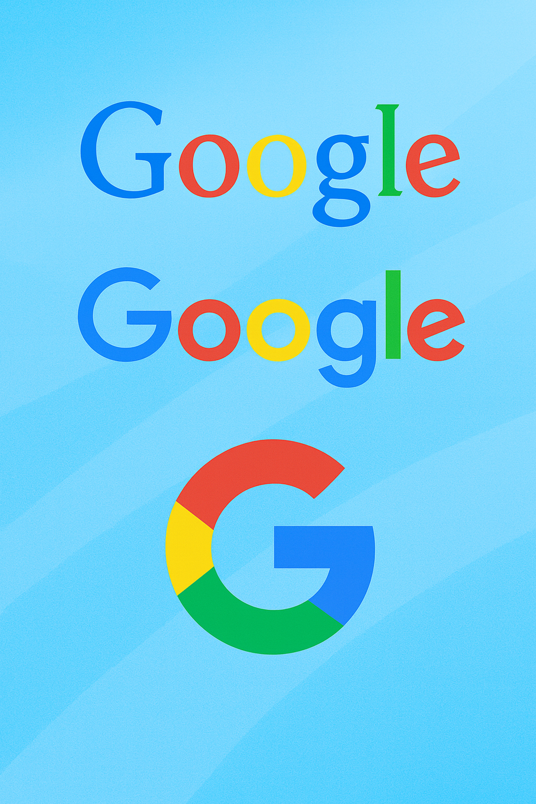
Google Logo
Key Takeaways
In today’s multi-device world, your logo must adapt across screen sizes to stay clear, recognizable, and professional. A responsive image ensures consistency and trust, whether it appears on a massive desktop or a tiny smartwatch.
To prepare your logo for responsive media handling and responsive design systems, keep it simple, scalable, and flexible. Use vector formats, create multiple versions for different devices, and test thoroughly across platforms. Maintaining visual clarity, image adaptation, color consistency, and adaptability helps your brand make a strong impression — anytime, anywhere.
Why Your Logo Needs to Adapt
Today's logos work harder than ever before. They represent your brand across dozens of platforms and devices. Each one has different size requirements and technical limits.
Your logo serves as your brand's ambassador. Like a good ambassador, it must adapt to any situation while keeping its core message clear. Whether someone sees it on a giant billboard or a tiny app icon, it should look professional and recognizable.
Think about where your logo appears today. Social media profiles, email signatures, mobile apps, website headers, and business cards all need different versions. Each platform has unique rules about size, shape, and format.
Poor logo display damages your brand's reputation. When people see a pixelated or stretched logo, they question your attention to detail. They wonder if you care about quality. A well-designed responsive logo system shows you're professional and current.
Your Brand’s Digital Ambassador
Think of your logo as your brand’s ambassador — a symbol that speaks for you in an instant. But a good ambassador must adapt to any situation. Whether it’s a bright, expansive billboard or a tiny app icon, your logo must always look sharp, clear, and recognizable through responsive media handling.
Adapting to User Experience
A logo that seamlessly adjusts to different screen sizes also improves user experience. No one wants to see a blurry, stretched, or cramped logo when navigating your website. A responsive image ensures that users always experience your brand as intended — consistent, professional, and trustworthy.
Enhancing Brand Trust
Imagine a user seeing your logo look distorted on a tablet — would they trust your brand? A poorly displayed logo can damage brand credibility. A responsive image, on the other hand, communicates that your brand is polished, thoughtful, and reliable.
The Psychology of Recognition
Ever noticed how some logos look authoritative on a desktop but feel cluttered on a mobile screen? That’s because our perception of a brand changes depending on how its logo is displayed. Clean, minimal designs work best on small screens, while detailed designs can shine on larger ones.
Steps to Prepare Your Logo for Responsive Design Systems
As we covered in the previous section, the need to have a responsive logo is essential, so let’s jump into how to position the logo for all ranges of screens and resolutions by designing a responsive logo:
Design with Flexibility in Mind
Start by making your logo versatile. Focus on simple, scalable elements that retain clarity, even when shrunk down. Avoid intricate details that become a confusing blur on smaller screens.
- Simplify the Design: Opt for clear shapes and minimal text.
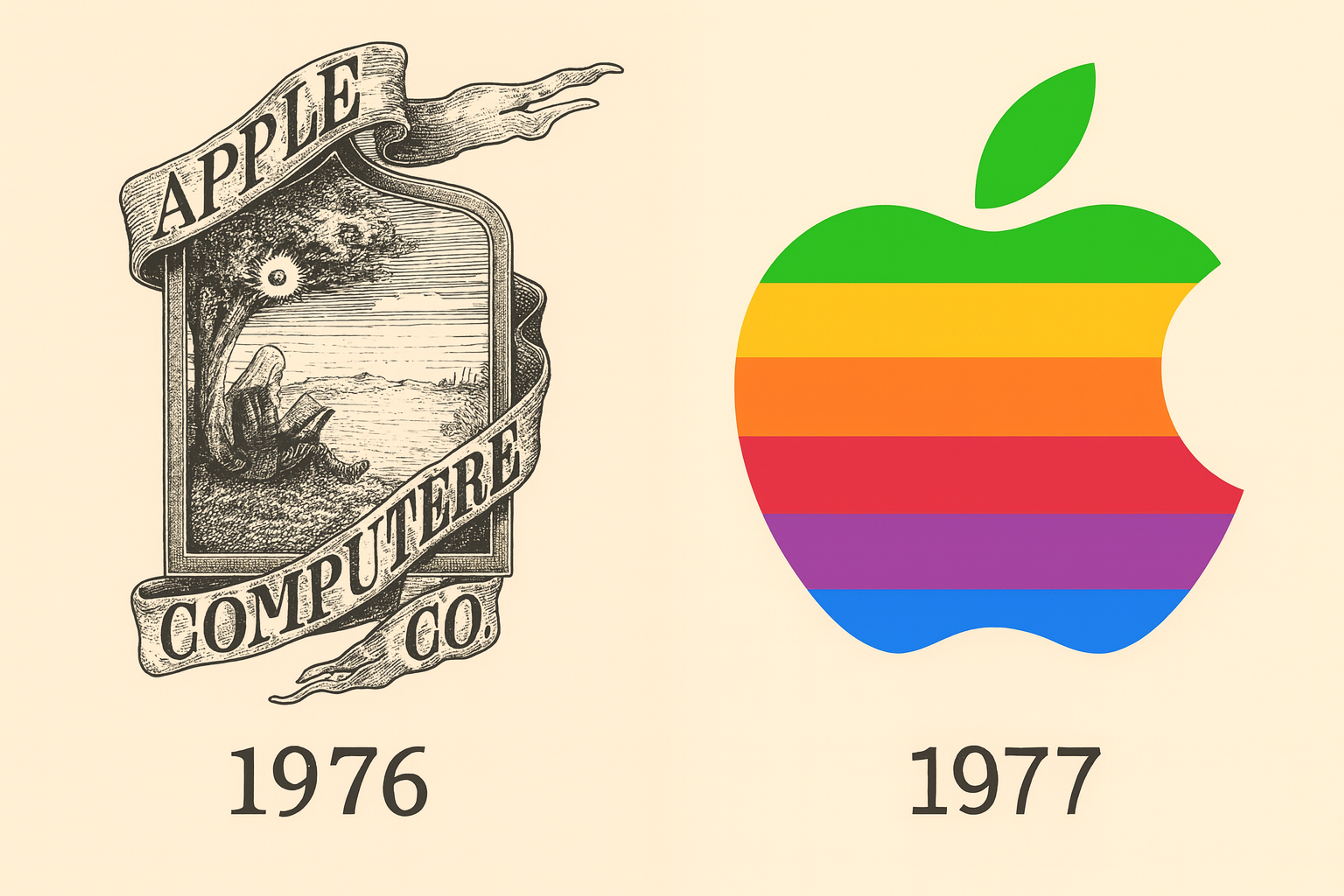
Apple Change
- Use Vectors: Design your logo in vector formats (like SVG) for infinite scalability without losing quality.
- Prioritize Clarity: Ensure your logo is readable, even at tiny sizes.
Create Multiple Versions for Different Screen Sizes
Changing a logo's approach is the most efficient way to manage screen sizing sensitivity, effortless resizing, and creating multiple variations to ensure adaptability across different platforms and sizes. Multiple versions of your logo can help maintain structure on all device sizes, ranging from small to large.
- Desktop Version: The full logo, which contains the brand mark and text, is available on larger screens.
- Tablet Version: As you downsize, you may need to compress or modify the logo. This can include removing the tagline or having an abstraction of the logo.
- Mobile Version: For smaller screens, consider using a greatly simplified version of the brand mark or possibly an abbreviation of the logo.
All these adjustments ensure the logo retains its integrity and aesthetics regardless of the device used. Changing the logo based on the device being used should be no difficulty because it will guarantee ease of accessibility on every device.
Use Scalable and Flexible Grid Systems
Responsive design systems often utilize flexible grids that permit design elements to resize and change position based on screen size, ensuring logos fit into these grids across different formats. When designing logos, you must make certain they fit into these flexible grids so that they can be resized.
- Grid-Based Layouts: Safeguard that your logo is situated within a grid modified with screen size. This keeps the logo from being excessively large or small on various devices and helps retain its proportions.
Abstract
- Padding and Spacing: Consistent padding and spacing around the logo must be maintained so that it doesn’t look cramped or stretched when it is resized. This is critical for logos with both text and graphical components.
Test Across Devices
After you mark the scalable logo design as complete, it’s time to put it through the paces on various devices and different sizes. Testing guarantees that the logo’s readability, aesthetics, and brand presence are consistent across devices. Some ways to do this include:
- Responsive Testing: Tools Several tools, such as Chrome’s responsive testing mode, allow you to preview the logo on different screen sizes.
- Manual Testing: It’s also possible to manually examine the logo depiction on phones, tablets, and desktops and assess how it scales in real life.
Finally, be sure to check how the logo looks on high-resolution screens like retina displays to ensure it is crisp and clear on even the latest devices.
Maintain Consistency in Color and Contrast
Uniformity across devices is crucial for responsive logos, which means that the color scheme needs to be the same throughout the brand. This ensures that the colors are consistent and that there is sufficient contrast for legibility.
- Color Selection: It is critical to check how the logo’s colors will display across different devices and backgrounds. It is vital to ensure that light and dark screens do not hinder the logo’s visibility, especially in smaller devices. A perfect example is our work with Snapchat. Initially, Snapchat's iconic logo — a white ghost on a bright yellow background — faced visibility challenges in dark mode. To address this, our team at Clay developed a dark mode version of the logo, featuring a black background with a white ghost.
Snapchat App by Clay
- Logo Contrast Measurement: Always verify that your logo is significantly contrasted to different backgrounds in relation to visibility and readability with accessibility tools.
Consider Animation or Interactivity
In some responsive frameworks, adding Animation or making the logo slightly interactive can improve the experience. This approach needs to be carefully used in cases where it is required. For example:
- Animation for Mobile: Logo scale or fade methods can tremendously improve the experience without making it seem cluttered. Ensure not to slow the loading time or distract users from the overall experience.
- Interactive Elements: On some websites, the logo can change, such as expanding or contracting upon being clicked or hovered over. If you decide to use such features, make sure they function correctly on all devices and do not disrupt accessibility.
The Future of Responsive Logos
As technology evolves, so does logo design. Brands are now experimenting with dynamic logos that change based on user behavior, season, or even location. For example:
- A logo that adopts winter colors in December.
- A logo that subtly animates when hovered over on a website.
- A logo that scales perfectly, whether seen on a smartwatch or a 4K monitor.
Responsive logos are no longer just an option — they are a necessity in a multi-device world. They ensure your brand stays consistent, recognizable, and engaging, no matter where or how your customers encounter it.
FAQ
Q: Can Any Existing Logo Be Made Responsive, or Is a Redesign Necessary?
Not all logos can be made responsive without changes. Logos with complex shapes or small text may need redesigning to stay clear and recognizable on smaller screens.
Q: How Does Responsive Logo Design Impact Brand Guidelines?
Responsive logos require updated brand guidelines. These often include rules for scaling, alternate versions, spacing, and usage in dark mode or animation.
Q: Are Responsive Logos More Costly to Design Than Traditional Ones?
Yes, responsive logos may cost more initially due to the need for multiple versions and testing. However, they improve usability and brand consistency across devices, offering long-term value.
Q: Can a Responsive Logo Affect a Website’s Loading Speed?
When optimized using vector formats like SVG, responsive logos load quickly and have little impact on site speed. They often perform better than large image files.
Read more:
Conclusion
Your logo is more than just a symbol — it’s the face of your brand. In a world where customers interact with brands across countless screens, a static, unchanging logo is no longer enough. Responsive logo design gives your brand the flexibility to shine everywhere, maintaining its integrity and impact.
By embracing the principles of responsive design — scalability, consistency, testing, and adaptability — you ensure that your logo not only looks good but also tells your brand’s story on any screen. So go ahead, future-proof your brand, and make your logo a true digital ambassador.

About Clay
Clay is a UI/UX design & branding agency in San Francisco. We team up with startups and leading brands to create transformative digital experience. Clients: Facebook, Slack, Google, Amazon, Credit Karma, Zenefits, etc.
Learn moreAbout Clay
Clay is a UI/UX design & branding agency in San Francisco. We team up with startups and leading brands to create transformative digital experience. Clients: Facebook, Slack, Google, Amazon, Credit Karma, Zenefits, etc.
Learn more