Your startup website has one critical job: turn visitors into customers. The most damaging web design mistakes for startups are unclear messaging, poor mobile optimization, slow loading speeds, and weak calls-to-action.
Even a single web design mistake can negatively impact user experience and lead to lower conversions, making it crucial to address these issues to improve your site's effectiveness. Each mistake directly impacts your ability to convert visitors and can be fixed with proven design principles.
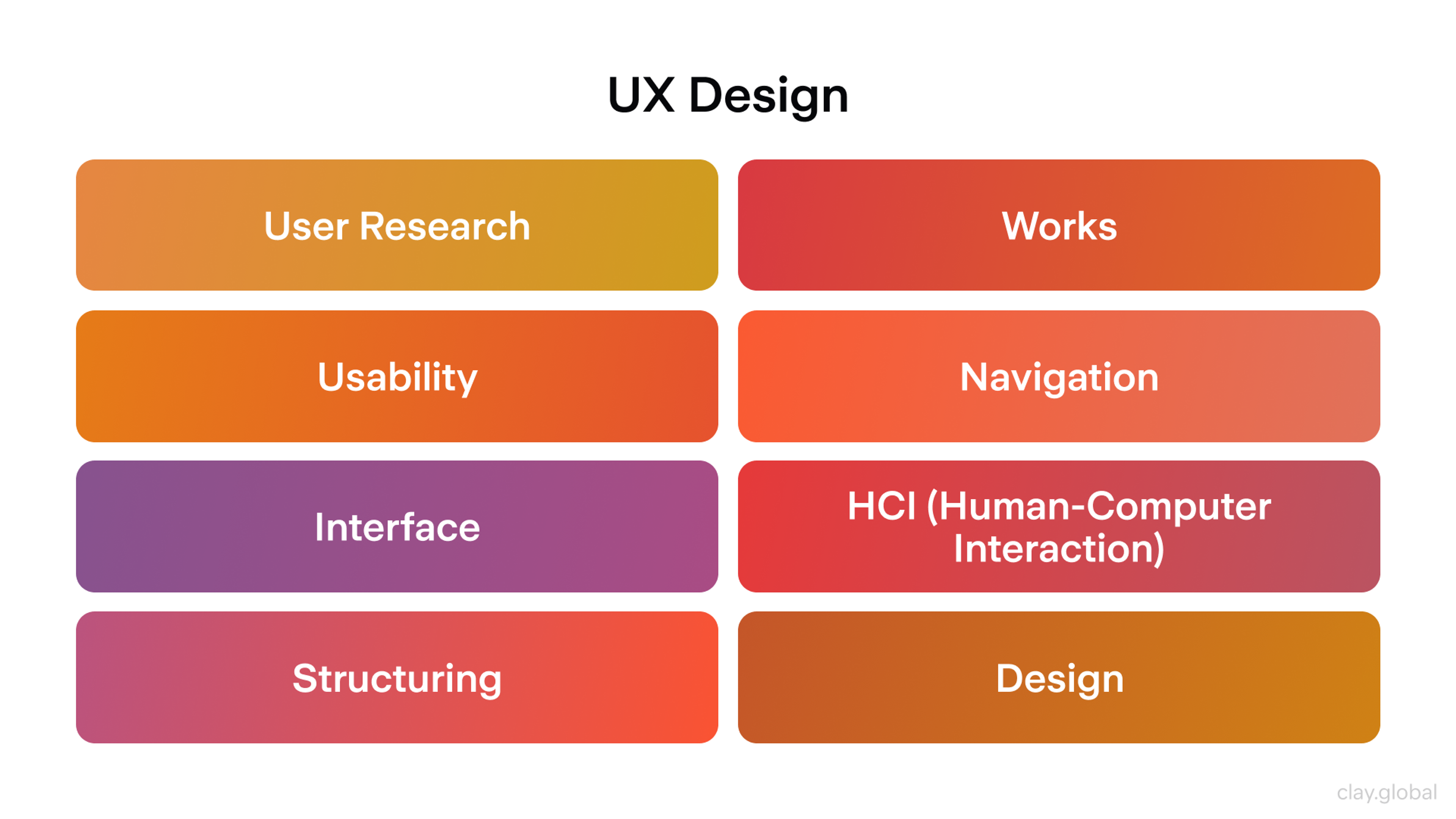
UX Design by Clay

A design mistake can make conversion nearly impossible and often leads to lower conversions. Most website design mistakes and common design mistakes are frequent issues for startups and can significantly hinder growth.
In this article, we’ll cover the biggest web design mistakes to avoid so your startup can maximize its impact. Here are twelve problems that sink startup websites and exactly how to fix them.
1. Trying to Do Everything on One Page
Most startup websites overwhelm visitors with too many choices. The homepage wants you to buy something, book a demo, join their newsletter, and download a guide. When everything screams for attention, nothing gets it.
The Fix: Give each page one clear purpose. Your homepage should explain what you do and guide people to the next logical step. Your pricing page should help people choose a plan confidently. A blog post should teach something valuable and suggest one specific action.
Write your page’s primary goal at the top of your draft. “This page gets people to request a demo.” Then make every element serve that goal. Remove anything that creates distraction or confusion. Make sure to highlight the most important elements on each page so users can focus on what matters. Ensure the most important content is visible and prioritized for the user.
2. Weak Headlines and Missing Trust Signals
Vague headlines kill interest before the first scroll. If your message says “Transform your business,” visitors still don’t know what you do. Without nearby proof, they won’t believe you can help.
The Fix: Say what you are, who you serve, and the key benefit — in one clear sentence. Put the main button right there. Add proof in the same view: real customer names, short quotes, results, or a security note. These elements directly enhance your website's credibility by showing authenticity and building trust with visitors. Keep it tight and specific.
Show the hero to someone for five seconds. Ask three things: What do we do? Who is it for? What should you click next? If any answer is unclear, rewrite the headline, tighten the subhead, or move the proof closer. Keep editing until a stranger can answer all three without guessing.
3. Looking Like Every Other Startup
Most startup websites follow the same template: hero section with generic benefits, three-column feature grid, customer logos, pricing table, signup form. You blend into the background when you need to stand out from funded competitors.
The Fix: Lead with what makes you fundamentally different, not just better. Instead of "Streamline your workflow," try "The only project tool that actually works for design agencies" or "Project management built by freelancers who got tired of complex tools."
Share your origin story prominently. Why did you build this? What existing solution frustrated you enough to start over? This authentic differentiation costs nothing but makes you memorable when visitors compare options.
Source: sitebuilderreport.com

4. Ignoring Mobile Users
Most people discover your site on their phone first. A huge percentage of web traffic now comes from mobile devices, making mobile optimization essential. Many websites get designed on large computer screens and compressed down later.
It’s crucial to have a mobile friendly and responsive site to ensure usability and engagement across all devices. This creates tiny buttons, broken text layouts, and important content buried below oversized images. Non-responsive design fails to adapt to different screen sizes and smaller screens, leading to poor user experience.
Responsive Example by Clay

The Fix: Design for small screens first. Make buttons large enough to tap easily (minimum 44 pixels). Put your main message and most important action where people see them immediately without scrolling. Test on actual phones, not just by shrinking your browser window. Be sure to test your site on different devices and screen sizes to guarantee a seamless experience for all users.
Build your mobile homepage and pricing page before designing desktop versions. If it works well on a small screen, it will look excellent on larger displays. Having a dedicated mobile version of your site further enhances user experience and search engine rankings.
5. Assuming Visitors Understand Your Industry
You live and breathe your product daily. You forget that most visitors don't understand industry jargon, why your approach is better, or even why they need a solution at all. Your website jumps straight into features without explaining the fundamental problem.
The Fix: Start every page by acknowledging the problem your visitors actually experience. Before explaining how your AI tool works, explain why current manual processes waste their time. Before listing your API features, explain why existing integrations break down.
Test your messaging with people outside your industry. If they can't explain what you do and why it matters after reading your homepage, simplify your language and add more context.
6. Making Your Site Hard to Use for Everyone
Poor accessibility hurts all users, not just people with disabilities. Web accessibility ensures that websites are inclusive and usable for everyone, including people with disabilities, and is essential for meeting legal standards and improving user engagement.
Light gray text on white backgrounds, missing image descriptions, and keyboard-unfriendly interfaces make your site harder for everyone to use. These issues can create significant barriers for users with visual impairments and those relying on assistive technologies such as screen readers.
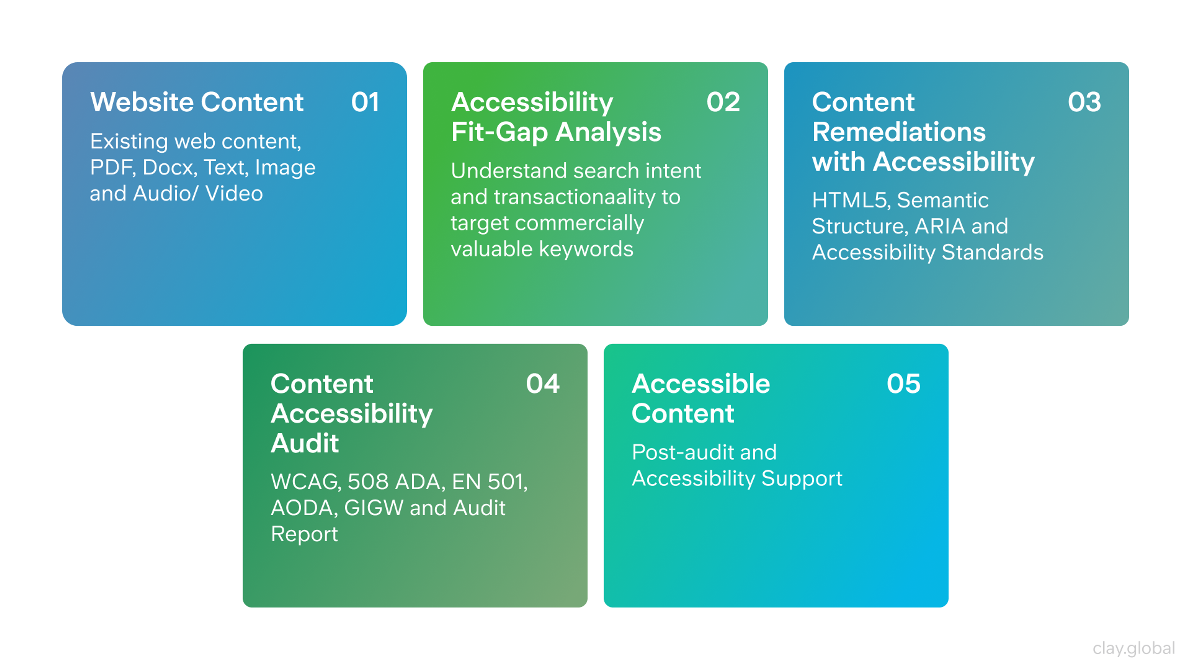
Accessible Content by Clay

The Fix: Build accessibility into your design process. Ensure strong contrast between text and background colors. Every button and link should work with keyboard navigation. Write helpful descriptions for important images.
Including descriptive alt text is crucial for users who rely on screen readers and is a key aspect of web accessibility. Label form fields clearly and logically. Use appropriate font sizes to avoid illegible font sizes and improve accessibility for all users across devices.
Try navigating your entire site using only the Tab key. Can you reach everything important? Can you easily read body text on your phone in bright sunlight? If not, increase contrast and improve focus indicators immediately. Understanding user needs and developing user personas can help inform accessible design choices that benefit all visitors.
7. Poor Error Handling and User Feedback
Many websites provide no feedback when people interact with them. Forms submit without confirmation, buttons don’t respond to clicks, and error messages are vague or unhelpful.
The Fix: Design clear feedback for every user action. Show when forms are processed and confirm successful submission. When something goes wrong, explain what happened and how to fix it. Make error messages helpful, not just “Something went wrong.”
Test every interactive element on your site. Do buttons show they’ve been clicked? Do forms display clear success or error messages? Are error messages specific enough to help people solve problems? Usability testing is crucial for identifying and fixing issues with user feedback and error handling, ensuring your site meets user needs effectively.
8. Visual Hierarchy Problems and Information Overload
When every part of your page has equal visual weight, nothing stands out. People need a clear path through your content. They should see your headline first, then proof you can deliver, then benefits, then what to do next. Visual clutter breaks this natural flow. Large, unbroken blocks of text can overwhelm readers, making your content harder to digest and reducing engagement.
The Fix: Create clear hierarchy with different text sizes, spacing, and contrast levels. Give sections room to breathe with white space. Group related information together and separate different ideas visually. Use bullet points to break text into more manageable sections and improve readability. Stick to two fonts maximum and a simple color scheme.
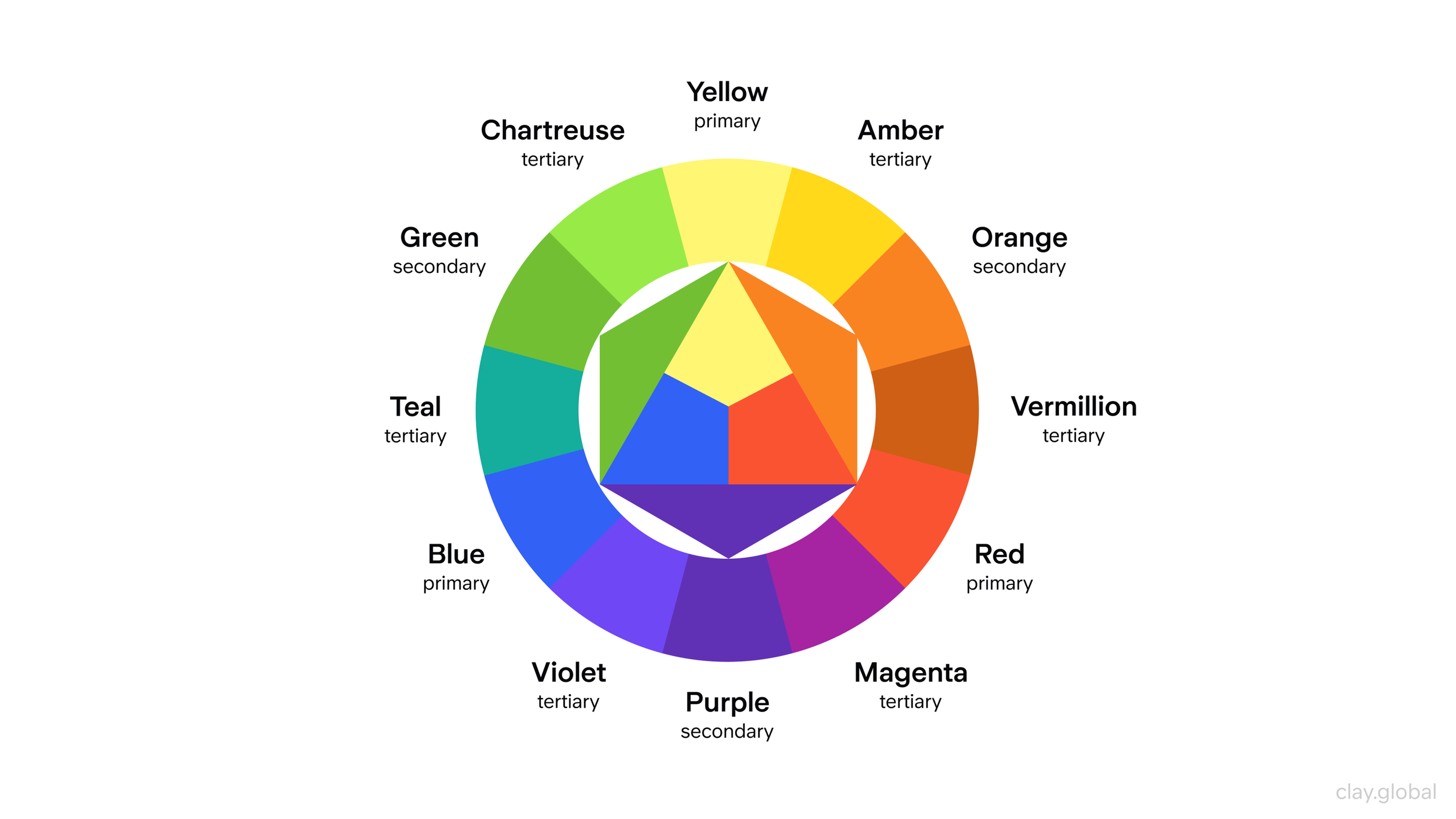
Color Wheel Illustration by Clay

View your page in black and white. Can you still identify what’s most important? If not, make headlines bigger and bolder, simplify backgrounds, and remove competing visual elements.
9. Building a Perfect Website Before Validating Your Message
Many founders spend months perfecting their website design while their actual value proposition remains untested. You launch with beautiful pages that convert poorly because you optimized for aesthetics instead of customer understanding.
The Fix: Launch with a simple, clear website that tests your core message quickly. Use basic templates if needed. Focus your limited time on getting the headline, value proposition, and call-to-action right. You can improve the design after you know what actually resonates with customers.
Set up simple A/B tests from day one. Try different headlines, value propositions, or signup button text. Learn what works before you invest in custom design.
Before You Launch
Check these critical elements before going live.
User paths from discovery to conversion are mapped and optimized. Conducting user research helps you understand potential customers, allowing you to tailor the site to their needs and improve user engagement.
Visual hierarchy guides users through content logically. The goal is to create a seamless user experience, making navigation intuitive and consistent across devices.
Strategy and Content
Each page has one clear goal with a supporting call to action. Your value proposition clearly states what you do, for whom, and why it matters. Making a strong first impression when a visitor lands on your site is crucial, as it sets the tone for the entire user experience and helps visitors arrive at a clear understanding of your brand. Trust signals like testimonials or security badges are visible. User paths from discovery to conversion are mapped and optimized.
Design and Usability
Mobile design is tested on real devices and optimized for touch. Visual hierarchy guides users through content logically. Design standards ensure consistency across all pages. A well designed website creates a seamless experience for users, making navigation intuitive and enjoyable across all devices. Navigation uses clear language with logical organization.
Technical and Performance
Pages load in under three seconds on mobile networks. All interactive elements work with keyboard navigation and have visible focus states. Color contrast meets accessibility standards. Ensuring WCAG compliance and avoiding non responsive design are crucial, as both directly impact user experience and can significantly improve conversion rates. Error states and user feedback work throughout the site.
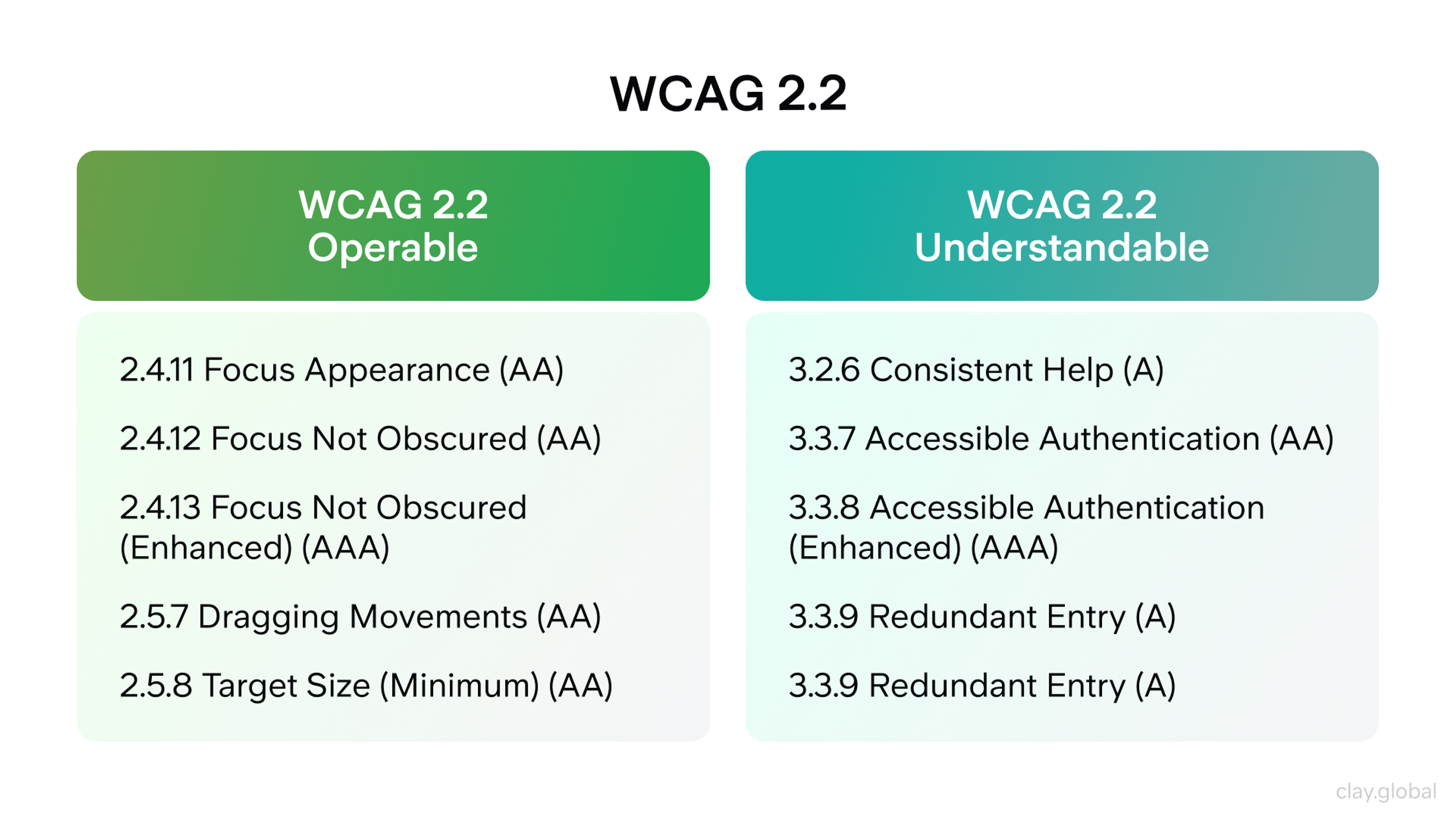
WCAG 2.2 by Clay

Measurement and Optimization
Analytics tracking is set up for key goals and events. Basic SEO elements are in place including titles, descriptions, and headings. Optimizing for mobile and SEO can significantly improve your site's visibility in search results. Form validation provides clear, helpful feedback. Testing plans are ready for post launch optimization.
What Matters Most
Great startup web design isn’t about beautiful visuals or clever animations. It’s about clarity, trust, and removing obstacles from the path to value. Website design and skilled web designers play a critical role in building trust, establishing credibility, and driving user engagement. Your website should make it effortless for the right people to understand what you do, believe you can deliver, and take the next step.
Start with the fundamentals. Clear messaging, fast performance, and accessible design. Measure everything. Test continuously. Each improvement builds on the last, creating a site that works harder for your business and improves as you grow.
The companies that succeed aren’t the ones with the biggest design budgets. They’re the ones that eliminate confusion, reduce friction, and build trust at every step. Master these basics and your website becomes your most valuable growth tool. Intentional site design and a focus on user engagement are key to achieving long-term success.
Read more:
FAQ
What's the Biggest Challenge in Web Design?
Balancing creativity with usability is the hardest part. A site must look good while staying fast, accessible, and easy to use.
What Makes a Poorly Designed Website?
Slow load times, cluttered layouts, bad navigation, weak contrast, and confusing calls to action make a site ineffective.
What Are the Major Design Problems?
Common issues include poor responsiveness, inconsistent branding, weak accessibility, unstructured content, and lack of clear hierarchy.
What Is the 60 30 10 Rule in Web Design?
It’s a color principle: 60% primary, 30% secondary, and 10% accent to keep layouts balanced and visually appealing.
What Are the 7 Basic Principles of Design?
Balance, contrast, alignment, repetition, hierarchy, proportion, and white space form the foundation of effective design.
Conclusion
Your website isn’t a brochure. It’s a sales engine. Each choice either clears the path or adds friction. Friction costs signups, demos, and revenue. Avoid these nine mistakes to gain clarity, speed, mobile ease, and accessible flows. Your CTAs will get tapped.
Make it practical. Ask every page one question. What single action should a visitor take? Tighten the hero. Simplify navigation. Cut page weight. Fix basic accessibility. Rewrite microcopy so the next step is clear. Set up analytics before each change. Measure what moved and why.
Repeat weekly. Your site will get clearer, faster, and more trusted. Clarity wins. Speed sells. Accessibility keeps users. Consistency scales. Build for these and your site will pull its weight from day one.


About Clay
Clay is a UI/UX design & branding agency in San Francisco. We team up with startups and leading brands to create transformative digital experience. Clients: Facebook, Slack, Google, Amazon, Credit Karma, Zenefits, etc.
Learn more

About Clay
Clay is a UI/UX design & branding agency in San Francisco. We team up with startups and leading brands to create transformative digital experience. Clients: Facebook, Slack, Google, Amazon, Credit Karma, Zenefits, etc.
Learn more


