Backgrounds in web design do much more than fill empty space. They shape how users feel, guide their attention, and create the emotional setting for every interaction on your website. When you design them strategically, backgrounds become powerful tools for communication, brand expression, and improving user experience.
This article explores both practical techniques and advanced ideas that separate exceptional background design from basic decoration. You'll learn how to create backgrounds that not only look amazing but also serve strategic purposes in user psychology, brand communication, and getting better results from your website.
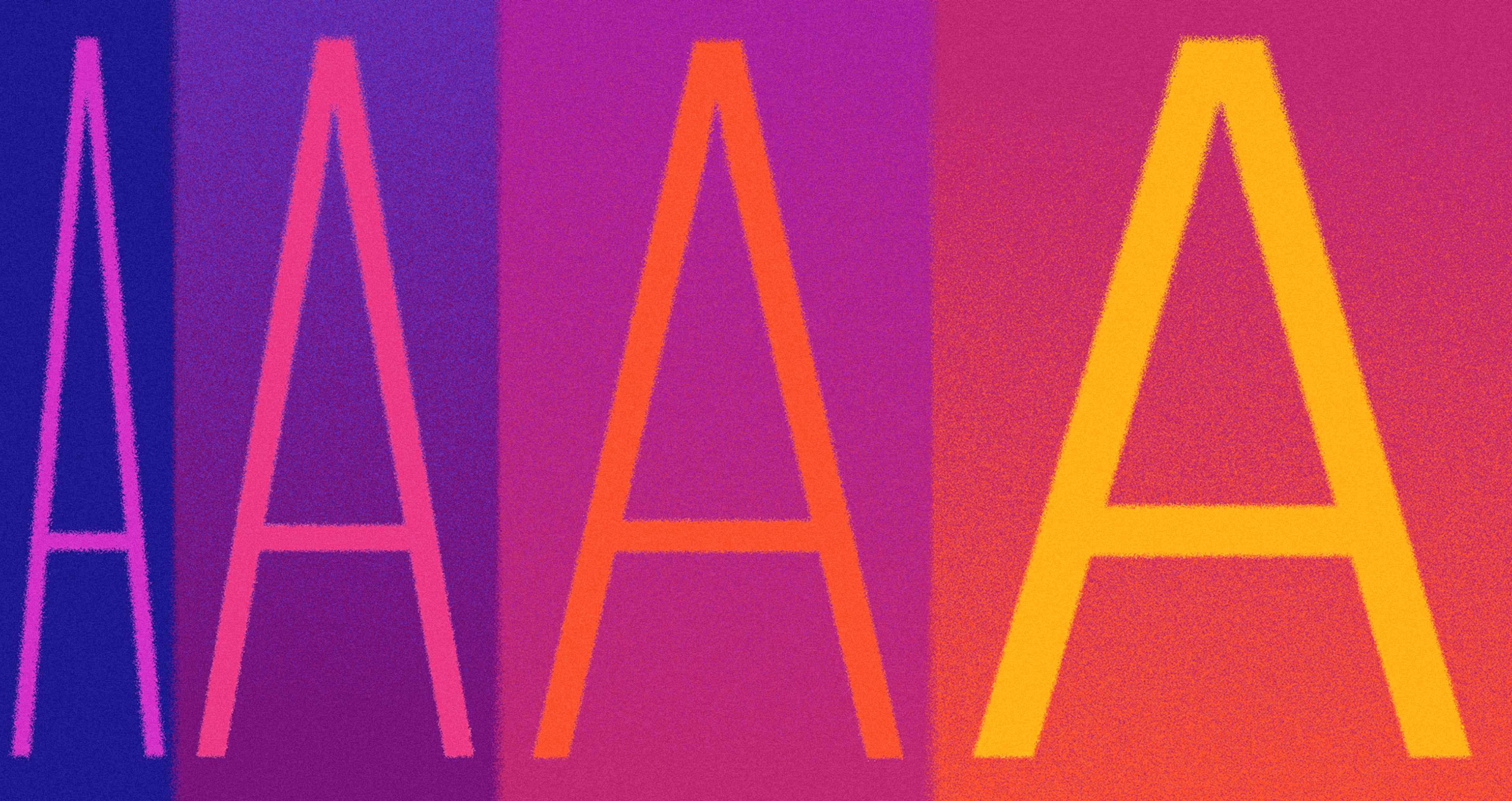
Quote About Website Backgrounds
What Is Website Design Background?
Backgrounds are the layer you see behind all the content on a web page. They might seem simple or unimportant, but they play a big role in good design. Backgrounds help shape how people experience your site. They guide attention, create structure, and show off your brand’s style.
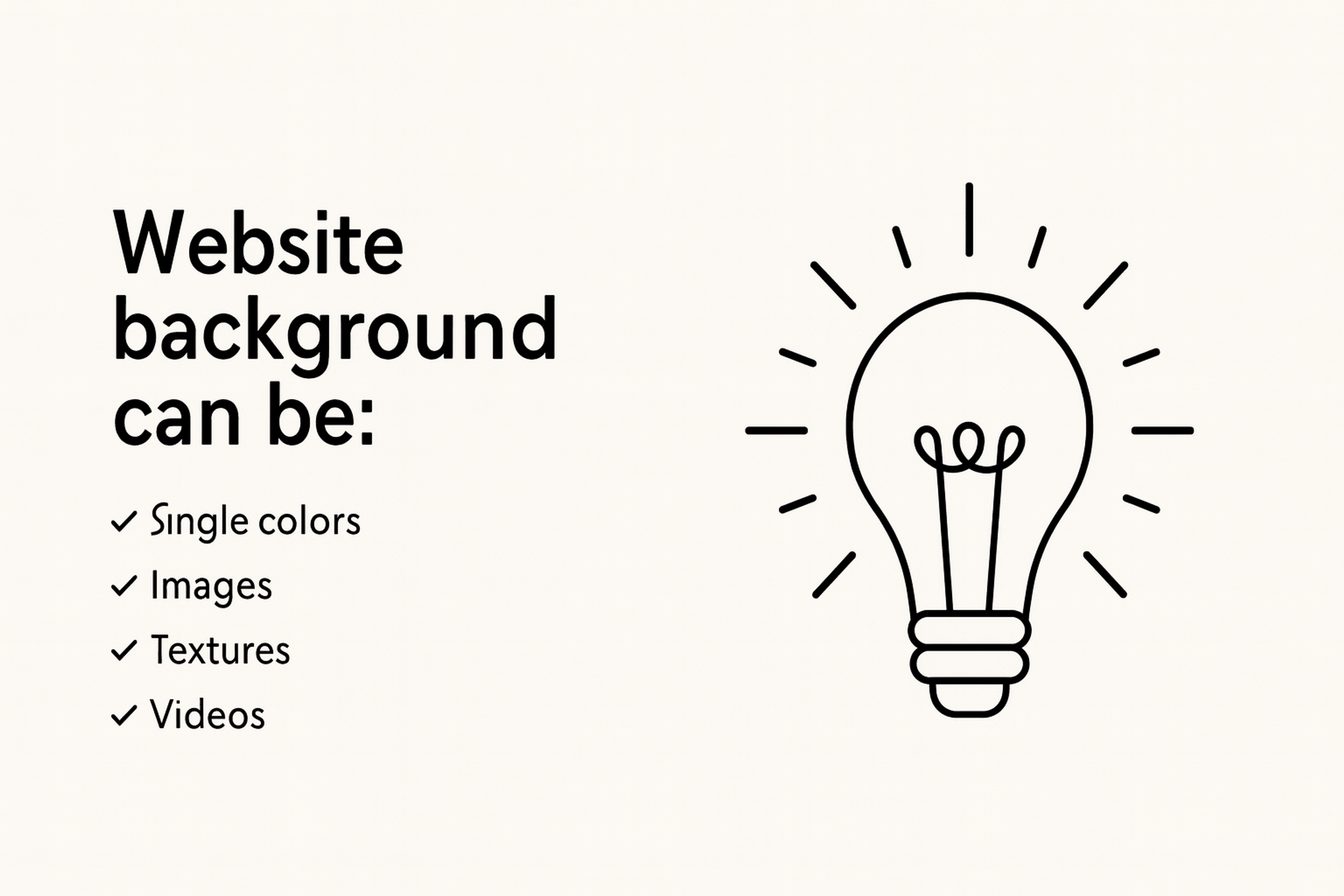
Backgrounds can be made of many things. Some use solid colors or soft gradients. Others include images, videos, patterns, graphics, or textures. Some even use animations or interactive effects.
Think of the background as the canvas for your design. It sits behind your text, images, buttons, and other features. But unlike a blank canvas, a website background is an active part of the design. It helps control where people look, how they feel, and how easy the site is to use.
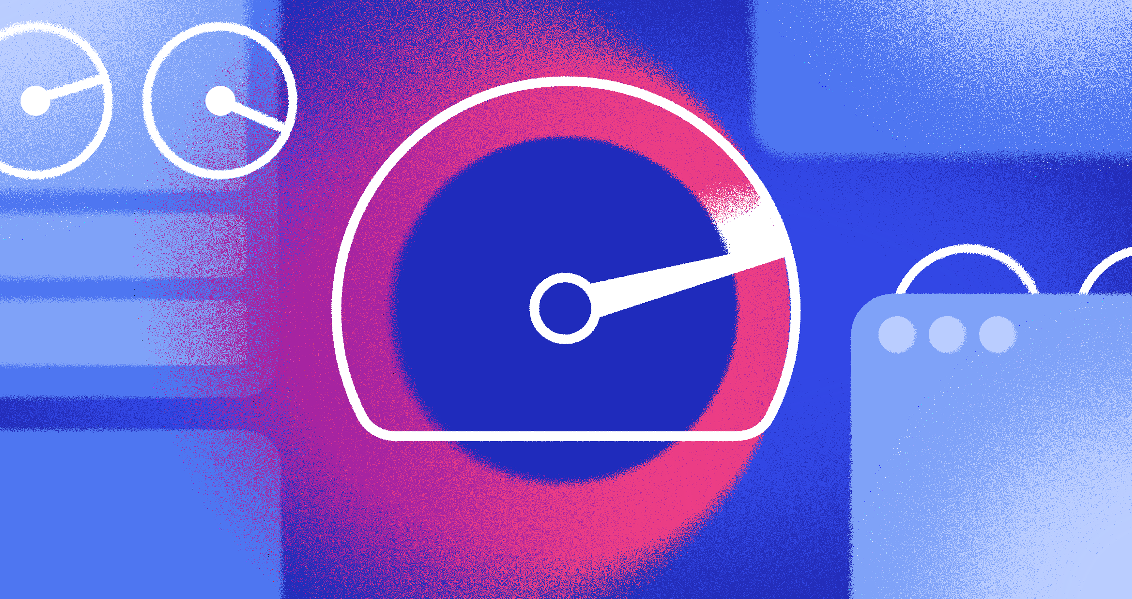
The Role of Website Design Background
Backgrounds Define Visual Hierarchy
In web design, the background is more than just space behind the content. It plays an important role in how people use a website. A good background helps guide the user’s eyes and shows them what to focus on first.
The right background sets the mood for the page. It also helps organize information so the layout feels clear and easy to follow.
Visual Hierarchy
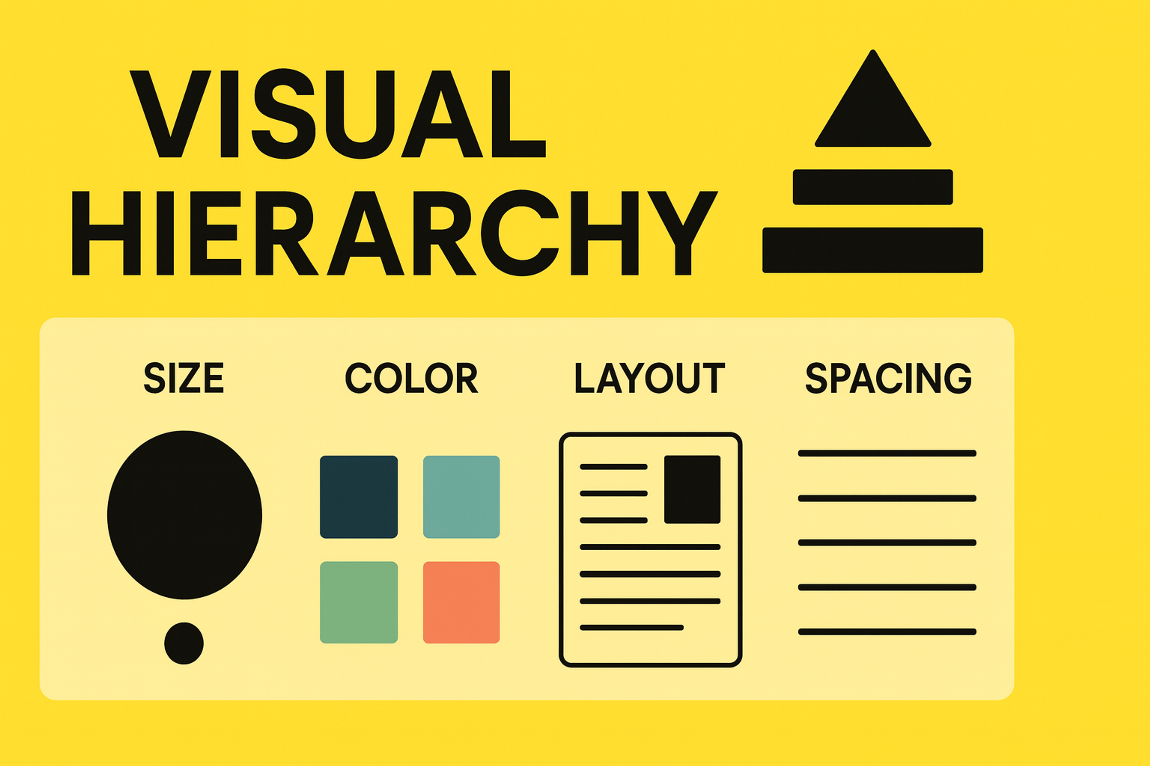
For example, a plain background makes buttons or text stand out more. A colorful background can help tell a story or show off your brand. Choosing the right background ensures your logo remains visible and reinforces brand recognition. The background works with the design to make sure people know where to look and what matters most.
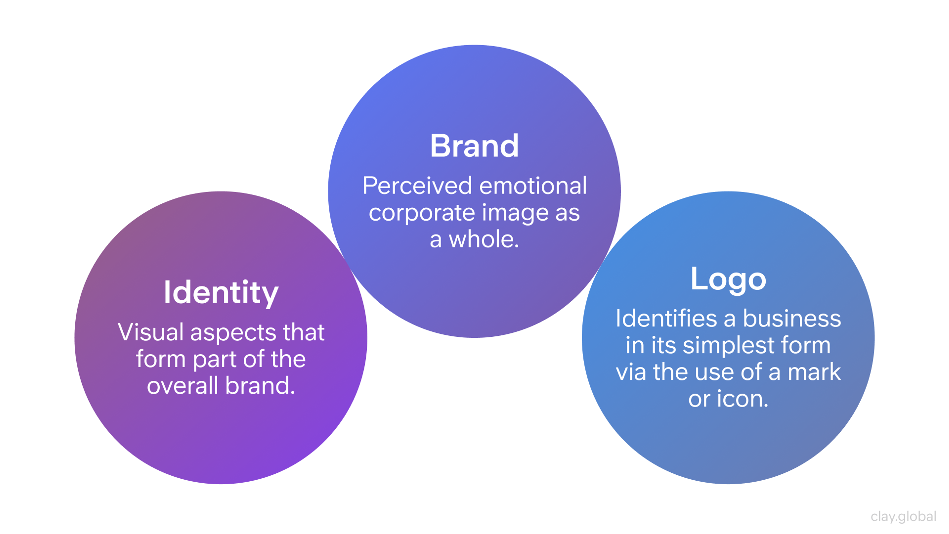
Emotional Impact and Brand Identity
The colors, textures, and images in your background can change how people feel when they visit your site. Warm colors like red or orange make a site feel welcoming and friendly. Cool colors like blue or gray feel calm and professional.
Your background should also match your brand’s style. It helps people recognize your brand and feel connected to it. Backgrounds that feature human elements or authentic moments can foster a stronger emotional connection with visitors.
Brand, Identity, and Logo by Clay
Enhancing User Engagement
Backgrounds can make people more interested in your site when they work with the user’s journey. Small effects like soft animations, moving images, or parallax scrolling add depth and make the site feel more interactive.
Seamless transitions between backgrounds can further enhance user engagement and immersion. Interactive backgrounds can also prompt users to complete an action, such as verifying their identity or engaging with a security check.
But backgrounds should never distract from the main content. They should support the design, set the mood, and still keep the site easy to use.
Source: Plufow Le Studio on Unsplash

Types of Website Design Background
Solid Color Backgrounds
Solid colors are timeless and effective. They offer clarity and minimal distraction, allowing text and key visuals to stand out. Choosing the right color is essential — leveraging color psychology can evoke the desired emotional response.
For example:
- Blue is often associated with trust, dependability, and calmness. It’s a favorite among financial, tech, and healthcare brands because it evokes feelings of security and professionalism.
- Green conveys harmony, freshness, and growth. It’s popular with wellness, sustainability, and eco-focused websites aiming to create a sense of balance.
- Red grabs attention and signals excitement, urgency, or passion. While potent, it should be used strategically to avoid overwhelming the viewer.
Solid color backgrounds are also advantageous for accessibility, as they allow for strong contrast, essential for legibility.
Designers can also use different solid color backgrounds to reflect changes throughout the day, such as lighter tones during the day and darker shades at night, creating a more personalized and dynamic user experience.
Types of Web Backgrounds
Gradient Backgrounds
Gradients add subtle depth without overwhelming the page. Modern gradients often feature soft, blended transitions between adjacent hues, creating visual interest without the heaviness of photographic backgrounds.
Tips for gradients:
- Stick to two or three complementary colors to maintain balance and avoid clashing tones that disrupt visual harmony.
- Use linear gradients for a directional flow, guiding the user’s eye across the page. For instance, a gradient from top-left to bottom-right can subtly draw attention diagonally.
- Try radial gradients to create a soft, spotlight effect that naturally emphasizes the center of the screen, ideal for hero sections or product showcases.
Source: canva.com

Gradients can add a modern, dynamic flair while maintaining readability when paired with proper overlays or contrasting text elements. Gradients can also be programmed to shift subtly over time, adding a dynamic and modern touch to the website background.
Background Images
Images are one of the most versatile background choices but require careful handling:
- Selection: Choose high-quality, relevant images that resonate with your brand and audience. A background image should support the message, not distract from it. Generic or low-resolution photos diminish perceived professionalism.
- Optimization: Large images can slow down page load times. Use compression tools and modern formats like WebP to maintain quality while reducing file size.
- Placement: Avoid placing text over visually busy areas. If unavoidable, use overlays or blurring to create separation between text and background.
Responsive design is critical. Background images must scale well across desktop, tablet, and mobile devices to prevent distortion, pixelation, or loss of focal elements.
Always test background images on every device to ensure consistent quality and performance.
Video Backgrounds
Video backgrounds can create a powerful, immersive experience but come with specific considerations:
- Purpose: Only use video backgrounds when they serve a clear purpose, such as demonstrating product use, conveying atmosphere, or providing visual storytelling. Decorative video for the sake of trendiness often harms usability.
- Performance: Video files should be compressed and optimized using modern codecs like H.264 or WebM to minimize loading times and bandwidth consumption.
- Fallbacks: Always provide static fallback images for devices or browsers that do not support video playback to maintain a consistent experience.
- Accessibility: By default, videos should be muted and subtle. Provide user controls to pause, disable, or reduce motion to ensure accessibility for all users, including those sensitive to motion.
When applied with care, video backgrounds captivate attention and quickly communicate complex ideas in an engaging, memorable way. They can also transport users to different parts of the world or create a sense of global connection, making the experience more immersive and engaging.
Patterned & Textured Backgrounds
Soft patterns and textures can make a web page feel more interesting and layered. They help keep a simple design from looking flat or empty.
Light geometric patterns work well for modern websites. They add style without pulling attention away from the main content.
Natural textures like paper grain or fabric can make a site feel warm and handmade. This look is great for creative, vintage, or craft-focused brands.
Patterns should never take focus away from the text or buttons. Using soft colors or transparent layers keeps the design clean while still adding depth.
Designers are often working on custom patterns and textures to create unique and memorable website backgrounds.
Source: Kseniya Lapteva on Unsplash

Glassmorphism & Blur Effects
Glassmorphism, characterized by frosted-glass-like blurred backgrounds, has become a popular trend in modern UI design, particularly in dashboards and mobile interfaces.
- Use Cases: Ideal for floating cards, modals, and navigation menus, where separation is needed without completely obscuring the background.
- Implementation: Achieve the effect with the CSS backdrop-filter property, which applies blur and transparency while preserving background context.
- Precaution: Overusing glassmorphism can reduce performance and visual clarity. Reserve this effect for isolated elements to maintain balance and focus.
Glassmorphism Example

When thoughtfully applied, glassmorphism creates a sleek, futuristic aesthetic that complements modern, minimalist design systems. Using the right design tool can greatly simplify the process of creating glassmorphism and blur effects for modern web backgrounds.
Best Practices for Website Design Background
Prioritize Readability and Contrast
A visually striking background is ineffective if users struggle to read the content layered above it. Ensuring legibility is paramount:
- Follow WCAG guidelines, aiming for a minimum contrast ratio of 4.5:1 for standard body text. This ensures readability for users with visual impairments or color blindness.
- Use layering techniques such as dark overlays, gradient shields, or subtle blurring to separate text from complex backgrounds, preserving both design impact and functionality.
Ignoring contrast undermines accessibility and damages user experience.
Account for Accessibility
Accessible background design ensures inclusivity:
- Avoid backgrounds with fast, looping animations or videos that could trigger motion sickness or distraction for sensitive users.
- Respect user preferences for reduced motion using CSS prefers-reduced-motion media queries, automatically disabling non-essential animations.
- When using patterns or textures, ensure they do not interfere with content legibility or contribute to visual noise.
Source: Francesco Ungaro on Unsplash

Designing with accessibility in mind broadens your audience and demonstrates ethical, user-centered values. Always check that any background images or graphics you use meet attribution requirements to maintain ethical and accessible design practices.
Advanced Techniques for Website Design Background
Parallax Scrolling Backgrounds
Parallax scrolling adds movement to your website by making backgrounds and foregrounds move at different speeds. This creates a layered, dynamic look.
When used in small doses, parallax can make landing pages, portfolios, or story-driven sites feel more polished and engaging.
But too much parallax can confuse users or slow down devices. It can even make some people feel dizzy.
On mobile devices, it’s better to keep things simple. Parallax effects often don’t work well on small screens or with touch controls.
When used carefully, parallax adds depth and makes your website feel more interactive without harming usability.
Source: Sketch
Animated and Interactive Backgrounds
Lightweight CSS or JavaScript-driven animations can enhance visual storytelling:
- Gently shifting gradients, animated particles, or ambient transitions subtly convey energy and motion.
- Interactive backgrounds, such as cursor-responsive effects, create playful user interactions that promote exploration.
However:
- Limit animation duration and intensity to avoid distraction.
- Provide user controls to pause or disable motion for accessibility.
Thoughtfully animated website design backgrounds can elevate a design from static to immersive without compromising usability. Some design tools and resources offer unlimited projects, allowing designers to experiment with various animated website design backgrounds across multiple sites without restrictions.
Dark Mode Adaptation
Dark mode is now common, so your backgrounds need to work in both light and dark themes. Always test your gradients, images, and textures in both settings to keep your design looking good.
Avoid using pure black backgrounds. Deep grays or dark textures look smoother and help reduce eye strain.
You can use CSS prefers-color-scheme to change backgrounds based on user settings. This way, your design automatically adjusts to match light or dark mode.
Well-designed backgrounds should feel consistent and comfortable, no matter which mode the user chooses.
Source: Adrien Olichon on Unsplash

Common Mistakes to Avoid
Overdesigned backgrounds can drown out your message. Busy textures or constant motion distract people and hide key content. Keep the backdrop calm so the main story stands out.
Design for mobile first. A background that looks great on a desktop can break on a phone. If it isn’t responsive, it may crop badly or cover important text and buttons.
Watch performance. Huge images, uncompressed video, and heavy animations slow pages down. Slow pages hurt SEO and annoy users. Optimize files and only animate what adds value.
Maintain clear contrast. If the background and text blend together, people can’t read. Aim for strong separation so content stays legible and accessible.
Use trends with purpose. Effects like glassmorphism, parallax, or background video can help, but only when they serve the goal. If they don’t, skip them.
Source assets safely. Check the creator and license before you download anything. Make sure the site uses a secure connection. Run basic security checks to protect your users.
Be careful with “premium” libraries that require tickets or special access. Only use trusted providers. If a source looks shady or unclear, don’t risk it.
Emerging Technologies and Future Trends
Next Generation Background Technologies
The future of background design involves emerging technologies that create new possibilities for user engagement and brand expression while maintaining focus on user value and accessibility.
AI Generated Background Content: Artificial intelligence increasingly enables dynamic, personalized background generation that adapts to individual user preferences, behavioral patterns, and contextual factors. This technology allows for mass customization while maintaining design coherence and brand consistency.
Immersive and Spatial Design: Virtual and augmented reality technologies create new possibilities for background design that extends beyond traditional screen boundaries, requiring new thinking about spatial relationships, user comfort, and interface navigation in three dimensional contexts.
Adaptive Intelligence Systems: Advanced systems that learn from user behavior and automatically optimize background elements for improved engagement, conversion, and satisfaction. These systems combine user analytics with design best practices to continuously improve background effectiveness.
Sustainability and Ethical Considerations
Environmental Impact Optimization: Growing awareness of digital environmental impact requires consideration of energy efficiency in background design, including optimization techniques that reduce computational requirements and battery usage while maintaining visual effectiveness.
Inclusive Design Evolution: Advancing understanding of accessibility and inclusion continues to expand requirements for background design, including consideration of cognitive accessibility, cultural sensitivity, and diverse user needs that extend beyond traditional accessibility guidelines.
Privacy Conscious Personalization: Balancing personalized background experiences with user privacy requires sophisticated approaches that provide customization benefits without compromising user data protection or requiring excessive information sharing.
Tools & Resources for Background Design
- Gradient Generators: CSS Gradient and UI Gradients help you create smooth, visually appealing gradients with customizable color stops and directions.
- Image Resources: Unsplash, Pexels, and Subtle Patterns offer high-quality, free images and patterns ideal for backgrounds. Adobe Stock is a preferred resource for professionals, providing high-quality, royalty-free images, graphics, and videos tailored for professional website designers and creatives.
- Performance Testing: WebPageTest.org evaluate load times.
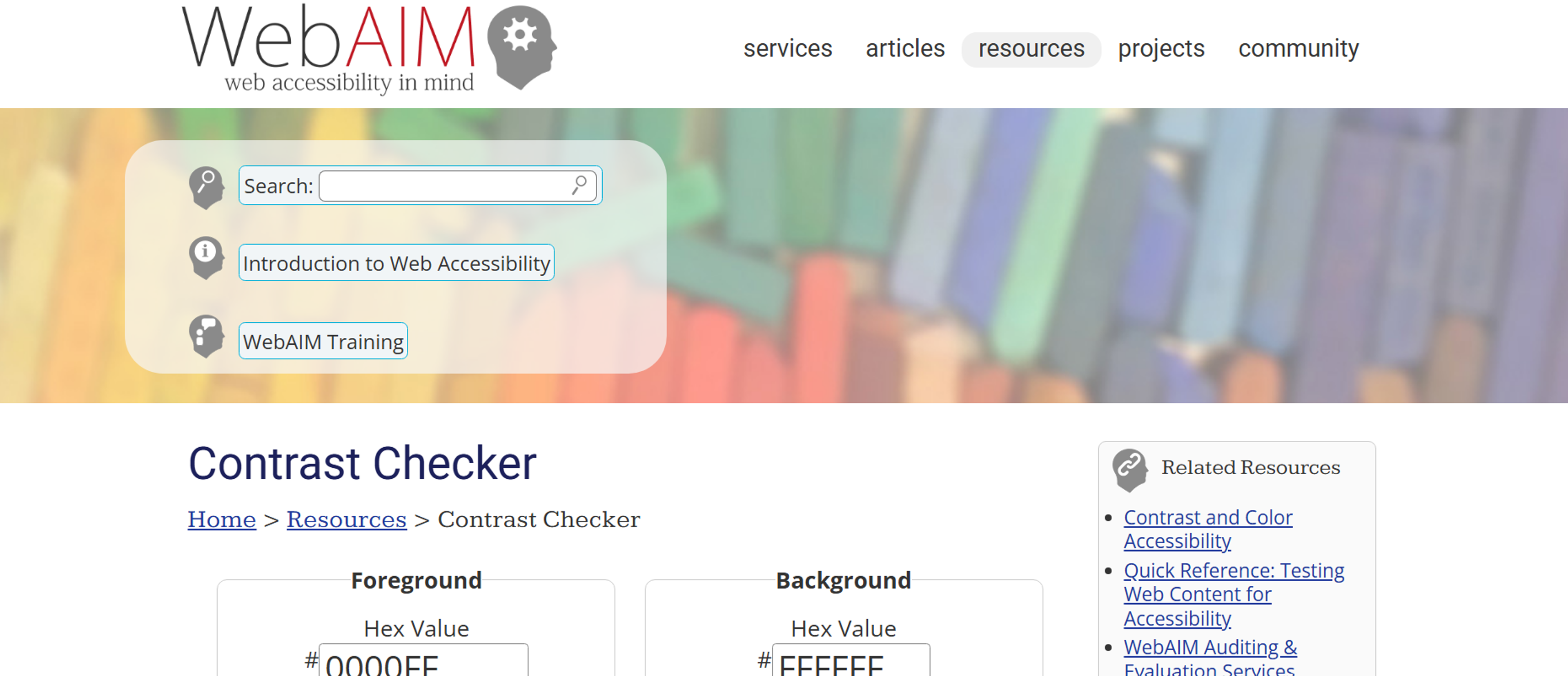
- Accessibility Checkers: WebAIM Contrast Checker ensure backgrounds maintain proper contrast and legibility for all users.
Source: webaim.org
These tools streamline the design process, ensuring your backgrounds are both beautiful and performance-optimized. They also make it easy to create engaging backgrounds for every blog post, helping your content stand out and become more visually appealing and shareable.
Read more
FAQ
What Is Considered the Best Background?
The "best" background depends on goals: Clean whites/neutrals enhance readability and focus. Textured/images add depth for portfolios or brands. Gradients/animations boost engagement sparingly.
Prioritize UX: Ensure text contrast, fast loading, and mobile responsiveness.
What Is the Most Attractive Color for a Website?
No single "most attractive" color exists. Blues convey trust (common in corporate), oranges excite (e-commerce), greens relax (eco-brands). Choose based on brand identity, audience psychology, and contrast with content. Test combinations for accessibility (WCAG).
Should Website Background Be White?
White backgrounds excel for readability, minimalism, and focus on content (e-commerce, blogs, SaaS). Alternatives (dark mode, colors, images) suit creative/entertainment sites. The key is to ensure sufficient text-background contrast (4.5:1 minimum).
How Big Should a Website Background Be?
Dimensions: Aim for ≥1920px wide to cover most desktops. File size: Compress to <500KB (ideally <200KB) for fast loading. Use responsive techniques: CSS background-size: cover or SVGs to adapt to screens.
What Is Based on the Background Information?
Design choices based on background include:
- Text color (light/dark for contrast)
- Overlay opacity (to improve readability on images)
- Content positioning (avoiding busy areas)
- Accent colors (pulled from background palette).
How Do I See the Background Code of a Website?
Right-click page → "Inspect" (Chrome/Edge) or "Inspect Element" (Firefox). In DevTools:
1.
CheckbodyorhtmlCSS forbackground-color,background-image.2.
Search "background" in the Styles panel.3.
View image URLs under "Sources" or "Network" tabs.
What Is the Best Format for a Website Background?
For photos/art: WebP (best balance of quality/size). Fallback: Compressed JPEG.
For patterns/gradients: SVG (scalable, tiny files).
For solid colors: CSS (no image needed). Always compress!
Is WebP Better than JPEG?
Yes, WebP typically outperforms JPEG:
- Smaller files (25-35% savings) → faster loading.
- Supports transparency (unlike baseline JPEG).
- Comparable/higher quality at same size.
Caveat: Check browser support (near-universal in 2024).
Conclusion
Mastering backgrounds in web design is about striking a delicate balance. The right background enhances readability, reinforces brand identity, and elevates user experience without overpowering the core content.
By understanding the different background types, adhering to accessibility standards, optimizing performance, and aligning visuals with your brand narrative, you create designs that are both visually stunning and functionally sound.
Remember: backgrounds aren’t just a decorative afterthought — they’re a powerful design element that, when used effectively, captivate users, communicate your message, and set your website apart.

About Clay
Clay is a UI/UX design & branding agency in San Francisco. We team up with startups and leading brands to create transformative digital experience. Clients: Facebook, Slack, Google, Amazon, Credit Karma, Zenefits, etc.
Learn moreAbout Clay
Clay is a UI/UX design & branding agency in San Francisco. We team up with startups and leading brands to create transformative digital experience. Clients: Facebook, Slack, Google, Amazon, Credit Karma, Zenefits, etc.
Learn more