
Mobile web design isn’t just about making a layout “shrink nicely.”
In 2026, users expect fast load times, stable layouts, and interfaces that feel effortless to tap, scroll, and complete tasks on - even on slower connections and smaller devices.
Great mobile design usually comes down to a handful of principles. Below are seven practical best practices to help you balance visual quality with real-world usability, along with examples to inspire you.
What Are the Best Practices for Mobile Web Design?
Strong mobile web design focuses on clarity, speed, and touch-first interactions. That usually means simplifying layout, using navigation patterns that are easy to discover, designing tap targets that feel comfortable, and keeping content consistent across mobile and desktop.
It also means treating performance and accessibility as design requirements, not “engineering polish.” A site can look beautiful and still feel broken if it shifts while loading, if buttons are hard to tap, or if key actions are buried behind clutter.
Is My Website Mobile Friendly?
A mobile-friendly site is easy to read and use without zooming. Text stays legible, spacing stays comfortable, and key actions (like “Buy,” “Book,” or “Contact”) are evident and easy to tap.
To assess your site, don’t rely on guesswork. Test your pages in real conditions:
- Run performance audits (e.g., PageSpeed Insights) and focus on speed, layout stability, and responsiveness.
- Use device emulation and, ideally, a couple of real phones to catch issues like sticky headers, broken modals, awkward keyboard behavior, or elements that fall outside the viewport.
- Review your Search Console reports to spot mobile usability issues and real-world performance trends.
A quick self-check: if someone can’t find the menu, can’t close a dialog, or can’t complete a form with one hand, the site isn’t mobile-friendly - even if it “looks responsive.”
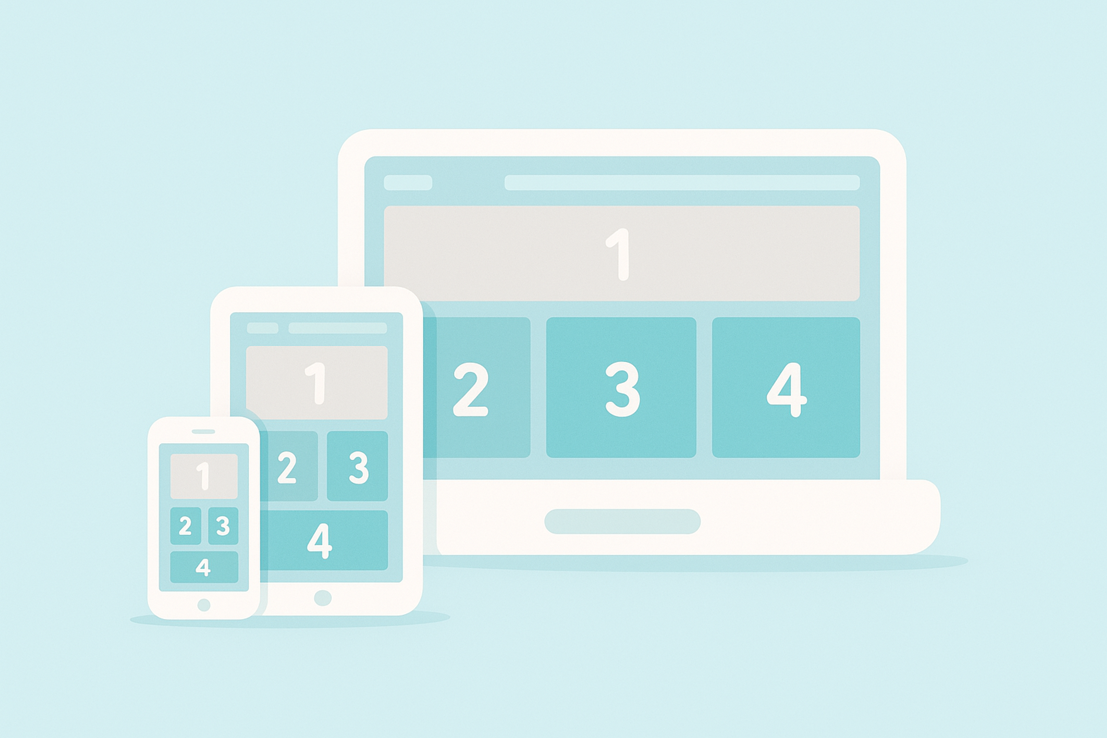
Responsive Design Example
Why Is Mobile Website Design Important?
- Search visibility starts with the mobile experience: Search engines evaluate your site through a mobile lens. If your mobile experience is slow, cluttered, or blocked by intrusive overlays, you’re not only losing users - you’re also making it harder for search systems to access and understand your content.
- Mobile traffic is the default behavior: For most industries, “mobile-first” is no longer a trend - it’s how people browse by default. If your mobile experience is weak, you’re turning away a large portion of your potential customers before they even reach your value proposition.
- Better mobile UX improves conversions: Mobile users are often goal-driven: check pricing, compare options, read reviews, book a time, or contact you. When the path is straightforward and fast, conversions improve. When it’s confusing, slow, or frustrating, bounce rates climb.
Explore 7 Best Mobile Web Design Practices
1. Keep It Simple
Mobile screens don’t forgive clutter. The best mobile interfaces feel obvious: one primary goal per screen, clear hierarchy, and fewer competing elements.
Aim for progressive disclosure. Show what users need now, and reveal secondary options only when they ask for them. This keeps attention on the main task and reduces decision fatigue.
Also, simplicity helps performance. Fewer heavy visuals, fewer complex components, and fewer third-party scripts typically mean faster pages that users immediately notice.
These are the main reasons why simplifying your website is a great design practice that will improve your website and give users a better experience. Many mobile app and web design agencies use this design practice frequently.
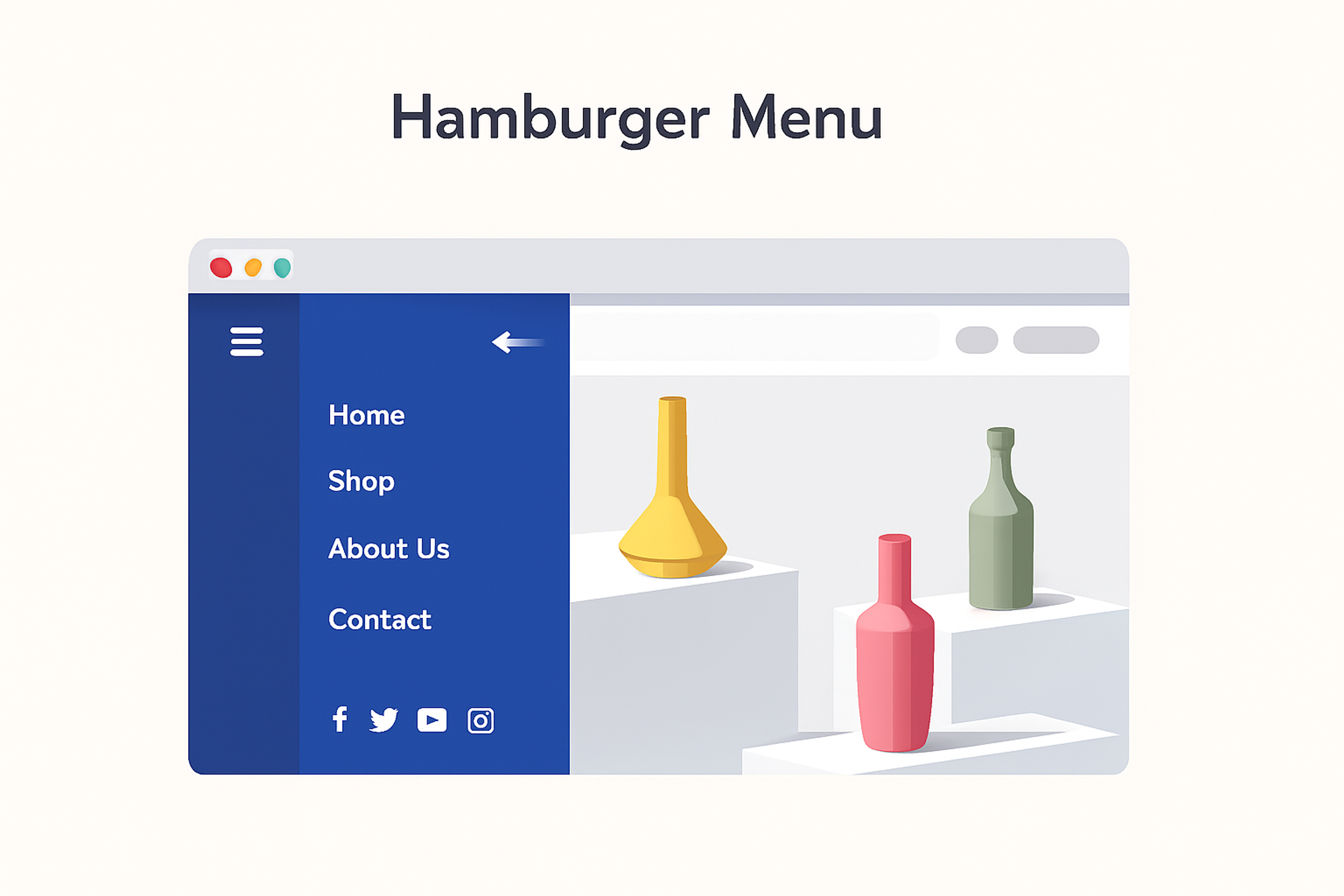
2. Use Hamburger Menus
Hamburger menus can work well for content-heavy sites, but they are not the only answer. In many cases, a hybrid approach performs better:
- A simple top navigation (logo + menu) for a broad structure
- A visible “primary” action (like “Get a quote” or “Book a call”)
- A bottom or sticky navigation for frequent actions on mobile (especially in ecommerce and apps)
The key idea is discoverability. If a navigation element hides the most important pages, users may never find them. If your site has many pages, consider adding search - it’s often the fastest navigation tool on mobile.
Hamburger Menu Example
3. Using Different Types Of Content
Images and video make content easier to scan and more emotionally engaging - but only when they don’t slow the experience down.
In 2026, the baseline is:
- Responsive images (so mobile doesn’t download desktop-sized assets)
- Modern formats, when possible (often significantly smaller)
- Thoughtful lazy-loading (great for below-the-fold photos, but not for critical “hero” content)
If your homepage hero image is the most significant element on the screen, treat it as performance-critical. Use an appropriate format, size it correctly, and load it early. For other images, lazy-load and compress aggressively.
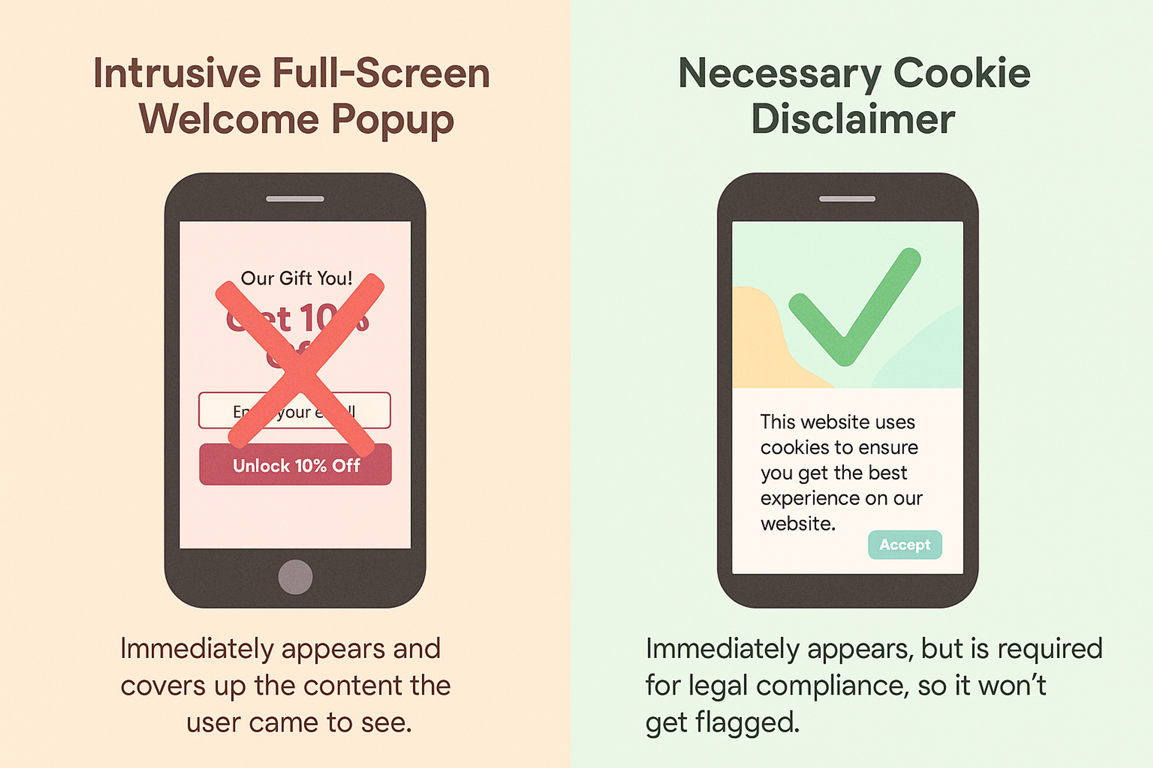
4. Disable Popups
Popups are especially painful on mobile: they cover content, are harder to close, and often interrupt people mid-task. When users arrive from a search, intrusive overlays can also delay content loading.
If you must show a message, prefer lightweight patterns:
- A small banner that doesn’t block reading
- A bottom sheet that’s easy to dismiss
- Inline content blocks inside the page flow
Cookie consent is a common reason popups still exist, but even consent can be designed in a way that doesn’t hijack the experience.
Example of Correct and Incorrect Popups
5. Make Important Elements Obvious and Tap-Friendly
Mobile users scan, then act. So your design needs to make “what matters” instantly visible:
- Clear visual hierarchy (headings, spacing, contrast)
- Buttons that look like buttons
- Links that don’t hide inside dense paragraphs
- Primary actions that stand out without screaming
Tap targets matter more than people think. If a user has to “aim” at a button, they will miss, get annoyed, and abandon. Make your interactive elements comfortably sized, with enough spacing to avoid mis-taps - especially in navigation, forms, and checkout flows.
Source: laetro

6. Place Controls Where Thumbs Reach
Most people use phones one-handed. That means the most important actions should be reachable without awkward stretching.
A practical approach:
- Keep primary actions near the lower half of the screen when possible
- Use sticky CTAs (but don’t let them cover content)
- Design for modern phone layouts (rounded corners, notches, dynamic browser UI)
Also, watch out for mobile browser toolbars that expand and collapse while scrolling - this can cause “jumping” layouts if you rely on older viewport sizing assumptions. Modern CSS viewport units and safe-area padding help keep layouts stable.
7. Make Contact and Next Steps One Tap Away
If someone is ready to contact you on mobile, your job is to remove friction:
- Phone numbers should be tappable
- The email should open instantly
- The address should open maps or directions
- Forms should support autofill and mobile-friendly keyboards
You can also reduce friction by adding small conveniences: “copy email,” “tap to copy address,” and short forms with clear validation messages. The goal is simple: when intent is high, the UI should get out of the way.
Mobile Website Design Examples
Looking for inspiration to create a sleek, user-friendly mobile website? Check out these standout mobile website design examples that combine functionality with great visuals.
Creating a mobile-friendly site is essential to enhance user experience, particularly for those accessing websites via smartphones.
Responsive web design examples are crucial for understanding how to create websites that offer optimal user experiences across different devices.
Grayscale
Let’s take one of the case studies we covered in class: Grayscale. The redesign focuses on a sleek, user-centric design that beautifully integrates the traditional finance lens with the modern world of crypto.
Some key highlights are clear layouts, clever graphics, and flexible device designs. A well-designed desktop site is crucial in maintaining consistency across devices, ensuring that key features and design themes are uniform. It is essential that both the desktop version and the mobile version of a website offer equivalent content and functionality to improve user experience and meet Google's guidelines.
With reusable and adaptable components, businesses can maintain a certain level of uniformity and designation while easing management tasks and adapting to new market changes.
This approach improves user engagement. Additionally, all desktop features are mobile-friendly and easily accessible, ensuring an efficient user experience across all devices.
Our expertise in the crypto space extends beyond Grayscale. At Clay, we specialize in crafting user-friendly, visually striking websites for crypto businesses, ensuring they stand out in a competitive market while providing seamless experiences for users across all platforms.
Grayscale website design by Clay
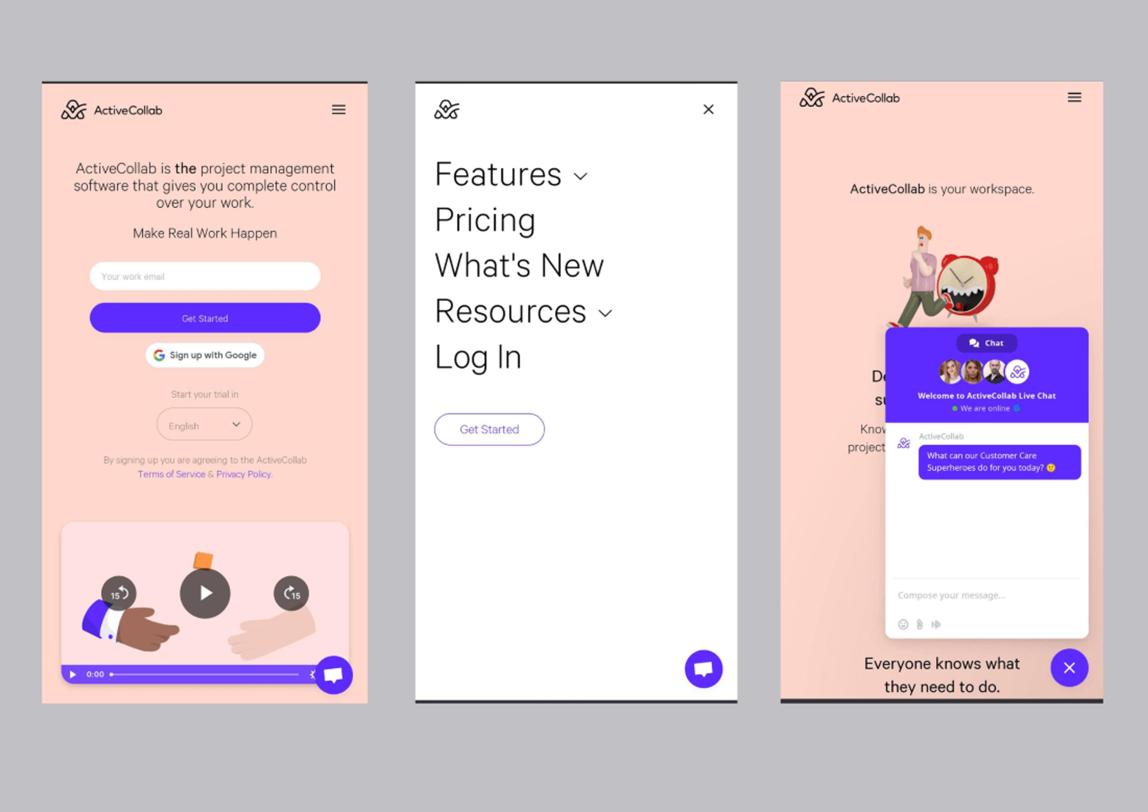
ActiveCollab
One of the best project management software, ActiveCollab, has updated its website and application interface to capture the essence of its latest features and urbanized branding. This focus on usability is a given in modern web design, and user experience has greatly benefited from it, making it a prime example for mobile web design.
Considering browser size is crucial in responsive design, as it ensures that web elements rearrange, resize, or simplify to accommodate different screen dimensions, enhancing user experience.
Responsive web design is essential for adjusting to various screen widths and orientations, ensuring a consistent user experience across all platforms by using CSS and media queries to control the design based on the screen width.
The website’s choice of colors is welcoming and soothing. The background is light orange. It looks good and feels warm and welcoming. At the same time, the purple web elements grab the user’s attention, which is a plus for usability. The combination provides a simple and elegant user interface that captures the user’s attention without excess complexities.
Source: optimizepress
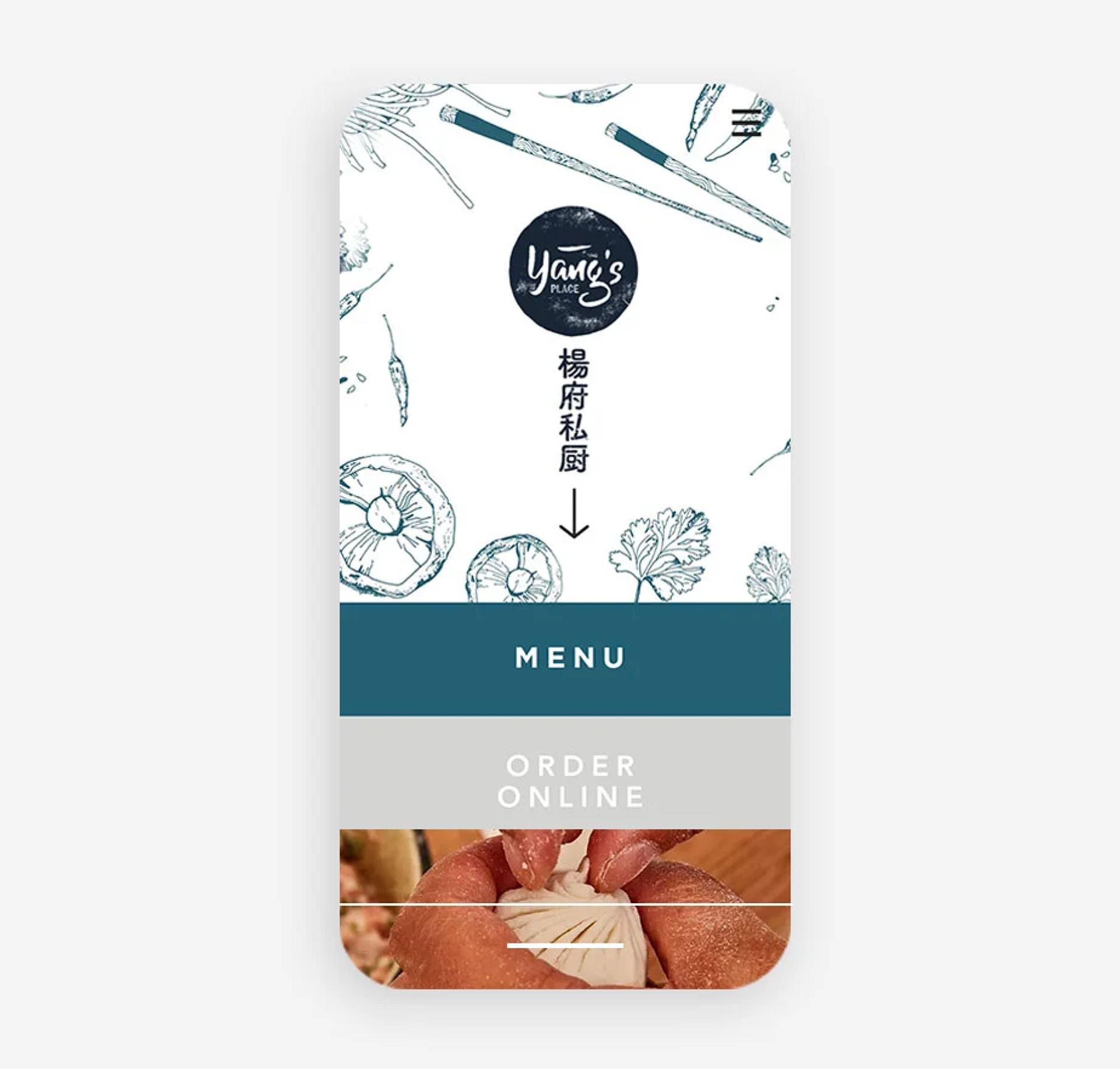
Yang’s Place
When checking the site of Yang's Place, the Chinese restaurant, I found it very appealing and aesthetically pleasing. All functions are easy to use, and the logo on the URL side of the site serves two purposes: it helps with the brand and is also a button that can be clicked to return to the homepage. This function is essential for mobile users and helps greatly enhance the UX.
When mobile screens are a primary focus in creating a site, challenges like the nav structure of the site and the amount of pop-up ads. Users on mobile devices expect a site to have a guided structure, so limiting features that can be complicated on a smaller screen is essential.
For mobile users, a homepage configured to eliminate barriers to intuitive navigation enhances the UX.
Source: wix
FAQ
What Is The Difference Between Responsive And Dynamic Websites?
Responsive websites adjust layout across devices, while dynamic websites deliver content that changes based on user interaction or data.
What Does Dynamic And Responsive Mean?
Dynamic means content updates in real time; responsive means the design adapts to different screen sizes.
What Does It Mean If A Website Is Responsive?
A responsive website automatically resizes and rearranges content for desktops, tablets, and smartphones.
What Is The Main Advantage Of A Dynamic Website?
Dynamic websites personalize content, making them more interactive and relevant to each user.
What Is The Difference Between Responsive Web Design And Web Design?
Web design is the overall process of creating a site, while responsive design specifically ensures it works on all devices.
Read more
Conclusion
Effective mobile web design in 2026 is a blend of usability, performance, and touch-first ergonomics. Keep layouts simple, make navigation discoverable, ship media efficiently, avoid intrusive overlays, and design tap targets that feel effortless.
If you get those fundamentals right, your site won’t just “work on mobile.” It will feel fast, precise, and modern - and that’s what drives engagement, trust, and conversions.

About Clay
Clay is a UI/UX design & branding agency in San Francisco. We team up with startups and leading brands to create transformative digital experience. Clients: Facebook, Slack, Google, Amazon, Credit Karma, Zenefits, etc.
Learn moreAbout Clay
Clay is a UI/UX design & branding agency in San Francisco. We team up with startups and leading brands to create transformative digital experience. Clients: Facebook, Slack, Google, Amazon, Credit Karma, Zenefits, etc.
Learn more