As we find ourselves in a technological society, it is easy to acknowledge that web design is an essential determinant of the success of a website. Besides pulling in targeted traffic, a properly built site guarantees visitors enjoy browsing it and actively participate in any interactive features.
Regrettably, most websites do not perform as anticipated due to some common web design mistakes, and many may need help understanding the extent of the damage.
Mistakes such as these can result in decreased user engagement, lower traffic coming to the site, and insipid sales conversion levels. It is essential to be aware of these patterns so that efforts are taken to improve web performance and, therefore, the business’s objective is met.
Common website design mistakes, such as poor color choice, lack of accessibility, and failure to ensure cross-browser compatibility, can significantly impact user experience and site credibility. Poor error handling design can also directly influence how users perceive your brand.
Binoculars
This article aims to highlight the ten website design mistakes that should be avoided if you are to increase the productivity of the website and how to prevent them.
What Is Web Design?
Web design is the art and science of creating websites that are both visually appealing and functional. It involves a blend of technical skills, such as coding and programming, and creative skills, such as graphic design and content creation.
Web designers work to craft layouts, choose color schemes, and design visual elements that enhance the user experience. A well-designed website not only looks good but also ensures that visitors can easily navigate and interact with the site, making it a crucial aspect of any online presence.
Why Is Web Design Important for User Experience (UX) and Conversion Rates?
Web design plays a pivotal role in shaping the user experience (UX) of a website. A thoughtfully designed website can captivate visitors, encourage them to explore further, and ultimately convert them into loyal customers.
Conversely, a poorly designed website can lead to a frustrating user experience, causing visitors to abandon the site and potentially tarnishing the business’s reputation.
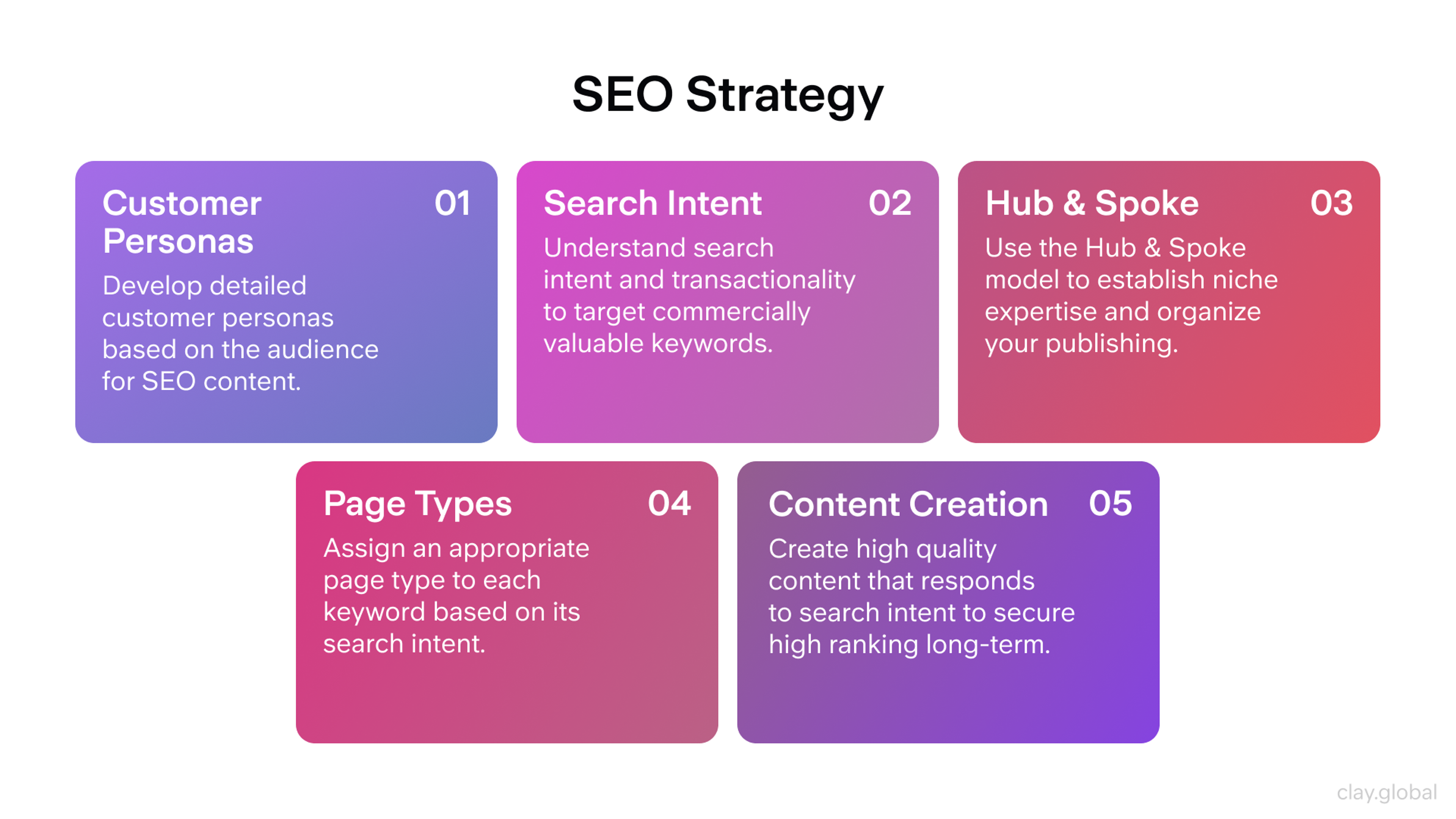
SEO Strategy by Clay
Moreover, web design is integral to search engine optimization (SEO). Search engines evaluate the user experience and accessibility of a website when determining its ranking.
Therefore, investing in good web design not only improves web performance but also boosts your site’s visibility on search engines, driving more organic traffic and improving conversion rates. This contributes to web performance on multiple levels, from technical structure to user satisfaction.
Ignoring Custom 404 Pages
Typically, when users get a 404 page on a website, it is frustrating and hinders their navigation, making them more likely to leave. Customizing the 404 page helps alleviate this situation by emphasizing more on users and their branding.
Where error handling design splash pages have become increasingly unhelpful, suggest to the user that some helpful content and additional navigation are provided instead of showing standard error splash pages.
Importance of Custom 404 Pages
In any case, if a site is down, rather than allowing the user to become frustrated, it is advisable that they use custom 404 pages.
Including links that will direct users to the possibilities of linking content on your page will assist in making people stay on your page more.
Creating a 404 page has several benefits, including decreased bounce rate, improved user-friendliness, and better user experience.
404 Error Example
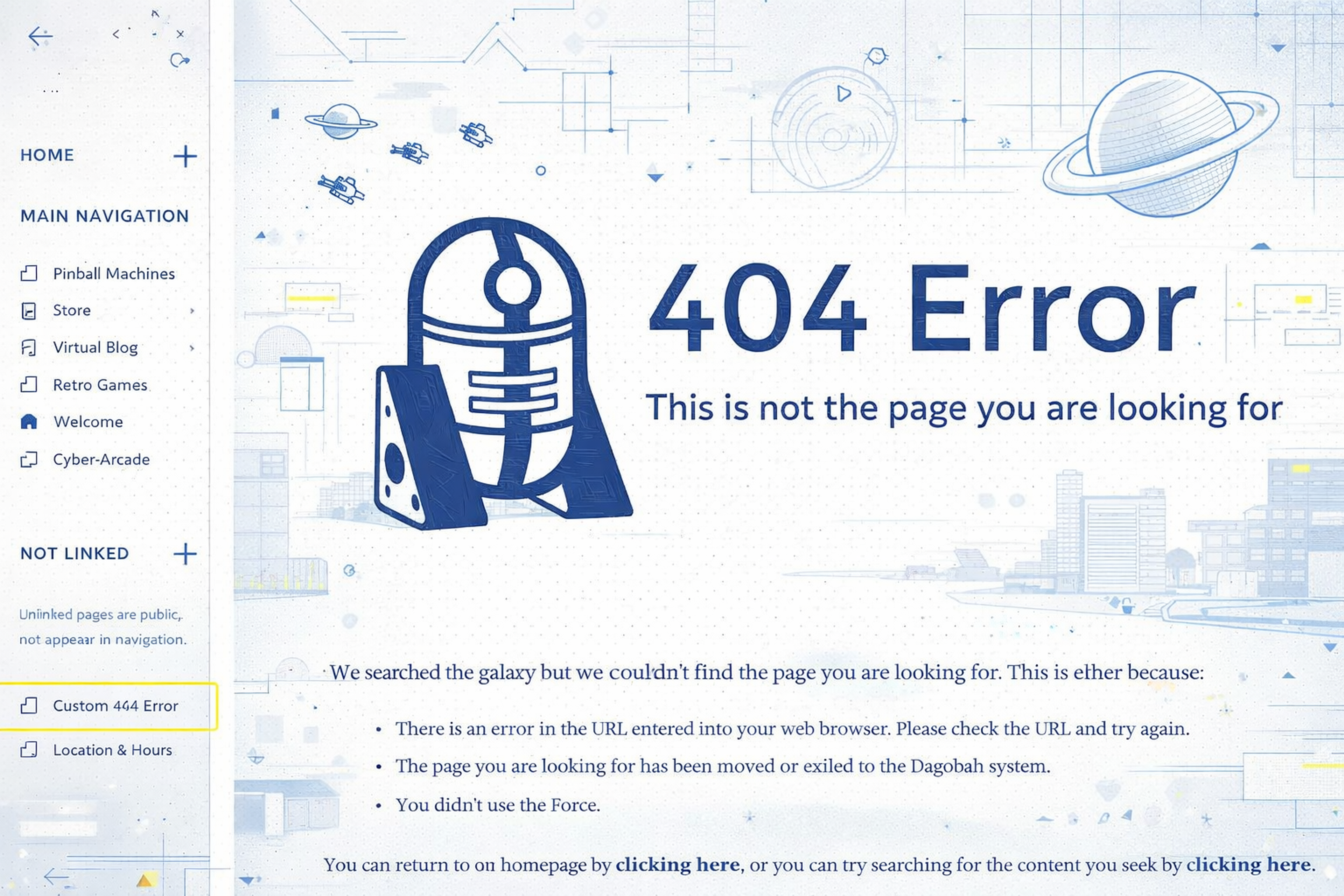
Elements of an Effective Custom 404 Page
Clear Message: It is customary to display a message informing the user that it is impossible to locate the excepted page in every situation. Use simple language and avoid technical vocabulary.
Navigation Links: Some issues arise when the site user needs navigational links. These can be home pages, popular site sections, or site maps where users are likely to find what they are looking for.
Search Bar: The search box is one element on a custom 404 page that helps users regain their focus on the information they were searching for.
Humor or Brand Personality: Establish particular aspects of your brand or add an element of fun to ease the annoyance of the experience.
Contact Information: Provide an option for the user to log a complaint regarding the matter or state how one can reach you. This demonstrates how much of a user's needs you will fulfill.
Knowing that a 404 error page is an unavoidable practicality and preparing for it with proper, cleverly designed custom 404 pages can be an opportunity to enhance positivity instead of frustration and optimize web performance through thoughtful, user-friendly error handling design. Poor 404 experiences often impact web performance indirectly through increased bounce rates and reduced engagement.
Not Prioritizing Grid and Columns for a Responsive Website
Refrain from discarding the importance of grid and column orientation while web designing is bound to create never-ending confusion for the user on the website. When designing a web page, it is easier to implement a grid system instead of just putting two or three buttons together.
This makes the page look organized. Implementing such grids and columns harmoniously in web content facilitates ease of reading and allows the reader's attention to not shift around.
CSS Grid Layout
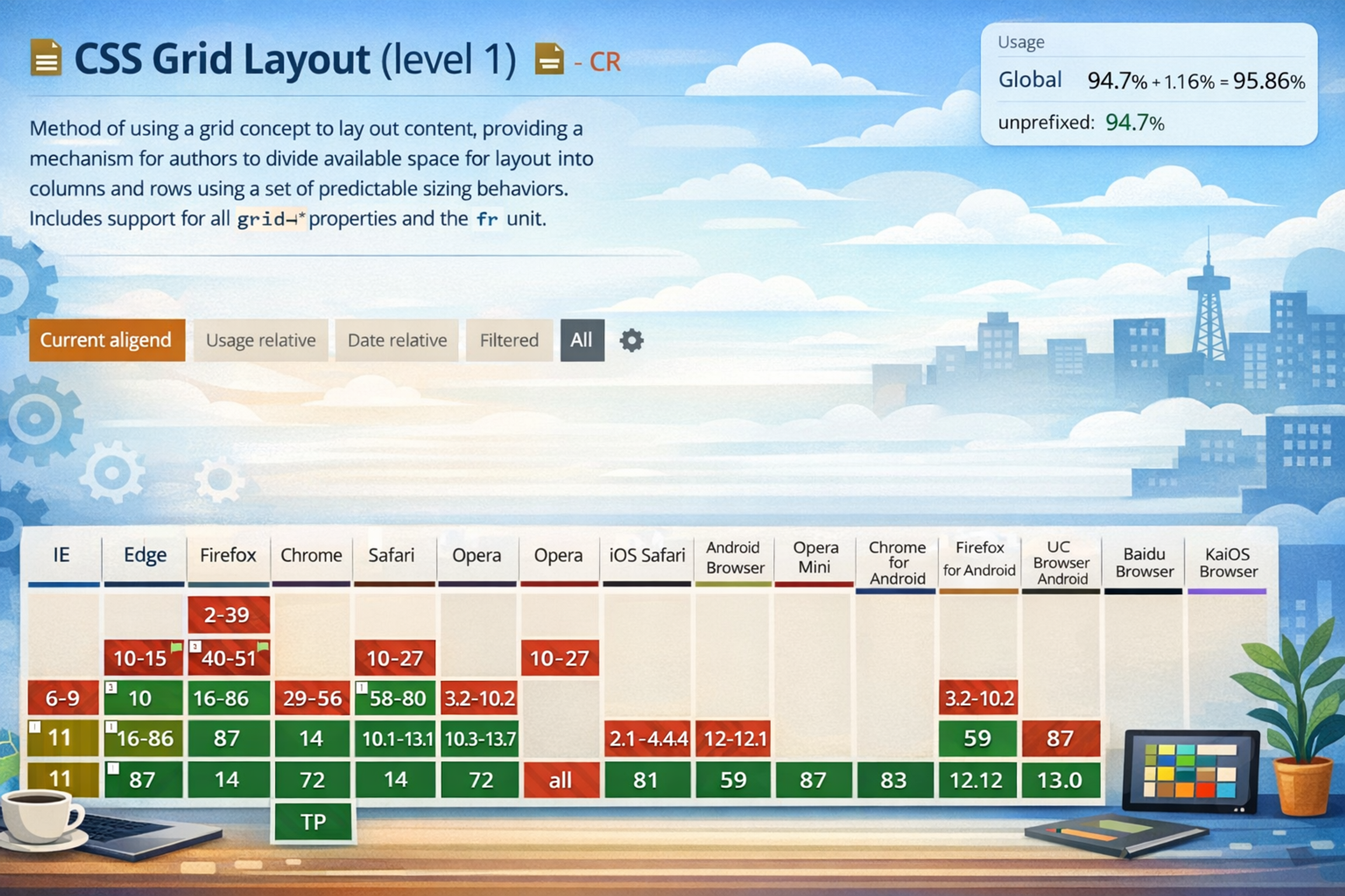
The Benefits of Using Grid Systems
A grid system reduces this problem by offering a structure to which elements can be attached systematically. Such uniformity enhances the beauty and even usefulness of the site as information flows logically.
When designing a grid layout, it is possible to make perfect divisions that will cater to different devices when well applied; hence, responsive design becomes easy.
Common Mistakes to Avoid
One good example is filling your grid with too many elements so that the users need to know which to ignore and which ones to take, failing to emphasize some essential items in the grid.
Another is paying too much attention to alignment and proportion while neglecting the visual organization of the grid. Typesetting cannot be achieved if there is too much white space and the text settings in different site areas are inconsistent.
Incorporating user research can help avoid these mistakes by understanding user needs and preferences.
Tips for Effective Grid Layouts
Use an Appropriate Framework: Different frameworks, such as Bootstrap or CSS Grid, offer both flexibility and structure. Choose one depending on your site's requirements.
Highlight Critical Content: To catch the user's attention, ensure that less important content is placed in more dominant grid positions.
Reduce the grid size that works excellently and expand for big screens – ensure your grid design has no fixed unit sizes. Utilize CSS's media queries for those who aren't aware of the presence of such.
So, ignoring grid and column layouts allows you to enhance your website's information hierarchy, which makes it more usable and effective in communicating its objectives.
Cluttered and Complex Webpage
A chaotic web design can cause problems for site visitors, who may need access to the data they seek. If the website has fewer components that grab the users' attention, this interrupts their concentration and diminishes their satisfaction, which could make them leave.
Cluttered and Complex Webpage
How Visual Chaos Affects User Experience
Visual chaos happens when a website has too many things, such as images, text blocks, buttons, and ads for the website visitor. This can cause cognitive overload, whereby the brain cannot help the user absorb information organizationally.
A site with too many scenarios can be complicated to understand, leading a site visitor to irritation and, thus, high bounce rates. On top of this, complicated structures can overshadow the core messages and actions on the site, harming the site’s effectiveness in fulfilling the business intentions.
Advocating for Clean, Intuitive Designs
To minimize the adverse effects of leucoplastic treatments, it is essential to induce and promote clear, usable interfaces reproducibly for website visitors. To do this effectively, here are some best practices:
Simplicity: Integrating a minimalist design into the interface enhances the user experience. Unnecessary items should be cut down, and only those that help achieve a specific site mission should remain.
Design Elements Consistency: Ensure all design elements, such as buttons, fonts, and colors, remain the same in each site part. As a result, users naturally grasp the logic underpinning the layout and the functions available.
User-Centered Design: Respond to the user’s needs and preferences. Conduct usability tests to determine whether the design can help users achieve their goals.
Users can efficiently perform tasks since the website’s design focuses on the most critical aspects. This strategy improves user experience and overall satisfaction, increasing user retention and conversions.
Slow Loading Times
A fast loading time is beneficial as it is pleasant, and the effective functioning of the pages of your website must complement this. Most visitors usually wait impatiently for a few seconds for a web page to load.
If it takes longer, people will likely bounce off and not be pleased with the site. There are various causes that one could complain of delays in the loading times:
Additionally, website accessibility is crucial in modern web design to ensure that users with various disabilities have an easy and intuitive experience.
Slow Loading Times
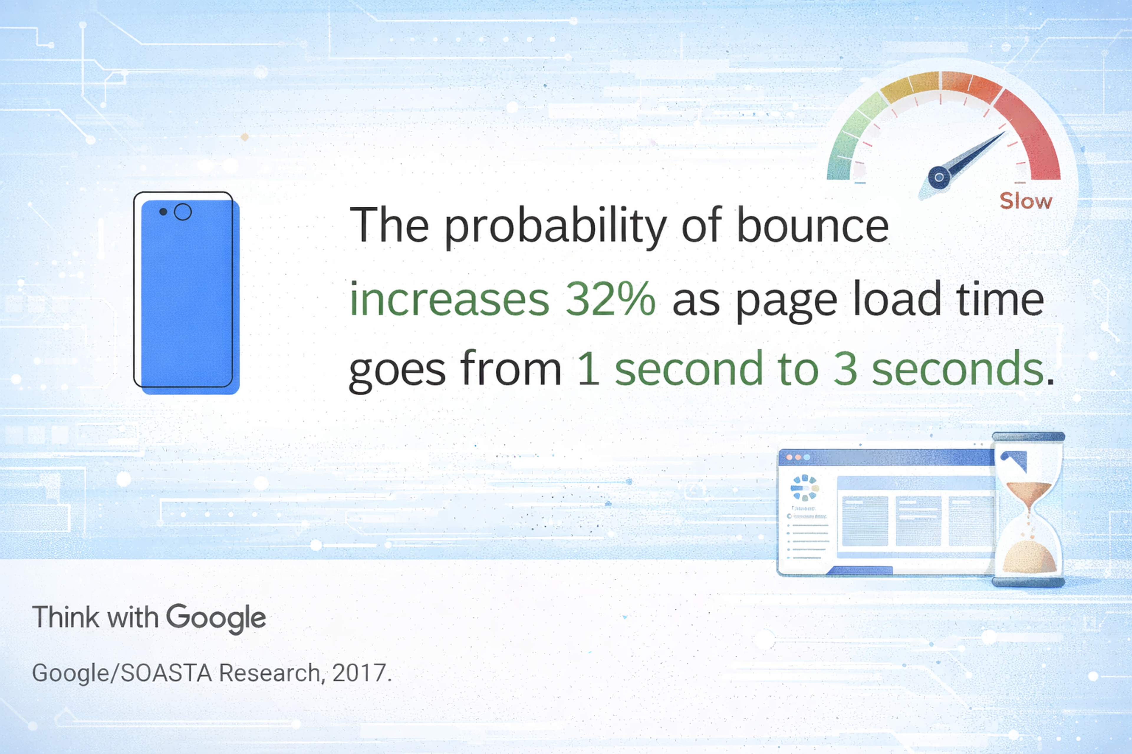
Factors Contributing to Slow Sites
- Unnecessary HTTP Requests: Every element on a webpage, which can be images, scripts, or CSS, will require a separate HTTP request. Excessive traffic due to excess HTTP requests leads to tedious and time-consuming loading.
- Heavy JavaScript and CSS Files: Non-minimized and bulk JavaScript and CSS files tend to increase the rendering time to load the pages. Minimizing these files makes the load time quicker.
- Third-Party Scripts: External scripts, such as those for ads, analytics, or social media, can create additional latency as they add loads to the pages.
- Poor Code Structure: Unsuitable and unstructured code may delay webpage loading and prolong the server's response time.
Tips for better site speed
- Reduce HTTP Requests: Minimize the number of HTTP requests by combining stylesheets and scripts and using CSS sprites for images.
- Minify CSS, Javascript, and HTML: Minimize files, including codes, using tools such as UglifyJS, particularly for Java, and CSSNano for CSS.
- Assessing External Scripts: Conduct periodic re-evaluations of why external scripts are included on the site. Remove or push the loading of unnecessary script surgery to enhance initial page loads.
- Clean and Efficient Code: Refactor your code effectively and cut back so that there are no redundant processes or loading of resources.
These points can be worked on, and the following recommendations can be followed to improve website loading times and rendering, bettering user experience and overall performance.
Lack of Clear Call-to-Action (CTA)
The absence of a clear call-to-action (CTA) can be very confusing and cause the number of conversions to drop. CTAs remain fundamental in the user pathways toward completion of goals such as subscription, purchase, or download. If no convincing CTAs exist, the visitors might remain confused as to what course of action they need to undertake next and, therefore, will have lost the opportunity once more.
Here is an example of a good CTA:
Source: typeform
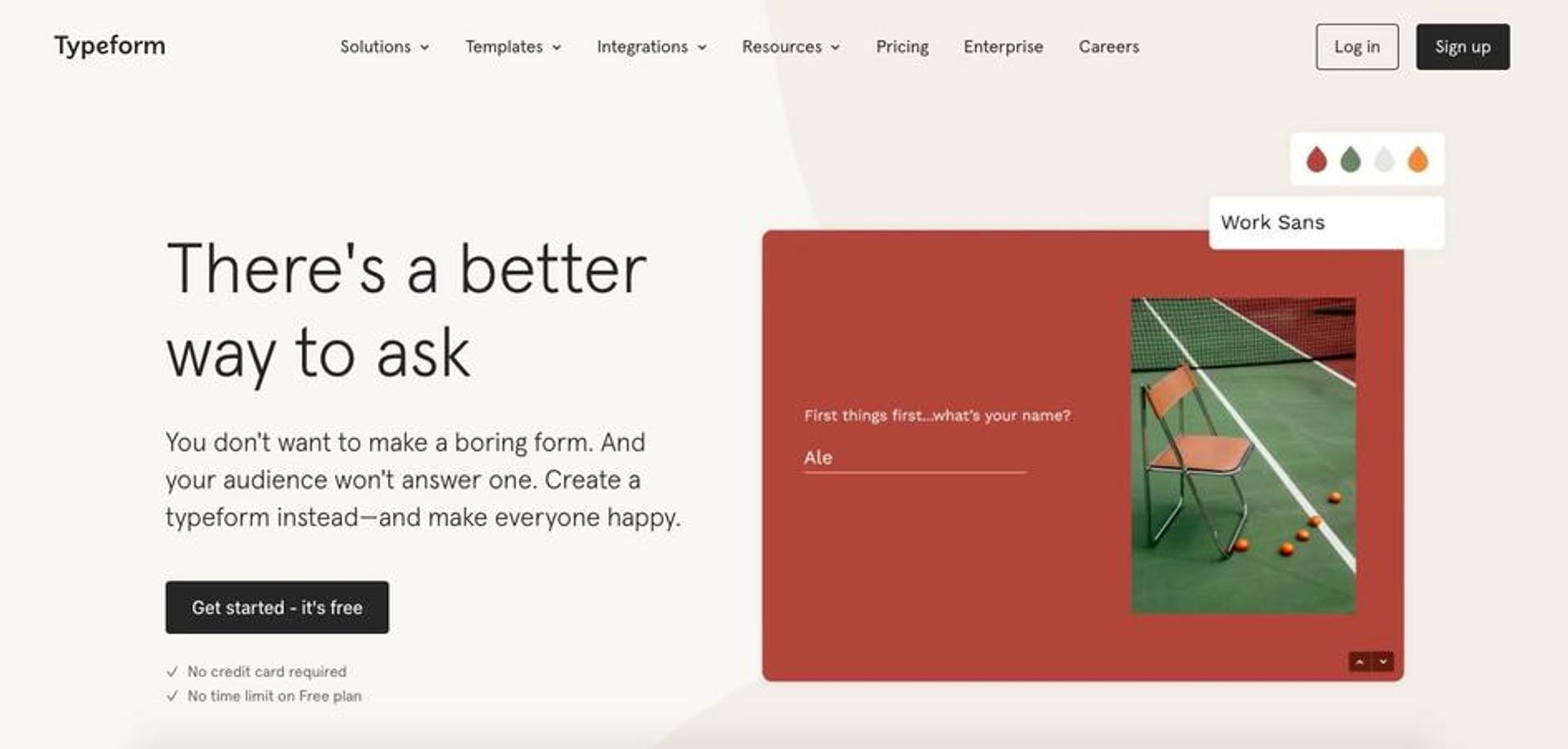
Importance of Guiding Website Visitors
CTAs give users guidance on what to do next while navigating your website. Using good CTAs can lead to better outcomes for users as they eliminate confusion and improve their decision-making ability. This type of guidance reduces bounce rates and aids in enhancing the aim of your website – making more sales or increasing the number of subscribers.
Examples of Effective CTAs
Enroll Now: This short and simplistic call to action warrants action. One can go further by creating a time pressure such as "Enroll Now and Get 20% Discount".
Find Out More: This is even more applicable to those in the research stage of figuring out what to buy and introduces a call to action for them to continue looking into what content or products/ services you have.
Get Started: Best suited for first-time use by new users, this CTA is appealing, evoking action and indicating that there is more to come in a good way.
Download Free Guide: Providing some benefits motivates clients to take action. This CTA clearly states the user's benefit.
Buy Now: This CTA is short, sweet, "clean," and straight to the point. It can be used on any e-commerce site to increase sales instantly.
Clear, visible, and logically clear, appropriate CTAs can lead the user to actions that correspond with the website's objectives. Perfect CTAs are essential for the system's success and conversion rate.
Poor Navigation Structure
Slow, illogical, or purely ugly navigation structures can seriously upset users and help them search for an emergency exit. The higher the number of ineffective menus and links, the more escalating navigational frustration leads to higher bounces.
Users struggle with how to use your website, and their engagement levels drop. Hence, it is essential to have an efficient and effective structure for web navigation so that users can quickly move around the site.
Navigation Structure
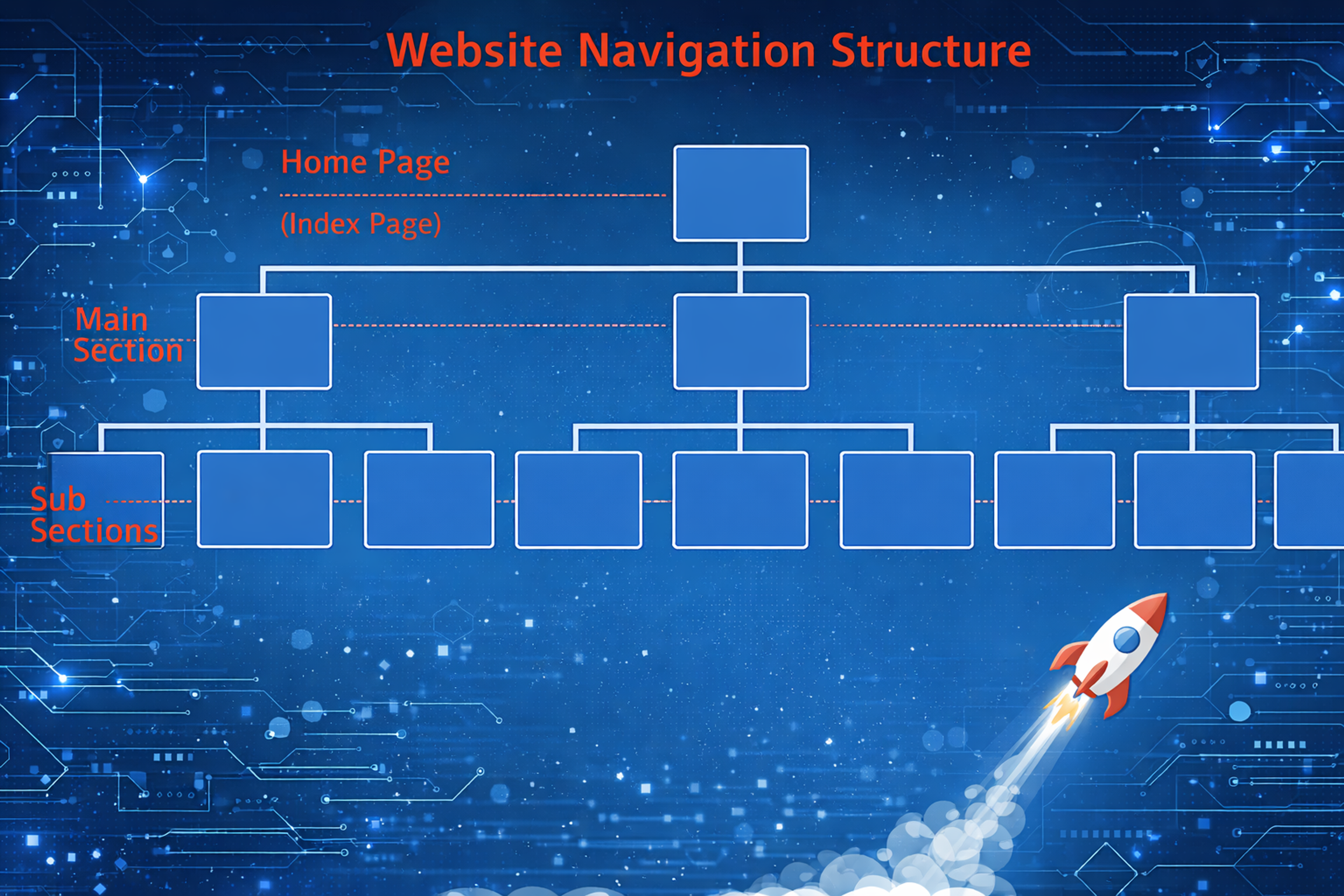
Impact of Confusing Menus
Cluttered, complicated, or deficient in logical structure menus can deter users from staying longer at your site. Without information to guide consumers, they can take the exit route and look for other websites that can serve their purpose. This not only dampens the users' satisfaction levels but also your site's overall productivity and trustworthiness.
How to Make Site Easier to Navigate
- Delete Unused Menu Options: Do not clutter the menu with unnecessary items. There should be no more than one or two categories within which users will look for the necessary features before giving up.
- Make Appropriate Labels: Even within the menu items, use precise language that will help users understand what the items do. It is discouraged to use complex terminologies.
- Add Search Feature: A search function is therapeutic to users since it allows them to look up information more directly without searching through web pages, especially on detailed websites.
- Breadcrumbs: Use breadcrumbs to provide context about users' positions in the site structure, helping them retrace their steps or look at alternative information.
Altering the navigational hierarchy improves the site's usability, making it easier for users to complete tasks, keeping them on the website for longer, and improving its performance.
Inconsistent Design Across Pages
Discrepancies in design across different pages of a website can hurt the credibility of the website and its brand image. Scrolling through pages of a website with different styles, colors, and structuring can be very frustrating for users, and they might abandon the site before achieving their goal.
The importance of stickiness in design cannot be overstated when it comes to creating solid branding and providing a stable and trustworthy professional image to the audience.
Page Design
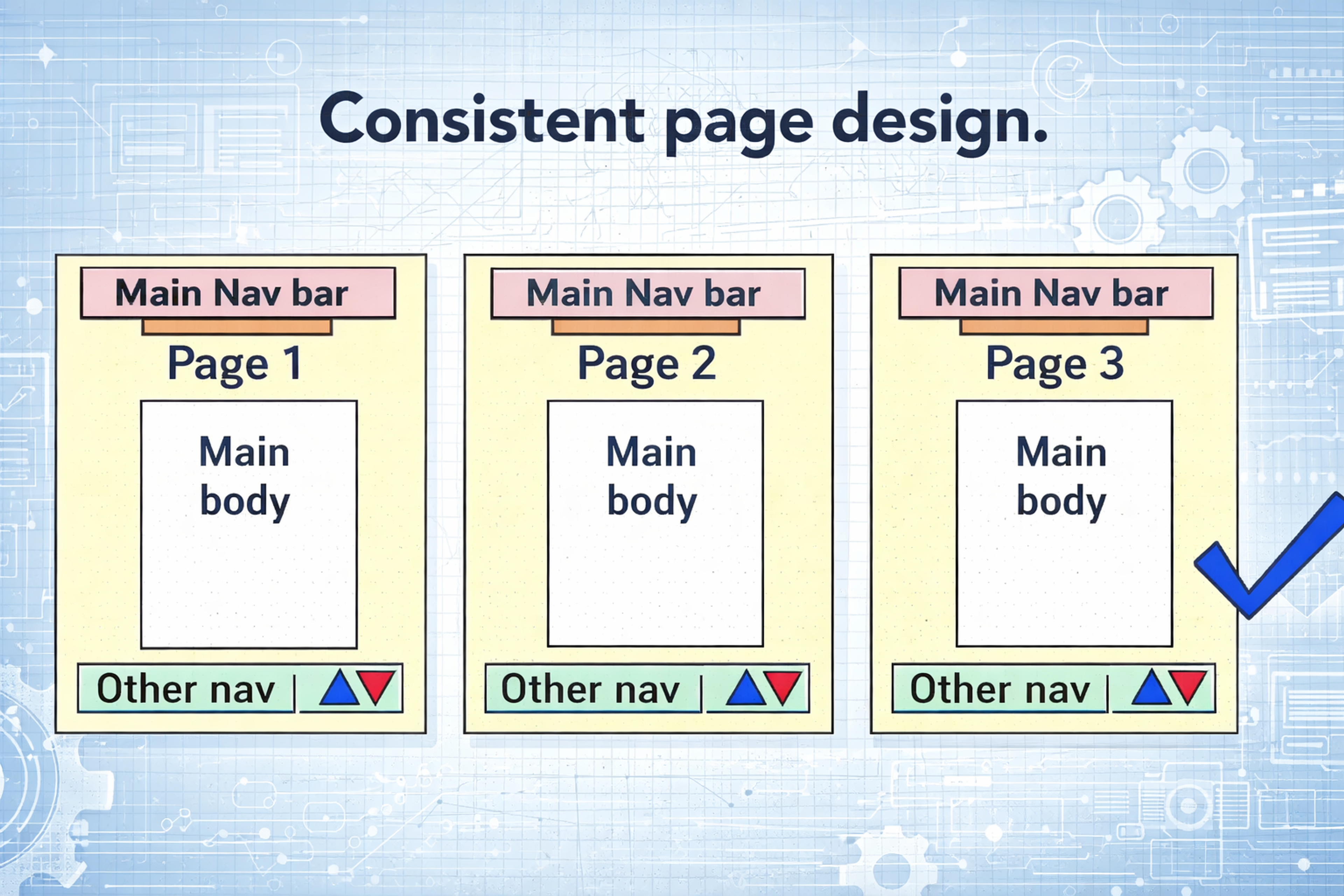
How Inconsistency Affects Brand Perception
A consistent design language aids the audience's recall of the brand. A specific framework should be adhered to when designing every page of the same website. This draws a supportive audience that uses every service the website offers.
Conversely, attention-diverting design issues create an impression of half-heated work from the web designer. When this situation arises, users are likely to doubt the type and standard of goods and services you have to offer, which impacts the site's credibility and the users' trust.
Advocating for a Cohesive Design Language
Establish Design Guidelines: Formulate a well-structured style guide on how the brand should look, which includes the brand's colors, fonts, button styles, and other design features. This document ensures that everyone involved in the project works under the same conditions.
Keep the Same Structure: Create a standard layout for different types of pages (such as homepages, product pages, blog post pages, etc.). This will make it easier for users to use the UI structure in a more user-friendly manner.
Similar Pictures: Pick pictures of the same standard and identical in context. Ensure that the current and future output will be in line with the brand's overall message.
This helps establish unity in the overall design language, which improves the user experience, reinforces the brand perception, and instills trust in the website's overall quality.
Not Adhering to a Website Security-first Approach
Website owners must prioritize safety precautions on their websites to avoid very harmful effects on their organization and its users. There are risks in using the internet, as threats of any type keep cropping up.
Website Security

Neglecting necessary measures when using the internet may lead a person to steal sensitive information, gain customers’ trust, and suffer huge losses or legal problems. As a website owner, it is essential to implement a thorough risk assessment for the issues with the advanced security features imposed on your website.
Consequences of Poor Website Security
This is especially dangerous since there is a poor security policy to safeguard the website and its contents. Theft of data breaches can include such critical information as individual identifiers, addresses, credit card information, personal usernames, and other logins.
This, in turn, will put you in litigation challenges and health effects at high costs. On that note, hijacked websites can promote viruses, malware, and other Software and smear one's good name to the users.
Embracing a Security-first Approach
Firm password policy
Require users and admins to have advanced password policies. Promote strong passwords and their changes to reduce the chances of intrusions.
Updating Software Regularly
Update your website's CMS, plugins, and other software components frequently. This helps reduce security risks and the incidence of new vulnerabilities.
Firewalls and Security Plugins
Use Web Application Firewalls (WAF) and Security Plugins to make the risks of other attacks like SQL injection and cross-site scripting (XSS) less likely to happen.
Source: hostinger
Backups
Store updated copies of your website data frequently so that if the information is compromised, you will still suffer less damage from the attack. When there is a disaster, backup ensures you can reconstruct activities as before.
User Education
Ensure your staff and users understand every security aspect relevant to the application. Educate and train staff to avert incidents like phishing or social engineering attacks.
Threat monitoring and management
Observe your websites for dubious behavior and react to any possible threats within a very short time. Designed Intrusion Detection and Invasion Prevention systems to help monitor and respond to various attacks directed at the institution.
Focusing on security and ensuring that it is an integral part of your website maintenance helps mitigate IT risks that your business and users face in the days of increasing cyber threats.
Using Outdated Design Trends
Adding old design tendencies can be very detrimental to the professionalism and relevance of your website. While all audience visitors appreciate a good-looking website, a common point of concern is the lack of internet website professionalism. That is why such visitors may never return to do business with you, which is a shame, for we are in an environment where content and services matter.
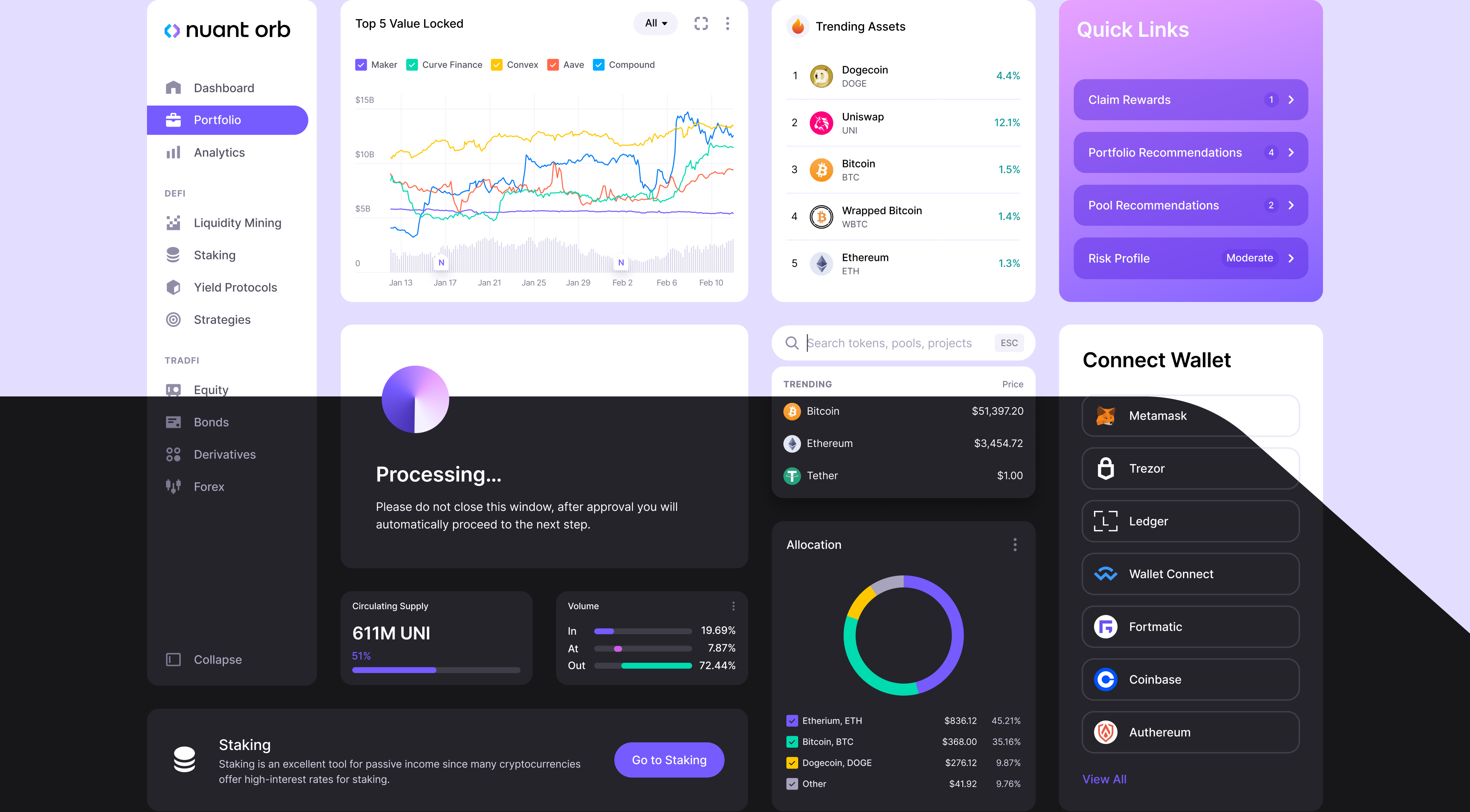
The example of Nuant emphasizes the importance of modern and holistic design for fintech platforms. We developed a visually appealing and user-friendly system for Nuant, including light and dark modes, customized iconography and optimized data visualizations.
This approach keeps the platform professional, attractive and accessible. On the other hand, adding outdated design elements would negatively impact the perception of the platform's professionalism and user trust, which could lead to a loss of returning customers - a critical factor in today's competitive digital environment.
The Pitfalls of Old Designs
Sites based on obsolete design features such as large gradients, moving graphics, and seismic details appear shabby. These deter users and make your site less pleasing to the eye. Older design schemes often are inconsistent with modern-day preferences centered around minimalistic, fast-loading, easy-to-use sites.
Staying Current Without Chasing Trends
Of course, it is essential to recommend individuals with current design styles in modern web design, but going after everything in vogue could be better. Instead, use principles of design that stress function timeline aesthetics.
Given how best practices change, changing one's site is desirable since its looks are modern but bold and practical. This will ensure no boredom and relevance to the site's design while retaining some professionalism from the industry.
Ignoring Accessibility
Designing without considering the accessibility factors can shut out many users, which only leads to a poor experience on the web and, in some instances, legal implications.
The term accessibility means that a given website can be accessed and operated by people of all genders and all restrictions of any nature to allow better engagement with that content.
With a focus on financially accessible design, designers can improve usability across all user types and improve the internet's image.
Understanding Inclusion or Inclusive Design
Although an accessible website is an ethical design consideration and involves specific laws, it is also a practical reason. There are various classes of users with disabilities that are a large sector of society, and their needs should not be ignored as it will limit exposure and scope.
Accessibility Elements by Clay
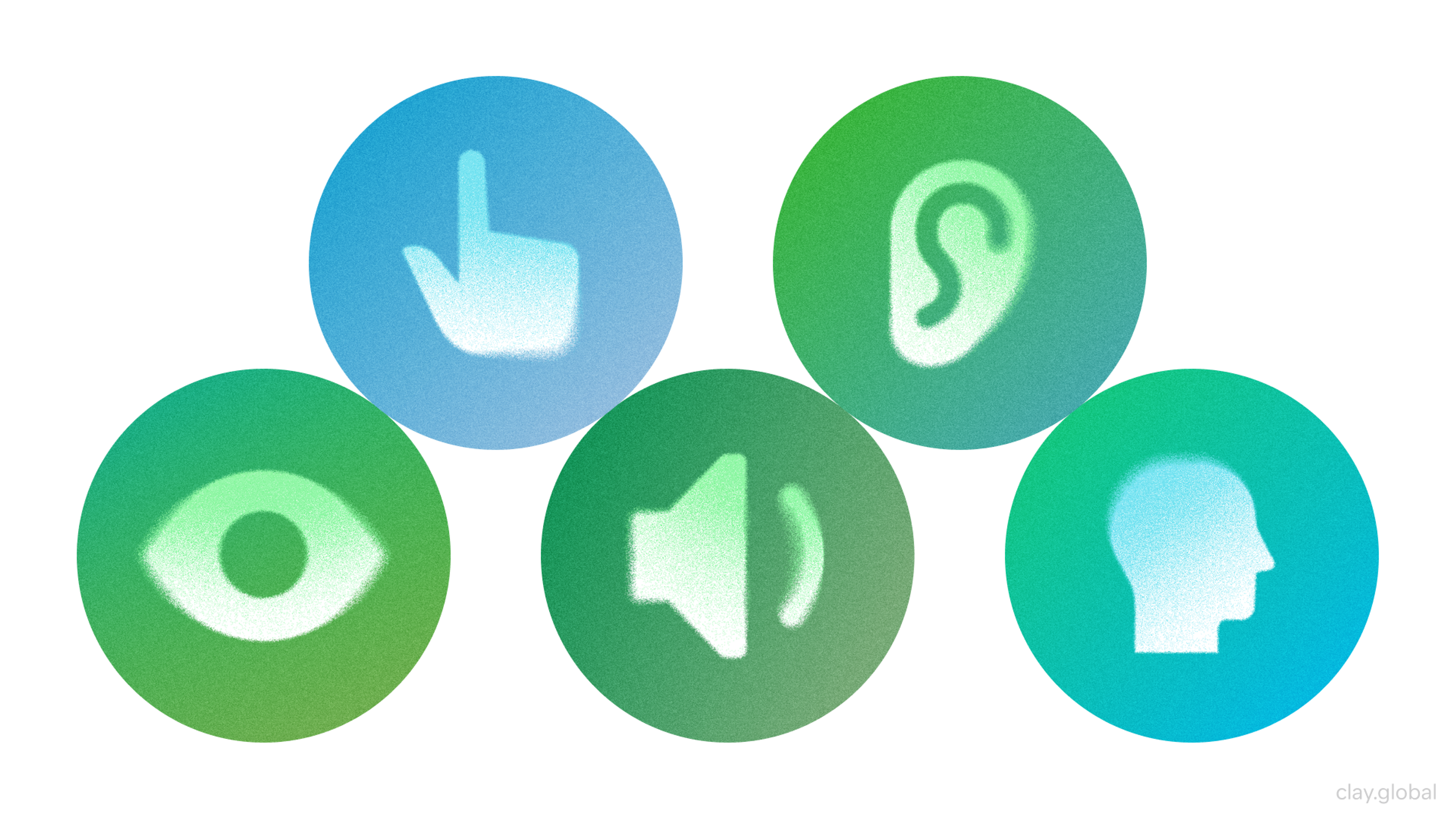
In most cases, however, enhancements aimed at Accessibility will benefit all users through more effective search capabilities, larger fonts, and even better layouts. When you lead the charge for inclusiveness, you become an advocate of equality and diversity, which works positively to strengthen your brand and even widen your target market.
Tips for Improving Site Accessibility
- Use Semantic HTML: Proper semantic HTML structure and elements (e.g., 'nav,' 'article,' 'footer') have been known to ease the use of a screen reader, thereby simplifying a user's ability to navigate your website.
- Text Alternatives: Almost every information-bearing medium, such as images and pictures, should also include alt texts or captions. This enables the blind to use screen readers.
- Keyboard Navigability: Where there are interactive features such as links and form fields, there should also be a keyboard-based option available. This is important for users without mice.
- Forms: Provide a label, directions, or description, and an error message on forms. Guide them by means of focus indicators as they fill them out.
- ARIA Landmarks and Roles: To enhance complex web apps with ARIA landmarks and roles, accessible (cra) composition techniques must be applied.
Including these measures in your web design process will help you enhance the user experience for everyone, which in turn will improve your website's effectiveness.
Read more:
Conclusion
This outline covers critical aspects of outsourcing web design and working with remote teams. Would you like more details on any section?
Maintaining a professional and secure website is crucial to avoid common design errors. Mistakes like ignoring mobile-friendly design or omitting essential elements can harm the site's effectiveness and alienate users.
A website achieves an excellent online presence by incorporating responsive design, updated content, security, and accessibility features.
Moreover, maintenance involves revising standards and implementing improvements. Regular evaluation and updates are essential to ensure broad usability acceptance.

About Clay
Clay is a UI/UX design & branding agency in San Francisco. We team up with startups and leading brands to create transformative digital experience. Clients: Facebook, Slack, Google, Amazon, Credit Karma, Zenefits, etc.
Learn moreAbout Clay
Clay is a UI/UX design & branding agency in San Francisco. We team up with startups and leading brands to create transformative digital experience. Clients: Facebook, Slack, Google, Amazon, Credit Karma, Zenefits, etc.
Learn more