Picture this: you open LinkedIn to check your feed, and instead of staring at a blank white screen, you see gray rectangular shapes exactly where your posts will appear. Within seconds, these placeholders fade into actual content. That smooth transition you just experienced? That's the magic of skeleton screens.
Skeleton screens are loading placeholders that display simplified page layouts while content loads, making websites feel faster and keeping users engaged. Leading platforms like LinkedIn, YouTube, and Facebook use skeleton screens to reduce perceived wait times and improve user experience during loading states. These smart placeholders show users exactly what to expect, turning frustrating loading moments into seamless experiences.
What Are Skeleton Screens?
Everything regarding a website or an app revolves around user experience (UX), especially in web and app design. Users get easily annoyed when a web page loads slowly and can leave to use faster websites.
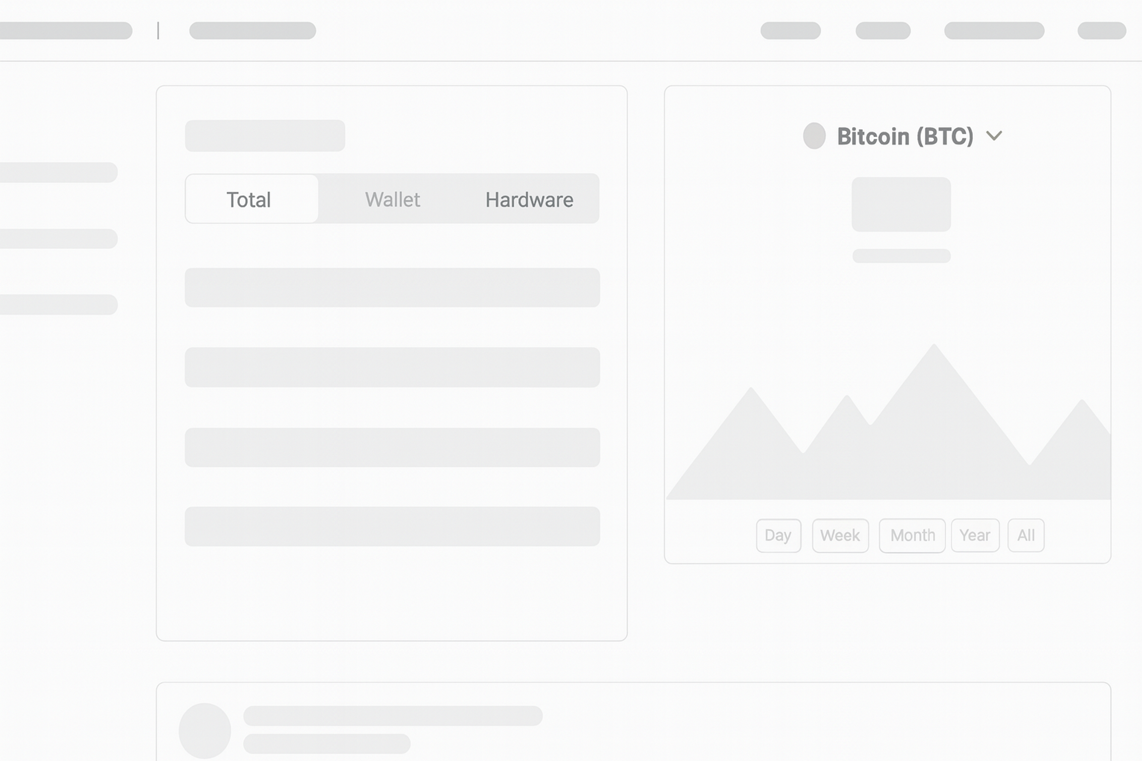
Skeleton Example
Skeleton screens have become one of the prominent design solutions for erroneous loading. These loading placeholders respond to user actions by providing immediate feedback, making the interface feel faster and more engaging during loading times.
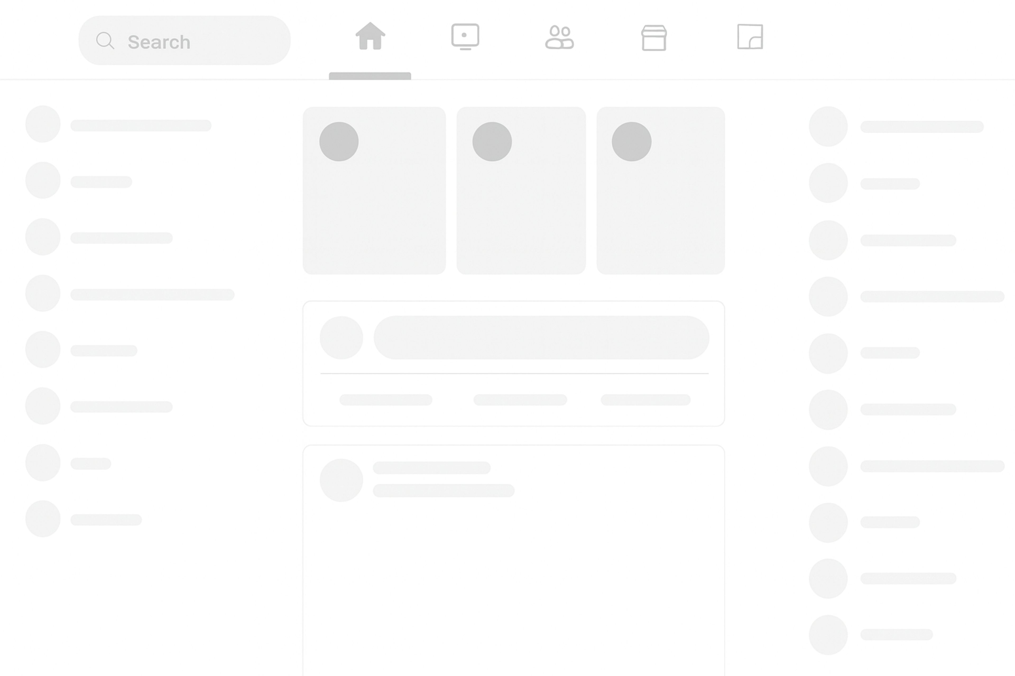
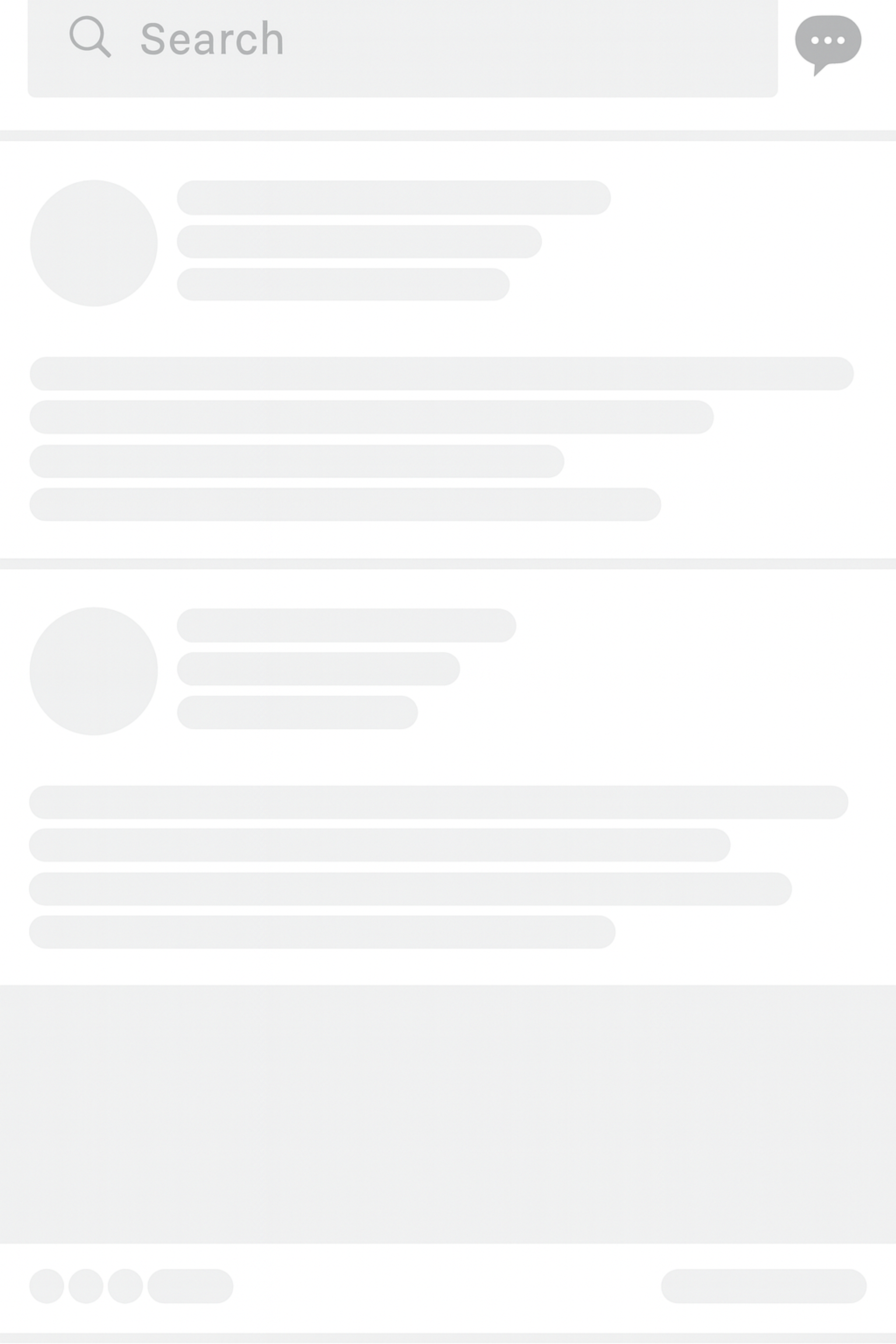
Skeleton screens provide visual aids where content or information is yet to be displayed and thus improve the impression of suspended periods. By presenting a simplified outline of the page's layout, these screens enhance user engagement and provide a visual cue of what to expect while the content populates.
In other words, skeleton screens give the appearance of a shortened waiting time and an improved experience by reducing stagnancy, thereby helping minimize user disengagement.
How Skeleton Screens Work
Skeleton screens are simple but powerful. When you click a link, a skeleton appears almost instantly. It shows the page’s basic layout with placeholder blocks. A soft shimmer every 1.5–2 seconds signals progress.
This motion isn’t just for looks. It tells users the system is working. Netflix uses this well: gray rectangles stand in for posters, with smaller blocks for titles and descriptions.
The swap to real content should be smooth. Use a cross-fade so placeholders fade out as content fades in. This avoids jarring jumps and layout shifts.
Developers often build skeletons with React or Vue. These components adapt to many content types—from simple articles to complex dashboards.
Benefits of Skeleton Screens
The main advantage of skeleton screens is their ability to increase perceived performance. While skeleton screens do not technically reduce load times, they diminish the wait time, thus making the process feel faster for users by reducing cognitive load.
Skeleton Screen Example
This is particularly true because studies show users are likely to remain on a given page if a loading icon is on display, even if what is loading is just a placeholder.
Skeleton screens also eliminate the dreaded layout shift — when the content appears and abruptly reflows the page, disrupting seamless, otherwise smooth scrolling by mimicking the actual content.
Skeleton screens have proven to enhance a user’s perception of performance. These loading screens actively keep users engaged by displaying the arrangement of the information that will load instead of using spinners or progress bars, which only display blank loading screens.
This user interface design forewarns users, enabling them to stay informed. Without this clarity, users would be frustrated and wonder if the page is loading.
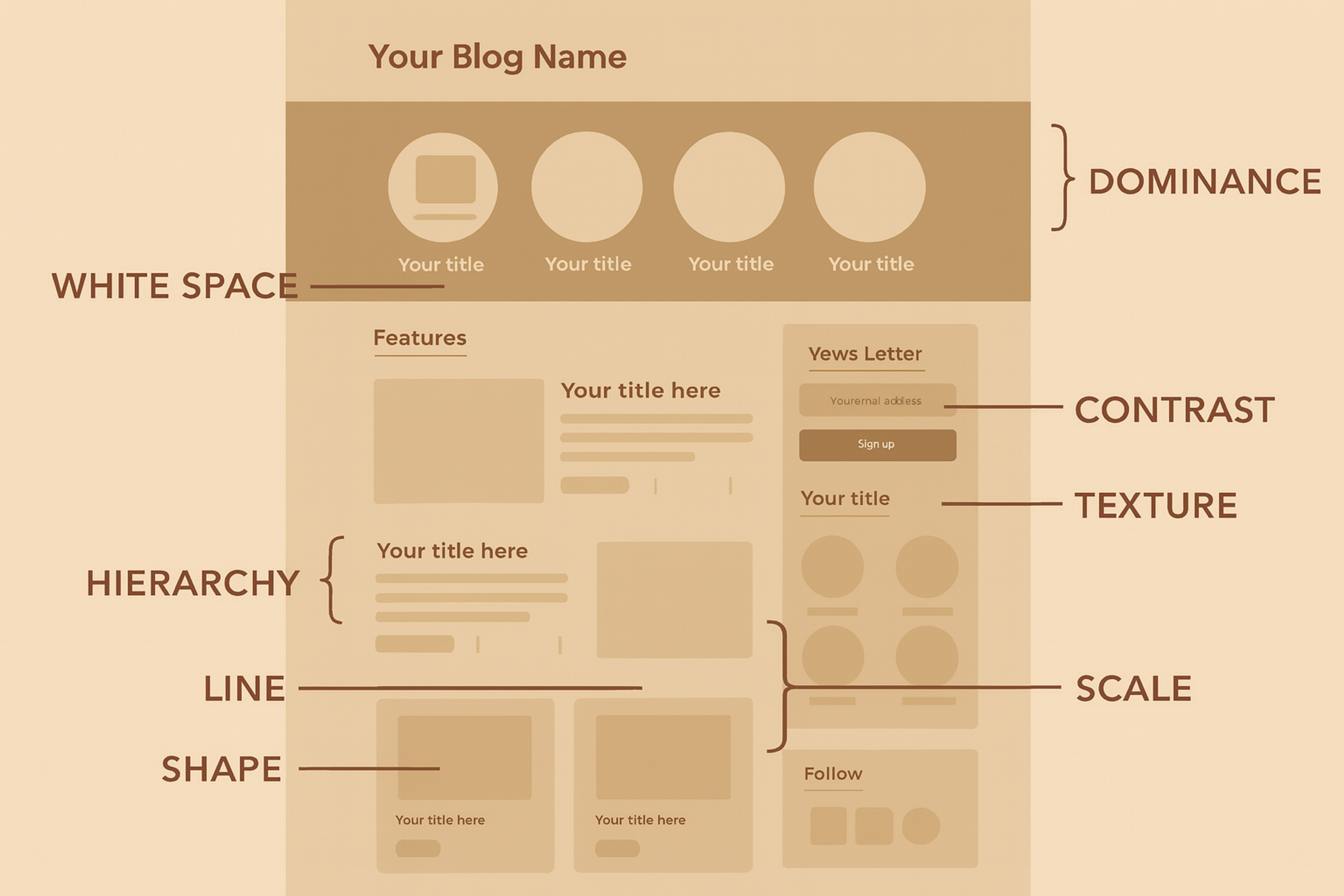
Implementing Skeleton Screens: Best Practices
Creating effective skeleton screens requires attention to timing, visual design, and user experience principles. The goal is seamless integration between loading and loaded states.
Skeleton Screen Example
Timing and Smooth Transition
Show skeleton screens within 300 ms of any user action. Fast feedback confirms the tap was registered.
Cross-fade from skeleton to real content. Fade the skeleton out while the content fades in. This keeps the transition smooth.
Prioritize key elements first: navigation, main headings, and primary images. Load secondary pieces after.
For longer waits, use progressive disclosure. Start with a basic skeleton, then add more detailed placeholders as data arrives.
Sequence and Prioritization
The primary page elements, such as navigation bars, primary actions, and visuals, should be prioritized to retain users’ experience while maintaining the feeling of temporal order. Skeleton screens should represent the final UI to ensure users feel the interface is responsive and intuitive.
Users must aim to receive a much more responsive experience and interact with the highlighted portions while other components are still awaiting. For instance, the main navigation bar becomes the #1 X skeleton, which is also loaded.
Maintain Visual Consistency
Skeleton screens are impactful as they give users a preview of the final content before it is fully available. Netflix is a good example of this, where users see rectangles of different sizes representing posters and descriptions of a movie, which they can visualize while waiting.
Source: Allison Saeng on Unsplash
This approach is particularly effective on content-heavy pages with multiple images, as it helps maintain user expectations during loading times and avoids frustration. In addition, subtitle shimmer effect animations increase engagement by visually moving without being overly distracting.
Design for Different Platforms
Skeleton screens must be tailored for each device and its corresponding screen size. While mobile apps typically need a more condensed version of skeleton screens, web applications leave space for more artistry and intricacy in placeholders. On mobile devices, performance optimization pertaining to battery drain and device resource utilization also needs to be addressed.
Smart TVs and wearables may need larger skeleton screens that are high-contrast for visibility. Regardless of the platform, maintaining user focus is crucial. Skeleton screens should provide visual cues during content loading to keep users engaged and improve the overall user experience.
Design Principles for Skeleton Screens
Use skeleton screens to improve loading moments. They cut perceived wait time, especially on mobile, and keep users engaged. This can lower bounce rates and lift conversions.
Skeletons work better than abstract loaders. They reduce cognitive load and build anticipation, so the experience feels smoother.
Always show clear loading cues. Give users an obvious signal that work is in progress, even before content appears.
Visual Design
Always aim for soft but impactful colors, like light gray (#E0E0E0 to #F5F5F5), which stands out against a white background without being harsh. This color selection enables the default skeleton to function as a neutral placeholder that does not divert the user from the main content.
Visual Design
Additionally, incorporating subtle animations can enhance the user experience by creating a sense of progress and making the loading process appear quicker, while ensuring the design remains simple and unobtrusive.
Shape and Form
The shapes used in skeleton elements should correspond to the content they represent. For instance, images can be framed in rounded rectangles, while simple lines can represent text lines. This gives users a moderate sense of what they should be expecting.
These skeleton screens act as a visual cue, indicating to users that content is loading and providing a graphical representation of where content will eventually appear. The animations should also be smooth and soft. Users should not get annoyed by pulse or shimmer effects that are kept slow and gentle at a 1.5-2-second cycle.
Content Hierarchy
Match the skeleton to the page’s content order. Use larger blocks for headings or images and smaller ones for subtext.
Keep the placeholder structure and spacing the same as the final layout. This helps users predict each element’s importance as content loads.
Airbnb’s listing skeletons mirror the final cards in size and spacing, so the transition feels seamless.
Accessibility
Everyone, even people who can’t see, must be able to view skeleton screens. Skeleton screens serve all users by providing visual placeholders that indicate the layout of content being loaded, which keeps users engaged and reduces frustration.
It is possible with ARIA attributes that let screen readers announce content loading. Moreover, skeleton screens should adhere to users’ reduced motion preferences by providing non-moving static placeholders instead of moving ones.
Measuring the Effectiveness of Skeleton Screens
Track UX and performance to see if skeleton screens help. Unlike spinners or progress bars, skeletons preview the page layout. They set expectations and make loading feel faster.
Measure attention during loading. Watch time on page, scroll start, and drop-offs while content loads. Check bounce rate, conversion rate, and task completion after adding skeletons.
Monitor perceived speed. Compare user behavior and satisfaction before and after skeletons. Even if real load time stays the same, people often feel the wait is shorter.
User Perception: Metrics such as perceived wait time are very important when evaluating how effective skeleton screens are in enhancing user experience. By mimicking the UI layout, skeleton screens help users perceive a page loading 20 to 30% faster than with traditional spinners or loading bars.
User Engagement: Engagement during the loading phase is yet another critical metric. Users are more likely to remain attentive within the page when skeleton screens are deployed than when they are shown a blank screen or a spinning indicator.
Technical Performance: Even though skeleton screens enhance perceived performance, actual performance must always be taken into consideration, particularly load times. In fact, overcomplicated skeleton screens can delay content rendering, which makes optimizing for performance a requirement.
Using a similar technique, platforms like LinkedIn, Facebook, Slack, and YouTube enhance user experience during loading times by optimizing their profile pages and other content. Keeping track of First Contentful Paint (FCP) and Time to Interactive (TTI) is essential in ensuring that skeleton screens do not add delays.
FAQ
Q: What Industries Can Benefit Most From Skeleton Screens?
Industries with content-heavy apps, like e-commerce, social media, news, and entertainment, benefit most from skeleton screens by improving loading feedback and keeping users engaged.
Q: Do Skeleton Screens Replace the Need for Fast Page Loads?
No, skeleton screens enhance perceived speed but do not replace technical performance improvements. Both should be used together for optimal user experience.
Q: Can Skeleton Screens Be Used for Offline or Slow Network Scenarios?
Yes, skeleton screens help maintain user engagement during offline states or poor connections by visually indicating that content is still loading.
Q: Are Skeleton Screens Effective for Complex Interfaces Like Dashboards
Yes, skeleton screens work well for complex dashboards by providing structure and reducing frustration while data-heavy elements load.
Read more:
Conclusion
Skeleton screens represent a thoughtful approach to one of web design's persistent challenges: keeping users engaged during loading times. By showing structured placeholders instead of blank screens, they transform waiting from a source of frustration into a seamless part of the user experience.
The most successful implementations combine smart visual design with careful attention to timing and accessibility. When done well, skeleton screens make your digital products feel more responsive, professional, and user-centered.
Whether you're building a content-heavy news site, an e-commerce platform, or a data-rich dashboard, skeleton screens can improve how users perceive and interact with your loading states. The investment in thoughtful implementation pays dividends in user satisfaction and engagement.

About Clay
Clay is a UI/UX design & branding agency in San Francisco. We team up with startups and leading brands to create transformative digital experience. Clients: Facebook, Slack, Google, Amazon, Credit Karma, Zenefits, etc.
Learn moreAbout Clay
Clay is a UI/UX design & branding agency in San Francisco. We team up with startups and leading brands to create transformative digital experience. Clients: Facebook, Slack, Google, Amazon, Credit Karma, Zenefits, etc.
Learn more