Imagine walking into a crowded room and instantly sensing who belongs together - friends clustered near the window, coworkers in a tight circle, a family gathered around a table. No one needs labels.
Your brain groups people by cues that "match," making the scene readable rather than chaotic. This is an example of visual perception, where the human eye organizes complex scenes by unconsciously connecting similar elements.
An Overview of Gestalt Psychology
History plays a vital role in understanding any theory. The Gestalt theory pertains to the mind and focuses on how one makes sense of the surroundings.
Developed in the early 1900s, it is based on the saying, ‘The whole is greater than the sum of its parts. ‘People inherently categorize information into distinct parts rather than empty fragments.
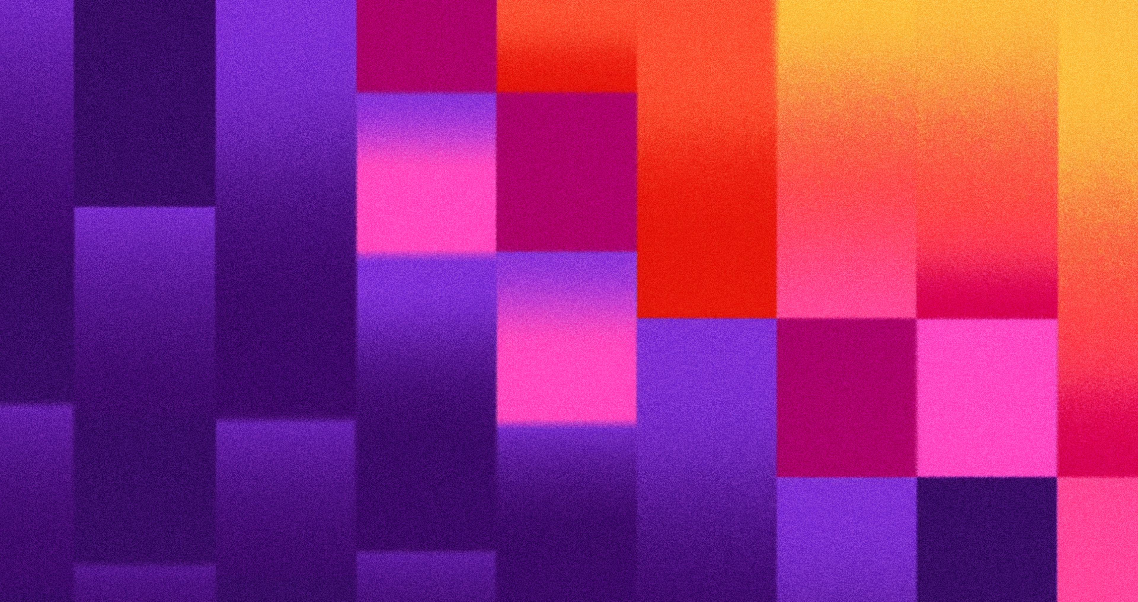
Example of Gestalt Design
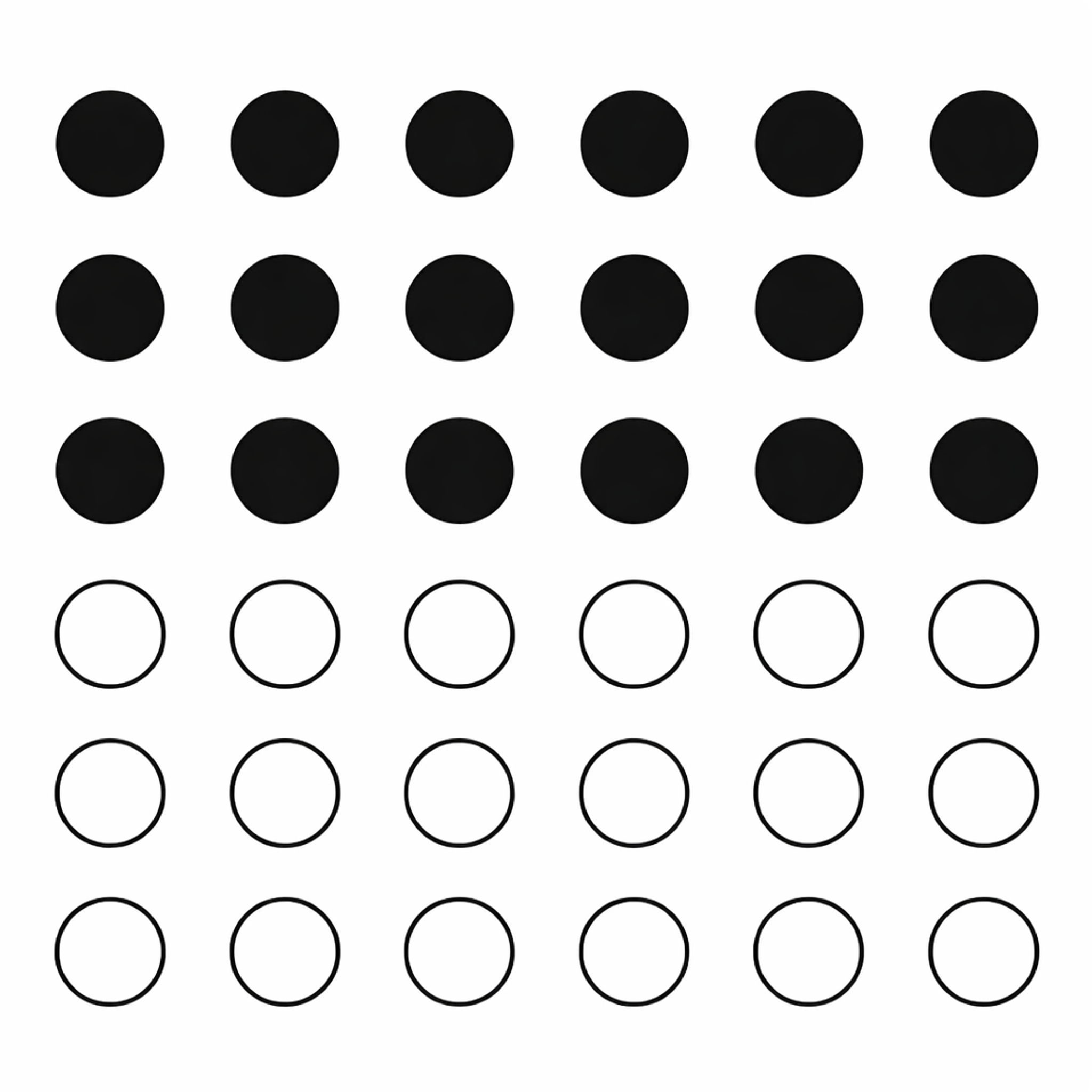
This notion is highly applicable in the modern world of psychology. The core notion of Gestalt psychology is relatively simple: people perceive a single image as a sum of its distinct parts.
For instance, a person viewing a picture made from many dots tends to view it as a single coherent image. Gestalt psychology is deeply rooted in understanding visual perception and how the human mind organizes visual information.
Key Principles of Gestalt Psychology:
1.
Proximity - Elements close to each other are perceived as a group.2.
Similarity - Objects that look alike are grouped together.3.
Continuity - The mind prefers continuous patterns over disjointed ones.4.
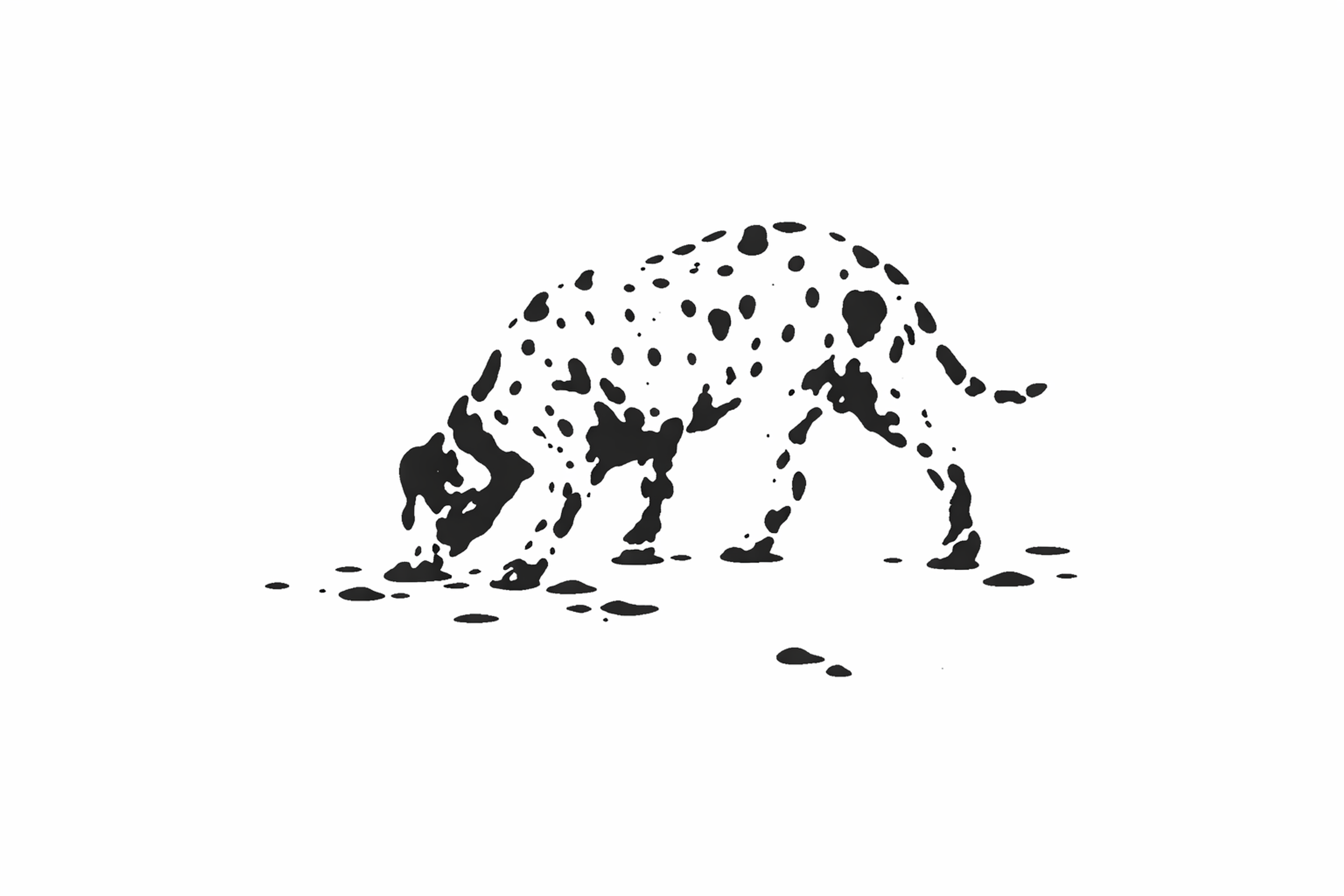
Closure - The brain fills in gaps to perceive a complete image.5.
Figure-Ground - We distinguish objects (figures) from their background (ground).
Gestalt principles are like a designer’s secret weapon, transforming scattered elements into clear, cohesive designs. These principles don’t just shape visuals — they influence how we think, learn, and heal.
In education, they turn complex concepts into clear, digestible lessons, making learning feel intuitive. In therapy, they guide practitioners to focus on the whole person — their thoughts, emotions, and experiences — creating a deeper, more meaningful connection. And in design, they transform chaotic layouts into intuitive, user-friendly interfaces.
At their core, Gestalt principles reveal a simple truth: our brains crave patterns. We are wired to seek order, connect dots, and make sense of the world around us. Whether you’re designing a website or navigating daily life, these principles are a reminder that clarity isn’t just a choice — it’s a human instinct.
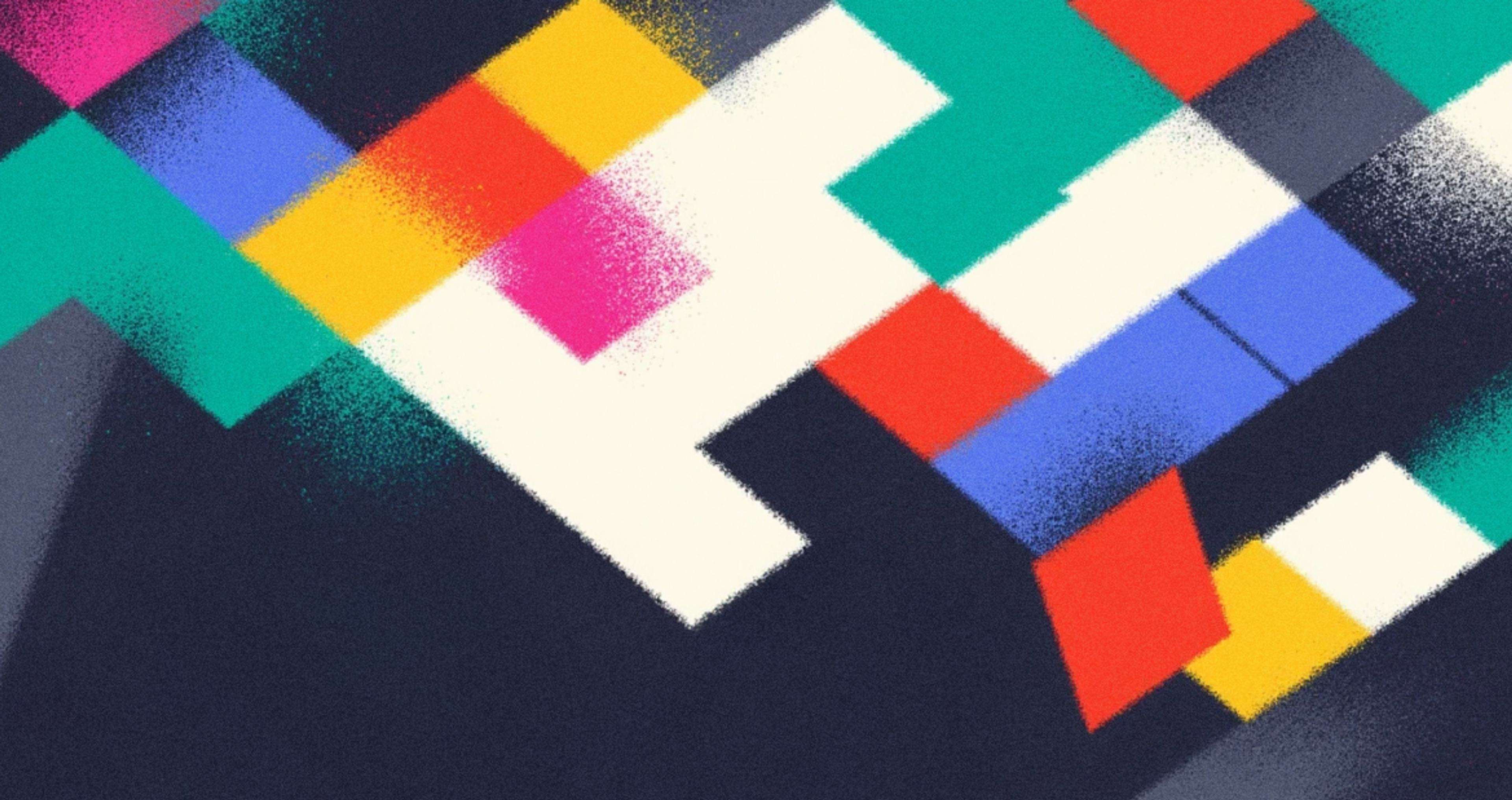
What Is a Law of Similarity?
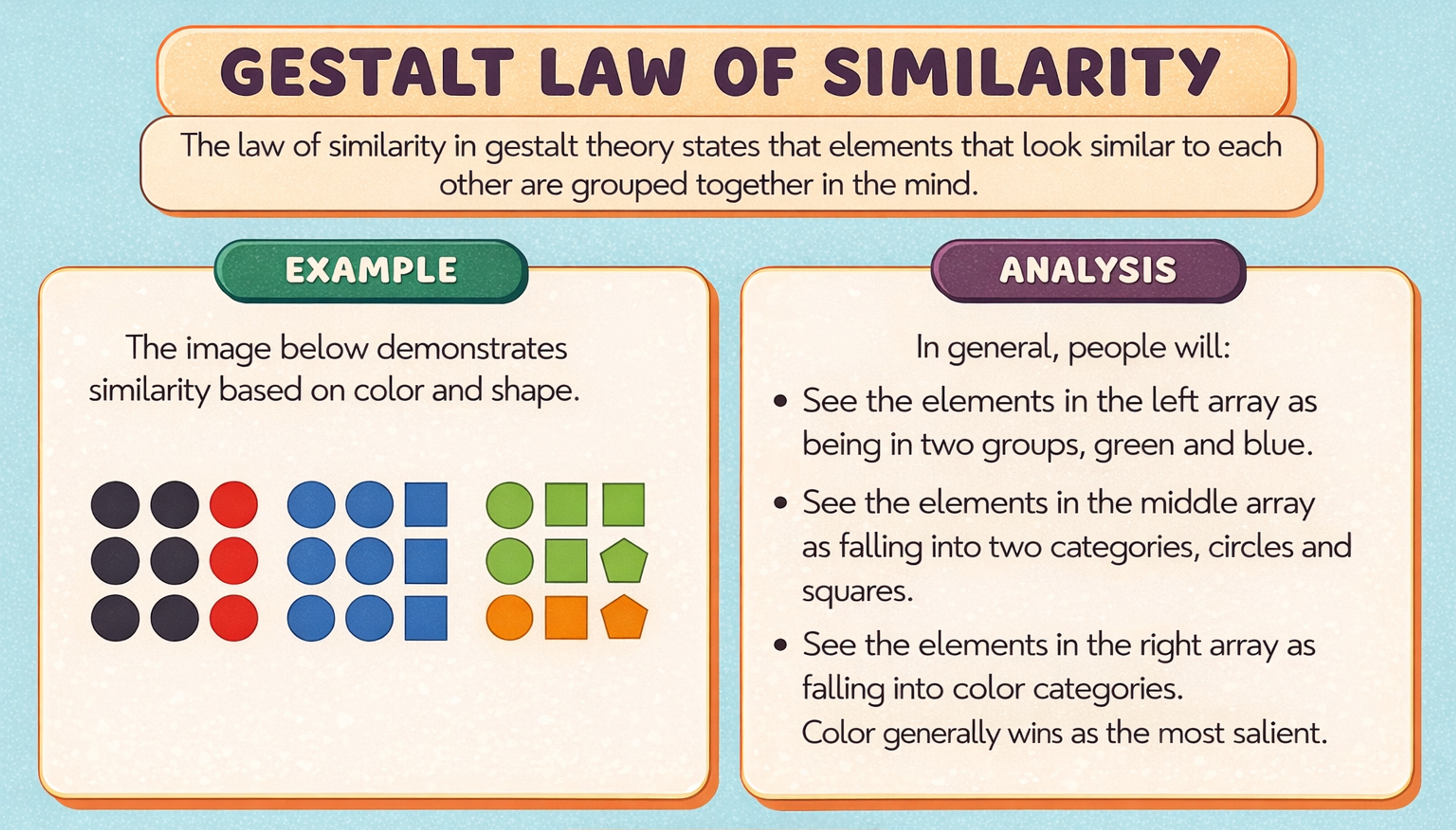
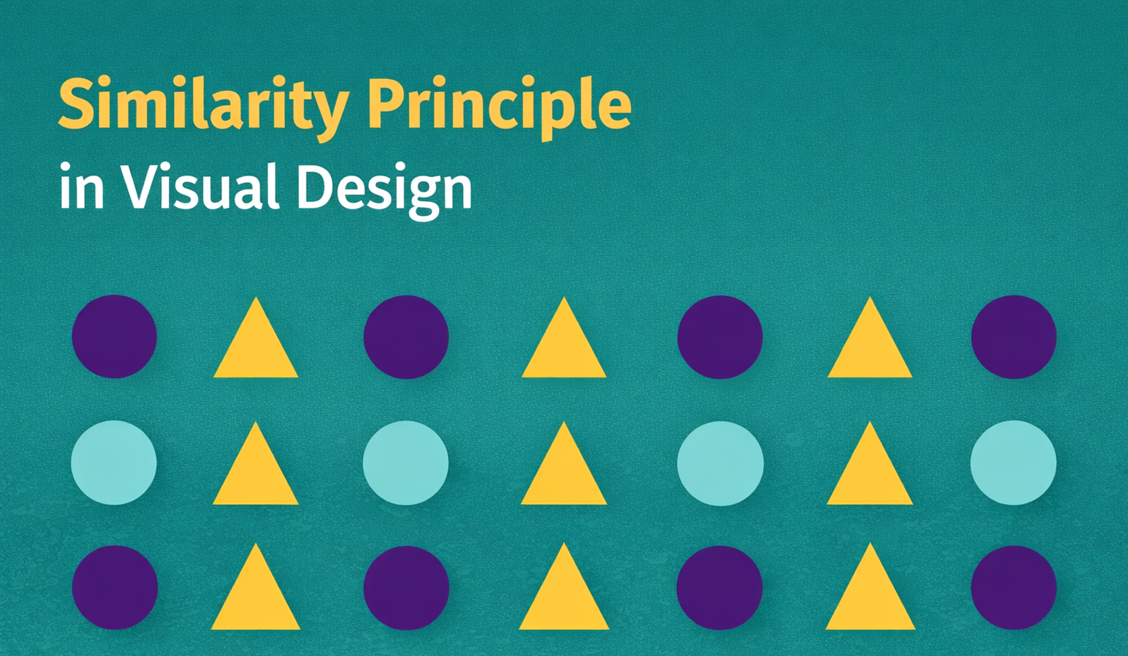
The law of Similarity is one of the most critical laws in Gestalt psychology. It explains how we tend to group similar elements based on attributes like shape, color, and size. Grouping is a cognitive belief or judgment based on common attributes, including shape, color, size, and pattern.
The Law of Similarity
For instance, this tendency can be observed when we look at collections of artifacts. A single object is more likely to be viewed as a group of objects than one object standing on its own.
This principle helps our minds structure and draw inferences from different views without difficulties. Artists and designers use this principle so that their designs make a first impression and are memorable.
Understanding the Law of Similarity in Design
The Law of Similarity is central to both design and perception. Similarity in design enables human beings to comprehend and organize what they see.
It is a natural behavior of human beings to classify elements that have something in common, and it enables us to step up the hierarchy of visual information.
Visual similarity helps users understand relationships between elements by sharing common visual characteristics. Let’s go ahead and discuss its main concepts in detail.
How Humans Process Visual Information and Visual Perception
Individuals perceive objects based on patterns and similarities in visual information, actively trying to organize components when encountering intricate visuals.
This ability helps reduce cognitive load, allowing for a quicker understanding of what may seem disorganized at first glance.
For example, when observing a chart or image, our brain templates together internal shapes or colors that look alike as a rudimentary function that doesn’t require much effort.
Key Points of Similarity
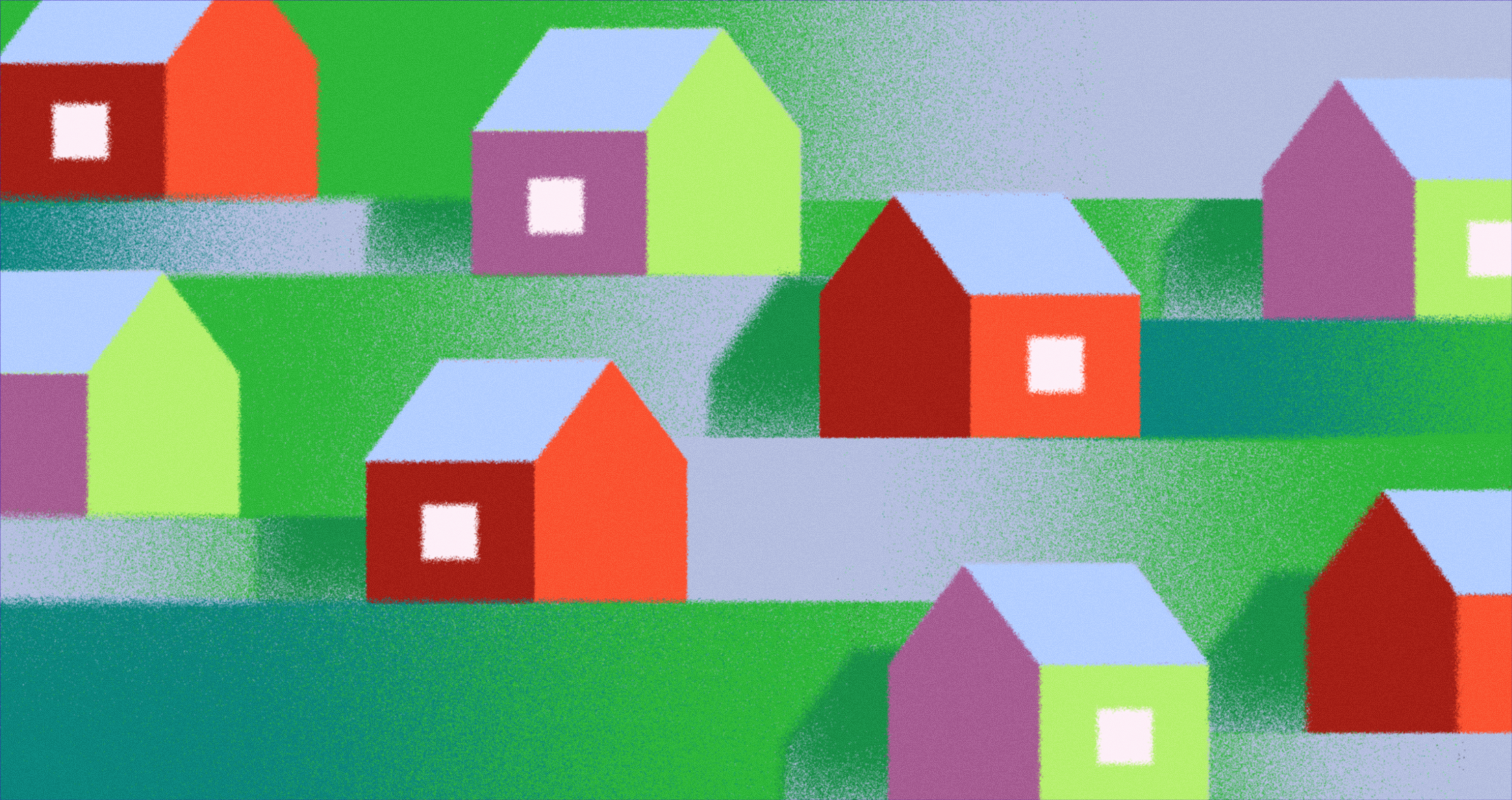
Elements are grouped based on attributes such as color, shape, size, orientation, and texture. For example, objects that are the same color, even if far apart, are considered a group. Items with identical shapes or the same size are perceived as part of the same group.
Gestalt Law of Similarity
To accomplish this, the cognitive process defers examination of individual elements and instead focuses on the form of the design as a whole.
Psychological Basis
The fundamental aspects of the Law of Similarity stem from the Patterns Recognition Mechanism, which is a fundamental aspect of visual perception. This mechanism is significant from a survival point of view.
People’s capacity to organize their visual surroundings and try to come to a conclusion out of the bulk of information helps in very effective decision-making and information processing.
Design Benefits
The majority of designers already know that the law of similarity helps designers group related elements to create an easier arrangement by assisting the layout and user’s experience. Together, related items are grouped, allowing the viewer’s attention to be directed seamlessly. That makes the design itself more appealing and easy to comprehend.
This principle proves to be especially useful in the digital world, including in website and application design where navigation and functionality is everything. For instance, designers may set the same color for buttons with the same purpose or put the same style on related sections so that users are able to identify their relevance.
A practical application of this principle is evident in our redesign of Yahoo! Games. The project introduced visually distinct sections and intuitive navigation, allowing users to explore a diverse range of games effortlessly. By transforming categories into dynamic hubs with bold visuals and clear categories, the design sparked user curiosity and facilitated deeper engagement with the content.
Yahoo! Games Navigation by Clay
This thoughtful organization exemplifies how applying the law of similarity enhances user experience by making interfaces more intuitive and navigation more seamless.
Practical Applications
The law of similarity can apply to branding as well as others. Similar company name typeface, color, and logo shapes can make the brand easier to remember. For web design, the similar style of menus, icons, and buttons helps create a usability design, which makes users confident with their interaction with the product.
Knowing and putting the Law of Similarity into practice is crucial to designers who would wish to create simple and attractive designs. The law of similarity helps designers link design elements to create cohesive and usable interfaces.
When designers work with the natural ways users perceive information, they can increase clarity, improve use, and create designs that are easy and fluid in nature. This principle applies to digital products, advertisements, and even in physical places for information to be communicated effectively and interestingly.
Applying the Law of Similarity in Web Design
The law of similarity is one of the principles in Gestalt Psychology and stipulates that users tend to group features that resemble each other.
Similarity in Design
Like the other guidelines discussed, the law of similarity is essential in web design and development because it helps to achieve high usability in user interfaces and guides users in undertaking desired activities.
When this principle is considered, designers can create experiences that users can easily navigate and interact with the websites effortlessly.
The most important one is how to implement the principles of web design incorporating the law of similarity, which are explained below:
Dividing Site Elements into Appropriate Groups
When users land on a webpage, dividing different elements into groups with similar visual characteristics like shapes, colors, or styles helps create interfaces that enhance user navigation. For example:
- The button of the same color and shape will effectively show that they perform related actions for “Save” and “Submit.”
- Icons with the same shape and mixed styling vertical offer consistent, integrated communication tools like email, chat, and video calls.
Such mixed grouping simplifies the problem for users by illustrating the pattern relationships between the grouped elements. It also solves the confusion that stems from the many options, enabling faster decision-making.
Enhancing Navigation
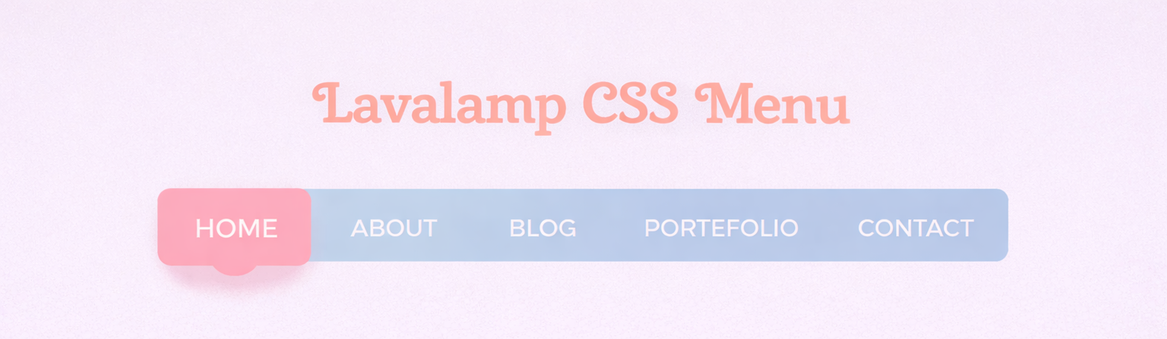
Online navigation menus assist users while browsing. It is best to design navigation elements on a web page with the same font type, color, or layout so that the navigation bar stands out on the page. For example:
- Users can instantly recognize horizontal navigation bars with associated links styled the same (in a specific font, size, and color) as the menu.
Horizontal Menu
- Users can recognize and accurately predict the behavior of consistent drop-down menus across different categories, making websites easier to navigate.
Consistency in the navigation design on a web page improves the experience and adds a level of trust, as users are sure that they will not encounter shocking surprises while looking around.
Adding Visual Hierarchies and Visual Hierarchy
The law of similarity helps designers create a visual hierarchy that guides users' attention by giving elements of equal importance a distinct yet cohesive design style. For example:
- Users tend to more easily understand page structures when the headers have the same font size, weight, and style as other headers in the same hierarchy.
- Homogeneous-styled product cards on an e-commerce website that are the same size, layout, and design do not overwhelm users and allow them to easily scan and compare options.
Designers systematically structure hierarchies on web pages, which helps draw a user’s attention to the critical aspects without too much effort to search for the needed information.
Improving User Interactions
Understanding the law of similarity and other elements of design is critical for reducing users’ cognitive load. When grouping items into categories, everyone can process the information with ease and proficiency. For instance:
- The use of identical card formats to display metrics on the dashboard allows users to analyze data quickly without wasting time figuring out what each box represents.
- Its use is more common in different forms where input boxes have similar text styles like shape, laid border, and even positioning of the labels. This usually makes a completed form look less intimidating and more friendly.
By reducing the number of patterns users are expected to analyze and using a simple navigation system, users are better engaged with the content without using excess mental energy.
Building Your Brand Identity
Consistency in visual elements not only applies the law of similarity but also reinforces brand identity. By using uniform button styles, typography, and colors across all pages, designers create a cohesive and memorable experience for users. For example:
- A brand that uses the same shade of blue for buttons across its website builds trust and familiarity, encouraging users to take action with confidence.
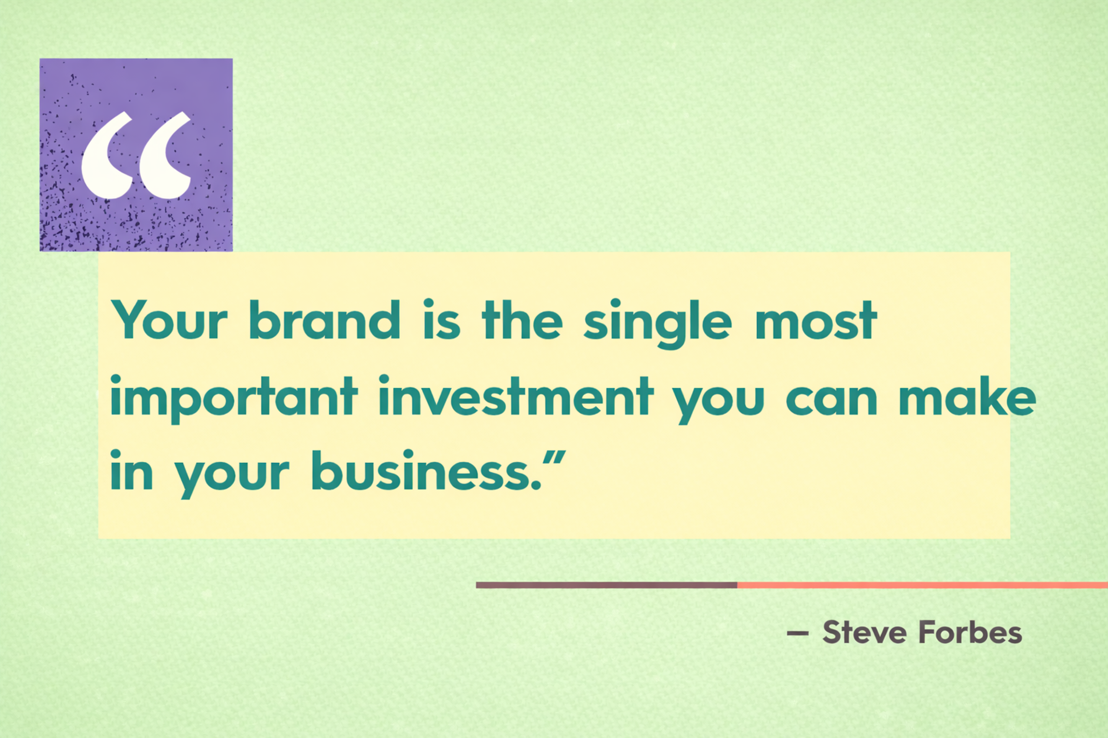
Steve Forbes Quote
- Uniform typography and color schemes across landing pages, blogs, and product pages ensure users associate the visual language directly with the brand.
Consistency makes your brand easier to spot and trust. When everything looks and feels the same, people remember you.
Using the law of similarity in web design creates clear relationships between elements. It makes navigation intuitive, builds visual cohesion, and improves the overall experience.
This principle also lowers mental effort, guides behavior, and strengthens brand identity. When you apply it with care, your site stays functional, looks great, and leaves a lasting, positive impression.
Common Mistakes in Design and Their Solutions
Design can be a powerful tool, but even the best designers make mistakes. Understanding these common pitfalls and how to fix them can help you create more effective, user-friendly designs. Let’s explore some typical design errors and their solutions!
Overusing Similarity Leading to Monotony
- Mistake: Repeating the same design elements will make your work look uninspired and dull.
- Solution: Keep designs fresh and engaging by balancing the similarity principle with creative diversity. This prevents monotony by incorporating different blocks of colors, shapes, and layouts.
Source: iwc

Inconsistent Application of Design Patterns
- Mistake: Breaking up your design patterns may result in confusion and disrupt the harmony of the design, which can confuse users.
- Solution: Apply a preset set of design rules from the start for better consistency throughout the project.
Breaking Established Patterns Without Purpose
- Mistake: Users may become frustrated if they do not adhere to the norms by breaking patterns that are there for a reason, leading to more excellent unusability.
- Solution: Make an effort to break patterns only after fully understanding the standard and doing so for particular intentions.
Balancing Similarity with Contrast
- Mistake: There is too much focus on unified design without appropriate creative diversity, which requires greater focus.
- Solution: To achieve balance, use similarity to unify the design and juxtapose or contrast to emphasize important elements.
FAQ
What Is The Law Of Similarity In Gestalt Psychology?
It’s the principle that people automatically group things that look alike. Shared traits like color, shape, size, typography, or texture make elements feel related.
Why Does Similarity Make Interfaces Feel Easier To Use?
It reduces cognitive load. Users spot patterns fast, understand what belongs together, and don’t have to decode each element from scratch.
How Is Similarity Different From Proximity?
Proximity groups items because they’re close. Similarity groups items because they look the same. Great UI usually uses both: spacing forms the group, styling confirms it.
How Do Designers Balance Similarity With Contrast?
Make systems consistent for same-role elements, then use contrast sparingly to highlight what matters, like one primary CTA or one featured metric.
What Are The Most Common Mistakes When Using Similarity?
Too much similarity makes everything blend together. Inconsistency is worse: when the same function looks different across screens, users lose trust and slow down.
Read more:
Conclusion
In the end, great design is more than just creativity — it's a careful balance of artistry and strategy. By thoughtfully applying key design principles, you can transform your ideas into user experiences that are not only visually stunning but also genuinely impactful.
To truly make a difference, don’t just learn these principles — live them. Let them guide your design decisions, shape your layouts, and influence your interactions. Start applying them today, and watch as your designs become more intuitive, memorable, and effective.
Your next great design is just one principle away. Make it count.

About Clay
Clay is a UI/UX design & branding agency in San Francisco. We team up with startups and leading brands to create transformative digital experience. Clients: Facebook, Slack, Google, Amazon, Credit Karma, Zenefits, etc.
Learn moreAbout Clay
Clay is a UI/UX design & branding agency in San Francisco. We team up with startups and leading brands to create transformative digital experience. Clients: Facebook, Slack, Google, Amazon, Credit Karma, Zenefits, etc.
Learn more