
User experience (UX) and user interface (UI) design aren’t just for big tech or fancy apps – they are critical for small businesses too. In fact, smart UX/UI can turn a small business’s website into a growth engine: clear layouts, quick paths to action, and consistent visuals all help build trust and boost revenue.
First impressions happen fast – as much as 94% of first impressions of a brand’s website are related to its design. This means that when a potential customer lands on your site, the design and usability will largely determine whether they stay or leave within seconds.
In this article, we’ll explore essential UX/UI design principles for small businesses, with real-world examples of good and bad design to illustrate each point. Each example will highlight a key concept with a practical example, showing how these principles work in real situations.
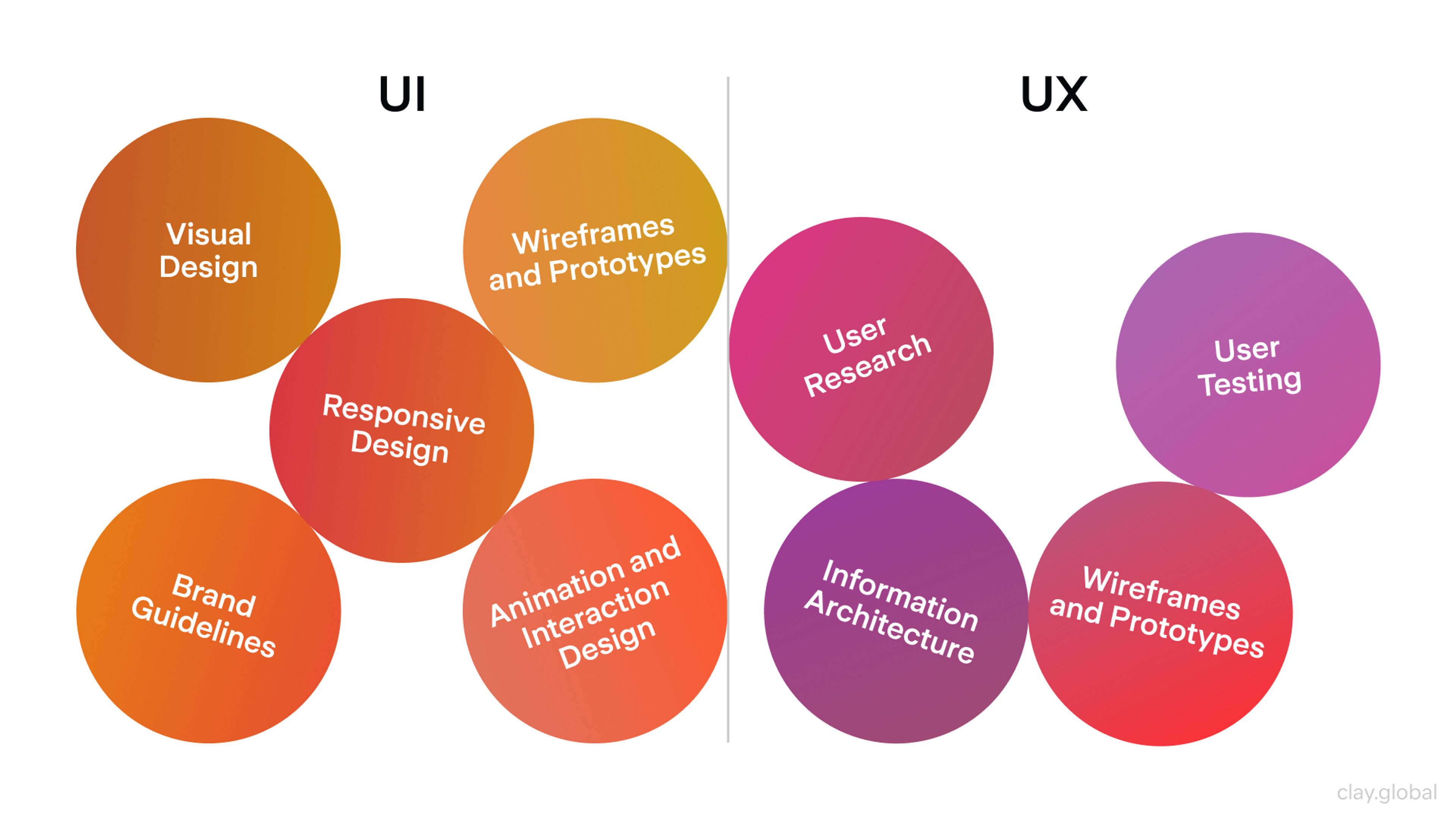
UI UX Elements by Clay
Why Good UX/UI Design Matters for Small Businesses
For any small business, a website often serves as the front door – it’s where many customers form their first impression of the company. A well-designed, user-friendly interface isn’t a luxury; it’s a necessity. Here’s why UX/UI design deserves your attention:
First Impressions & Credibility
A polished website immediately signals professionalism. Users form an opinion about your business within moments of landing on your page, and if the site looks outdated, cluttered, or confusing, it undermines trust. About 75% of consumers admit to judging a company’s credibility based on its website design.
In other words, you could be the best at what you do, but if your site looks amateurish, visitors may doubt your legitimacy. On the flip side, a clean, modern UI can make a small company appear as credible as a larger brand, giving you a fighting chance to win the customer. Strong design builds trust: people feel confident engaging with businesses that invest in quality UX/UI.
Conversions & Customer Satisfaction
Good UX/UI isn’t just about looking nice – it directly impacts your bottom line. A website designed around the user’s needs will guide them to take desired actions, whether that’s making a purchase, signing up for a service, or contacting you for a quote.
Simplified checkout processes, clear “Contact Us” buttons, or well-placed calls to action all help increase conversion rates and keep customers happy. Conversely, bad design can sabotage sales. Think about experiences you’ve had on clunky websites: you probably left in frustration. You’re not alone – 88% of online consumers are less likely to return to a site after a bad experience.
In fact, 70% of online businesses that fail do so because of poor usability. Small businesses can’t afford to lose potential customers over something as fixable as bad UX. By creating an intuitive, pleasant online experience, you not only satisfy users but also encourage them to stick around longer, view more pages, and ultimately convert into customers.
Investing in good UI design leads to higher conversion rates, competitive advantages, and reduced support costs. Exceptional UI/UX design can triple or quadruple conversion rates, especially for e-commerce businesses.
Mobile Responsiveness
With most website visits now originating from mobile devices such as smartphones and tablets, a responsive, mobile-friendly user interface is essential.
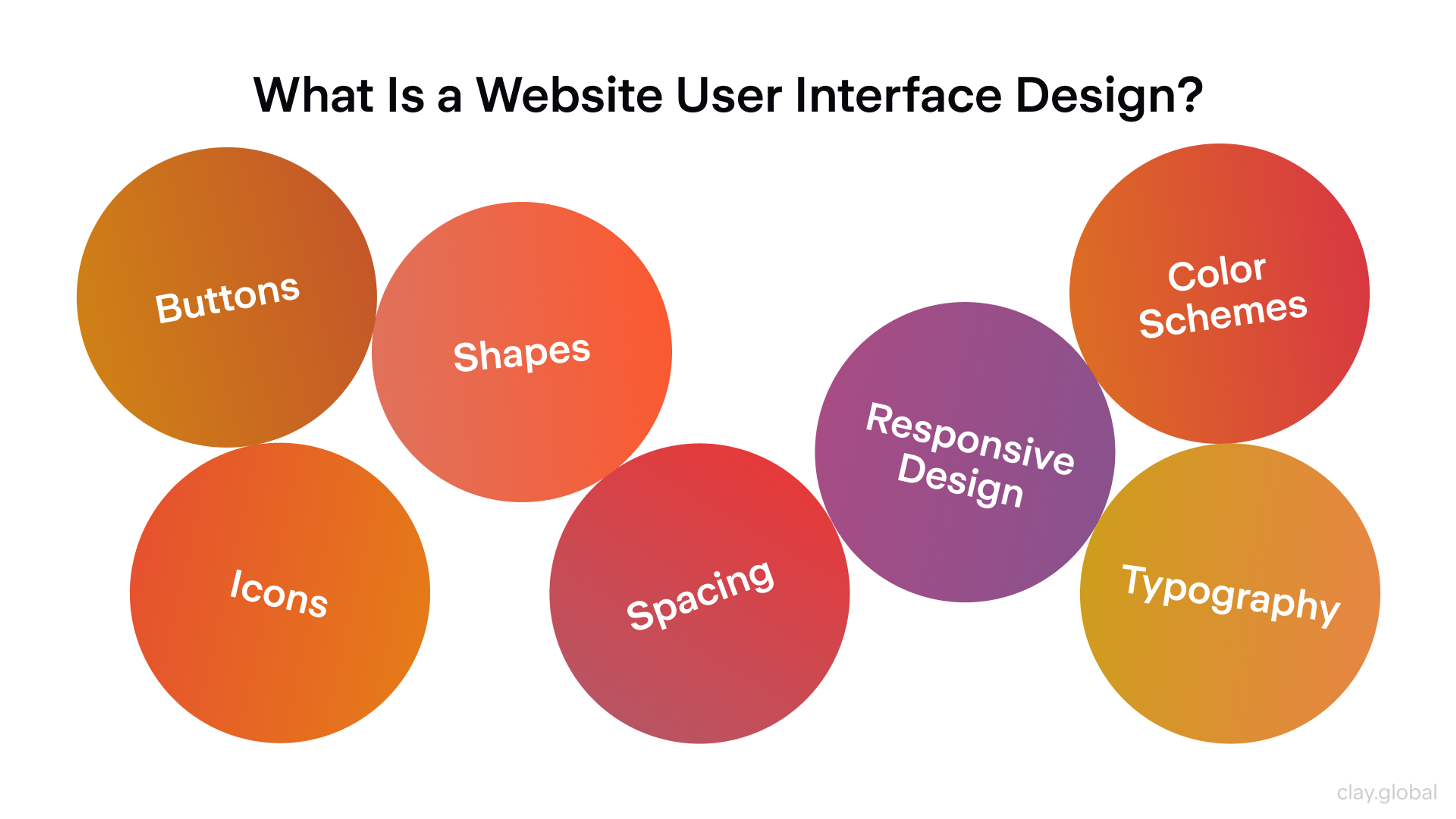
What Is a Website User Interface Design by Clay
Good UI design on mobile devices should minimize the learning curve, making it easy for users to understand and interact with your site quickly. Mobile responsiveness also impacts search rankings, user engagement, and overall website performance.
Competing with Bigger Players
Great UX/UI is a competitive equalizer. A decade ago, a small local shop’s reach was limited, but now that most customers find businesses via Google or social media, your website might get as much traffic as a larger competitor’s.
If your site’s user experience is better – say it loads faster, works flawlessly on mobile, and clearly communicates your value – users will prefer it even if your brand is less known. On the internet, the quality of experience can matter more than a company's size. A slick, user-centered site gives the impression of a competent, trustworthy business.
It can also reinforce branding and customer loyalty. In short, investing in UX/UI design helps a small business punch above its weight, attracting and retaining customers who might otherwise go to bigger competitors. In 2026, good UI design directly impacts a product's success by reducing cognitive friction and driving measurable growth.
Core Principles of Effective UX/UI Design for Small Businesses
What does “good design” look like in practice? For small business websites, it comes down to five essentials: clarity, visual appeal, consistency, mobile responsiveness, and speed. Nail these, and even a simple site can feel dramatically better to use.
- Clarity and Simplicity: Clarity is the basis of good UX. Visitors should instantly understand what you offer and how to move through your site. Use intuitive navigation, clear labels, and straightforward content. Every page needs a purpose, and the next step should be obvious through strong calls to action. Many small business sites still miss this. Some estimates say around 70% do not have a homepage CTA, so users arrive and do not know what to do. Keep layouts clean, reduce visual noise, and follow the classic rule: don’t make people think. Tip: Use progressive disclosure to manage complexity – reveal information step by step so users aren’t overwhelmed and can easily follow the process.
- Visual Appeal: First impressions are visual, and visuals shape trust fast. A cohesive color palette, readable typography, and high-quality imagery make your business feel credible and inviting. The key is attractive but usable. Design should guide attention to important elements like buttons without distracting effects that get in the way. UI designers use contrast strategically to draw attention to important content or features. Designing in grayscale before adding color simplifies the most complex element of visual design and forces you to focus on spacing and layout.
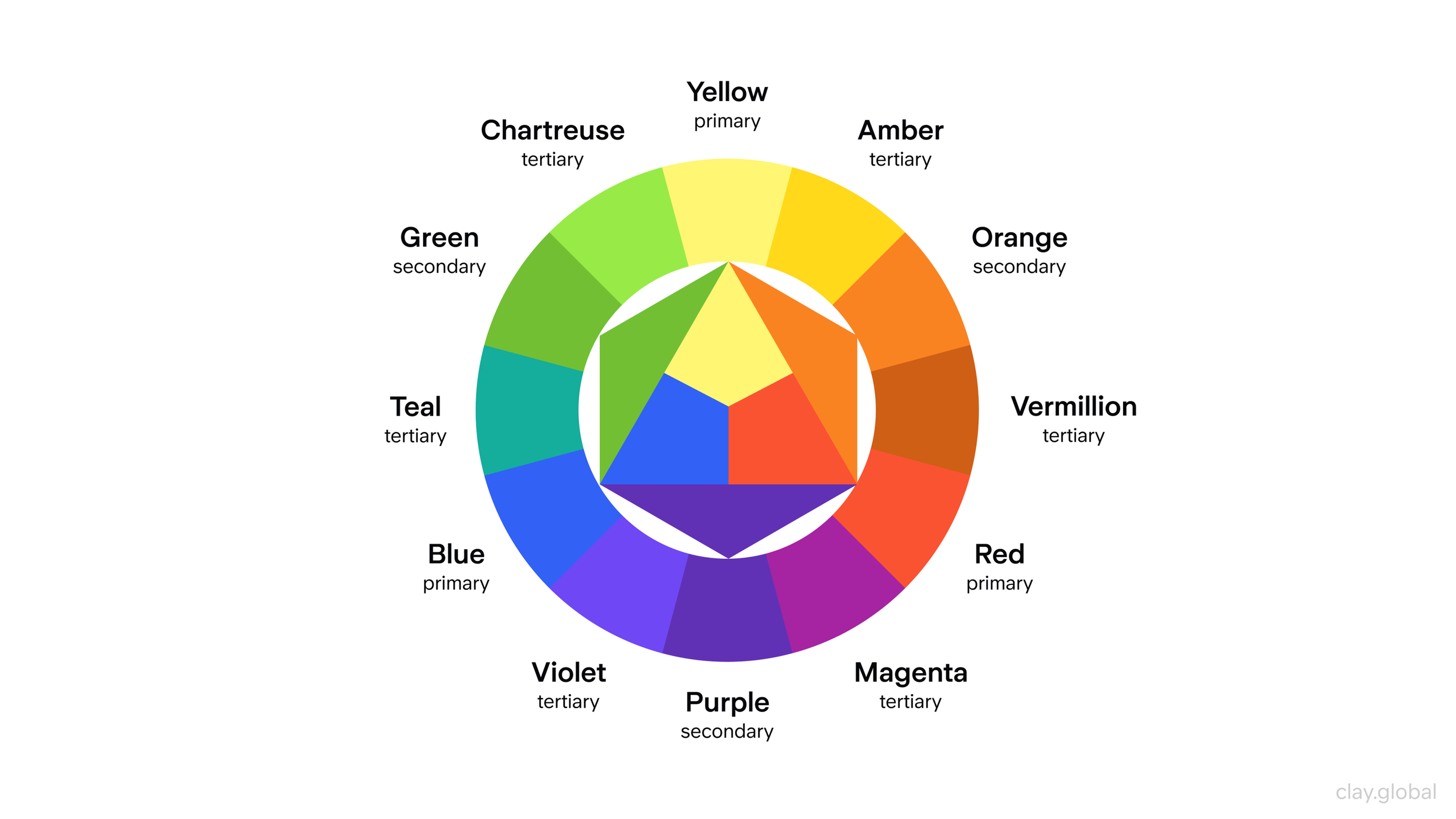
Color Wheel Illustration by Clay
- Consistency: Consistency creates familiarity. Keep colors, fonts, button styles, and layout patterns consistent across pages, and keep your tone of voice aligned as well. When people learn how your site works in one place, they should be able to apply that everywhere. Consistency also strengthens branding and makes a small business look more polished. Following established practices and using consistent UI elements across your platform ensures a seamless, high-quality user experience.
- Mobile Responsiveness: A large share of small business traffic comes from phones, so responsiveness is non-negotiable. If your site breaks on mobile, you will lose customers. One common stat is that 52% of users are less likely to engage after a bad mobile experience. Design for thumbs, keep key actions visible, simplify menus, and make phone numbers and addresses tap-friendly.
- Speed and Performance: Speed is part of UX. Slow pages drive people away, especially on mobile. A widely cited metric is that about 53% of visits are lost if a page takes over 3 seconds to load. Improve performance by compressing images, trimming heavy scripts and plugins, using caching, and avoiding overloaded hosting. A fast site feels respectful and dependable, and it supports conversions.
- Practical tips for small businesses: Use generous white space to make even the messiest interfaces look more inviting and simple. Focus on organizing your UI elements with a clear visual hierarchy, and always look for opportunities to apply best practices that improve your platform’s usability.
Designing with User Psychology in Mind
Great UX is not just about looking good. Many UI design principles are inspired by psychological theories, providing inspiration for effective design. It works with how people see and process information, so the site feels obvious to use. Two practical areas matter most here: Gestalt principles of visual perception and cognitive concepts like mental models and cognitive load.
Gestalt Principles for a Clearer UI
- Proximity and Grouping: People assume items close together belong together. Keep each product’s image, title, price, and button close together, and separate unrelated sections with white space. If labels drift away from their fields, users hesitate and double-check. Tight grouping removes that friction.
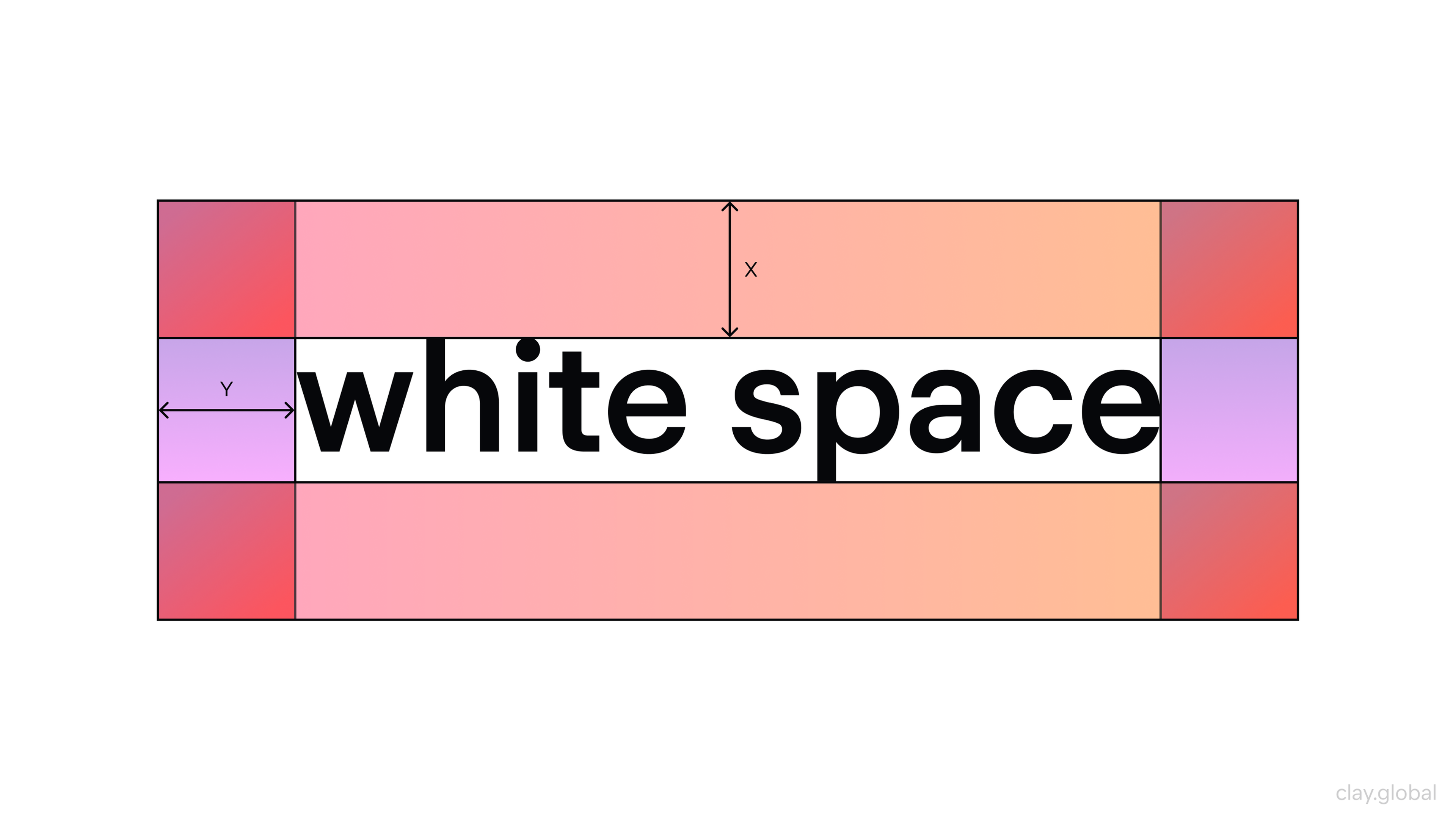
White Space Illustration by Clay
- Similarity and Pattern Recognition: When elements look alike, users expect them to behave alike. Buttons should share the same style, links should look like links, and interactive elements should be visually consistent across pages. If you use the same style for clickable and non-clickable items, users will misread the interface. Familiar conventions also help. Users already know what a cart icon means and how typical navigation works.
- Closure and Continuation: People mentally complete patterns, so you can create clear sections through spacing, alignment, and repeated structure without heavy boxes and borders. Clean layouts feel easier to scan, and aligned elements naturally guide the eye through the page.
Used together, these principles make your site readable at a glance. Things feel organized, predictable, and effortless. Next, we’ll focus on cognitive design, including user expectations and how to reduce mental effort.
Designing for Intuition
Good UX matches how users think and what they expect. Three practical ideas help most: mental models, cognitive load, and clear affordances. In plain terms, do not surprise people, do not overload them, and make actions obvious.
- Align with user expectations (mental models): Users arrive with learned habits. Logos usually return to the homepage; underlined blue text reads as a link, and the cart icon signals shopping. Stick to familiar patterns for navigation, contact info, and checkout flow. You can still be unique, but any deviation should be clearly helpful, not just different.
Website Navigation Example by Clay
- Minimize cognitive load: Every “Where do I click?” moment costs mental energy. Too many choices slow decisions (Hick’s Law), so simplify menus, limit competing CTAs, and guide users with a clear visual hierarchy. Show only what people need right now, use plain labels, and keep forms short. If users cannot quickly understand the page, they leave.
- Use clear affordances (interactive cues): Buttons, links, and fields should look clickable and give feedback when used. Avoid styling plain text like a link, and do not hide important controls. If an action is possible, the UI should signal it instantly.
Apply these principles, and your site feels effortless. Users focus on your offer, not on figuring out the interface.
Information Architecture and Navigation
Great visuals do not help if people cannot find what they need. Information architecture is how you organize and label content through your sitemap, menus, and user paths. Even small sites can feel confusing when structured around internal logic rather than user goals.
- Organize content around user goals: Start with what visitors come for, then build your main sections around that. A gym user wants pricing, schedules, and trainers, so those should be clear pages. Use plain labels people expect, not internal jargon like “Capabilities” when “Services” is clearer. Keep top navigation short, ideally 5 to 7 items, and group subpages logically within their section. Key info should be accessible in 1 or 2 clicks. A simple test is to ask someone new to your site to find something important and watch their first click. Design clear workflows that guide users through key tasks, making complex processes more intuitive and efficient.
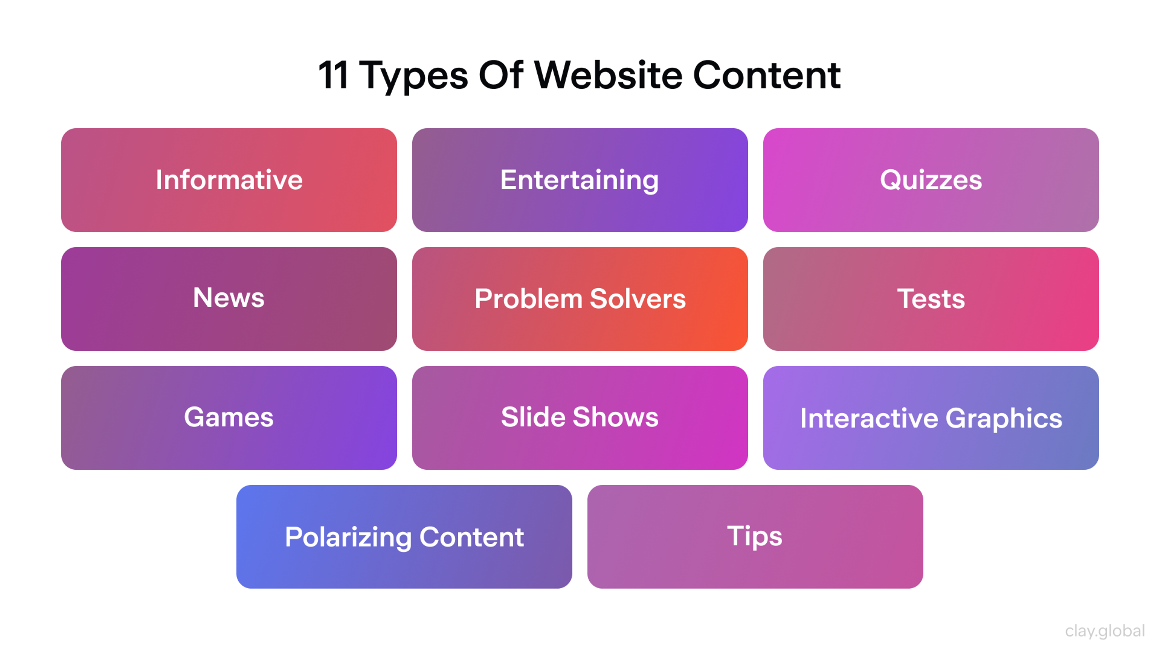
11 Types of Website Content by Clay
- Design navigation that guides users: Keep your main menu visible and predictable, and avoid clever labels that require decoding. Show the user's location with an active state, and clear page titles and breadcrumbs if your site has more than one level. Simplify navigation by focusing on a single, well-designed screen for each major task or section, reducing decision fatigue and helping users stay focused. Do not bury critical pages, such as pricing or booking, behind deep menus, and avoid hover-only navigation that breaks on mobile.
Good navigation works like clear signage. Users always know where they are, and getting to the next step feels effortless.
Building Trust Through Design
Trust is what turns visitors into customers, especially online, where people judge you through your site. Design can strengthen credibility fast, or quietly undermine it.
- Professional aesthetics and first impressions: Visual polish signals competence. A clean, modern, consistent interface with sharp images and tidy typography feels reliable. An unattractive or outdated design creates doubt before users even read your content. One widely cited finding is that people make most credibility judgments from aesthetics. Avoid clashing fonts and colors, obvious layout mistakes, and dated UI patterns. Your site is your storefront. Seamless connection processes, such as effortless Bluetooth pairing or intuitive video call setup, further enhance user trust and experience.
- Content transparency and communication: Trust also comes from clarity. Use honest, plain copy about what you offer, pricing, terms, and policies. Do not hide costs, stock status, or fine print. If you cannot list exact prices, give a range and explain what affects it. Add a helpful FAQ where it makes sense. Provide easy access to important information, such as through a contact form or dedicated email link, so users can request more details or view exclusive content when appropriate.
- Social proof, done right: Reviews and testimonials work best when they feel real and specific. Use names, locations, photos, or concrete details when possible. A few client logos, awards, or credentials can help, as long as they are genuine and not overhyped. Organize video testimonials or video content in a user-friendly way to make it easy for visitors to engage with authentic experiences.
- Avoid dark patterns: Nothing kills trust faster than feeling tricked. Do not hide cancellations, pre-check boxes, or disguise fees. Make actions and consequences clear, and use helpful microcopy, such as specific error messages. When the site feels fair and transparent, users feel safe moving forward.
Accessibility is essential in UI design, ensuring products are usable for all users, including those with disabilities.
Consistency and Design Systems
A “design system” is not just for big teams. For a small business, it simply means using consistent, reusable styles so the site stays unified as it grows. Even a simple mini style guide or a good template can do the job.
- Reusable components and styles: Stick to a small set of building blocks and reuse them everywhere. One primary and one secondary button style, one input style, one card layout for listings, and a few standard section layouts. This makes the site easier to learn, faster to update, and less error-prone. If you change a single button style, it improves the whole site. Following best practices for organizing and styling UI elements across your platform ensures a cohesive and high-quality user experience.
- Established patterns and templates: Use familiar UI patterns for navigation, forms, galleries, FAQs, and checkout flows. It is not unoriginal. Users already know how these patterns work, and templates give you proven structure while your branding and content make it distinctive.
- Maintain cohesion as you grow: New features like shops, blogs, or booking tools should feel like they belong on the same site. Third party add ons often look mismatched, so theme them to match your fonts, colors, and button styles. When you introduce a new UI element, design it in your existing style so it becomes part of the system.
Consistency keeps the experience predictable and on brand. It also saves time and prevents your site from turning into a patchwork over time.
Good UX vs. Bad UX: Examples from Small Business Websites
Smaller businesses with great UI design are distinguished by their appealing, effortless, and engaging user experiences. The following are real-world examples and projects drawn from the own work and portfolios of designers and agencies, highlighting authentic and effective UI and product design.
A UX design portfolio is a curated compilation of work samples that demonstrates your skills, abilities, and expertise as a UX designer. A well-crafted portfolio website is essential for standing out in the job market, as hiring managers use portfolio quality to quickly assess and weed out potential candidates.
The best UX portfolios showcase an applicant's ability to think critically, solve problems creatively, and demonstrate technical proficiency in product design and user experience.
Joe & The Juice
In our work with Joe & The Juice, we created a visually appealing and user-friendly website that makes a strong first impression. We built trust with potential customers by strategically using colors, typography, and layout.
Joe & The Juice Design by Clay
The clean, intuitive design allows users to navigate easily without having to search for information. Additionally, including interactive elements enhances the website's visual appeal and increases user engagement, making it more accessible and enjoyable.
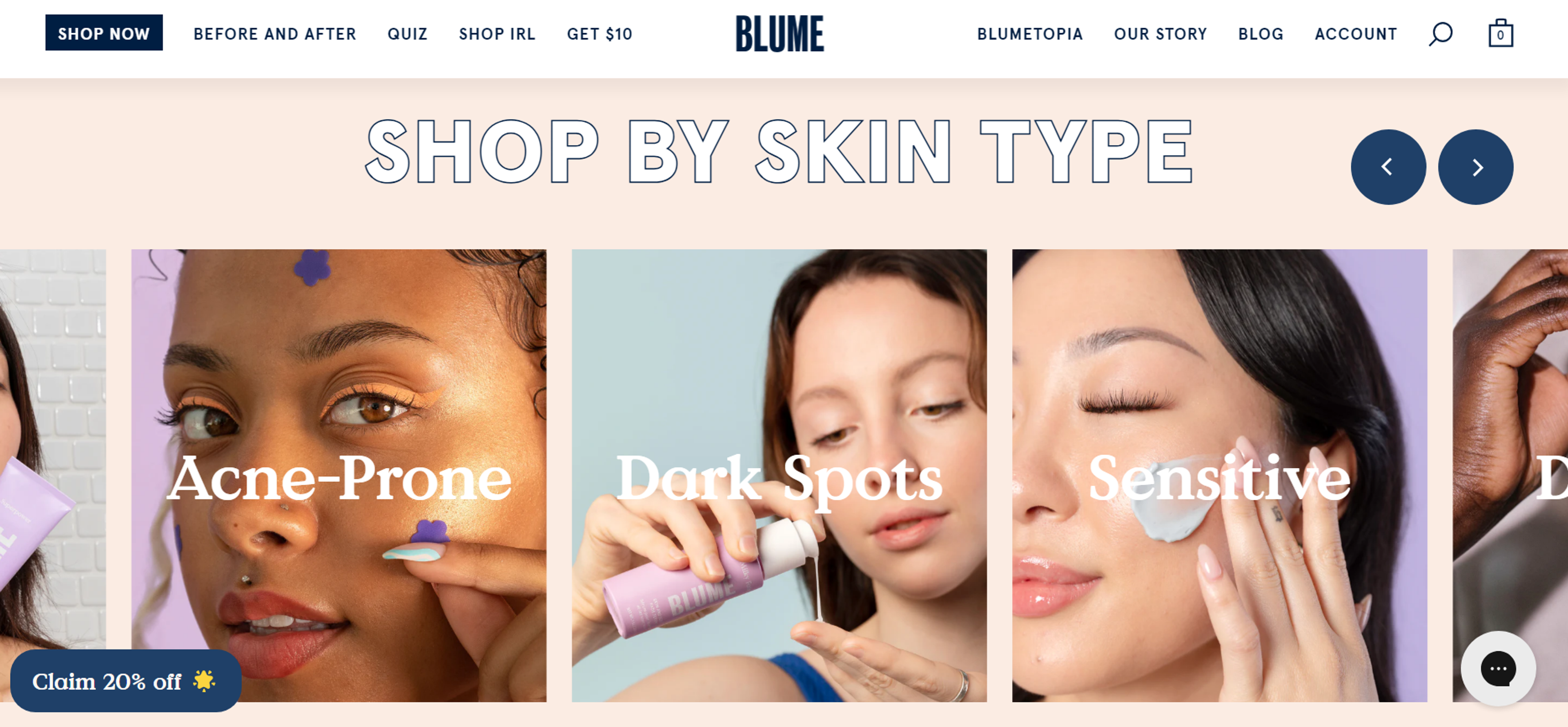
Blume
Blume is a skincare and wellness brand that favors a minimalist yet playful design for their shopping experience. For a small business that values branding and usability, the soft color palette, intuitive navigation, and interactive product pages are a perfect fusion of a tranquil experience.
Source: blume.com
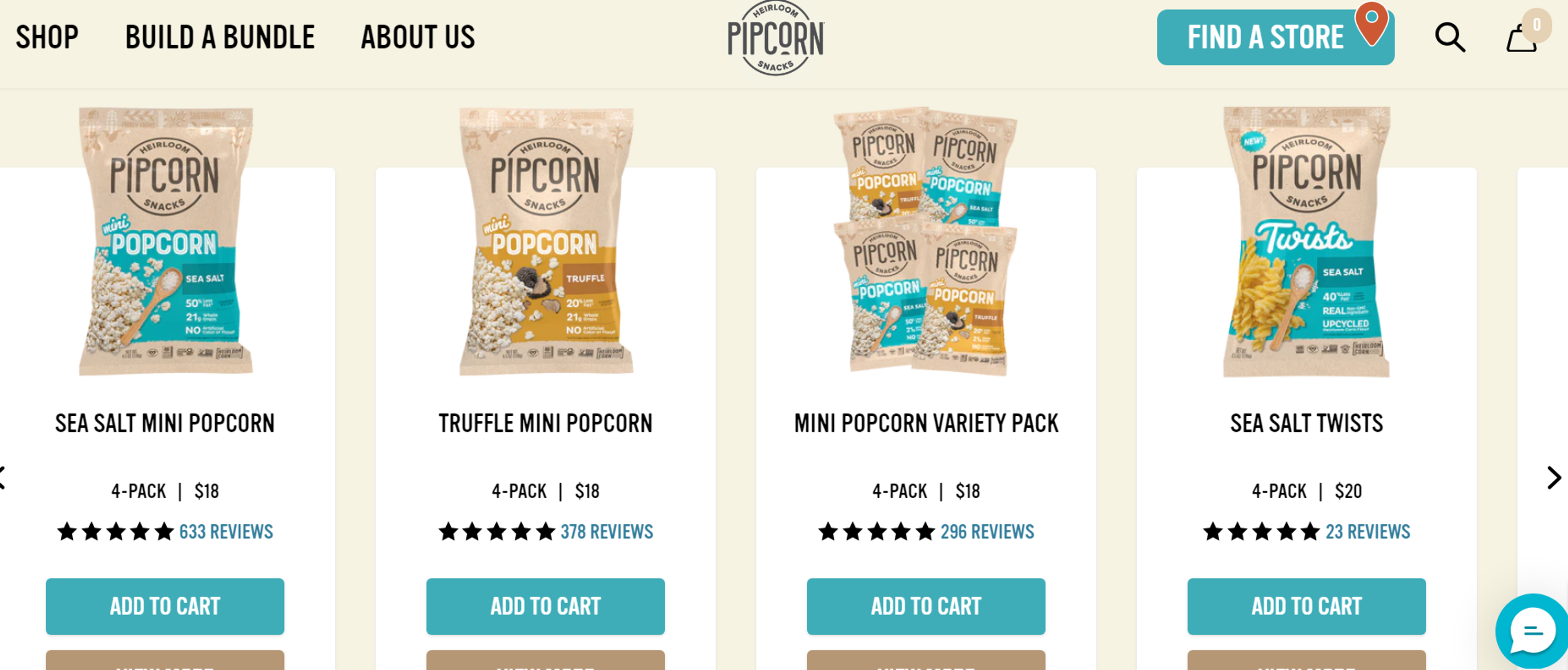
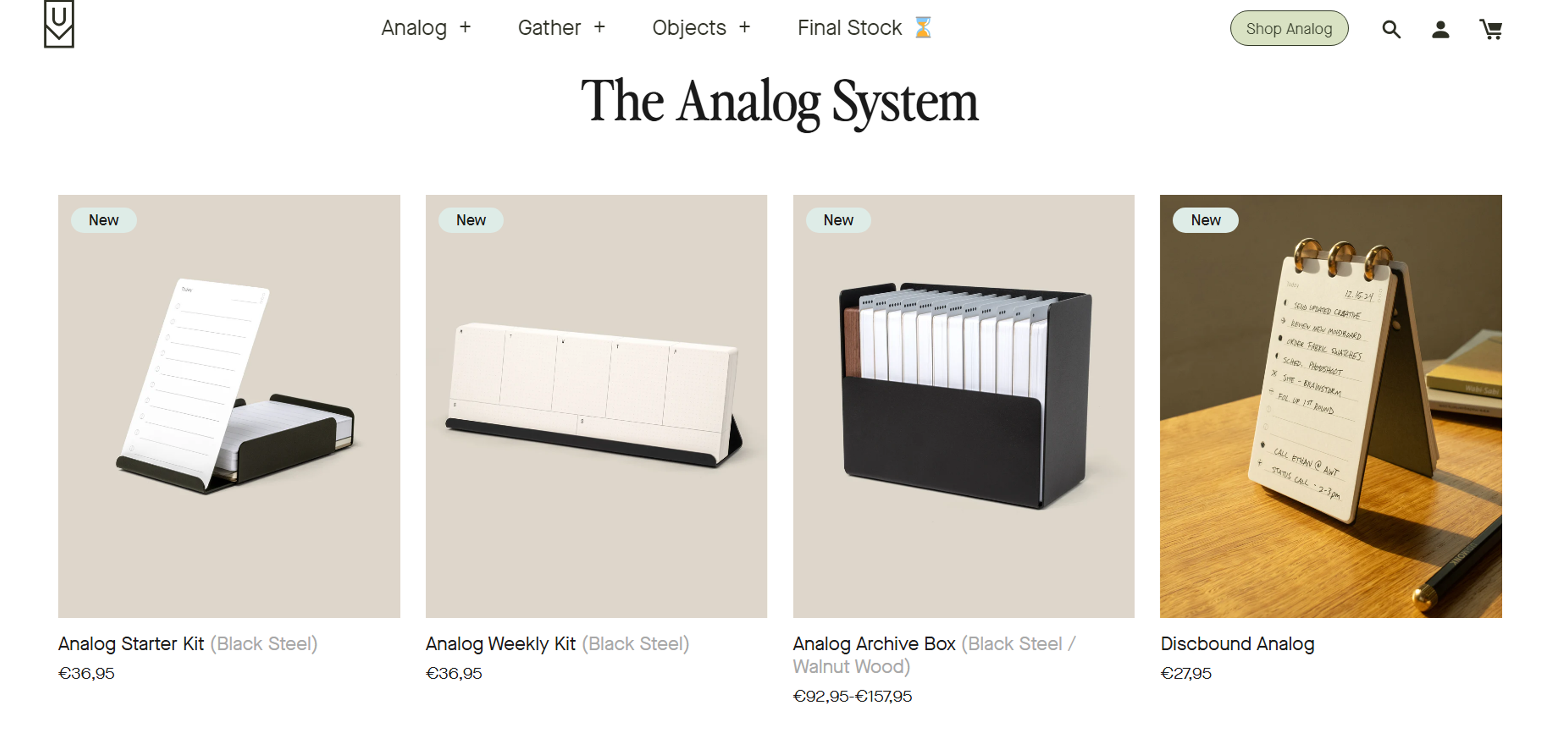
Pipcorn
Pipcorn is a small yet growing snack brand with a simple UI design that provides an effortless, smooth user experience. The website highlights its products with bold visuals, large buttons, and easy checkout options. Users can easily discover and browse products seamlessly, which greatly helps keep them engaged.
Source: pipsnacks.com
Ugmonk
The boutique lifestyle brand Ugmonk has always drawn attention with its clean typography, breathtaking high-quality visuals, and intuitive interface, which convey a sense of rest and comfort. Its product pages emphasize an uncluttered design and ample white space, offering a premium yet accessible shopping experience that many greatly appreciate.
Source: ugmonk.com
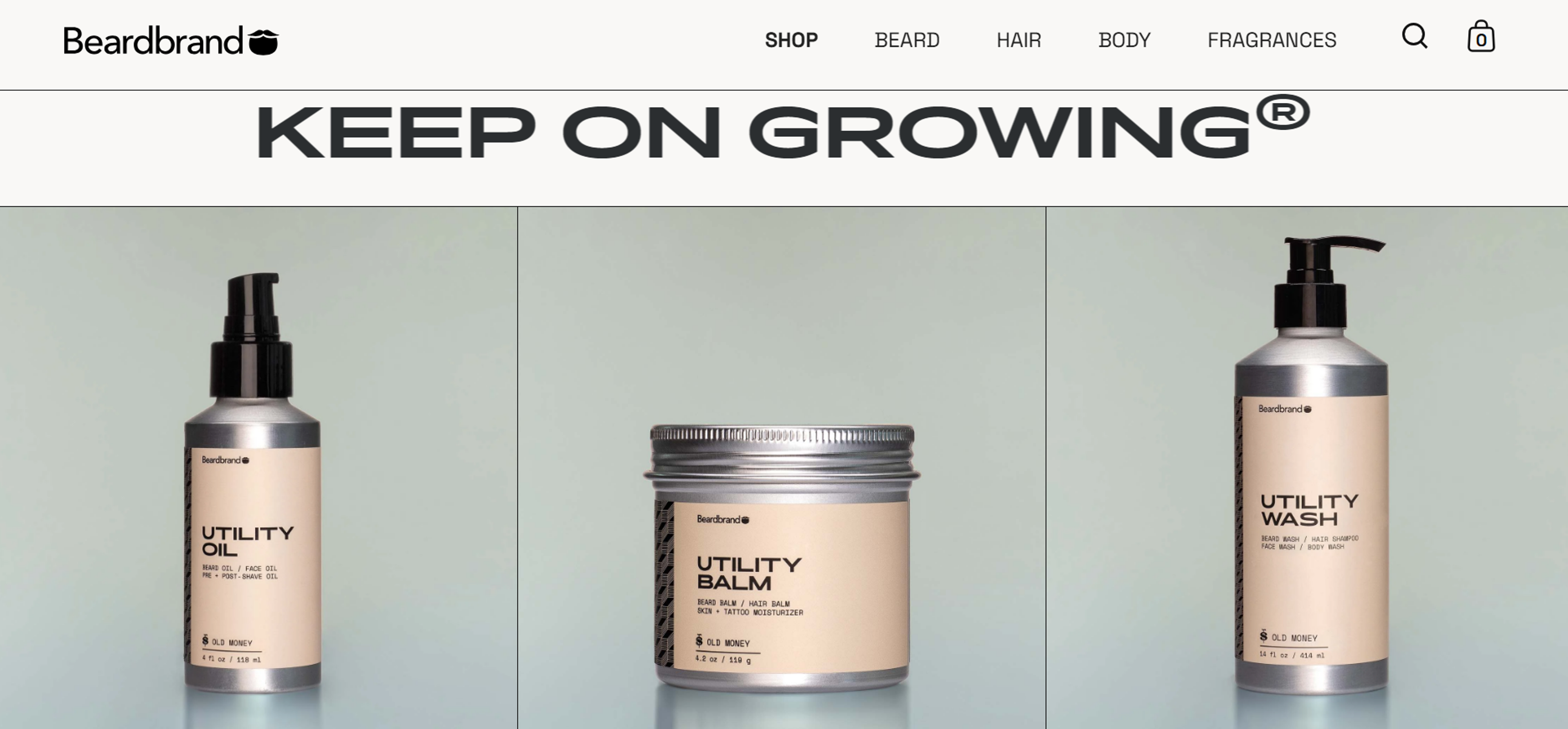
Beardbrand
Beardbrand is a small men's grooming brand with bold branding and functional UI. It ensures customer engagement via an interactive product quiz, informative visuals, and smooth product navigation, making the products easy for customers to find.
Source: beardbrand.com
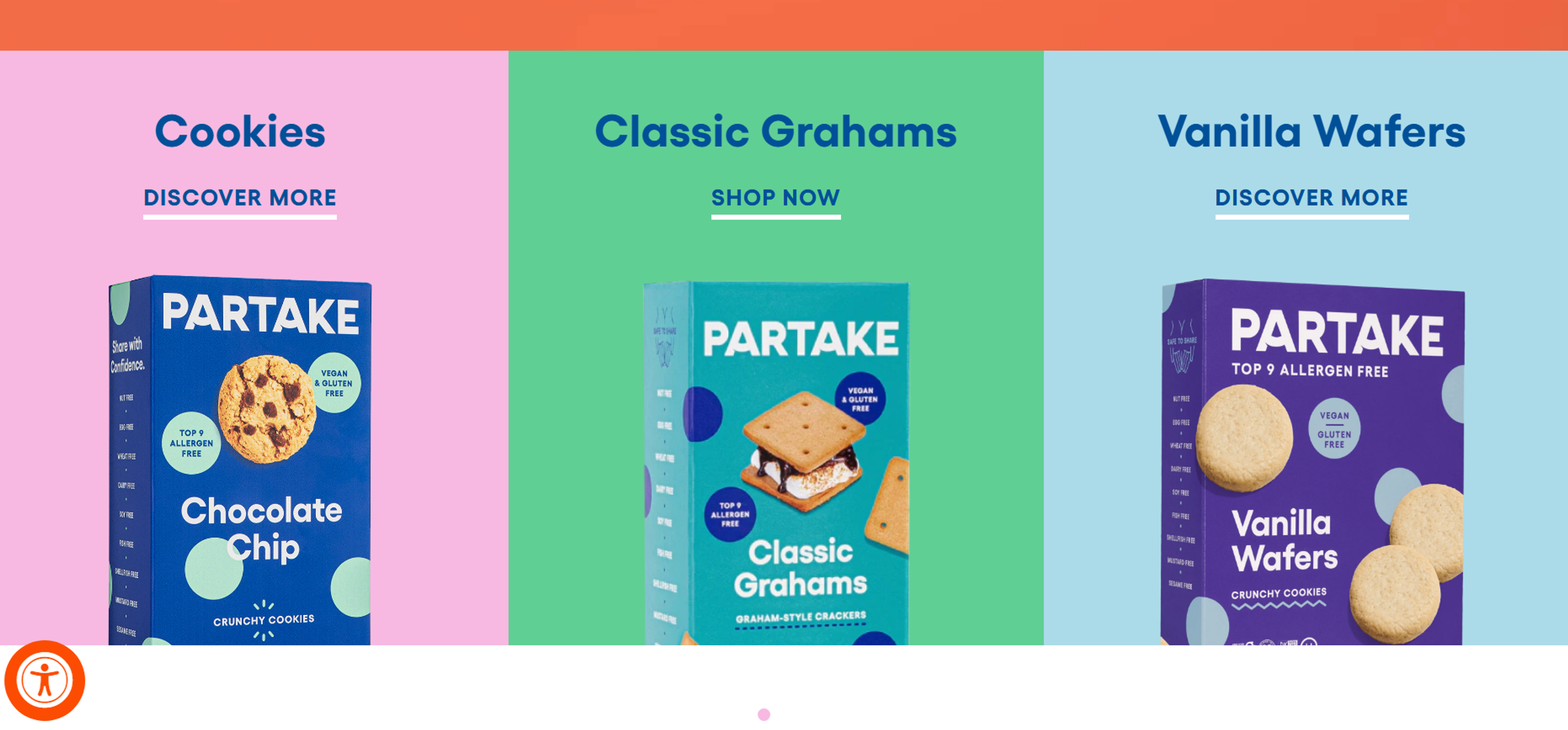
Partake Foods
Partake Foods focuses on creating snack products that are free of allergens. They utilize simple fonts, easy-to-filter product labels, a universal design style, clear communication, and an overall very visual UI. All of these efforts strengthen its brand identity while still catering to a broader audience.
Source: partakefoods.com
FAQ
What Is UI Design?
UI design works closely with UX design, where UX designers focus on the overall user experience, including user flows and emotional impact, while UI designers concentrate on the visual and interactive aspects of a digital product.
It includes layouts, colors, typography, buttons, icons, and all elements users touch or see. Its purpose is to make interactions clear, intuitive, and visually appealing so users can complete tasks easily.
Why Is UI Design Important for Small Businesses?
UI design affects how users perceive your business within seconds. Clear, intuitive interfaces build trust, increase conversions, and make your website easier to navigate. A polished interface signals credibility, reduces frustration, and helps small businesses compete with larger brands.
What Makes a UI Intuitive?
A UI feels intuitive when it aligns with users' mental models, employs familiar patterns, and conveys functionality visually. A clear hierarchy, consistent design elements, and recognizable cues, such as buttons and icons, help users understand the interface with minimal effort.
How Does UI Design Build Trust?
UI design builds trust through professional visuals, consistent branding, readable content, and transparent communication. High-quality images, clean layouts, and clear navigation show reliability. Users feel safer engaging with businesses whose interfaces appear credible and well-maintained.
How Can Small Businesses Improve Their UI?
Small businesses can enhance their UI by simplifying navigation, using consistent colors and typography, organizing content clearly, and minimizing visual clutter. Testing designs with real users reveals problems quickly. Even minor improvements, such as clearer buttons or better spacing, can significantly enhance usability.
Read more
Conclusion
For small businesses, investing in UX and UI is a smart way to boost online results.
Your website is often the first impression. Good UX builds trust, helps users find what they need, and increases conversions. Bad UX pushes people away fast.
Focus on the essentials: clarity, consistent visuals, mobile friendliness, and speed. Add a clear homepage CTA so users always know the next step.
Use psychology to make the site feel intuitive. Apply familiar patterns, reduce mental effort, and organize navigation around user goals so nobody gets lost.
Build trust through professional design, transparent copy, visible contact info, clear pricing and policies, and basic security cues.
Stay consistent as you grow by reusing a small set of styles and components. The biggest wins come from thoughtful structure and simplicity, not budget.

About Clay
Clay is a UI/UX design & branding agency in San Francisco. We team up with startups and leading brands to create transformative digital experience. Clients: Facebook, Slack, Google, Amazon, Credit Karma, Zenefits, etc.
Learn moreAbout Clay
Clay is a UI/UX design & branding agency in San Francisco. We team up with startups and leading brands to create transformative digital experience. Clients: Facebook, Slack, Google, Amazon, Credit Karma, Zenefits, etc.
Learn more