
Mobile isn't just another channel anymore. For most products, it's the primary surface where people discover value, build habits, and decide whether they trust you at all.
That makes mobile work less about pretty screens and more about a handful of early decisions: which build path to take, what belongs in your first release, how to design for touch and speed, and how to ship without the process quietly eating your timeline.
Key Takeaways
- Native, cross-platform, hybrid, and PWA solve different problems. Choose based on budget, team skill, and which device features you actually need, not on habit.
- AI-assisted coding tools have changed development velocity, but they haven't changed which decisions still need a human call: scope, hierarchy, and trust.
- An MVP isn't a smaller version of your app. It's the one feature that proves people want what you're building.
- Touch targets, load time, and permission requests decide whether people stick around long enough to see your best work.
- Most launch delays come from a short list of repeatable mistakes, not bad luck.
- Accessibility and privacy compliance affect App Store approval, not just ethics.
Native vs Cross-Platform vs Hybrid vs PWA
Before a single screen gets designed, someone has to decide how the app gets built. That choice shapes cost, speed to launch, and what the app can eventually do.
Native vs Cross-Platform vs Kotlin vs PWA
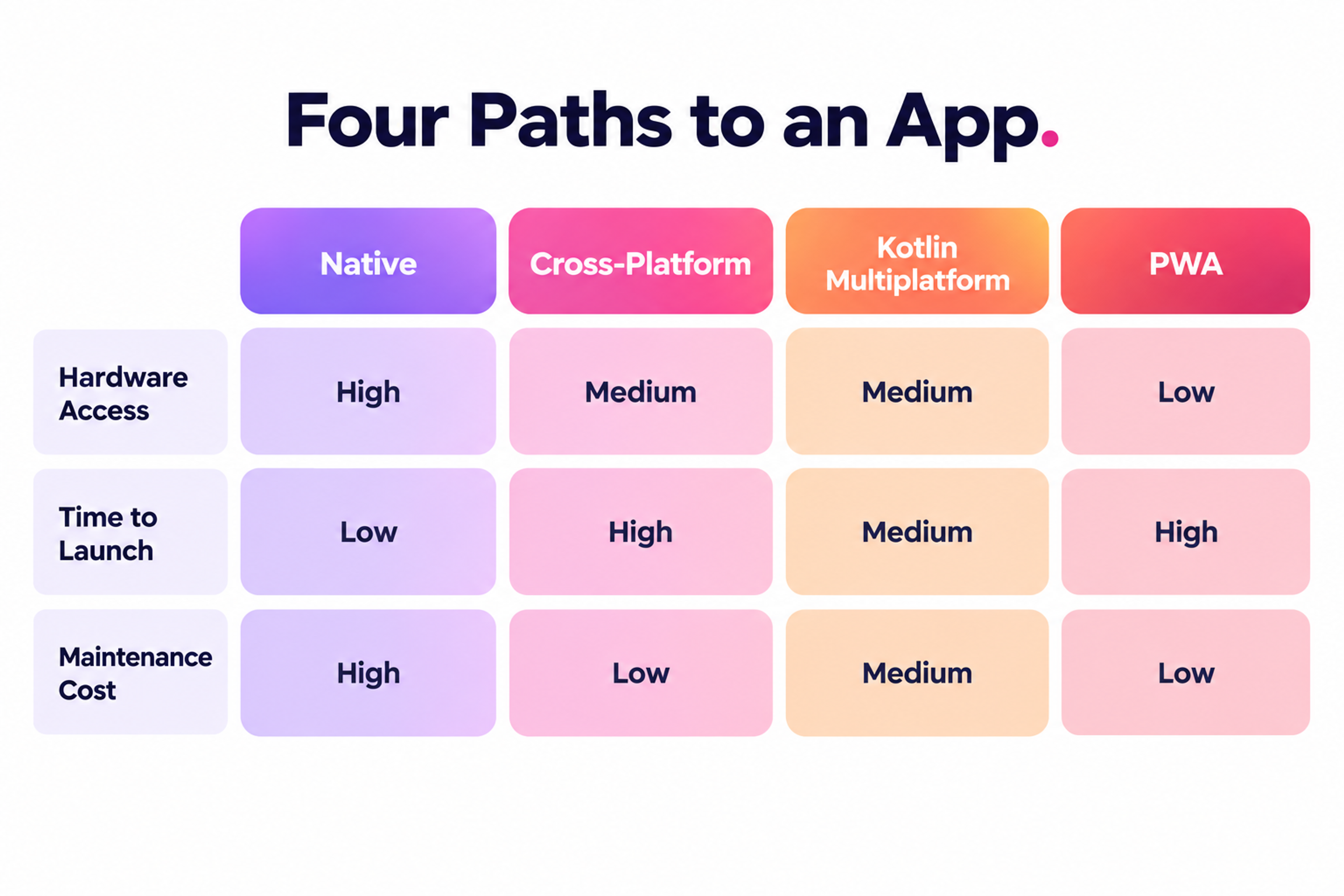
Native apps are written specifically for one platform, Swift and Kotlin, using each OS's own tools. You get full access to the camera, biometrics, background processing, and every other device capability, plus the smoothest performance. The cost is that you're maintaining two separate codebases if you want both iOS and Android.
Cross-platform frameworks, React Native and Flutter being the two with the largest ecosystems, let you share the bulk of your codebase across both platforms. You trade a small amount of performance and slightly delayed access to brand-new OS features for a real cut in development time and cost. For most consumer and B2B apps, that trade is worth making.
Kotlin Multiplatform (KMP) takes a different cut at the same problem: it shares business logic, data layer, and networking across platforms while keeping fully native UI on each one. Teams that need native-feeling interfaces but don't want to duplicate everything below the screen are increasingly reaching for it instead of choosing native or cross-platform outright.
It's a newer option than React Native or Flutter, so the library ecosystem is thinner, but production use at companies like Netflix and Cash App has made it a credible third path rather than a niche experiment.
Hybrid Approach to App Development
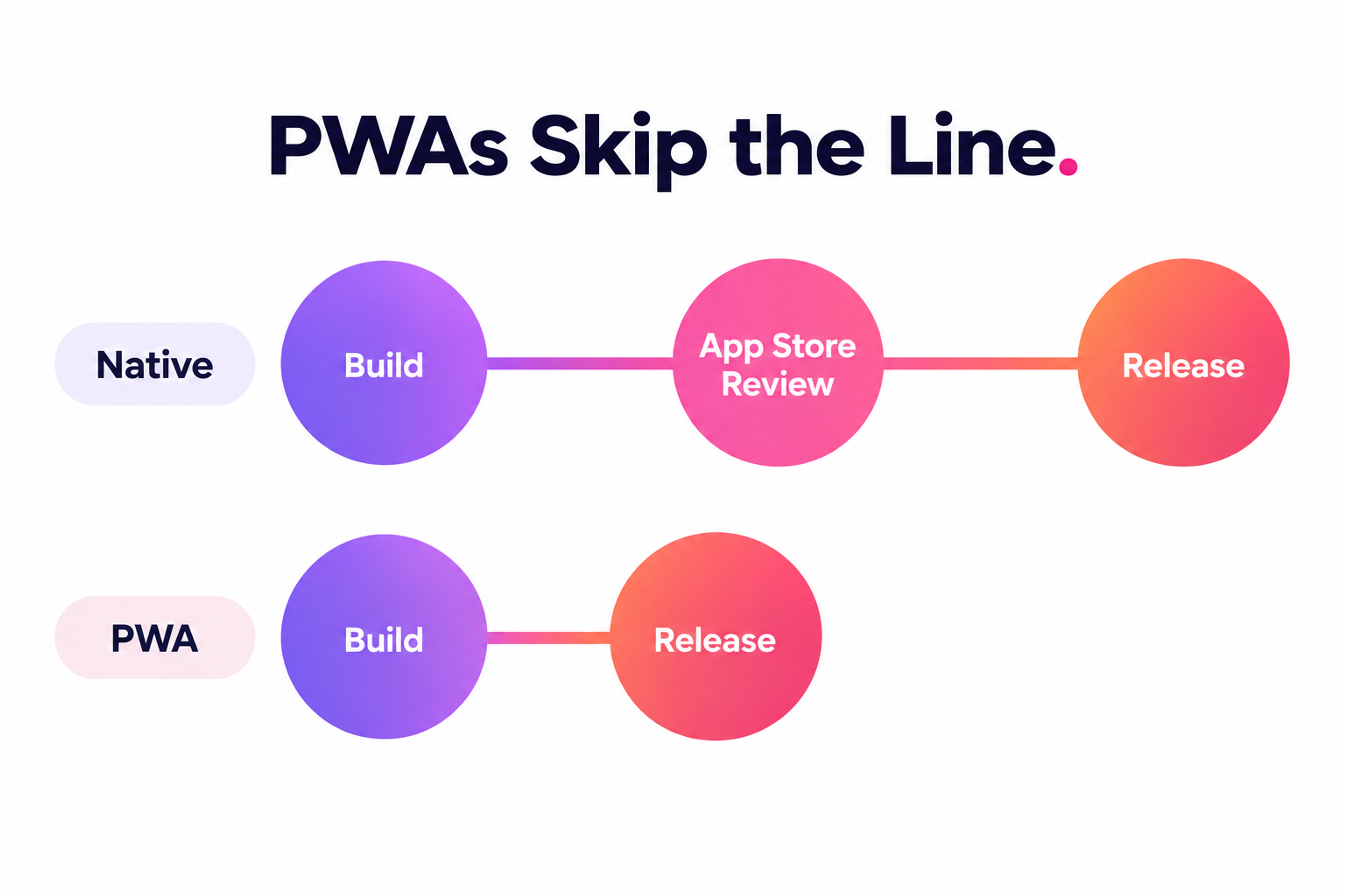
Progressive Web Apps (PWAs) are the option teams most often skip, and the one worth a second look. A PWA installs from the browser, no app store review, no separate codebase for a second platform, and it updates instantly without waiting on anyone's approval.
The catch: PWAs still can't reach the full range of device hardware a native app can, and iOS support for PWA features lags behind Android's. If your app's core value doesn't depend on deep hardware access, a PWA can get you to market before a native build has even cleared its first App Store review.
Pick based on three questions: how much of the device's hardware does the core experience need? How fast do you need to be live? What's your budget for maintaining two codebases versus one?
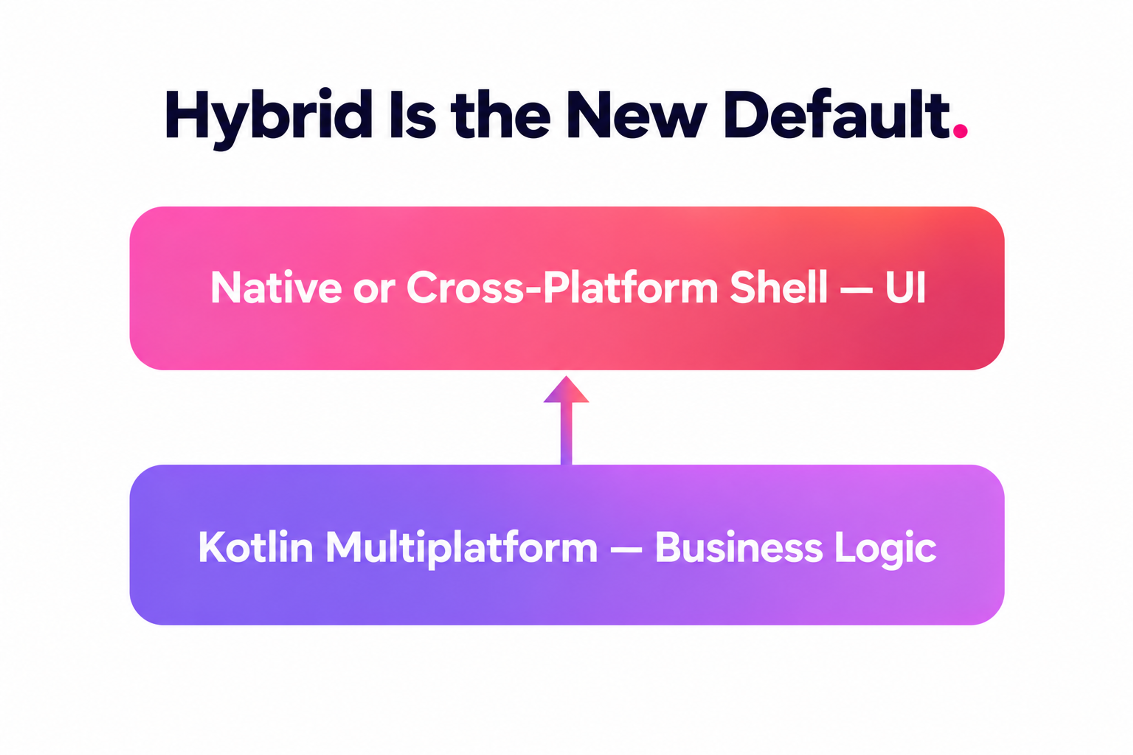
The increasingly common answer isn't a single framework anyway. Teams building both a performance-critical core and a fast-moving UI often mix approaches, KMP under the hood with a native or cross-platform shell on top, rather than treating the choice as all-or-nothing.
PWA Process
What still sinks teams is skipping this exercise entirely and defaulting to "native because that's what everyone does." That usually means paying twice, once for the build, and again when they realize a PWA, KMP, or a cross-platform build would have gotten them to the same users for less.
Scoping an MVP to Validate Demand
An MVP is not a stripped-down version of your final app. It's the smallest thing you can ship that tests whether the core assumption behind the product is true.
Start with the job-to-be-done: the single task the user hires your app to do. Everything that doesn't serve that task gets cut from version one, no matter how good the idea sounds in a planning meeting. A loyalty app doesn't need gamified streaks in week one. It needs a fast, reliable way to earn and redeem points.
A useful scoping test: if you removed this feature, would the app still prove or disprove your core hypothesis? If yes, cut it for now. This is harder than it sounds, because most feature requests during early planning come from stakeholders imagining the finished product, not the smallest version that answers a real question.
The MVP Test
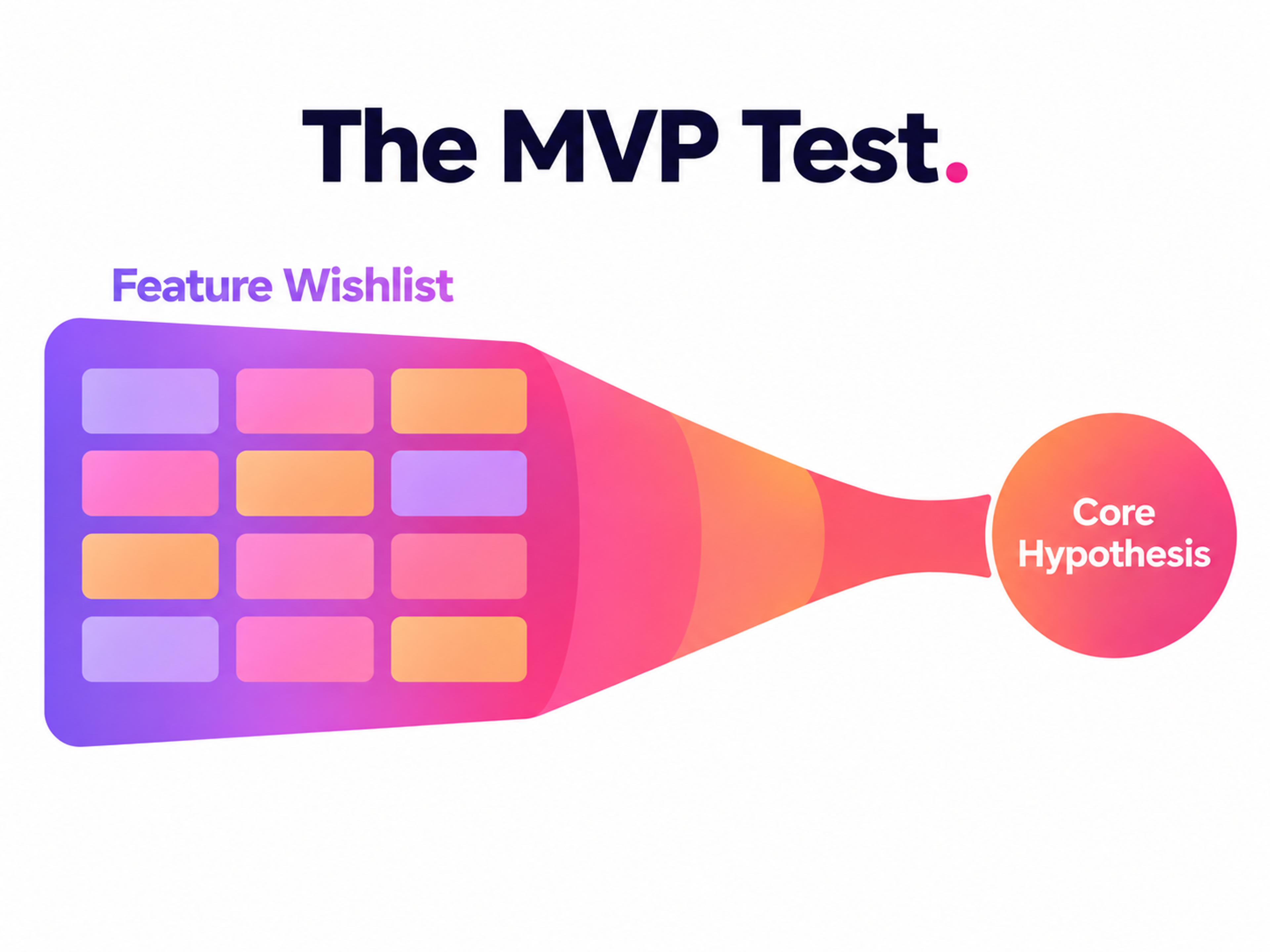
Once the MVP is live, the goal is the data: activation rate, day-one retention, and whether people complete the core task without help. Those numbers tell you whether to invest further or rethink the premise, and they're far cheaper to get wrong on an MVP than on a fully-built app six months in.
Designing for Touch, Speed, and Trust
A mobile app lives inside real constraints: small screens, touch input, inconsistent connectivity, and a battery that people notice draining. None of that forgives a confusing interface the way a desktop app sometimes can.
Interaction design is where this gets solved. Clear visual hierarchy, consistent typography and color, and intuitive navigation all work together to tell someone what to do next without making them think about it. Touch targets need real room. A button that's easy to hit with a mouse cursor is often too small for a thumb, especially for anyone holding the phone one-handed or using it while walking.
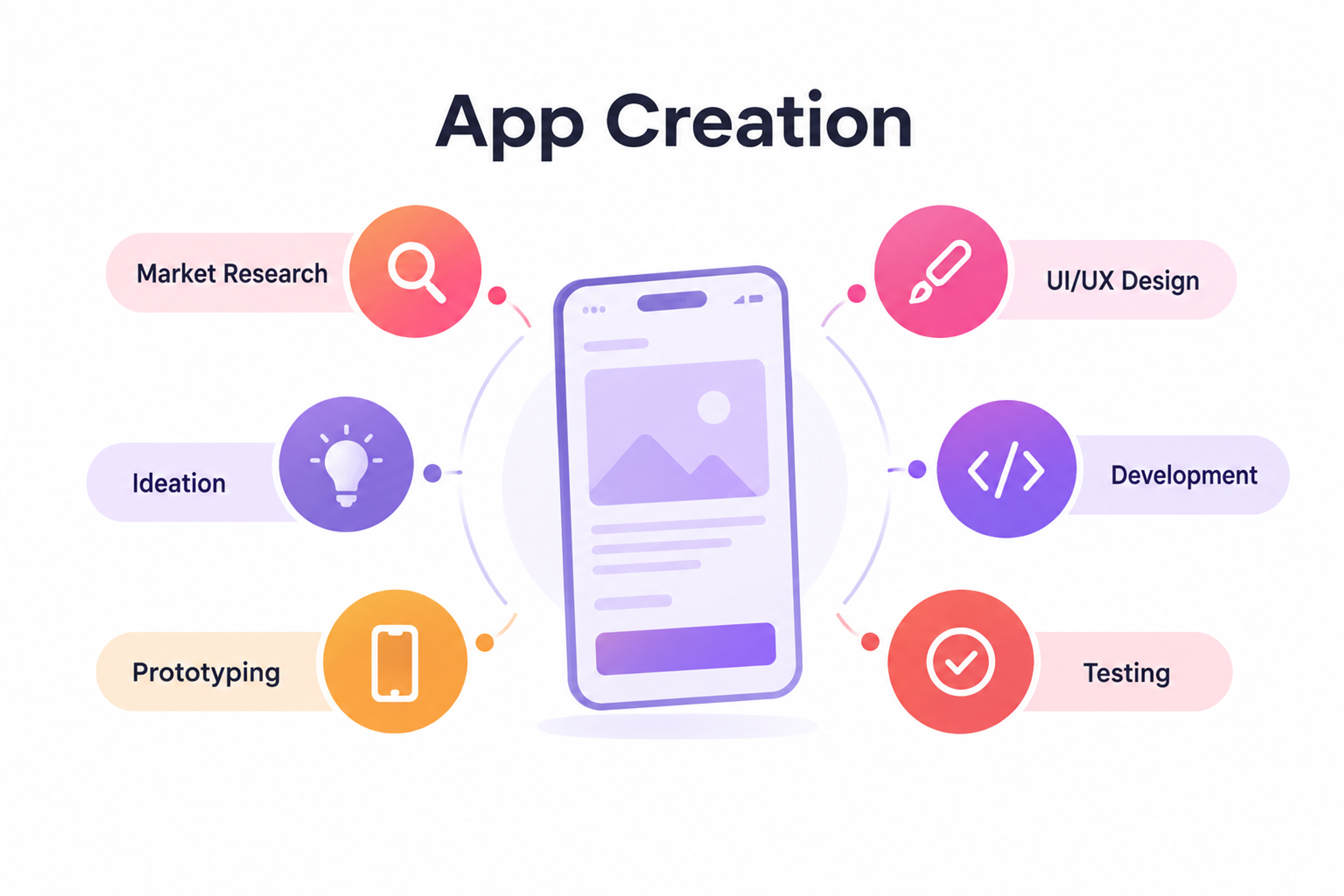
App Creation Process
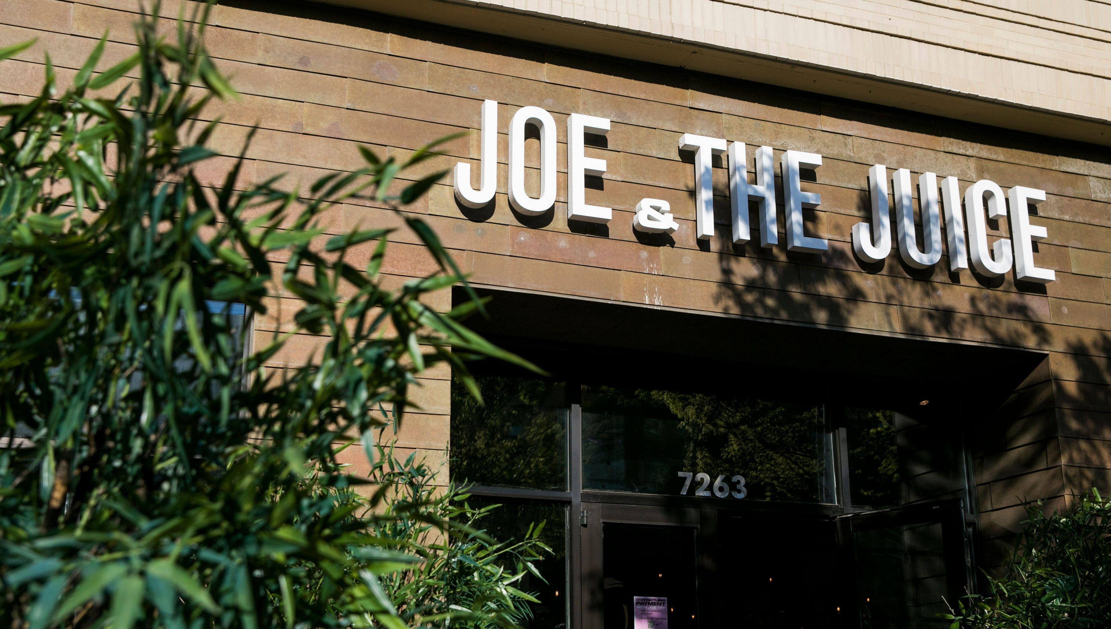
Our mobile app work for Joe & The Juice is a good example of what this looks like at scale. Streamlining ordering across 300+ stores meant designing a visual hierarchy that made the loyalty program, pickup, and delivery flows obvious at a glance, then iterating on that design over a multi-year partnership as new needs came up, including contactless pickup solutions during the pandemic, when the app briefly became the brand's only sales channel.
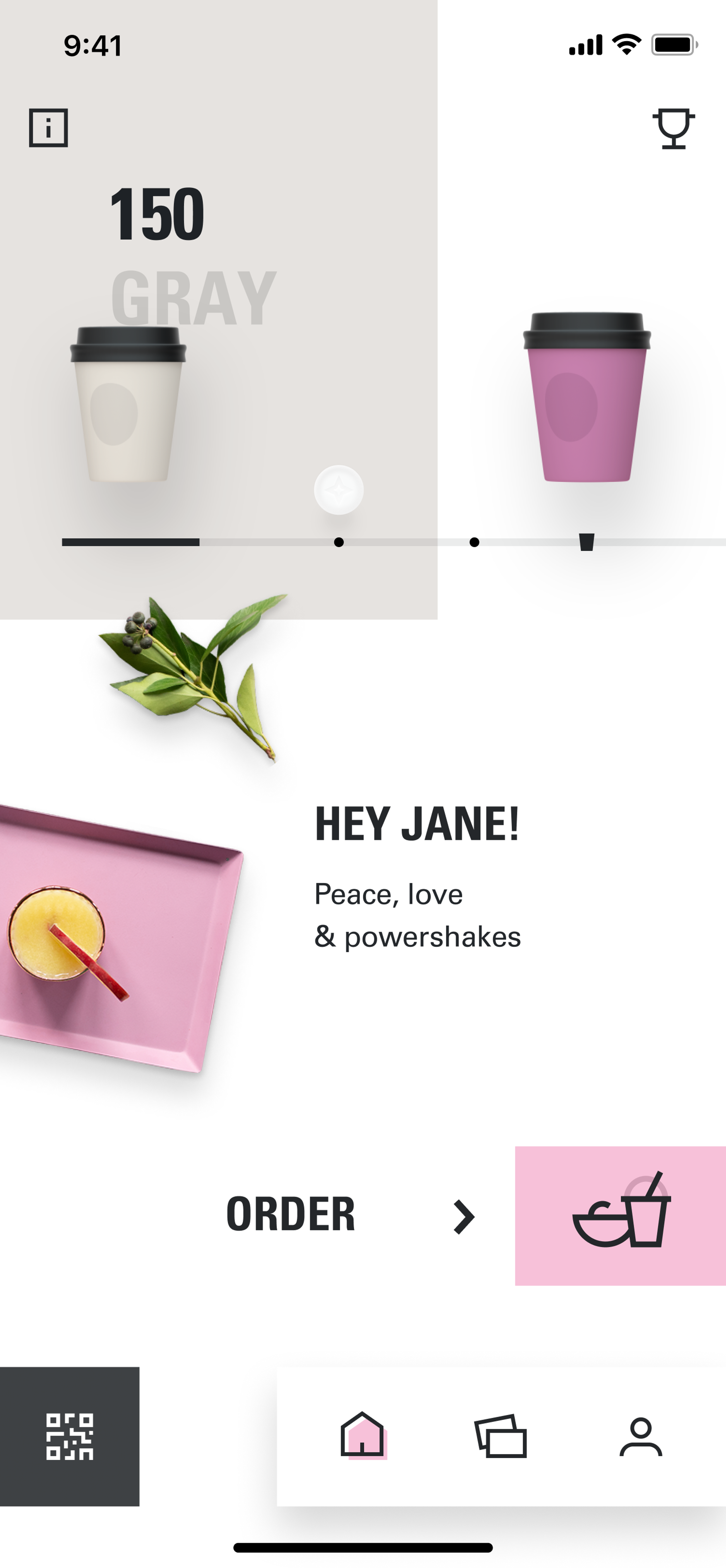
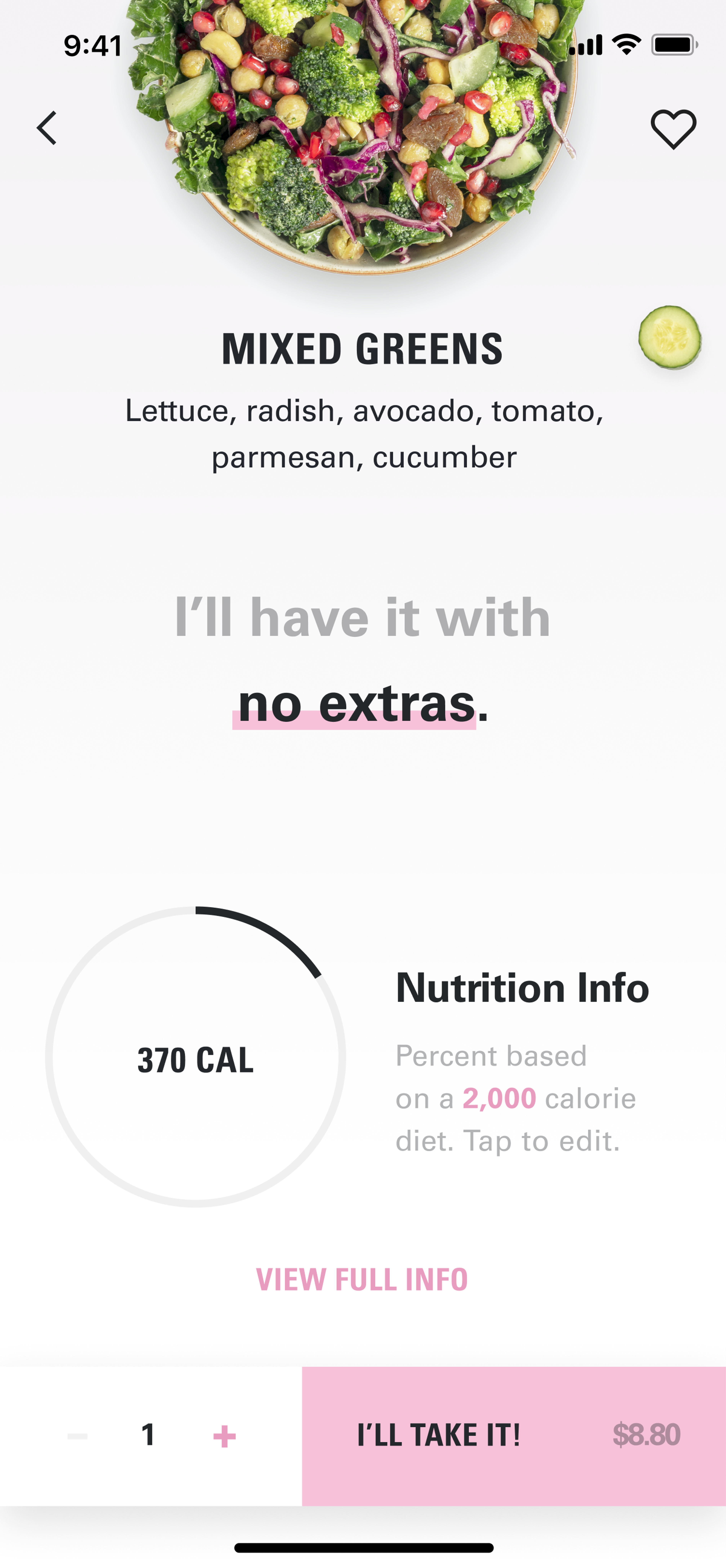
That kind of longevity only happens when the interaction design holds up under real usage, not just in a first demo.
If it feels fast, predictable, and safe, people return. If it feels slow or surprising even once, they bounce, and a long feature list won't win them back.
How to Avoid the Common Traps in the Development Process
The methodology you pick for building the app matters less than most teams think. What matters more is catching the mistakes that sink launches regardless of methodology.
Agile suits most app projects because requirements shift as you learn from early testing, and Agile's short cycles let you adjust without blowing up the whole plan. Waterfall still has a place when requirements are locked and unlikely to change, but that's rare for a first mobile release.
Whichever you choose, version control (Git, almost universally) and a real testing discipline (unit tests, integration tests, and actual user acceptance testing) aren't optional extras. Skipping them doesn't save time. It just moves the cost to after launch, when fixing something is far more expensive.
AI-assisted coding tools have genuinely sped up the mechanical parts of this work (scaffolding, boilerplate, routine test writing), and teams that use them well move faster through the build phase.
What AI Can Speed Up in the Development Process
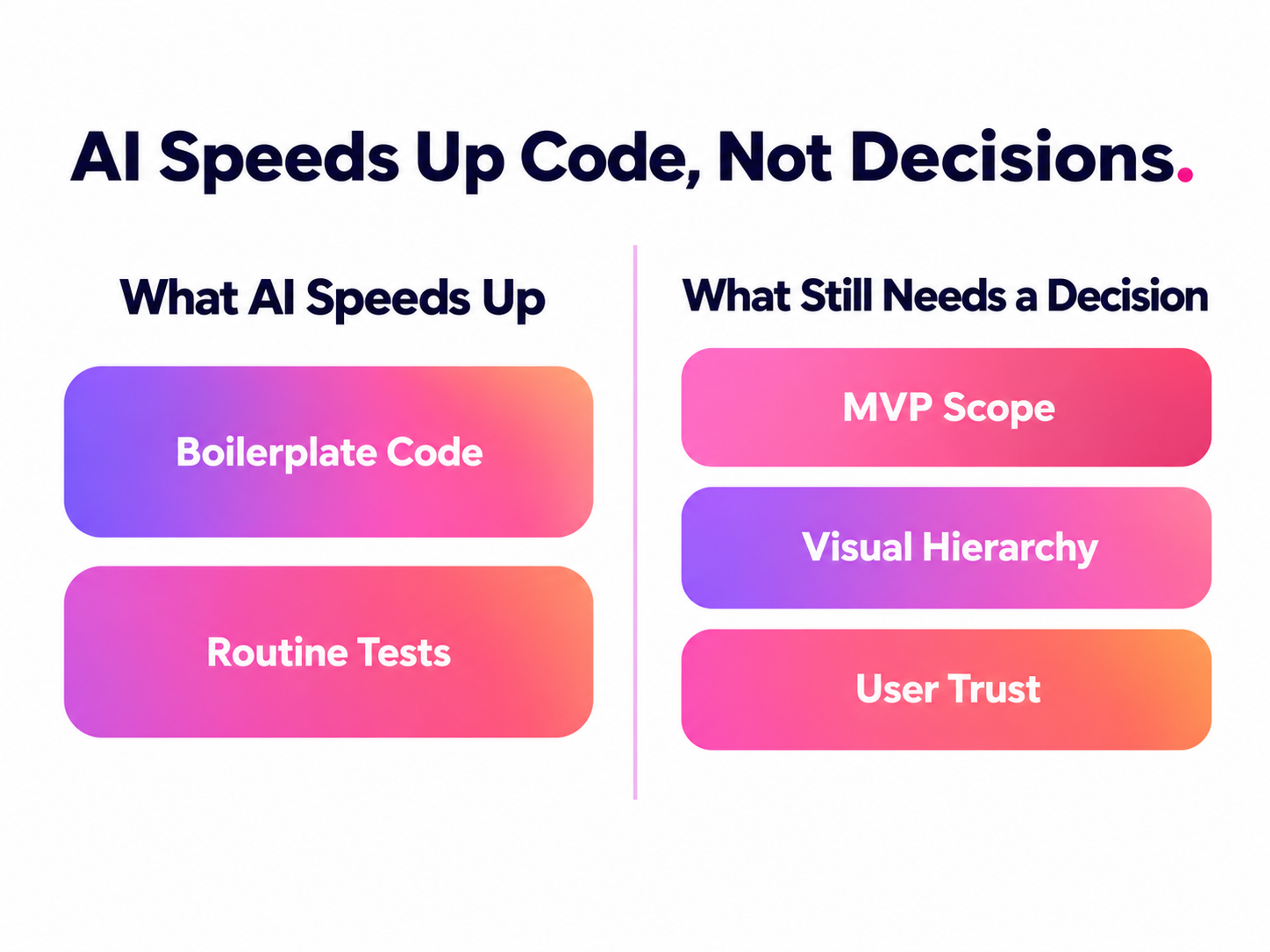
What they haven't done is remove the need for the calls that actually determine whether an app succeeds:
- what belongs in the MVP
- where the visual hierarchy should draw attention
- which permission requests will make someone distrust the app
Faster code doesn't fix a wrong decision. It just gets you to the wrong outcome sooner.
A short list of mistakes causes most of the delays and bad reviews teams don't see coming:
- Scope creep. Features added mid-build because they seemed reasonable in isolation, none individually catastrophic, all of them together enough to blow the timeline.
- Skipping usability testing until the end. Problems caught in week two cost an afternoon to fix. The same problems caught after launch cost a redesign and a wave of one-star reviews.
- Ignoring offline and poor-connection states. Mobile connectivity is inconsistent by nature. An app that breaks the moment a signal drops loses trust fast.
- Over-requesting permissions. Asking for location, contacts, and notifications all at once, before explaining why, is one of the fastest ways to tank install-to-active conversion.
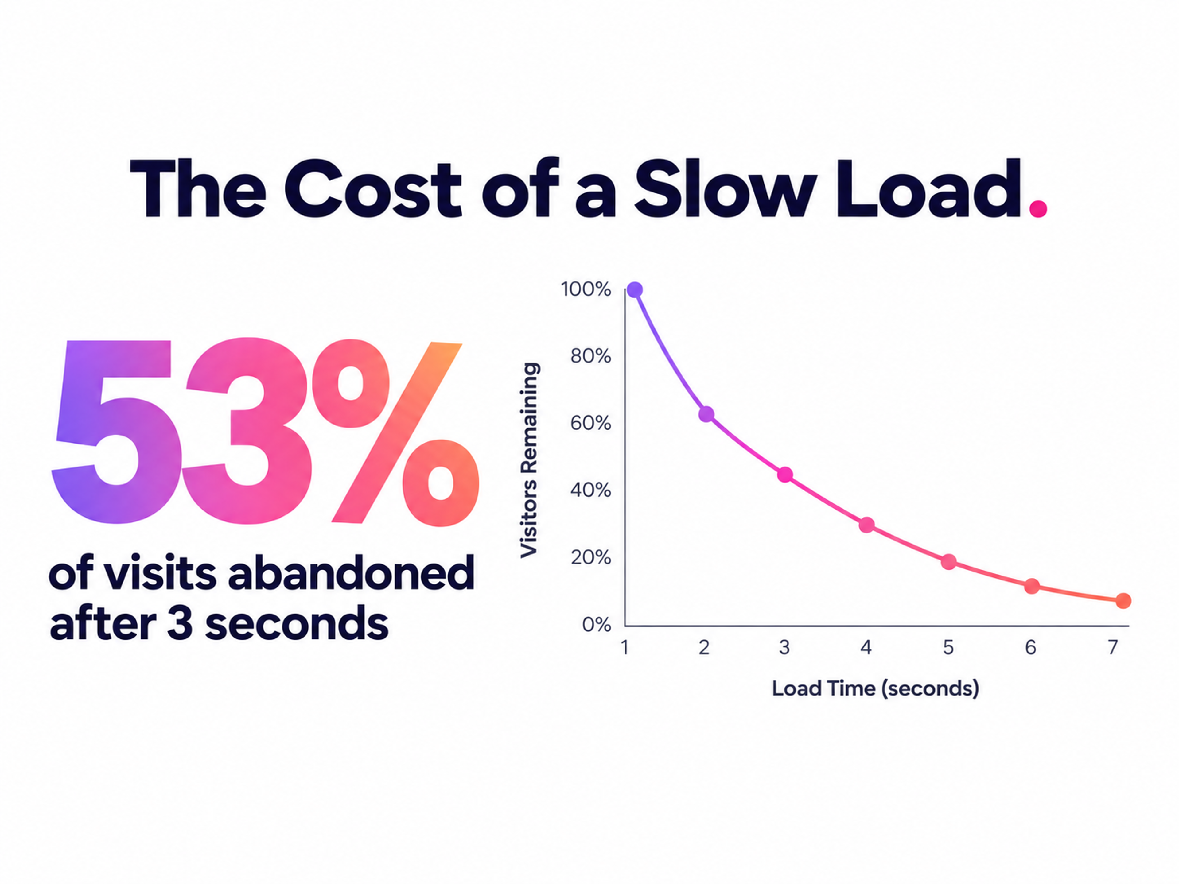
Performance mistakes deserve their own mention, because they compound. Google's own analysis of mobile load times and visitor abandonment found that pages taking longer than three seconds lose more than half their visitors before they even see the content.
Apps face the same math on cold starts and background sync: slow feels broken, even when nothing is technically wrong.
The Cost of an App Slow Load
From Google's wearable experience to Snapchat’s AR try-on lenses, we've helped teams across every industry design products people actually want to use. Let's talk about yours.
iOS vs. Android
Deciding whether to build for iOS or Android first isn't a coin flip, and the two platforms differ in ways that go well beyond which language you're writing in.
Development tools. iOS work happens mostly in Xcode with Swift, occasionally Objective-C for legacy codebases. Android uses Android Studio with Kotlin, now the default choice over Java. Each has its own toolchain quirks worth learning before you commit a team to one.
Design guidelines. Apple's Human Interface Guidelines favor restraint: predictable animations, generous whitespace, a small number of clear focal points per screen. Android's Material Design gives you more room to work with, layered surfaces, motion that guides attention toward buttons and tabs, but that flexibility means it's easier to get wrong if you don't follow the system closely.
iOS Apps vs Android Apps
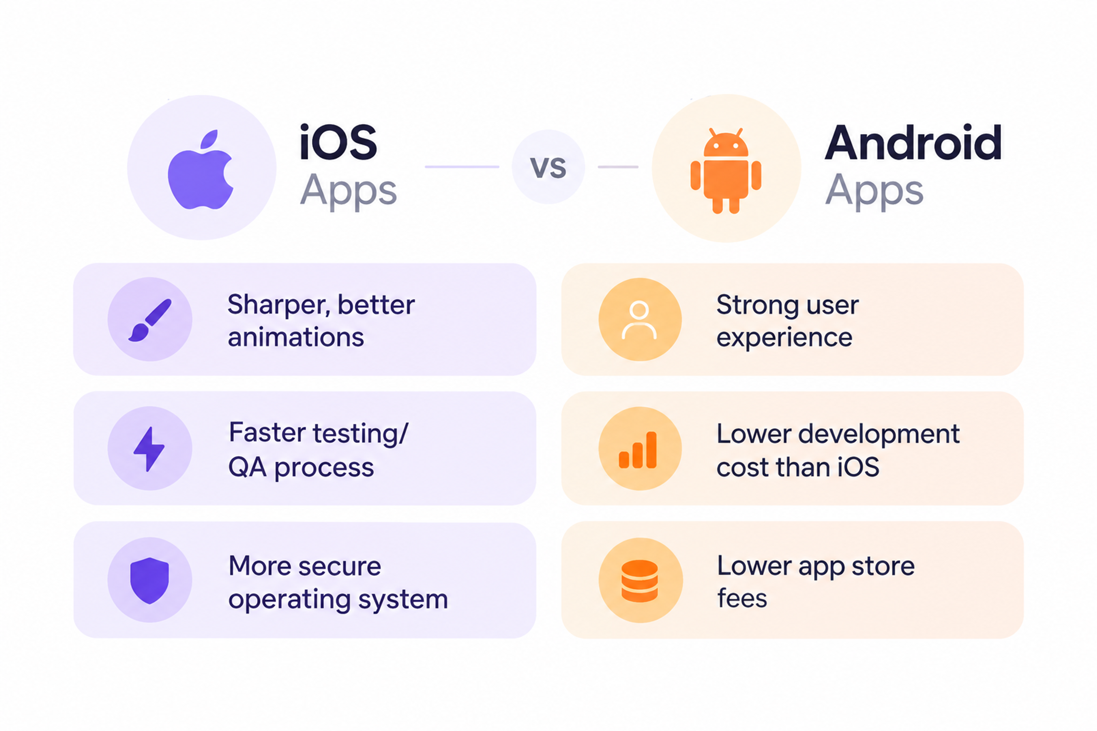
Audience and revenue. iOS users in the U.S. and Western Europe skew toward higher household income, which is part of why in-app purchases and subscriptions tend to perform better there. Android's global reach is far broader, especially across Asia, Africa, and Latin America, which usually means adjusting pricing and feature depth to match a wider range of spending habits.
Store review and monetization. Apple's review process is stricter and takes longer, but it also keeps a tighter lid on scams and low-quality apps reaching the store. Apple's own App Review FAQ reports that 50% of submissions clear review within 24 hours and 90% within 48 hours, though new apps and anything touching a sensitive category (health, finance, kids, crypto) routinely take longer than that average suggests. Google Play moves faster on average, often clearing updates within hours, with the tradeoff being a looser initial gate.
None of this makes one platform objectively better. It makes them different enough that "build for both simultaneously" is usually the wrong first move for a team without the budget to do both properly.
Accessibility and Privacy Aren't Optional
Accessibility gets treated as a nice-to-have on far too many mobile projects, right up until it becomes an App Store rejection or a support ticket from someone who genuinely can't use the app.
Touch target size is the most common miss. The W3C's WCAG 2.2 standard requires interactive elements to measure at least 24 by 24 CSS pixels, and both Apple and Google recommend going larger still: 44 points on iOS, 48dp on Android, for anything a thumb needs to hit reliably.
Undersized buttons don't just fail an audit. They cause real mis-taps for anyone with limited dexterity, and plenty of frustration for everyone else, especially one-handed users on the move.
Privacy prompts matter just as much. iOS requires explicit opt-in through App Tracking Transparency before an app can track someone across other apps and websites, and how that prompt is worded and timed affects both opt-in rates and App Store approval.
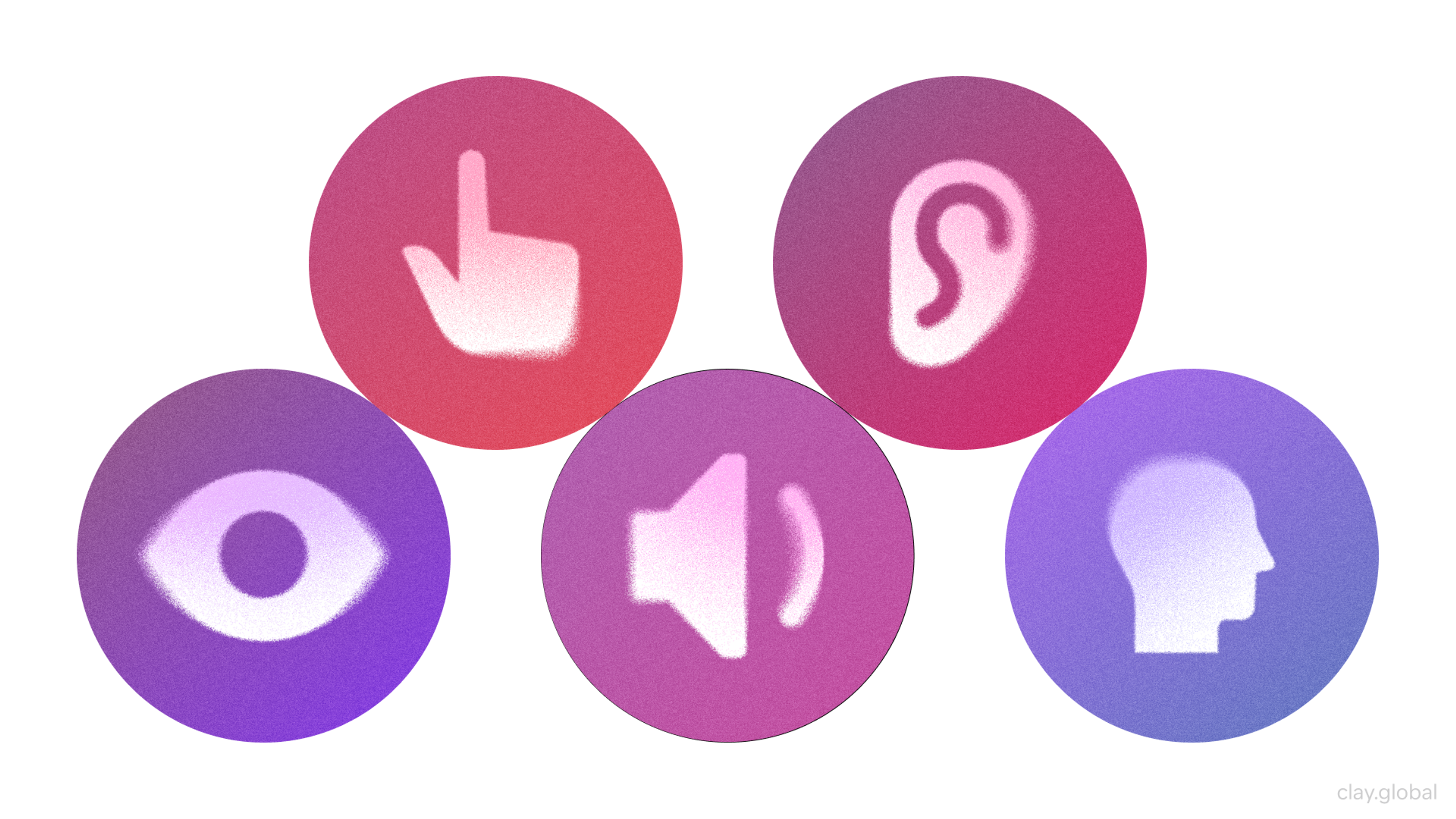
Accessibility Elements by Clay
Getting privacy messaging right isn't a legal afterthought bolted on before submission. It's part of the same trust-building work as the interface itself, and reviewers on both platforms treat it that way.
App Store Optimization (ASO)
A well-built app that nobody finds doesn't matter. App Store Optimization is the work of making sure people who are already searching for something like your app actually land on it.
Start with the app title and description. The title needs to be specific enough to signal what the app does while working in a primary keyword naturally, not stuffed. The description's job is to get someone from "interested" to "installed," which means leading with the core benefit rather than a feature list.
Keyword research matters here in the same way it matters for a website: find what people actually search for within your category, then place those terms in the title and metadata where the store's search algorithm weighs them most.
ASO Optimization Checklist
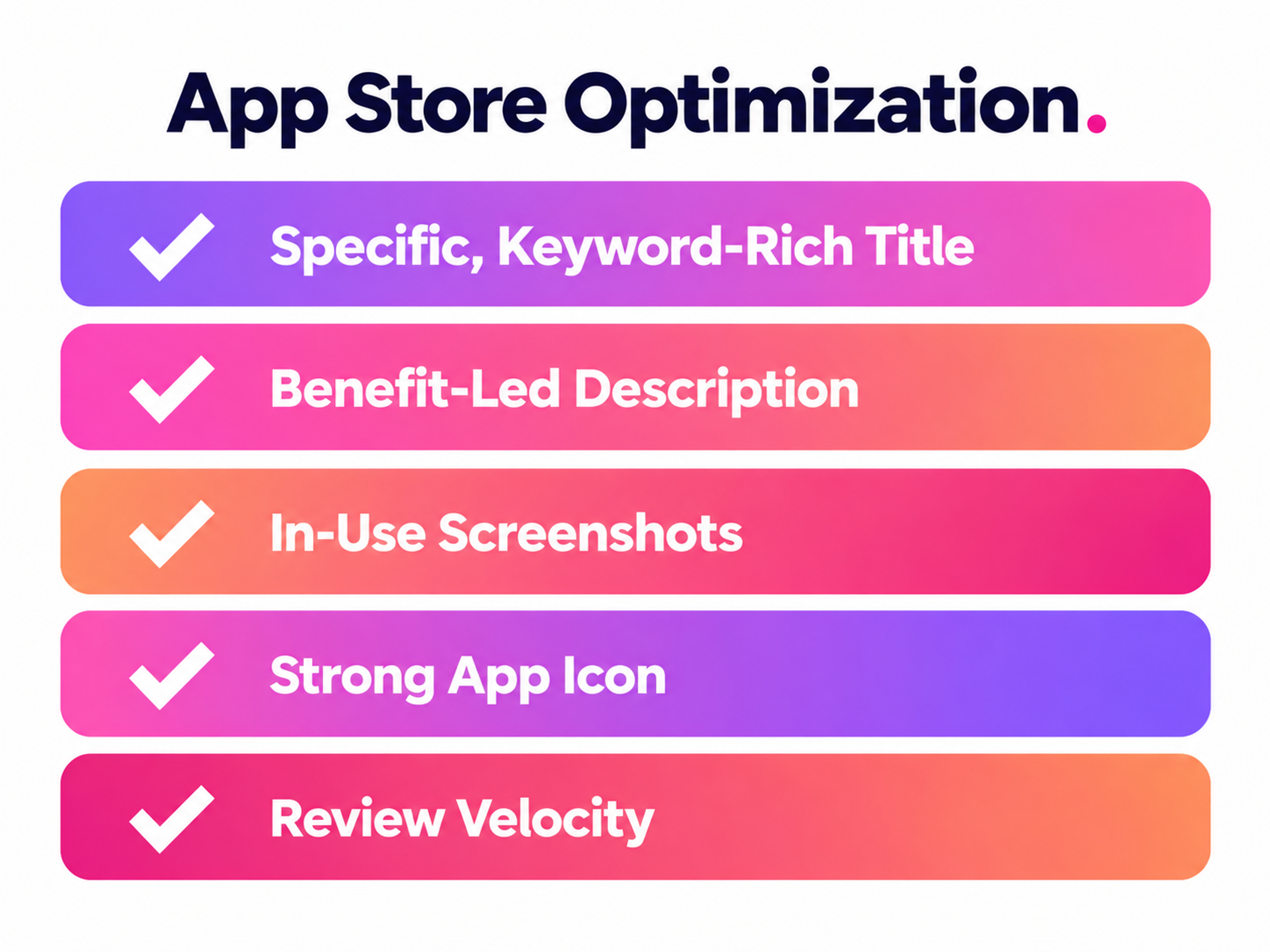
Screenshots and the app icon carry more of the conversion burden than most teams expect. A screenshot showing the app mid-use, doing the thing someone searched for, converts better than polished marketing art or a login screen.
None of this is a one-time task. Store algorithms shift, competitors update their listings, and review velocity affects ranking on both platforms, which means ASO is closer to an ongoing practice than a launch checklist item.
Real Apps, Real Decisions
Two of our own projects show these decisions playing out with real constraints attached, not hypothetical ones.
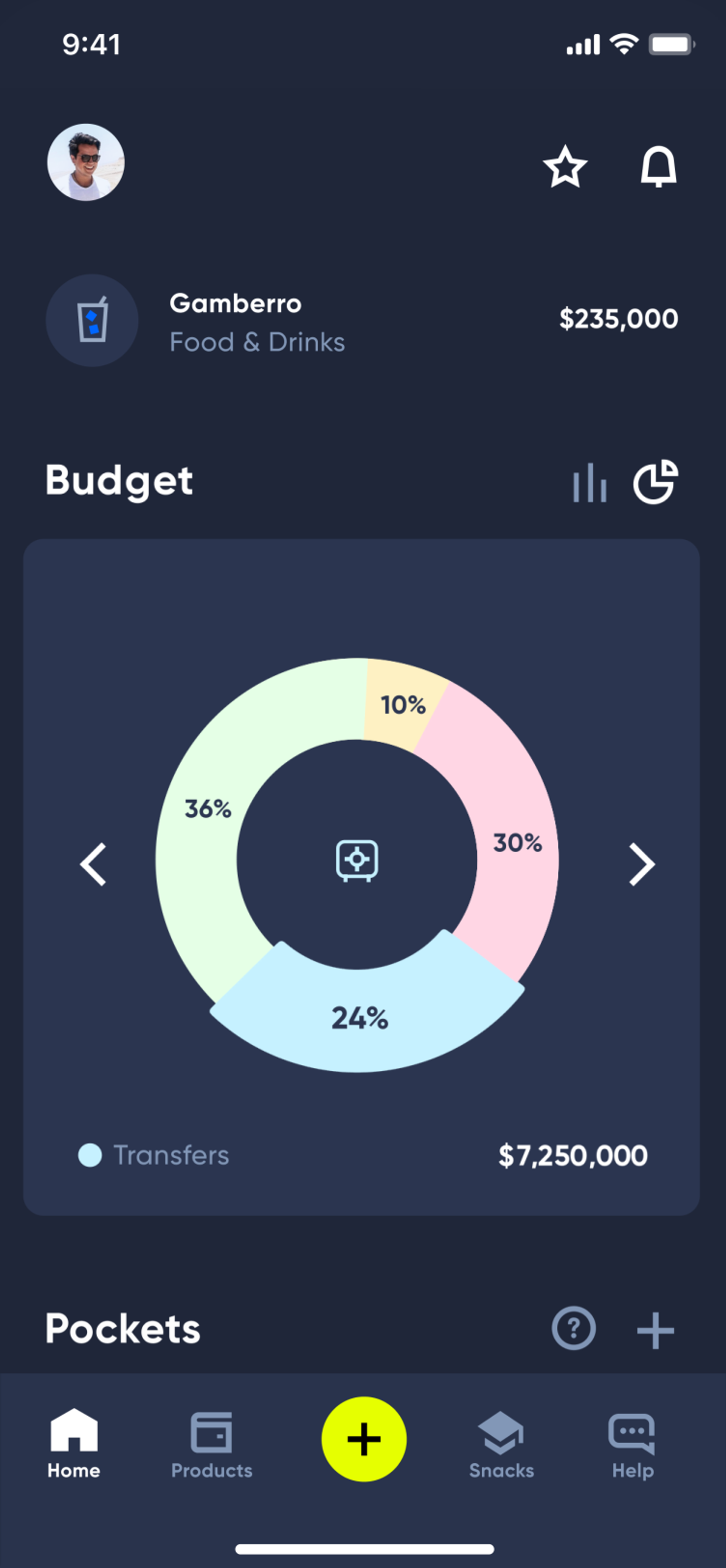
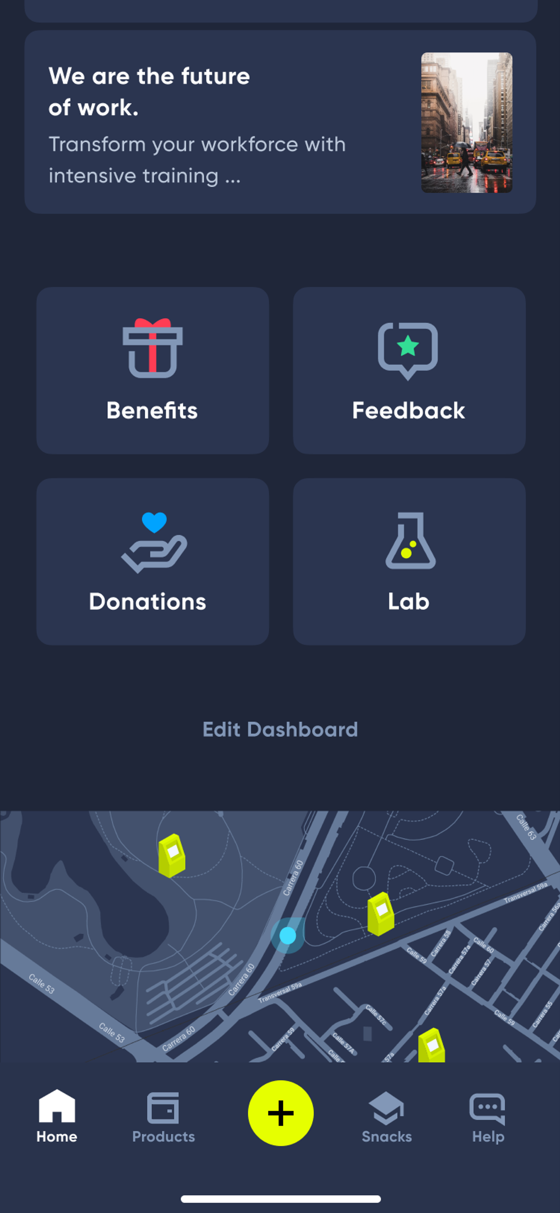
Lulo Bank, Colombia's first fully digital bank, needed an app that made banking feel approachable to people who'd never used a bank with no physical branch. The build prioritized clarity over cleverness: straightforward navigation, custom micro-interactions used sparingly to reinforce key actions rather than decorate the screen, and a visual language built to earn trust in a category where trust is the whole product. That's the MVP-scoping discipline in practice: every screen justified itself against the core job of making digital banking feel safe.
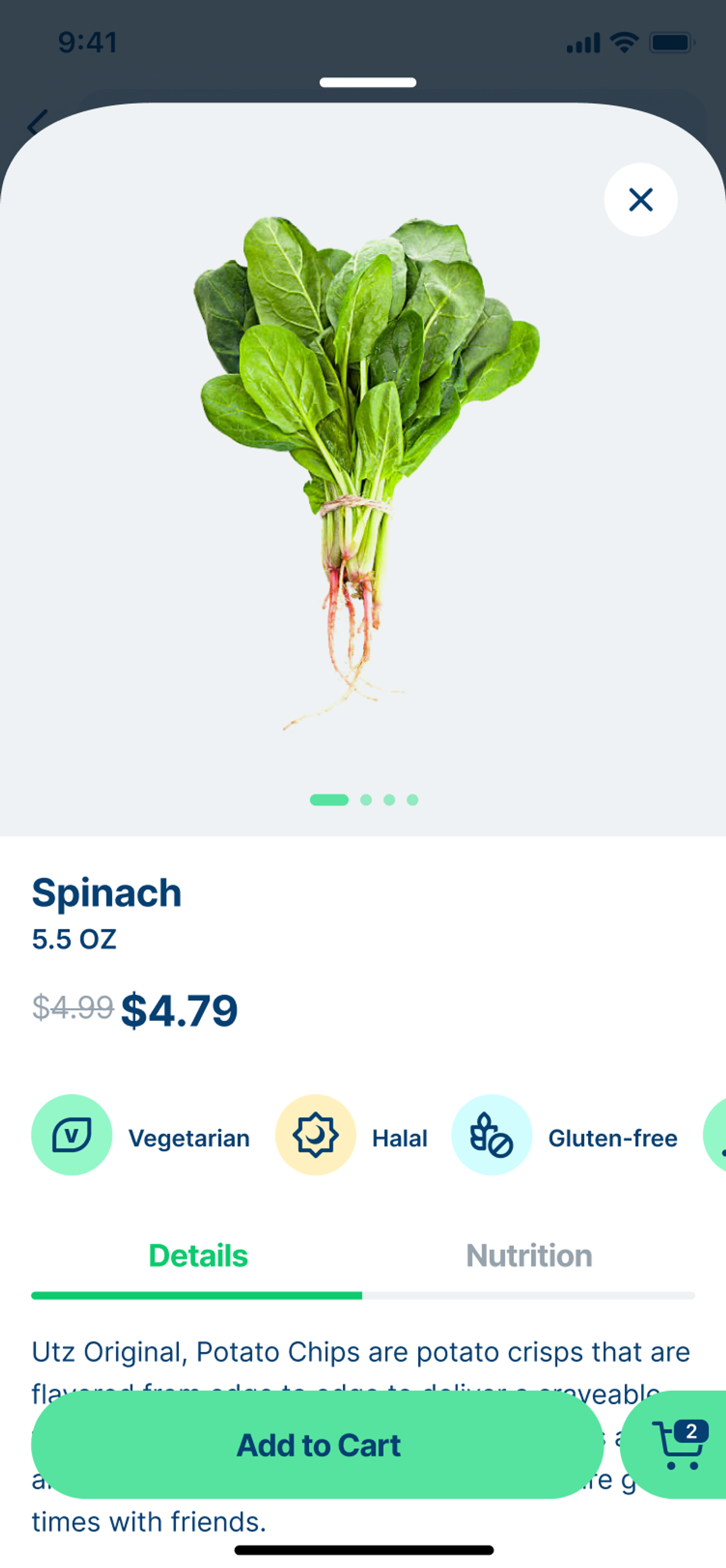
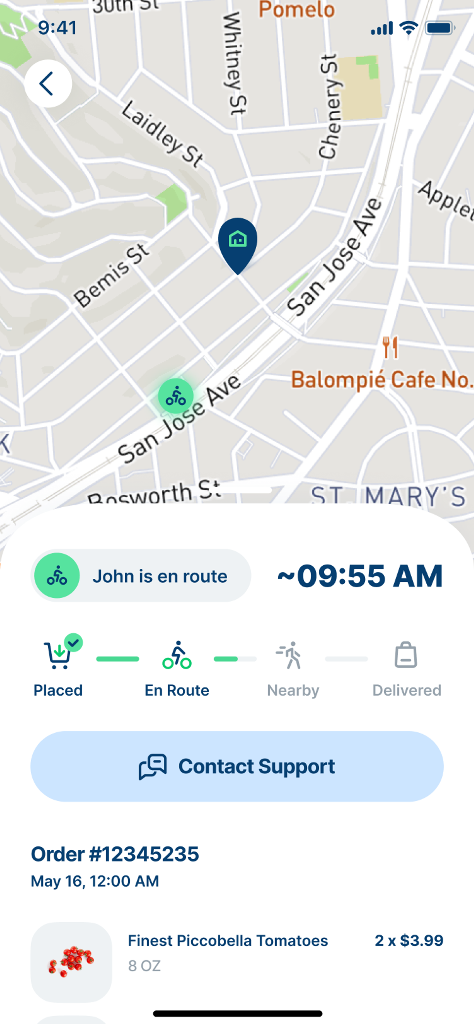
JOKR, a fast grocery delivery startup, needed the opposite challenge solved: turning a routine task, ordering groceries, into something fast enough to use daily without feeling like a chore. The Smart Basket feature personalizes suggested lists from order history and onboarding preferences, letting people check out in one tap while still allowing edits. That's interaction design doing real work: less time spent deciding, more time spent completing the task the app exists for.
The Next Steps
A successful mobile app isn't built by stacking features. It's built by making a small number of real decisions early: which build path fits your budget and hardware needs, what belongs in the first release and what doesn't, and which process traps to design around before they cost you a launch date.
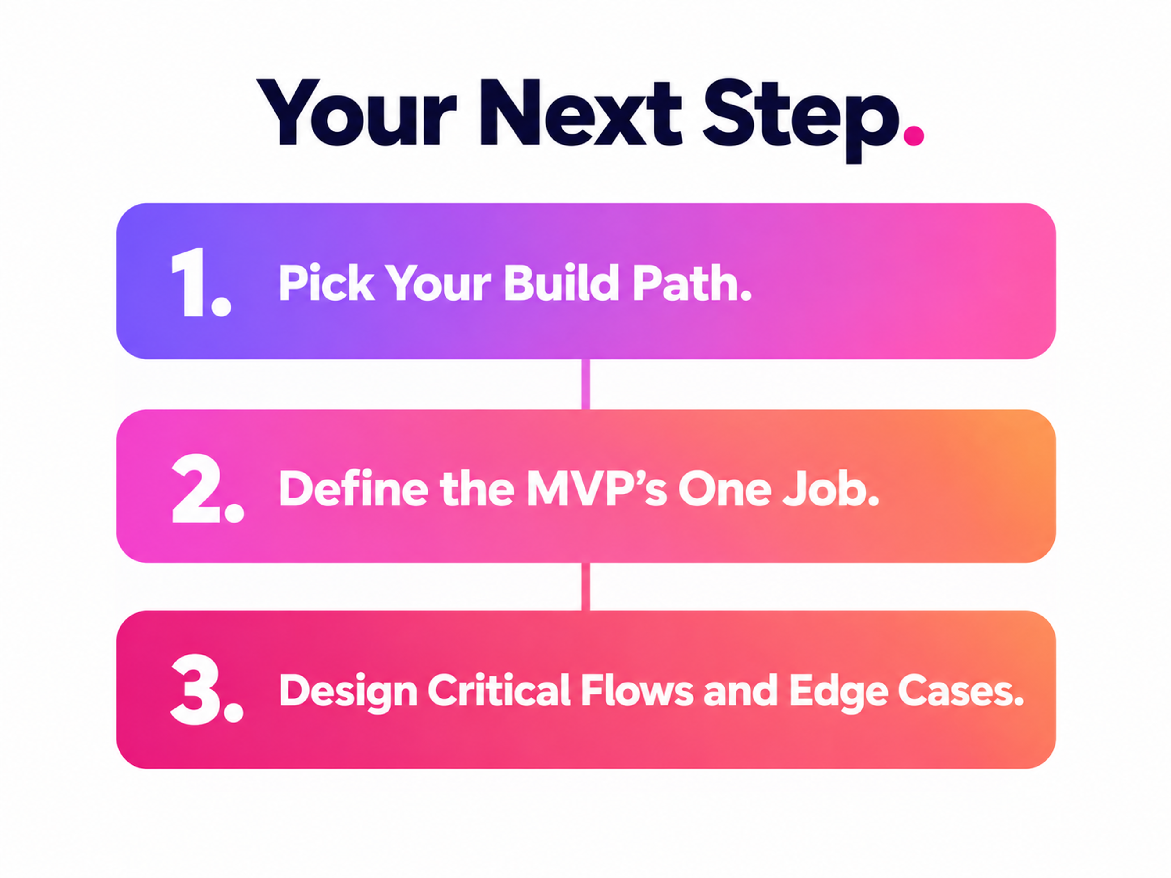
If you're starting from scratch, the practical next step is this:
1.
Pick your build path2.
Define the one job your MVP has to do3.
Design the critical flows plus their edge cases (offline, error, empty) before you write a line of production code.
Practical Step to App Development
That combination gets you to a confident launch, and to a product that can keep growing after it.
Whether you're untangling a legacy product like Tipalti or building something new like Lulo Bank, good UX starts with the right partner. Let's figure out where to begin.
Read more
- Clay Global’s Web Design Case Studies
FAQ
Should I build for iOS or Android first?
Build first for the platform where your highest-value users already are. Weigh your target region, revenue model (subscriptions and in-app purchases tend to perform better on iOS, broader reach favors Android), and where your competitors already have traction. Expand to the second platform once you've proven the first one works.
How long does app development take?
It depends heavily on build path and scope. A tightly-scoped MVP built cross-platform can launch in a few months. A fully native app with custom backend infrastructure can run a year or more. Cutting scope, not cutting corners, is the fastest way to shorten this timeline responsibly.
What's the real difference between native, cross-platform, and PWA?
Native gives you full device access and the best performance at the cost of maintaining two codebases. Cross-platform frameworks share most of the code across iOS and Android with a small performance tradeoff. A PWA skips app store review entirely and updates instantly, but can't reach every device capability a native app can. The right choice depends on how much hardware access your core feature actually needs.
What's a realistic budget for building a mobile app?
Costs scale directly with complexity and build path. A simple, single-purpose MVP built cross-platform costs meaningfully less than a feature-rich native app with custom backend work. Cross-platform builds generally cost less than developing separate native apps for both platforms, but budget for ongoing maintenance too. Apps aren't a one-time expense.
How many features should an MVP have?
As few as it takes to prove your core hypothesis, and no more. If cutting a feature wouldn't change whether the MVP validates or invalidates your assumption about user demand, cut it. Add it back once the core loop is proven.
What's the difference between QA and usability testing?
QA checks whether the app works as built: no crashes, no broken flows, correct behavior across devices. Usability testing checks whether people can actually use it without help: whether the flow you designed makes sense to someone seeing it for the first time. You need both, and usability testing should start well before the app is feature-complete.
Do I need to worry about accessibility for a mobile app?
Yes, and not only for compliance reasons. WCAG's touch target guidelines exist because small, poorly spaced buttons cause real errors for a large share of users, not just people using assistive technology. Building accessibility in from the start is far cheaper than retrofitting it after launch.
What is App Tracking Transparency and does it affect my app?
It's Apple's requirement that apps get explicit user permission before tracking someone across other apps and websites for advertising purposes. It affects any iOS app that does cross-app tracking, and how you word and time the prompt affects both your opt-in rate and how smoothly your app clears App Store review.
How do I improve my approval odds in the app stores?
Follow each store's guidelines closely, test thoroughly on real devices, and make sure your privacy labels and permission requests match what the app actually does. Avoid misleading claims in your listing, respect intellectual property, and don't submit a build with known bugs hoping reviewers won't notice. Mismatched metadata is one of the most common and most avoidable rejection reasons.
When should I hire an agency instead of building in-house?
An in-house team makes sense when the app is core to your long-term product roadmap and you can commit to ongoing hiring and management. An agency partner makes more sense when you need design and development to move together under one process, especially for a first build, where the cost of getting the fundamentals wrong is higher than the cost of the engagement itself.
What causes most mobile app launches to slip their timeline?
Scope creep is the most common cause by a wide margin, followed closely by skipping usability testing until late in the process, which forces late-stage redesigns. Both are avoidable with tighter MVP discipline and testing built into the schedule from week one rather than bolted on at the end.
How soon after launch should I run usability tests?
Before launch, not after. Testing with real users during development, even with a rough prototype, catches the problems that are cheap to fix. Waiting until after launch to test means you're fixing the same problems in public, with real users already forming their first impression.


About Clay
Clay is a UI/UX design & branding agency in San Francisco. We team up with startups and leading brands to create transformative digital experience. Clients: Facebook, Slack, Google, Amazon, Credit Karma, Zenefits, etc.
Learn moreAbout Clay
Clay is a UI/UX design & branding agency in San Francisco. We team up with startups and leading brands to create transformative digital experience. Clients: Facebook, Slack, Google, Amazon, Credit Karma, Zenefits, etc.
Learn more