Heuristic evaluation helps UX designers find and fix usability problems before users encounter them. As a usability inspection method, heuristic evaluation systematically identifies issues in user interface design by applying established principles. This method uses proven design principles to spot issues that could frustrate or confuse people.
Heuristic evaluation is most effective when used during the early stages of design development, allowing teams to refine the interface before more formal testing. Situated within the broader context of UX design, heuristic evaluation supports the creation of user-centered and accessible products.
What Heuristic Evaluation Does for Designers
According to a survey by the Nielsen Norman Group, 73% of UX professionals reported using heuristic evaluations in their work.
Heuristic evaluation gives designers a structured way to review user interfaces. It helps spot problems like confusing navigation, unclear labels, or missing feedback. The method also reveals how users might interact with your product.
This technique saves resources by finding issues before development or launch. It works alongside other methods like user testing and A/B testing. Think of it as a health check for your design.
Designers apply usability principles to examine every part of an interface. Strong interface design is crucial in this evaluation process, as it ensures the product is both effective and user-friendly. Usability heuristics, such as Nielsen's well-known set, form the foundation for this evaluation.
Heuristic evaluation is also a key method in interaction design, helping refine how users engage with digital products. They look at layout, feedback systems, error prevention, and action clarity. The goal is to make products more intuitive and user-friendly.
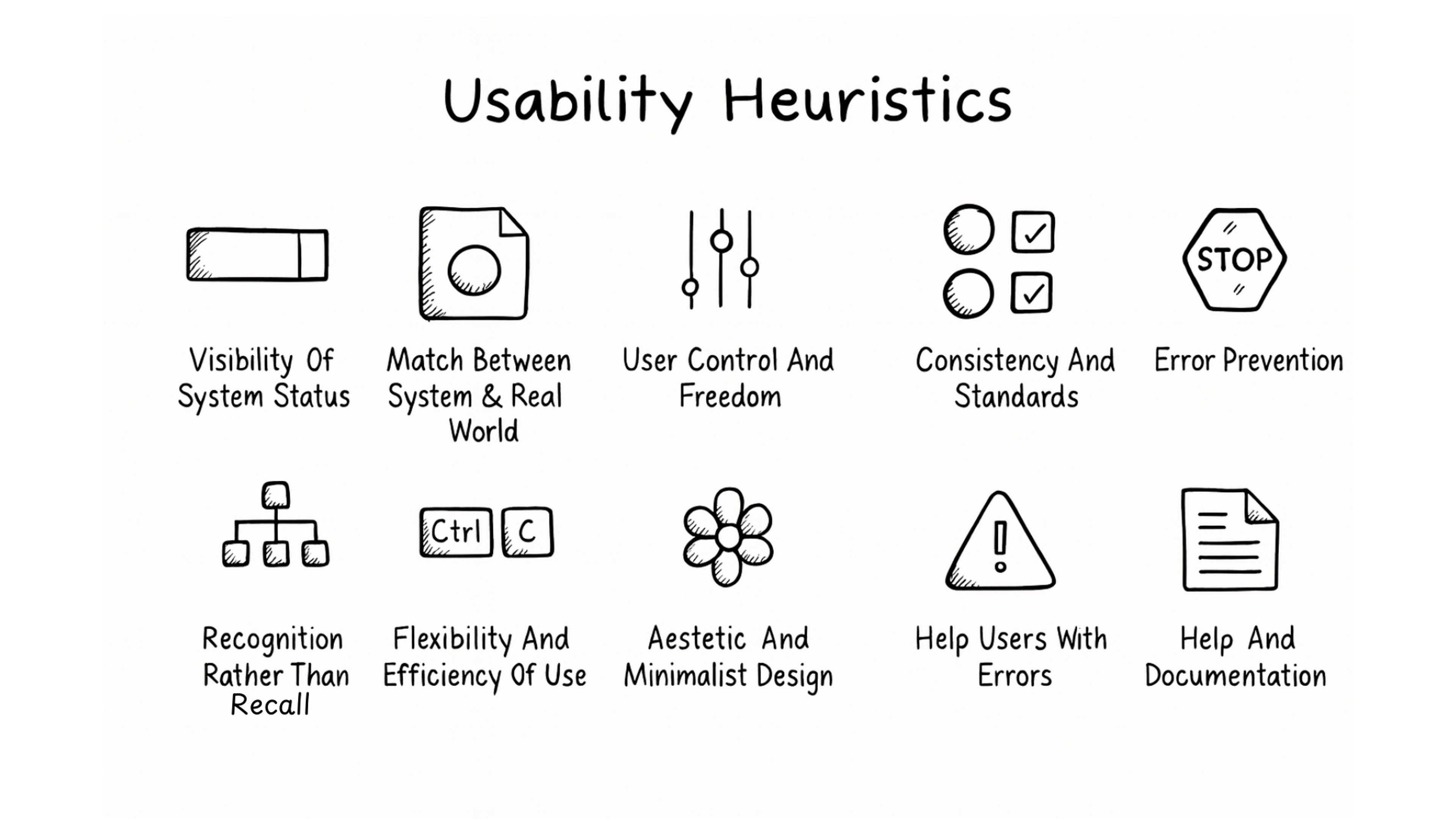
Usability Heuristics Principles
The Origins of Heuristic Evaluations
Usability experts Jakob Nielsen and Rolf Molich created this method in the mid-1990s. They wanted a faster way to find usability problems than traditional testing. Their approach caught on because it worked efficiently.
Nielsen and Molich developed ten core principles that designers still use today. These are broad rules of thumb, not specific usability guidelines, serving as general principles to guide usability and interaction design rather than strict, detailed rules for every situation. These rules became the foundation for modern usability evaluation.
Companies like IBM and Microsoft adopted similar frameworks. IBM introduced the Rational Unified Process in 2004, which applied usability principles to software development. Google and Apple now use comparable methods in their design processes.
The method has evolved with digital products. Modern designers combine it with tools like Figma and Adobe XD. They also pair it with other techniques like eye tracking and user interviews.
Nielsen-Molich Heuristics Rules
The 10 Core Usability Principles for User Interface Design
These principles form the backbone of heuristic evaluation. Each one addresses a specific aspect of user experience.
10 Usability Heuristics by Clay
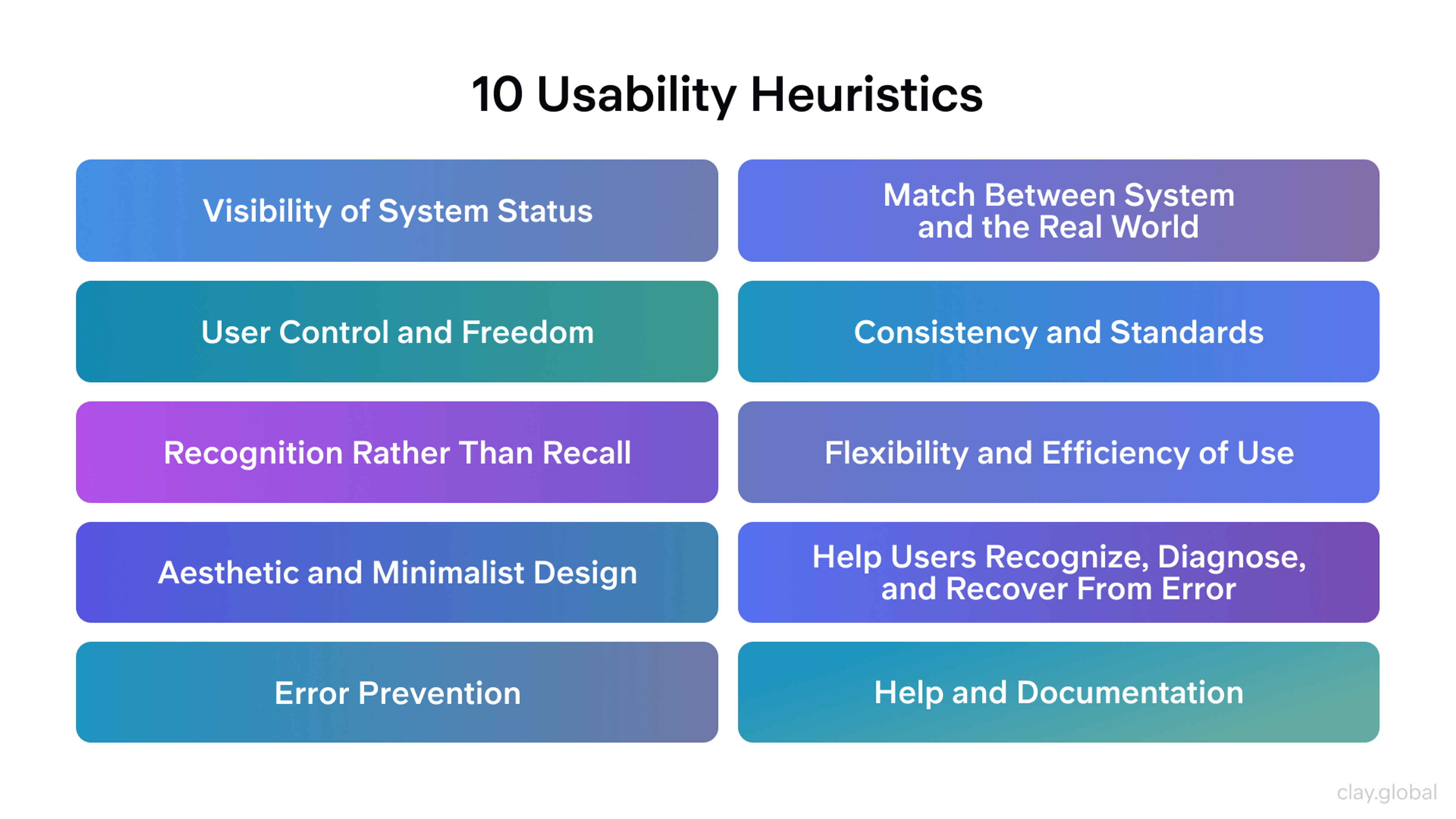
1.
System Status Visibility: Users should always know what the system is doing. Show clear feedback for every action. Display loading states, progress bars, and confirmation messages. This keeps users informed and confident by providing appropriate feedback that is easily retrievable.2.
Real-World Connection: Use the users' language and concepts familiar to them. Match your interface to real-world conventions and organize information in a natural and logical order. Icons and labels should feel natural, not technical. This reduces the learning curve by following real world conventions and presenting content in a way that aligns with users' expectations.3.
User Control and Freedom: Give users easy ways to undo mistakes or change their minds. Include clear cancel and back buttons, a confirmation option, and an emergency exit to let people exit unwanted actions without consequences. Avoid extended process for undoing actions. This builds trust and reduces frustration.4.
Consistency and Standards: Keep design elements consistent throughout your product. Buttons should work the same way everywhere. Follow platform standards that users expect, and avoid using different words for the same concept. Predictability makes interfaces easier to learn and reduces cognitive load.5.
Error Prevention: Design systems that stop mistakes before they happen. Add confirmation steps for important actions like deletions. Validate inputs in real time. Identify and eliminate error prone conditions to prevent errors for present users. This saves users from frustration and wasted time.6.
Recognition Over Recall: Make options visible instead of hidden. Help users recognize information, system states, and interface elements easily emphasizing recognition rather than recall. Users shouldn’t need to remember information from previous screens. Minimize the user's memory load and cognitive load by making information easily accessible. Reduce cognitive effort and the mental effort required for users by supporting recognition over recall. Keep important functions easy to find. This reduces mental effort.7.
Flexibility and Efficiency: Support both new and experienced users. Provide shortcuts for frequent actions and let users tailor frequent actions to their needs, catering to expert users. Let users customize settings to match their workflow. This improves satisfaction across skill levels.8.
Minimalist Design: Remove unnecessary elements that distract users. Focus on essential content and functions, ensuring the relative visibility of relevant information and relevant units. Arrange individual elements to highlight importance and use visual hierarchy to guide attention. Clean designs feel more professional and easier to use. When necessary, focus on domain specific needs.9.
Error Recovery: When errors happen, explain them clearly and offer solutions. Use plain language instead of technical codes. Provide error messages that constructively suggest solutions and help users understand how to fix issues. Help users fix problems quickly. Good error messages turn frustration into learning.10.
Help and Documentation: Provide easy access to help when users need it. Include tooltips, guides, and FAQs. Make documentation searchable and concise. Focus on the user's task and ensure users understand the guidance provided. Users should find answers without digging through long manuals.
Practical Questions for Each Principle
Use these questions when evaluating your design.
For System Status: Does the interface show clear feedback for every action? Are loading states and error messages noticeable? Does the system provide appropriate feedback to inform users about system status?
For Real-World Match: Does the interface use familiar terms? Do icons and navigation match user expectations?
For User Control: Can users easily undo actions? Are exit points clear and accessible?
For Consistency: Do design patterns repeat throughout? Do elements follow industry standards?
For Error Prevention: Does the system anticipate common mistakes? Are there confirmations for critical actions?
For Recognition: Are important options always visible? Does the design help users recognize options and system states, supporting recognition rather than recall? Does it minimize the user's memory load and cognitive load?
For Flexibility: Can both beginners and experts work efficiently? Are there shortcuts and customization options?
For Minimalist Design: Does every element serve a purpose? Does visual hierarchy guide users naturally? Is the design focused on presenting only relevant information?
For Error Recovery: Are error messages helpful and actionable? Does the system suggest solutions?
For Help Access: Can users find assistance when needed? Are guides and tooltips available?
Why Designers Use This Usability Inspection Method
Heuristic evaluation improves design efficiency. It is one of several usability inspection methods used to assess user interfaces. Following proven principles helps avoid common pitfalls. Designers can identify problems that testing might miss.
Pros and Cons of Heuristic Evaluations
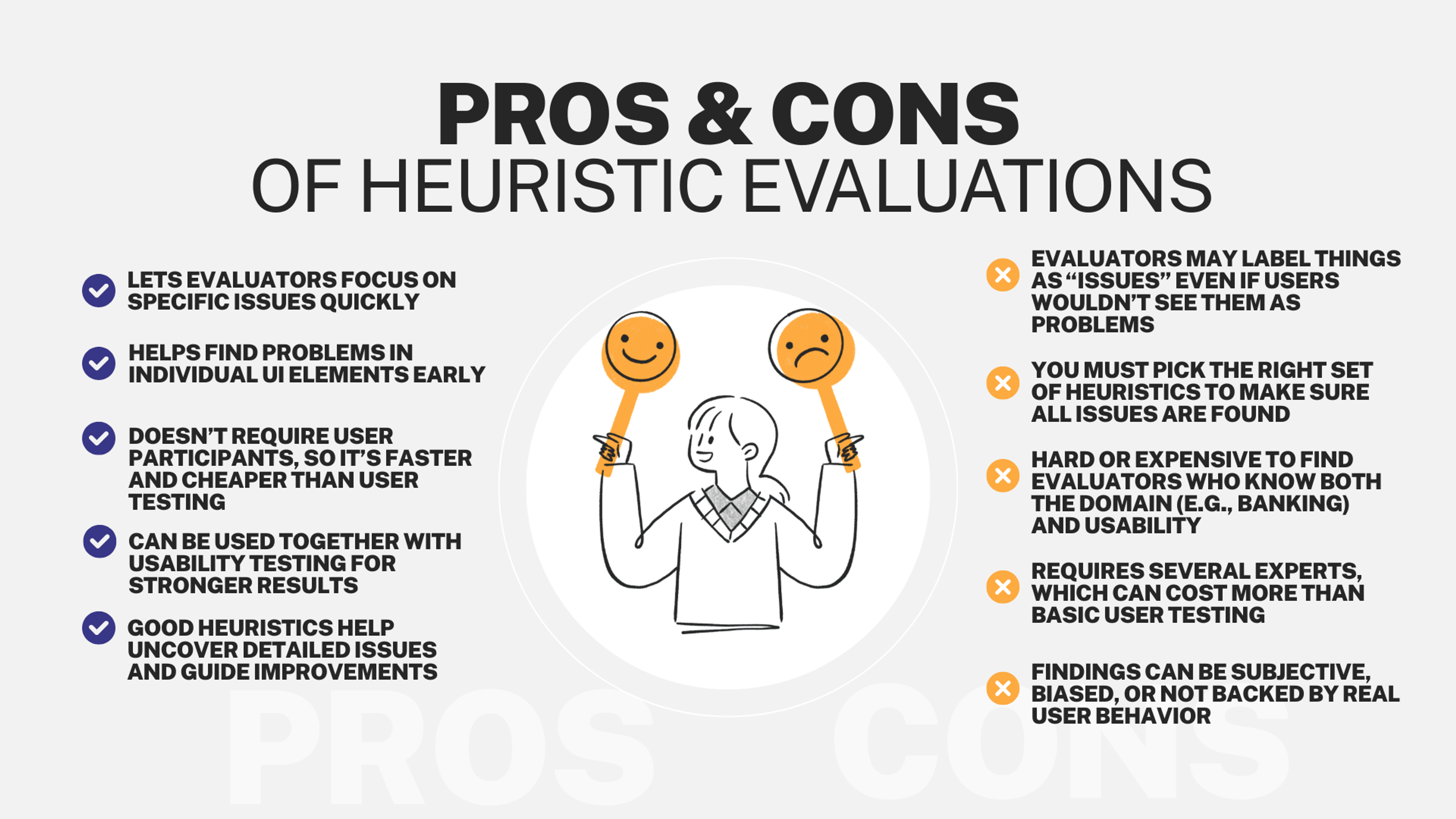
Heuristics support decision making by providing mental shortcuts that guide designers through the decision making process. The method reveals issues early when fixes cost less. It uncovers problems that only appear during specific workflows. This prevents surprises after launch.
Teams gain insight into user behavior patterns. They learn what confuses people and what works well. This knowledge improves future designs too. User research also plays a key role by informing heuristic evaluation and ensuring that findings are grounded in real user needs.
How to Conduct an Effective Evaluation
Start by identifying your target audience. Understanding user needs shapes your evaluation criteria. Different audiences have different expectations and abilities.
Create specific benchmarks based on your product goals. Consider what matters most for your users. This focus keeps the evaluation relevant.
Apply established usability principles systematically. Heuristic evaluation relies on broad usability principles, such as Jakob Nielsen's heuristics, rather than specific usability guidelines. Review each screen and interaction against the core guidelines. Look for violations of design standards.
Document every issue you find. Note severity levels and potential solutions. Evaluators should be aware of the availability heuristic, as relying only on easily recalled usability problems can lead to overlooking rare but significant issues. This creates a roadmap for improvements.
Test your findings with real users when possible. Heuristic evaluation works best alongside methods like usability testing. User feedback validates your observations.
Heuristic Evaluation Process
Best Practices for Better Results
Define clear goals before starting. Know what you want to learn from the evaluation. This keeps reviewers focused on relevant issues.
Use a consistent framework throughout. Apply the same standards to every part of your product. This ensures thorough coverage.
Involve multiple evaluators when possible. Different perspectives catch different problems. Three to five reviewers often find most issues. Including diverse viewpoints can also help identify ways to improve human computer dialogue, leading to more effective interactions between users and the system.
Record findings systematically. Use templates or tools to track problems consistently. This makes it easier to prioritize fixes.
Combine this method with other research techniques. Use surveys to understand user preferences. Conduct walkthroughs to simulate user journeys. Each method reveals different insights.
Complementary Evaluation Techniques
Several methods work well alongside heuristic evaluation. Each adds a different perspective on usability. Evaluating the user interface is a key focus of these techniques, as it helps ensure that the system's surface is intuitive, consistent, and easy for users to interact with.
Cognitive Walkthrough: Evaluators step through tasks as users would. This reveals where people might get confused. It focuses on learnability and first-time use.
Pluralistic Walkthrough: Designers, developers, and users review together. Each group provides unique insights. This collaborative approach catches more issues.
Consistency Inspection: Check that design elements work the same way everywhere. Look for patterns that repeat across screens. This ensures a cohesive experience.
User Scenario Testing: Test your design with realistic use cases. See how well it handles actual user goals. This grounds evaluation in real needs.
Comparative Analysis: Review how competitors solve similar problems. Learn from industry best practices. This identifies opportunities for improvement.
Accessibility Evaluation: Check your design against WCAG standards. Ensure everyone can use your product. This expands your potential audience.
Expert Review: Get feedback from experienced UX professionals. They can spot subtle issues quickly. Their expertise speeds up the process.
Understanding the Limitations
Heuristic evaluation has boundaries you should know. It provides valuable insights but cannot guarantee perfect usability. Context and individual preferences still matter.
The method focuses on general principles, not specific user needs. It might miss subtle problems with system functionality. Technical issues often require different testing methods.
Evaluator bias can influence results. One person might emphasize certain problems over others. The mental effort required for a thorough evaluation can also lead to missed issues, especially if the process is mentally taxing. This is why multiple reviewers help balance perspectives.
Time constraints can limit thoroughness. A complete review requires careful attention and resources. Focusing on the most relevant units during evaluation helps ensure that only pertinent information is considered, reducing distractions from irrelevant units. Finding qualified evaluators with the right expertise can be challenging.
Some issues only appear during actual use. Heuristic evaluation happens before users interact with your product. Real-world testing often reveals unexpected problems.
Overcoming Common Pitfalls
Supplement heuristic evaluation with user testing. Watch real people use your product. This validates your findings and reveals new issues.
Conduct cognitive walkthroughs to explore user paths. Walk through specific tasks step by step, focusing on the user's task. This uncovers obstacles that principles might miss.
Use consistent criteria across all reviews. Make sure every evaluator applies the same standards. This improves result quality and comparability.
Include experts from different disciplines. Programmers, marketers, and designers each see different problems. Diverse perspectives create more complete evaluations. Feedback from these experts should constructively suggest improvements.
Run multiple evaluation rounds as your design evolves. Early reviews catch major problems. Later ones polish details and verify fixes.
Evaluation Checklist for Your Product
Use this guide to systematically review your interface.
System Status Check: Does feedback appear for all user actions? Are progress indicators visible? Do users always know what’s happening?
Real-World Match Check: Does language feel natural? Are metaphors intuitive? Do workflows feel logical?
Control Check: Can users undo mistakes easily? Are exits obvious? Can people correct errors without major issues?
Consistency Check: Do elements behave predictably? Does design follow platform standards? Are similar actions handled the same way?
Prevention Check: Does the system stop common mistakes? Are there confirmations for important actions? Does input validation work in real time?
Recognition Check: Are key functions visible? Does design minimize memory requirements? Are labels clear enough to guide users?
Flexibility Check: Do shortcuts exist for experts? Can users customize their experience? Does the system adapt to user behavior?
Aesthetic Check: Is the interface clean and focused? Does visual hierarchy guide attention? Are distractions removed? Have you reviewed individual elements to ensure their clarity and importance within the layout?
Recovery Check: Are error messages clear and helpful? Does the system guide users toward solutions? Are errors explained in plain language?
Help Check: Can users find assistance easily? Are guides and tooltips available? Is documentation clear and searchable? Is information easily retrievable so users can access what they need without difficulty?
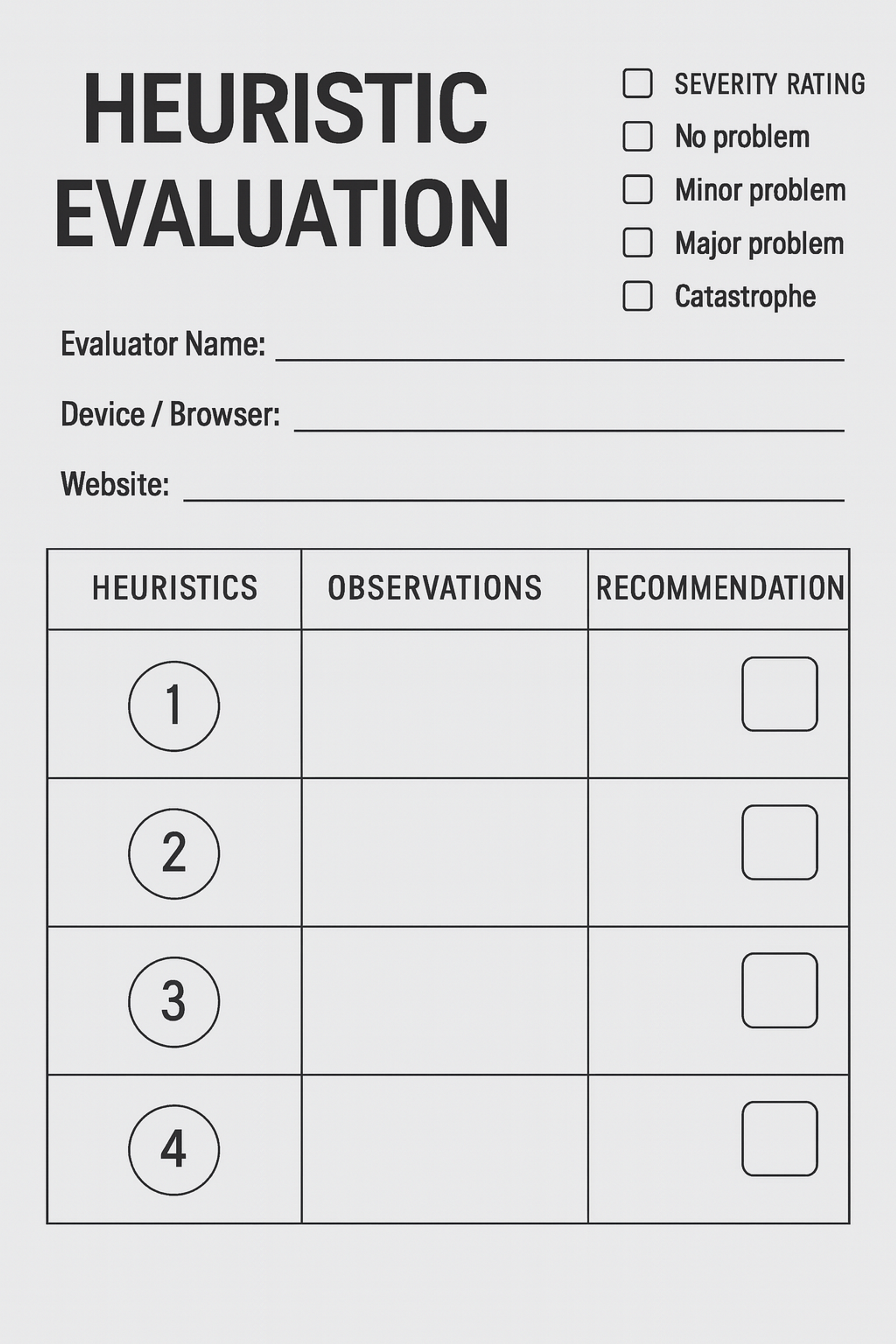
Heuristic Evaluation Template
FAQ
What Types Of Projects Benefit Most From Heuristic Evaluation?
Heuristic evaluation is especially useful for digital products with complex interfaces or workflows that need early feedback.
When Should A Design Team Use Heuristic Evaluation In The Design Process?
It works best during early or mid-design stages to identify usability issues before final development or user testing.
How Many Reviewers Are Needed For An Effective Heuristic Evaluation?
Using 3–5 evaluators is often recommended to get a balanced range of insights and reduce bias.
Can Non-Experts Conduct A Heuristic Evaluation?
While anyone can apply heuristics, trained usability experts are more likely to identify critical issues and interpret results accurately.
Is Heuristic Evaluation Enough On Its Own?
No. It should be paired with other methods like usability testing for a fuller understanding of user experience.
Read More
Conclusion
Heuristic evaluation gives designers a practical way to improve products. It helps identify and fix usability problems efficiently. The method saves time and resources while improving user experience.
Apply this technique early in your design process. Use it alongside other research methods like user testing and A/B testing. Remember that no single method tells the whole story.
Focus on creating interfaces that feel natural and easy to use. Keep refining your designs based on what you learn. Good usability comes from continuous improvement and attention to user needs.

About Clay
Clay is a UI/UX design & branding agency in San Francisco. We team up with startups and leading brands to create transformative digital experience. Clients: Facebook, Slack, Google, Amazon, Credit Karma, Zenefits, etc.
Learn moreAbout Clay
Clay is a UI/UX design & branding agency in San Francisco. We team up with startups and leading brands to create transformative digital experience. Clients: Facebook, Slack, Google, Amazon, Credit Karma, Zenefits, etc.
Learn more