A beautiful website might catch the eye — but a truly great one goes deeper. It’s the product of smart, intentional design choices that balance style with substance. Behind every smooth scroll, intuitive button, and engaging layout is a process rooted in understanding what users need and how they behave. Great design often applies universal design principles and integrates perceptual design principles to support both inclusivity and clarity.
Effective web design isn’t just about looking good — it’s about creating a seamless, enjoyable experience that feels effortless. When you combine strong visuals with usability and purpose, your website doesn’t just attract visitors — it keeps them coming back. Thoughtful design also guides perceptual design principles to ensure visual and cognitive flow.
In this article, we’ll explore the core principles that turn good websites into great ones — and how to design with clarity, creativity, and real impact.
Why Is Web Design Important
A great website does more than just look good — it draws people in, holds their attention, and makes exploring feel effortless. From the moment someone lands on your site, every visual element — your layout, graphics, typography, and color choices — should work together to create a smooth and engaging experience. Effective web design aligns with universal design principles to ensure all users can interact with content easily, regardless of their abilities.
The homepage is your handshake. It should quickly communicate who you are, what you offer, and why it matters. A well-designed site reflects your brand’s personality and values, giving visitors a sense of trust and professionalism right away.
But it’s not just about visuals. Clear structure, intuitive navigation, and fast-loading pages are just as important. Good design speaks directly to your audience’s preferences, guiding them where they need to go — and encouraging them to stick around. When done well, it supports perceptual design principles that influence how people process and prioritize information.
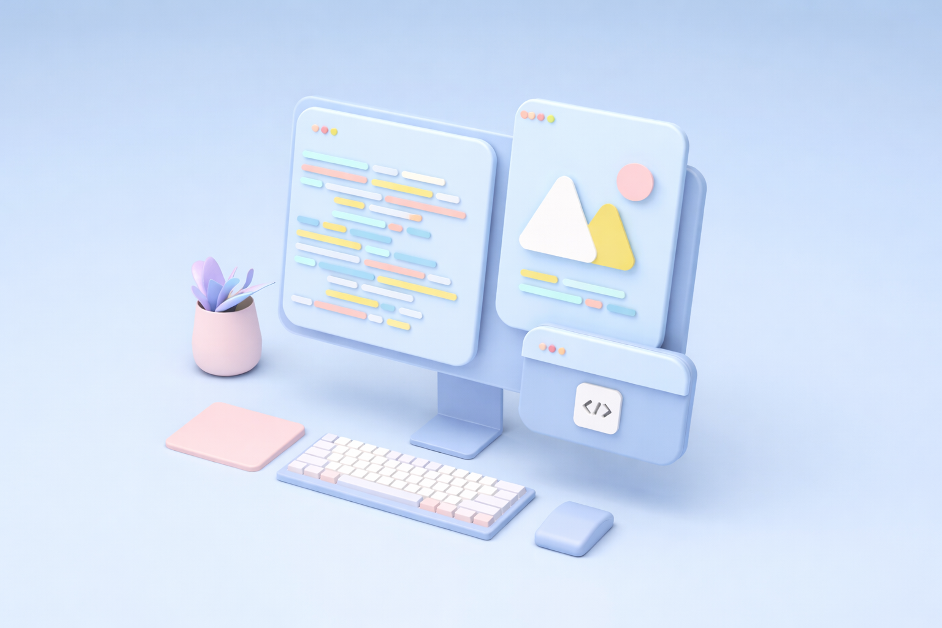
3D Computer with Elements
In today’s digital world, a polished, user-friendly website doesn’t just boost credibility — it supports SEO, drives conversions, and strengthens your overall brand image. When design meets strategy, the result is a site that truly works for your business and your users. Great web design often implements universal design principles to accommodate diverse needs and platforms.
9 Core Web Design Principles
1. Visual Balance
Balance on a web page is essential in web design because all the components of the web page should integrate well with each other. The objective is to achieve harmony, order, and stable visual features that users find pleasing. There are two broad categories of balance: symmetric and asymmetric.
Symmetric balance is a more orderly, structured, and formal approach in which the components are organized evenly on opposing sides of a central line. On the contrary, asymmetric balance incorporates an energetic and unbalanced feeling by employing various elements that differ in size, weight, or color but are still arranged in a balanced way.
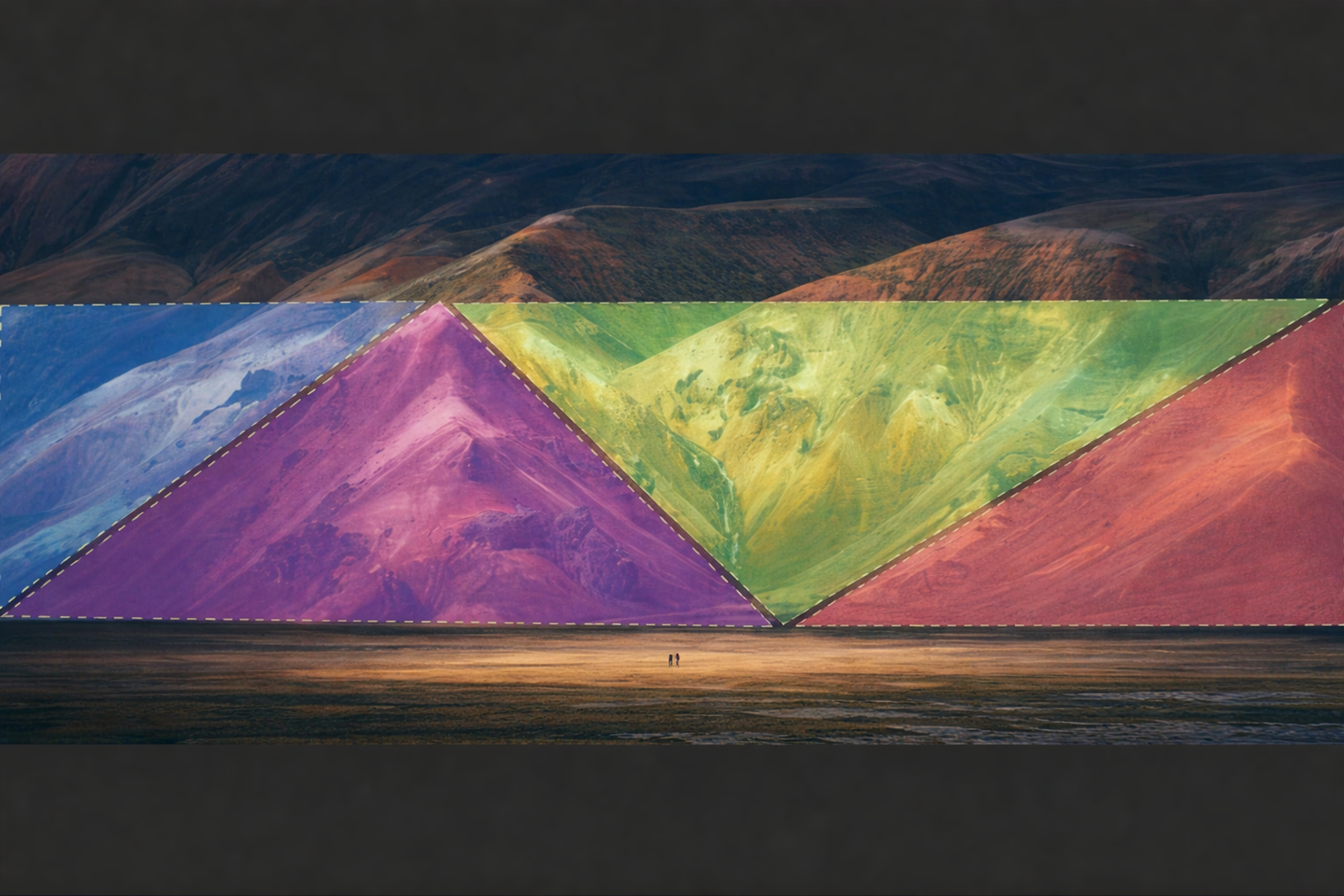
Visual Balance Example
To obtain visual balance, aspects such as alignment, hierarchy, and spacing must be considered. The effective handling of white space is also crucial to visually balance a design.
White space allows essential components of the design to catch a person's attention and avoids the possibility of the design looking disorganized. A well-balanced design improves aesthetics, efficiency, speed, and usability.
The user is guided to the main focal points of the web page, resulting in a seamless browsing experience. By focusing heavily on visual balance, designers are able to create functional and usable websites that are also appealing. This design approach often informs perceptual design principles, ensuring smooth visual flow and cognitive ease.
2. Navigation
Studies have revealed that nearly all people (94%) agree that simple navigation is an essential website feature.
Navigation can be one of the most important principles for getting the website right. Users who visit your website should intuitively understand how to find what they're looking for in a few clicks or taps. The trick is to create a navigation system that is not only simple but also efficient and intuitive.
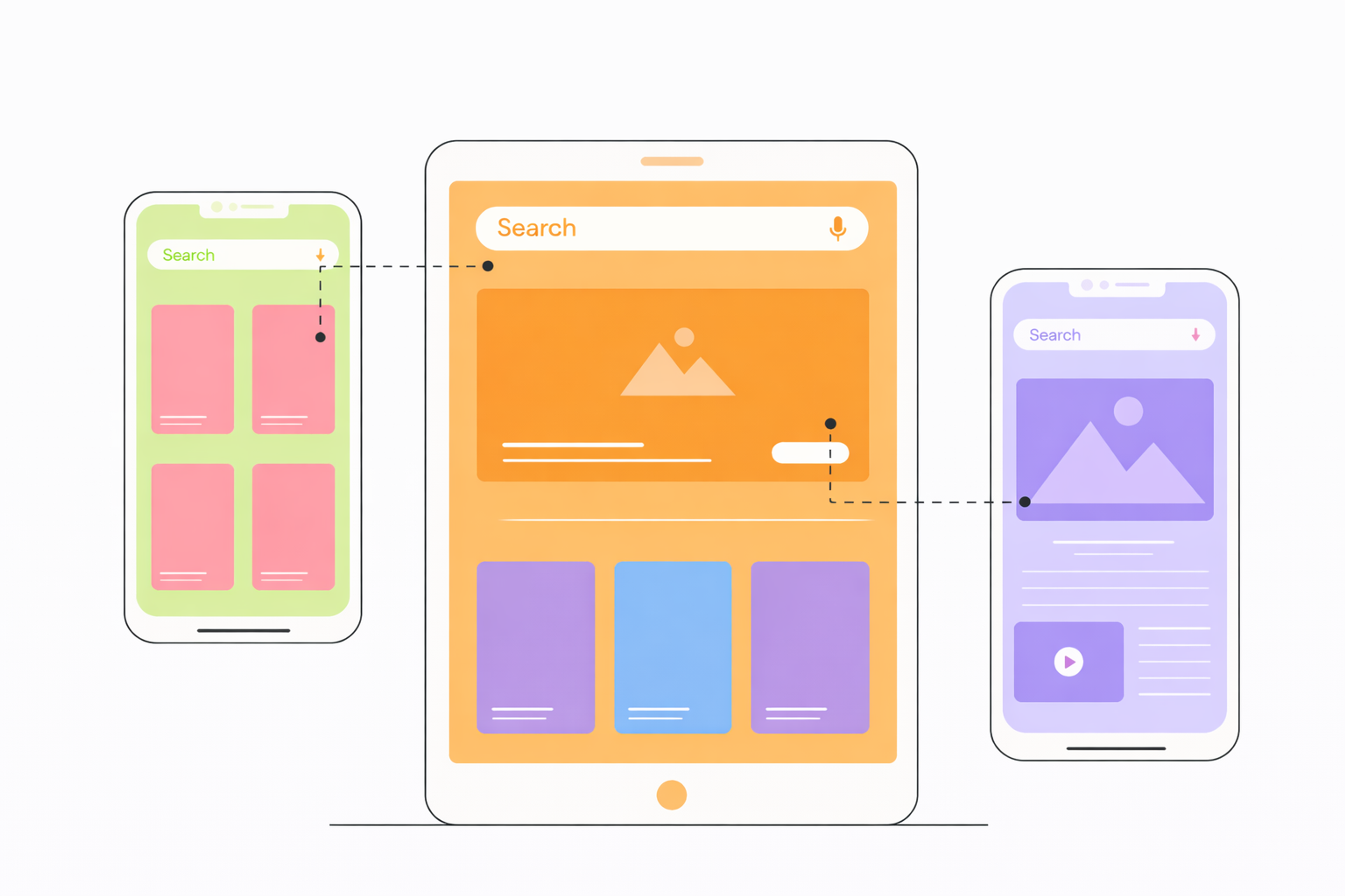
Web Page User Path scheme
Complex navigation systems can lead visitors into an endless loop of tabs, drop-down menus, and links with no final destination in sight - and of course, this should be avoided at all costs!
Good web design should always aim at making the navigation process as smooth as possible, so visitors have a pleasant experience while exploring your web pages. By doing so, it applies universal design to ensure clarity for a wide variety of users, including those with cognitive or motor challenges.
We wanted our design to be understandable to anyone, so navigation in Slack is intuitive and straightforward. By avoiding the pitfalls of complex navigation systems, the design ensures that users are not trapped in an endless loop of tabs and menus. Instead, it provides clear, intuitive paths that effortlessly guide visitors through the content.
This thoughtful navigation approach improved the user experience and encouraged exploration and engagement, demonstrating the importance of user-friendly web design that supports perceptual design principles and accessibility.
Slack demo by Clay
3. The F- or Z-Pattern
Principles seizure Users' reading patterns on the web are referred to as the F-Pattern or Z-Pattern. These are derived from natural eye movements and are essential in developing efficient and practical designs. These concepts directly guide perceptual design principles used in layout strategy.
The F-pattern is easily noticed on pages that contain heavy text, such as blogs or articles. With the F pattern, users look at the screen top first for headings or navigation.
After this, they tend to look down the left side of the given text for key points and sometimes look sideways through the content. This pattern underlines the need to place important information and call-to-action buttons at the top and left of the page.
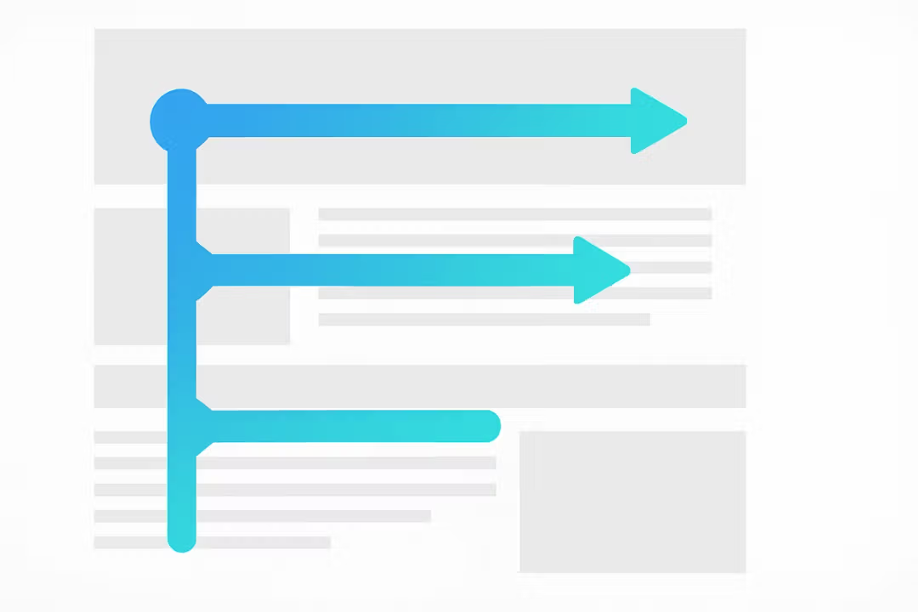
F-Shaped Pattern Example
On the other hand, the Z-Pattern is often found in low-complexity, visual-dominated designs like landing pages. Users' eyes follow a "Z" pattern through the layout, starting from the top left corner, reading across to the top right-hand corner, then diagonally moving to the bottom left and finishing off at the bottom right. This format remains effective for directing users through a lucid sequence of a headline, image, and the ultimate CTA.
With this knowledge, designers can place these elements in a way that captures the attention they seek and engages the user, regardless of whether the anchor text is heavy or minimalistic. The Z—or F-pattern will always ensure a positive and seamless online experience. Understanding these models informs perceptual design principles and supports effective layout decisions.
4. Responsive and Mobile-Friendly Design Is Necessary
In web design, one universal truth holds: responsive design is necessary. In today's digital age, having a mobile-friendly website is essential, as a significant portion of global website traffic comes from mobile devices. Responsiveness refers to web pages that display properly and optimally on various devices, like monitors, tablets, and smartphones.
And because web surfers worldwide access web pages regardless of platform, it’s never been truer that following web design principles allows a page to respond seamlessly on mobile devices.
Responsive Design
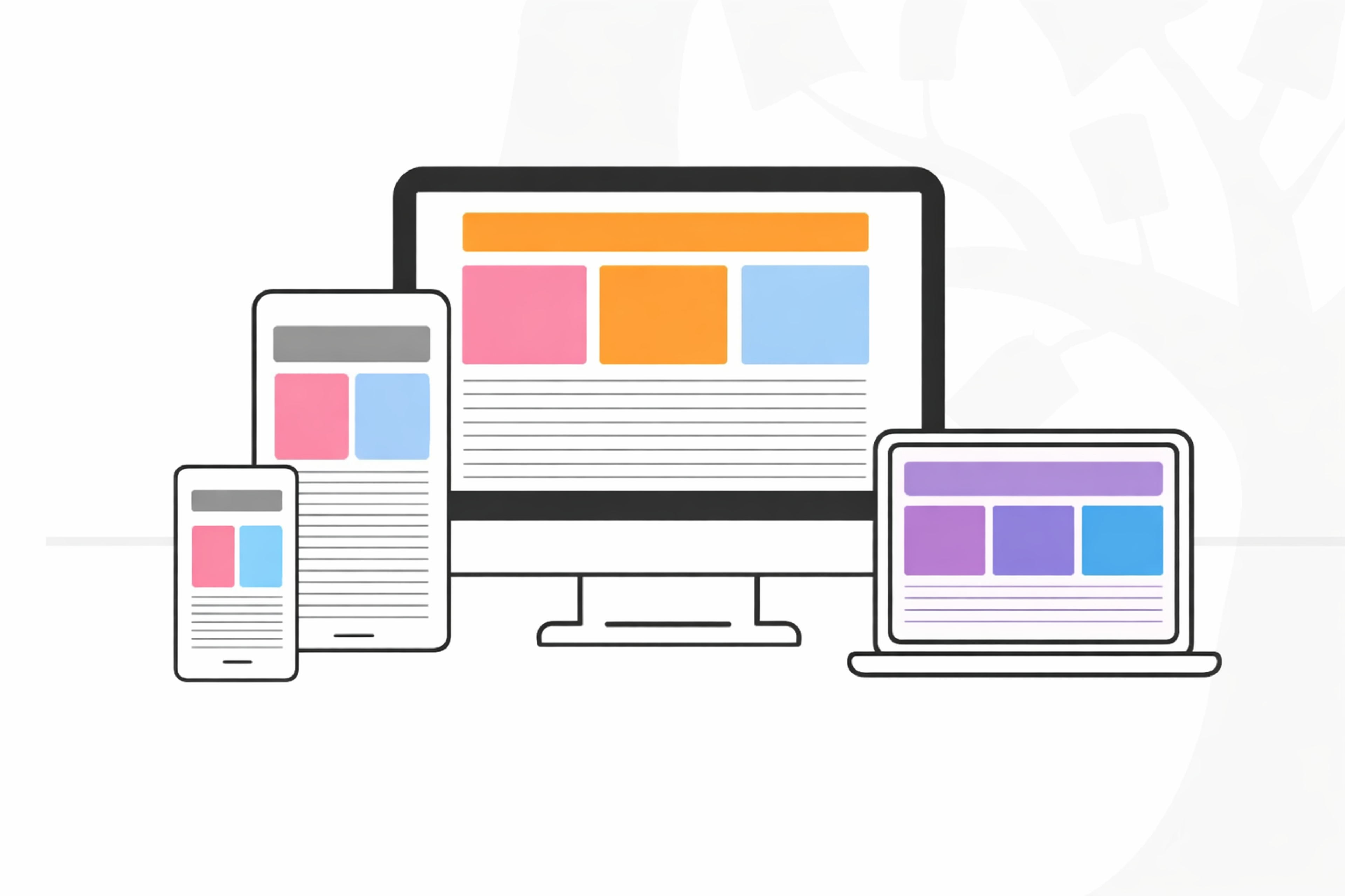
Responsive design often includes resizing images, adjusting buttons according to device type, and other interactive features, to accommodate various screens.
And while this may be tedious work, taking the time to ensure a website is properly responsive is worth it. After all, we don’t want our web pages failing us at a crucial moment — especially with many web design principles designed specifically for optimal user experience!
5. Grid-Based Layout
As a web designer, an individual should understand grid-based layout, which is a technique used to arrange content with rows and columns. Incorporating well-designed visual elements such as images, graphics, and icons can enhance the overall look and feel of the website, making the grid-based layout more effective. A well-structured grid system also establishes design principles that guide consistency, alignment, and visual hierarchy across the site.
The grid system adds symmetry and waterfalls to the content, making the page easy to use. This enhances the users’ experience with the website and gives the design some clarity.
A grid system improves a site’s performance because it is responsive across various platforms and devices. Users can have a smooth experience on the device they prefer since the design adapts to desktops, laptops, and other mobile devices. Grids, in general, help with the placement of content, which also improves harmony and gives the layout a professional look.
Grids maintain the required level of accuracy when working on blocks of written words, pictures, and content. They can create an organized interface and enable users to have vivid experiences regardless of the device they choose to use.
Wireframe vs Actual Website Grid

This principle has shifted how modern websites are built since more designers choose to improve their layouts in a way that makes the website attractive and easy to use. With a grid system, a designer can easily create a fusion between creativity and usefulness because the design can convey the intended meaning while also serving the users’ needs.
6. Use Colors Wisely
With web design, color can make all the difference in creating a visually appealing website. After all, it’s the first thing a visitor notices about your web page!
To ensure your web design stands out for the right reasons and remains visually appealing, using color wisely is one of the nine core web design principles. Think carefully about combinations; consider which colors complement each other and how people process visual information.
Color Wheel by Clay
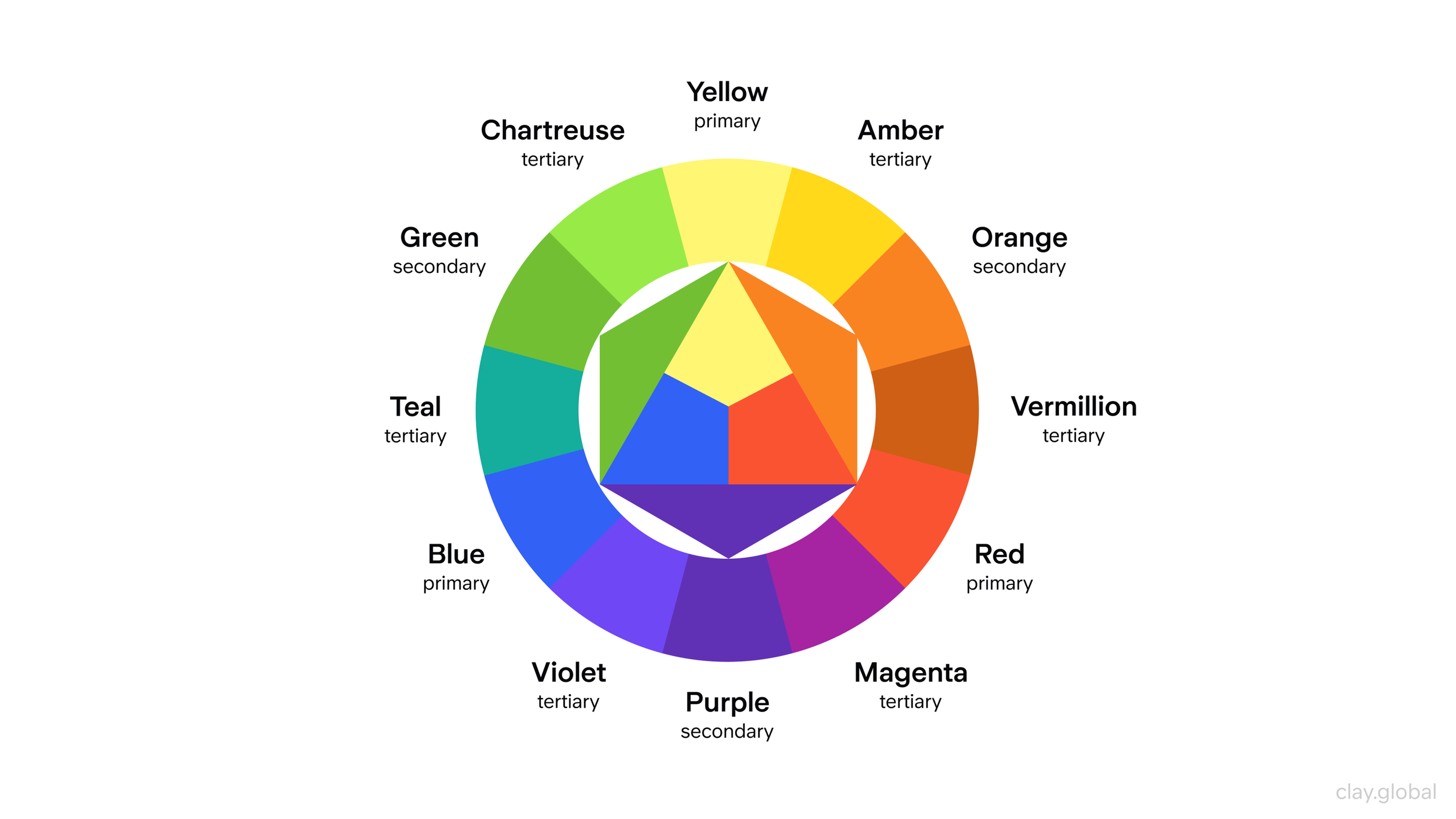
Try experimenting with different shades to see what color scheme works best, and remember: less is often more. A few well-placed hues complementing each other make for a much more effective web design page than an array of clashing colors!
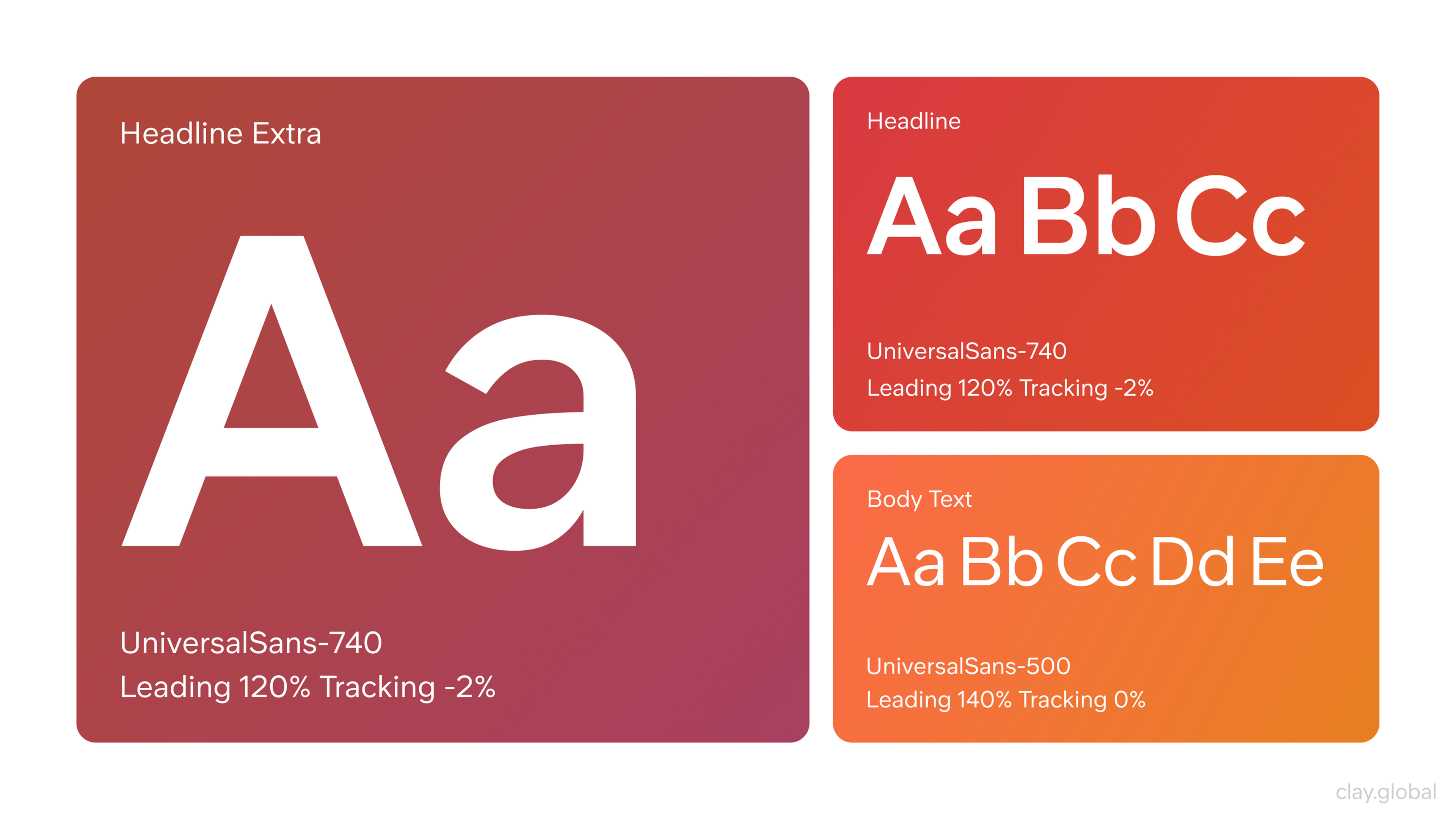
7. Fonts Matter
Fonts aren't just for adding decoration to web pages - they can make or break all your efforts in web design. When selecting a font, we must remember that web design principles are at play. We must consider readability, style, size, and overall aesthetic appeal. It's easy to pick a font that looks good on the surface only to find it unreadable on screens of any size. So take the time to pick a font that looks and works great - your web audience will thank you!
Typography Examples by Clay
8. Negative Space
Negative space plays an important role in web design, as it helps to create a sense of balance and clarity on the page. Setting aside certain areas of the page that are empty or contain fewer elements helps to emphasize the more important content areas and draw attention to them.
Additionally, negative space can be used to create a visual hierarchy - that is, it can help organize visuals into groups or sections according to important topics.
White Space by Clay
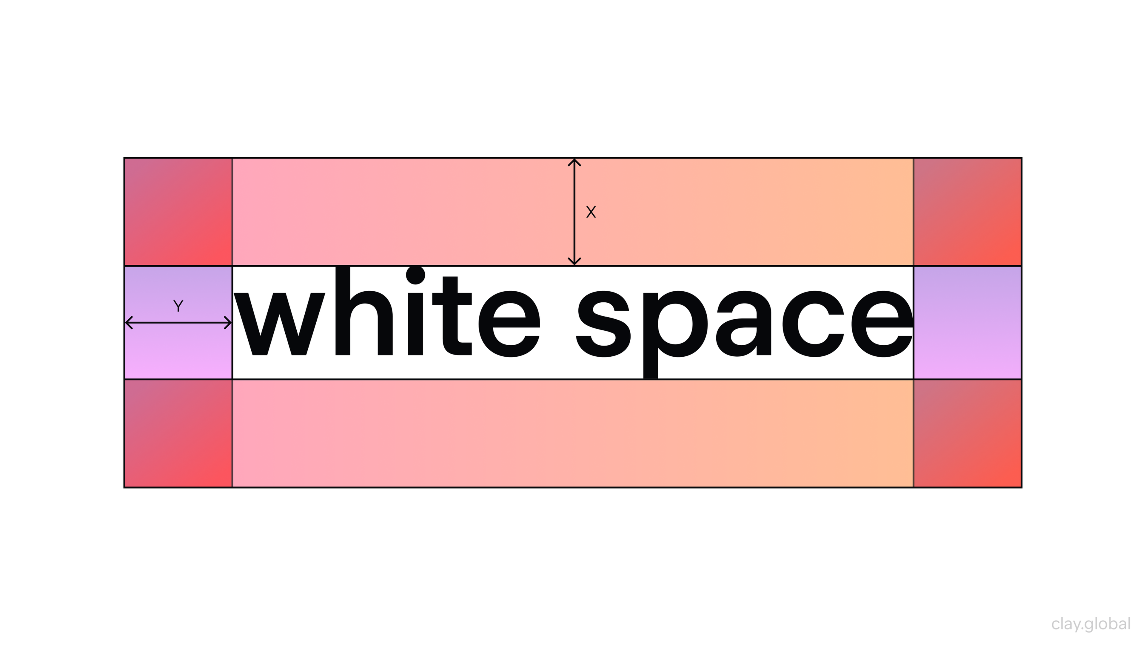
Furthermore, negative space can also act as a tool for creating breathing room between different pieces of content, which helps visitors focus on one topic at a time without getting overwhelmed by too much information.
Finally, negative space makes web pages look more aesthetically pleasing and inviting, encouraging visitors to stay longer and explore further. When used judiciously and effectively, negative space can significantly impact user experience and make website navigation easier for visitors.
9. Optimized Buttons and Calls to Action
Buttons and calls to action (CTAs) are essential elements in web design that guide users toward taking specific actions, such as signing up, purchasing, or downloading content.
Engaging website visitors with clear and compelling calls to action can significantly improve user engagement and conversion rates. Optimizing these elements can significantly improve user engagement and conversion rates.
- Clear and Compelling Text The text on your buttons should clearly state the action. Use concise, action-oriented phrases like “Sign Up Now” or “Get Started.” Avoid vague language and ensure the CTA aligns with the user’s expectations.
- Strategic Placement Place your buttons where users naturally look, such as above the fold, at the end of a form, or near relevant content. Ensure they stand out and are easy to find without overwhelming the page.
- Size and Shape Buttons should be large enough to click easily, especially on mobile devices, while not dominating the page. Rounded edges and a clean design often make buttons more visually appealing and approachable.
Red Button
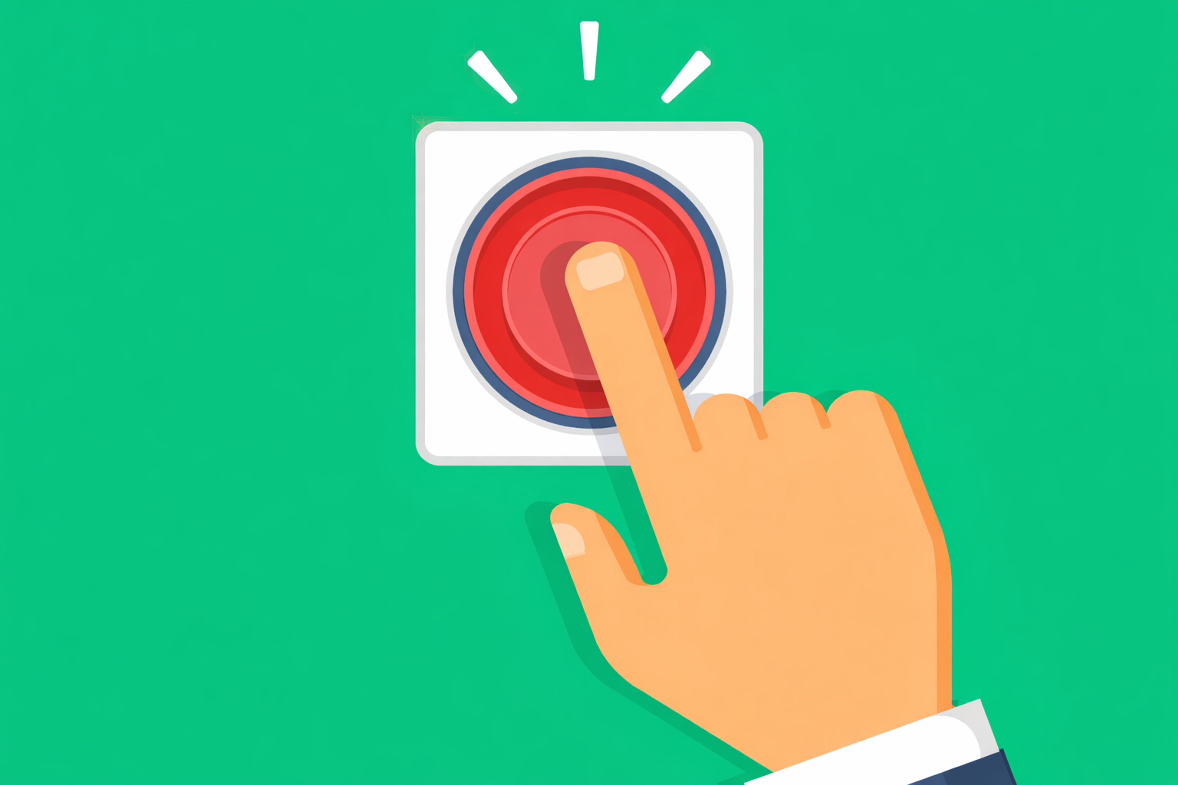
- Encourage Urgency Incorporate urgency or exclusivity in the CTA, such as “Limited Offer” or “Download Today.” This can motivate users to act quickly.
- Test and Optimize Use A/B testing to experiment with different button designs, text, colors, and placements. Analyze the results to determine what resonates most with your audience.
By paying attention to these details, you can create optimized buttons and CTAs that enhance your website’s usability and help drive meaningful actions.
Read More
Conclusion
Great web design isn’t about cramming in every flashy element — it’s about making thoughtful choices that serve both beauty and function. The principles we’ve covered aren’t just design “rules” — they’re tools to help you craft experiences that feel intuitive, engaging, and true to your brand.
Remember, simplicity often wins. It’s not about doing the most — it’s about doing what matters best. As a web designer, your real skill lies in finding that sweet spot between creativity and clarity, form and function.
When you design with intention, your website won’t just look good — it’ll work beautifully for the people who use it. And that’s when the magic really happens.

About Clay
Clay is a UI/UX design & branding agency in San Francisco. We team up with startups and leading brands to create transformative digital experience. Clients: Facebook, Slack, Google, Amazon, Credit Karma, Zenefits, etc.
Learn moreAbout Clay
Clay is a UI/UX design & branding agency in San Francisco. We team up with startups and leading brands to create transformative digital experience. Clients: Facebook, Slack, Google, Amazon, Credit Karma, Zenefits, etc.
Learn more