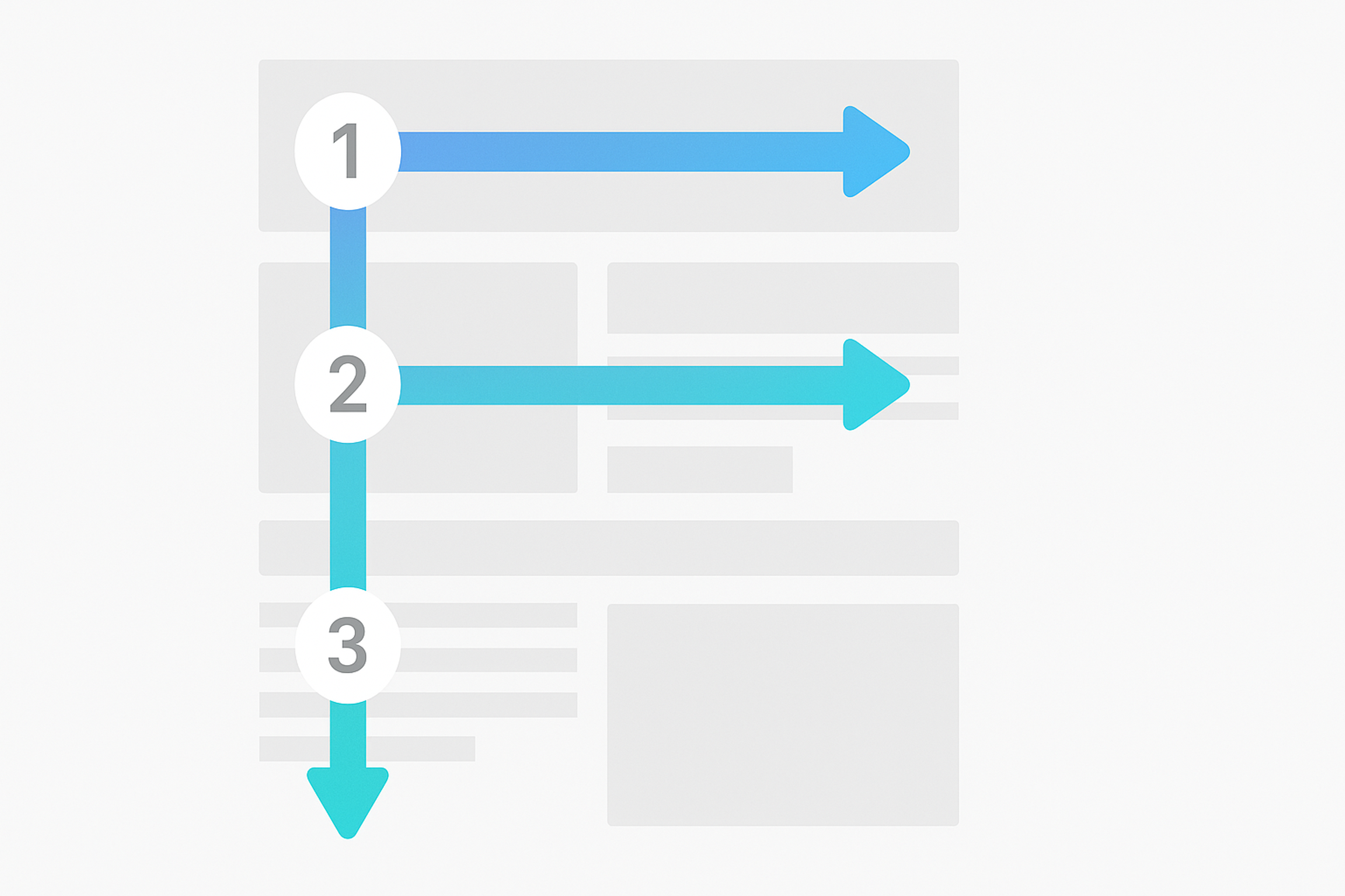
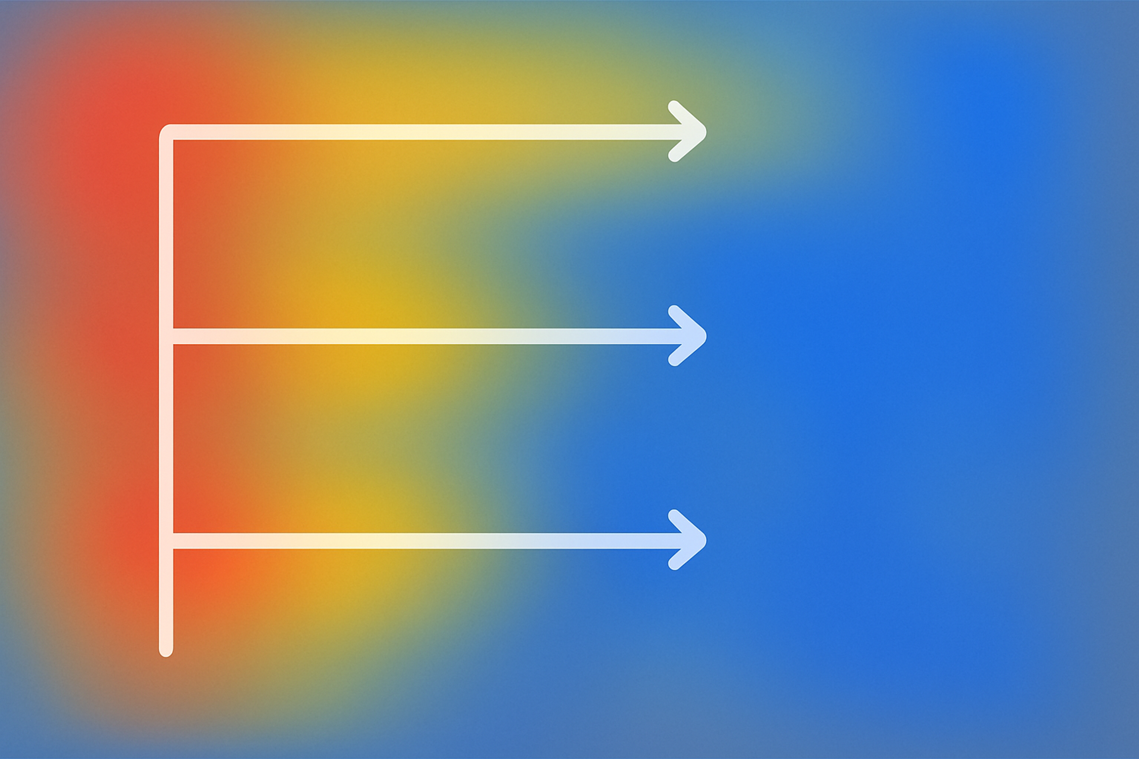
Eye-tracking studies describe an F-pattern: users scan from the top left, read across, then move down and scan across again.
Design for scanning by placing key elements like headlines, keywords, and CTAs near the top and left. Use clear headings, short text blocks, and supportive visuals to guide the eye. This makes pages easier to navigate and can improve engagement and conversions.
What Is F-shape?
The F-pattern is a common design layout that helps websites catch attention, keep visitors interested, and guide them to take action. It works by supporting three key behaviors: scanning, reading, and navigating.
Eye-tracking studies show that people often scan pages in an F shape. Their eyes start at the top left, then move across the page, then down. This pattern helps them find important content quickly.
Placing headlines and key information in the top left corner makes it more likely that users will notice it. After scanning, users begin to read more closely, moving down the page line by line.
F-Pattern
The F-pattern also supports easy navigation. It guides users through content in a way that feels natural and helps them find what they need without confusion.
Why Are The F-Shape Web Pages Effective?
The F pattern is a practical design structure because it helps website owners engage, capture, and convert their visitors into customers. Also it helps to create a beautiful and striking visual hierarchy. The F-shape encourages visitors to quickly scan for relevant information that has been placed in the top, left side-hand corner of the page.
The top line of the F-pattern gets the most attention, so key information should appear early.
This scanning behavior helps users grasp the page quickly and decide whether to keep reading. Clear structure and logical navigation make content easy to find, improving the user experience and supporting conversions.
Key Elements of the F-Shaped Pattern
The F-pattern reflects how many users scan a page: headline, subheads, and the first lines, then a quick sweep down the left side with short horizontal scans.
Designing around this behavior helps place key information where attention naturally lands.
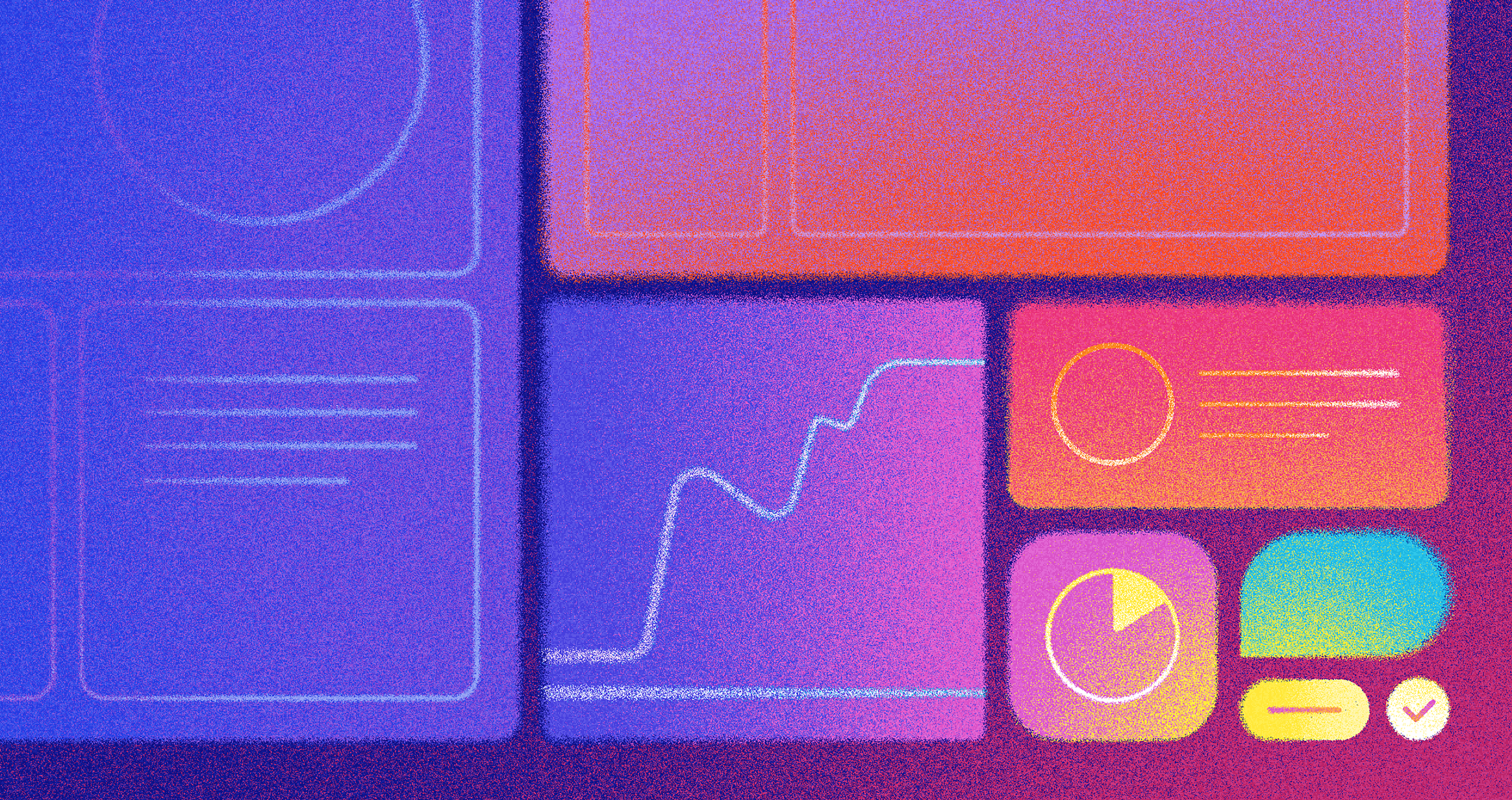
Example of F-Shaped Pattern
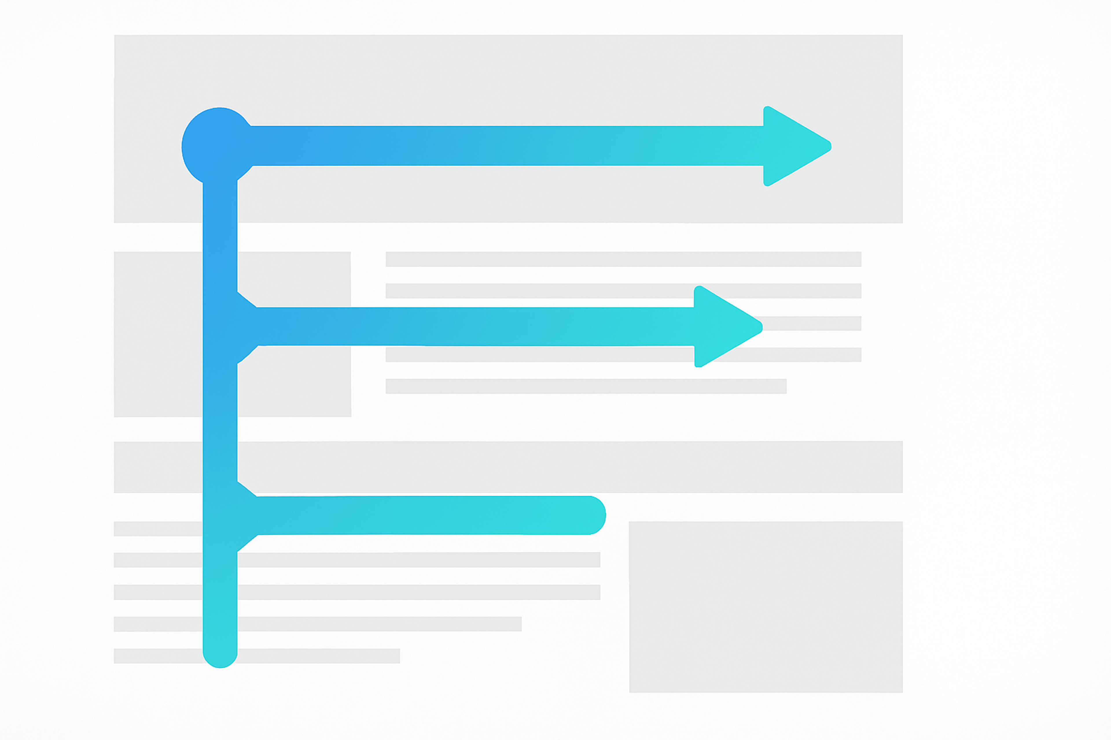
The key elements of the F-Shaped Pattern are horizontal eye movement and scanning behavior, an emphasis on headlines, subheadings, and first sentences, and strong visual cues such as color, images, or icons. To leverage this pattern effectively, content should be organized to guide the horizontal movement of users’ eyes from left to right in an “F” shape, forming horizontal lines as they process the text more linearly.
The headline should be placed prominently at the top of the page, while subheadings should be used throughout the page with bold font or other strong visual cues. Additionally, short sentences that draw attention should be placed near the top of each section to capture users’ attention quickly.
When designing a website using this pattern, it is important to ensure all content is easily readable and scannable with clear headings for each section. Too little or no formatting much text can overwhelm readers, so it’s essential to consider what information you want them to take away after reading your content before writing it out in full.
Additionally, calls-to-action should be placed throughout the page with vibrant colors or unique icons that catch users’ eyes and compel them to click through.
By leveraging these key elements of the F-shaped pattern, businesses can create an engaging online experience that will capture their target audience’s interest and increase conversions on their site.
Using strong visual cues for headlines and subheadings along with shorter sentences near the top of each section will help guide visitors’ eyes across the page, while calls-to-action strategically placed throughout will encourage them to explore more deeply.
With this combination of design elements, businesses can create an optimal user experience for their visitors, resulting in more conversions over time.
Designing for the F-Shaped Pattern
Design for how users scan: across the top, down the left, then short horizontal sweeps.
Make key content easy to catch fast:
- Put clear headlines at the top of sections
- Use subheadings with strong visual emphasis
- Keep the first lines short and informative
- Add visual cues like icons or color to highlight priorities
- Use images where they explain or reinforce the message
This structure improves readability, engagement, and conversions.
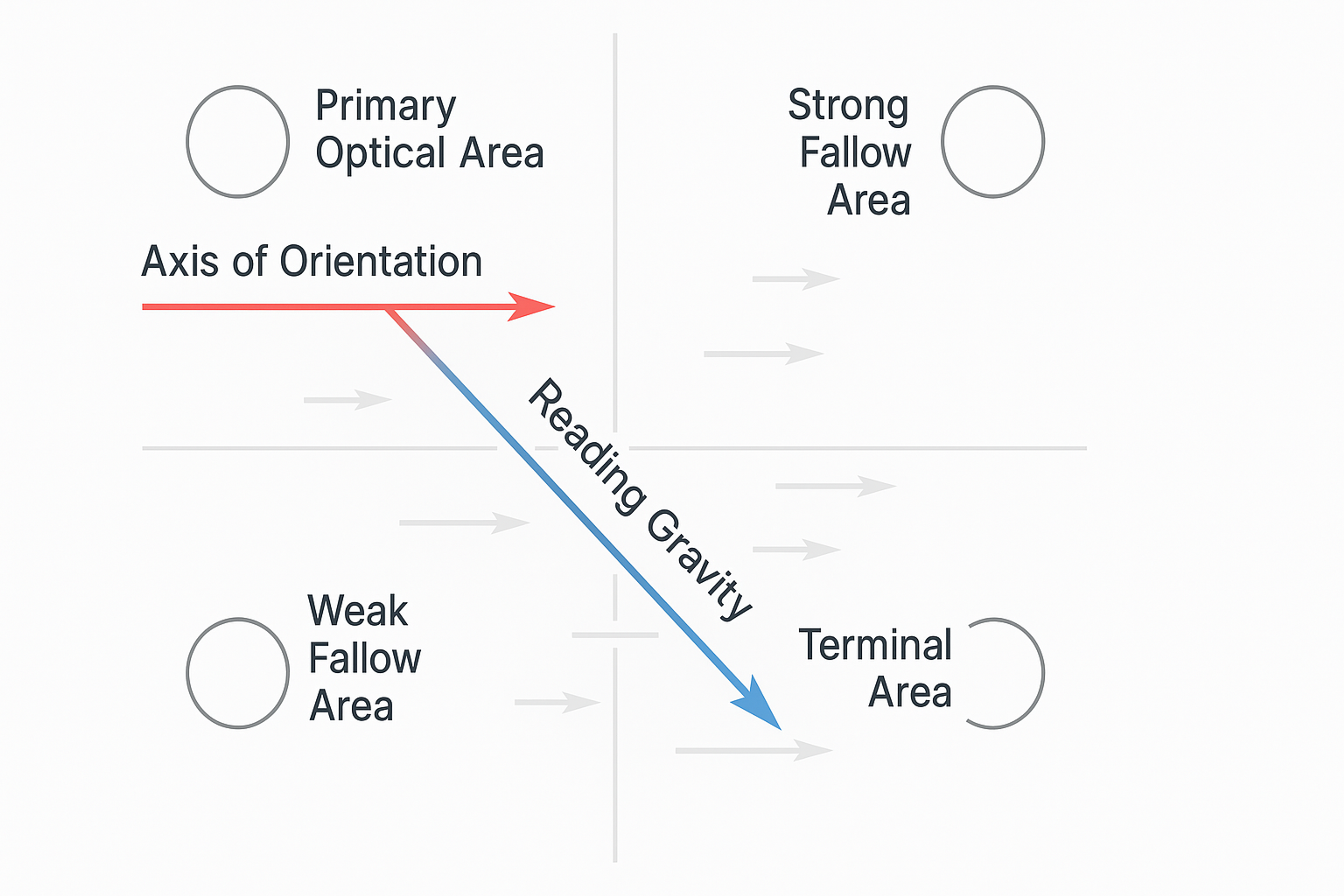
Reading Gravity
Content Writing Techniques for a Scanning Pattern
Start the F-pattern layout from the top left. Place the headline, key message, and primary CTA near the top and along the left side.
Users skim text-heavy pages in an F-shape, so front-load the essentials in the first two paragraphs. Use clear subheadings as scan anchors, short paragraphs, and strong opening lines.
Guide attention with bold headings, whitespace, and strong contrast without visual clutter. Put secondary content in the sidebar. Place CTAs along the natural F-path and test placements to keep what improves engagement.
Content Writing Tips
Mobile Responsiveness and the F Pattern
When designing for the F layout, it is essential to consider how your content will look on mobile devices. Mobile browsing has become increasingly popular as phones and tablets become increasingly advanced, so ensuring your website is optimized for these devices is essential for providing users with a positive experience.
One key way to optimize content for mobile devices is through responsive design. This ensures that viewers will see the same content regardless of the device they are using while still being able to interact with it effectively.
To do this, designers must consider font size and line length and how elements like images and menus will appear on different-sized screens. Additionally, links and buttons should be easily clickable on any device by allowing ample space between them to prevent accidental clicks or taps.
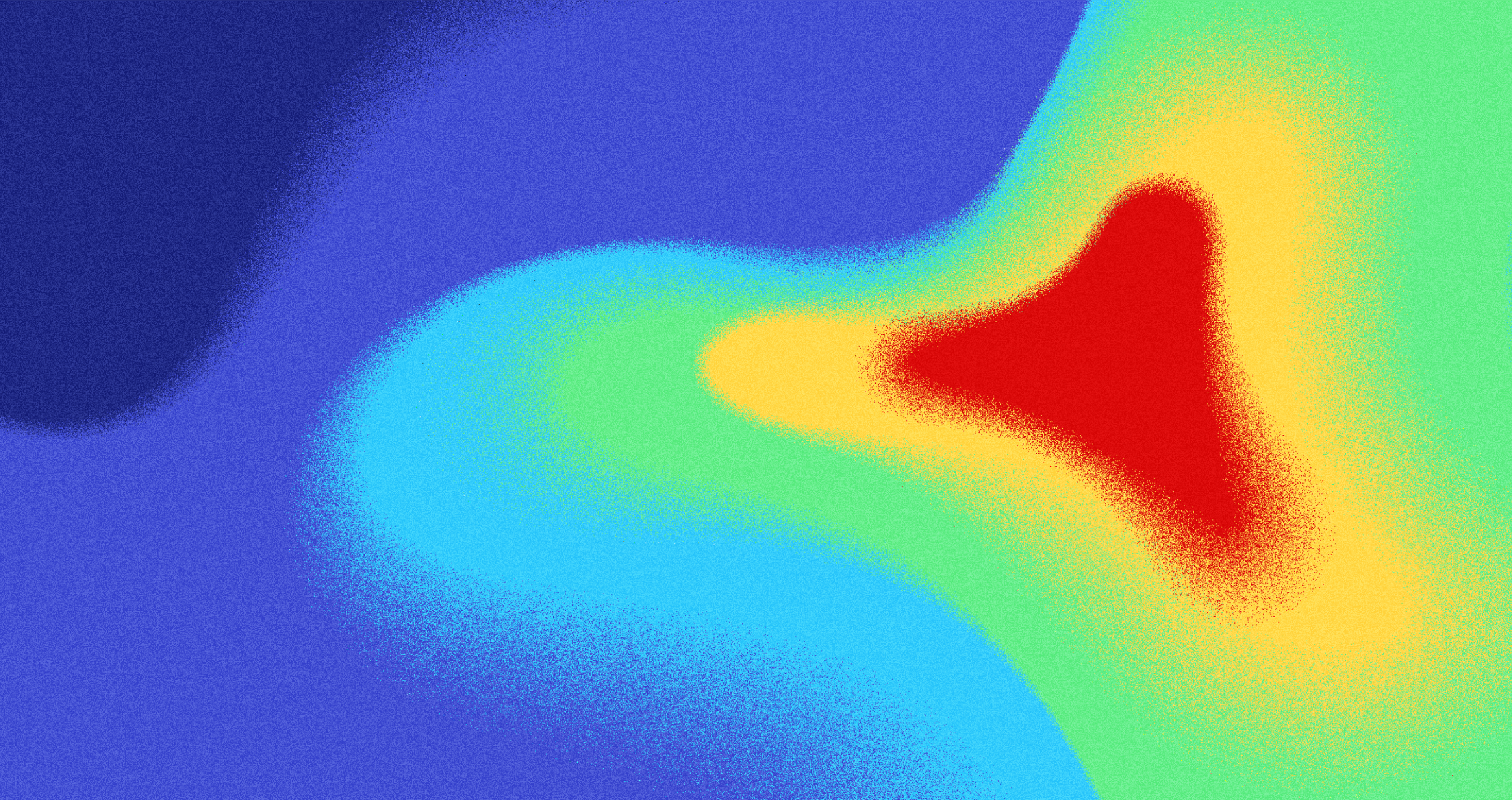
F-Pattern on a Heat Map
Moreover, when designing mobile devices in the F pattern, it is crucial to focus on usability. Content should be concise yet meaningful so readers can quickly scan and remove information from a page.
Additionally, icons or photos should be included where applicable, as this can help draw attention across the horizontal lines of a page and increase engagement with content.
By leveraging these best practices for mobile-friendly web content and design, businesses can create an optimal user experience that leverages the F layout while being accessible on various devices. With this combination of design elements, businesses can expect more engaged visitors who stay longer on their websites and are more likely to convert into paying customers over time.
F-Pattern and Search Engine Optimization
Search engines use engagement signals. If users stay and interact, it suggests the page is useful.
Match layout to scanning:
- F-pattern for text-heavy pages
- Z-pattern for simple, low-text pages
- In F-pattern layouts, content on the right is seen less
Place key terms where attention is highest, near the top and along the left, but keep it natural. Clear structure helps users find answers faster, reduces bounce, and can increase dwell time, which may improve search performance over time.
Tools and Metrics for Tracking Reading Pattern Effectiveness
To measure the effectiveness of F-shaped reading pattern optimization, using the right tools is essential. Heatmaps from platforms like Hotjar reveal where users focus their attention, helping you see if key content aligns with natural scanning behavior.
Google Analytics adds context with metrics like bounce rate and time on page, which indicate whether your layout keeps users engaged. For deeper insight, eye-tracking software in user testing can show exactly where and how long users look at different areas.
By combining these tools, you can fine-tune your design to ensure vital content appears where users are most likely to notice it — boosting engagement, usability, and SEO performance.
FAQ
Q: Is the F-pattern Effective for All Types of Websites?
No, the F-pattern works best for text-heavy pages like blogs, news articles, and landing pages. Visual or app-based interfaces may follow different scanning behaviors.
Q: How Does the F-pattern Compare to the Z-pattern?
The F-pattern is ideal for content-heavy layouts with multiple paragraphs and headings, while the Z-pattern suits simpler designs like single-page websites or ads with minimal text.
Q: Can the F-pattern be Applied to Video or Multimedia Content?
Not directly. The F-pattern applies to reading behavior. For multimedia, engagement depends more on placement, motion, and clear visual hierarchy than eye-scanning patterns.
Q: Should Designers Always Follow the F-pattern Strictly?
No. The F-pattern is a guideline, not a rule. Effective design considers user goals, content type, and context before choosing a layout structure.
Read more:
Conclusion
To create products that customers love, we need innovative minds. Product designers have exactly that – and so much more! With technology advancing daily, designers must stay current on trends and learn automated technologies such as AI.
Strong communication skills are also necessary because working within diverse teams is crucial to meeting customer needs.
Remember: creativity paired with technical knowledge makes a great designer - so start today if you have what it takes!

About Clay
Clay is a UI/UX design & branding agency in San Francisco. We team up with startups and leading brands to create transformative digital experience. Clients: Facebook, Slack, Google, Amazon, Credit Karma, Zenefits, etc.
Learn moreAbout Clay
Clay is a UI/UX design & branding agency in San Francisco. We team up with startups and leading brands to create transformative digital experience. Clients: Facebook, Slack, Google, Amazon, Credit Karma, Zenefits, etc.
Learn more