
Traffic gets more expensive every year, yet most visitors still leave without converting. A conversion is any action that helps your business, such as a purchase, form fill, demo request, trial signup, or early signals like adding to cart or starting checkout.
The fix is not always more ads or better targeting. It often removes friction on your site. Conversion optimization uses data, clear goals, and A/B testing to turn existing traffic into more customers.
To improve results, understand your visitors, track key metrics such as orders and subscriptions, and use these insights to refine layouts, personalization, and engagement, all while respecting user privacy.
These 12 tips work across ecommerce, SaaS, marketplaces, and lead generation. Even small gains can improve ROI and revenue by reducing uncertainty and speeding decisions.
Choose One Primary Conversion Per Page
A page that attempts to convert users through five different methods usually converts none of them.
Start every critical page with a single job to be done. Choose one primary conversion goal for visitors. On a product page, it is usually added to the cart. On our pricing page, you can start a trial or contact our sales team.
On a landing page from an ad, the action should match exactly what the ad promised. Your messaging and landing page content must do precisely that to meet expectations.
Primary Conversion Per Page
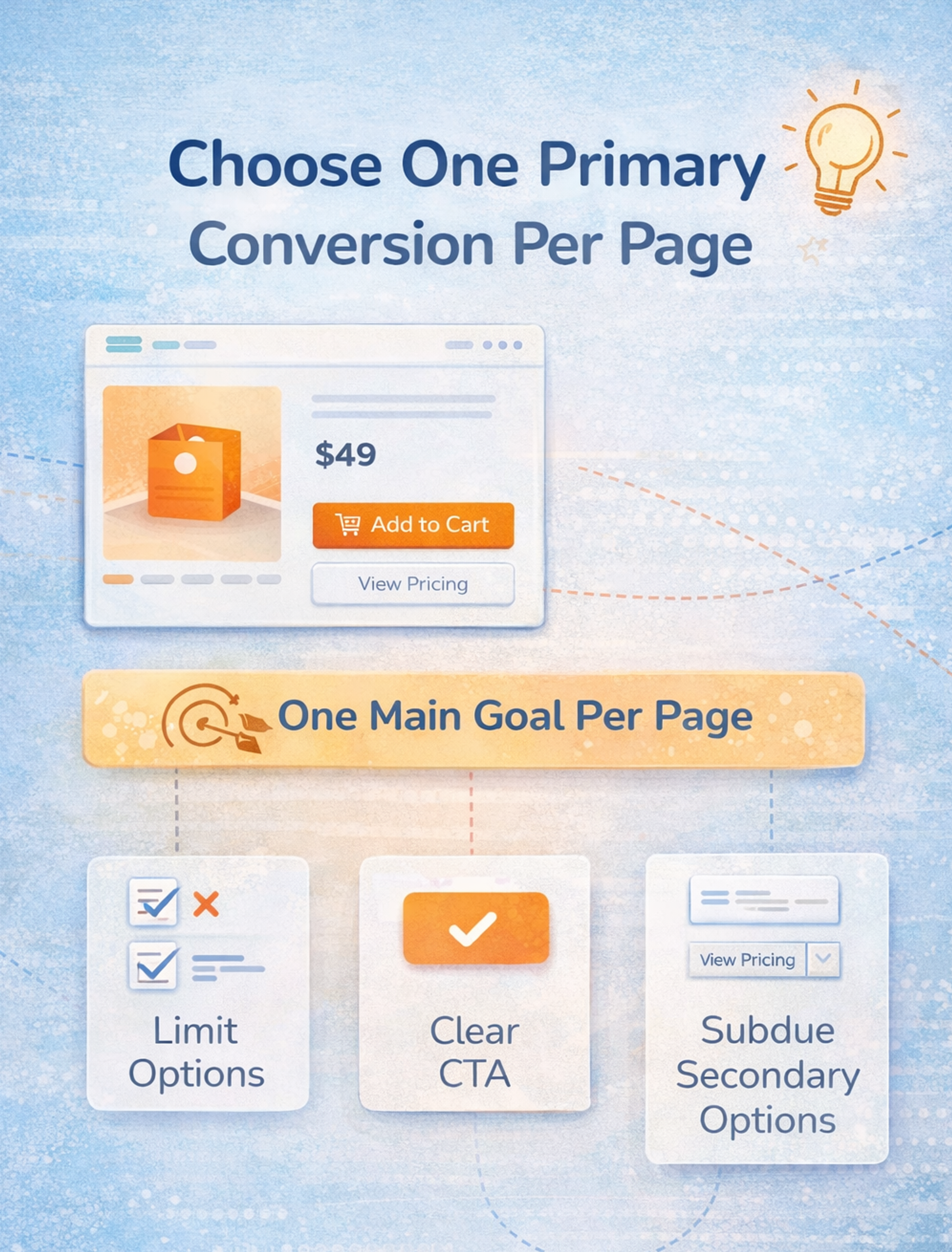
Once you commit to one primary desired action, many decisions become simpler. You can decide:
- What goes above the fold?
- Which proof and social proof matter most?
- How aggressive or minimal should the navigation be?
- How to phrase the primary call to action?
- Which secondary options are acceptable, and where do they belong?
It's essential to make your call-to-action (CTA) buttons prominent and compelling to drive conversions.
This doesn't mean removing every other path. It means ranking them. Secondary actions should stay available but visually subordinate. If your primary action is a bold button, the secondary might be a smaller ghost button or a text link. If the primary is "Start free trial," the secondary could be "View pricing" or "Watch demo."
The test is simple: can someone glance at your page for five seconds and tell you what you want them to do? If not, you've created a decision overload.
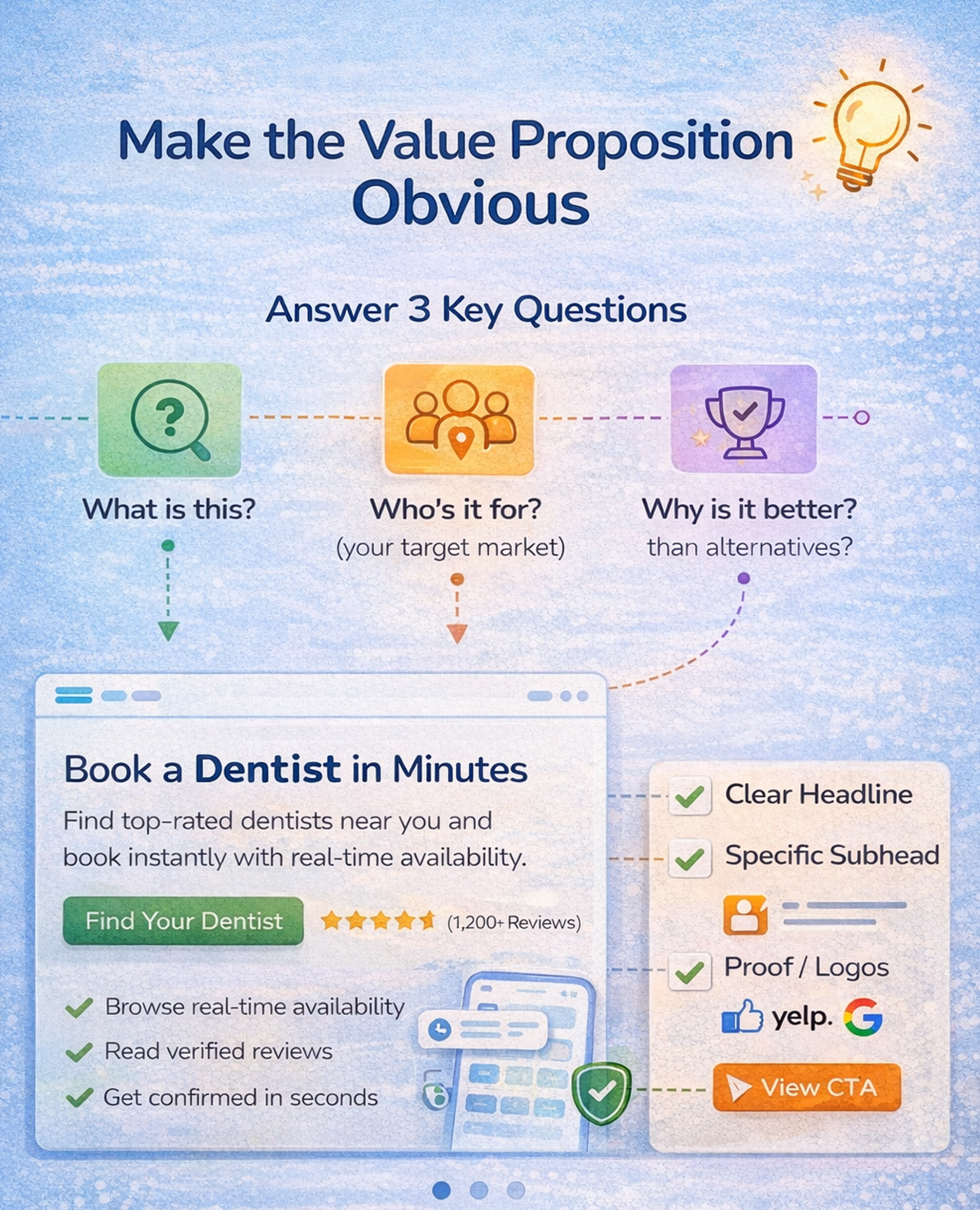
Make the Value Proposition Obvious
You're competing with indecision, distraction, and the fear of making a bad choice. Your value proposition has to cut through that quickly.
In a few seconds, it should answer:
- What is this?
- Who is it for? (your target market)
- Why is it better than the alternatives?
Most sites fail because they write for investors, not users. The homepage hero says something like "The unified platform for modern growth." It sounds impressive, but it tells visitors nothing about what the product actually does.
Move toward specific, concrete language. Add a "because" clause that makes the promise believable, for example:
"Book a dentist in minutes, with real-time availability."
"Launch invoices three times faster with templates that auto-fill from your CRM."
"School backpacks that survive daily abuse with reinforced seams, waterproof fabric, and easy returns."
A strong value proposition isn't just a single headline. It works as a small stack:
- A headline that makes a clear promise
- A subhead that explains who it's for (your target market) and how it works
- Proof that backs it up (ratings, testimonial snippet, logos)
- A clear next step that matches intent (start trial, book demo, see pricing)
Once you have a clear version, use A/B testing to test variations that change only one thing at a time: the level of specificity, the target audience, or the type of proof you highlight. Over time, this gives you a value proposition that is both sharp and validated by real behavior, not just internal opinions.
Make the Value Proposition Obvious
Treat Responsiveness As a Conversion Feature
Users don't experience performance as a lab score. They experience it as confidence. When they tap, the site responds. When they scroll, it feels stable. When they try to buy, nothing jitters, lags, or breaks.
Critical factors, such as page load time, page load speed, and overall user experience, directly impact website conversions. Improving page load time is crucial, as slow pages can lead to high bounce rates and decreased conversions.
Google's Core Web Vitals now emphasize interaction responsiveness. They replaced an older metric with INP, which measures how quickly your site responds to user interactions across a session.
Even if you don't care about search rankings, the user experience is a universal point. Sluggish interactions destroy momentum, and momentum fuels conversion.
To improve conversions, optimize performance in ways that users actually feel. Reduce layout shifts that cause misclicks and frustration. Make buttons and inputs respond instantly, especially on your mobile site.
Optimizing your mobile site's load time and resolving any technical issues is crucial to retaining visitors and enhancing conversions. Delay non-essential scripts until after the user engages. Audit third-party tags and remove what you don't use. Prioritize perceived speed by showing progress, skeleton states, and instant feedback.
Tools like PageSpeed Insights, Lighthouse, and WebPageTest help you measure what matters. A helpful habit is to record your checkout or signup flow on a mid-range phone over a standard connection. You'll spot the moments where the experience feels stuck, even when your analytics look fine.
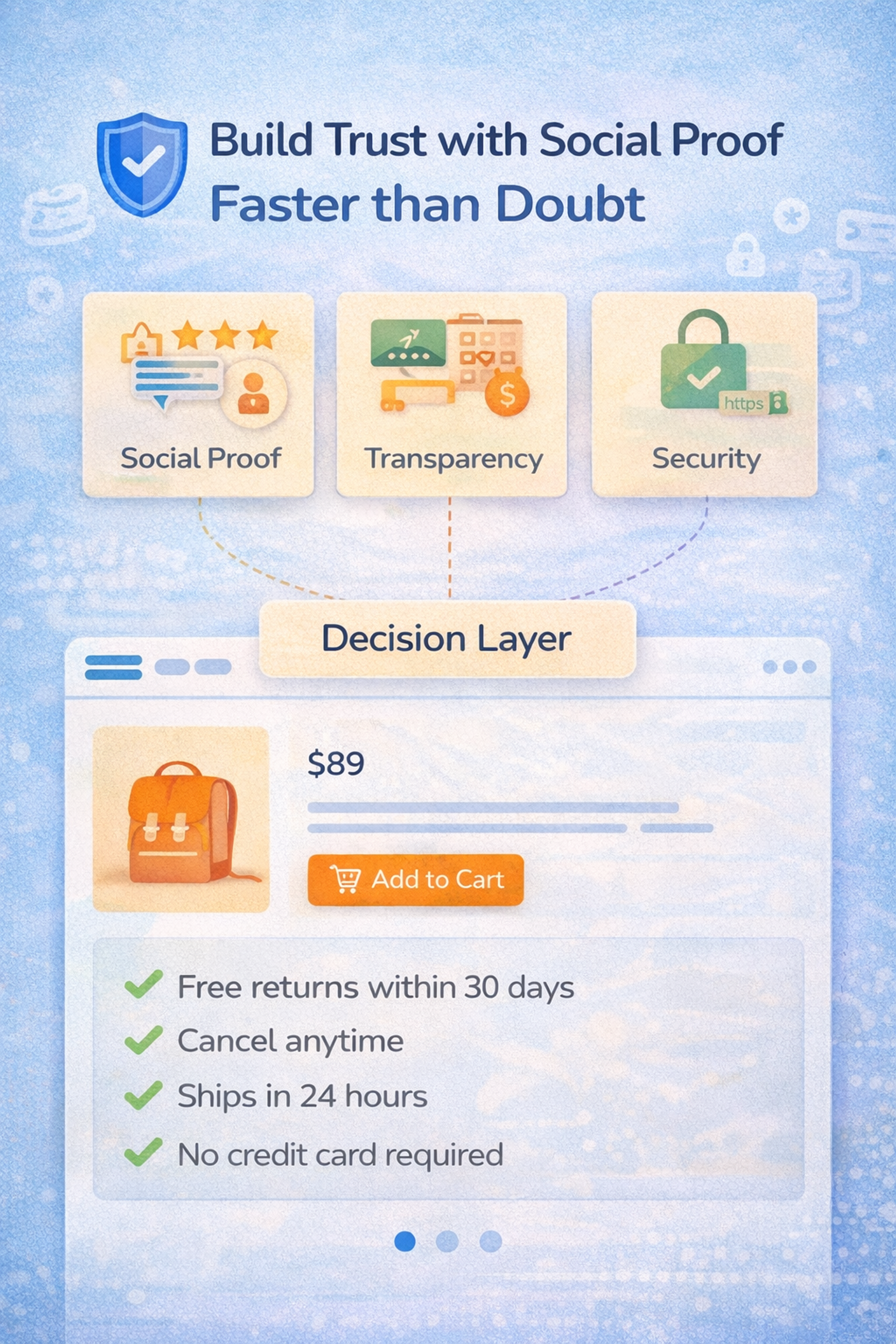
Build Trust with Social Proof Faster than Doubt
Conversion is a trust decision. When potential customers hesitate, they look for reasons not to proceed. Your job is to address doubts before they fully take shape.
Trust isn't a single badge in the footer. It's a system made of cues that stack. Social proof comes from customer testimonials, authentic customer reviews, stories, and feedback from existing customers, as well as ratings, customer stories, and user counts.
These trust signals are particularly influential for potential customers evaluating your site. Using testimonials and reviews helps build trust with visitors, which can, in turn, enhance conversion rates.
Leveraging psychological triggers, such as social proof, is a proven way to improve website conversions. Risk reversal includes returns, refunds, cancellation policies, and trial terms.
Transparency means showing shipping costs, delivery times, taxes, fees, and what's included. Legitimacy signals originate from genuine company information, contact options, and physical addresses.
Security cues include payment methods, HTTPS, and recognizable providers. Tone matters too because clear, human copy doesn't feel evasive.
A powerful trust pattern is the decision layer near your call to action. This is a small cluster of reassurance that removes top objections.
Examples include:
- "Free returns within 30 days"
- "Cancel anytime in one click."
- "Ships in 24 hours"
- "No credit card required"
Build Trust with Social Proof Faster than Doubt
Reduce form Friction with Progressive Disclosure
Forms kill conversion dreams, especially on mobile. The fix is rarely making the button bigger. It's designing the form as a conversation rather than a bureaucratic demand. For mobile users, optimizing forms for smaller screens and touch input is crucial to ensure a seamless experience and reduce drop-offs.
Three principles work exceptionally well. Ask only what you need now. If you don't need information to deliver the next step, delay asking for it. This is progressive profiling in SaaS and progressive disclosure in ecommerce.
Each step a user completes, such as entering their email or clicking a 'sign up' button, can be considered a micro-conversion, while completing the entire form and creating an account is a macro-conversion.
Make the form autofill-friendly.
Use the correct input types for email and phone, provide proper labels, and display clear error messages. Don't punish users for formatting. Turn uncertainty into guidance. People abandon forms when they feel trapped. Show what happens next, how long it takes, and why you need the information.
Additionally, simplifying website navigation helps visitors find the information they need quickly, which can lead to higher conversion rates.
Build a Fast Lane to Completion
When a user is ready to convert, any delay becomes a reason to abandon the process. In ecommerce, this is often forced account creation before purchase, especially on an online store or ecommerce website. In SaaS, it is unnecessary to have gates before product access. In lead generation, it is asking for too much information too early.
A fast lane for high-intent users is essential. Guest checkout enables payment without creating an account. Express payments provide wallets and one-tap methods where relevant.
A short path for returning users allows preferences to be remembered with consent. A clear, linear checkout page with a visible step indicator helps reduce uncertainty and minimize cart abandonment.
Accelerated checkouts and modern payment elements reduce the number of form fields while maintaining security and convenience. Offering multiple payment options at the checkout page reduces friction and increases conversion rates by accommodating different customer preferences.
Trust signals, such as SSL certificates and security badges, are essential for lowering purchase anxiety and instilling confidence in your online store.
Familiar payment brands increase trust. Mobile wallets let users complete checkout in seconds.
Get Users to First Value Fast
People don’t convert because they love forms - they convert when they can see the payoff. Reduce the time between “I’m interested” and the first meaningful result.
For SaaS, that means a guided quick start (templates, sample data, smart defaults) that gets users to an “aha” moment in minutes. For ecommerce, it means showing the key decision details early (delivery date, total cost, returns) and keeping the path to purchase uninterrupted. The rule is simple: remove steps that don’t directly help users reach the first win.
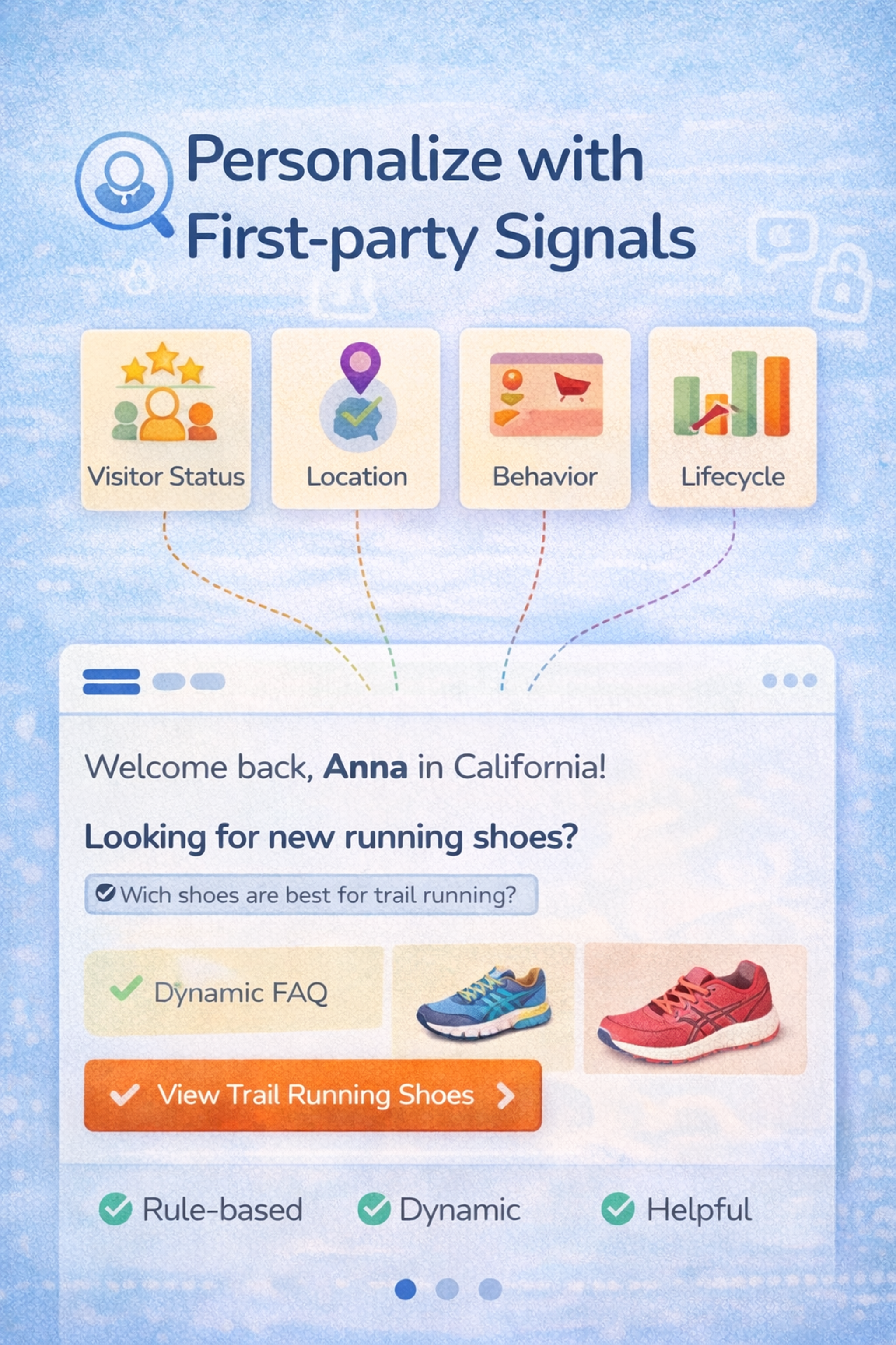
Personalize with First-party Signals
Personalization can lift website conversions, but only when it feels genuinely helpful to site visitors. The best personalization in 2026 is subtle and grounded in user intent, not surveillance, and is driven by analyzing visitor data to tailor experiences.
A practical approach is to start with explainable and straightforward concepts, then add sophistication over time. Personalizing the site experience with visitor data can increase conversion rates by making the site more relevant to each person.
Mapping the user journey, from the initial interaction to conversion, helps identify opportunities to improve each stage and reduce drop-off rates. Creating user personas from collected data can further inform and refine your optimization strategy.
Begin with rule-based personalization that you can clearly describe, such as:
- New vs. returning visitors
- Location, but only when it matters (shipping, currency, legal)
- Category interest based on pages viewed or items browsed
- Lifecycle stage: trial users, active paid users, churn-risk users
- Source intent: pricing page visitors vs. blog readers vs. ad clicks
Once these basics work, bring in AI to scale what's already effective:
- Generate copy variants for different segments
- Summarize reviews by theme and surface what each segment cares about
- Create dynamic FAQs that adapt to context
- Power on-site search and product discovery with more intelligent ranking
Platforms like Dynamic Yield and Optimizely enable teams to manage personalization at scale while maintaining control over rules and experiments, ensuring seamless integration and effective personalization.
The key principle is that personalization must be testable, reversible, and measurable. You want a system where:
- You can see what changed and why
- You can roll back a variation if it underperforms
- You can attribute impact to specific personalized experiences
Avoid black-box setups you can't debug when something breaks. Helpful personalization feels like the site "gets" the user, rather than watching them.
Personalize with First-party Signals
Design for Thumbs First
Mobile is not a smaller desktop. It's a different interaction model, especially on mobile devices, which now account for a significant portion of global web traffic. Optimizing for mobile devices is crucial to enhancing website conversions, as most users interact with websites on their phones.
Mobile optimization is crucial - thumb-first conversion rate optimization means placing primary calls to action where they're easily accessible. Mobile-first design ensures a seamless experience on all devices, including thumb-friendly buttons. Keep tap targets large, spaced, and stable. Avoid tiny filters and frustrating dropdowns.
Make sticky calls to action intelligent by showing them only when helpful, not always. Keep critical information close to the decision point, including price, delivery details, stock availability, and return policies.
If you only do one thing, ensure that users can complete your primary conversion without needing to pinch, zoom, or hunt. Test on actual phones, not just browser simulators. Tools like BrowserStack and LambdaTest let you test across real devices.
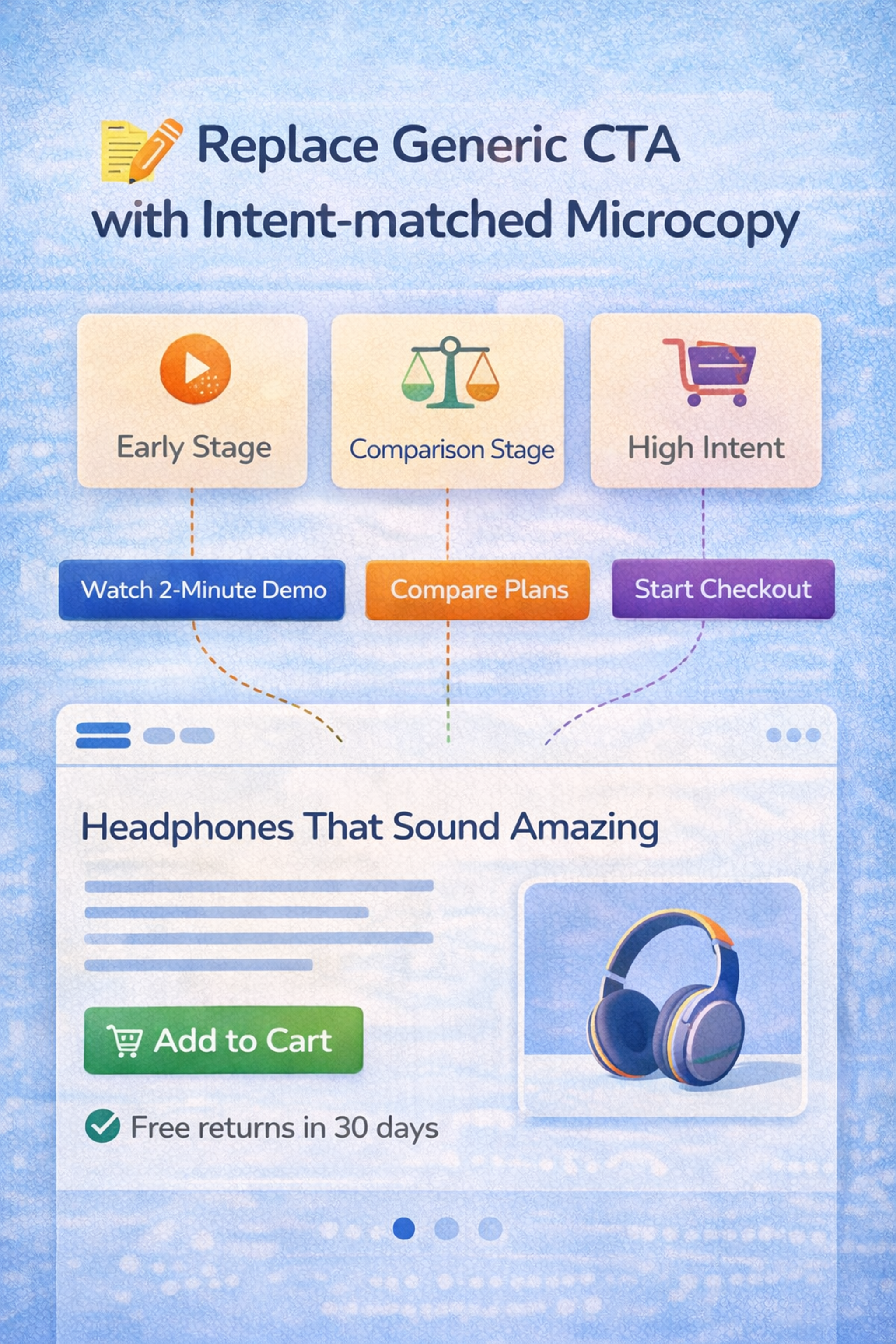
Replace Generic CTA with Intent-matched Microcopy
Buttons like "Submit" and "Learn more" waste the most valuable real estate on your page.
A call to action should serve two purposes simultaneously: inform users of the next step and mitigate perceived risk. The best CTAs are designed to generate conversions by guiding visitors toward completing a desired action, such as making a purchase or signing up, and align with the visitor's stage in their decision-making process.
You can think about it at the intent stage:
- Early-stage visitors: "See how it works," "Watch the 2-minute demo."
- Comparison-stage visitors: "View plans," "Compare models," "Check sizes."
- High-intent visitors: "Start checkout," "Start free trial," "Book a demo."
A clear, benefit-oriented headline above your CTA can increase conversions by over 300%, making it a crucial element for encouraging users to take action.
You can also bake risk reduction into the CTA itself:
- "Try it free."
- "Cancel anytime"
- "No card required"
Microcopy around the call to action matters just as much as the button label. Optimized CTAs and supporting microcopy can significantly boost conversions by building trust and addressing user concerns. One short line nearby can remove a lingering doubt:
"Takes 30 seconds," "No spam," or "Instant access" all work because they answer the question forming in the user's mind right before they decide.
Replace Generic CTA with Intent-matched Microcopy
Add Objection-handling Content where People Hesitate
Most teams treat FAQs, returns, or shipping information as extra pages. High-converting sites treat them as conversion tools.
The trick is placement. Put answers near the moment the question appears, not hidden in the footer.
On landing pages, web pages, and especially on sales pages, include objection-handling content such as delivery times, returns policies, warranties, and sizing guidance.
Adding reviews and testimonials can build trust and significantly increase conversion rates. On pricing pages, clearly explain what's included, who each plan is intended for, and the cancellation rules.
User-generated content, such as customer reviews and shared experiences, serves as powerful social proof, further enhancing trust and engagement.
On lead forms, show what happens after submission, response time, and privacy promises. On checkout, clarify total cost, payment options, and support availability.
This is especially effective when paired with behavioral data. Identify where users drop off using session recordings from Hotjar or similar tools, then place the relevant objection-handling block just above that point.
Fix Measurement for a Privacy-first Web
If you can't measure reliably, you'll optimize the wrong things. Or you'll stop optimizing because you don't trust the data.
Measurement in 2026 needs two upgrades. Consent-aware tracking and triangulation.
Analytics tools, such as Google Analytics, are essential for accurately measuring website conversions and ensuring reliable data collection. Proper configuration of these analytics tools is crucial for accurately tracking conversion rates and engagement metrics. Analyzing website data provides valuable insights into visitor behavior, user preferences, and areas for optimization.
Visitor data and competitor research help you improve conversions through ongoing iteration. But whatever tools you use, your tracking must be consent-aware and aligned with legal and UX requirements.
Since the cookie landscape keeps changing - Google kept third-party cookies with user-controlled settings - you need measurement that stays reliable when attribution gets messy.
Focus on high-confidence macro conversions (orders, leads, trials) using multiple data sources (analytics, backend, ad platforms, CRM). Invest in first-party events, use server-side tracking when it makes sense, and treat attribution as directional. Track quality, not just volume: refunds, churn, and retention.
Combine quantitative data with qualitative feedback (surveys, widgets) to understand what users experience. When measurement is noisy, optimize what you can measure confidently.
FAQ
What Is Conversion Rate Optimization In 2026?
CRO, or conversion rate optimization, involves improving your site so that more visitors complete key actions, such as making purchases, signing up, or requesting demos, without increasing traffic.
The conversion rate optimization process typically involves analyzing user behavior, identifying areas for improvement, prioritizing changes, implementing techniques, and measuring results.
One standard method is A/B testing, where you compare different versions of a webpage to determine which elements lead to higher conversion rates.
What Is The Most Important Conversion Tip For 2026?
Make one primary action obvious on each page. Too many competing CTAs reduce decisions and lower conversions. Focusing on a single, clear call-to-action helps increase conversions by guiding visitors toward the desired outcome.
Additionally, improving the overall user experience (UX) is essential for increasing conversion rates, as a seamless and intuitive UX directly impacts visitor satisfaction and encourages more users to complete your primary action.
How Do I Improve Conversions Without Redesigning My Whole Site?
Fix friction first. Clarify the value proposition, streamline key flows, minimize form fields, and incorporate trust cues near the CTA. Instead of a complete redesign, focus on conversion optimization efforts, such as analyzing data, testing headlines, and refining the user experience to drive more conversions.
If you notice a low conversion rate, it may indicate a poor user experience. Identify user pain points and blockers to resolve issues that hinder visitors from converting.
What Builds Trust Fast On A Website?
Transparent pricing and policies, genuine reviews, visible contact information, secure payment options, and clear, concise human copy near the decision point are all essential for building trust.
For ecommerce brands, having transparent shipping and returns policies is especially important to increase customer confidence and website conversions.
Well-executed marketing campaigns can also help establish trust and authority by consistently communicating your brand values and engaging customers. Additionally, providing educational content, such as blog posts, can build authority and further reassure potential customers.
How Can I Reduce Form Drop Off?
Ask only what you need now, use autofill-friendly inputs, show clear errors, and explain what happens next. Ensure your forms and overall site are user-friendly and easy to navigate, with simple menus, clear labels, and a logical hierarchy. A well-organized and intuitive navigation structure keeps visitors engaged and guides them toward conversion.
Read more:
Conclusion
Boosting conversions in 2026 isn't about secret hacks. It's about making your site feel obvious, fast, and trustworthy, then iterating with discipline. Pick two tips from this list that match your most significant drop-off point. Ship improvements this month. Let compounding do the rest.

About Clay
Clay is a UI/UX design & branding agency in San Francisco. We team up with startups and leading brands to create transformative digital experience. Clients: Facebook, Slack, Google, Amazon, Credit Karma, Zenefits, etc.
Learn moreAbout Clay
Clay is a UI/UX design & branding agency in San Francisco. We team up with startups and leading brands to create transformative digital experience. Clients: Facebook, Slack, Google, Amazon, Credit Karma, Zenefits, etc.
Learn more