People see interfaces move, and then they read before the text, aligning with the principles of motion design. A person’s movement might demonstrate how to explain order, show reason and result, and convey a company voice simultaneously. In moderation, it reduces effort, accelerates decisions, and establishes implicit trust.
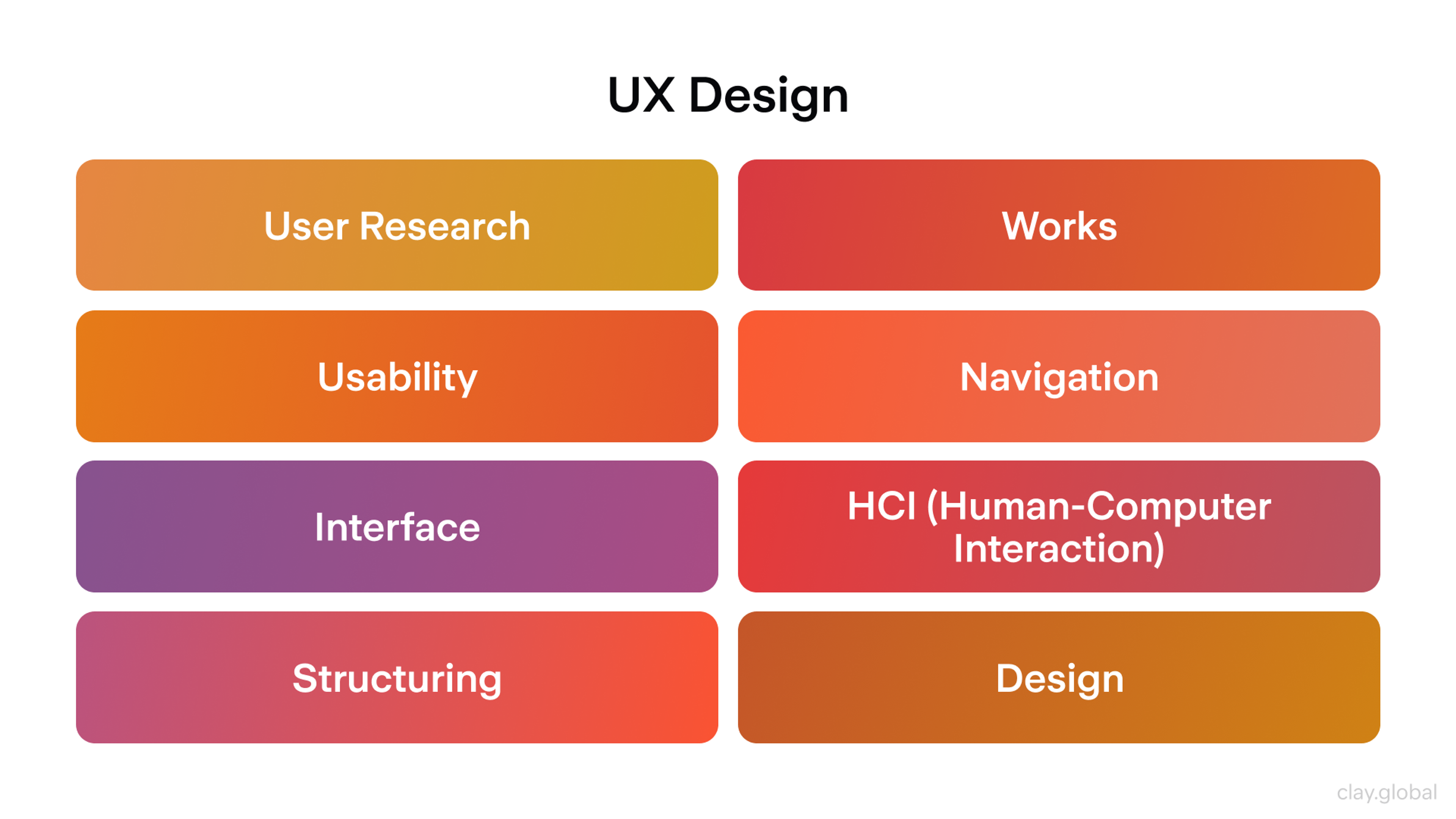
This article is a beginner's guide to ux design and motion design principles, covering foundational concepts and essential knowledge for newcomers interested in the field.
When attention is used, it captures focus and increases time. Motion design is an art that combines creativity and technical skill, playing a vital role within graphic design.
Our article on manipulating intervals and distance as physical elements rather than embellishments. You will master simple rules, distinct patterns, overlapping action, and a structure you can deploy. The aim is not to show off but rather to assist people seamlessly.
UX Design by Clay
Why Motion Is More Than Decoration
Interfaces move for a reason, not just for fun. According to the principles of motion design, Motion clarifies structure and cause and effect, carries brand voice, and, if used well, reduces cognitive load and builds trust. Motion graphic design, a subset of graphic design, combines static elements with movement to enhance communication.
These fundamentals are grounded in motion principles, which are the foundation for designers' shippable rules: purpose, time, coherence, continuity, easing, hierarchy, feedback, systematization, inclusion, performance, interruptibility, and measurement. The term motion graphic is often used to describe animated visual elements that clarify structure and cause and effect.
Define the Job
Every animation needs a job you can say in one sentence. You may not need the motion graphics if you cannot state the job.
Purpose drives timing, easing, and complexity. It also sets limits. An animation that tries to welcome, educate, and sell will do none of those well. According to the principles of motion design, ask what the user should learn or feel right now.
Animations can also convey character, using movement to express personality and emotion, which enhances storytelling and emotional engagement. Traditional animation often follows a narrative and uses characters to drive the story, while motion design focuses more on visual communication, composition, and style rather than character-driven plots.
Speed, direction, rhythm, and scale should answer that question. Remove the motion if it does not serve comprehension, confidence, or control.
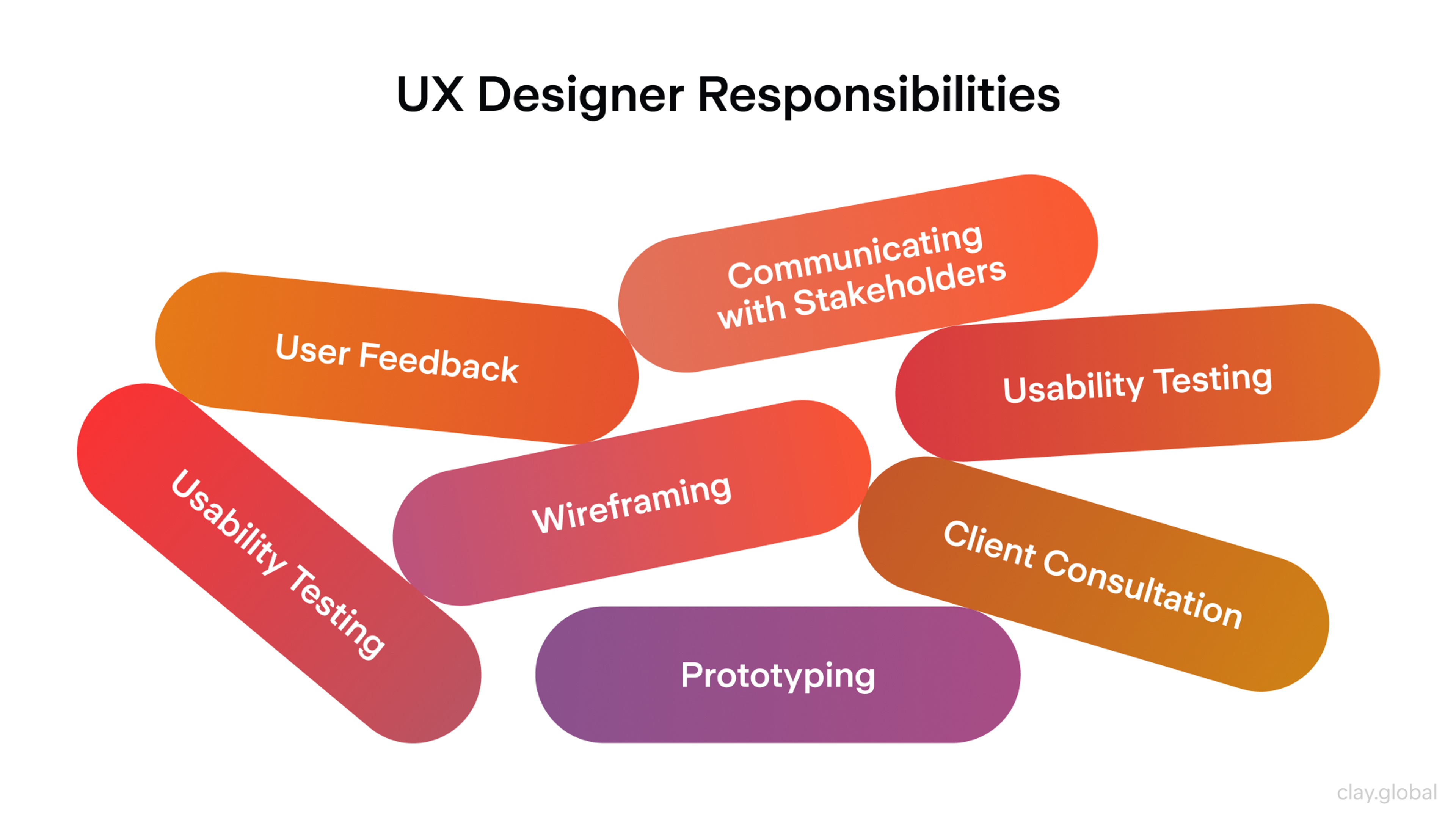
Clear ideas drive effective motion design decisions. Defining an animator’s job is crucial in the creative process, ensuring that each motion serves a clear purpose. The ux designers and the designer play a key role in shaping effective motion graphics by applying design principles and skills. Creativity is essential for designers to craft engaging and innovative animations that capture attention and communicate effectively.
UX Designer Responsibilities by Clay
Time as a Design Material
Time sets expectations. Quick tasks deserve quick animations. Significant spatial moves can take slightly longer. Create a duration scale rather than random timings:
- 120 to 160 ms for micro feedback, such as press or hover
- 200 to 240 ms for short translations such as chip to panel
- 300 to 400 ms for full-screen transitions or complex reflows
Designers must decide whether objects should move simultaneously or at different speeds to achieve the desired focus and depth. Different speeds for various elements can create depth and focus, especially when animating multiple objects together. When objects of different masses move at the same speed, more force is needed to stop heavier objects, so considering mass and weight is important for realistic timing.
Keep steps consistent so the product develops a clear tempo. Proper spacing between animated elements enhances rhythm and visual harmony. Animation plus delay equals waiting, so use delays only to sequence meaning, for example, a short stagger that communicates grouping.
If two things do not depend on each other, animate them together. The best rhythm feels like life, frictionless, not theatrical.
Spatial Continuity
Motion explains where things live in space. The flow of movement guides the viewer’s attention to the image, helping to create a seamless and engaging experience. When a card expands into a detail screen, continuity maps the small element to a larger canvas, emphasizing the importance of the position of elements during transitions.
The scene provides the context for introducing and managing animated elements, ensuring that each motion object is organized within the visual narrative. You are not switching screens. You are transforming one state into another, where the form of an element changes to communicate meaning.
Favor arcs over straight lines. Curved paths align with how eyes track. Start where the user acted and end where new information appears. Crop and mask with intent, using a well-chosen image to establish visual hierarchy and support storytelling within motion design, while enhancing spatial continuity. Images can be animated or manipulated within motion graphics to create dynamic infographics, transitions, or overlays, further increasing user engagement and visual storytelling.
Benefits of Storytelling by Clay

A good transition reveals structure. This panel belongs inside that sheet, these chips belong to this filter, and this dialog sits above everything else. If movement does not clarify structure, simplify the layout or the motion.
Easing and Physics
Easing tells the nervous system whether objects behave naturally. Constant speed feels robotic. Most things accelerate and decelerate. Gravity influences the acceleration and deceleration of movements, making them feel more organic and authentic to nature. The principle of easing is fundamental to creating believable and compelling Motion.
- Use ease out for elements entering the screen. Fast start and soft landing
- Use ease in for elements that exit. Soft start and fast finish
- Use spring curves for interactive affordances
Keep overshoot small in functional interfaces. Overshooting amounts signal material stiffness. Understanding the nature of materials helps in animating realistic movements. Buttons feel firm, sheets feel heavier, chips feel elastic. Tune springs so they settle once and briefly rather than bounce repeatedly. Keep easing consistently across similar components so behavior is predictable.
- Practical defaults that work well in many stacks
- iOS springs: damping ratio from 0.85 to 0.92 and initial velocity from 0 to 0.4
- Android Compose springs: damping ratio near 0.85 and stiffness from 180 to 300, where heavier elements sit near 180
- Web curve that feels spring-like without bounce: a cubic bezier curve with points 0.2, 0.8, 0.2, 1
- Animating with attention to gravity and natural movements creates more believable effects. Realistic effects are achieved by applying the correct easing techniques.
Hierarchy and Focus
Animation is a spotlight. It should guide attention to what matters now. Motion design principles help capture and direct the viewer’s attention to key points, ensuring that the most important information stands out. That can be a primary action, a new message, or a validation state.
When everything moves, nothing stands out. Limit concurrent animations in one viewport and rank them by importance.
A gentle pulse can suggest the next step. A color change may be enough to confirm success. A complete panel transform should signal a significant state change. If users need to read or decide, keep competing motions to a minimum. The goal is not to be noticed. The goal is to keep people oriented and confident.
Our project Sky, turns a complex DeFi system into an atmosphere you can feel. The identity leans on natural gradients moving from sun to stars and realistic sky simulations combining volumetric clouds with a physical sky for accurate atmospheric light. On the site, Motion reads as part of that environment.
Engaging animations are used throughout the experience to captivate audiences and reinforce the brand’s personality, ensuring dynamic and memorable visual storytelling. Motion design helps communicate and reinforce a brand's personality across different platforms, creating a consistent and memorable brand experience.
The visual language of motion reinforces the brand’s personality, making the experience cohesive and memorable. Thoughtful animations, smooth transitions, and subtle lighting invite you in from the first second.
Motion in Sky
Feedback and Causality
Interfaces teach fastest when they feel causal. Touch down, and the element instantly responds. Hold down, and the action is confirmed with a sharp snap. The value change in UI elements provides immediate feedback that reflects user actions, helping users understand the results of their interactions immediately. This feedback should reflect the user’s input, visually mirroring their actions in real time to reinforce the connection between cause and effect.
If a request takes longer than a blink, progress must be articulated honestly, with defined parameters and a clear representation of when the task will be completed. Where possible, connect inputs to outputs within the same spatial region.
Press a switch, and that same switch toggles there and then rather than across the screen. For destructive actions, stage the decision. A single interaction with one object can trigger several actions, such as updating a progress indicator, revealing a secondary state, or providing a short undo window, which enhances the feedback experience.
The grammar of motion is causation. Motion design principles ensure that users interact with various UI elements in an intuitive and responsive way. These principles are also used to capture and hold the viewer’s attention through engaging and dynamic animations. Keep sentences short and the syntax consistent.
Brand Voice in Motion
Brand goes beyond a logo and typeface. Motion carries voice. A distinctive style in motion design creates a memorable brand experience and reinforces brand identity.
Motion design builds upon graphic design by introducing movement and time-based elements to static visuals, transforming traditional graphic elements into dynamic experiences that enhance communication and visual impact. Unlike static graphics, animated content is more effective at capturing audience attention and communicating brand messages, making motion design a powerful tool in digital marketing.
Easing a banking app might feel balanced and accurate with small overshoots and careful sequencing. Have a look at our project for Lulo Bank:
Graphics in Lulo Bank
A children’s app might prefer bold springs and larger overshoot arcs. Identify a range of emotions to be conveyed, such as calm and upbeat, and translate those emotions into tempos, easings, scale factors, and cel animation. Motion creates more life and makes interactions more engaging for users.
The range should be limited enough to be distinctive but broad enough to accommodate errors, celebrations, and routine transitions. Avoid a universal signature animation for everything.
Let the brand emerge from small decisions like how cards fold, gentle pauses before brief bits of confetti, and decorum in success states. Your motion should still be distinguishable without the brand colors. Well-crafted motion design can have a lasting impact on brand recognition and user engagement.
Build the Kit
To scale the Motion, you need to codify it. Motion tokens represent durations, easings, and distances in named variables instead of random numbers on a scale. A velocity grid maps the distance and the time to ensure similar moves feel equally fast. Longer travel distances are given more time, but the perceived speed remains unchanged.
When building a component library, explicitly define the parent element for each UI component and establish the hierarchical relationship between components. This ensures consistent motion across all objects and components by clarifying how child elements depend on and move with their parent elements during interactions.
Adjust time by a base plus a constant multiplied by the square root of the distance. Clamp the value between 160 and 420 ms. Close enough ranges can feel far.
Close far moves never feel sluggish. Capture canonical patterns like expand, crossfade, slide, reveal, and visual effects, and specify when to use them and the spaced variations. In your design kit, detail how the transformation of objects and the introduction of new objects are handled within each pattern.
When new objects are created, they should be derived from existing ones - often through cloning - to maintain continuity and establish a clear relationship between the original and the new object in motion design. Ensure tokens are baked into the component library to align prototypes and production.
Accessibility and Inclusion
Motion and animation that pleases some can terrify others. Dynamic animated elements can be adjusted to meet accessibility needs by allowing users to reduce or turn off Motion while maintaining engagement. Respect the system preference that says reduce Motion and offer in-app control when sequences are dense. Use opacity, scale, and translation over panning the camera and zooming in violently.
Parallax should be very subtle or none at all. Do not use continuous looping in contexts where reading is required. Always use non-motion affordances such as contrast shifts, icons, microcopy, and effective visuals to provide meaning even when animation is reduced or disabled. Various forms of animation and design can be adapted to meet different accessibility needs.
Skeletal Motion should have some feeling to invoke emotion rather than being lifeless.
Accessibility Elements by Clay

Performance and Feasibility
Every minute detail is equally essential. Unlike other concepts, this one won’t be good if a frame is dropped. Focus on the remaining properties that a GPU would have no issue computing.
These are opacity and any of the transform functions. Do not attempt to animate properties that initiate a layout for any reason. Stale, layout, and paint chaos should be kept to a minimum.
When creating videos or video content for marketing or tutorials, the choice of animation technique can significantly impact performance. Techniques such as overlay or kinetic typography may be more GPU-friendly, while others could cause dropped frames or increased load, especially in longer videos.
Additionally, the choice of software plays a crucial role, as different software options can influence both the technical performance and the creative possibilities available in motion graphics projects.
Even the lowest specs and the most inefficient networks should be used. The standard for animations should be the ability to maintain 60 fps on the given device. This includes duration, complexity, and the device used.
The battery must not be neglected. Mobile devices have a hard time coping with long and dense animations. If the design calls for a pause or a skip, this must be done in a manner that is not disruptive. Design is a holistic concept. It doesn’t end at what is feasible.
Interruptibility
Anything that lasts more than a blink can be removed. If a user is in the middle of navigating, taps in another place, or pulls a sheet down, the animation will also snap to its end in 120 ms. The focus will remain on the interface, remaining unchanged.
During the entire manipulation time, no point should be more static than any other point. The functions of the pointer, keyboard, and any other assistive device should be free-flowing and not constrained at any time.
Cross-Platform Coherence
Products often span browsers and native operating systems on mobile and desktop, such as iOS, Android, Windows, macOS, and Linux. All platforms have defined rules for transitions, sheets, and gestures. Respect rules that help users speed up. Diverge only for good reasons.
Unlike other fields, which may have more rigid or universal rules, motion design relies on guiding principles that must be adapted to each platform's context.
Coherence is the same mental model everywhere, not the same pixels. Velocity grids and tokens should be adjusted locally for navigation and input on each platform. The product should feel at home everywhere and on each device.
Measure What Matters
Motion has outcomes that you can measure. Track the following:
- Change in task time for navigational flows. Aim for a reduction from five to ten percent.
- Reorient rate is the share of back actions within two seconds after a transition. Target a reduction of about eight percent.
- Mis tap rate on controls with micro Motion. Target a reduction from three to five percent.
- Dropped frames on low-end hardware. Keep below one percent per interaction.
- Opt-out rate for Motion. Keep below two percent in routine flows.
For example, you might measure how adding parallax or overlays in a UI reduces task time or track the mistap rate before and after introducing masking or transformation effects. These examples help illustrate how to apply these metrics in real-world motion design projects.
Write explicit hypotheses. For example, guided continuity will reduce wrong path navigation by eight percent. Pair quantitative results with qualitative notes. Use instrument animations so diagnostics are routine and not exceptional.
Common Patterns Worth Knowing
Micro interactions create engaging experiences. Motion graphics and motion graphics design are used to create engaging visual experiences across various applications, including micro interactions. During touchdown, press states respond.
Toggles flip with a crisp ease out and settle, subtly signaling completion. Incorporate overlapping action and follow-through to enhance realism, such as when a character’s hair continues to move after they stop running, so micro interactions feel more natural. Designers can create motion graphics for these patterns using modern web-based tools and platforms, making it accessible even for beginners.
Page transitions. Grow the tapped element and move it to the next screen when possible. Otherwise, use directional slides that match the navigation. Explainer motion graphics can be used in page transitions to help simplify and communicate complex ideas, making navigation more intuitive.
Loading. Use skeleton screens for predictable content and spinners only for brief and uncertain waits. Honestly communicate progress. Graphics are integrated into these motion design patterns to enhance communication and keep users informed.
Empty states. Gently reveal the state by fading in slightly upward so the state feels welcoming rather than punitive. Provide a reduced motion variant for each pattern.
Anti-Patterns to Avoid
Gratuitous Motion pays out in attention and never pays it back. While it can be tempting to make animations exciting, excitement should never come at the expense of clarity or purpose. If something does not clarify structure, provide feedback, or subtly reinforce a brand, it does not belong. Competing timelines occur when multiple components are animated in different ways simultaneously, creating noise.
Choose one lead animation and synchronize the others to its markers or delay them by about eighty milliseconds. Off-brand flair often sneaks in through one-time celebrations.
Make the celebration short, skippable, and aligned with voice. Novelty fades. Coherence lasts.
Allocate a budget per screen to limit the background noise. Do not exceed a total of three authored animations simultaneously. The total active duration for each animation should not exceed 800 milliseconds. Do not use loops in reading contexts.
In very short, celebratory moments, a user may have a single short loop that plays for 2 seconds and stops independently.
Read more:
FAQ
What duration works for most interface motions?
Start with a three-tier scale. Use 120 to 160 ms for instant feedback, 200 to 240 ms for short moves, and 300 to 400 ms for full-screen transitions. Keep durations consistent so rhythm becomes predictable.
How do I decide whether an animation is needed?
State its job in one sentence and tie it to comprehension, confidence, or control. If it only decorates, remove it.
How can I keep Motion accessible without losing meaning?
Respect Reduce Motion, provide an in-app toggle for prominent sequences, and offer non-motion alternatives such as contrast, icons, and microcopy. Replace long travel with fades or instant swaps while you preserve semantic cues.
Conclusion
The opposite of stillness is not chaos but rather clarity in Motion. Interfaces that move with intention feel natural because they replicate real life. Effects emerge from causes and style, objects retain their identity even while transforming, and time flows at a human pace. In such cases, Motion is advantageous if it is relevant, calculated, and organized.
It communicates more than it decorates. Within its flows, it respects the body as much as the eye. Go back to the basics: purpose, time, continuity, easing, hierarchy, feedback, brand, system, inclusion, performance, coherence, interruptibility, and measurement. When well executed, the design process quiets the interface to enable confident goal pursuit on the user's part.

About Clay
Clay is a UI/UX design & branding agency in San Francisco. We team up with startups and leading brands to create transformative digital experience. Clients: Facebook, Slack, Google, Amazon, Credit Karma, Zenefits, etc.
Learn moreAbout Clay
Clay is a UI/UX design & branding agency in San Francisco. We team up with startups and leading brands to create transformative digital experience. Clients: Facebook, Slack, Google, Amazon, Credit Karma, Zenefits, etc.
Learn more