
Cross-browser compatibility in 2026 means reliable behavior across browsers, devices, and privacy settings.
Core flows should work, text should stay readable, layouts stable, forms usable, and interactions responsive. Accessibility should hold up, and analytics and embeds should keep working under stricter browser limits.
The practical approach is simple: define browser support, build a stable baseline, add enhancements carefully, and test continuously.
This article discusses efficient ways to prepare your website for various browsers for improved accessibility, performance, and user satisfaction. It also touches on how effective web development often follows cross-platform design principles to maintain usability across environments.
What Cross-browser Compatibility Means in 2026
A site is cross-browser compatible when users can complete the same core tasks across major browsers and real-world conditions.
In practice, that means content stays clear, navigation works, the interface remains accessible, interactions stay responsive, and critical features still function under privacy restrictions.
Browser differences are smaller than before, but the ones that remain still affect UX, especially on mobile, in forms, typography, privacy behavior, and performance.
Building Cross-Browser Compatible Website

Advantages of Cross-Browser Compatibility
- Expanded Audience Reach: A cross-browser-compatible website ensures that users can access and interact with your site seamlessly, no matter which browser or device they prefer. Whether they use Chrome, Safari, Edge, or an older browser version, maintaining compatibility allows you to tap into a larger and more diverse audience, preventing potential visitors from encountering frustrating errors or broken layouts. It also means your design effectively supports cross-platform design.
- Seamless and Consistent User Experience: A website that looks and functions uniformly across all platforms builds trust and engagement. Users expect a smooth experience whether they visit from a desktop, tablet, or smartphone. You create a polished, professional presence that keeps visitors engaged and encourages them to return by eliminating inconsistencies in design, navigation, and responsiveness. These are all characteristics of a solution that follows cross-platform design principles.
Advanced Components Input Controls for Material UI in Modal Window

- Improved SEO and Higher Search Rankings: Search engines prioritize websites with strong usability, fast load times, and a seamless browsing experience. A well-optimized, cross-browser-friendly website reduces bounce rates and ensures mobile responsiveness - two critical factors for ranking higher in search results. By making your site accessible and user-friendly across multiple browsers, you not only attract more visitors but also boost visibility and organic traffic. These outcomes reflect a design approach that follows cross-platform principles..
Common Cross-Browser Issues and Solutions
Browsers interpret code slightly differently, which can lead to rendering issues, broken scripts, and unstable layouts.
To reduce these problems, use CSS resets, feature detection tools, responsive design, and regular cross-browser testing. This helps keep the experience consistent across browsers and devices.
Testing for Fragmentation

Form Elements
Forms often cause the most cross-browser issues because inputs, checkboxes, radio buttons, and selects can look and behave differently across browsers and devices.
To reduce problems:
- Use consistent form styling instead of relying on browser defaults
- Apply CSS resets to remove browser-specific quirks
- Add JavaScript only where older browsers need support
- Test forms across browsers, devices, and screen sizes
The goal is simple: keep forms clear, usable, and reliable everywhere.
Fonts
Font rendering may look different across different browsers, which can lead to problems with readability and appearance. Some browsers, including Mozilla Firefox, may lack support for certain font formats, which can result in fallback problems.
As a solution, developers often use web-safe fonts and also embed custom fonts using Google Fonts and @font-face. Fallback fonts defined in a style sheet will aid in smoothing the transition of unsupported preferred fonts.
Anti-aliasing and rendering subpixels will also allow better legibility across different platforms. Font strategies that anticipate browser inconsistencies typically follow cross-platform design principles.
Scrollbars
The style of a scroll bar can change widely among browsers and operating systems, substantially altering the user’s experience. A few browsers have custom scroll bars, and others have default ones, while some can be styled differently. Ensuring compatibility with older browsers like Internet Explorer can present additional challenges in rendering and interpreting HTML and CSS.
Scrollbars
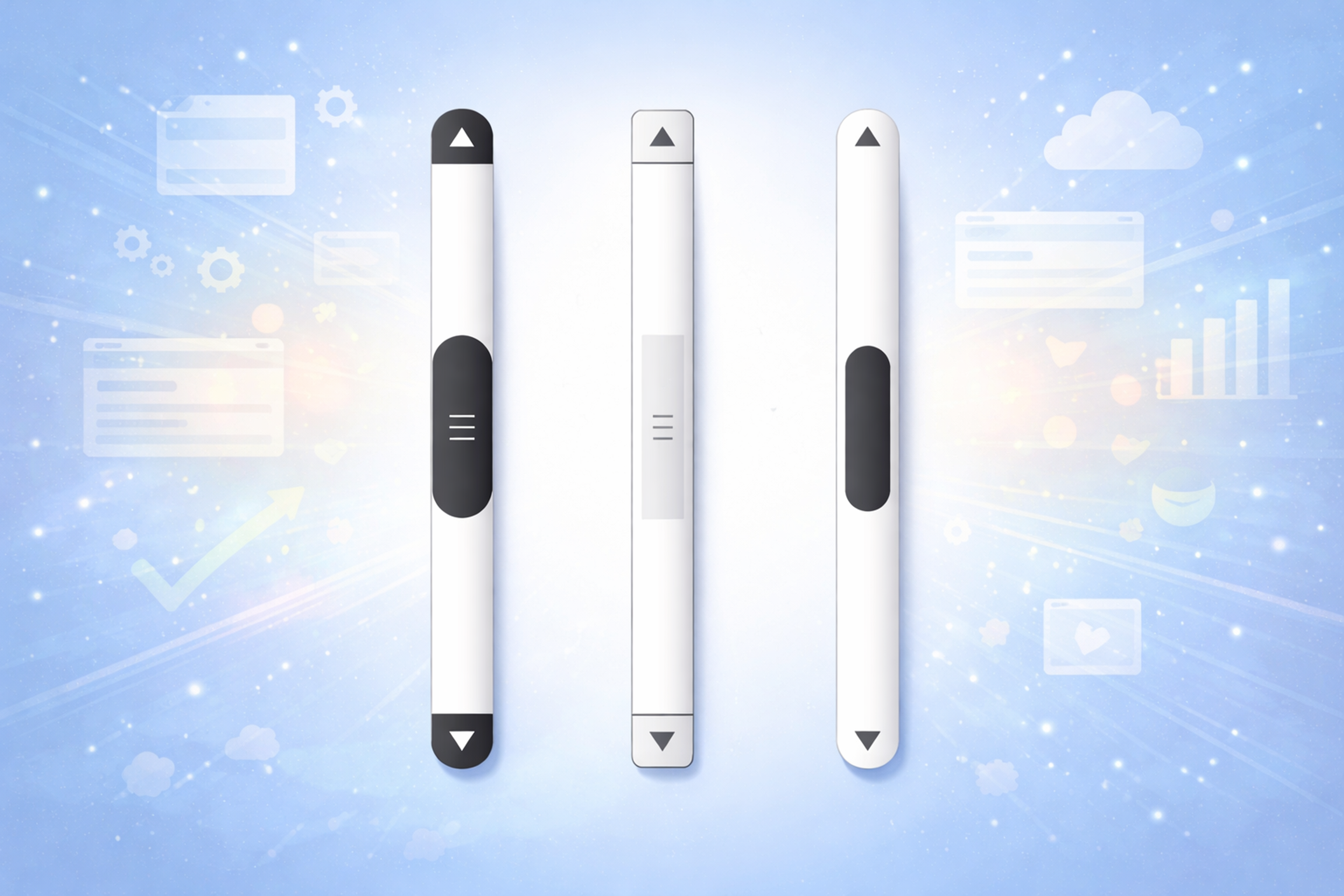
CSS properties such as scrollbar width and color can be used for a more modern approach to styling scroll bars in most browsers.
To cover a wider audience, developers use JavaScript-based custom scroll bars that work on every device and do not compromise performance speed.
These styling choices often follow cross-platform design principles to preserve a cohesive visual identity.
Progressive Enhancement and Graceful Degradation
Progressive enhancement and graceful degradation let you ship modern features without breaking the experience for users on older or stricter browsers.
- Progressive enhancement starts with a basic, functional version that works everywhere, then adds upgrades only where the browser supports them. The key is feature detection and loading enhancements after the core experience so even older browsers or slow connections still get something usable.
- Graceful degradation starts with the full experience and adds fallbacks when a browser can’t support a feature. It’s useful when you’re building around modern UI patterns but still want the site to remain functional in less capable environments. In practice, this means backup CSS (often with feature queries) and alternative JavaScript paths or selective polyfills when needed, balancing compatibility against bundle size and performance.
Graceful Degradation and Progressive Enhancement

Mobile Browser Compatibility and Testing
Mobile compatibility is harder than desktop because browsers behave differently, devices vary widely in power, and touch input changes interaction patterns.
The biggest practical differences show up between iOS Safari and Chrome on Android, especially in performance, viewport behavior, and feature support. Touch handling can also vary, so interactions should not rely on hover or mouse-only patterns.
Mobile performance is more fragile because devices have tighter CPU, memory, network, and battery constraints. Browsers may throttle background tabs, pause timers, and aggressively manage memory and caches, which can affect heavy JavaScript and animations.
Testing matters more on mobile. Emulator/devtools are useful, but they miss real issues. Validate key flows on real iOS and Android devices, and cover a range of screen sizes and device classes (phones, tablets, hybrids).
Browser Compatibility Testing

Modern Web APIs and Compatibility
Modern Web APIs can improve UX, but support and behavior still vary across browsers and devices. Treat these APIs as enhancements, not requirements.
- WebGL: Most modern browsers support it, but performance and edge cases differ by engine, device, and GPU. Always feature-detect, test on real hardware, and provide a Canvas or static fallback when WebGL isn’t available.
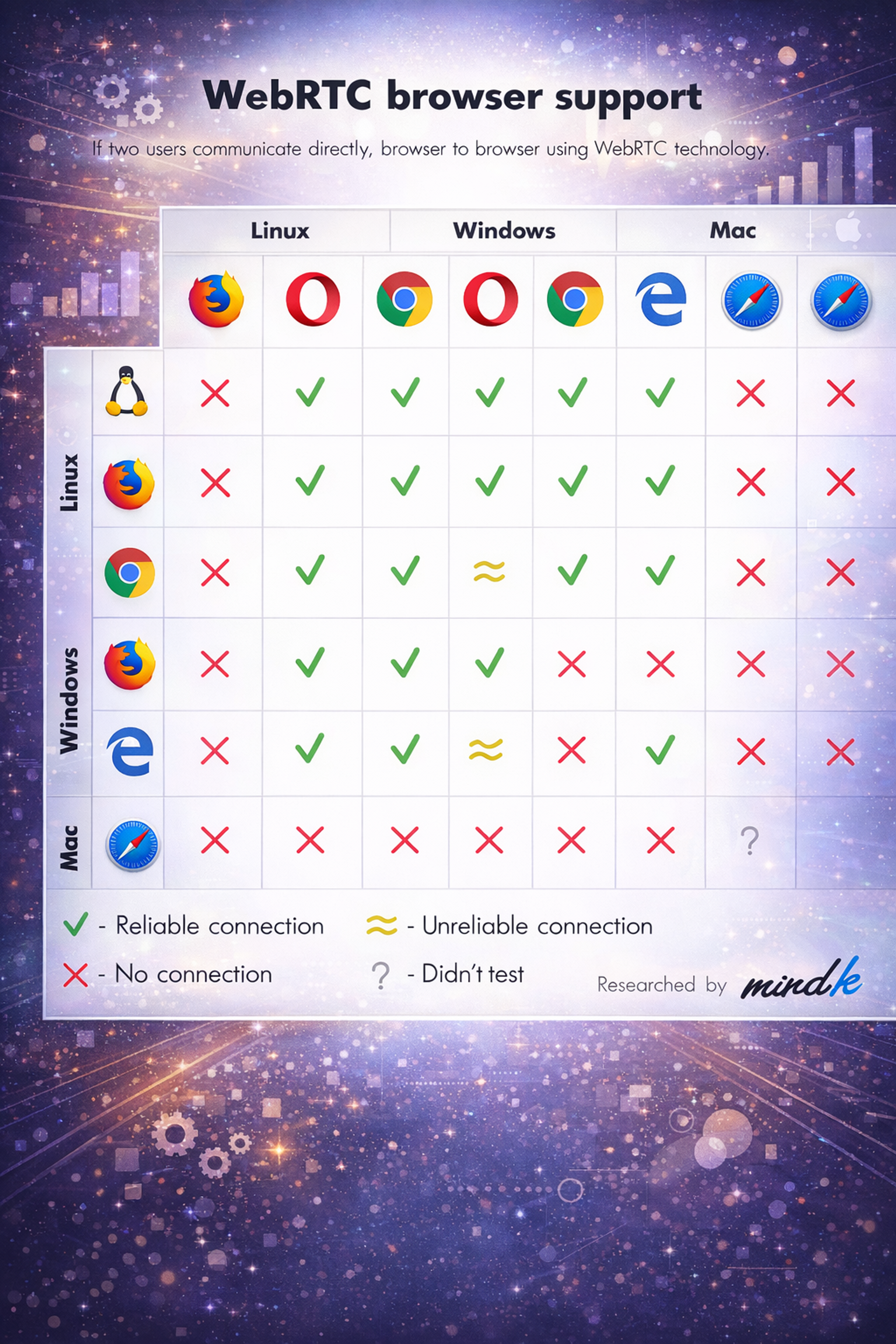
- WebRTC: Support and reliability vary, especially around codecs, permissions, and network conditions. Use capability checks, test across browser pairs and mobile, and offer a fallback path (for example, an alternative join method or reduced functionality).
WebRTC Browser Support Compatibility Chart
- Web Audio: Differences show up most on mobile, where autoplay and audio-session restrictions can block playback. Feature-detect, test on iOS/Android, and fall back to standard HTML audio where needed.
- Payments and Crypto: Support is uneven and often policy-driven. Never make modern payment APIs or client-side crypto the only path. Provide a standard checkout flow and design security features to degrade safely when a capability is missing.
Supporting Legacy Browsers
Cross-platform adaptability is critical for modern websites, ensuring accessibility and performance across devices and browsers. Supporting legacy browsers is crucial to ensure your website remains accessible to users who may not have updated their browsers. Here are some key considerations:
- Use Polyfills and Shims: Implementing polyfills and shims can provide fallbacks for unsupported features in older browsers. This ensures cross-browser compatibility so that your website remains functional even on outdated browsers, reducing browser compatibility issues.
- Use Feature Detection: Utilizing feature detection allows you to determine whether a browser supports a particular feature. If a feature is not supported, you can provide alternative solutions, ensuring a consistent user experience across different browsers.
- Optimize for Older Browsers: Optimizing your website’s performance for older browsers is essential. This includes minimizing the use of heavy scripts and optimizes cross-platform images to ensure that your site loads quickly and functions correctly, even on less capable browsers.
- Provide Alternative Solutions: Offering alternative solutions for users with outdated browsers can enhance their experience. This might include providing a simplified version of your website that is easier to load and navigate on older browsers.
- Monitor Browser Usage: Keeping an eye on browser usage statistics helps you determine which legacy browsers to support. This allows you to prioritize your development efforts effectively, ensuring that you cater to the needs of your audience.
By following these strategies, you can ensure that your website remains accessible, functional, and visually appealing across multiple browsers, enhancing user satisfaction and engagement.
Cross-browser compatibility and cross-platform strategy are central to ensuring seamless performance.
Effective Tools for Ensuring Compatibility
Maintaining compatibility across multiple browsers is essential, and browser compatibility testing plays a crucial role in this process. Users want uniformity in their experience, and statistics show that a lot of users will avoid returning to a site with known compatibility issues.
The correct tools can aid developers in enhancing their website’s performance and user experience through cross platform design and CSS grid implementation as part of smart layout structuring.
Some essential tools for cross-browser testing are:
- BrowserStack: Offers live testing on real devices and browsers.
Source: browserstack.com

- LambdaTest: A cloud-based solution that supports multiple browser versions.
- CrossBrowserTesting: Has many browsers and devices for comprehensive testing.
- Modernizr: A JavaScript library that checks for support of HTML5 and CSS3 features.
- Can I Use: Assists in maintaining web technology compatibility.
To achieve this goal, users will need to use these tools. These tools will significantly aid developers in resolving issues as they arise. The automated testing feature will assist in speeding up the process even more.
Proper compatibility testing eliminates errors, enhances engagement, and decreases the bounce rate, which adds to the website’s overall achievement.
Using the right testing solutions ensures a smooth, user-friendly experience across all platforms and helps meet users’ expectations.
What to Remove from Older Cross-browser Advice
Some older compatibility content drags teams into the wrong work.
Do not chase pixel-perfect alignment across all browsers if it sacrifices speed and maintainability. Users do not need identical pixels. They need predictable behavior, clear hierarchy, and working flows.
Do not over-invest in cosmetic “fixes” that create fragile code, like replacing native scroll with custom scroll implementations, or rebuilding form controls that work fine as native elements.
Do keep the timeless parts: semantic HTML, progressive enhancement, feature detection, accessibility-first components, and testing on the environments your users actually use.
Interop’s progress is a reminder that interoperability has improved significantly. For example, WebKit’s Interop 2025 announcement highlights that Interop 2024 reached a very high overall pass rate and calls out areas like accessibility and important platform features becoming more consistent across browsers.
The web is more consistent than it used to be. Your strategy should take advantage of that, not pretend it is still 2016.
FAQ
How To Fix Compatibility Issues In Chrome?
To fix compatibility issues in Chrome, start by clearing cache and disabling extensions. Use Chrome DevTools to identify layout or script errors, and check if features used are supported in Chrome. Update browser and code to follow web standards.
How To Change Browser Compatibility Mode In Chrome?
Chrome does not have a traditional "compatibility mode" like Internet Explorer. Instead, use Developer Tools (F12) to emulate older devices or switch user agents. For advanced needs, test using legacy browser environments or browser testing tools.
How To Enable Browser Compatibility?
To enable browser compatibility, write clean, standards-based HTML, CSS, and JavaScript. Use responsive design, test on multiple browsers, and apply polyfills or fallbacks for unsupported features. Avoid using browser-specific code when possible.
How Do You Approach Cross-Browser Compatibility Issues?
Approach cross-browser compatibility issues by testing your site in multiple browsers early and often. Use validation tools, check feature support via MDN or Can I Use, and apply CSS resets or fixes. Prioritize graceful degradation and progressive enhancement.
Read more:
Conclusion
Modern tools and established practices make cross-browser compatibility easier to manage. With regular testing and small code adjustments, you can keep your site working consistently across major browsers.
At minimum, test on Chrome, Firefox, and Safari. Consistent compatibility testing helps prevent issues and improves the overall user experience.

About Clay
Clay is a UI/UX design & branding agency in San Francisco. We team up with startups and leading brands to create transformative digital experience. Clients: Facebook, Slack, Google, Amazon, Credit Karma, Zenefits, etc.
Learn moreAbout Clay
Clay is a UI/UX design & branding agency in San Francisco. We team up with startups and leading brands to create transformative digital experience. Clients: Facebook, Slack, Google, Amazon, Credit Karma, Zenefits, etc.
Learn more