
Web design in 2026 is more dynamic, user-centric, and innovative than ever. As the digital world continues to evolve, 2026 is poised to be a pivotal year for modern web design, with brands needing to stay current with top web design trends to remain competitive and relevant.
Sites are expected to look stunning, feel intuitive, and run blazingly fast. Designers and developers worldwide are embracing new aesthetics and technologies to captivate users across industries.
Mobile-first design is now critical for modern websites. Additionally, sustainability in web design is gaining traction, with consumers increasingly demanding eco-friendly practices from brands.
In this practical guide, we'll explore the key website design trends shaping web design in 2026.
So, without further ado, let's dive into the trends driving the web's evolution in 2026.
Visual Design
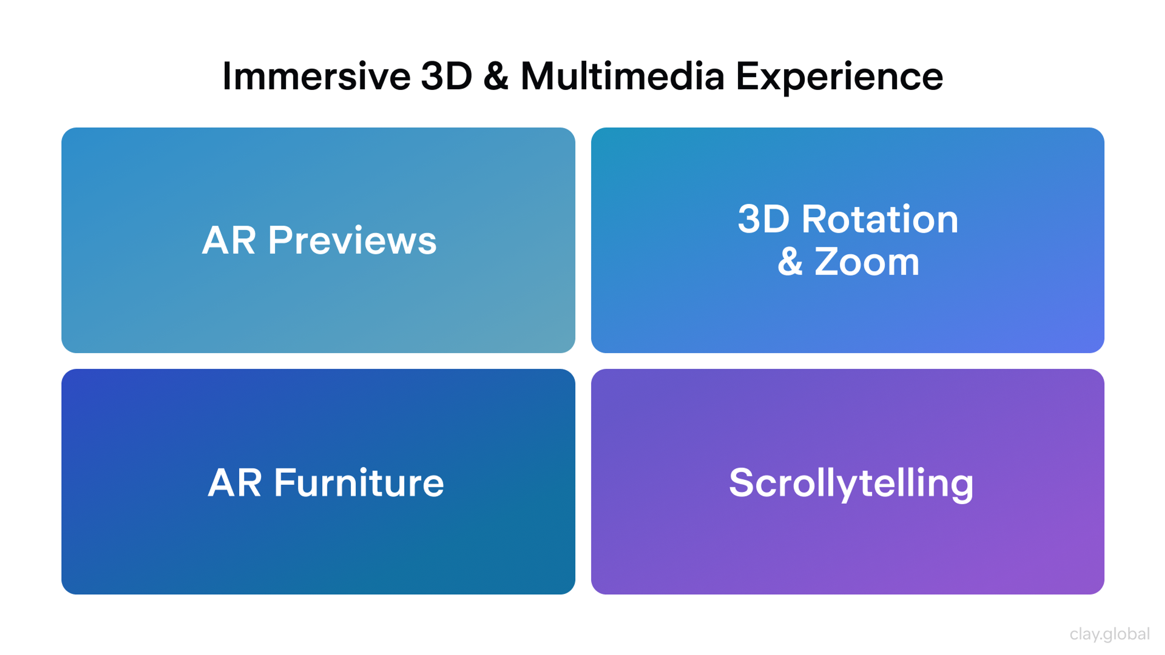
1. Immersive 3D and Multimedia Experiences
In 2026, many websites will move beyond flat visuals toward richer, more immersive experiences. The integration of virtual reality is an emerging trend in web design, enabling immersive and interactive online experiences.
Three-dimensional elements, AR previews, and cinematic scroll effects help showcase products and tell stories more engagingly.
Key patterns you see in practice:
- Retailers utilize interactive 3D models and augmented reality, allowing users to place products in their own space before making a purchase.
- Product pages often allow rotation and zoom in 3D, which reduces uncertainty about details and scale.
- AR furniture and decor previews help users make decisions faster and with greater confidence.
- High-performance 3D elements are becoming standard for product showcases and storytelling, thanks to advancements in browser technology.
Scrollytelling, also known as scroll-driven storytelling, is a widely used technique. As users scroll, content unfolds through layered animations and transitions, turning a static page into a narrative journey. Interactive storytelling is a growing trend that helps engage users by making content more dynamic and immersive.
The key takeaway from the design is to use 3D and motion selectively. Interactive elements such as 3D models and animations are increasingly used to engage users and create memorable experiences. They should support the message and delight users without overwhelming them or slowing the site.
Immersive 3D and Multimedia Experiences by Clay
2. Bold Typography and Expressive Layouts
Typography becomes a primary visual element in 2026 interfaces. Instead of sitting in the background, text often takes the lead with oversized headlines, distinctive typefaces, and even kinetic typography that responds to interaction.
Current typography trends emphasize the use of bold, oversized font sizes to create visual hierarchy, making key messages stand out and improving user engagement.
This approach helps:
- Communicate personality clearly
- Strengthen hierarchy and scannability
- Focus attention in hero sections without relying on heavy imagery
- Use bold and experimental typography to capture attention and reinforce a brand's visual identity
Typography & Layout 2026 Trends by Clay
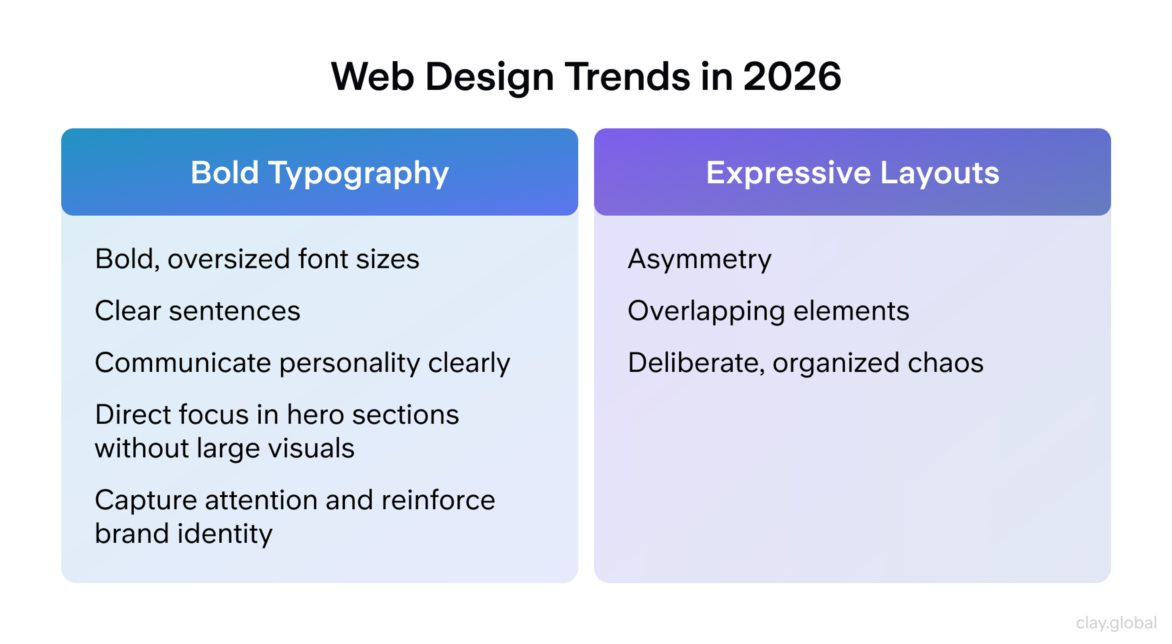
Layouts are also more experimental. Designers use asymmetry, overlapping elements, and deliberate, organized chaos. At the extremes, this connects to neo-brutalism or anti-design.
When supported by strong fundamentals such as contrast, spacing, and straightforward navigation, distinctive typography and expressive layouts contribute to a brand's visual identity, creating a distinct presence that stands out from template-based design.
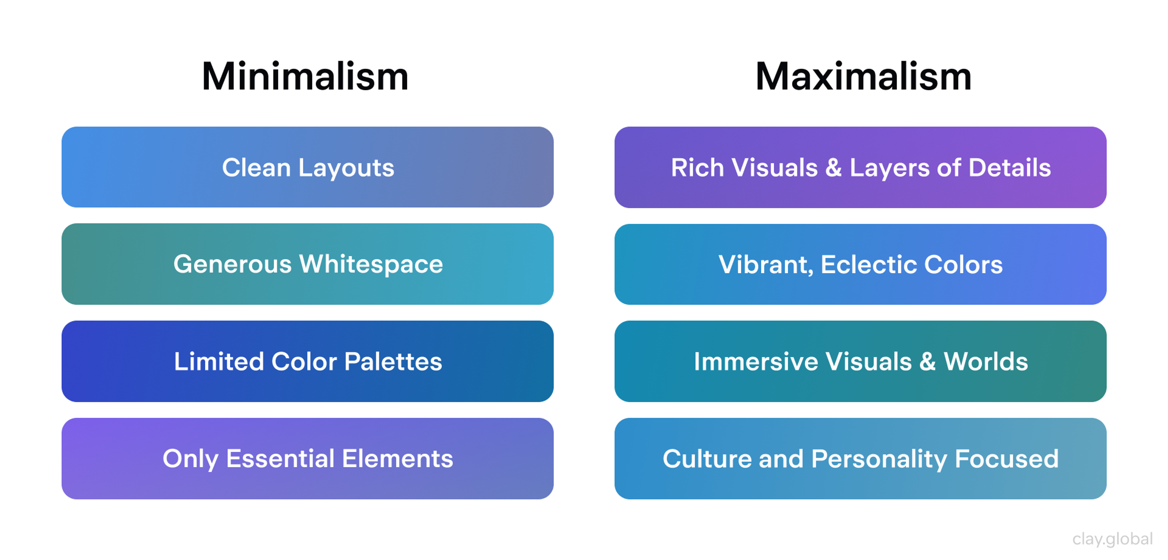
3. Minimalism, Maximalism, and Nostalgia
Web aesthetics in 2026 pulls in two opposite directions, and both are viable.
Minimalism stays popular for clarity and calm. It favors clean layouts, generous whitespace, limited color palettes, and only essential elements on screen. Minimalist design strips back to crucial elements and often features text-forward designs, emphasizing simplicity and naturalness. This style typically feels premium, supporting both usability and performance goals.
Maximalism grows in spaces where story and personality matter most. Fashion, entertainment, and culture-led brands lean into rich visuals, layered details, vibrant colors, and eclectic typography to create immersive worlds.
Minimalism vs Maximalism by Clay
Maximalist and nostalgia-driven designs often incorporate decorative elements such as vintage patterns, ornamental frames, and illustrative embellishments to enhance visual appeal and convey a sense of luxury or nostalgia.
Retro and nostalgia-driven design resurges alongside both. References to the 90s and 2000s are evident in pixel-inspired details, bold vintage typography, and old-school color schemes, often combined with modern motion and layout techniques.
Designers are using color palettes that emphasize bold, pastel, neon, metallic, and retro-inspired shades, as well as gradient color schemes, to add depth and visual interest. This nostalgic yet futuristic mix taps into familiarity while still feeling current.
4. Colors and Dark Mode Evolution
Both aesthetic and comfort considerations influence color choices.
You frequently see:
- Earthy and organic tones, such as warm browns, deep greens, and muted blues, lend interfaces a sense of grounding and trustworthiness.
- Bold dopamine accents and neon gradients are used as highlights to add energy and draw attention against quieter bases.
Accessibility and brand requirements shape these palettes. Many designers pair softer base colors with high contrast highlights wherever clarity is critical. Responsive design is essential to ensure that color choices and gradients remain accessible and visually effective across different devices, screen sizes, and themes.
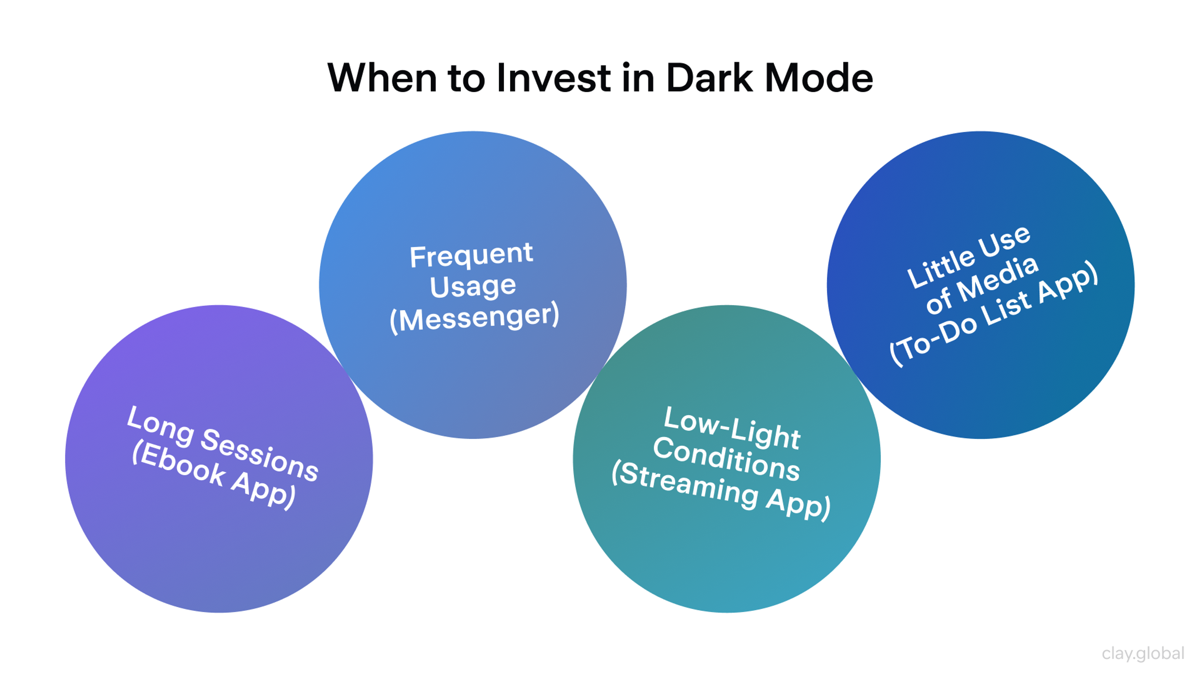
Dark mode is now expected rather than a novelty. Modern teams design dark themes intentionally instead of inverting colors. That means recalibrating contrast, shadow, and saturation so dark UIs feel as considered as light ones.
Dark mode is gaining popularity as it enhances website performance and reduces eye strain. Some brands add multiple theme options to give users more control.
When to Invest in Dark Mode by Clay
An illustrative example of these trends in action is the design of Fooji's Crowdsail web app. The project emphasized creating an intuitive and enjoyable user experience by incorporating helpful tips, descriptive elements, and thoughtful interactive behaviors to enhance user-friendliness.
Fooji Light vs Dark Mode by Clay
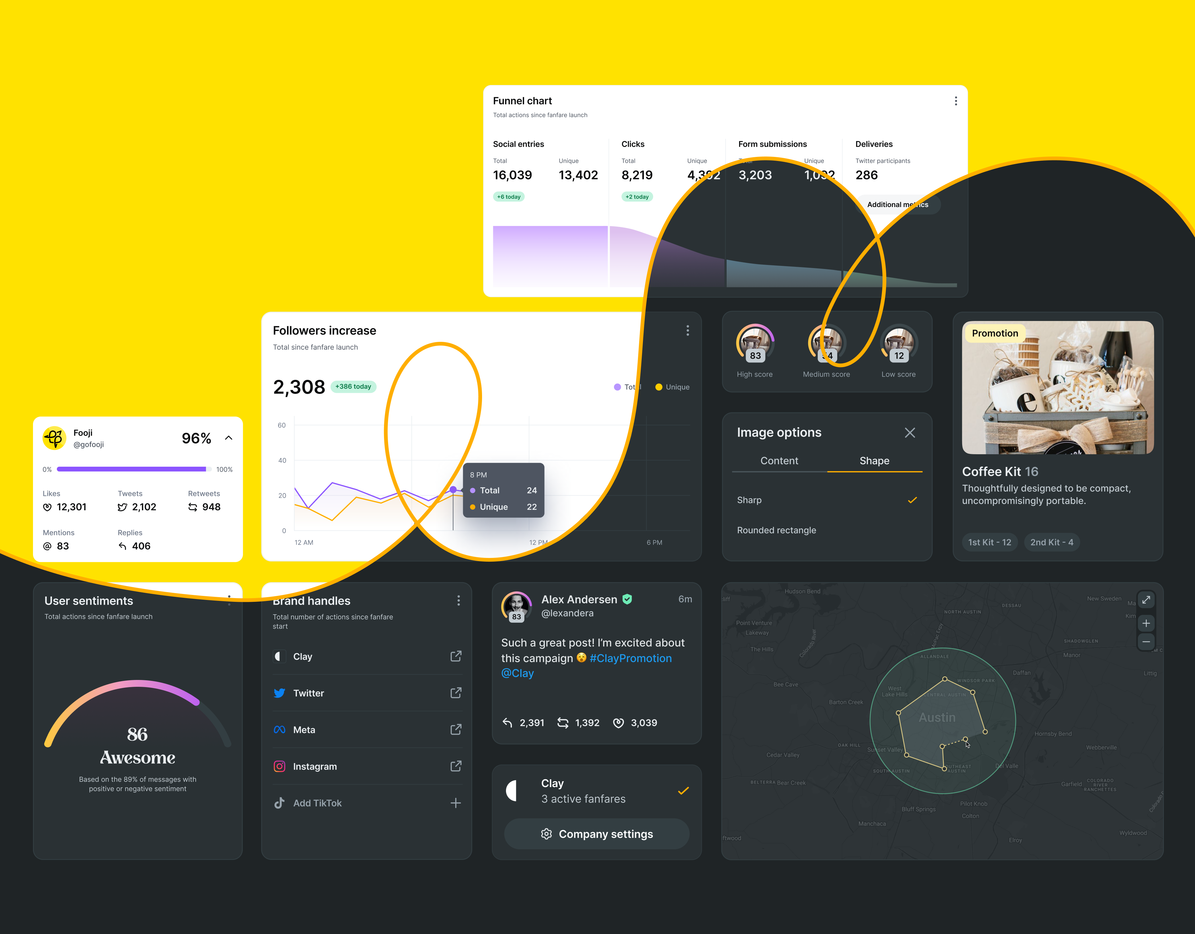
A dark theme was implemented to ensure visual coherence and provide a more personalized user experience. Custom illustrations and icons were also crafted to uphold the brand's identity, strengthening the connection and preserving a friendly brand language.
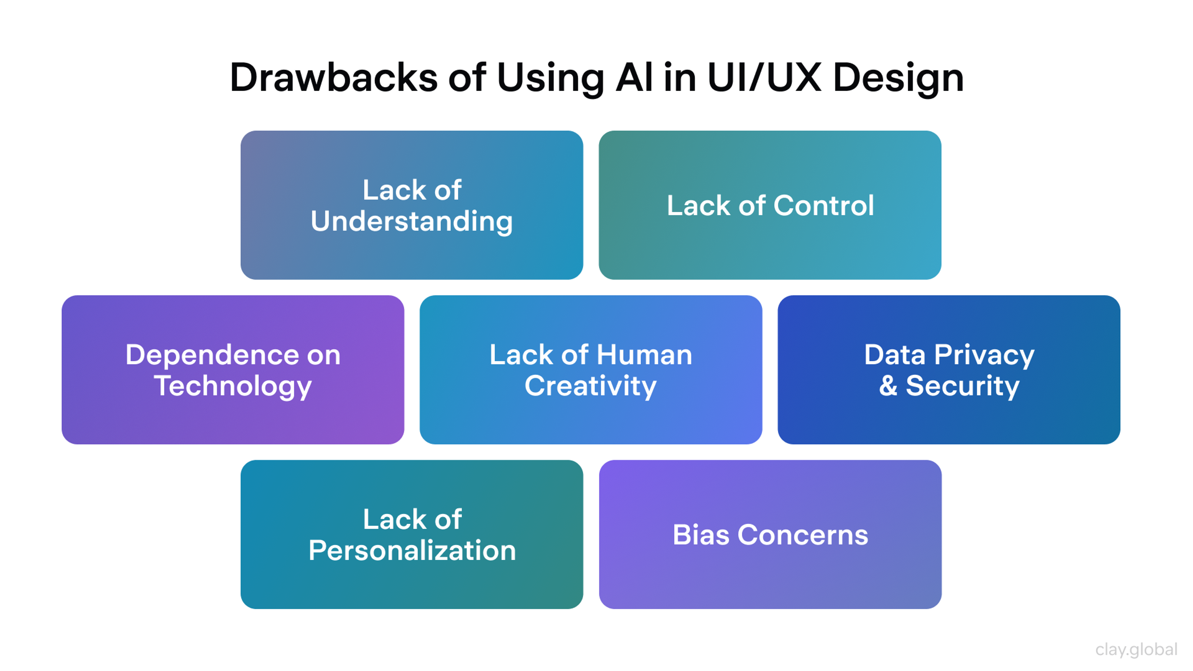
5. Human Touches in UI
As AI-generated visuals become increasingly widespread, many teams reintroduce human elements to make interfaces feel more authentic and less generic, thereby strengthening brand identity and visual appeal.
You often see:
- Hand-drawn illustrations and doodles
- Imperfect textures and organic shapes
- Custom illustration systems and mascots instead of stock images (using illustrations instead of photography can speed up load times and convey concepts more effectively)
These details add warmth, help users recognize the brand, and reinforce a consistent brand identity.
Cons of Using AI in Design by Clay
Micro animations also contribute to a human feel. Small, responsive moments acknowledge user actions. Subtle button feedback, playful loading states, and light celebratory interactions make products feel alive and attentive. Micro animations are expected to increase in use as they help bring websites to life and enhance user experience.
User Experience (UX) Practices and Trends
Strong visuals get attention, but UX determines whether people stay, complete tasks, and return. In 2026, UX trends lean toward experiences that feel more personal, intuitive, and inclusive across devices.
User-centric design and user engagement are now central to modern UX practices, as micro-interactions and predictive analytics help boost engagement, retention, and satisfaction. The mindset shifts to "designing with users, not just for them," with continuous focus on real needs, feedback, and context.
Websites are evolving into connected hubs that integrate various business functions, further enhancing user experience. Websites that prioritize user experience can have a significant impact on user retention and conversion rates.
Here are the practices shaping products this year.
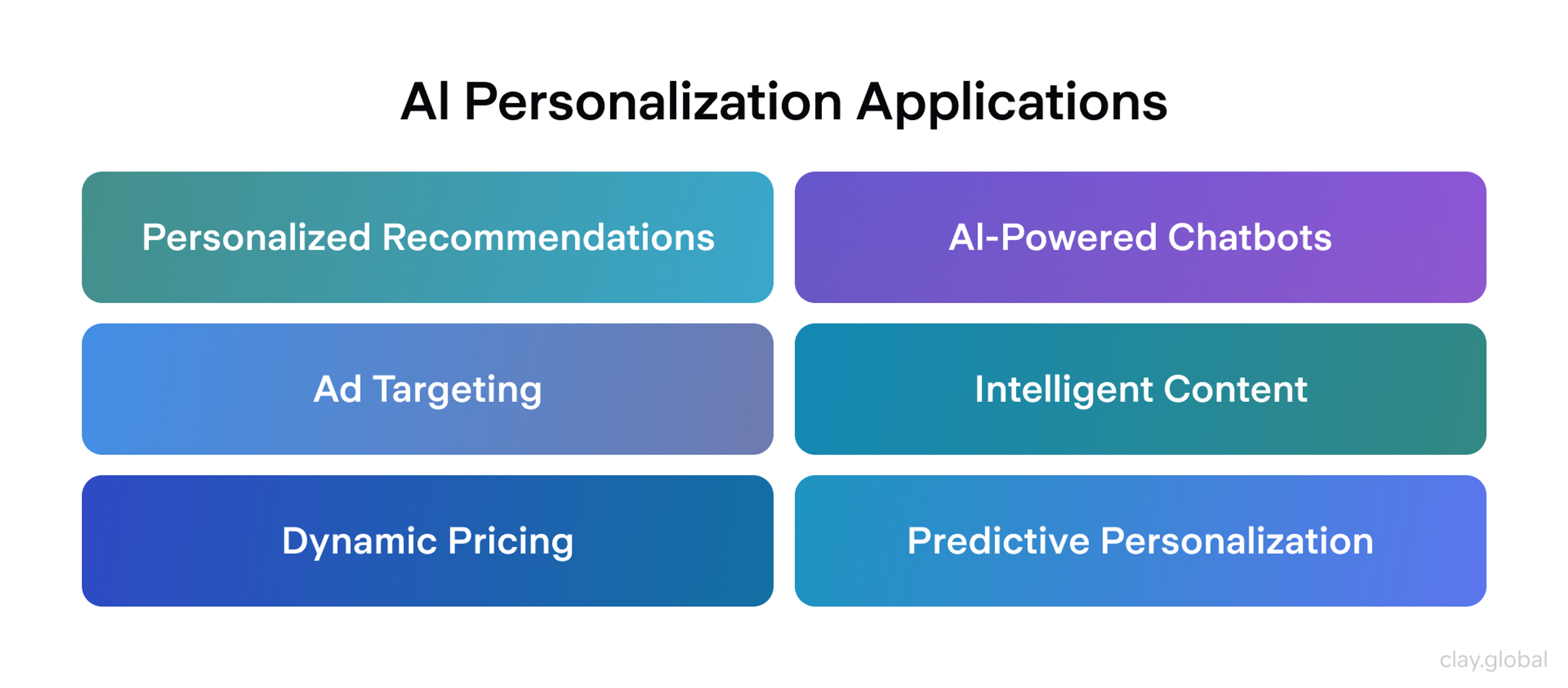
6. AI-Assisted Personalization and Adaptivity
AI has evolved from a buzzword to a core component of UX infrastructure. Artificial intelligence and AI tools now play a crucial role in personalizing user experiences, surfacing dynamic product suggestions based on real-time user data, including browsing history, preferences, and behavior. Websites and apps tailor content and recommendations in real-time based on user behavior and preferences.
In 2026, teams are also exploring adaptive interfaces. Some products experiment with modes that respond to context, for example, a calmer, more minimal layout during focus time and a more energetic one for leisure. AI chatbots are increasingly integrated into websites to enhance user interaction and support.
The direction points toward hyper-personalized UX, but it only works if it stays trustworthy. The key is striking a balance between personalization and privacy, while maintaining control over one's own information.
Practical takeaways:
- Explain why users see certain content with patterns like "Why am I seeing this?"
- Give clear settings to adjust, reset, or opt out of recommendations
- Avoid opaque black boxes; users should feel helped, not watched
- AI can automate layout generation, allowing designers to focus on customization and fine-tuning
AI-Assisted Personalization Applications by Clay
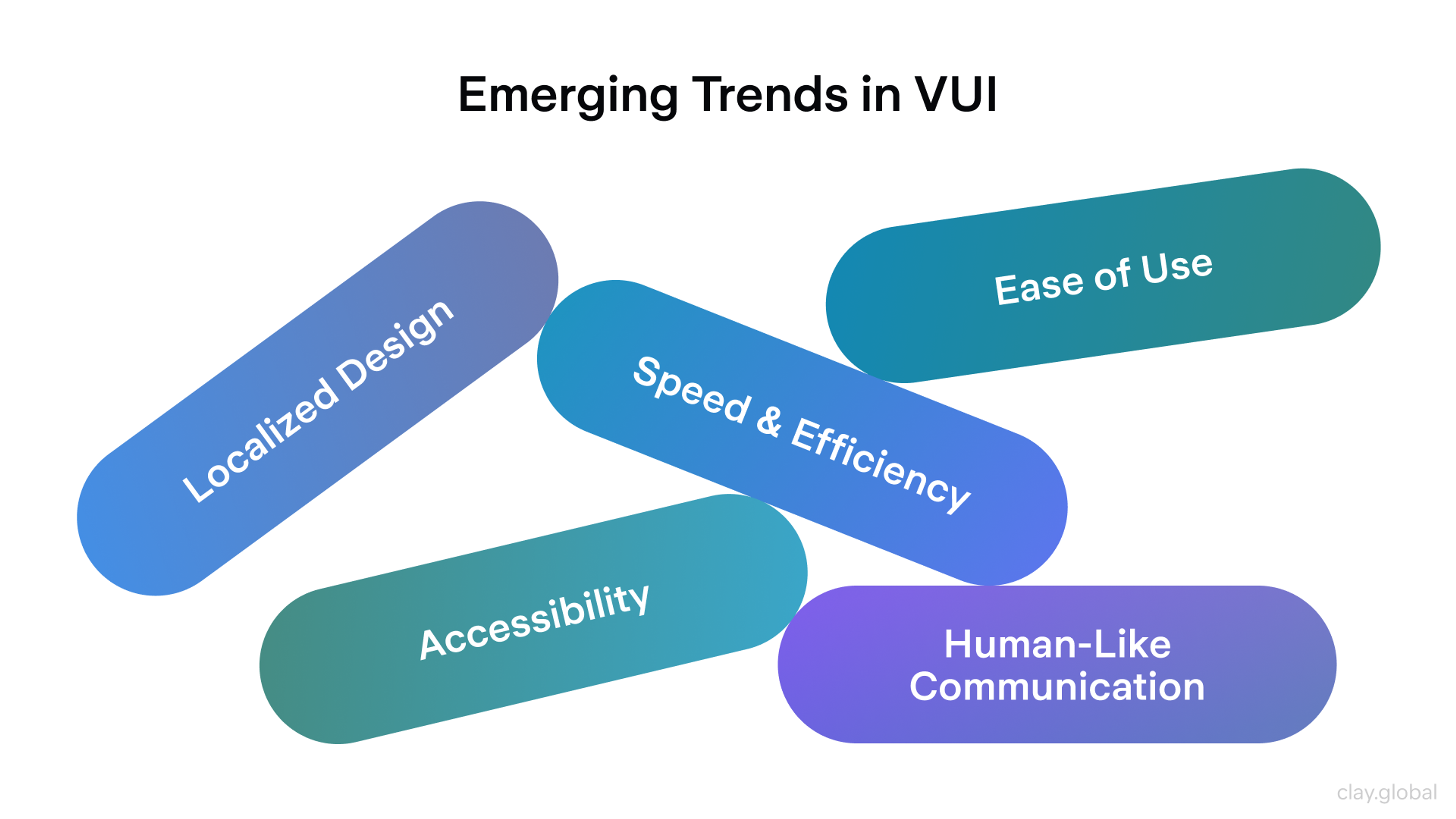
7. Voice and Multimodal Interfaces
User input is expanding beyond clicks and taps. Voice becomes a practical option for specific tasks, especially on mobile, where speaking can be faster than typing.
Voice search and simple commands are becoming more prevalent, and some experiences are shifting toward "zero UI," where actions are triggered through voice, gestures, or context rather than traditional controls.
The UX goal is reduced friction. The design challenge is clarity. Non-visual interactions still need feedback so users know the system heard them and acted correctly. Voice should complement, not replace, visual UI.
Trends in VUI by Clay
Design guidelines:
- Always provide a fallback, such as on-screen controls
- Show clear confirmations that a voice command was heard and executed
- Consider noise, privacy, and accessibility for people who cannot or do not want to speak
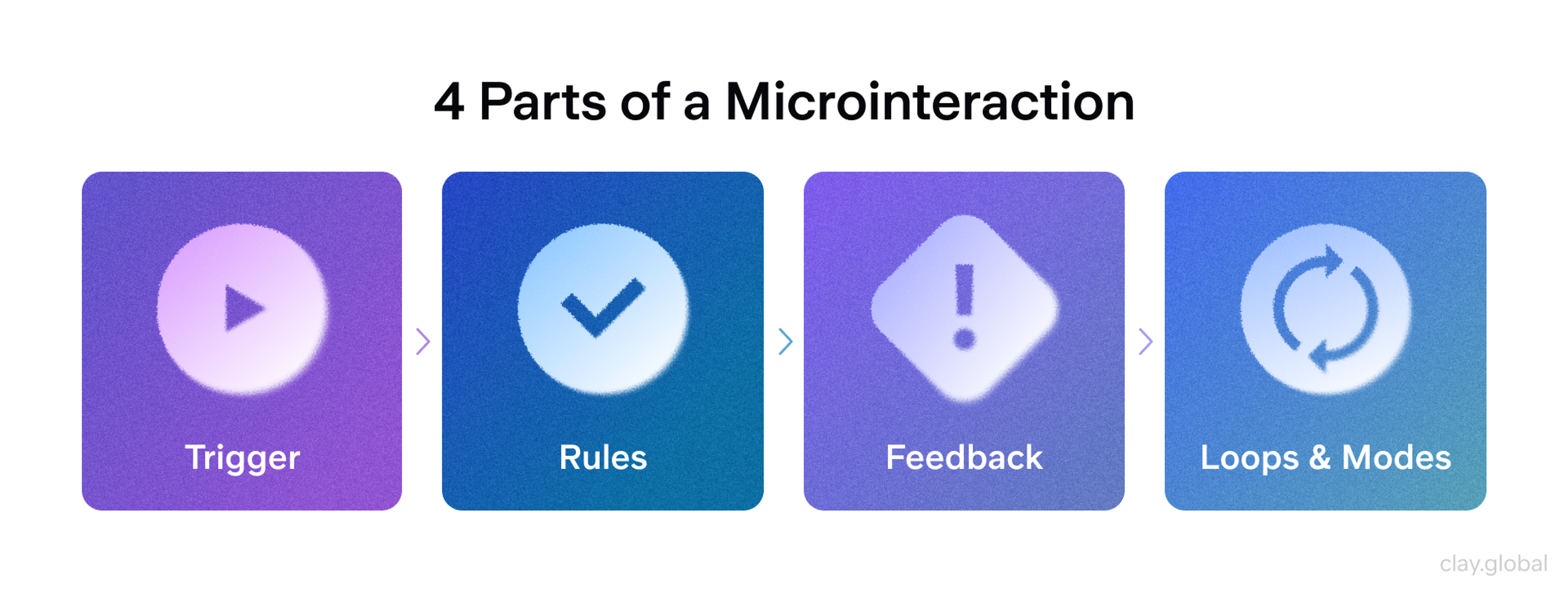
8. Micro-Interactions and Feedback Loops
Micro-interactions are now part of the core UX language, not just a matter of polish. Subtle animations and responses confirm actions, guide attention, and convey status without requiring additional text.
Micro animations and micro interactions enhance usability by making interfaces more intuitive and engaging, ultimately leading to better user satisfaction and engagement.
A like button that animates, hover states that clearly signal clickability, inline validation that appears at the right moment, and loading states that reduce uncertainty all help users feel oriented and in control.
In 2026, the best micro-interactions are purposeful and context-aware. They reduce errors, direct attention, and teach the interface through behavior.
Good practice:
- Map key moments: taps, submissions, errors, transitions, waiting states
- Design a fast, lightweight response for each one
- Use micro animations to guide users through complex interfaces and highlight important areas of a page
- Avoid animations that introduce delay or pull focus away from the primary task
Micro animations are expected to increase in use as they help bring websites to life and enhance user experience.
Four Parts of a Microinteraction by Clay
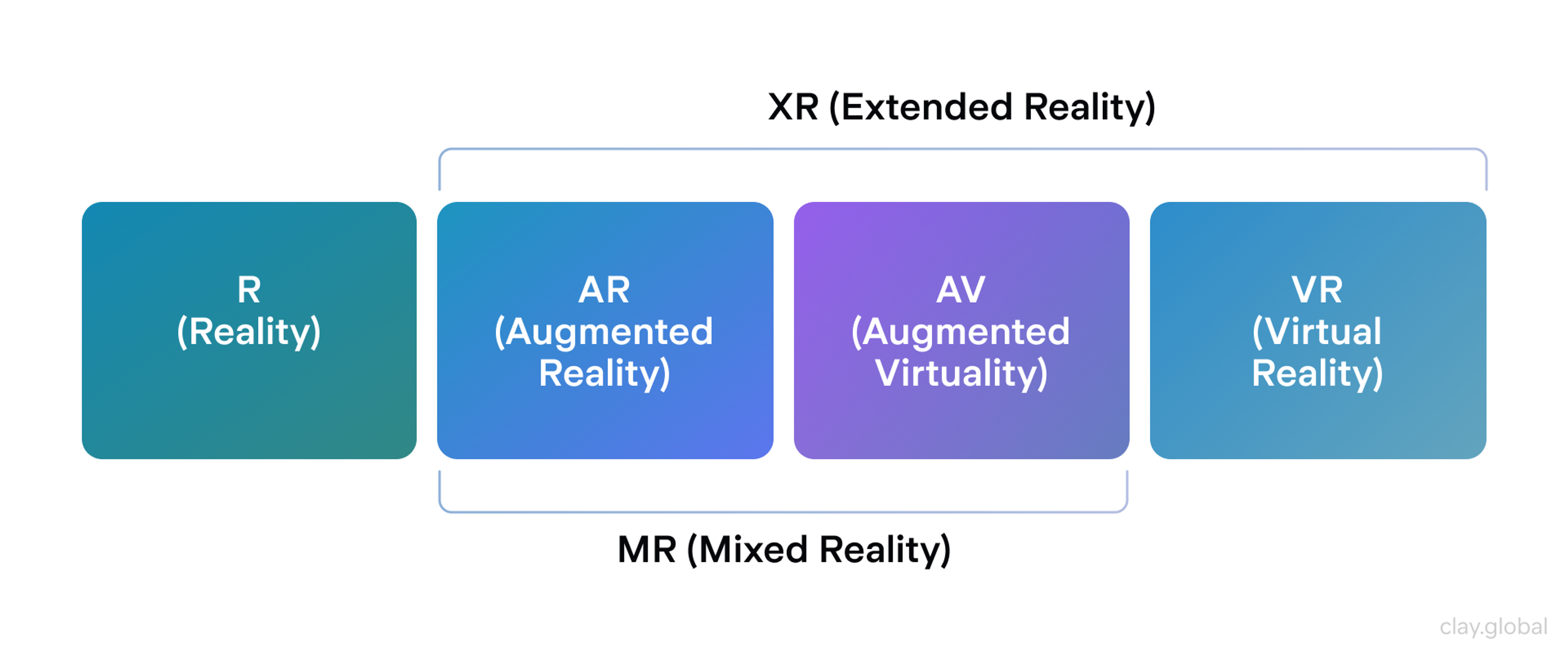
9. Augmented Reality (AR) and Mixed Experiences
AR is transitioning from novelty to practical UX, where it truly aids in informed decisions. Creating websites with AR and high-performance 3D elements is now a hallmark of modern website design, enhancing user experience and engagement.
Retailers let users preview furniture or products in their own space. Education, tourism, and museums layer information onto exhibits and locations. Virtual try-on flows for eyewear and accessories continue to expand as device support improves.
The focus is on usability and smooth execution. AR should launch with minimal friction, run reliably, and clearly explain what users need to do.
Augmented Reality (AR) and Mixed Experiences by Clay
To keep AR usable:
- Minimize steps to start an AR experience and be explicit about permissions
- Provide clear instructions and visual guidance inside the AR view
- Offer a fallback such as a 3D viewer or standard gallery if AR is unavailable
Even without full AR, well-executed 3D models on product pages can increase confidence by letting users inspect items from multiple angles.
10. Cross-Platform Continuity
People move across devices all day: phone to laptop, tablet to TV, watch to car. A major UX priority is continuity, allowing users to start a task in one place and complete it elsewhere without losing progress. This goes beyond responsive layout. It is about state and intent.
Key questions:
- Can users pick up exactly where they left off?
- Do carts, drafts, and progress sync reliably and quickly?
- Are core features and patterns consistent across platforms?
Cross-Platform Consistency by Clay
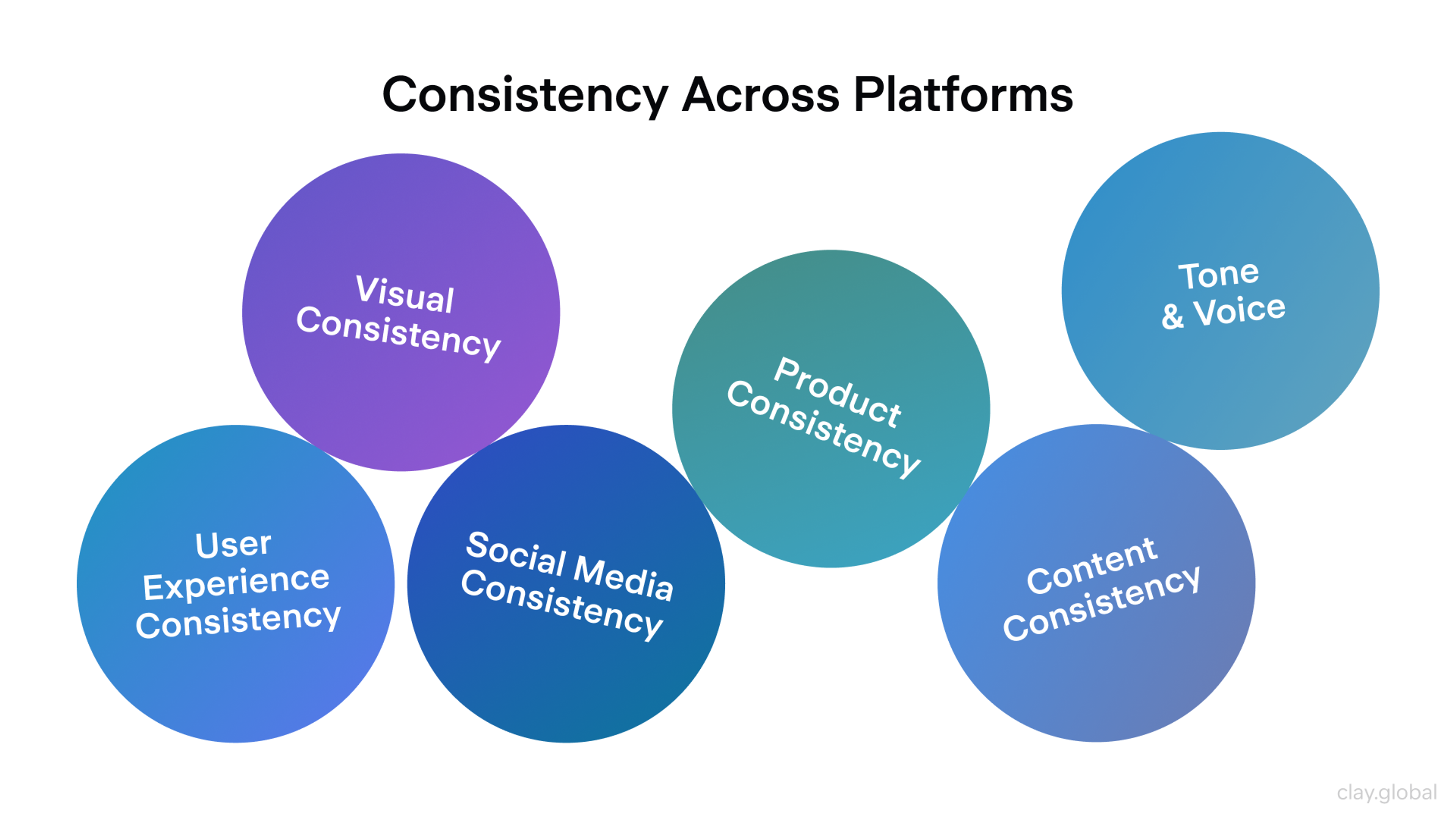
Design systems help by aligning components, behaviors, terminology, and interactions across web and native apps. To improve continuity, map cross-device journeys, identify handoff friction points, and utilize cloud sync and recovery patterns so users never feel forced to start over.
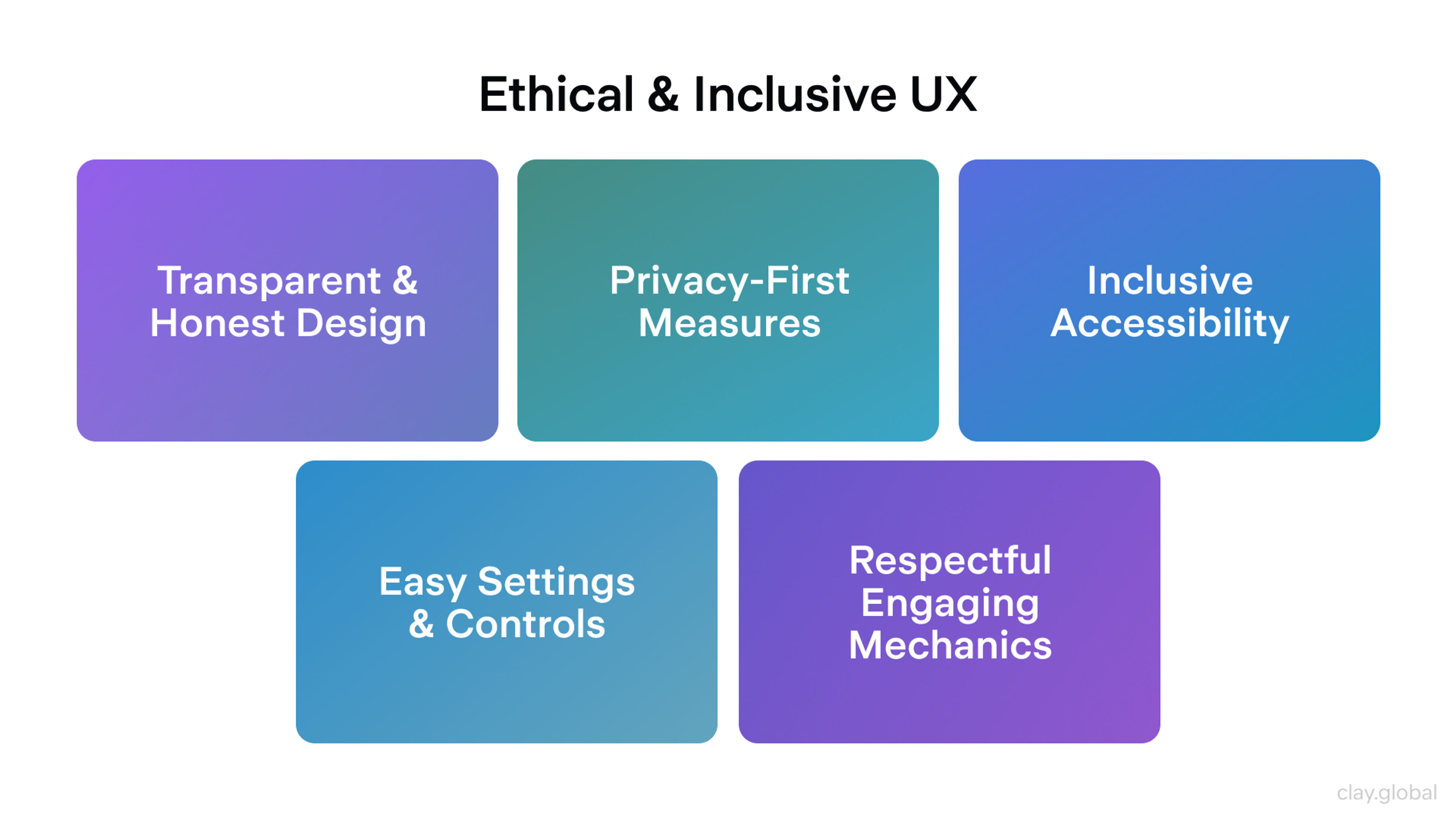
Bonus: Ethical and Inclusive UX
A defining theme for 2026 is ethical UX that respects time, attention, privacy, and diverse needs. Ethical web design and sustainable web design are becoming the norm as more companies recognize their importance. Dark patterns are more widely recognized and increasingly challenged by regulation and user backlash.
Trust-driven design means more explicit consent, transparent data usage, easy-to-find privacy controls, straightforward settings, and reversible actions. Ethical web design also emphasizes privacy-first design and data minimization to build user trust.
Concrete practices:
- Avoid manipulative patterns in sign-ups, subscriptions, and consent flows
- Use engagement mechanics such as infinite scroll or streaks only when they serve the user
- Build accessibility into layout, interaction, and content from the start
In short, UX in 2026 is more context-aware and user-controlled. When teams use AI responsibly, support multiple interaction modes, and design for clarity and trust, the result is an experience that feels more helpful and more human.
Ethical and Inclusive UX by Clay
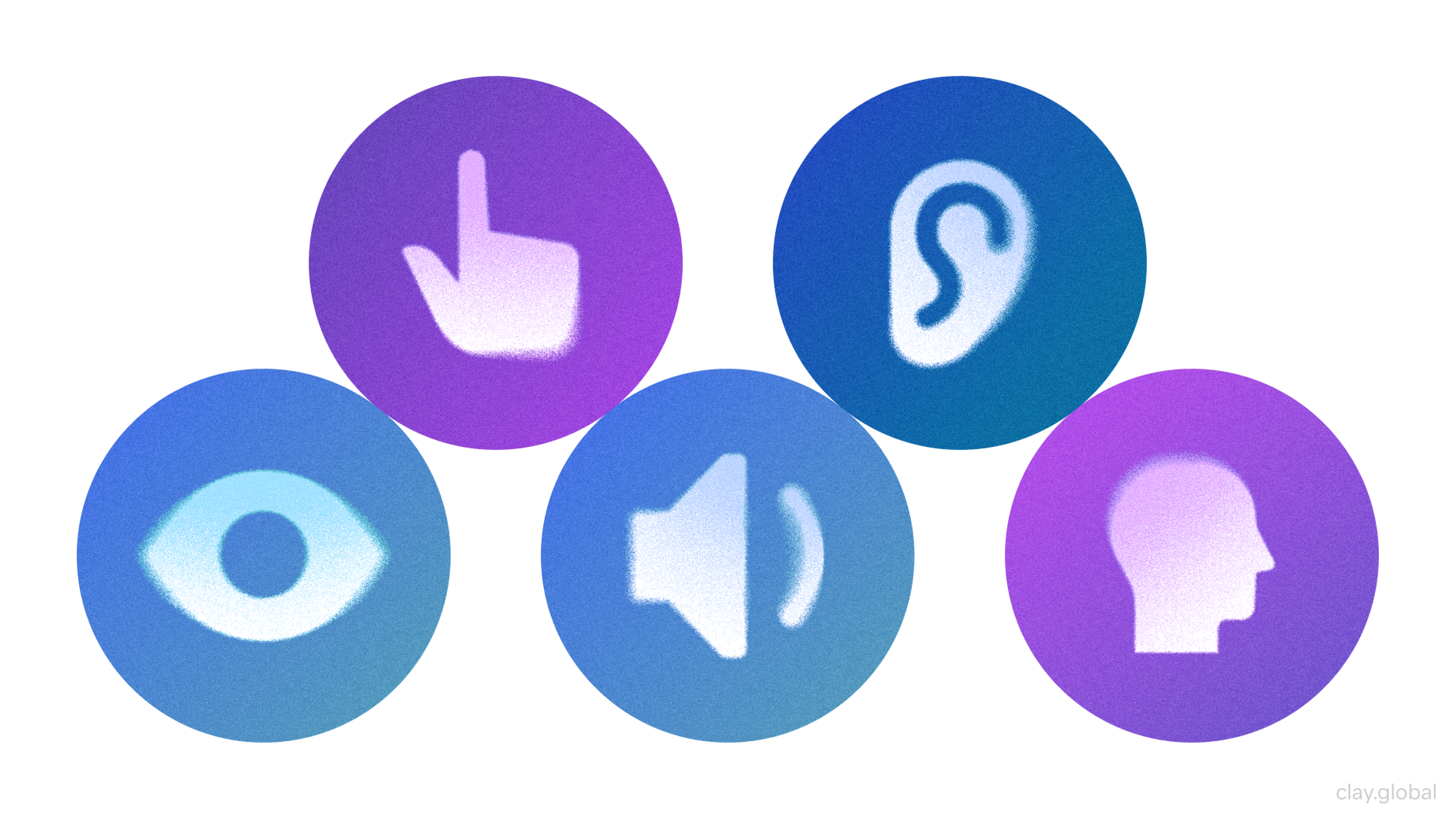
Accessibility and Inclusive Design as Standard
Accessibility is no longer a nice-to-have. In 2026, it is a baseline expectation and, in many regions, a legal requirement for public-facing sites and apps. The design process now incorporates inclusive design and accessibility as core principles.
That means interfaces must work for people with visual, auditory, motor, and cognitive disabilities so everyone can perceive, understand, navigate, and interact with content.
The business case is also more transparent: accessible sites reach a wider audience and often see measurable gains in traffic and engagement following improvements.
Cognitive Accessibility and Neurodiversity
Accessibility conversations now go beyond alt text and keyboard support. Inclusive design increasingly accounts for cognitive differences and neurodiversity: users with ADHD, autism, dyslexia, anxiety, or anyone who struggles with overload and complex layouts.
Analyzing user behavior helps inform design choices that support cognitive accessibility and neurodiversity by revealing how different users interact with content and which features enhance usability for diverse needs.
In practice, this can look like:
- Low-stimulation or "calm" modes that reduce motion, autoplay, and visual noise
- Predictable, consistent layouts with clear headings and logical structure
- Plain, direct language that reduces cognitive load
- Reading or "simple" modes with stripped-down views
- Controls for text size, line spacing, and more readable type options
These features initially benefit neurodivergent users, but they also enhance clarity and comfort for everyone. The core principle is flexibility: there is no single "average" user, so interfaces should adapt to different needs and preferences.
Accessibility Elements by Clay
Assistive Tech and Emerging Tools
Assistive technologies continue to improve, and teams are testing them more deliberately in real-world workflows. Screen readers are a significant focus, including:
- Ensuring reading order matches visual structure
- Providing meaningful headings and landmarks
- Avoiding hidden traps like focus jumps or inaccessible custom controls
Voice control, switch access, and eye-tracking navigation also benefit from clean semantics and predictable patterns.
AI is starting to help here, too, by:
- Suggesting image descriptions
- Auto-captioning video
- Flagging potential accessibility issues during development
- Identifying and fixing missing alt text, which is crucial for creating an inclusive user experience
AI can help in designing websites that are more accessible by identifying and correcting accessibility issues, making it easier to ensure compliance and usability for all users.
These tools can reduce gaps and speed up checks, but they do not replace human-centered design or testing with real users and assistive tech.
Web Performance Optimization
Speed is one of the few universal truths on the modern web. By 2026, users will have even less patience for slow websites, and search engines will continue to reward fast and stable experiences.
Performance is no longer just a technical concern; it is also a strategic one. It is a product and design priority. Fast-loading, responsive websites offer a competitive edge by enhancing user experience, improving SEO rankings, and driving better business outcomes.
Many teams plan for speed from the first wireframes, treating it as a constraint alongside layout, accessibility, and brand. Even minor delays can harm engagement and conversions, so the goal is straightforward: make the experience feel instantaneous.
Core Web Vitals
Google's Core Web Vitals have pushed performance into the mainstream, and by 2026, most teams will actively optimize for them. The principles are straightforward: load meaningful content quickly, respond promptly to input, and maintain a stable layout.
A well-optimized site displays relevant content within a couple of seconds, reacts immediately to taps and clicks, and avoids the "jumping" UI caused by late-loading elements.
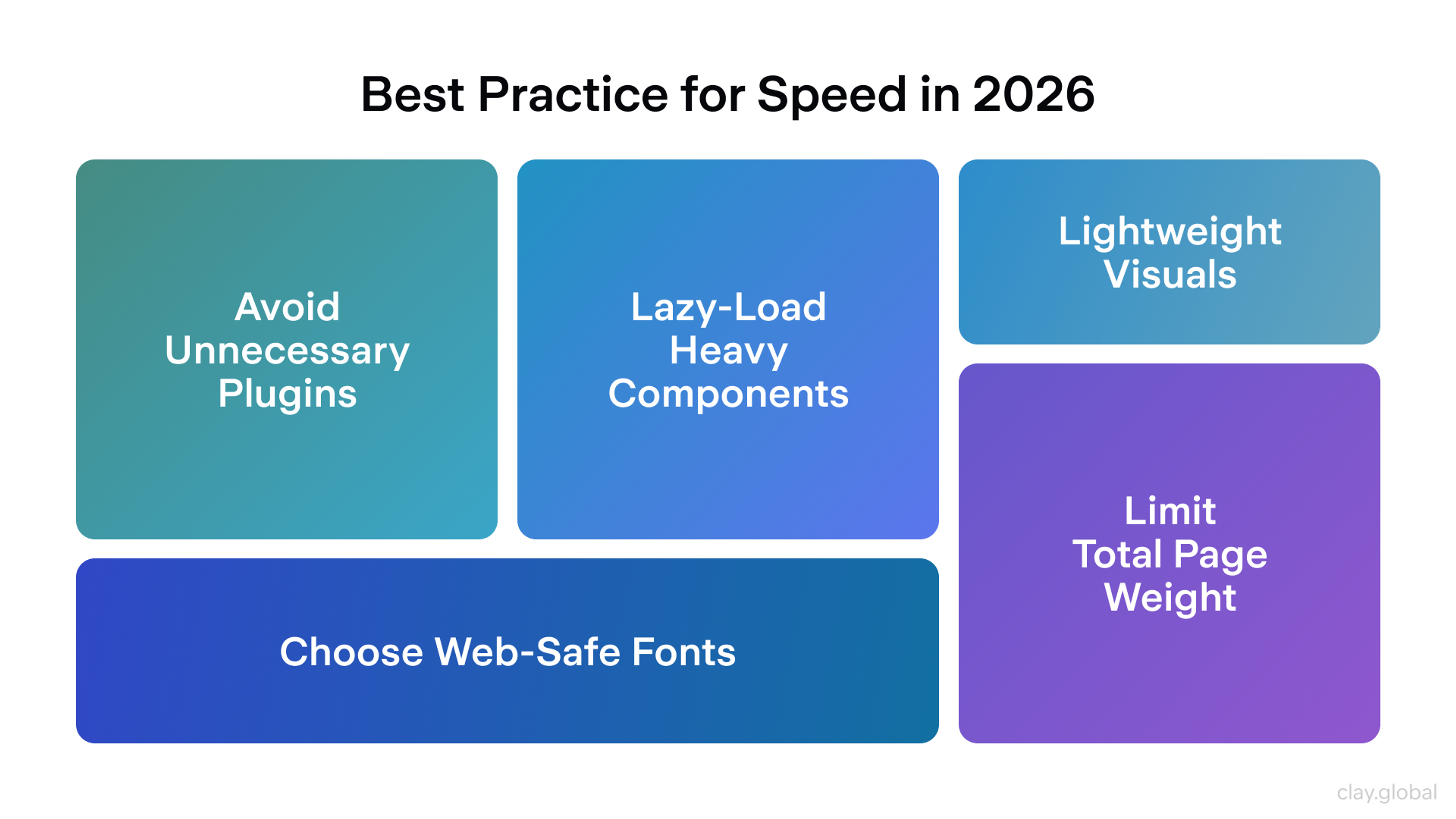
Best Practices for 2026 Speed:
- Efficient loading strategies: Performance often suffers because too many run too early. Every third-party script has a cost and should justify its place. Avoid unnecessary plugins, as they can negatively impact performance and security. Scripts should load with 'defer' or 'async,' so they do not block rendering. Code splitting helps ensure users download only what they need for the current view. Heavy components such as maps, carousels, and embeds work best when they are lazy-loaded, along with images below the fold.
- Performance-first design decisions: Design choices can significantly impact a site's speed before development even begins. Web fonts are a frequent culprit, so many teams lean on system fonts, reduce the number of variants, or use careful font loading strategies so text appears immediately. Heavy animation and extensive video backgrounds are scrutinized more closely. Lightweight visuals, such as SVG illustrations, CSS-based effects, and restrained motion, are preferred because they feel polished without adding much payload.
- Budgets and monitoring: High-performing teams define a performance budget and defend it. This can include limits on total page weight, JavaScript size, and time to interactive. Performance is continuously monitored through real-user metrics and automated checks on each release, allowing regressions to be caught early.
Best Practices for 2026 Speed by Clay
Front-End Development Frameworks and Tools in 2026
The front-end in 2026 remains fast-moving, but it has become significantly more standardized. Most teams build on proven foundations and choose tools that make performance, routing, and deployment easier by default.
To stay current with emerging frameworks and tools, it is essential to continually maintain and enhance your design skills, as strong design skills enable you to adapt to new web design trends and create impactful websites.
In practice, the "right" stack is typically the one that aligns with your product, scale, and team's preferred workflow.
Frameworks
React, Angular, and Vue still anchor most front-end work.
- React remains the most popular choice for highly interactive UIs, thanks to its extensive ecosystem, large hiring pool, and extensive library depth.
- Angular remains strong in enterprise settings, where teams seek a structured, opinionated framework with TypeScript built in.
- Vue occupies a practical middle ground, offering a flexible learning curve and the capability to scale well with modern Vue 3 setups.
Web designers play a key role in selecting and implementing these frameworks to ensure that the final product aligns with current web design trends and delivers the desired user experience.
At the same time, performance-focused frameworks keep gaining mindshare:
- Svelte compiles away much of the framework, reducing runtime overhead and bundle size.
- SolidJS gives React-like ergonomics with fine-grained reactivity and minimal runtime work.
- Qwik pushes resumability, optimizing how server-rendered apps become interactive.
These challengers are attractive when every millisecond matters, but they typically come with smaller ecosystems and fewer "battle-tested" patterns than React or Vue.
Meta-frameworks
In 2026, most serious apps pair a UI framework with a meta-framework that handles routing, data loading, and performance.
Common pairings include:
- React + Next.js for flexible rendering (SSR, SSG, ISR) and firm performance defaults.
- Vue + Nuxt for a similar pattern in the Vue ecosystem.
- Svelte + SvelteKit to cover routing, SSR, and deployment.
- Remix for React teams that want progressive enhancement and web-native patterns.
- Astro for content-heavy sites that wish to minimize client-side JavaScript and ship only what each page needs.
Micro-frontends are still used in large organizations to enable multiple teams to ship different parts of the UI independently. This is primarily an organizational strategy, rather than a user-facing trend.
CSS in 2026
Styling has shifted toward systems that scale across products and teams.
You'll commonly see:
- Utility-first CSS, such as Tailwind, to speed up UI work and keep spacing, typography, and color consistent.
- Design tokens to centralize decisions about spacing, color, radius, and typography across design and code.
- AI-powered tools that can automatically generate layouts, streamlining the design process and making it easier to create functional, visually appealing structures.
Modern native CSS also plays a bigger role:
- Grid and Flexbox are standard foundations.
- Newer features, such as container queries and the: has() selector, make responsive and state-based styling possible directly in CSS, without the need for JS hacks.
Design, Collaboration, and AI-assisted Workflows
Design and development are more tightly connected.
- Design systems map from Figma libraries to component libraries in code, helping to establish a unified design language that maintains consistency across digital design projects.
- Storybook and similar tools are used to build, document, and test components in isolation.
- AI is embedded throughout the workflow, including code suggestions, refactoring, variant generation, and identifying common issues. These AI tools are transforming the digital space by enabling more efficient and creative workflows in digital design.
These tools reduce friction and speed up iteration, but strong engineering and design judgment still decide what ships.
FAQ
What Are The Most Important Visual Design Trends In 2026?
Immersive 3D, bold typography, expressive layouts, and a split between clean minimalism and intentional maximalism. More brands are adding human touches, such as hand-drawn details and subtle microanimations.
How Does AI Impact Web User Experience Now?
AI powers more innovative personalization, recommendations, and adaptive interfaces. In 2026, good AI UX also encompasses transparency, user control, and clear opt-out options.
Is Accessibility Still Just About Screen Readers And Contrast Ratios?
No. Accessibility now also encompasses cognitive load and neurodiversity through clearer layouts, simpler navigation flows, and user controls such as typography and motion settings.
What Makes A Website Feel Fast In 2026?
Fast sites respond instantly and stay visually stable. Teams plan performance early with optimized media, quick loading, mobile-first design, and strong Core Web Vitals.
Read more:
Conclusion
Web design in 2026 is about striking a balance: utilizing new technology with clear intent. Immersive visuals, AI-driven personalization, inclusive design, and fast performance all point to the same goal: creating experiences that prioritize users. Trends matter only when they solve real problems and make the product easier and more enjoyable to use.
To do that well, teams need continuous iteration. Track user feedback and analytics, run regular UX, accessibility, and performance audits, and treat speed and inclusion as core requirements, not add-ons.
The strongest results emerge from a tight collaboration between design and development, particularly when aiming for rich interaction without compromising usability or performance.

About Clay
Clay is a UI/UX design & branding agency in San Francisco. We team up with startups and leading brands to create transformative digital experience. Clients: Facebook, Slack, Google, Amazon, Credit Karma, Zenefits, etc.
Learn moreAbout Clay
Clay is a UI/UX design & branding agency in San Francisco. We team up with startups and leading brands to create transformative digital experience. Clients: Facebook, Slack, Google, Amazon, Credit Karma, Zenefits, etc.
Learn more