
Frosted glass was supposed to be a passing moment as a Dribbble phase. Something designers would flush out of their systems and move on from.
That's not what happened. Five years after glassmorphism swept through concept portfolios, it's embedded in production interfaces at Apple, Google, and Microsoft. With Apple's Liquid Glass design language now shipping across iOS 26, iPadOS 26, macOS Tahoe, and every other Apple platform simultaneously, the aesthetic has gone from trend to infrastructure.
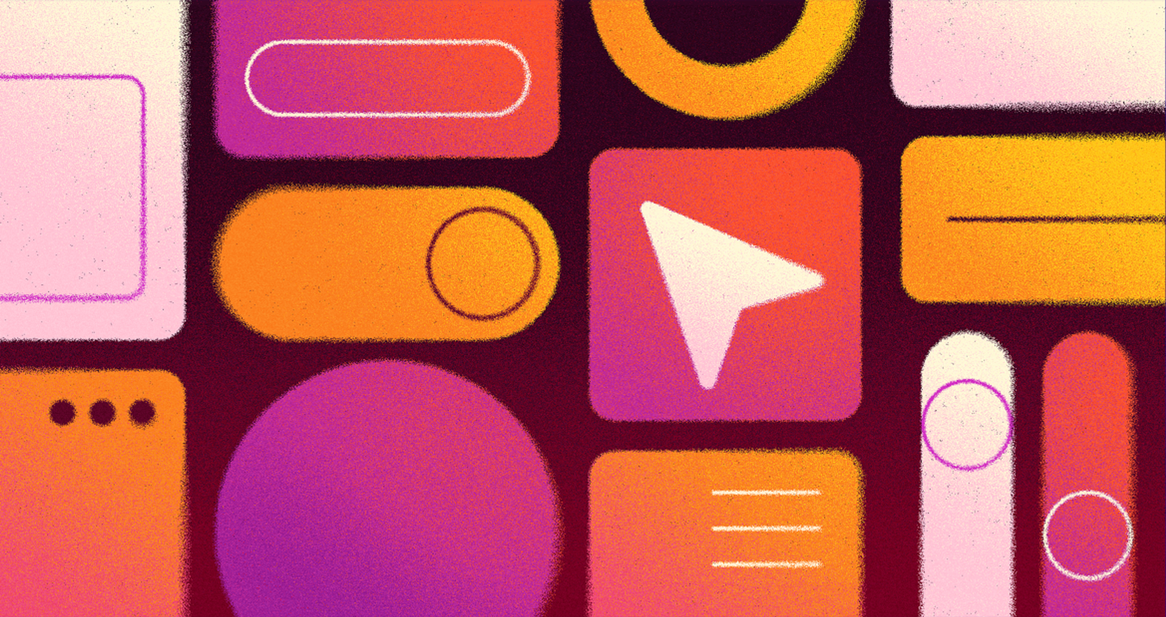
Apple's Liquid Glass
The question isn't whether glassmorphism is here anymore. It's whether you're using it well.
Key Takeaways
- Glassmorphism uses translucency, backdrop blur, soft borders, and layered depth to create frosted glass-like UI surfaces
- When applied selectively, it directs attention and builds visual hierarchy without adding visual clutter
- Contrast, legibility, and performance are the three failure points most teams discover after launch
- Apple's Liquid Glass (introduced at WWDC 2025) is the most significant platform-level adoption of glass-based design since Windows Aero in the mid-2000s
- Glassmorphism works best as a supporting element on modals, cards, and overlays rather than as a full-screen visual language
- Dark mode and low-end device performance require separate testing, because what works on flagship hardware often fails elsewhere
What Is Glassmorphism?
Glassmorphism is a UI design style that makes interface elements look like frosted or tinted glass. Think of the blurred, see-through panels you might see in a weather app, a music player, or a finance dashboard. The content sits inside a surface that feels light and layered, almost like it's floating above the background.
In practice, the effect comes from four things working together: a semi-transparent background, a blur applied to whatever is behind the element, rounded corners, and a faint border that traces the edge of the "glass." The kind of interface that feels modern and airy without being flat or empty.
The style has been around in concept work for years, but two things made it practical for real products. First, modern devices now have the processing power to render blur and transparency smoothly.
Second, the CSS property that creates the blur effect (backdrop-filter) is now supported across all major browsers. What was once too expensive to ship is now a standard tool.
The Visual Properties That Define It
Key Glassmorphism Elements
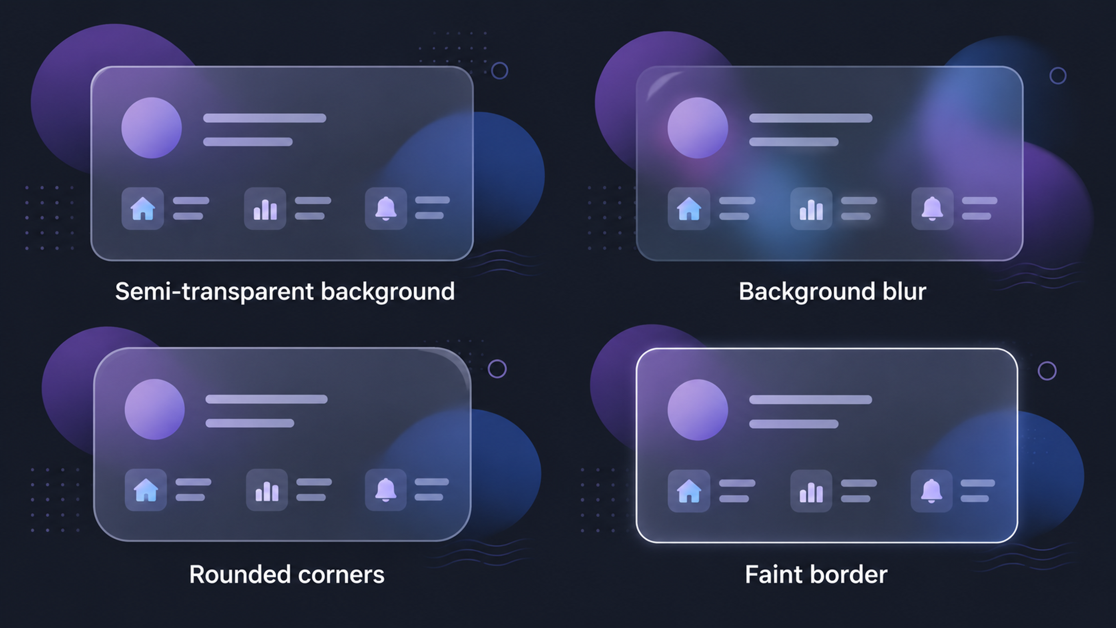
Backdrop blur is the core ingredient. It softens whatever sits behind the glass surface, creating visual separation without fully hiding the background. The background stays visible but slightly out of focus.
Translucency is what separates glassmorphism from flat design. Instead of an opaque panel, the surface lets light and color pass through it. You can see what's behind it, just softened.
Depth and layering give the interface a sense of dimension. Glass elements are placed over colorful or textured backgrounds (gradients, photography, moving content) so the blur has something to work with. Without a vivid background, the effect disappears into plain gray.
Soft borders trace the edge of the glass. Usually a thin, semi-transparent white or light stroke, visible enough to define the shape but light enough not to draw attention.
Clean typography and simple icons are essential. Detailed or decorative type fights the blur and loses. Glassmorphism needs restraint everywhere except the background behind it.
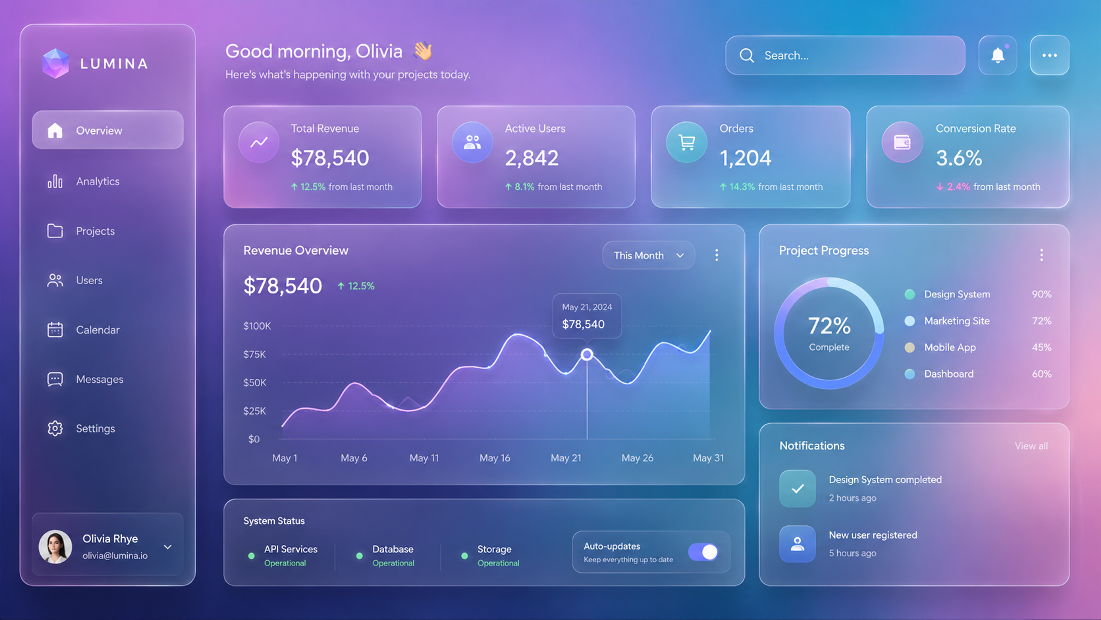
How Glassmorphism Improves UX
A common assumption is that glassmorphism is purely decorative. Used with intention, it does genuine UX work.
It Creates Visual Hierarchy Without Hard Borders
Most design systems build hierarchy through contrast: bolder type, stronger colors, heavier shadows.
Glassmorphism offers a quieter path. A frosted panel placed over a blurred background naturally separates the foreground content from the background context. The eye reads the separation because of depth, not because a hard line is drawn.
This works especially well in dashboards and data-heavy interfaces where multiple layers of information exist. Floating glass panels create containment without making the interface feel like a grid of nested boxes.
It Directs User Attention Through Blur
When you blur the background behind a modal or overlay, you're quietly telling users where not to look. Everything behind the glass becomes secondary.
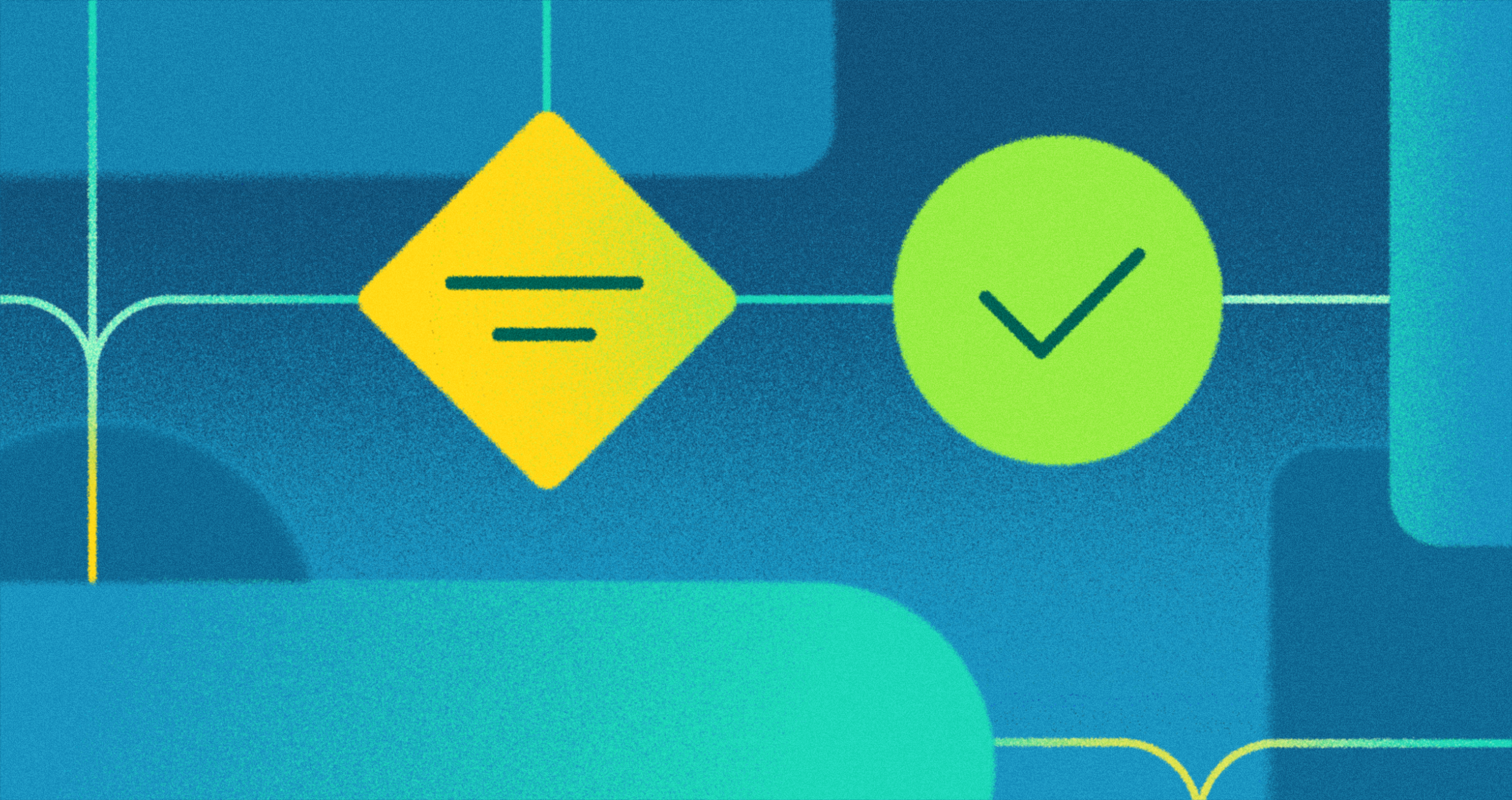
Glassmorphism Example
The foreground content (a form, an alert, a confirmation dialog) takes focus without needing animation or heavy color contrast to do the work.
This is one of the most useful properties of glassmorphism in functional UI. It redirects attention passively, in a way users don't consciously notice.
It Creates a Calmer Emotional Tone
Frosted glass has a softness that hard-edged flat design can't replicate. Rounded corners, diffused color, gentle layering.
For apps where the emotional tone matters (productivity tools, wellness apps, personal finance), this isn't decoration. It shapes how users feel during interactions they might otherwise find stressful or clinical.
We've designed for 100M+ Speedtest users, Discover cardholders, and Snapchat's AR commerce experience. Scale and complexity don't intimidate us. Tell us about your product.
Where Glassmorphism Breaks Down
The risks are real, and most teams only discover them after something ships.
Text Legibility
Low contrast is the most common problem. When light text sits on a translucent panel, the text is actually sitting over a shifting background.
What looks clear in a static Figma mockup can become unreadable when the background is a dark image, a saturated gradient, or a video.
Always check that your text contrast meets the WCAG 2.1 minimum of 4.5:1 against the worst-case background your design can produce.
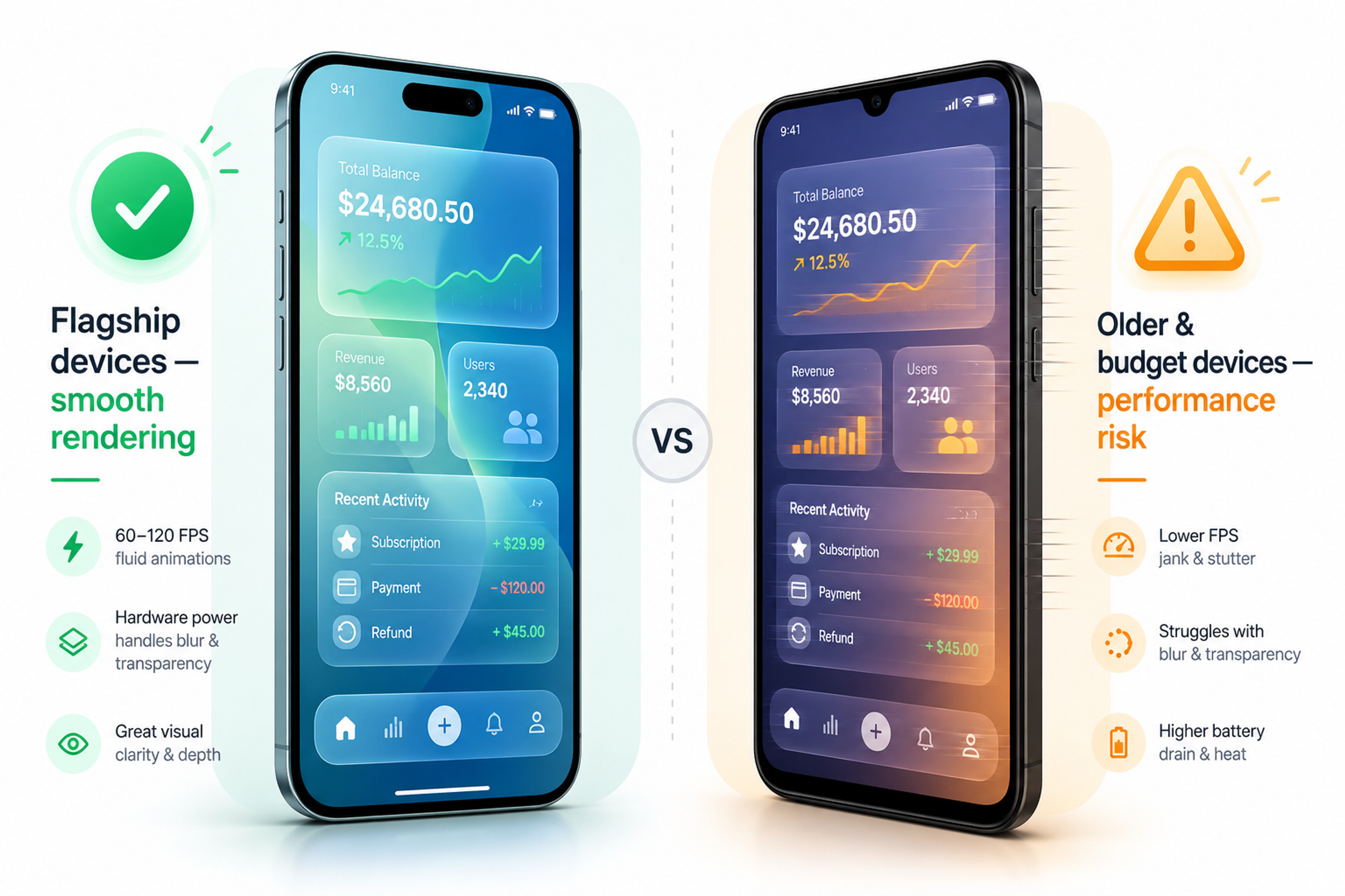
Performance on Older Devices
The blur effect is processed by the device's graphics chip. On recent flagship phones, it runs without issue.
On older or budget-tier devices (which still make up a significant share of global usage), heavy blur can cause visible stuttering or slowdowns. If your audience includes people on older hardware, test there before committing to a glass-heavy approach.
Glassmorphism Potential Risks
Dark Mode
Glass effects that look sharp in light mode often disappear or look muddy in dark mode. The effect works by showing contrast between the blurred surface and the light coming through from behind.
Dark backgrounds remove that light. Designers who test only in light mode often ship a broken dark-mode experience. Both modes need to be treated as separate design problems.
Brand Fit
Glass is soft, modern, and tech-forward. If your product is designed around industrial toughness, retro character, or high-density professional information (mapping tools, clinical software, emergency systems), glassmorphism will feel out of place. The style carries associations. Use them deliberately, or don't use them.
How to Use Glassmorphism Effectively
Use it selectively. Glassmorphism works as an accent, not a full visual language. Apply it to modals, notification overlays, floating cards, and navigation elements. When every surface in the interface is glass, nothing reads as glass. The effect needs contrast against non-glass elements to register.
Pick the right surfaces. The ideal candidate is a modal or card floating over a dynamic, colorful background. A primary button or a data table is not the right place. The blur needs something visually rich behind it to work. Pair glass surfaces with gradients, photography, or animated content.
Check your contrast separately. Don't rely on the blur to create enough separation for text legibility. Add a semi-opaque backing layer, increase the surface opacity slightly, or use heavier type weights. Test against the least favorable background your app can show behind that surface.
Test across devices. What renders smoothly on a new iPhone may stutter on a three-year-old Android. Run your interface on mid-range hardware before launch.
Test dark mode explicitly. Don't assume light-mode behavior carries over. Adjust opacity, border visibility, and background colors independently for each mode.
Glassmorphism in the Wild
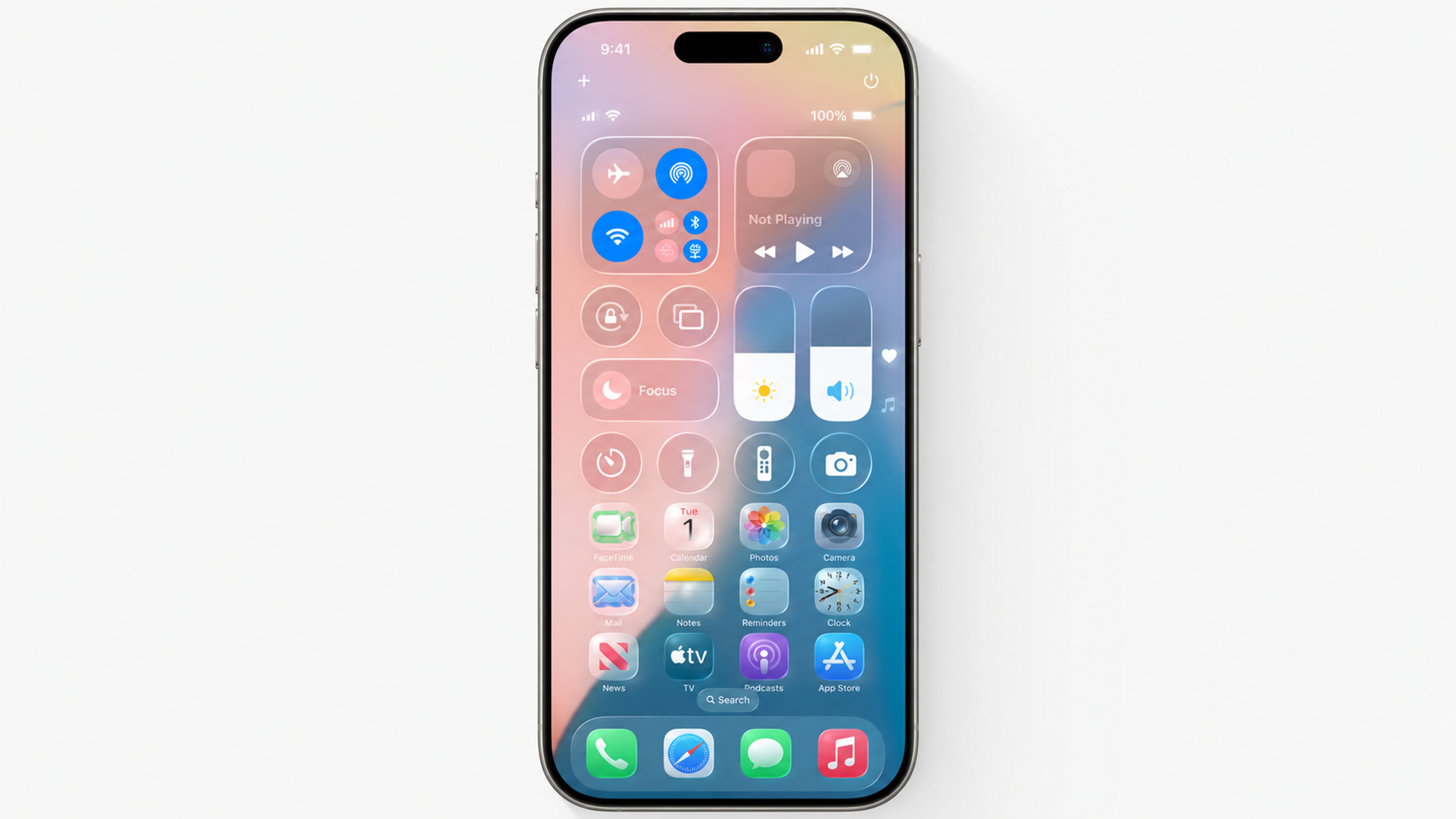
Apple's Liquid Glass (iOS 26)
The biggest glassmorphism story of 2025 came from Apple. Introduced at WWDC 2025 and now shipping across all Apple platforms, Liquid Glass is described by Apple as "a translucent material that reflects and refracts its surroundings, while dynamically transforming to help bring greater focus to content."
Navigation bars, tab bars, and system overlays throughout iOS 26 use glass surfaces that respond to the content and light behind them in real time.
What Apple's version adds beyond standard glassmorphism is refinement. The way surfaces adapt to background content is more physically realistic than what you'd achieve with a standard CSS blur, and the system-wide consistency means the effect reads as a coherent design language rather than a decorative choice made by individual apps.
Spotify
Spotify is one of the most visible mainstream adopters of glassmorphism. The music player uses frosted glass surfaces throughout its mobile UI, most notably in the Now Playing screen, where the current album art is blurred and darkened to form the background layer, with playback controls and song metadata floating on top as a semi-transparent panel.
Spotify Glassmorphism Example
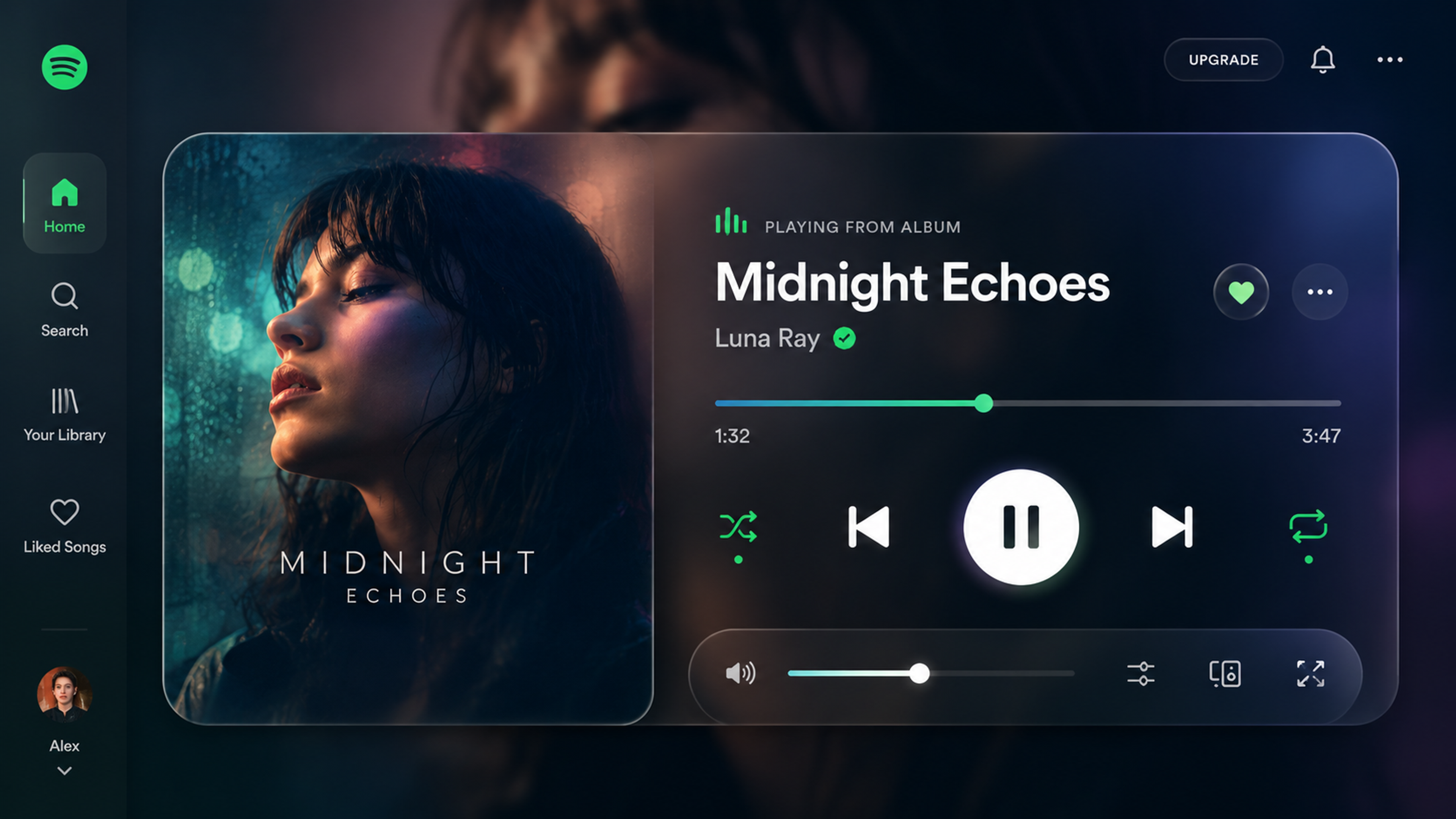
The effect creates a sense of depth without adding visual clutter, letting the album artwork set the mood while keeping the interface readable.
What makes Spotify's execution worth studying is its restraint. Glassmorphism can easily tip into excess, but Spotify applies it selectively to overlays, modals, and player controls rather than across every surface.
Glassmorphism UI Practices for Pros
This section is for designers and developers who are already comfortable with the fundamentals and want to think more carefully about implementation, performance, and where the style is heading.
Contrast Math in Dynamic Backgrounds
The beginner-level advice is to check your contrast ratios. The intermediate reality is that contrast in glassmorphic UI isn't static. The background behind your glass element changes as users scroll, switch content, or as the app state updates. A panel that passes contrast checks against one background state may fail against another.
The practical approach is to test contrast at the extreme ends of what your background can produce: the lightest state, the darkest state, and the most saturated state. If you can't guarantee 4.5:1 across all of them, add a semi-opaque scrim layer (typically rgba(0,0,0,0.3) or similar) between the background and the glass surface to create a consistent floor. This preserves the depth and layering without letting the contrast drift into inaccessible territory.
Limiting Blur Layers for Performance
Every backdrop-filter: blur() call is a separate compositing pass on the GPU. One or two glass surfaces in a view are generally fine on modern hardware. Three or more overlapping blur layers start to compound the rendering cost, and on mid-range devices, the result is visible frame drops.
A practical ceiling is two to three glass surfaces per view. If your design needs more layering than that, consider increasing surface opacity to reduce the visual demand of the blur rather than adding more blur layers. A surface at 30% opacity with a 6px blur often reads comparably to one at 15% opacity with a 12px blur, and performs better.
Dark Mode as a Separate Design Problem
Glass effects rely on the luminance contrast between the surface and the background behind it.
In light mode, a white-tinted semi-transparent surface over a vibrant background reads clearly. In dark mode, that same surface over a dark background produces almost no visible separation.
The fix is not simply inverting the colors. Dark-mode glass surfaces typically need higher opacity (moving from 10-15% up to 20-30%), adjusted border treatment (a light border becomes more important as a primary visual indicator when the blur contrast drops), and sometimes a subtle inner shadow to maintain the sense of depth. Treat dark mode as a separate material decision, not a color theme swap.
Spatial Computing and What It Means for Glass UI
Glassmorphism keeps returning because it's solving a problem that's becoming more important, not less. Flat, opaque panels work on 2D screens where depth is implied rather than real. In spatial computing environments (Apple Vision Pro, Meta's mixed-reality devices), interfaces exist in three-dimensional space. A flat opaque element in that context looks wrong because it denies the spatial environment around it.
Glass surfaces work in spatial UI because they acknowledge their environment. They pick up ambient light, show what's behind them, and recede visually when they should. The spatial computing market is projected to reach $280.5 billion by 2028, growing at 23.4% CAGR.
Apple's Liquid Glass, designed in part as a bridge between current iOS and Vision Pro interfaces, is an early production signal of where this is heading. Designers who understand glass as a material (not just a visual style) will be better positioned as spatial platforms mature.
The CSS Implementation in More Detail
The standard glassmorphism snippet is simple:
.glass {
background: rgba(255, 255, 255, 0.1);
backdrop-filter: blur(10px);
-webkit-backdrop-filter: blur(10px);
border: 1px solid rgba(255, 255, 255, 0.2);
border-radius: 16px;
box-shadow: 0 4px 30px rgba(0, 0, 0, 0.1);
}
A few things are worth understanding beyond the basic snippet. The rgba alpha value controls translucency. Lower values (0.05 to 0.15) produce a more transparent, airy surface. Higher values (0.2 to 0.4) produce a more opaque surface that performs better in dark mode and over complex backgrounds.
The blur radius controls how much the background is softened. Values between 8px and 16px work for most applications. Going above 20px produces a heavy, foggy effect that can feel oppressive rather than light. The -webkit- prefix is still needed for Safari compatibility. The box-shadow is optional but helps separate the surface from the background on flat or low-contrast backgrounds.
For production use, consider wrapping the glass style in a @supports query so browsers without backdrop-filter support fall back to a higher-opacity solid surface:
.glass {
background: rgba(255, 255, 255, 0.7);
}
@supports (backdrop-filter: blur(10px)) {
.glass {
background: rgba(255, 255, 255, 0.1);
backdrop-filter: blur(10px);
-webkit-backdrop-filter: blur(10px);
}
}
This ensures the element remains legible on browsers where the blur doesn't render.
A website that works hard across fintech, crypto, B2B, and beyond - we've done it for some of the most demanding industries out there. Yours could be next.
Read more
- Clay Global’s Work in Web Design
FAQ
What is glassmorphism in UI design?
Glassmorphism is a visual design style that makes interface elements look like frosted or tinted glass. It uses semi-transparent surfaces, a blur applied to the background behind the element, soft borders, and subtle shadows. The result is a layered, floating look where components appear to sit above the background rather than on top of it.
Is glassmorphism still relevant in 2026?
Yes. After peaking as an experimental aesthetic around 2021, glassmorphism has matured into a standard tool in production design systems. Apple's Liquid Glass, which shipped across iOS 26 and all Apple platforms in 2025, is the clearest sign that the style has moved from trend to infrastructure.
What is the difference between glassmorphism and Apple's Liquid Glass?
Glassmorphism is the broader category: any UI approach that uses translucency, blur, and layered depth to simulate glass. Liquid Glass is Apple's specific implementation, which adds dynamic light refraction, motion responsiveness, and adaptive behavior based on surrounding content.
It's more physically realistic than standard CSS glassmorphism and is deeply integrated with the operating system rather than applied as a standalone visual treatment.
How do I create a glassmorphism effect in CSS?
The core CSS is:
.glass {
background: rgba(255, 255, 255, 0.1);
backdrop-filter: blur(10px);
-webkit-backdrop-filter: blur(10px);
border: 1px solid rgba(255, 255, 255, 0.2);
border-radius: 16px;
box-shadow: 0 4px 30px rgba(0, 0, 0, 0.1);
}
This creates a semi-transparent, blurred surface with soft edges. Note that the effect requires a visually distinct background behind the element to read as glass. A plain white background will produce almost no visible effect.
Is glassmorphism accessible?
It can be, but it requires attention to contrast. Semi-transparent surfaces over shifting backgrounds can cause text to become hard to read. The WCAG 2.1 standard requires a minimum 4.5:1 contrast ratio for normal text. Test your designs against the worst-case backgrounds your app can produce, and compensate with higher surface opacity or a scrim layer if needed.
When should you not use glassmorphism?
Avoid it when your interface requires maximum clarity and sharp contrast, such as in medical software, emergency response tools, or dense professional data applications. Also avoid it when your primary audience is on older or budget-tier devices, where blur effects can cause visible performance issues.
What backgrounds work best with glassmorphism?
The blur effect needs something visually interesting to work with. Vivid color gradients, photography, and subtle animated backgrounds all produce strong results. Flat white or near-white backgrounds offer almost nothing for the blur to diffuse, which makes the effect invisible.
Does glassmorphism work in dark mode?
It can, but dark mode requires separate treatment. The effect depends on the luminance contrast between the glass surface and the background behind it. Dark backgrounds reduce that contrast significantly.
In dark mode, increase surface opacity, adjust border visibility, and test independently from your light-mode design. Don't assume the light-mode behavior carries over.
What is the difference between glassmorphism and neumorphism?
Neumorphism uses soft shadows and highlights to make elements look like they're raised or pressed into a soft physical surface, similar to molded plastic. Glassmorphism uses translucency and blur to simulate glass with visible depth behind it. Neumorphism emphasizes surface texture and tactility.
Glassmorphism emphasizes spatial layering and lightness. Both have accessibility challenges in their extreme forms, but glassmorphism is easier to adapt when contrast is managed carefully.
Does glassmorphism affect app performance?
The backdrop-filter property is processed by the device's GPU, and heavy blur effects can cause frame drops on older or lower-end hardware. Modern flagship devices handle it without issue.
For broader audiences, keep blur values moderate, limit the number of glass surfaces visible at once, and test on devices that represent the lower end of your user base.
Can glassmorphism be combined with other design styles?
Yes, and this is increasingly the standard approach in 2026. Most designers use glass selectively on overlays, modals, and floating cards while keeping primary content areas flat and unblurred. It layers well on top of almost any base style as long as the base provides enough visual richness behind the glass surfaces.
Is glassmorphism good for mobile UI?
It works well on recent iOS and Android devices. On older hardware, the performance considerations become more relevant. Mobile designs should also account for the fact that backgrounds often shift as users scroll, which can affect the legibility of text on glass surfaces if contrast hasn't been checked across scroll states.
What is the future of glassmorphism in UI design?
Spatial computing is the most likely driver of long-term glassmorphism adoption. AR and VR interfaces require UI that makes sense in three-dimensional space, and glass surfaces are better suited to that context than flat, opaque panels. Apple's Liquid Glass is an early production version of this idea.
As spatial platforms grow, glass-based UI is likely to become the expected default rather than a stylistic choice.
Conclusion
Glass UI isn't a moment anymore. It's a material with specific properties, real constraints, and staying power rooted in a genuine design problem it solves well. The question isn't whether to use it. It's whether you understand it well enough to use it on purpose.

About Clay
Clay is a UI/UX design & branding agency in San Francisco. We team up with startups and leading brands to create transformative digital experience. Clients: Facebook, Slack, Google, Amazon, Credit Karma, Zenefits, etc.
Learn moreAbout Clay
Clay is a UI/UX design & branding agency in San Francisco. We team up with startups and leading brands to create transformative digital experience. Clients: Facebook, Slack, Google, Amazon, Credit Karma, Zenefits, etc.
Learn more