A logo is often the first thing people notice about a brand — and first impressions matter. If your logo isn’t well-designed, it can send the wrong message and turn potential customers away.
That’s why it’s so important to have a logo that accurately reflects your brand, and we’re here to help you make that happen.
In this article, we’ll walk you through the steps to improve your logo’s design. You’ll discover helpful tips, techniques, and insights into the process professional logo design agencies use to create logos that are both visually appealing and effective.
What Exactly Is A Logo?
A logo is a visual representation that serves as a symbol for a company or product and is an integral part of a business's branding strategy. A logo is a critical part of what helps a business identify itself in the public's eyes.
A logo is one of the most expensive parts of a business's branding and requires the most thought and planning. A logo usually, but not exclusively, includes the company name and may or may not include an image or graphic.
A logo may or may not include a tagline and is created in an attempt to capture the holistic personality of the business. Most company logos are designs made in association with a company that employs or contracts graphic artists and designers. These artists have experience blending business personality with strategy to create designs that leave a positive, lasting impression on consumers.
Examples of Logos

A logo, alongside other business elements, is one of the most essential parts, as it contributes to the recognition and trust the business builds with customers and consumers.
A logo is designed to capture the holistic business personality that it represents. This captures the business's trustworthiness, strength, creativity, and/or friendliness, or any key traits, to create a positive impression and/or customer relationship with the business.
A logo can be placed anywhere it is needed, including websites, other social media, or marketing sites. It may be printed on product packaging and business signs. A logo must be simple and easily recognizable. It is standard practice to use a simple, clean logo design.
What Is Logo Design?
The visual representation of a business's branding through logos is known as logo design. It typically includes a combination of typography, graphical components, illustrations, and color. When successfully integrated, these elements will convey the business or product's identity.
In logo design, the goal is to balance visual appeal with the ability to be remembered and recognized. It should do all of these things, especially in crowded and competitive marketplaces. In addition, the logo should be consistent with the business's values and personality.
Starting a logo design requires extensive research to ensure it is well-designed. Designers should understand the company, research competitors, and identify the company's distinctive advantage. Doing all this research will ensure the company is well-designed when it's time to design. The logo will also make it easy to express the company's design.
A logo that has been well thought out and extensively researched becomes much more than just a symbol of the company. It tells a large part of the company's story.
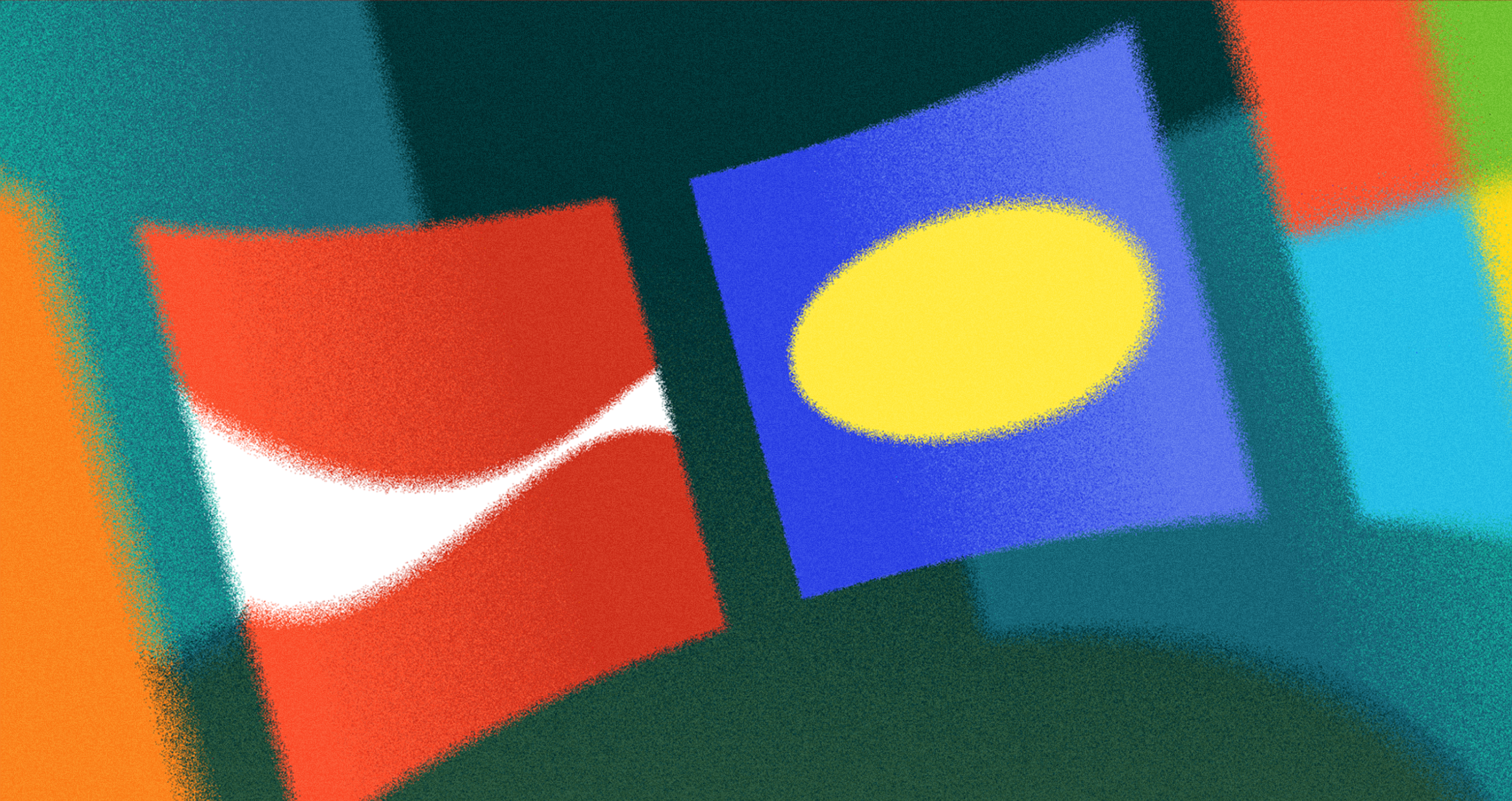
Sky Logo Concept Research

A strong logo tells a story and gives an impression almost instantly. For Web3 and crypto companies, logos become more critical because they can demystify some of the technology and build credibility in a space where trust is most needed.
When designing your logo, consider the points listed above, and you will be able to differentiate it from the competition and communicate what is unique about your company.
Why Is Logo Design Important?
A well-designed company logo is important for branding and marketing efforts. According to a study by the University of Loyola, a logo is the most important element of a company's brand identity, followed by website design and social media presence.
On top of professional recognition, logos can also help build customer loyalty by providing them with a recognizable symbol they can identify with. In addition to recognition and loyalty, logo design is important for ensuring your branding is consistent across all mediums, from print materials to website content.
This helps create a cohesive look that will make it easier for customers to find you in their searches. Logo design is essential for businesses looking to make a lasting impression on their target audience and establish themselves as an authority in their field.
Why Is a Logo Important?

How Much Does Logo Design Cost?
Logo design costs vary depending on the complexity and scope of the project. Generally, a basic logo design can range from $50 to $500 dollars, while more complex designs with custom illustrations or drawings could cost up to $2,000 or more. The cost of logo design also depends heavily on the experience level of the designer and the quality of their work.
A professional designer with years of experience in logo design may charge more for their services than a newer designer just starting out. Additionally, incorporating animation into logos will usually increase their cost as well. Ultimately, it’s essential to consider all these factors when budgeting for a logo design to ensure you get a high-quality product that meets your needs within your price range.
Source: Kostya Markevich on Unsplash
Understanding Good Logo Design
A strong logo design is the foundation of effective branding. It creates a clear system for recognition and consistent identification in the market.
Poor branding does the opposite: it leaves the wrong impression and weakens trust. The right logo captures the brand’s essence and builds positive associations through repeated exposure in marketing and advertising.
A good logo should engage the audience, stay recognizable, and remain consistent across different contexts, devices, sizes, and environments without losing its meaning.
How to Improve Your Logo Design in 5 Steps
Do Research
It's important to know who you are designing your logo for, who you want to attract, and how to appeal to them with your logo. One way to create a logo and ensure it is well-received is to research your target audience, competitors, and the industry as a whole.
Top logo design companies are known for investing time in their work to create the best results. You should do the same. There is a lot of information that you should consider at this step. If you are looking for more help, you can hire a logo design agency.
Choose The Right Colors
Using the right colors in your logo can make all the difference. Different colors can invoke other emotions from people, so you need to use colors that conjure the feelings you want people to feel when they see your logo.
Understanding color psychology is critical, and if you don’t feel you know enough about it, you can hire a logo designing agency to help you. This is important, and if you have it in your budget, you should hire professionals to help you make the right decision for your brand.
Color Wheel
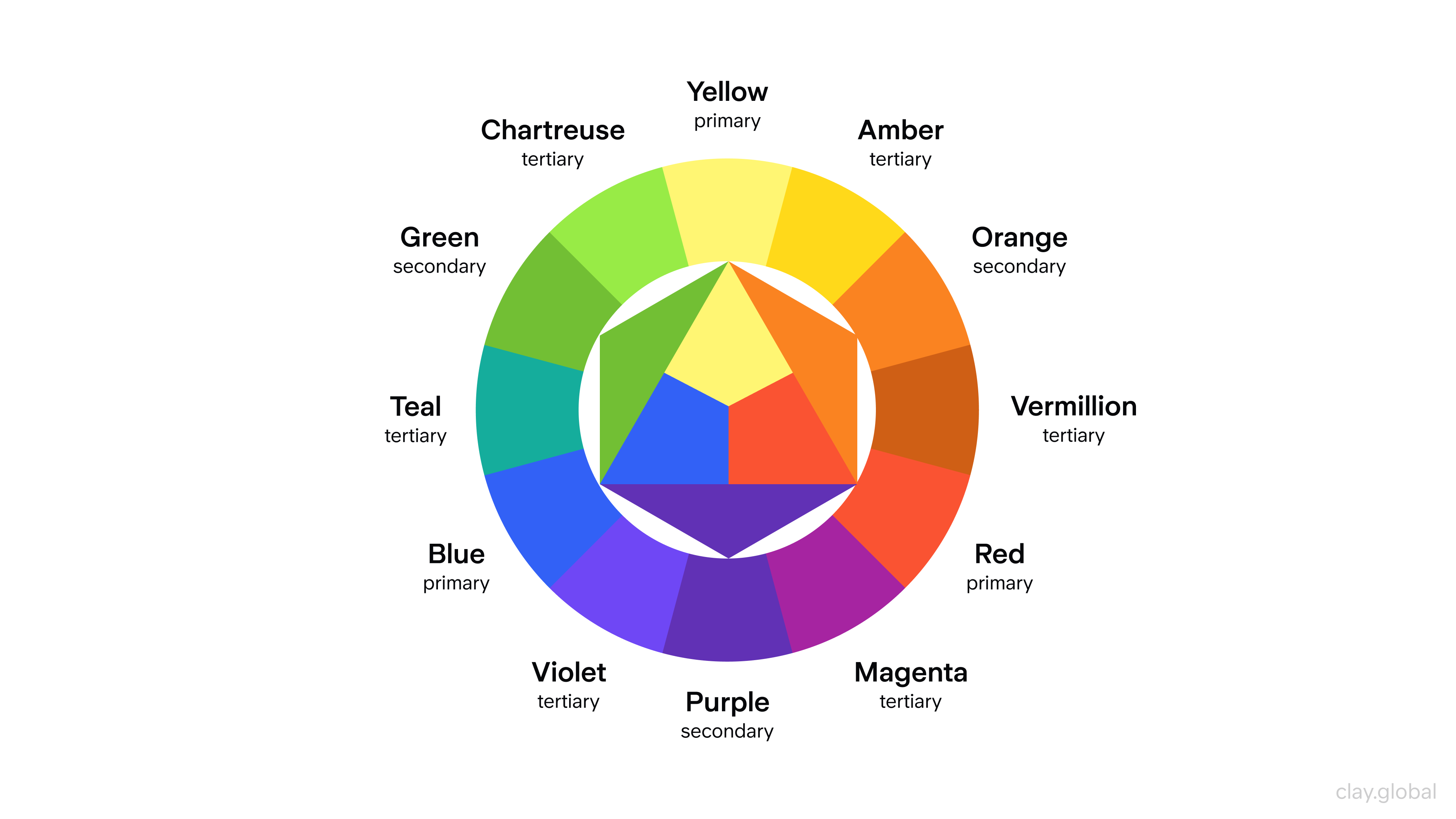
Look into what different colors represent and what they can make people feel, then decide what you want your brand story and logo to make people think. You should have already done this, but if you didn’t, then do it now. Once you have your answer, choose the colors that are the right fit for your brand.
For instance, the Wealth branding case illustrates the importance of color in conveying brand values and emotions. We carefully chose Wealth's color palette of vivid greens and yellows to reflect trust, growth, and a fresh approach to estate planning.
Combined with a versatile typography system, these colors helped create a modern yet timeless brand identity that resonates with users emotionally, ensuring the brand stands out in the competitive financial services market.
Wealth logo by Clay

How Your Logo Will Become Memorable
Logos matter for businesses of any size because they’re often the first touchpoint customers have with a brand and a key part of brand identity. A logo should be easy to recognize.
A common mistake is making logos too complex. Simplicity improves clarity and recall, which supports faster brand recognition.
Logos also shape how people feel about a brand. Color and form carry emotional meaning and help memory. To be effective, a logo should be memorable, consistent, and built with clear, purposeful visual elements and a strong idea behind them, so it leaves a lasting impression.
Source: Giorgio Trovato on Unsplash

Recognizability
When people see your logo, they should be able to recognize it instantly. If they can’t, then you need to redesign your logo. Most people will only glance at your logo and not pay too much attention; they need to remember it during this brief moment.
This is something that you need to consider when designing your logo. Logos are an essential part of a company's branding. A logo is a visual representation of a company’s brand identity design.
It needs to be recognizable so that customers can connect the brand and its products or services. Companies need to have easily recognizable logos so that customers can identify with their brand.
One way to create a recognizable logo is by using familiar shapes, symbols, and colors. Shapes like circles, squares, and triangles are familiar and can help people immediately recognize a logo.
Similarly, symbols such as stars or arrows can also be used in logos to make them instantly recognizable. Colors, too, can indicate something about the company – blue might suggest trustworthiness, while yellow might suggest optimism or warmth.
Source: Carlo D'Agnolo on Unsplash

Clarity
People shouldn’t need to figure out what your logo means. It should be apparent immediately. A simple logo will help make this possible, and that’s why you need to ensure your logo is simple enough for people to understand what it is trying to tell them instantly.
When it comes to logos, clarity is key. A good logo should be easy to recognize and remember, conveying the company's mission and purpose. Logos can be simple or complex, but all should have a clear identity that stands out.
Strong colors and bold lines can help create a memorable logo, while clever typography can add another layer of meaning and depth. The clarity in logos also means they are legible, even when scaled down to small sizes such as on business cards or websites.
Companies should ensure their logotype is easily read and understood at any size, avoiding overly intricate designs that may become illegible when reduced.

Designing For Mobile
When designing your logo, you need to think about mobile phones. Your logo must be designed to look great on mobile phones. This is easier if you have a flat and straightforward logo design, as it can be adjusted to look good on mobile and other platforms.
More people are using the internet on their mobile phones than before, meaning logo design on mobile phones needs to take priority. You don’t want your logo to look blurry or pixelated on smaller screens.
If you need help designing for mobile phones and the different screens, people will be using. You should hire one of the best design companies to ensure professionals design your logo.
Look At Successful Logos
Look at the countless logos online for inspiration to help you design a perfect logo that will look great and be received well by your target audience. If you want to improve your logo, you need to look at some of the best logos in different industries and find out why they are so popular.
Once you know what makes a logo great, you can use that knowledge to improve your own logo. Avoid mistakes made by other logos and take inspiration from what makes certain logos successful and popular.
The Jamba logo features a colorful swirl that represents movement, energy, and the blending of fresh ingredients. Its vibrant colors and modern, clean typography reflect the brand’s fun, healthy, and approachable identity — perfectly aligning with its smoothie-focused mission.
Source: id.wikipedia.org

The Balmain Paris logo is a refined symbol of luxury and heritage. Featuring bold, modern typography with a clean sans-serif font, it communicates strength and sophistication.
The inclusion of "Paris" emphasizes the brand’s French roots and high-fashion legacy, while the minimalistic black-and-white palette reinforces its timeless elegance.
Source: 1000logos.net

The Guardian logo reflects the publication’s bold and authoritative voice in journalism. With its distinctive lowercase "g" and classic serif typography, the logo balances modernity with tradition.
Its navy-blue color conveys trust and credibility, aligning with the brand’s mission to provide independent, reliable news. The clean, simple design ensures clarity and strong recognition across digital and print platforms.
Source: theguardian.com

The RadioShack logo is a nostalgic nod to the brand's legacy in consumer electronics. Featuring a bold, red “R” encased in a circle, the design is simple yet instantly recognizable.
The choice of red conveys energy and innovation, while the clean sans-serif typography reflects a straightforward, no-frills approach — fitting for a brand long associated with gadgets, components, and DIY tech.
Despite evolving with time, the logo retains its core identity, symbolizing RadioShack’s enduring presence in the electronics retail space.
Source: radioshack.com

The Worst Logo Redesigns of All Time: When Brands Get It Wrong
Logos are an essential part of a business's profile. Some changes to an existing logo can be beneficial, but others can lead to discontent and confusion.
1. Gap (2010) – A Redesign Gone in 6 Days
In 2010, Gap made one of the worst logo changes by replacing its classic blue-box logo with a plain, boring design that looked like something from a free-font website.
Gap Logo Rebrand 2010

Fans hated it so much that Gap scrapped the new look within six days and returned to the original. This is a perfect example of a bad logo redesign that nobody requested.
2. Tropicana (2009) – A $30 Million Mistake
In 2009, Tropicana lost more than $30 million due to its poor logo design choice. They have stood out on shelves with an image of an orange with a straw, but have since removed that image.
Tropicana Rebrand

They put a generic logo with their name on it, which cost them business to competitors. Before the rebranding, Tropicana was the leading company, but the logo change cost them too much.
3. Animal Planet (2008) – What Happened Here?
A bad logo design in 2008 by Animal Plant left many confused and disconnected from the design. The previous design, featuring an elephant and a globe, was a symbol of wildlife and nature, very relevant to the channel.
Animal Planet Rebrand 2008

The new design looked like a poor choice of font for a school PowerPoint presentation. It is still to this day known as one of the most poorly designed logos in television history.
4. Pepsi (2008) – The $1 Million "Smirk"
Pepsi decided to change its logo and spent $1 million to do so. The redesign was one of the most controversial logos of that time and in history.
Pepsi Logo Rebrand Example

The globe, a symbol for Pepsi, was designed to look off-balance, but many people thought it looked more like an inflated version of the smile. The change left people confused and was highly formatted for its cost.
5. Cardiff City FC (2012) – A Rebrand That Angered Fans
Picture yourself as a passionate football fan. Your team has a strong tradition, a classic logo, and an essential identity. One day, they decide to switch things up, change their logo to a dragon, and their primary color to red.
Cardiff City FC Logo Rebrand

That's what Cardiff City FC did in 2012, and fans have been furious about it ever since. They called the logo change one of the worst in sports history, and it took a ton of public outrage for the club to plaster a bluebird image on its promotional materials, showing that it at least cares a little about its fans.
6. London 2012 Olympics – An Expensive Eyesore
The London 2012 Olympics logo has been heavily criticized for its design. Many have described the logo as chaotic and visually unpleasant, and some have even gone so far as to say it resembles vulgar symbols.
London 2012 Olympics Logo

It has one redeeming quality. The 2012 Olympics logo cost over $800,000 to design and remains one of the most criticized logos in design history.
What We Can Learn from These Logo Fails
These disasters prove that not all logo redesigns are a good idea. Here’s what they teach us:
- Don't fix what isn’t broken. Many of these brands already had recognizable, successful logos. Their bad logo redesigns only alienated loyal customers.
- Test before launching. A lot of these worst logo changes could have been avoided with better market testing.
- Minimalism isn’t always better. A "simplified" bad company logo can sometimes strip away what made the original memorable.
- Listen to your audience. Tropicana, Cardiff City, and Gap paid the price when they ignored customer reactions.
From bad company logos to ugly logos that went viral for the wrong reasons, these examples prove that branding mistakes can be costly.
If you’re thinking of redesigning your logo, take a lesson from these worst logos ever — and make sure your audience is on board before you roll it out.
Read More:
Conclusion
Following the steps in this article will help you improve your business logo’s design and increase the likelihood of it being successful and correctly representing your brand. Creating a successful logo may take time and changes, but it is worth the effort.
You must ensure your logo is excellent so your branding makes a positive first impression on people. If your budget allows, you should hire a design agency to help you improve your logo. This will be worth the investment and will enhance your business’s branding.

About Clay
Clay is a UI/UX design & branding agency in San Francisco. We team up with startups and leading brands to create transformative digital experience. Clients: Facebook, Slack, Google, Amazon, Credit Karma, Zenefits, etc.
Learn moreAbout Clay
Clay is a UI/UX design & branding agency in San Francisco. We team up with startups and leading brands to create transformative digital experience. Clients: Facebook, Slack, Google, Amazon, Credit Karma, Zenefits, etc.
Learn more