Used thoughtfully, animation can enhance the user experience. Used carelessly, it can frustrate visitors and create accessibility problems. Both fans and critics of web animation have a point: motion can be a great addition when it supports your goals, but too much or poorly integrated animation quickly turns into visual noise.
In this article, we’ll cover best practices and common pitfalls when adding animation to a website. You’ll learn how to balance delight with usability across user experience, performance, accessibility, and aesthetics.
Animation can help you achieve specific objectives, such as enhancing your marketing efforts and supporting motion design strategies to engage your audience more effectively.
What Are Web Animations?
Web animations are now a core part of modern web design. Motion can bring static pages to life, adding depth, personality, and a sense of responsiveness, while also creating the illusion of movement and depth that captures user attention.
Whether you’re making simple transitions or more expressive motion moments, understanding the fundamentals matters if you want animation to help rather than distract.
Animations do more than look impressive. They can guide attention, confirm actions, explain changes, and make an interface feel alive. From subtle hover feedback to richer narrative motion that tells stories and increases engagement, the possibilities are broad. The key is to stay purposeful: good animation serves the user first.
In our Vantara case study, animation supports exploration and understanding. We used motion to support exploration and understanding. We focused on motion design and 3D design, building detailed 3D maps of infrastructure, animal habitats, and research zones so visitors could navigate the territory and grasp its scale. We kept the animation purposeful to guide attention, confirm interactions, and reveal information gradually.
Types Of Web Animations
Web animations come in many forms, and each is better for a specific job. The key is to know what role the motion plays before you add it.
- Loading animations: Reassure users that content is on the way and reduce perceived wait time. Even a simple spinner or progress bar can play while content loads to prevent frustration.
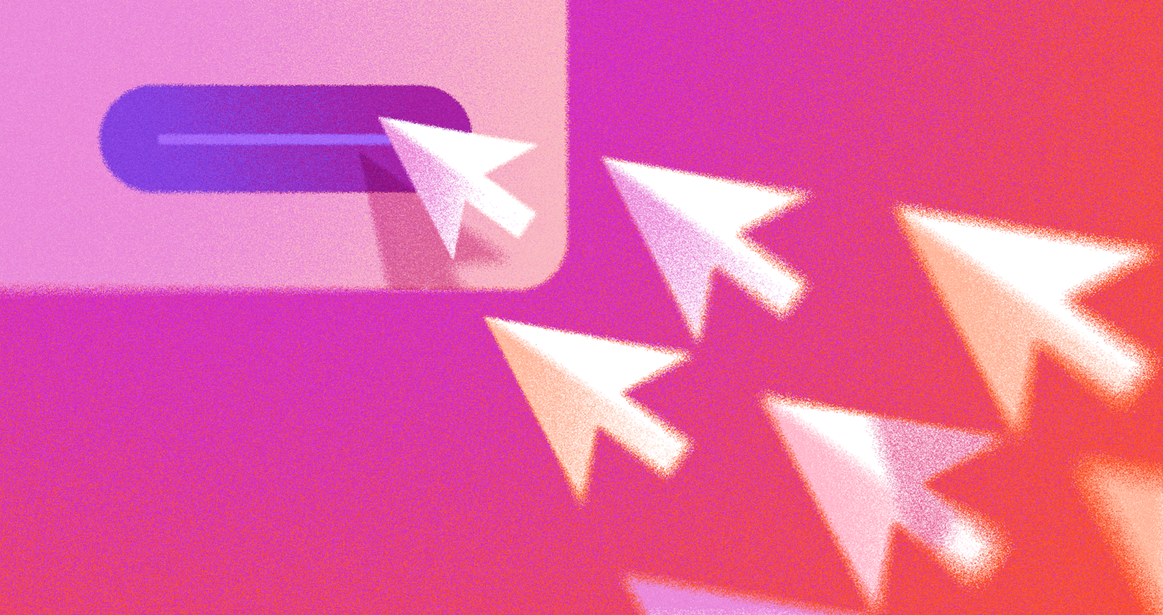
- Hover effects and microinteractions: Give instant feedback on buttons, icons, and links. Small motions make the interface feel responsive and polished without stealing focus from the content.
- Scroll-driven animations: Reveal or accent content as users move down the page. Used carefully, they support storytelling, direct attention, and add depth.
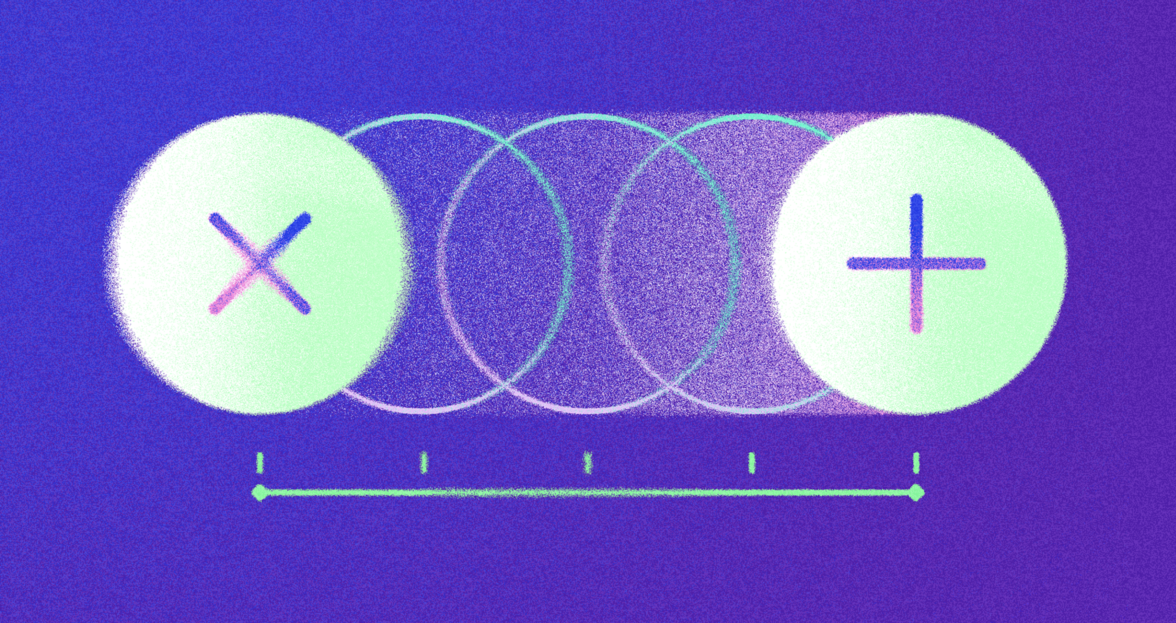
- Transitions and animated backgrounds: Smooth changes between states or sections so navigation feels less abrupt. Good transitions reduce cognitive load and maintain the flow.
- Animated characters and icons: Add personality and warmth. When used sparingly, they can support explanations, reinforce brand voice, and make products feel more approachable.
- Interactive and immersive effects: Turn static pages into rich experiences (for example, interactive 3D or complex scenes). Best for moments where extra complexity clearly supports the message.
- Navigation and link animations: Help users understand structure and state. Subtle menu reveals and link state changes show where users are and what actions are available.
You can find many inspiring examples of effective animation for websites, apps, and ads to see how motion design can boost engagement and storytelling across platforms.
In summary, animation can capture attention, guide users, and bring content to life. The best results come from picking the correct type of motion for the job and matching it to your audience, content, and performance constraints.
Role of a Motion Designer
A motion designer is at the heart of creating web experiences that truly stand out. Their expertise lies in crafting animations and motion graphics that not only capture attention but also enhance user interaction with a site.
By blending creativity with technical know-how, motion designers use tools like CSS and WebGL to transform simple web layouts into engaging, dynamic environments.
Working closely with both designers and developers, a motion designer ensures that every animation aligns with the project’s vision and goals. They focus on ensuring that motion is not just visually appealing but also functional and accessible.
Whether it’s a subtle hover effect or a complex interactive sequence, their work helps guide users, highlight essential actions, and bring life to web designs. Ultimately, a skilled motion designer can turn even the most straightforward interface into an experience that captures attention and leaves a lasting impression.
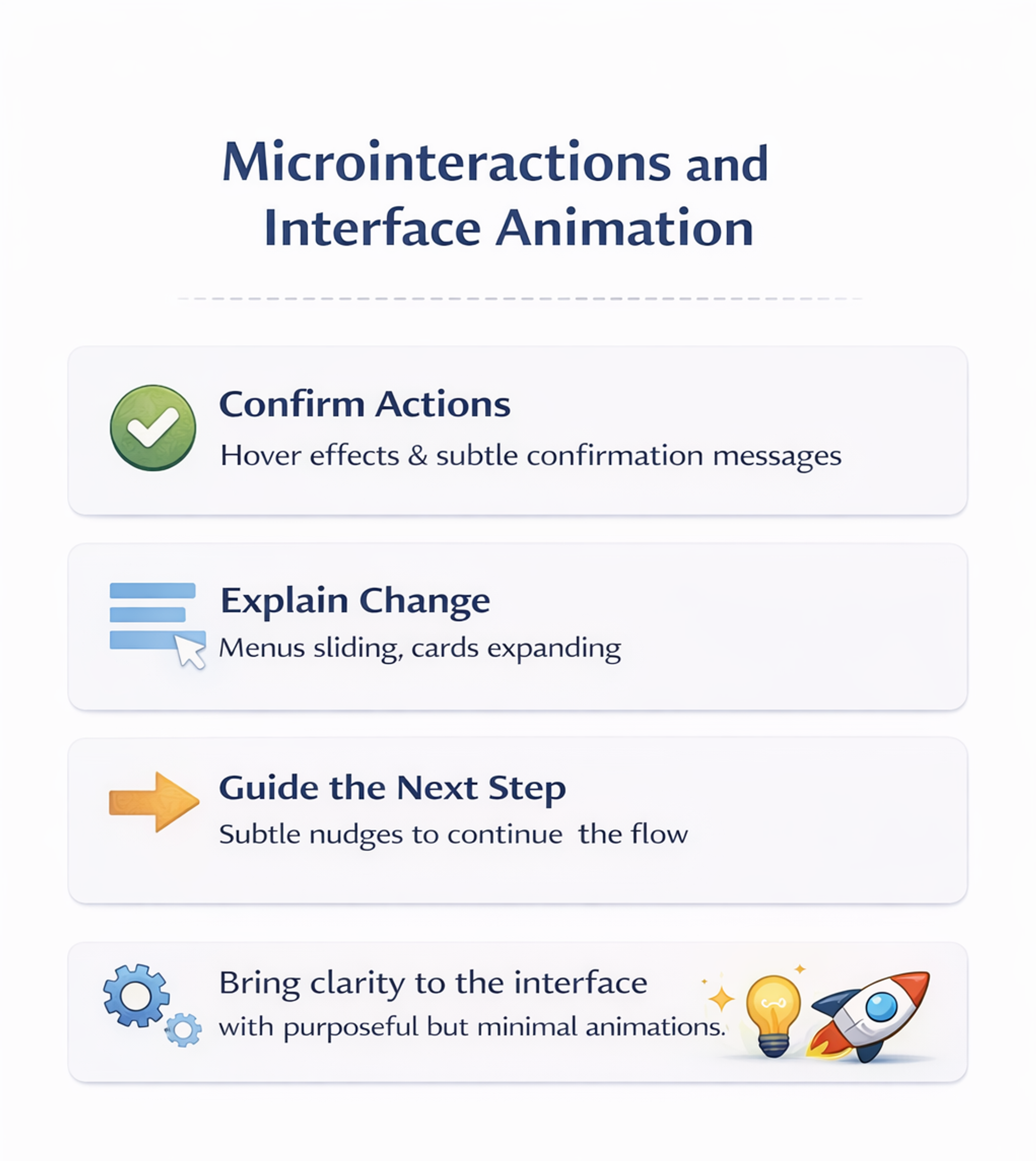
Microinteractions and Interface Animation
Microinteractions are small animations and responses that make each interaction feel smoother and more human. They often go unnoticed when done well, but they have a significant impact on how polished a product feels.
Use microinteractions to:
- Confirm actions – a button hover, press state, or a subtle “saved” message reduces uncertainty.
- Explain change – menus sliding, cards expanding, or navigation highlights help users see what just happened.
- Guide the next step – animations that gently point to a new state or option make flows easier to follow.
The key is consistency and purpose. Motion should clarify what happened and what to do next, not add noise. Modern tools make it easy to prototype these moments quickly, so focus on a few high-impact spots instead of animating everything.
Microinteractions and Interface Animation
Background and Loading Animations
Background and loading animations shape the atmosphere and usability of a site. A subtle background motion can add depth and tone, while loading animations reduce frustration by signaling progress during waits. Fun loading animations can also make the experience more enjoyable for users.
When creating these effects, prioritize simplicity, accessibility, and performance. Motion should not compete with content, and it should remain smooth across devices. If an animation creates lag, drains battery, or distracts from reading and navigation, it needs to be simplified or removed.
Using Animated Gradients
Animated gradients are a popular way to add depth, personality, and motion to modern websites. Flowing color transitions can sit in backgrounds, overlays, or even interactive elements, instantly making a layout feel more engaging and contemporary.
Use them to:
- Enrich backgrounds and surfaces so the page feels dynamic rather than flat
- Support brand identity with a recognizable color language and motion style
- Gently guide attention to key areas without overwhelming core content
With CSS and modern design tools, it’s easy to create gradients that shift and morph in subtle ways, whether you want a bold, high-energy look or a calm, atmospheric vibe.
Hero Section Animations
The hero section is often the first thing visitors see, making it the ideal place to capture attention and set the tone for your brand. Hero section animations - whether it’s a simple fade-in, a dynamic text reveal, or a striking WebGL effect - can instantly engage users and encourage them to explore further.
Designers use these animations to introduce a brand’s personality, highlight key messages, or memorably showcase products. With tools like CSS and WebGL, it’s possible to create everything from subtle, elegant transitions to bold, interactive experiences.
The key is to match the animation style to your brand’s identity and keep the effect purposeful - drawing attention without distracting from the main message. When done right, hero section animations make a website feel modern, engaging, and ready to impress from the very first glance.
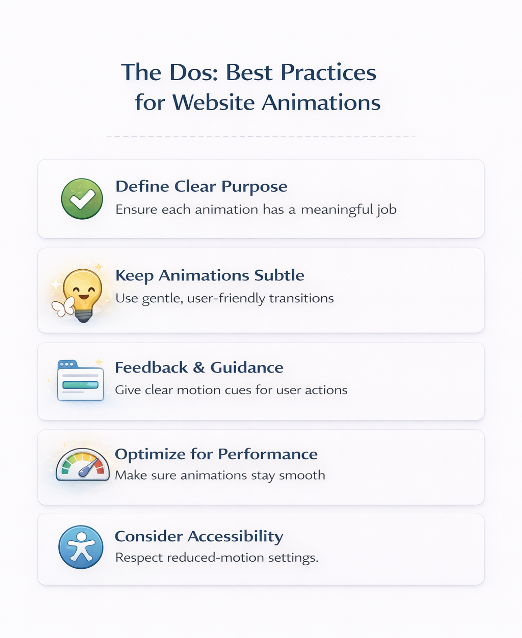
The Dos: Best Practices for Website Animations
- Define a clear purpose for each animation: Each animation should serve a purpose, not just look stylish. If it doesn’t help the user clearly, it probably doesn’t belong. Use animation to draw attention to key actions, confirm state changes, or reinforce the story your interface is telling. If you can’t describe the benefit in a specific, testable way, the effect risks becoming a distraction.
- Keep animations subtle and user-friendly: With motion, less is usually more. Long, showy sequences steal attention and slow people down. Favor short, gentle movements that support the interaction without calling attention to themselves. Aim for consistent behavior across the site so similar elements feel related. Use smooth easing so motion feels natural rather than sharp or jumpy.
- Use motion for feedback and guidance: Some of the best animations are functional. Small motion cues can confirm a click, indicate progress, or show that content has updated. These microinteractions reduce uncertainty and make the interface feel responsive.
- Optimize animations for performance: Great motion is useless if it makes the site feel slow or stuttery, especially on older devices. Prefer lightweight, native approaches and avoid techniques that trigger expensive layout work. Choose animation methods that stay smooth and avoid blocking interaction. Understanding code can help you create more efficient, performant animations and collaborate better with developers.
- Consider accessibility and give users control: Motion affects people differently. Intense animation can cause discomfort for motion-sensitive users. Avoid flashing, aggressive movement, and overly dramatic parallax effects. Respect system-level reduced-motion preferences and provide a straightforward way to reduce decorative animation when possible.
Designers can also take advantage of free tools and resources to create, export, and manage animation files efficiently for their web projects.
The Dos: Best Practices for Website Animations
The Don’ts: Common Pitfalls to Avoid
- Don’t overdo it or animate without purpose: Too many moving elements create chaos and compete with content. Motion should support tasks, not fight them. Avoid getting started with animation before defining clear goals - begin with a plan to ensure each animation serves a purpose. A small number of well-placed animations can improve clarity, while constant movement can overwhelm and annoy.
- Don’t let animations slow down the site: Heavy assets and complex sequences can hurt load time and responsiveness. If an effect looks smooth on a powerful desktop but stutters on typical phones, it needs to be simplified.
- Don’t ignore reduced-motion preferences: Some users are motion-sensitive or dislike animation. Forcing full motion on everyone is a mistake. Respect reduced-motion settings and offer ways to tone down non-essential motion.
- Don’t animate text or critical content: Avoid moving paragraphs, flashing copy, or shifting form fields while someone is trying to read or type. Never rely on animation alone to communicate important information. Pair motion with clear labels, stable layouts, and accessible cues.
Animation Trends and Future
Animation in web design is evolving fast as technology and user expectations change. Motion is no longer just decoration – it’s a core part of how interfaces communicate, guide, and feel.
Current trends include:
- Microinteractions that give instant feedback on small actions
- Scroll-triggered effects that reveal content and support storytelling
- Immersive 3D and WebGL graphics that add depth and playfulness when performance allows
Looking ahead, animation will be shaped by:
- AR and VR, bringing more spatial, environment-aware experiences to the web
- AI-driven tools, helping generate, adapt, and personalize motion for different users and contexts
At the same time, accessibility is becoming a central constraint rather than an afterthought. Designers are expected to:
- Respect motion preferences (like reduced motion settings)
- Avoid overwhelming or harmful effects
- Keep experiences comfortable, inclusive, and clearly understandable
To stay ahead, motion designers and developers need to keep learning and testing in real products, pushing the boundaries of what’s possible while staying focused on one goal: animation that makes interfaces more engaging, effective, and genuinely user-friendly.
FAQ
How Do I Decide Whether an Animation Is Worth Adding?
Add it only if it improves a specific user moment, such as feedback, guidance, or an apparent state change.
Measure impact using behavior signals like clicks on the primary action, form completion, error reduction, drop-off changes, or usability testing observations.
What Timing and Motion Style Help Animations Feel Smooth, not Distracting?
Keep motion brief, consistent, and restrained. Use gentle easing and avoid attention-grabbing bounces unless they communicate meaning. Establish a shared rhythm across components to make the site feel coherent.
How Do I Keep Animations Responsive on Real Devices?
Favor animation techniques that don’t trigger expensive layout recalculations. Keep assets lightweight, delay non-essential motion, and test on mid-range devices to catch stutter and interaction lag early.
How Do I Make Motion Accessible While Respecting User Preferences?
Respect reduced-motion preferences by removing decorative animation and using instant changes or minimal fades. Avoid flashing and aggressive scroll effects. Provide an easy way to reduce motion when motion is a strong part of the brand.
What Should I Avoid Animating Because It Harms Usability?
Avoid animating long text, critical information, and form fields while users interact. Don’t move targets people are about to click or tap. Never make animation the only cue. Combine it with clear labels and stable states.
Read more:
Conclusion
When done with care, animation can make a website feel more immersive and alive without harming usability. The rule is simple: animate with intent. Use motion to highlight what matters, provide feedback, and add personality, but never at the expense of clarity, speed, or accessibility.
Before adding an effect, ask whether it genuinely improves the experience, stays smooth across devices, and remains comfortable for users who prefer less motion. A small number of purposeful animations can elevate a site. Too many can push users away

About Clay
Clay is a UI/UX design & branding agency in San Francisco. We team up with startups and leading brands to create transformative digital experience. Clients: Facebook, Slack, Google, Amazon, Credit Karma, Zenefits, etc.
Learn moreAbout Clay
Clay is a UI/UX design & branding agency in San Francisco. We team up with startups and leading brands to create transformative digital experience. Clients: Facebook, Slack, Google, Amazon, Credit Karma, Zenefits, etc.
Learn more