
Good design is more complex to notice because it fits needs so well that it becomes invisible, which is why a strong UX design team is crucial. This principle explains why focusing on principles matters more than focusing on processes.
Every design team and its team members have tools, rituals, and processes. Some run dual-track agile, others follow design sprints, and some combine both approaches. The specifics matter less than the principles behind them. Whether teams follow design thinking or traditional processes, these principles provide practical guidance for daily work.
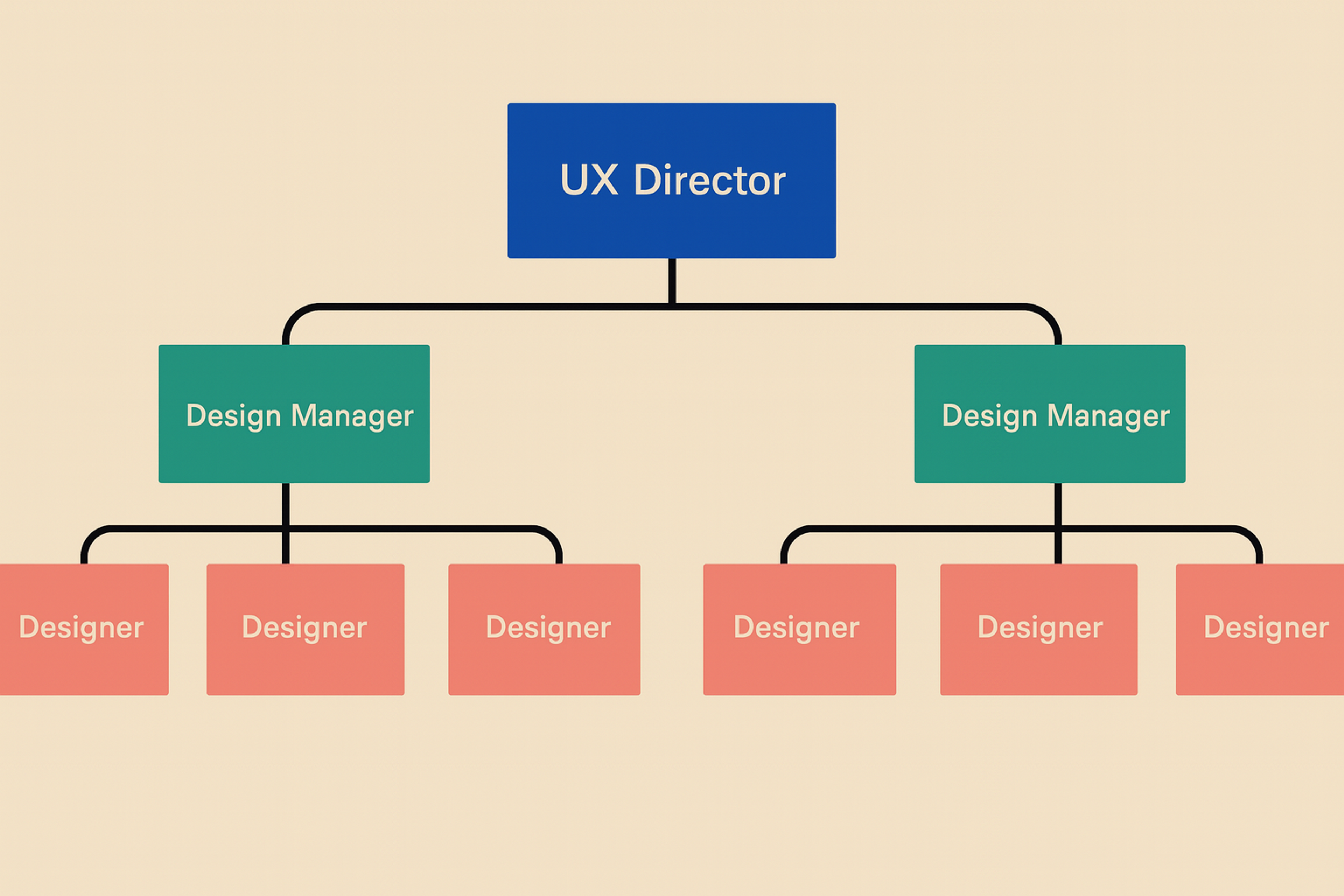
A strong UX team is essential for delivering user-centered products. The structure, collaboration, and key UX roles within the team have a direct impact on the quality of the user experience.
UX agencies can also play a major role in achieving the same outcomes, especially when an in-house team is small, overloaded, or still developing. They bring proven expertise, established methods, and cross-industry perspective, helping teams move faster without sacrificing quality.
This article outlines fundamental UX design principles and enhances UX knowledge that any team can apply, regardless of industry, size, or maturity.
UX Design Team
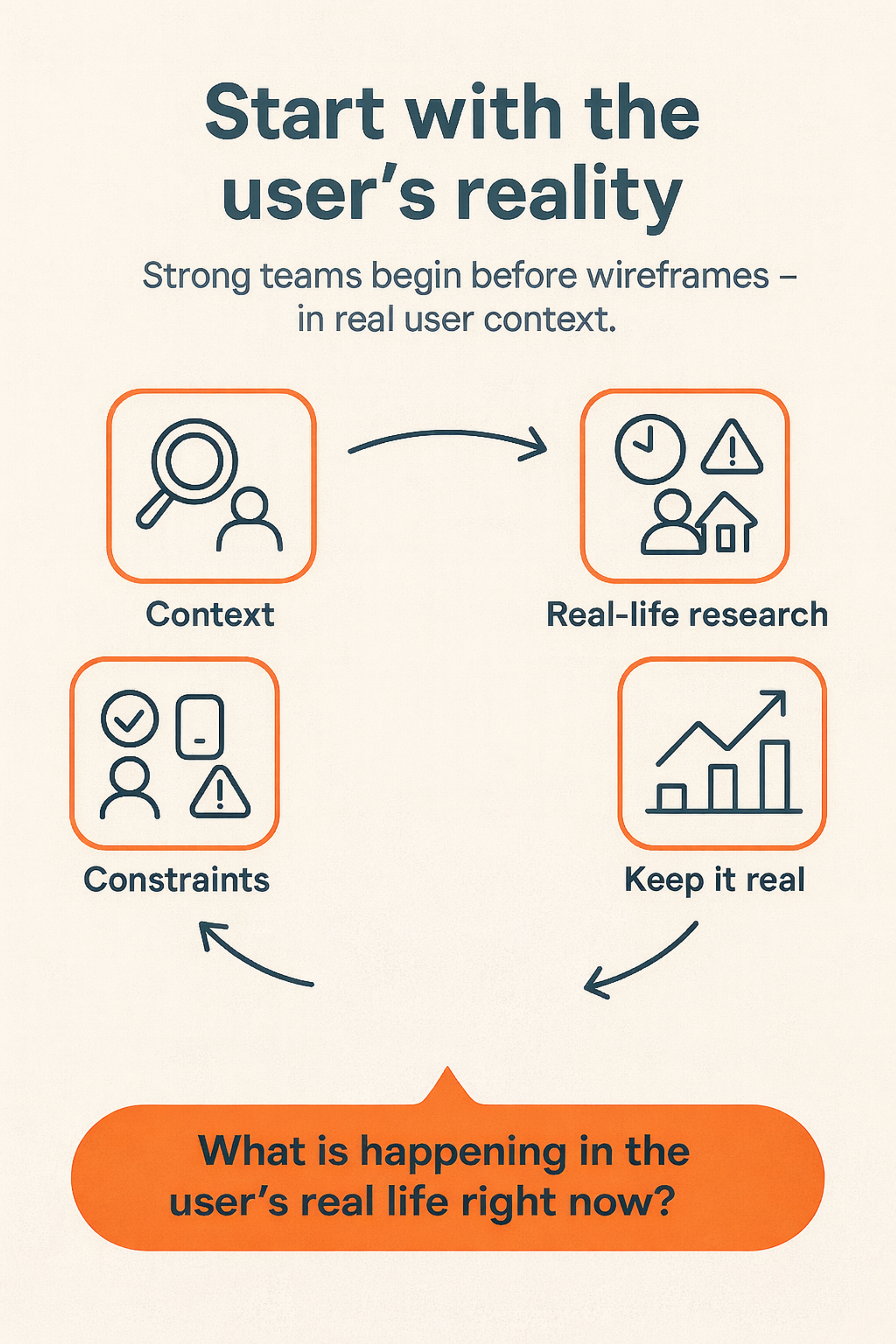
Start With User Research and The User's Reality, Not Your Ideas
Strong teams start earlier than wireframes or trendy patterns, and a cohesive team is essential in this process. They begin with the user's reality.
That means understanding context: where users are, what they're trying to do, what pressures they feel, and what success means to them. It also means understanding constraints: time, device, environment, and mental load.
Designers should conduct research and study behavior in real contexts rather than only in lab settings. Utilize contextual inquiry and in-situ observation, as well as diary studies, to capture experiences over time. Conducting user research is essential for identifying target users and understanding their user needs.
User research at this stage helps teams gather insights directly from target users and create user journey maps, ensuring that user needs are clearly defined and addressed throughout the design process. Understanding users early reduces the risk of costly redesigns later.
Ways to keep this principle alive include regularly communicating with users, not just at the project's outset. Capture real quotes, screenshots, and behaviors instead of relying on assumptions. Map user journeys to see how a single screen fits into a larger flow.
When the team is tired or stuck, asking what is happening in the user's real life at this moment often unlocks the next decision.
Start With User Research
Define Problems Clearly Before Designing Solutions
A beautiful interface that solves the wrong problem is still a failure.
Before jumping into design tools, a UX director and the team should align on a few core questions:
- Who is the primary user for this feature?
- What exactly is the problem or friction point we’re solving?
- How will we know that we’ve actually solved it (what does success look like)?
Research and user insights help uncover real pain points. When you clearly define the problem, you can prioritize features based on their measurable impact, rather than opinions.
With a clear problem statement, the team can:
- Prioritize features by impact rather than the loudest voice in the room
- Evaluate design options against a concrete goal
- Communicate trade-offs to product and engineering in simple, specific terms
The team should always be able to point to a problem statement and say: “This is what we’re working on and why this screen exists.”
Design As A Team Sport
Design does not happen in isolation. Product managers, engineers, marketers, support teams, and stakeholders all shape the experience. In cross-functional teams, UX works closely with these partners to keep alignment and ensure the experience feels consistent across the organization.
Strong collaboration shows up in everyday practices:
- Designers share work early, even when it’s still rough
- Engineers join design reviews and highlight technical constraints
- Customer support shares what people actually complain about
- Product and design align on success metrics and acceptable trade-offs
Communication is more than meetings. It’s also:
- Clear documentation in design files
- Simple visual explanations of flows
- Short, plain-language rationales for decisions
A good test: if someone joins the project mid-way, can they understand what you’re doing and why just by reading the design file?
If yes, your collaboration practices are working.
Consistency Through Design Systems
Consistency isn't about making every screen look the same. It's about creating predictable patterns so users don't have to relearn how your product works in every new flow.
A design system enforces consistent patterns by utilizing reusable components and collaborating with external teams. It helps teams reuse components instead of redesigning from scratch. It maintains consistent spacing, typography, and colors. It moves faster without sacrificing quality.
Teams report significant efficiency gains after establishing component libraries, with compound benefits as systems mature. A centralized UX team, working closely with a visual designer responsible for the visual elements and aesthetics, plays a crucial role in maintaining a consistent user experience across all products.
A design system is more than just a component library. Strong teams define usage guidelines for when to use each component and when not to use it. They document edge cases and examples, not just happy path states. They treat the system as a living product with its own roadmap.
The principle is simple. Consistency is a user benefit first, and a team efficiency benefit second. When users immediately understand a new screen because it feels like an extension of the product, your design system is doing its job.
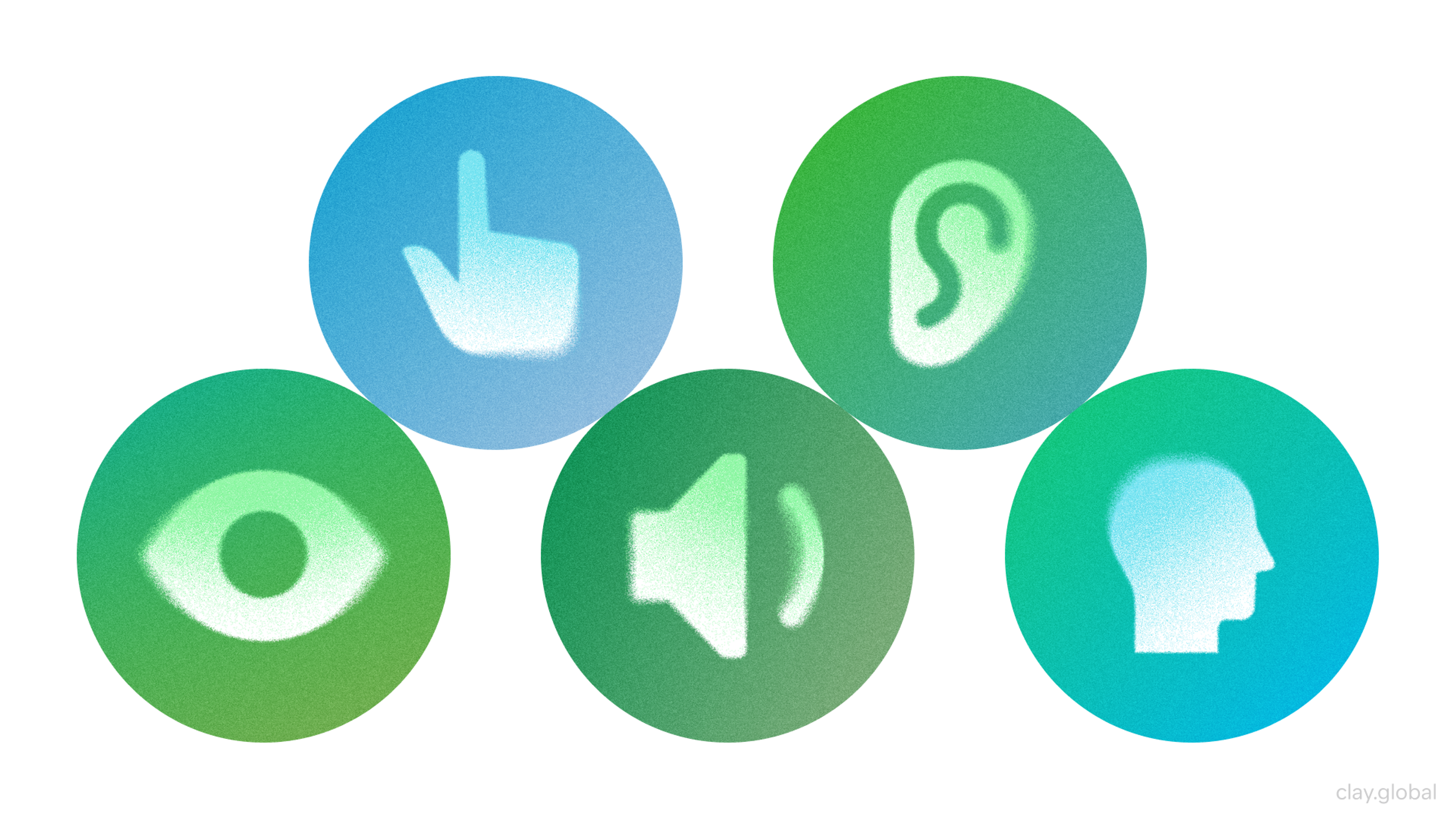
Accessibility By Default, Not As An Afterthought
Accessibility isn't just a nice bonus at the end of a project that user experience specialists can ignore. It's the foundation for creating a user-friendly product. Ensuring that the user interface is accessible to every end user is crucial for creating an inclusive digital experience.
Accessibility Elements by Clay
WCAG 2.1 Level AA provides the baseline standard for accessible digital experiences. Design teams that bake accessibility into everyday work choose color combinations with sufficient contrast, at least 4.5:1 for body text.
They use a clear hierarchy with proper headings, obvious focus states, and clear labels. They design interactive elements large enough to tap comfortably, at least 44x44 pixels. They write clear, concise copy so people don't have to decode the interface.
Accessibility also means considering different modes of use. Screen readers need ARIA labels to understand interactive elements. Keyboard navigation requires a logical tab order. Low-bandwidth or older devices need performance optimization. Situational constraints, such as bright sunlight or noisy environments, need consideration.
Iterate Relentlessly
No design is perfect on the first release. Strong teams treat launch as the beginning, not the end.
An iterative mindset is shipping minor, coherent improvements instead of massive, risky redesigns. It means running experiments where it makes sense and learning from them. It means keeping a backlog of experience improvements and refining them as you go. Incremental improvements compound over time, reducing risk while building confidence in what actually works.
Iteration is not just about speed. It's about reducing risk by testing your ideas in the real world. User testing plays a crucial role in validating and refining design iterations, ensuring that changes truly address user needs and improve usability. It's about building confidence that changes actually help users and metrics. It's about creating a culture where improvement is continuous, not reactive.
The team should regularly revisit shipped features and ask what we expected to happen, what actually occurred, and what adjustments we should make next.
Content Is Part Of The Interface
Interfaces are not just boxes and icons. They are words.
Microcopy includes button labels, field names, empty states, error messages, and tooltips. It often decides whether users understand what’s happening or feel confused and stuck.
Teams that treat content as a first-class citizen bring writers or content designers into projects early. UI designers and content designers work together to shape interfaces that are both visually clear and easy to understand. They avoid vague jargon and instead write short, precise, human copy. They also keep the product’s voice consistent across all flows.
Some simple rules for strong microcopy:
- Tell users what will happen before they click
- Explain what went wrong and how to fix it
- Avoid blame and reduce anxiety, especially in payments, account changes, or data loss flows
Good microcopy guides, reassures, and sets expectations. And when the team is choosing between a clever line and a clear one, clarity should almost always win.
Visual Clarity, Hierarchy, And Simplicity
Visual design is not decoration. It shapes how quickly users understand what to do.
Strong teams utilize visual design to guide attention through a hierarchy by leveraging elements such as size, weight, contrast, and spacing. They group related elements and separate unrelated ones.
They make the primary action obvious and secondary actions available but quieter. Interaction designers play a key role in shaping user flows and visual hierarchy, ensuring that users can navigate interfaces intuitively and efficiently.
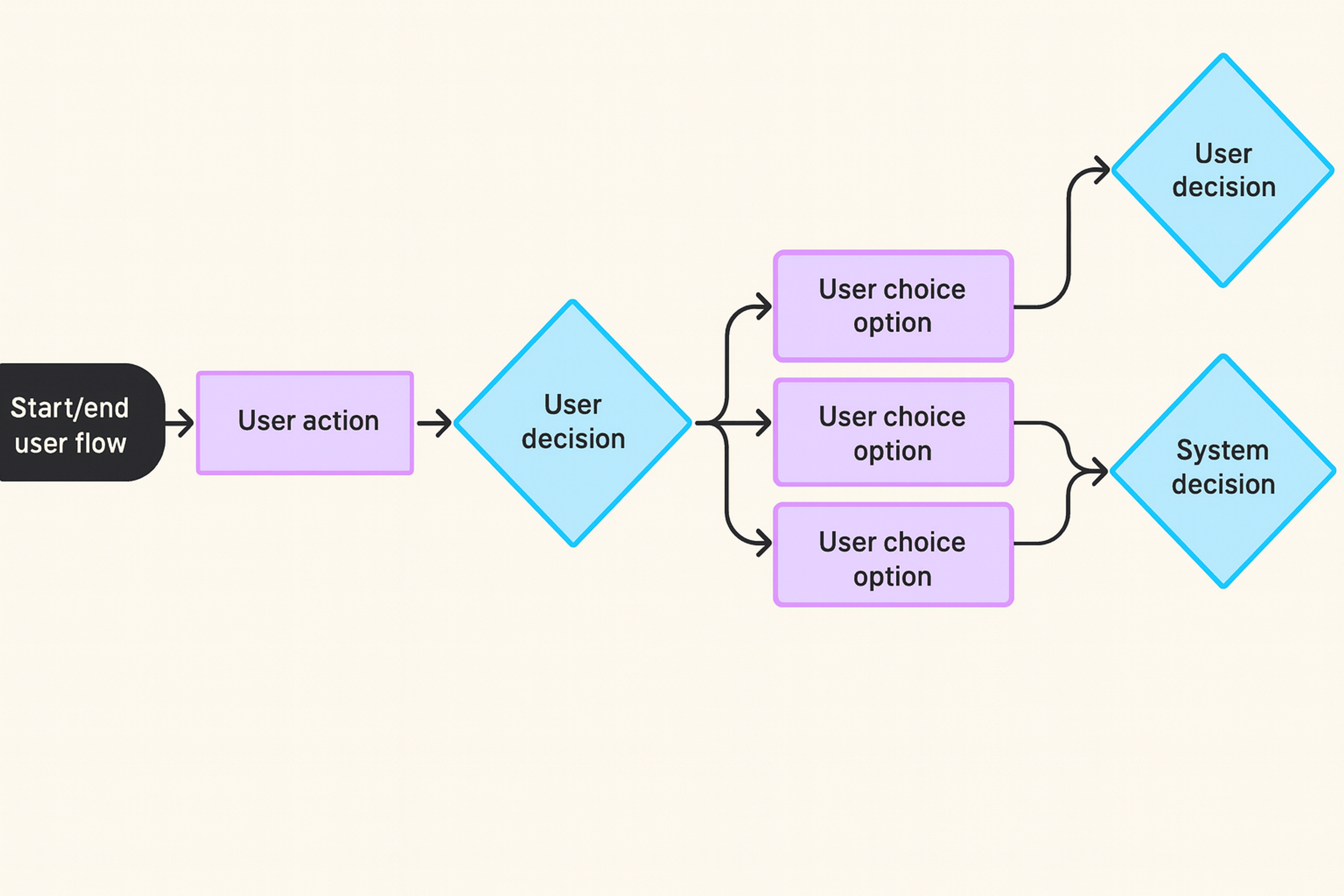
User Flow
The essence is simple: the interface shouldn't make people think. Simplicity isn't minimalism for its own sake, especially when collaboration with development teams is involved.
It means only what's necessary is on screen. Each screen supports a single primary goal. Visual complexity is appropriate only when it serves a purpose, such as showing relationships or status.
A practical rule is that if everything looks essential, nothing is important. The job of visual design is to help users instantly see what matters.
Sustainable Design Ops
Great ideas fail when they're lost in chaos. Design operations ensure the team's work remains sustainable as the product and organization grow.
Strong teams put structure in place so that people can focus on solving problems, rather than searching for files or specifications. For example, they:
- Define clear file structures and naming conventions in design tools
- Use handoff checklists that cover edge cases, responsiveness, states, and specifications
- Create shared templates for user flows, prototypes, and research reports
An effective team structure also supports collaboration across multiple product teams and projects. It facilitates maintaining consistency, sharing expertise, and enhancing the team's skills through ongoing professional development.
Design Ops is not bureaucracy. Done well, it:
- Reduces repeated questions from developers and stakeholders
- Helps new team members ramp up faster
- Prevents subtle inconsistencies and regressions over time
Quality assurance is a core part of this. Designers should review implemented features against the design, check "hidden" states like loading, error, empty, and success, and validate on key devices and environments, not just the ideal setup.
The result is a smoother, more reliable path from idea to production.
Feedback Culture And Continuous Learning
Teams that grow quickly share feedback openly and learn constantly, which helps them gain valuable insights.
A healthy feedback culture includes regular design critiques focused on the work, not the person. It means clear, specific comments instead of vague reactions. It means equal space for juniors and seniors to contribute ideas.
For junior designers, this environment presents unique challenges and valuable learning opportunities, as they often face high expectations and must quickly develop skills while managing full design responsibilities, all while benefiting from mentorship and constructive feedback.
Continuous learning can be as simple as show-and-tell sessions, where people share a pattern, a product, or a case study. It can be short internal write-ups on what was learned from a project or experiment. It can be time allocated for exploring new tools, methods, or accessibility guidelines.
The key is psychological safety. Designers must feel safe sharing unfinished ideas, admitting uncertainty, and adjusting their direction when they learn something new.
FAQ
What Are the Core Principles of Effective UX and UI Design?
Effective UX and UI design is guided by principles that help teams make consistent, user-centered decisions. These include understanding real user contexts, clearly defining problems, collaborating across disciplines, maintaining consistency with design systems, and integrating accessibility into every step of the process. These principles serve as a compass for teams to deliver exceptional user experiences , regardless of the tools or methodologies they use.
Why Should UX and UI Teams Start With the User's Reality?
Teams should begin with real user behavior because it prevents designing solutions based on assumptions. Observing users in their actual environment reveals context, constraints, and motivations that early research can easily miss. This leads to more explicit problem definitions, better research insights, design decisions, and far fewer costly redesigns later.
Why Is a Clear Problem Statement Essential in UX and UI Work?
A clear problem statement aligns teams around who the feature is for, what the specific friction is, and how success will be measured. It keeps design work focused on measurable impact instead of opinions. Teams that define problems precisely deliver better solutions and move faster with fewer revisions.
How Do Design Systems Help UX and UI Teams Work Better?
Design systems improve predictability and usability by creating consistent patterns across products. They contain reusable components, spacing rules, typography scales, and usage guidelines. This helps users quickly understand new screens and enables teams to work more efficiently without compromising quality. Consistency becomes a user centric mindset, user benefit and an efficiency benefit.
Why Is Iteration Critical for UX and UI Design Teams?
Iteration ensures that the design does not stop at launch. Continuous improvement based on user feedback and real-world data enables teams to refine features, mitigate risk, and validate what actually works. Small, ongoing adjustments compound over time into significant improvements in usability, conversion, and overall product quality.
Read more:
Conclusion
Principles only matter if they show up in daily work.
For a design team, that means referring back to users and problem statements in every discussion. It means utilizing the design system and refining it when you identify gaps. It means considering accessibility, content, and data from the first sketches. It means reviewing shipped work and iterating, rather than moving on forever. It means giving and receiving feedback as a regular, respected part of the process.
You don't need to adopt every principle at once. Start with one or two that feel most urgent for your team. Turn them into concrete rituals, such as checklists for reviews, agenda items in weekly syncs, or prompts in your design templates.

About Clay
Clay is a UI/UX design & branding agency in San Francisco. We team up with startups and leading brands to create transformative digital experience. Clients: Facebook, Slack, Google, Amazon, Credit Karma, Zenefits, etc.
Learn moreAbout Clay
Clay is a UI/UX design & branding agency in San Francisco. We team up with startups and leading brands to create transformative digital experience. Clients: Facebook, Slack, Google, Amazon, Credit Karma, Zenefits, etc.
Learn more