
Your product already has user flows. Every product does. The only question is whether anyone on your team has looked at them, or whether they assembled themselves out of a year of individual screen decisions that nobody stitched together.
That gap is where most conversion problems live. A signup form tests beautifully in isolation and still bleeds users, because the person hitting it arrived from a paid ad expecting something else and now faces a password requirement nobody warned them about.
No single screen is broken. The path between them is.
A user flow is the artifact that makes that path visible before you build it.
Key Takeaways
- A user flow maps the steps, decisions, and system responses between a user's entry point and their goal, including the paths where things go wrong.
- The unhappy path matters more than the happy path. Most flow diagrams skip it, and most production bugs live there.
- Map flows that branch, carry consequence, or cross teams. Skip flows that are linear and low-stakes.
- User flow, task flow, wireflow, and user journey are four different artifacts with four different jobs. Picking the wrong one wastes a week.
- Baymard Institute puts average cart abandonment at 70.22% across 50 studies, with checkout-design fixes worth an average 35.26% conversion lift. Flow structure is a large share of that.
- AI agents now traverse your flows alongside humans, and they fail at different points.
What a User Flow Is
A user flow is a diagram of the route a person takes through your product to finish one task. It captures three things: the steps they take, the points where the path splits, and what the system does back at each stage.
That third element is what separates a user flow from a wish list of screens. Nielsen Norman Group describes user flows as capturing key user steps and system responses without contextualizing them with emotion or thought, which is exactly right.
Reading the Notation
Flow diagrams borrow their notation from process flowcharts, and the convention is stable enough that most teams can read each other's work without a legend:
UX User Flows
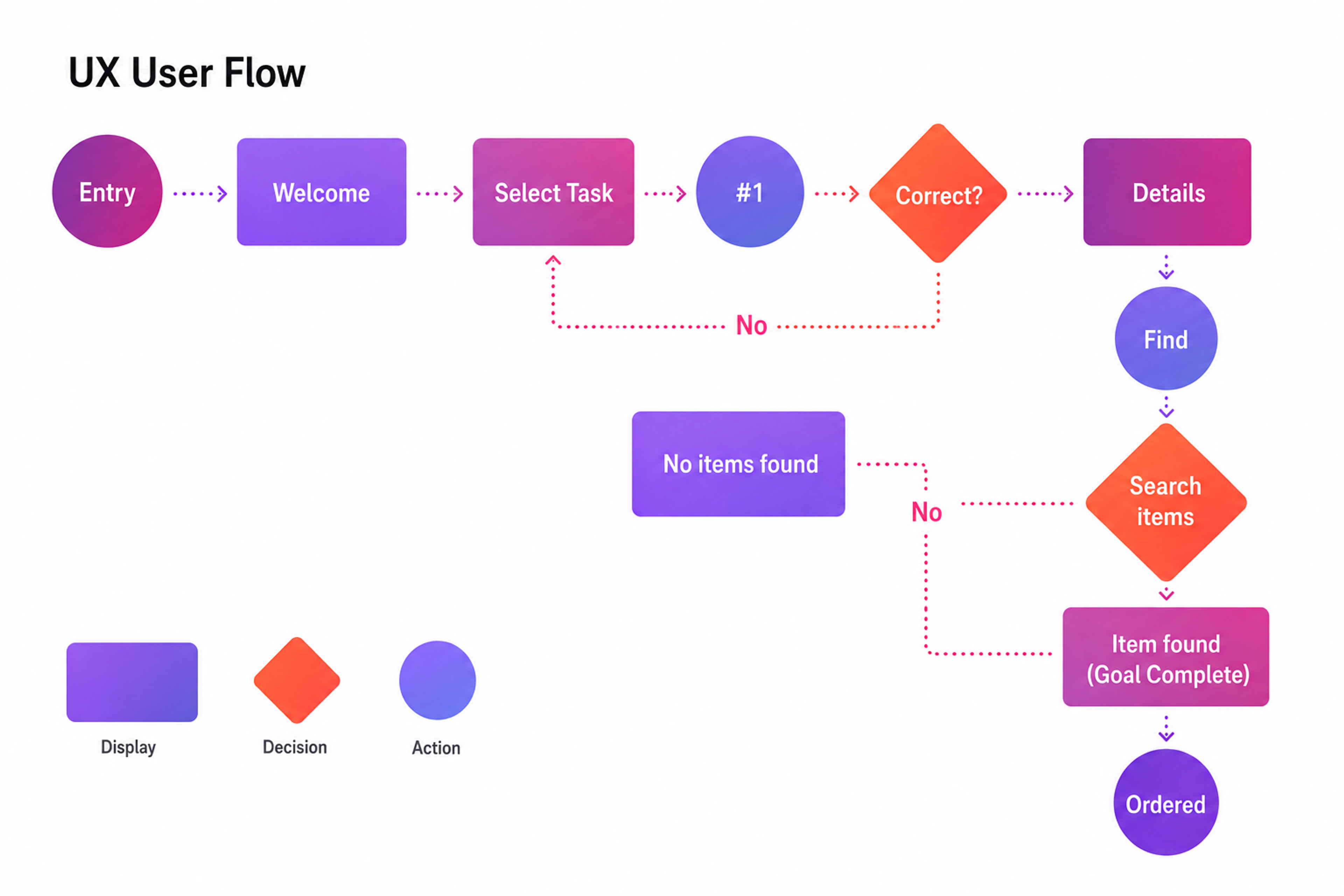
- Oval or rounded rectangle: a start or end point. The entry into the flow, and the completed goal.
- Rectangle: a screen, page, or state the user lands on.
- Diamond: a decision or branch. Something splits here, either because the user chose or because the system evaluated a condition.
- Arrow: direction of travel. Two arrows out of one diamond, labeled with the condition each represents.
The discipline that matters is labeling your arrows. An unlabeled branch out of a diamond is a decision you haven't actually made yet, and it will surface as a question during the development sprint instead.
Types of User Flows
Most articles classify flows by what the diagram looks like. That's the wrong axis, because it tells you nothing about what to do next. Classify by shape instead, because shape predicts where the flow will fail.
Linear Flows
One path, no branches. Log in with known credentials, confirm an email address, run a single-field search.
Linear flows have exactly one failure mode: step count. There's nowhere to reroute a struggling user, so every additional step is a straight subtraction from completion. If you're auditing a linear flow, the only question worth asking is which step you can delete.
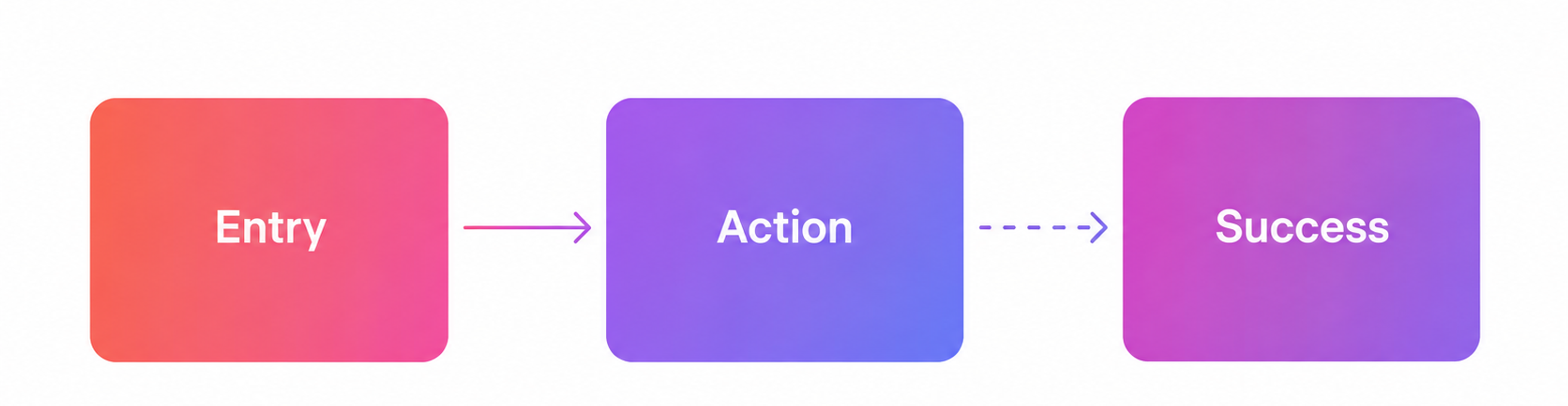
Task Flow Example
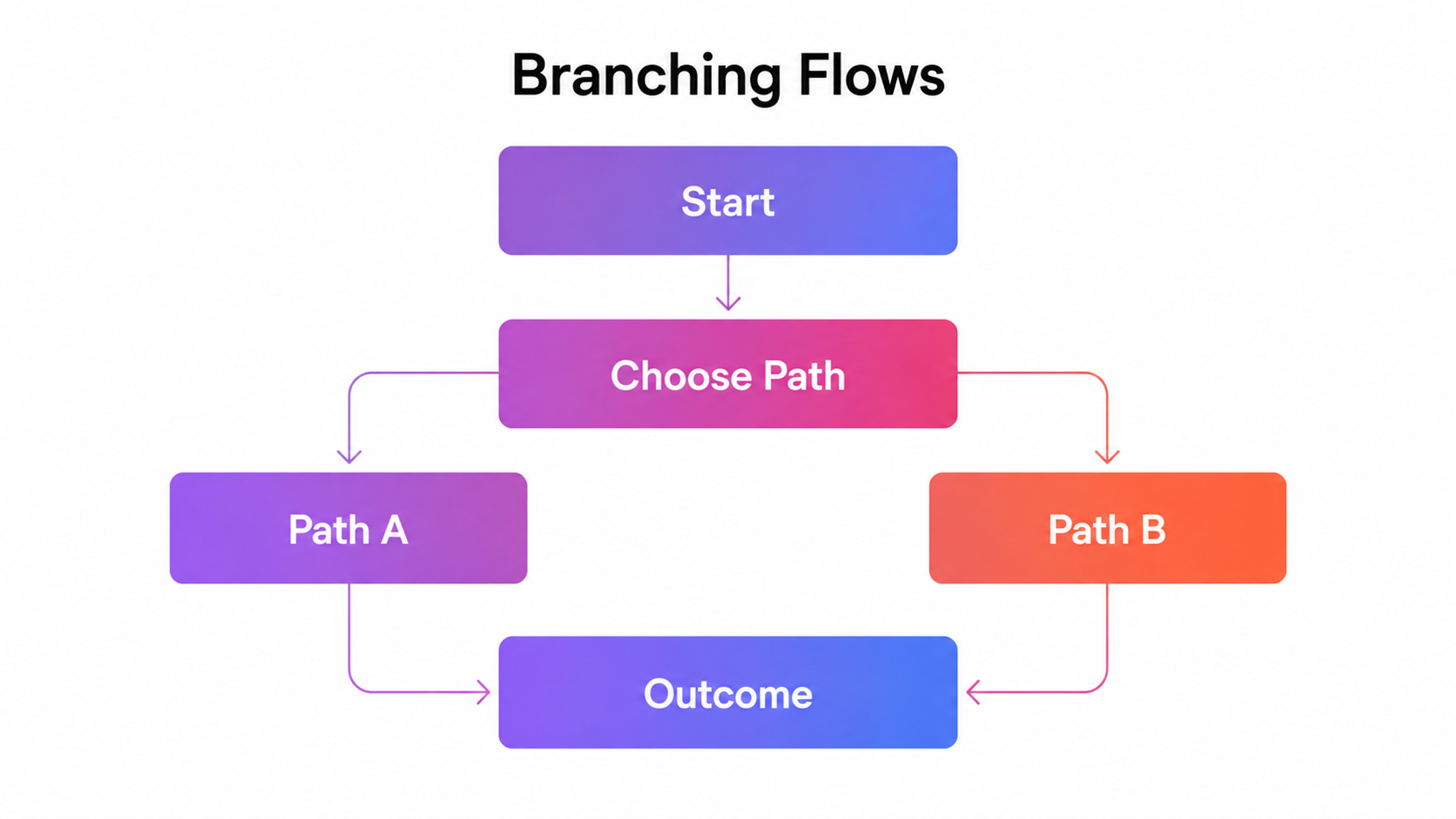
Branching Flows
The path splits, either because the user chose or because the system checked something. Guest checkout against account checkout, new user against returning, free tier against paid. These are the flows worth the diagramming effort, and they fail in two predictable ways.
The branch is invisible in the interface, so users take the wrong fork and reverse out. Or one branch got designed properly, and the other got half-finished, which is almost always the returning-user branch, because the person drawing it was thinking about acquisition.
Branded Flows Example
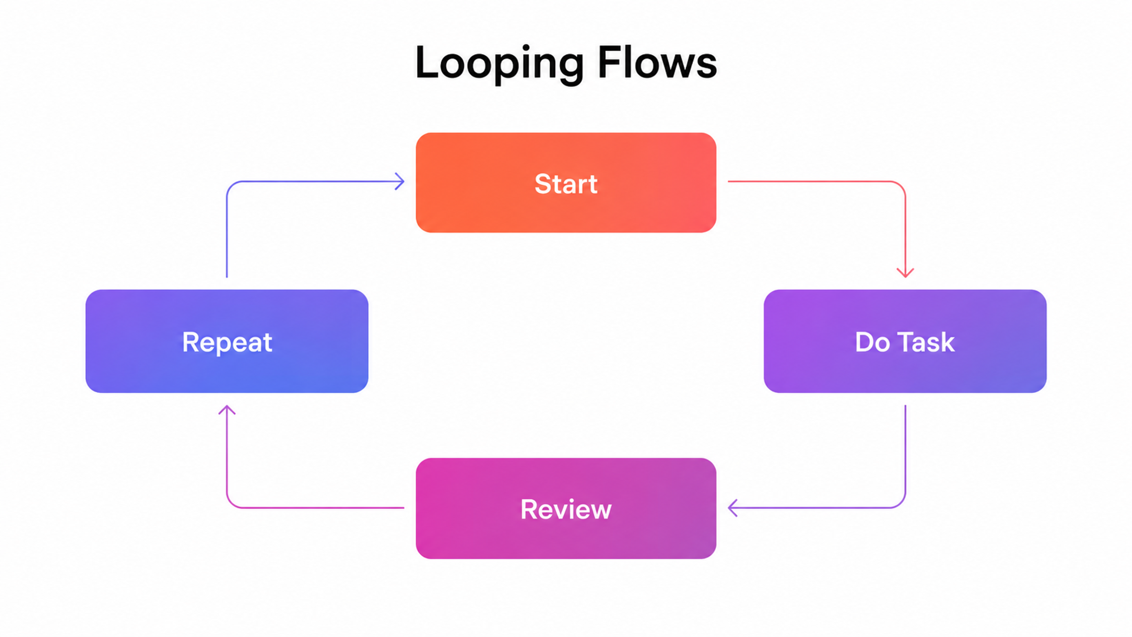
Looping Flows
The user cycles through a step more than once before moving on. Refining filters, editing a cart, correcting form validation errors, browsing content. Loops are legitimate and often desirable, but they break when there's no visible exit and no sense of progress.
A user who has adjusted filters four times without a result count changing doesn't know whether they're close or stuck, and the loop turns into an exit.
Looping Flows Example
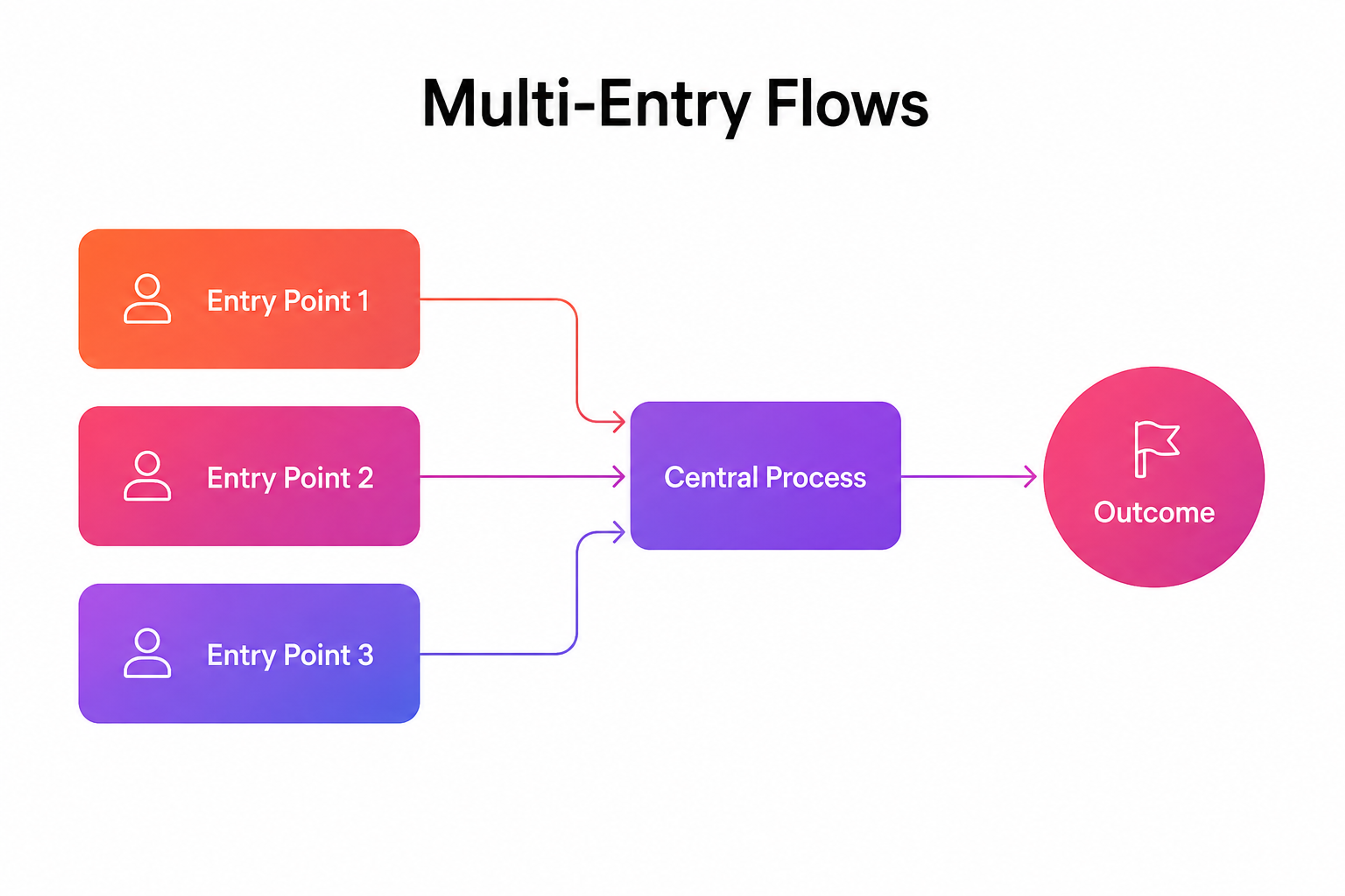
Multi-Entry Flows
One goal, many starting points. Someone lands on a product page from search, taps a push notification, or opens a link in a receipt. The shape looks like several short paths converging on a shared trunk.
The failure is context loss: the flow assumes everyone started at the beginning, so a user arriving from a specific ad gets asked to re-specify what the ad already told you.
Multi-Entry Flows Example
The Flows Most Products Run
Sorted by job rather than shape, the recurring set is short:
- Onboarding and registration
- Authentication and account recovery
- Purchase or subscription
- Search and discovery
- Content creation or submission
- Account and settings management
- Cancellation and offboarding
Six of those get mapped routinely. The last one almost never does, and it's the one that decides whether the customer comes back. A cancellation flow that hides the exit, demands a phone call, or dumps the user into an unstyled confirmation page converts a lapsed customer into someone who tells people about it. Map it with the same care as signup, because it's the same person on the way out.
When to Map a Flow, and When to Skip It
Most guides treat flow mapping as universally worthwhile. It isn't.
Mapping a flow costs a designer half a day minimum, plus a review cycle on top, and plenty of interactions don't earn that.
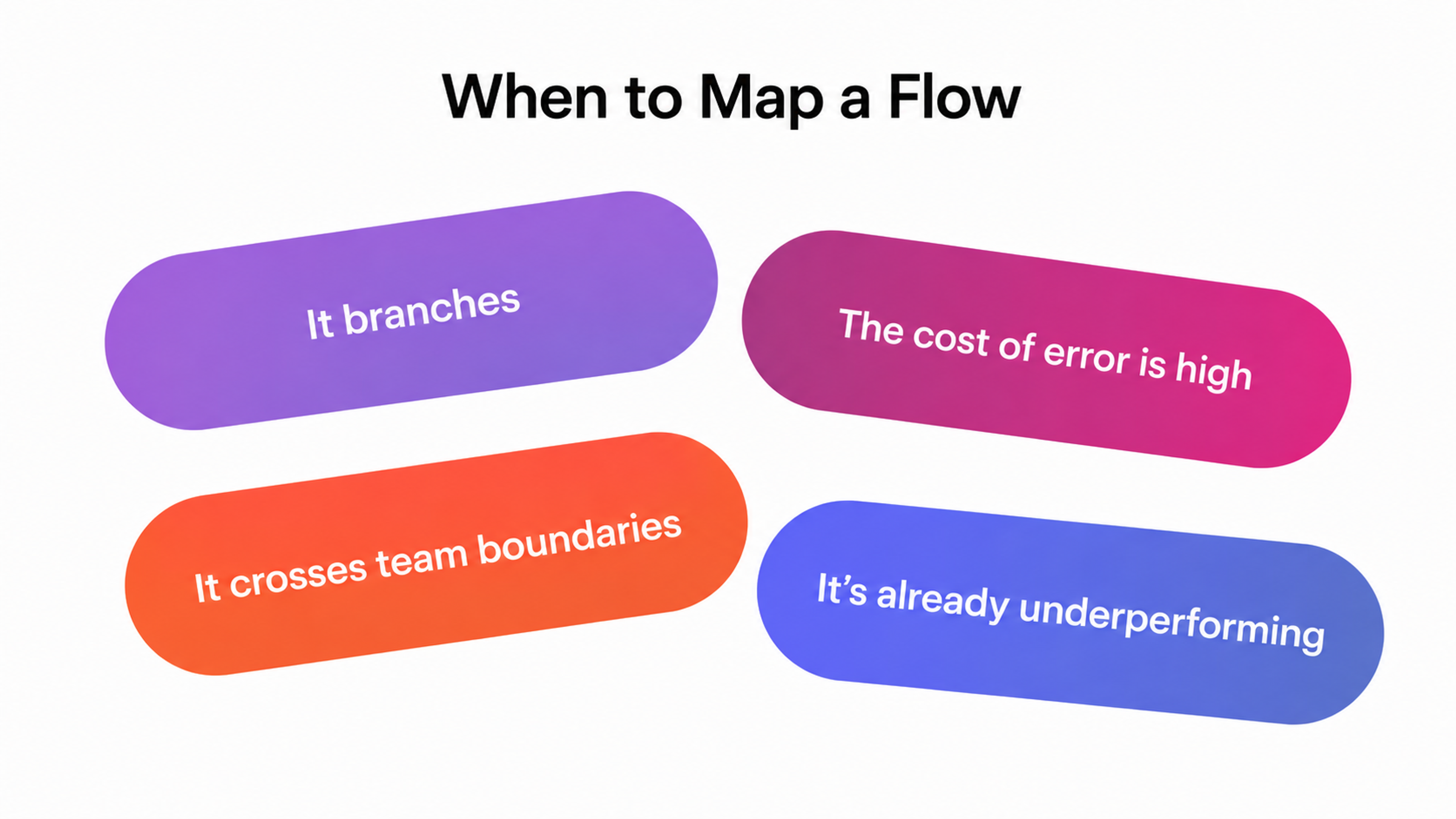
Map the flow when at least one of these is true:
It branches. Two or more meaningfully different paths to the same goal, or one path that forks based on account state, permission level, or prior behavior. Branching is where ambiguity hides.
The cost of error is high. Payment, identity verification, data deletion, anything irreversible. When we built the onboarding and account structure for Lulo Bank, a digital-first bank in Colombia, the flow work carried more weight than the visual design did. A user who gets stuck halfway through identity verification doesn't try again later. They're gone, and regulated onboarding gives you one shot at the sequence.
It crosses team boundaries. If the path touches marketing pages, product screens, and a transactional email, three teams own pieces of it, and none of them own the whole. The diagram becomes the shared reference.
It's already underperforming. You have analytics showing drop-off but no theory about why. Mapping the current flow forces you to name every step, which usually surfaces the answer before you run a single test.
When to Map a User Flow
Skip the flow diagram when the interaction is genuinely linear and reversible. A settings toggle, a filter, a single-field search. Drawing a three-node diagram for those produces documentation debt without insight. Write the interaction into the ticket and move on.
How to Build a User Flow?
The process below assumes you already know who the user is. If you don't, that's a research problem, not a diagramming one, and user interviews come first.
Start From the Goal
Write the user's goal as a sentence in their words before you draw anything.
"Move money to an account I've never sent to before."
"Cancel without talking to anyone."
"Find out if this fits my dog."
Goals are not tasks. Filling in a form is a task. Getting a service you want is the goal. Teams that start from the first screen end up designing the flow they already have, because the existing screen constrains everything downstream.
One goal per flow. When a diagram tries to cover signup, purchase, and account recovery at once, it stops being a flow and becomes a sitemap with arrows.
Map Every Real Entry Point
Users don't all arrive at your front door. They land on a product page from search, tap a push notification, click a link in a receipt email, or deep-link from an ad with UTM parameters that promised something specific.
Each entry point sets up different context and different expectations. A flow that only starts from the homepage will break for the 70% of people who never see it. List the entry points first, then check which ones your flow actually accommodates. The gaps are usually obvious and usually unaddressed.
Your product might be ready. Your design might be what's holding it back. We've helped companies close that gap fast and without cutting corners. Let's talk.
Branch at the Decisions, and Label Both Sides
At every diamond, ask what the system knows and what the user has to supply. Then draw both outcomes. Not just the one you're hoping for.
This is the step where scope becomes visible. A flow with four decision points has sixteen theoretical paths, and your engineering lead will want to know which of those you intend to build and which you intend to prevent. Answering that in the diagram is cheaper than answering it in code review.
How to Build a User Flow?
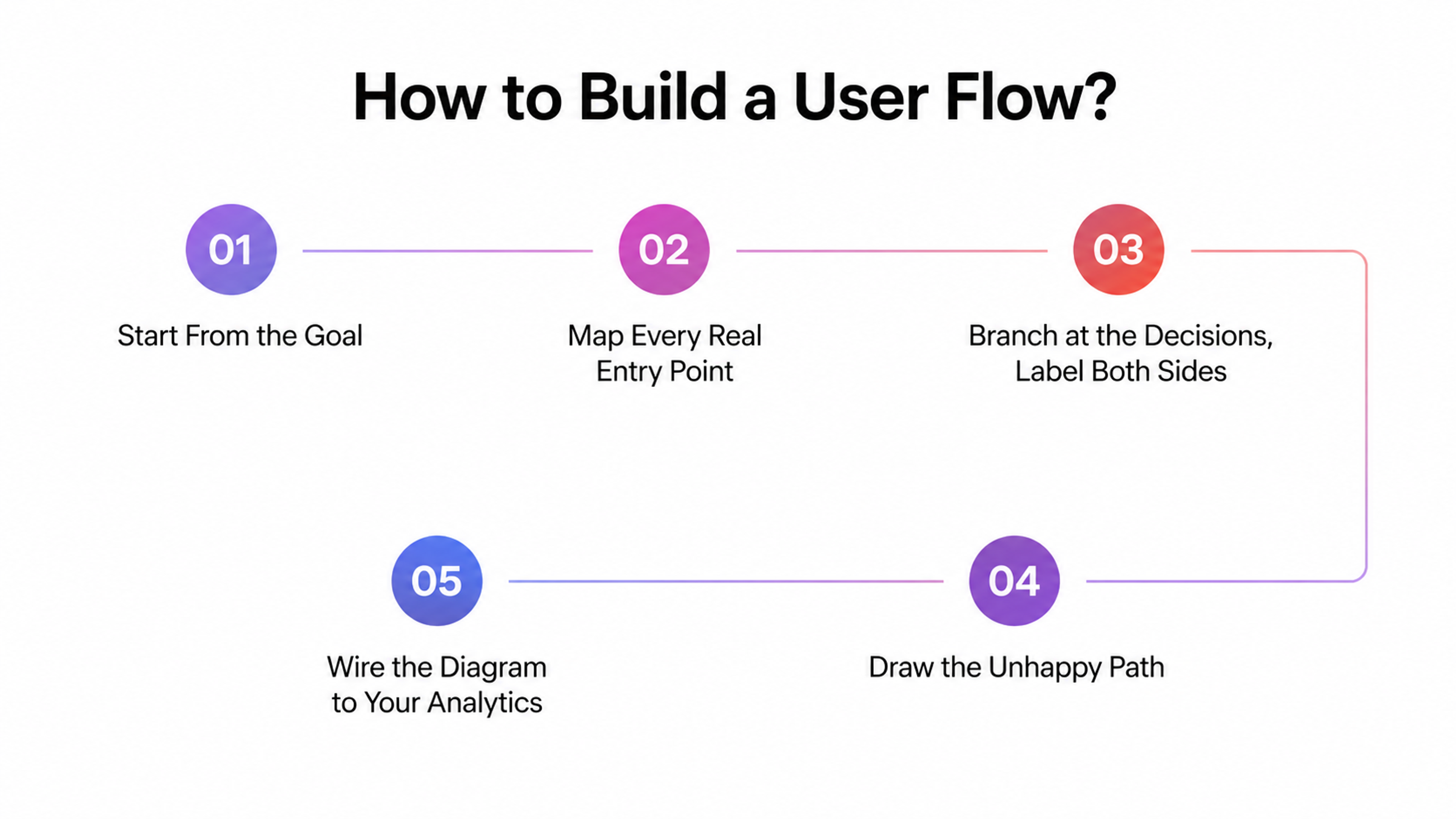
Draw the Unhappy Path
This is the section most flow guides skip, and it's the one that separates a useful diagram from a decorative one.
The happy path is where everything works. The user has an account, the card clears, the file uploads, the connection holds. The unhappy path is everything else, and in production it's a large fraction of sessions.
For each step, ask three questions:
What happens if the input is invalid?
What happens if the system fails or times out?
What happens if the user leaves and comes back in twenty minutes?
Then map the recovery. An error state that dead-ends is worse than no error state, because the user now knows something is wrong and has no move. Baymard's checkout research is blunt about the cost of this kind of friction: mandatory account creation drives roughly 19% of abandonments, and an overlong or complicated checkout drives another 18%. Those aren't visual design problems. They're flow structure problems, and they're visible on a diagram months before they're visible in revenue.
For Nuant, a crypto portfolio analytics platform, the unhappy paths dominated the flow work. Wallet connections drop, on-chain data lags, and an API returns partial results. Every one of those needed a defined state and a defined way back, because in that category a blank screen reads as "your money is gone."
Wire the Diagram to Your Analytics Before You Ship
Give each node in the flow an event name, and hand that list to whoever implements tracking. Do it while you're drawing, not after launch.
The payoff is that your funnel report and your design artifact use the same vocabulary. When drop-off spikes at step four, you're looking at the same step four in both tools, and the conversation about why takes minutes instead of a week.
Teams that skip this end up with analytics events named after code components and a flow diagram named after user intent, and nobody can reconcile them.
User Flow, Task Flow, Wireflow, or User Journey?
Four artifacts, constantly confused, each answering a different question. Picking the wrong one is a week of work aimed at a question nobody asked.
They differ mainly in how wide a scope they cover, and the four sit on a clean scale from narrowest to broadest.
Task flow: One Path, No Branches
A task flow documents a single fixed sequence that every user follows in the same order. No diamonds, no alternates. Reach for it when the task genuinely has one route, and you need that route written down precisely, such as a regulated verification step where deviation isn't permitted. If you find yourself wanting to add a branch, you needed a user flow.
User Flow: One Goal, All Branches
A user flow covers one goal but every legitimate route to it, including the decision points, the system responses, and the paths where things fail. This is the default artifact and the one most teams actually need, because different users almost always reach the same goal by different routes depending on account state, entry point, or permission level.
User Flow vs Task Flow vs Wireflow vs User Journey
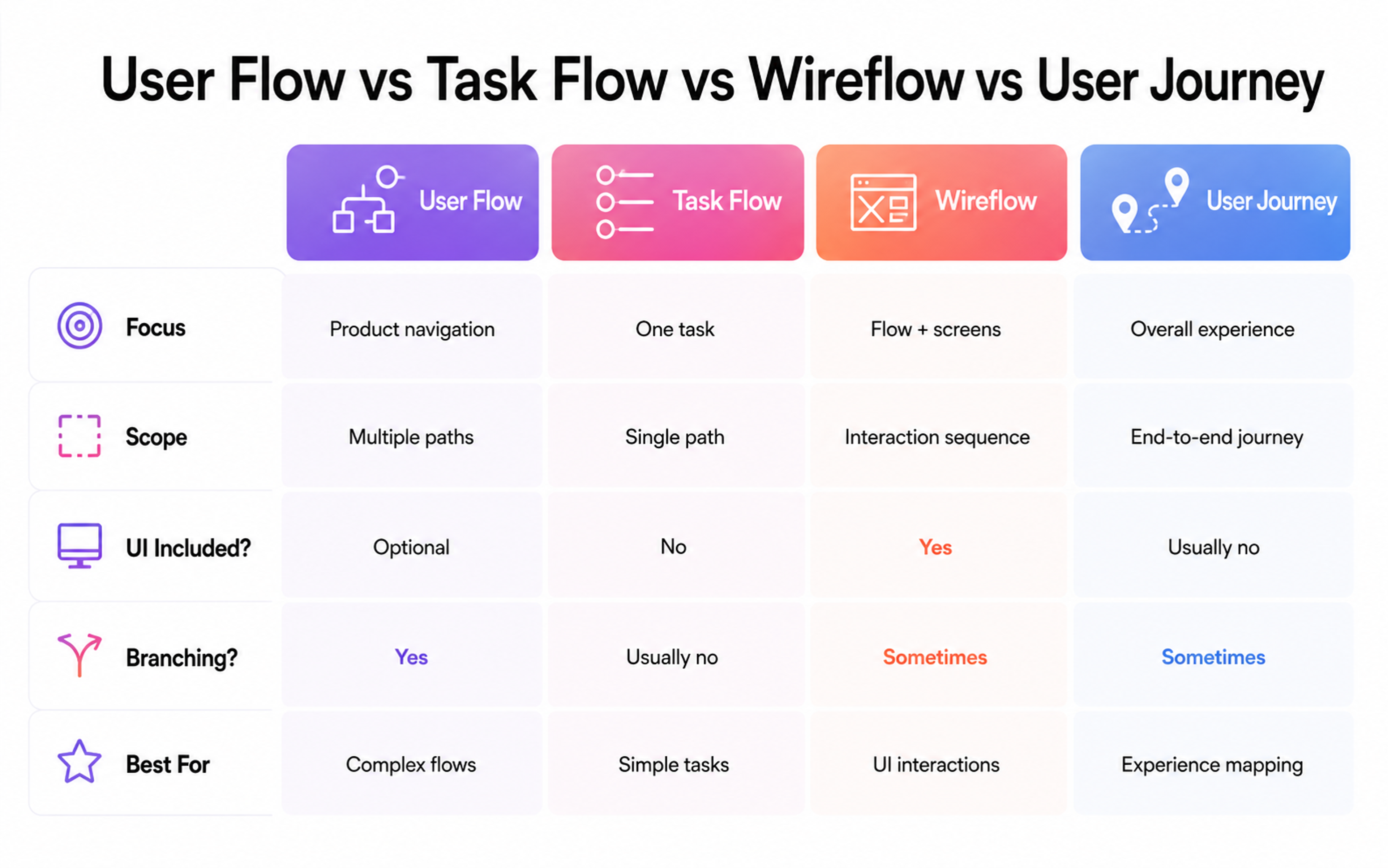
Wireflow: One Goal, Plus the Interface
A wireflow is a user flow with low-fidelity screens sitting at each node instead of labeled boxes. Use it when the interaction detail is contested, and words alone won't settle the argument, typically on mobile, where a decision point and the screen it lives on are hard to reason about separately.
The cost is speed. Wireflows take longer to draw and get stale faster, so save them for the two or three flows that carry real disagreement.
User Journey: the Whole Relationship
A user journey steps outside the product entirely.
It covers stages across channels and over time, including emotion, offline touchpoints, and everything before and after the task you're designing. NN/g draws the line cleanly: user journeys describe a high-level experience spanning channels and unfolding over time, while flows stay inside the product and stay mechanical.
The distinction between the last two trips teams most often. A practical test settles it. If your artifact tracks how the user feels, it's a journey map. If it has diamonds, it's a flow. If it has both, it's doing two jobs badly, and you should split it.
Customer journey mapping is the marketing-side sibling of the user journey, extending to offline touchpoints, brand awareness, and post-purchase behavior. It's a legitimate artifact, but it answers a positioning question, not an interface question.
Don't reach for it when someone asks why signup is leaking.
Five Ways Flows Break
The flow has more steps than the goal requires. Every screen between intent and completion is a place to leave. Baymard's testing puts the ideal checkout at 12 to 14 form elements against an industry average closer to 24. Count your nodes, then justify each one out loud.
The flow assumes a fresh, logged-out, first-time user. Returning users, users mid-subscription, and users who abandoned last week all hit the same screens with different context. A flow that only models the new user forces everyone else through irrelevant steps.
Decision points aren't obvious to the user. A branch exists in your diagram but reads as a single ambiguous button on screen. The user picks wrong, lands somewhere unexpected, and reverses out. Every diamond in the diagram should correspond to something visibly choosable in the interface.
Terminology shifts between steps. The flow says "cart," the button says "bag," the confirmation email says "order." Each rename costs the user a beat of reinterpretation, and the friction compounds across a multi-step flow. Consistency here is a usability issue before it's a branding one.
Edge cases got deferred and never returned. The most common flow failure isn't a bad decision. It's a decision marked "handle later" in a comment on a Figma file that shipped anyway.
Designing Flows for AI Agents
Something changed in 2025 that most flow guidance hasn't caught up with. Your product now has a second class of traveler.
HUMAN Security's benchmark research found that AI systems crossed from reading the web to transacting on it, with automated traffic growing roughly eight times faster than human traffic and 2.3% of agentic activity now landing on checkout pages. Agents browse product pages, authenticate into accounts, and complete purchases without a person watching a screen.
Agents fail at different points than humans do. They handle dense information well and ambiguous affordances badly. Where a human infers that a greyed-out button means "finish the field above," an agent stalls. Multi-step forms with client-side state, modal interruptions, and CAPTCHA gates all assume a human operator.
The practical implication for flow work is modest but real:
- Where a decision point depends on visual inference, add an explicit textual state
- Keep critical paths reachable by direct URL rather than only through a sequence of interactions
- Make sure the flow's success and failure states are expressed in the DOM and not only in animation
None of that costs a human user anything, and it's the difference between being traversable and being invisible to the systems your customers increasingly delegate to.
This is early. Agent-completed checkout hasn't become the norm, and OpenAI's retreat from in-chat checkout in early 2026 suggests the path runs through merchant sites rather than around them. But the authentication and account routes are already carrying real agent volume, and those are flows you control.
Keeping the Flow Alive After Launch
Flows rot. A team ships the mapped version, then adds a promo interstitial in March, a consent modal in May, and a new payment option in July. By autumn, the diagram describes a product that no longer exists, and the next designer to open it makes decisions on stale information.
Two habits prevent this. Attach flow updates to the same review gate as design updates, so changing the path requires touching the diagram. And schedule one walkthrough per quarter on your highest-value flows, clicking through production against the diagram, noting drift.
The second habit surfaces things analytics won't. Funnel reports tell you where people leave. Walking the flow tells you what they saw when they decided to.
From Google's wearable experience to Snapchat’s AR try-on lenses, we've helped teams across every industry design products people actually want to use. Let's talk about yours.
Read More
- Clay Global’s Web Design Case Studies
FAQ
What is a user flow in UX design?
A user flow is a diagram showing the route a person takes through a product to complete one task, including the screens they see, the points where the path branches, and how the system responds at each step.
How long should a user flow take to create?
A simple single-goal flow takes two to four hours, including review. A complex flow with regulated steps or heavy branching can take several days, mostly spent resolving decisions the team hadn't made yet rather than drawing.
What tools do designers use to build user flows?
Figma and FigJam dominate, with Miro, Whimsical, Lucidchart, and Overflow all in common use. Tool choice matters far less than whether the flow lives somewhere the engineering team will actually look.
Should user flows come before or after wireframes?
Before, in most cases. The flow determines how many screens exist and what each needs to accomplish, which is hard to work out backward from wireframes you've already drawn.
How detailed should a user flow diagram be?
Detailed enough that an engineer can identify every state that needs building, and no more. If you're specifying button copy inside a flow diagram, you've moved into wireframe territory and should switch artifacts.
What's the difference between a user flow and a sitemap?
A sitemap shows what pages exist and how they nest. A user flow shows the sequence someone moves through to achieve a goal, which may cross several branches of a sitemap and skip most of it.
Can one user flow cover multiple user types?
It can, using swim lanes or conditional branches for role differences. Once you're managing more than two or three distinct user types in one diagram, separate flows read better.
How do you validate a user flow before building it?
Walk it with five users using a clickable prototype or a paper version, and watch where they hesitate at decision points. Hesitation at a diamond means the branch isn't legible in the interface.
What is a happy path?
The happy path is the route where nothing goes wrong: valid input, working connection, user has the account and permissions they need. It's the version most diagrams show, and the version most sessions don't follow exactly.
Do user flows apply to AI and conversational interfaces?
Yes, though the branching is probabilistic rather than deterministic. You map intents and fallback states instead of screens, and the recovery paths carry even more weight because misinterpretation is routine.
How do user flows connect to conversion rate?
Each additional step and each ambiguous decision point is a place users exit. Baymard's research attributes an average achievable 35.26% conversion lift to checkout-design improvements, a substantial share of which is step count and sequencing.
Who should own the user flow in a product team?
A designer usually draws it, but it needs sign-off from product and engineering to function as a spec. A flow that only the design team has read is documentation, not an agreement.
How often should user flows be updated?
Whenever the path changes, and reviewed quarterly regardless. Flows drift silently because each individual addition seems too small to warrant redrawing the diagram.
The Diagram Isn't the Point
The value of a user flow isn't the artifact. It's the argument the team has while making it.
Drawing the diamond forces someone to say out loud what happens when the user picks the other option. Drawing the unhappy path forces someone to decide whether a timeout shows a retry or a dead end. Those decisions get made either way. The only variable is whether they get made deliberately by the people who understand the goal, or accidentally by whoever was implementing that ticket on a Thursday afternoon.
Draw the flow. Then go walk it.


About Clay
Clay is a UI/UX design & branding agency in San Francisco. We team up with startups and leading brands to create transformative digital experience. Clients: Facebook, Slack, Google, Amazon, Credit Karma, Zenefits, etc.
Learn moreAbout Clay
Clay is a UI/UX design & branding agency in San Francisco. We team up with startups and leading brands to create transformative digital experience. Clients: Facebook, Slack, Google, Amazon, Credit Karma, Zenefits, etc.
Learn more