User Interface (UI) design is critical to any modern website or application. The bridge allows users to interact with and navigate digital products, enabling them to access information and complete tasks quickly and easily.
UI design encompasses all the visual elements of a product, such as colors, typography, images, layout, buttons, icons, and more. It also covers how users interact with these elements – from simple clicks to complex interactions like drag-and-drop operations.
By understanding the basics of UI design principles, such as usability guidelines and user experience best practices, you can create an interface that intuitively guides your users through their journey with your product.
What Is UI Design?
User Interface (UI) design is a field of study and practice focusing on creating user-friendly and aesthetically pleasing digital interfaces that enable people to interact with technology. It involves the research, planning, prototyping, development, testing, and refinement of digital products based on user needs, behavior patterns, and visual trends.
UI designers are responsible for creating various elements — menus, navigation systems, icons, buttons, and color palettes — to ensure users can easily navigate digital products and access the necessary information. Moreover, UI designers use principles like Gestalt psychology to create a more natural interface.
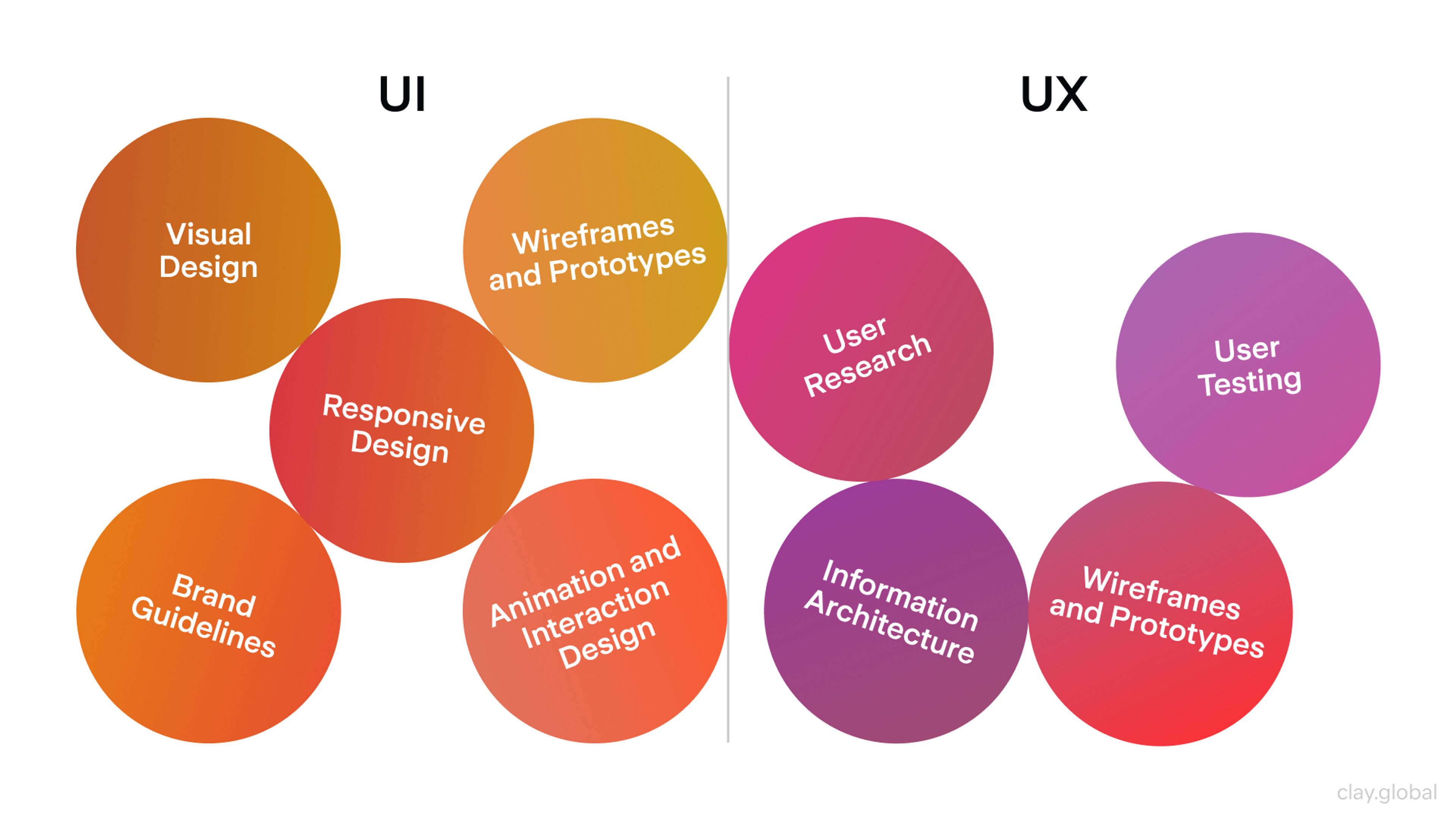
UI design vs UX design by Clay
A successful UI design should be both visually appealing and intuitively functional. Designers must consider how users interact with their products to craft a seamless experience by creating compelling visual cues and navigation systems.
Furthermore, they must pay attention to details such as typography choice and color palette manipulation for maximum usability. Additionally, designers must consider accessibility features during the design process to ensure that their product meets the needs of all users regardless of physical ability or language proficiency.
Ultimately UI design is about crafting an intuitive experience where the product's interface becomes almost invisible. By understanding user needs and utilizing best practices when designing for any interface – websites or mobile applications – UI designers can create interfaces with a seamless interaction between the end user's interaction and system while providing a pleasant experience overall.
Why Is User Interface Design Important?
User Interface (UI) design is crucial for all websites and apps today. UI design dictates how users interact with the product. A good UI design allows users to complete tasks without frustration through a visually pleasing and seamless experience. Good design will guide users through to the completion of a task.
UI designers design for all types of user interactions. When designers create effective information structures and navigation, users can complete tasks quickly.
Working with Snapchat was a great example of the importance of good UI design. We brought AR (Augmented Reality) to Snapchat, allowing users to try on and interact with products via voice and hand gestures.
Source: Snapchat mobile app
We created a good shopping experience by designing clear navigation and a smooth flow to follow user intentions, and by providing seamless interactivity through detailed animated tutorials and 3D models.
The design of a User Interface (UI) must also include accessibility options. Accessible design means products can be used by everyone, regardless of their physical or cognitive ability. Good design also provides consistent branding by using elements such as color, fonts, images, and buttons so that customers can remember the product and the company.
Positive UI design means customers enjoy using the product and will continue using it for a long time.
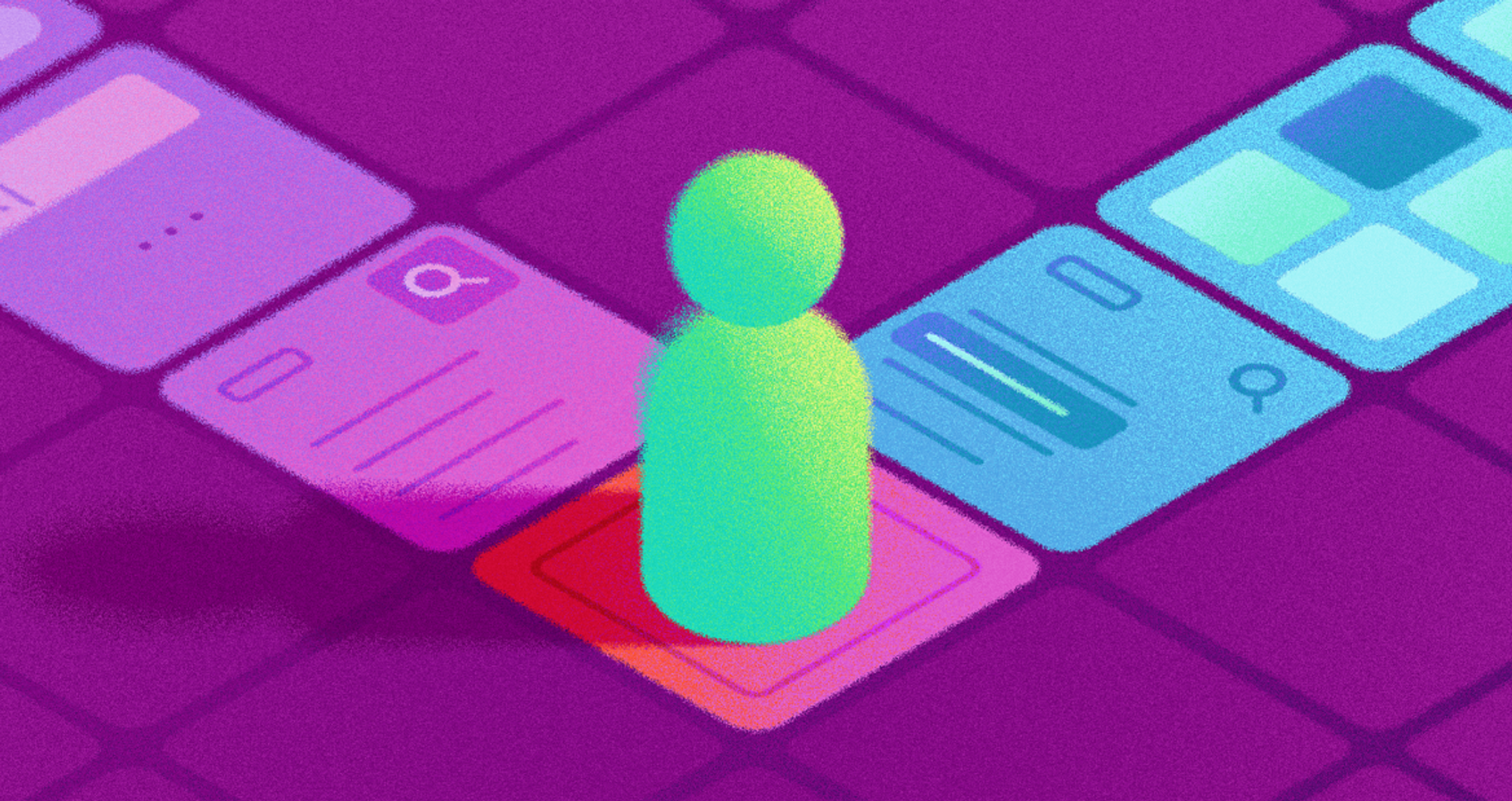
Difference Between UI and GUI
UI (User Interface) and GUI (Graphical User Interface) are similar, but cover different aspects of interacting with technology.
UI is the larger area. It is any combination of technologies that any user can interact with. This covers everything from text input and command-line interfaces (CLIs) to audio systems such as voice assistants, touch systems, and graphical systems. UI refers to any way a human can interact with a system.
GUI is a branch of UI that focuses solely on the visual aspects of interactions. This includes the use of windows, images, buttons, and menus. GUIs made software easier to use by replacing text commands with visual elements that could be used with a mouse or directly with a finger.
Overall, UI includes visual, auditory, and physical touch elements, among others.
A GUI is a type of User Interface that allows for user interaction through graphical features.
While all GUIs fall under the definition of UIs, the converse is not true; not all UIs are GUIs.
Challenges of UI Design
When designing user interfaces, UI designers encounter many problems. For example, they must understand the context of how a product is used. Depending on how a product is used, designers may have to take different approaches for mobile-first versus desktop-first experiences.
As new technologies, such as voice interfaces and virtual reality, continue to develop, designers must be able to employ them in conjunction with appropriate principles and practices for each environment.
Another challenge is to provide a seamless experience that balances diverse user requirements and preferences while remaining accessible. There is also the problem of designing an interface that works on all platforms and devices without diminishing usability, performance, or user experience.
Source: charlesdeluvio on Unsplash

The visual decisions that a designer makes are also important. For example, a designer must use appropriate colors and typography and use micro-interactions to provide feedback without distracting users. A designer must maintain a consistent visual language across screens and products, as this improves navigation and enhances brand recognition.
A designer must be able to balance all design elements and maintain a high level of usability, inclusiveness, and enjoyment in their work. This requires a high level of creative design and technical knowledge.
Types of User Interface
You can find five types of interfaces on phones, computers, and smart devices.
- Graphical User Interface (GUI): This is the most common type of user interface. Visuals drive GUIs. Users can click buttons and interact with windows to navigate the system. Dragging and zooming make the experience feel the same on all systems and apps.
- Command Line Interface (CLI): Most commonly used by developers and IT teams. They type commands to operate the system instead of using a mouse. It may seem plain, but CLI is very powerful for server and complex workflows.
- Touch User Interface: This interface type is used for tapping, swiping, and pinching. Touch UIs are used on smartphones and tablets and have influenced the design of most applications.
- Voice User Interface (VUI): UIs like Siri and Alexa use Voice UIs. Voice UIs are good for smart homes and accessible to many people.
- Menu Driven Interface: UIs that use a list of commands for step-by-step navigation. They are common in kiosks, older devices, and ATMs. They are easy to use and great for completing tasks quickly.
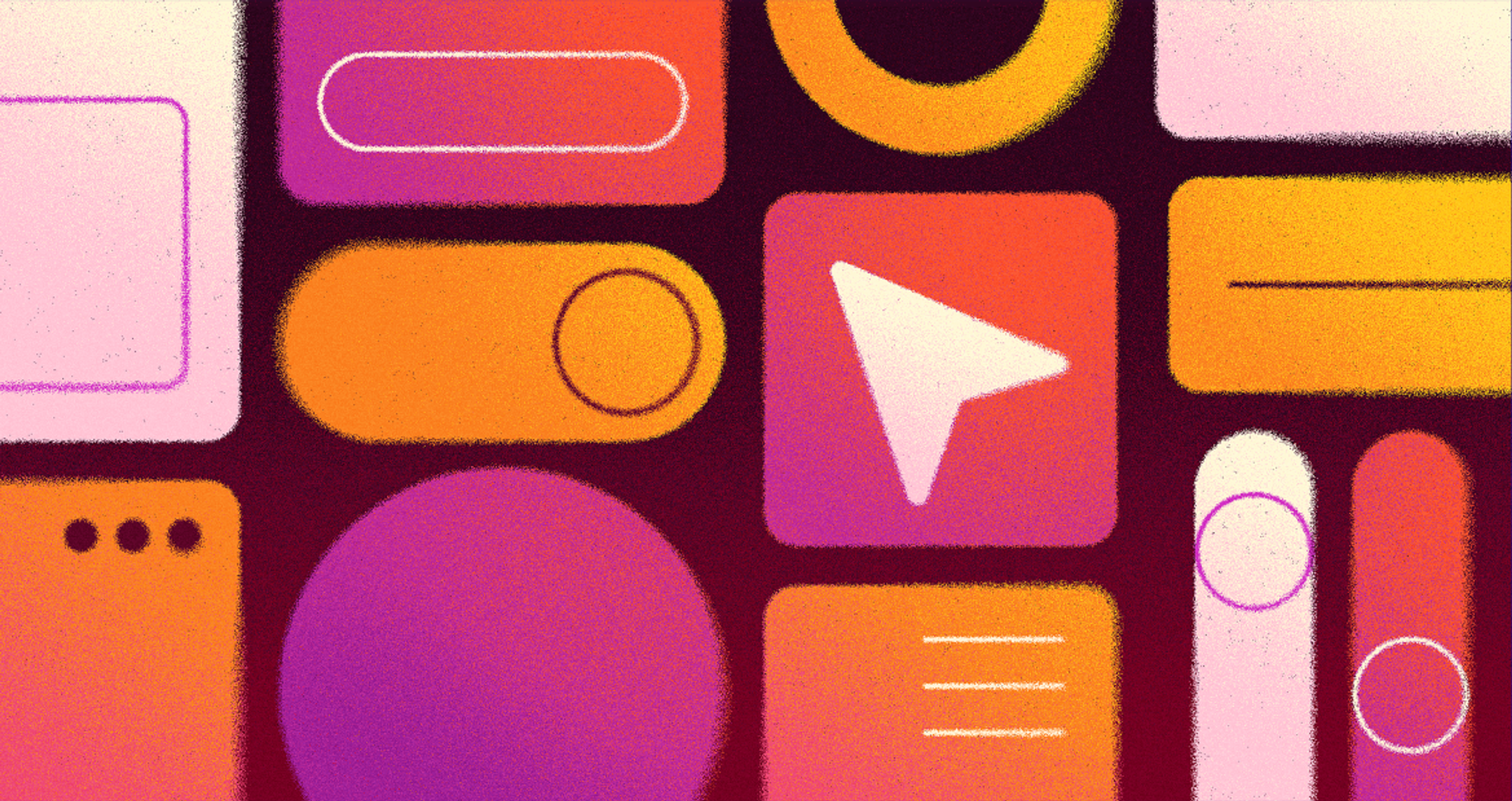
Elements of User Interfaces
Foundational UI components are the building blocks of any interface: fonts, color choices, visuals, buttons, icons, and subtle graphic cues work together to produce smooth navigation.
However, smoothness won’t matter if the interface excludes someone, so builders must layer in accessibility — from screen-reader cues to language translations — right from the start. Only then does a user interface speak to and for everyone.
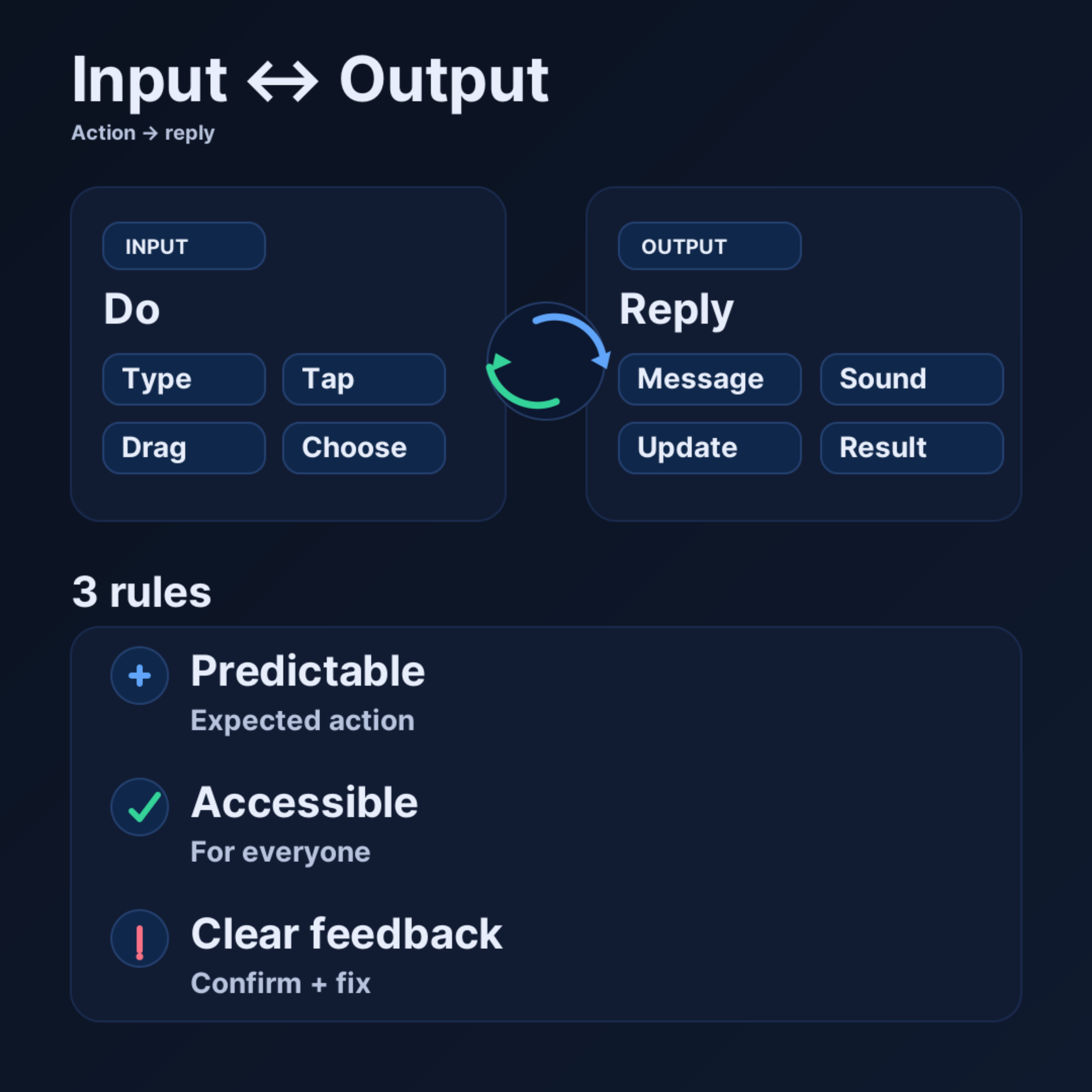
User Inputs and Outputs
Every User Interface (UI) relies on unambiguous user input and system feedback to operate efficiently.
- User input can take various forms, such as typing, clicking, dragging, or selecting.
- System output can include visual feedback, audio, system confirmations, or system status messages.
Great user input and system output create an invisible feedback loop. With predictable system behavior, users build trust and consistency. When users press and hold an icon or push a button, they expect a certain behavior.
User input and system output accessibility is important for people with varying abilities, the use of different devices, or even different languages.
System feedback should be prompt and specific: for example, once a user has submitted a process, the system should acknowledge this by confirming the action.
If something isn’t working as intended, the system should explain what the issue is and, if possible, provide an automated solution. Well-articulated system feedback is ideal as it minimizes the need for guessing.
User Inputs and Outputs
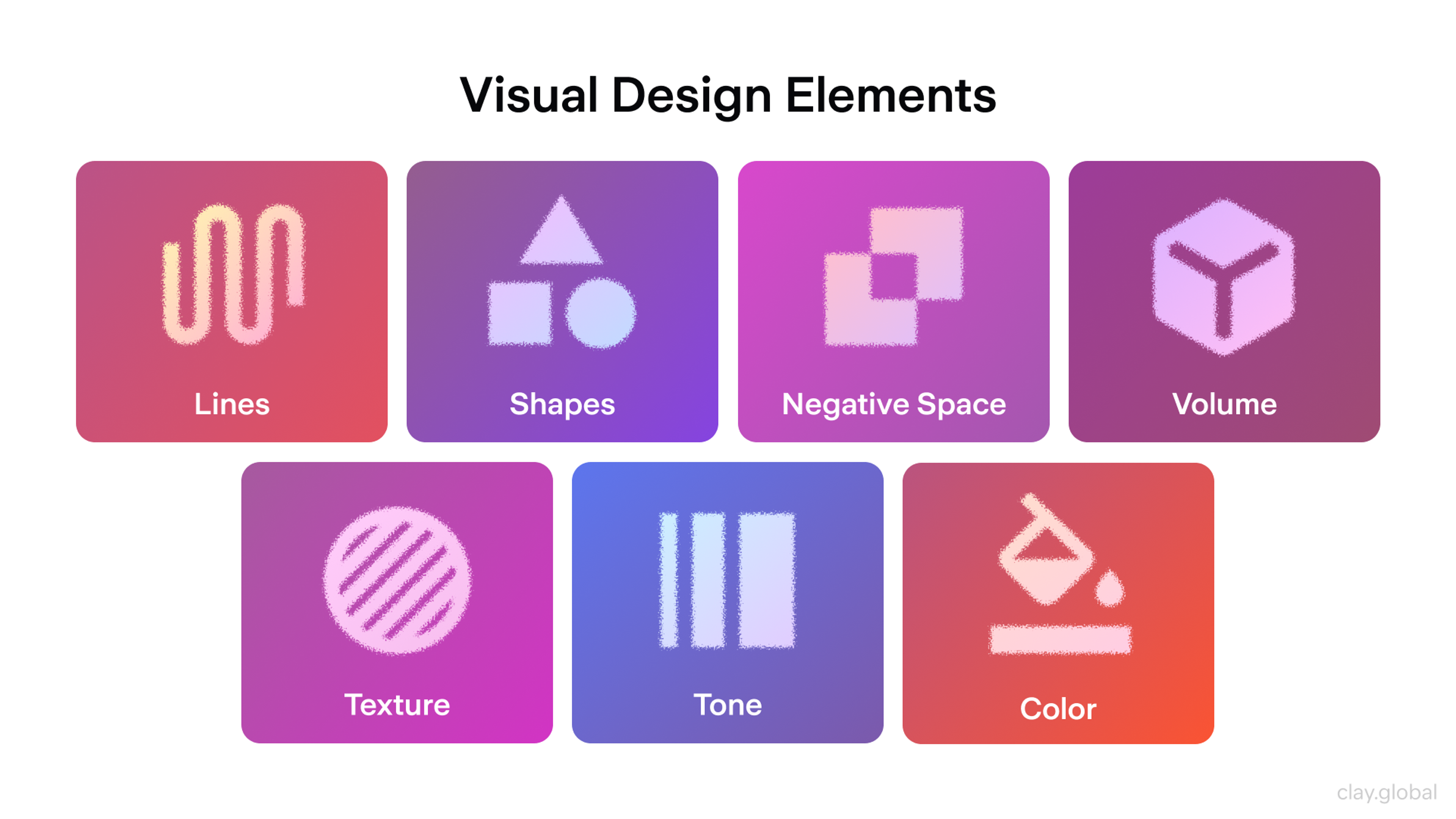
Visual Design
An effective UI should be user-friendly. Designers use various methods, such as color and typography, in addition to images, icons, and other layout techniques, to provide guidance and minimize cognitive load.
Colors set moods. They can also be used to highlight or downplay aspects of the UI. A well-balanced use of contrast should also ensure good readability without overwhelming the users.
Text can be styled for tone and readability. Choosing appropriate typefaces and visual hierarchies (e.g., headings, body text, buttons) makes content easier to scan and understand. It is important to ensure that text remains legible regardless of screen size, language, or user preferences.
When used appropriately, images can enhance the experience; however, decorative images that do not aid the task at hand can distract and create a cluttered layout. Providing accessibility (like useful alt text and clear context) helps everyone understand the content.
Icons and buttons aid in clear navigation and decision-making. They must be easy to recognize and create a consistent experience across the interface. Good visuals should streamline the experience, ensuring the interface is on-brand and user-friendly.
Visual Design Elements by Clay
Interactivity and Navigation
Engagement and navigation play a major role in creating a positive user experience. Interactivity gives users the ability to do more than look at pictures or read text. Interactivity enables users to touch, swipe, drag, and explore a webpage or application on their own terms.
The website might include animations, sounds, short videos, or simple confirmation messages. The most important part is to use them deliberately so they are simple and useful to everyone. Navigation is just as important to the user experience.
Our redesign of Reyes Holdings' marketing website embodies those principles. Reyes Holdings is a global leader in food and beverage distribution, and they wanted to showcase their company history while adding a more personal touch to their brand story. We achieved better navigation and tailored content by balancing visibility across business units.
Reyes Holdings Design by Clay
Designers must pay attention to the structure of their interfaces and select navigation options appropriate to the product's complexity, such as hamburger menus, breadcrumbs, search boxes, and other familiar elements. Working through user feedback and accessibility helps users navigate with confidence, stay engaged, and move to the next task.
Best Practices for UI Design
A powerful user interface (UI) can make the user experience feel welcoming, friendly, powerful & engaging.
Visuals need every color, shape, and spacing choice to be intentional and purposeful, supporting the user's understanding rather than just making it look good. Additionally, type spacing and type sizing/play need to be purposeful to the user.
Visuals need to serve a purpose and further users' understanding. Do not use unnecessary decoration. Use buttons and icons that are simplistic and visually understandable.
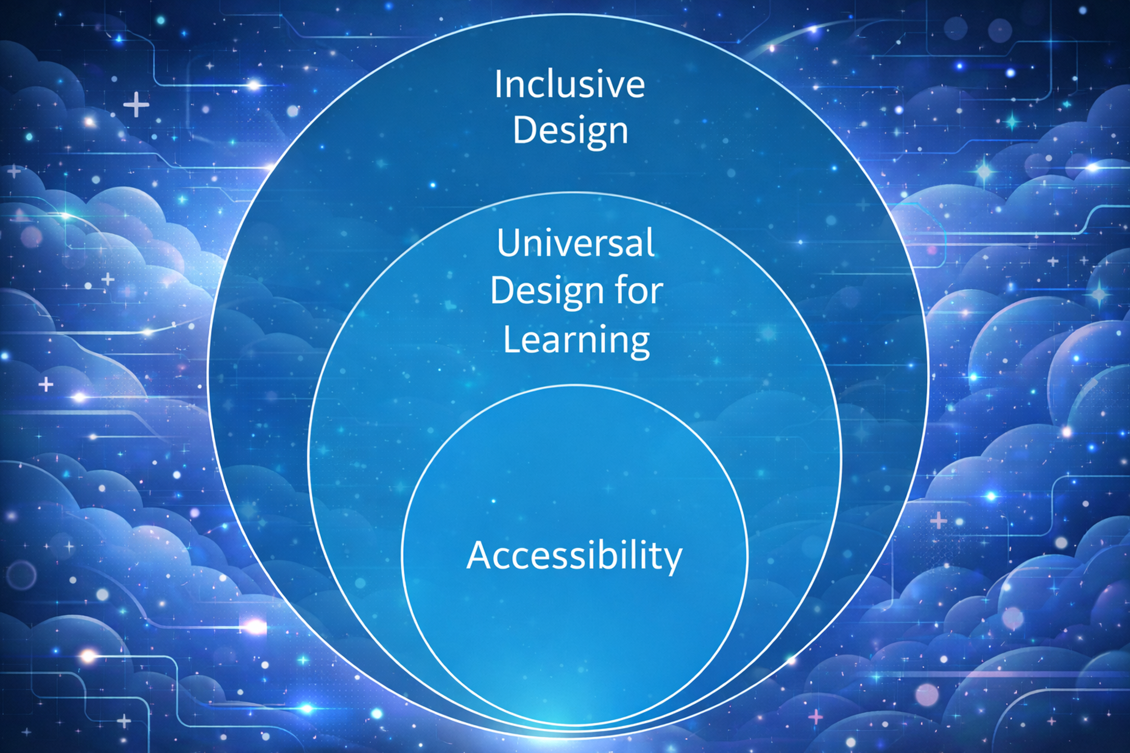
Inclusive Design, Universal Design for Learning, and Accessibility
In any UI, the user journey and experience should feel as quick and as simple as possible. Simplicity in design is key. The bigger the UI, the more layers it has, the more small improvements are needed to recommend here.
Finally, the most fundamental part of UI design is designing and redesigning specific components based on data and feedback before release, performing post-release data analysis, and redesigning components based on that analysis. This is fundamental to getting a UI that feels natural and intuitive right from the start.
Best User Interface Examples
Hello Monday
When several visual elements fight for our attention, almost no one wins. Focusing on just one lets it sing. White space is your best supporting actor; space around important UI pieces lets their message ring clear.
Hello Monday's homepage shows this to perfection. The studio uses micro and macro white space to choreograph the user's gaze, directing the user to one main point at a time. This balance keeps the site alive and dynamic while keeping it from feeling cluttered.
Source: careerfoundry.com

Rally
Digital studio Rally sets its website apart by combining smooth interactions and subtle animations with a clean layout and thoughtfully chosen colors. The site feels vibrant and engaging, with a particularly elegant touch in its “click the arrows to get more info” feature, which adds both function and style.
Source: rallyinteractive.com

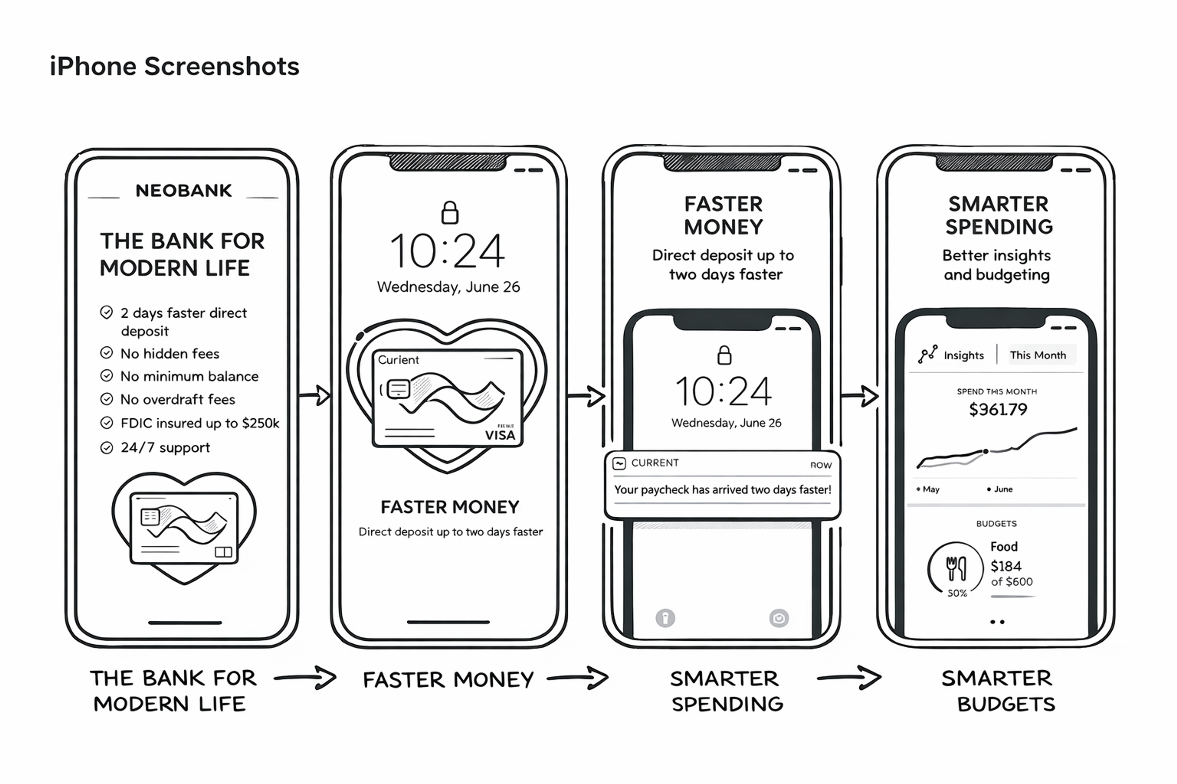
Current
Designed specifically for teenagers, Current is a parent-managed debit card and app that encourages smart financial habits and helps make money management more approachable. Keeping their young audience in mind, the app’s designers broke away from the traditional, formal look often associated with finance — opting instead for vibrant colors, modern typography, and playful backgrounds.
Even though it deals with complex financial topics, the app features a clean and intuitive interface, making it easy for users to understand budgets, tasks, and next steps.
UI Design Example
FAQ
What Does UI Stand For?
UI stands for user interface. It refers to the screens, buttons, icons, and interactive elements that allow people to interact with a device, app, or website.
What Is UI On My Cell Phone?
UI on a cell phone is the layout and design of menus, icons, notifications, and settings that let you navigate and control the device.
What Does UI Mean In Games?
In games, UI means the visual layer players use to interact with the game, such as health bars, maps, menus, inventory screens, and action buttons.
What Does UI Text Mean?
UI text refers to the written words inside an interface, such as button labels, error messages, tooltips, or navigation prompts, designed to guide users.
What Is UI In Social Media?
UI in social media is the design of feeds, buttons, chat boxes, and interaction elements that let users post, comment, and engage with content.
Read more:
Conclusion
In conclusion, UI design is about creating an efficient and enjoyable experience that users of all skill levels and abilities can use.
Designers should be mindful of their products' visual design, navigation, and interactivity elements when creating a UI to provide people with an intuitive experience from start to finish.
By considering these best practices, designers can create successful product designs that make the user journey simple yet rewarding at every stage.

About Clay
Clay is a UI/UX design & branding agency in San Francisco. We team up with startups and leading brands to create transformative digital experience. Clients: Facebook, Slack, Google, Amazon, Credit Karma, Zenefits, etc.
Learn moreAbout Clay
Clay is a UI/UX design & branding agency in San Francisco. We team up with startups and leading brands to create transformative digital experience. Clients: Facebook, Slack, Google, Amazon, Credit Karma, Zenefits, etc.
Learn more