
Key Takeaways
Companies should quantify user experience (UX) metrics and avoid leaning on assumptions. These metrics can be both qualitative (e.g., surveys) and quantitative (e.g., error rates) and can help guide design decisions and uncover user pain points.
UX metrics can be behavioral or attitudinal and cover usability and engagement. Common metrics are the Net Promoter Score (NPS), Customer Satisfaction Score (CSAT), System Usability Scale (SUS), and Customer Effort Score (CES).
Understanding User Experience
User Experience (UX) is the level of ease and enjoyment that a user derives from using a product. Good UX design strengthens customer loyalty. It is more than making a product look pretty.
It involves ensuring that the product is usable and meets its users' needs. Measuring UX helps identify areas that are functioning well, those that are not, and those that need improvement, thereby providing a seamless experience and increasing trust.
How to Measure UX Metrics?
User experience, or UX, is a big part of any digital product or service. It’s how people see and interact with what a brand offers. UX includes how easy a product is to use and how happy people feel when they use it.
You can’t just guess whether the UX is good or bad. Companies need to measure it carefully. They need clear data to understand what’s working and what needs to change.
UX Metrics Overview by Clay
To measure UX, businesses use both numbers and opinions. They ask users for feedback through interviews and surveys. They run A/B tests to compare designs. They also use heat maps to track where users click or move on a page. These tools help companies learn how users move through the product and what their experience is like.
But collecting data isn’t enough. Companies need to study the results to find out where people struggle or feel frustrated. This helps them spot problems and find ways to make things better.
When businesses use these insights, they can improve their products and create a smoother, more enjoyable experience that keeps users coming back.
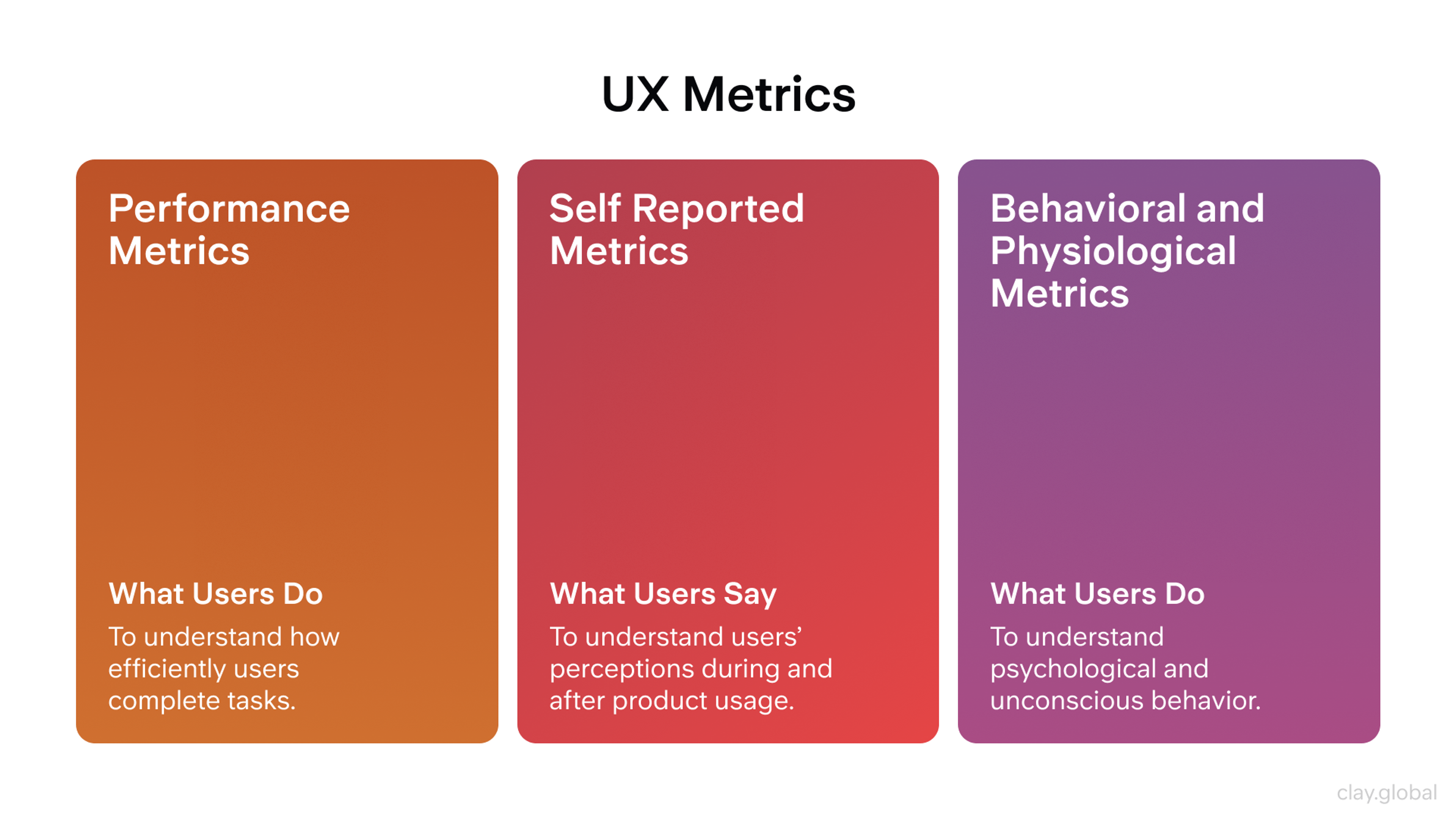
What Are UX Metrics?
UX metrics are a combination of user data and user feedback that help quantify web/app user interactions and identify areas of improvement.
UX metrics can be quantitative (error rate, user click data, time on page, task completion, etc) and qualitative (surveys, interviews, observations, etc).
Definition of UX Metrics
User experience (UX) metrics include users' behaviour and attitude towards a product. UX Metrics connect customer needs and business objectives. UX Metrics help teams identify what is helpful to users' experience, what is confusing, and what requires improvement.
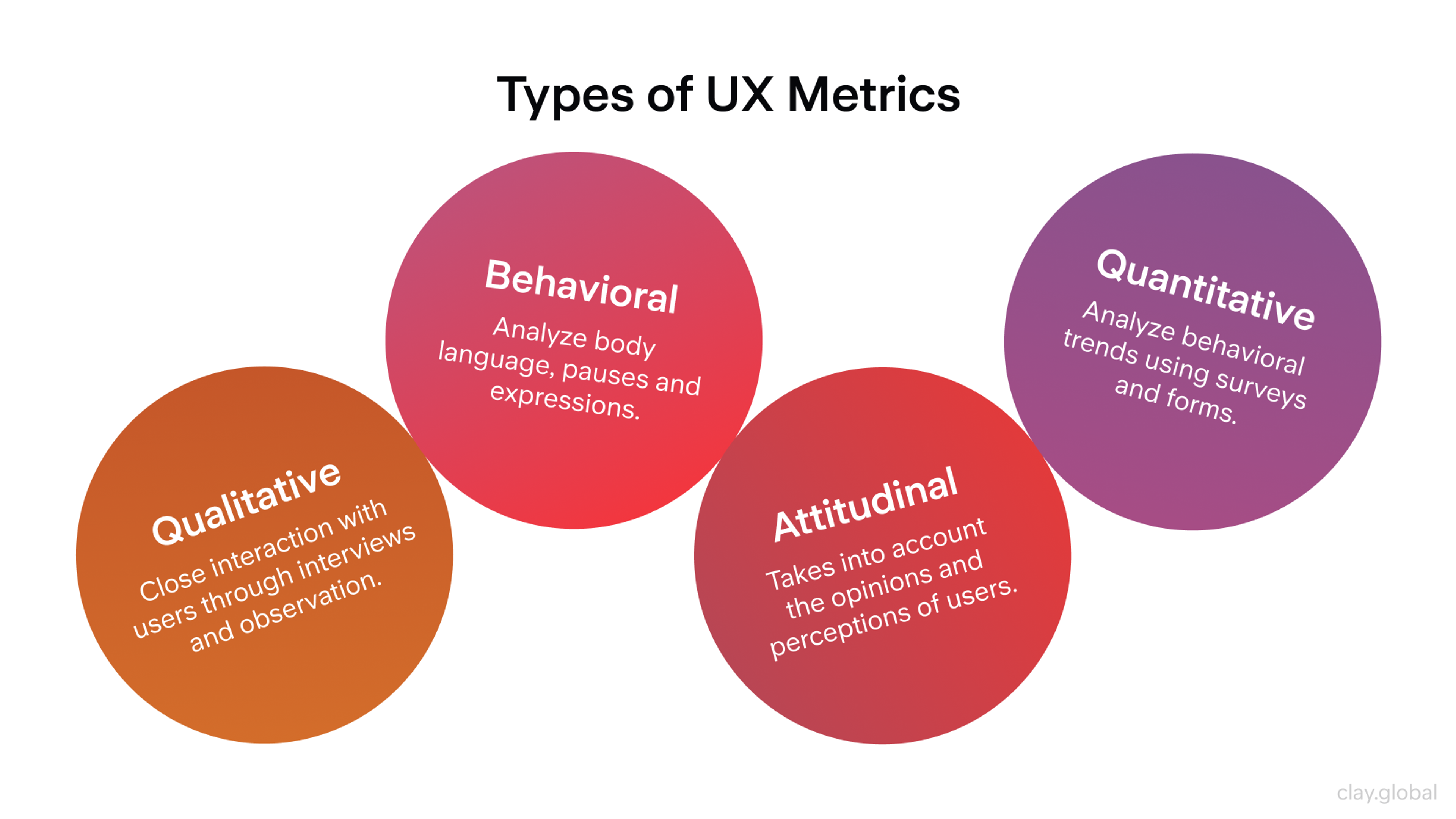
Types of UX Metrics
UX Metrics can be classified into four categories:
- Quantitative: Task completion, time on task, and error rate.
- Qualitative: User feedback captured through surveys, interviews, and observations.
- Behavioral: User actions such as clicking, time spent on a page, and points of drop-off.
- Attitudinal: Metrics of satisfaction and recommendation were captured through surveys.
Types of UX Metrics by Clay
Why Measuring UX Is Important
Giving customers a good user experience is key to a company’s success. To do that, businesses need to understand how people interact with their products and what changes can make those experiences better.
Companies collect this kind of insight using tools like surveys, interviews, heat maps, and A/B testing. These methods help them see where users struggle and where the product could improve. With this information, businesses can make changes that lead to higher customer satisfaction.
Design Project Success Metrics by Clay
Evaluating UX helps businesses create better solutions that meet customer needs more quickly and effectively. It also improves how easy and accessible their products are. When companies listen to user feedback, they can make changes fast and give people a smoother, more enjoyable experience.
UX metrics also show how customers feel about a product or service. These insights can guide design updates and marketing efforts. By studying the data, businesses can spot improvement areas and understand what users expect.
When companies know where their product falls short, they can focus on fixing those weak spots. This not only improves the product but also strengthens the brand and builds customer trust.
Understanding UX Metrics
Understanding UX Metrics means understanding user behaviour and the product's pain points. UX Metrics provide evidence-based design strategies to improve the user experience.
Quantitative vs. Qualitative Metrics
Analyzing UX is based on the two types of metrics: quantitative and qualitative. In the case of quantitative metrics, the time taken to complete a task, the number of steps involved, and the number of errors committed help analyse what is happening.
For qualitative metrics, observations from surveys, interviews, and usability testing are recorded to explain the causes of confusion or frustration. A design decision based on an analysis of both metric types is more holistic.
Behavioral Metrics (e.g., Time on Task, Average Session Length)
When measuring behavioral metrics, how the user interacts with the product can be studied in various ways:
- Time on Task: the time taken to complete the task. If it is too long, there may be friction.
- Average Session Length: how much time is spent in a single session. Is the user engaged or not?
- Error Rate: How many times does a user make an error? Usability problems can be resolved here.
- Engagement (clicks, taps, scrolls): The user's level of activity is demonstrated here. It can display some perceived value.
Attitudinal Metrics (e.g., Net Promoter Score)
Attitudinal metrics, on the other hand, focus on emotions, satisfaction, loyalty, and other psychological elements.
- Net Promoter Score (NPS): If a user is to recommend a product to the people close to him, how likely is he to do so? This determines customer loyalty.
- Customer Satisfaction (CSAT): The user is likely to provide a rating. This is a measure of satisfaction.
- User Satisfaction (USAT): how well the product meets needs and expectations.
- System Usability Scale (SUS): A single usability questionnaire is utilized.
When combined with behavioral data, these metrics provide insight into how users understand and perceive the product. The team can focus its efforts to maximize improvements in user experience.
UX Metrics and KPIs
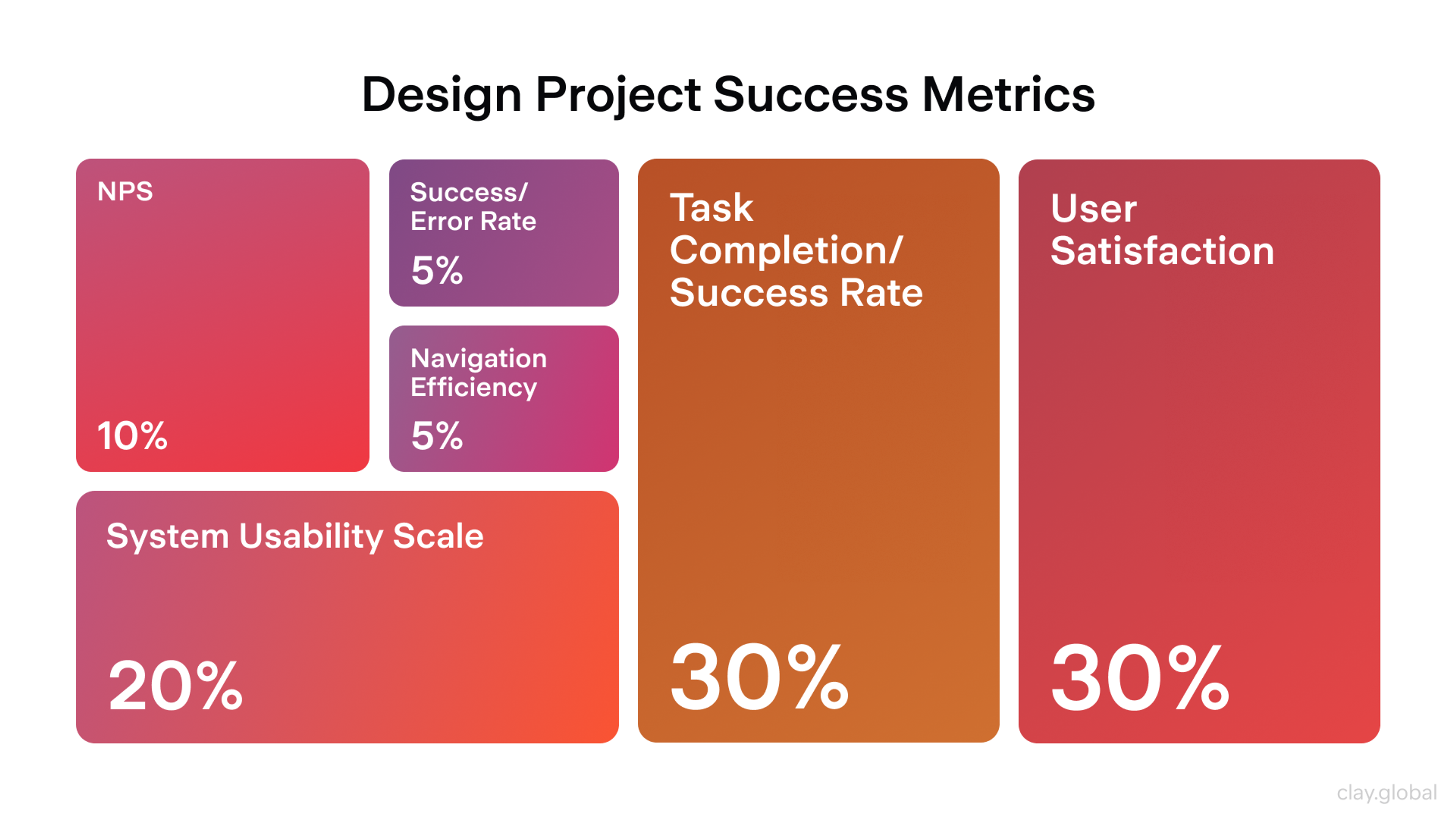
Measuring Usability
Every business needs to ask a key question: is our product easy to use, helpful, and user-friendly? Usability metrics help answer this by showing how well people can use a product and how smoothly they move through it.
These metrics focus on four main things:
- Completion rate: The percentage of users who successfully finish a task
- Task time: How long it takes to complete the task
- Session errors: How many mistakes users make while trying to finish the task
- Satisfaction score: How satisfied users feel with the experience
Usability Test and Where It Stands by Clay

These numbers help businesses find out where users struggle. The goal is to make the product experience smooth and simple.
If error rates are high, the design might be confusing or hard to navigate. A low completion rate could mean the instructions aren’t clear enough, hurting usability. Low satisfaction scores are a sign that users aren’t happy, and the company needs to find out why.
Basic usability metrics are helpful, but companies should also look at a few more detailed ones to get the full picture. These extra metrics give deeper insight into how users learn and interact with a product over time:
- Learnability: How quickly users can figure out how to use the product for the first time
- Memorability: How easily users can use the product again after not using it for a while
- Navigability: The paths users take to move through the product and how easy those paths are to follow
- Complexity: How hard or easy the product is to understand and use
Combining user behavior and preferences with traditional UX metrics can help companies better understand user behavior and preferences. This helps them design products that are not just usable but also easier to learn, return to, and enjoy over time.
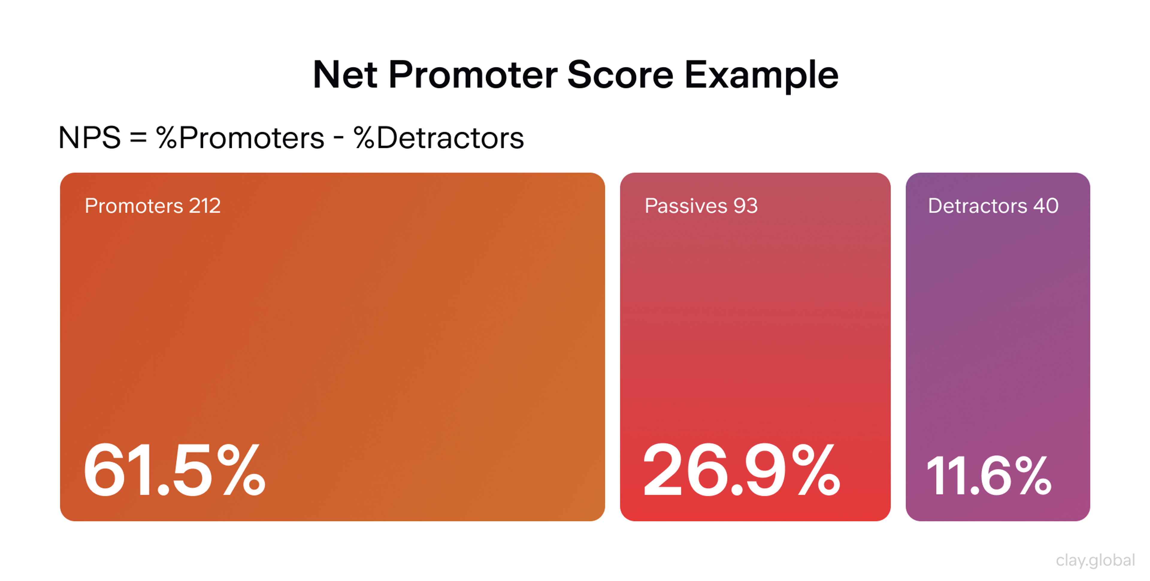
NPS (Net Promoter Score)
The Net Promoter Score determines loyalty by asking customers how likely they are to recommend a company. Unfortunately, there is not a single metric to assess customer loyalty or NPS.
The most common way is to use a customer loyalty NPS score that a customer provides after interacting with a company. The most common way to calculate NPS is to use a customer loyalty NPS score given after a customer interacts with a company.
The calculations are simple: take a survey to get a score, then classify customers as `Promoters` (9-10), `Passives` (7-8), or `Detractors` (0-6).
The NPS score is calculated as the Promoter Percentage minus the Detractor Percentage. After NPS is calculated, we can analyze changes in consumer attitudes and predict the next steps to improve customer loyalty over time.
Net Promoter Score (NPS) by Clay
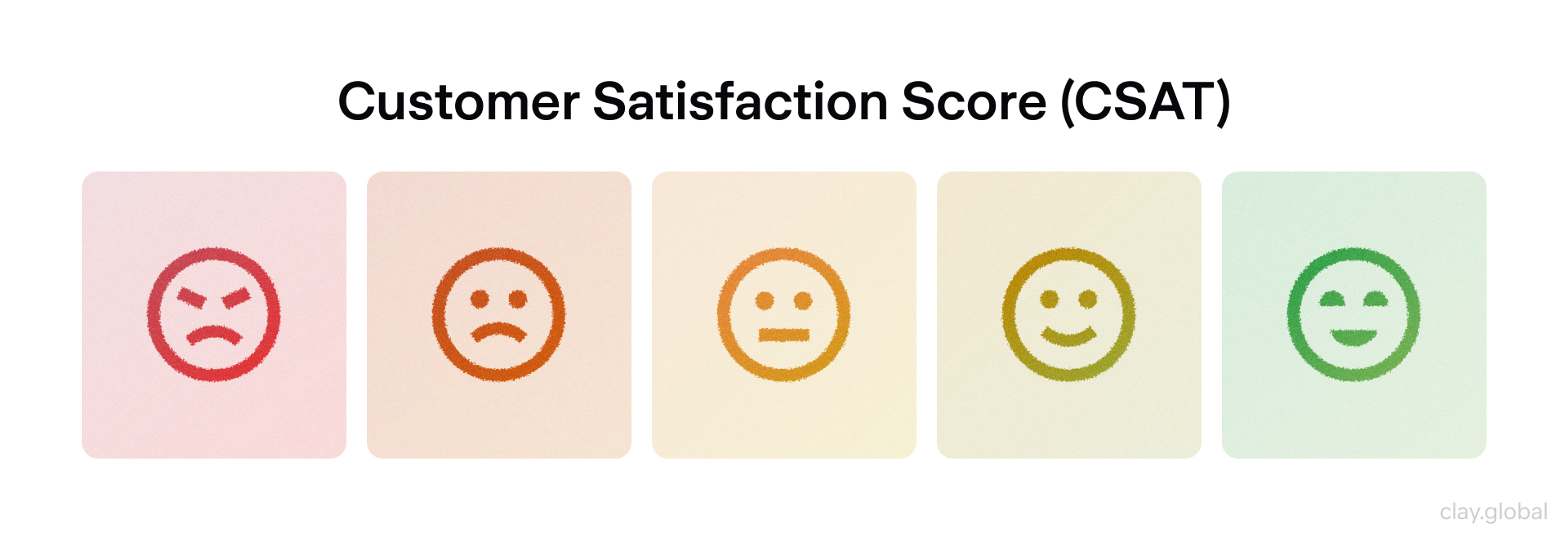
CSAT (Customer Satisfaction)
This metric provides a company with insight into how satisfied a consumer is after a specific interaction. As with NPS, the most common way to collect the Customer Satisfaction Score is via survey questions.
The questions are generally on a scale from `1` to `5` or `1` to `10`. CSAT score is a tremendous metric that helps a company learn what is working and what is not, and how to improve the interaction.
Customer Satisfaction Score (CSAT) by Clay
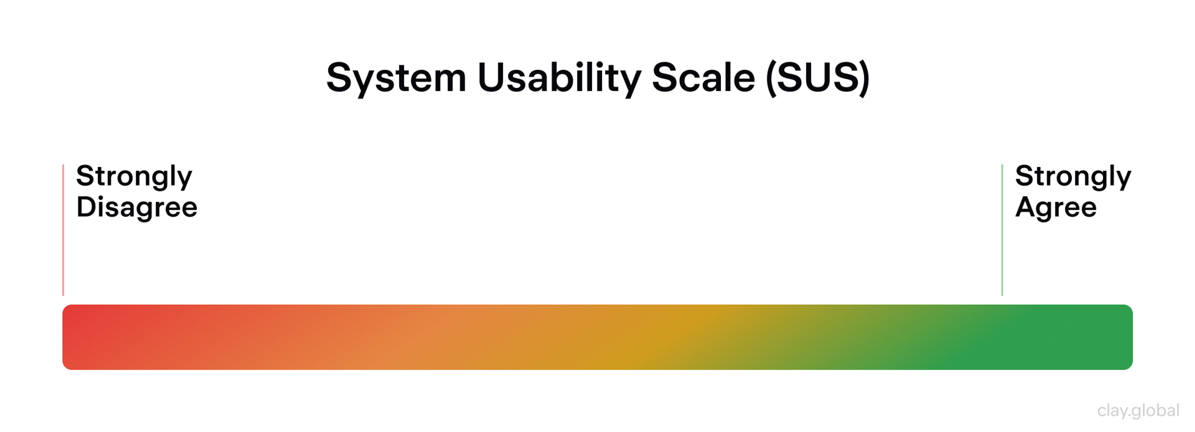
SUS (System Usability Scale)
The System Usability Score is a simple metric that enables a company to collect more usability measures from fewer data points.
System Usability Score produces a single usability score. It increases the ability to benchmark products and helps a company evaluate data.
System Usability Scale (SUS) by Clay
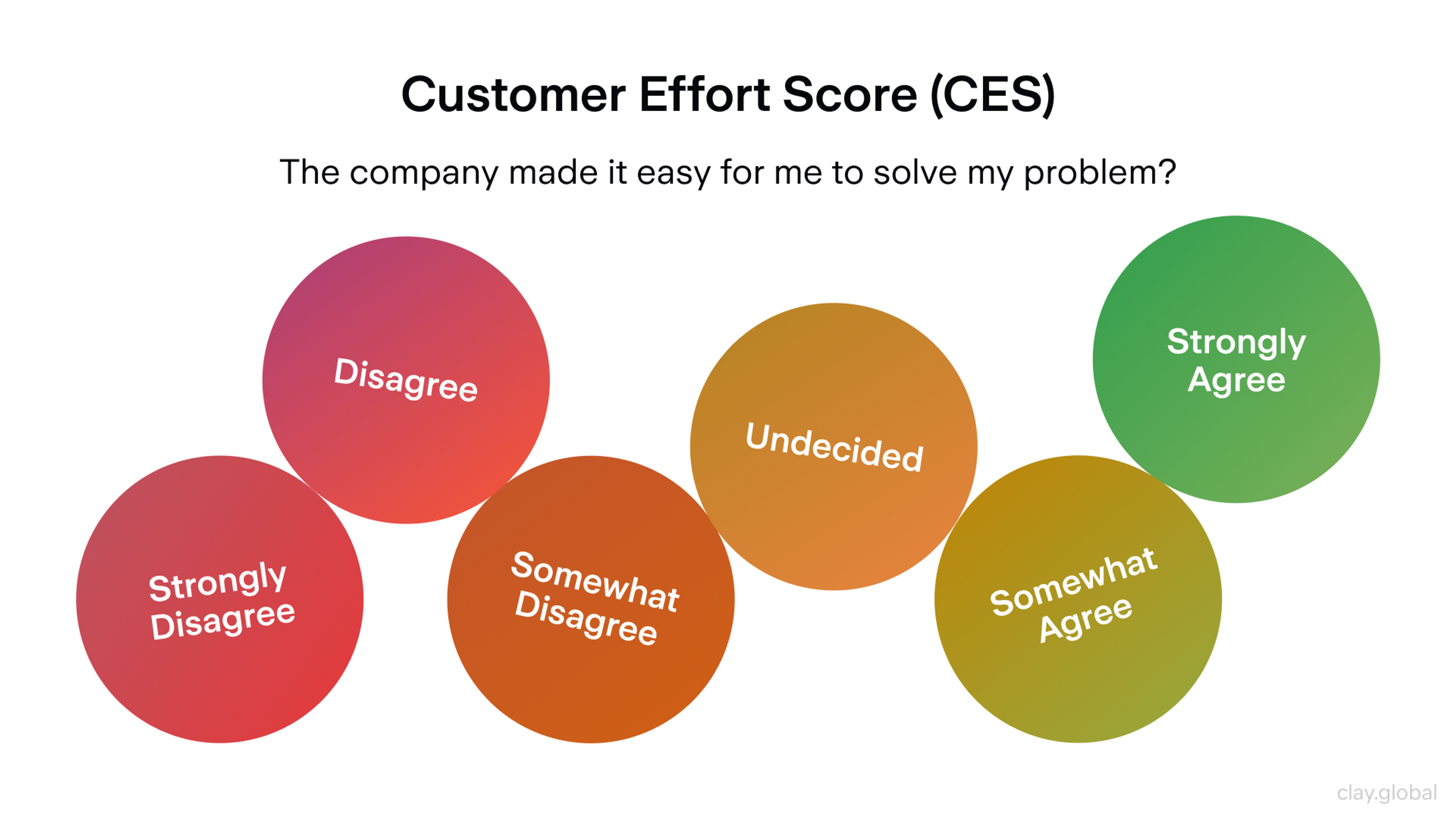
CES (Customer Effort Score)
The CES measures how easy it is for customers to use a service to complete a given task. The most common way to assess the usability of a score is via a scale from `1` to `7`.
The lower the number, the easier it is to complete a task, and the experience is generally smoother and more pleasant. CES highlights areas where a company can improve to eliminate unnecessary steps that add to customer frustration.
The Customer Effort Score helps identify areas in a business that may add to customer frustration and reduce it, leading to a better customer experience.
Customer Effort Score (CES) by Clay
Single Ease Question (SEQ)
Single Ease Questions ask users to answer a single, easy question after completing a task to measure usability. The question is typically, "How easy/difficult was this task?"
The user will then select a number from 1-7, 1 being extremely difficult and 7 being very easy. SEQs are quite useful for answering questions about how UX changes affect key flows over time.
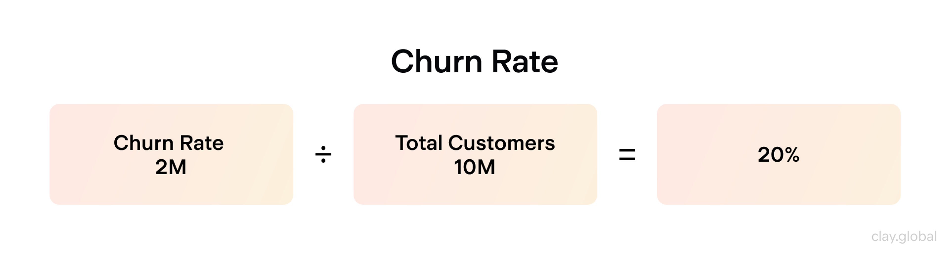
Customer Churn Rate (CCR)
CCR quantifies churn as the percentage of customers who discontinue use or cancel]over a given time frame.
Churn Rate = (Customers lost ÷ Customers at start) × 100.
Churn rates indicate reduced value, issues with the product, changes in pricing, or increased difficulty in accessing support, and it's a strong retention health indicator.
Churn Rate by Clay
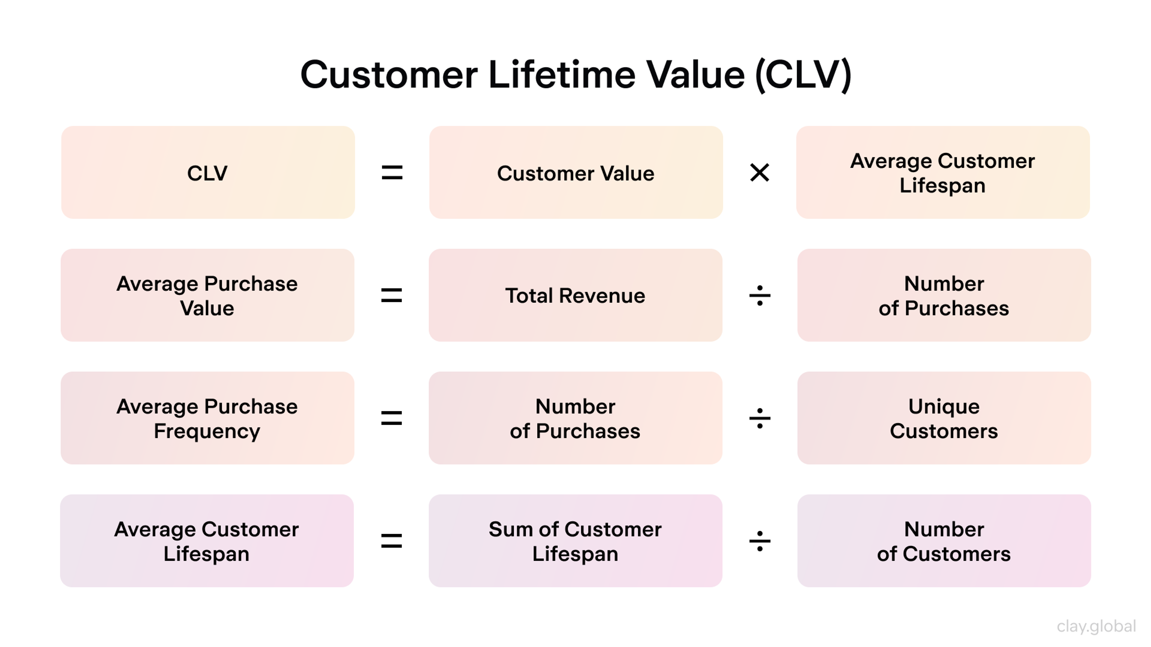
Customer Lifetime Value (CLV)
CLV provides value by forecasting the total revenue a customer will generate while they are a customer of the business. This is commonly calculated using the average purchase value × purchase frequency × customer lifespan.
A business looking to provide value to its customers will use CLV to inform how much it can afford to spend on acquiring and retaining customers while still making a profit.
Customer Lifetime Value (CLV) by Clay
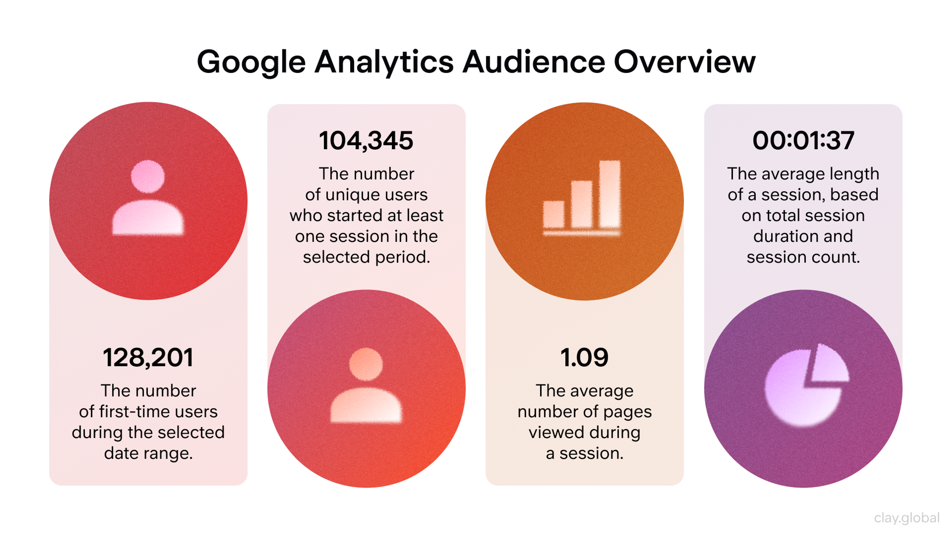
Time Spent On Page
Users' time on page can be a measure of several user behaviors, including engagement and confusion.
It is most helpful when combined with other metrics, such as bounce rate, clicks, or scroll depth, to determine whether users are reaching their goal or getting stuck.
Google Analytics Audience Overview by Clay
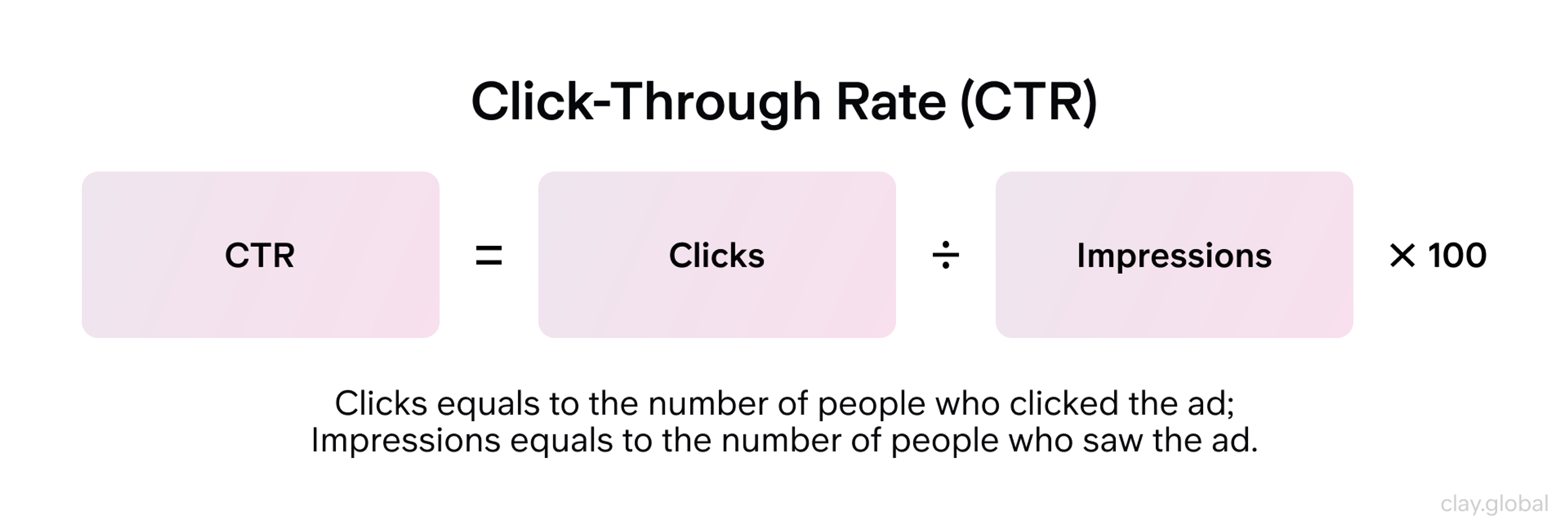
CTR (Click-Through Rate)
CTR is useful for measuring relevance, messaging, and placement, as a low CTR indicates an issue with the creative or placement.
CTR = (Clicks ÷ Impressions) × 100.
Click-Through Rate (CTR) by Clay
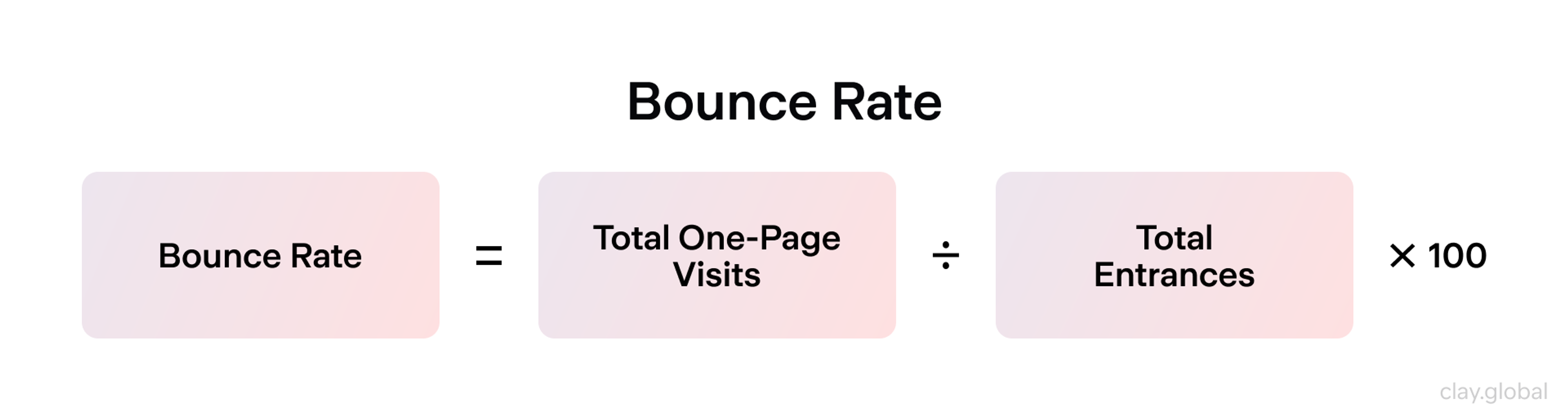
Bounce Rate
A high bounce rate can indicate low relevance, long load times, unclear messaging, or poor page experience.
Bounce Rate = (Bounces ÷ Total visits) × 100.
Bounce Rate by Clay
Conversion Rate
It helps identify which funnel steps require improvement.
Conversion Rate = (Conversions ÷ Visitors) × 100.
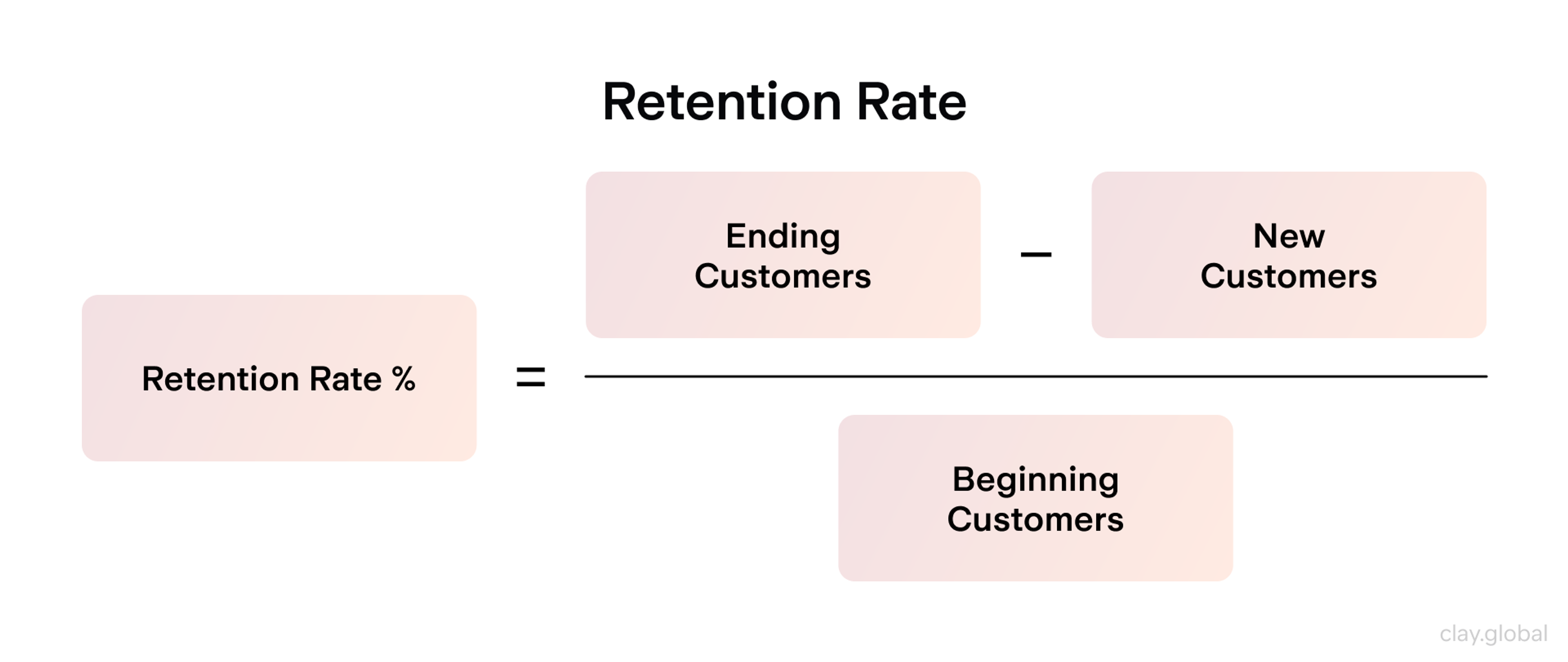
Retention Rate
Retention rates measure how many users remain active or continue to visit over time.
Retention Rate = Active users left ÷ Total users x 100%
If retention is high, it signals that value is consistently being created and that the experience is strong. If the value created is consistently low or absent, this signals churn risk and highlights opportunities for improvement.
Retention Rate by Clay
How to Choose the Right Methods And Metric
Up to this point, we've discussed several UX measurement methods, all yielding a particularly valuable set of data points. But how does a company choose which is most relevant to their needs? This is based on several considerations, including:
1.
Objectives and goals2.
Audience and context3.
Qualitative vs. quantitative approaches4.
Limitations and biases in understanding
Objective and Goal Determinations
Select your objectives, then choose the appropriate techniques and metrics that best address them.
Use surveys to gauge satisfaction and attitudes, and conduct experiments such as A/B testing to compare versions and determine their impact in isolation.

Context and Audience Understanding
Create objectives that address the specific audience(s) that you serve, what they want, and the problems that they face. Your metrics should capture that.
Qualitative vs. Quantitative Approaches
Integrating qualitative data and quantitative data enable you to grasp the situation both on the qualitative and quantitative side(s) respectively. This unifies the outcomes and the causes, and equips you to determine what to change.

Knowing Limitations And Biases
Be alert to confirmation bias, as well as sampling bias. To validate your insights, use the hinges and see if the metrics, public feedback, and some user segments confirm what you see.
Leveraging User Feedback
Collect it often. Use surveys, interviews, usability testing, and behavioral analysis to identify friction points. This can help you allocate and prioritize fixes and iterate continuously.
Best Practices for UX Metrics
To measure user experience effectively, businesses should follow best practices for UX metrics. These include:
- Setting Clear Goals and Objectives: Know what you want to achieve. Are you trying to raise task success rates? Improve user satisfaction? Boost your Net Promoter Score (NPS)? Clear goals help you stay focused and measure the right things.
- Choosing the Right Metrics: Pick metrics that match your goals. Common ones include task success rate, user satisfaction, and NPS. These show how users interact with your product and how they feel about it.
- Combining Quantitative and Qualitative Metrics: Combine quantitative metrics (like success or error rates) with qualitative ones (like survey or interview feedback). This gives you a full picture of the user experience.
- Regular Analysis: Don’t wait for problems to grow. Look at your metrics often to spot trends early and improve before issues get bigger.
- Informing Design Decisions: Use what you learn to guide product changes. When design choices are based on real user data, your product becomes more useful and user-friendly.
Following these steps helps ensure your UX metrics are clear, accurate, and actionable. That leads to better experiences for users and better results for your business. Ta-da!
FAQ
What Are the Key 4 Performance Indicators?
The four key performance indicators (KPIs) for user experience are:
1.
User Retention Rate – measures how many users return over time.2.
Conversion Rate – tracks how many users complete a goal, like signing up or purchasing.3.
Customer Satisfaction Score (CSAT) – shows how happy users are with a product or service.4.
Net Promoter Score (NPS) – gauges how likely users are to recommend the product to others.
These indicators provide a well-rounded view of product performance and user loyalty.
How to Measure UX Content?
UX content is measured using a mix of user feedback and behavioral data. Key methods include:
- Task success rates to see if users understand and complete actions guided by the content.
- Time on task to measure how long users spend reading or interacting with content.
- Content-specific CSAT surveys to capture satisfaction.
- Heatmaps and click tracking to identify engagement patterns.
Content testing, A/B experiments, and qualitative feedback also reveal whether content supports usability goals.
How to Measure UX Improvements?
To measure UX improvements, compare key metrics before and after changes. Focus on:
- Task success rate: Are users completing tasks more often or faster?
- Error rate: Are they making fewer mistakes?
- CSAT, NPS, and SUS scores: Are satisfaction and usability scores rising?
- Engagement and retention: Are more users returning or converting?
Use analytics tools, usability tests, and surveys to track impact over time.
How to Measure Engagement in UX?
Measure user engagement in UX by analyzing:
- Time spent on page or in product: Longer time can show interest (or confusion, if combined with other signals).
- Click-through rate (CTR): Tracks how often users interact with content or features.
- Event tracking: Measures interactions with key elements (buttons, videos, tools).
- Feature usage frequency: Shows which tools users find most valuable.
- Scroll depth and heatmaps: Reveal how deeply users explore a page.
Pair these with user feedback to understand motivation and intent.
How to Measure UI Quality?
UI quality is measured through a blend of usability and visual feedback:
- System Usability Scale (SUS): A trusted tool for assessing perceived usability.
- Aesthetic Usability Effect: Survey users on visual satisfaction and trust.
- Error rate and task success: Show how the UI affects user performance.
- Accessibility audits: Check compliance with WCAG standards.
- User feedback and visual consistency reviews: Ensure clarity and cohesion across screens.
These methods help assess how intuitive, attractive, and accessible the UI feels to real users.
How to Measure Error Rate in UX?
Error rate is the percentage of tasks users attempt but fail due to mistakes. To measure it:
Error Rate = (Total errors ÷ Total attempts) × 100
Track this through:
- Usability testing: Watch for failed clicks or incorrect actions.
- Analytics tools: Detect form errors, drop-offs, and system warnings.
- User recordings and feedback: Help explain why errors happen.
Lower error rates usually mean clearer design and better user guidance.
How to Measure Success as a UX Designer?
Success as a UX designer is measured by:
- User outcomes: High task success, satisfaction, and retention rates.
- Business impact: Increases in conversion, engagement, and ROI.
- UX metrics: Improvements in NPS, CSAT, CES, or SUS scores over time.
- Team feedback and collaboration: Positive input from peers and stakeholders.
- Growth and learning: Expanding skills, solving complex problems, and delivering consistent value.
A successful UX designer creates user-centered solutions that meet both user needs and business goals.
Read More
Conclusion
Though retention and engagement are important, it is not wise to rely on one metric. When you use a variety of methods, including having a clear bias in your findings, I will help you arrive at better judgments and user experience enhancements that suit your audience.

About Clay
Clay is a UI/UX design & branding agency in San Francisco. We team up with startups and leading brands to create transformative digital experience. Clients: Facebook, Slack, Google, Amazon, Credit Karma, Zenefits, etc.
Learn moreAbout Clay
Clay is a UI/UX design & branding agency in San Francisco. We team up with startups and leading brands to create transformative digital experience. Clients: Facebook, Slack, Google, Amazon, Credit Karma, Zenefits, etc.
Learn more