Most "approved" designs aren't really approved. Stakeholders nodded at a wireframe, agreed it looked solid, and quietly formed their own private mental image of the final product.
Usually, the one that resembles a website they admire rather than the one you're actually designing. The mockup is what closes that gap. It turns a vague mental picture into a single shared one.
That's the job. A UX mockup sits between the rough scaffolding of a wireframe and the clickable feedback loop of a prototype. It's the first time anyone - be it your team, your client, your CEO's spouse who has opinions - actually sees what you're building.
Skip this step or rush through it, and the disagreements get pushed downstream into engineering, where bugs cost roughly six times more to fix during implementation than during design, according to the IBM Systems Sciences Institute.
Key Takeaways
- A UX mockup is a static, high-detail visual of an interface (with real colors, typography, and components) that lacks the click logic of a prototype.
- Wireframes are scaffolding, mockups are the painted facade, prototypes are the working doorbell. Each phase answers a different question.
- Mockups exist mainly to align humans, not to test usability, though static review still catches a surprising amount of friction early.
- Skipping low-fidelity and jumping straight to high-fidelity is one of the most expensive mistakes new designers make.
- Figma now holds around 80–90% of the UI/UX design tool market, but the right tool depends on the job, not the trend.
- AI is reshaping how mockups get drafted, but the strategic decisions still belong to the designer.
What Is a UX Mockup?
A UX mockup is a static, high-fidelity visual representation of an interface. Think of it as the design photographed before it can move. Colors are real, typography is real, spacing is real, and the brand assets come straight from the actual style guide, not the gray rectangles you'd see in a wireframe.
What it isn't: a working product. You can't click anything. Buttons don't lead anywhere. Forms don't validate. That's deliberate. The mockup's job is to settle visual and structural questions before anyone burns development time making them work.
Designers usually build mockups in Figma, Sketch, or Penpot, layering refinement on top of an approved wireframe. The result is something a stakeholder can look at and say, "yes, that's the product" or "the hero feels too crowded" without getting tangled in technical implementation details.
You'll hear "mockup" used loosely in the user experience design industry. Sometimes as a synonym for prototype, sometimes for any visual that isn't a wireframe.
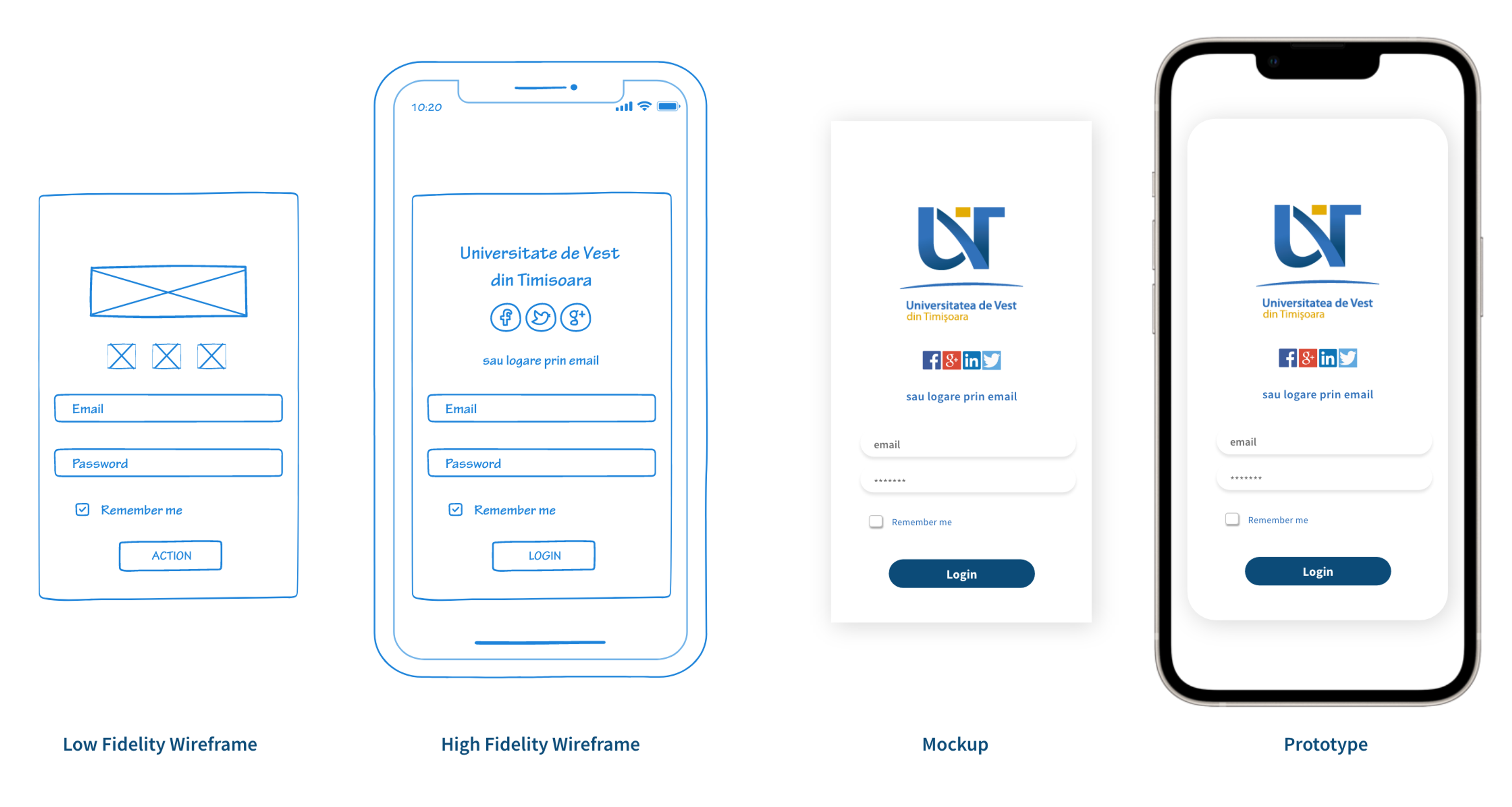
Wireframes vs. Mockups vs. Prototypes
These three artifacts get mashed together more than they should. They aren't the same thing, and treating them as interchangeable wastes time at every stage of design.
Wireframes: the Blueprint
A wireframe is the skeleton. Boxes for images, lines for text, no color, no typography. It answers structural questions only: where does the navigation sit? How many sections does the page have? Is the CTA above or below the fold?
You sketch wireframes in tools like Balsamiq, FigJam, or even pen and paper. The deliberate ugliness is the point, because it stops people from arguing about the shade of blue when you haven't even decided what goes on the page yet.
Mockups: the Painted Facade
A mockup takes the approved wireframe and dresses it up. Real colors, brand-correct typography, actual imagery, and the icon set you'll ship with.
Stakeholders react to mockups in a way they never react to wireframes: now they can see it.
Mockup vs Wireframe vs Prototype by Clay

This is where most visual disagreements get resolved. The mockup also becomes the artifact developers refer back to during the build, because it carries the canonical look of every component.
Prototypes: the Working Doorbell
A prototype takes the mockup and adds behavior. Buttons go places. Modals open. Hover states animate. You're not building a real product, but a believable-enough simulation to test whether real users can use it.
Tools like Figma's prototyping mode, Framer, and Axure RP handle this. Prototypes are where you find out that the navigation everyone loved in the mockup is actually confusing once people try to tap it.
The takeaway: ship a wireframe to validate the structure, a mockup to validate the visual identity, and a prototype to validate the interaction. Conflate them, and you'll end up testing the wrong thing at the wrong time.
Why Mockups Matter More Than You Think
Mockups solve a problem that's mostly social: getting humans to agree on what something should look like before money gets spent making it.
Stakeholders don't read wireframes well. They squint at them, nod politely, and form their own private mental image of the final product. When the polished version eventually lands, the gap between expectation and reality becomes a feedback war you didn't see coming.
A mockup short-circuits that. Stakeholders react to what's actually being built, not to what they hoped you'd build. Feedback gets sharper, and branding misalignment surfaces earlier.
The arguments that would have happened in production happen in Figma instead, where they cost a few hours of revision rather than a sprint.
Benefits of Mockups
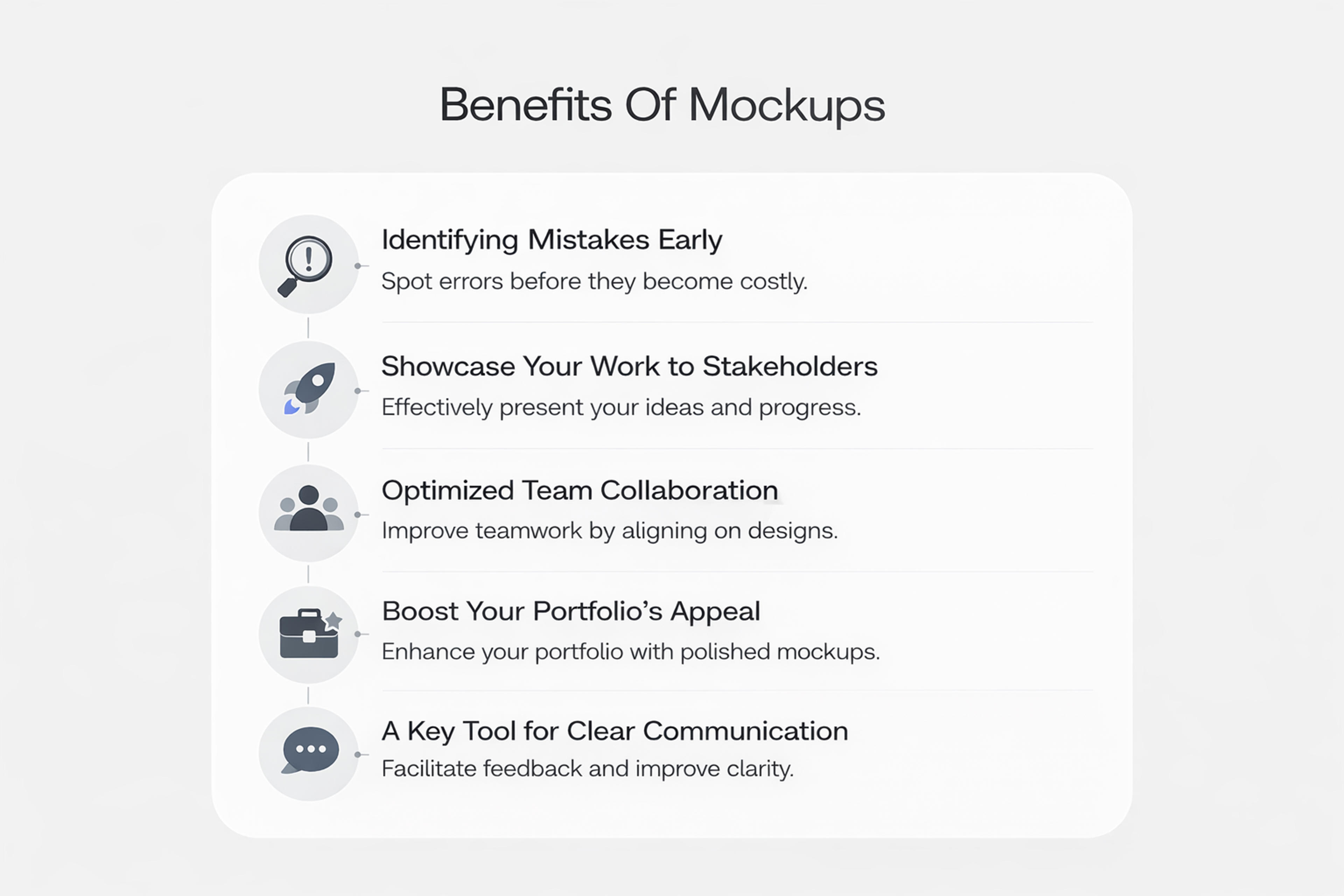
Static mockups also catch real usability problems. Tap targets are too small, a hierarchy that buries the primary action, color contrast that fails at small sizes…
None of this requires interactivity to spot, it just requires fresh eyes on something realistic enough to evaluate. With 80.3% of businesses rating usability as the single most important web design factor, catching these issues at the mockup stage pays off directly.
And iteration is fast. Swapping a color palette across a screen in Figma takes minutes. Trying three typography options is a quick afternoon exercise. Compare that to refactoring a half-built React component, and the math is obvious.
Types of UX Mockups
Not every mockup needs the same level of polish. Match fidelity to the question you're trying to answer.
Low-Fidelity Mockups
Low-fi mockups sit just above wireframes. You've added some color, maybe basic typography, but you're still rough around the edges. They're built for fast comparison: the goal is to show three or four directions side by side without anyone getting attached to one because it looks finished.
Use them in early concept work, especially when presenting to a team that needs to weigh in on direction before committing to detail. They invite real feedback because they are not final.
High-Fidelity Mockups
High-fi mockups are the version you've probably seen in design portfolios: pixel-precise, brand-perfect, indistinguishable from a screenshot of the live product. Every shadow, every spacing decision, every micro-interaction state is locked in.
Source: Alexandruionascu, CC BY-SA 4.0, via Wikimedia Commons
These come after low-fi has confirmed the direction. They're the artifact you hand to developers, present to executives, and use as the source of truth for QA later in the cycle. Spending high-fi effort on the wrong direction is the most common time-waster in design - get the cheap version approved first.
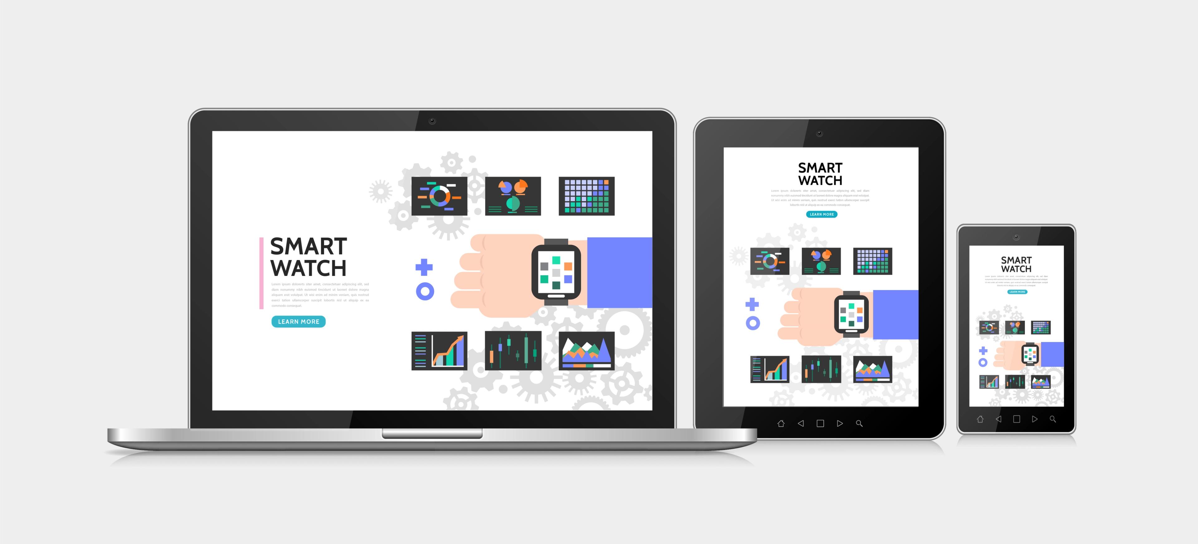
Device-Specific Mockups
A desktop layout doesn't survive contact with a phone. Hierarchy that breathes on a 27-inch monitor suffocates on a 6-inch screen. Device-specific mockups address this directly, with separate compositions for mobile, tablet, and desktop.
In 2026, mobile-first is the assumption, and not the exception. Build the mobile mockup first, then expand outward. Every breakpoint you skip becomes a guess for your engineers, and engineers are not paid to guess.
Anatomy of a Strong UX Mockup
Five things separate a mockup that earns approval from one that gets a polite "we'll think about it."
Color used with intent. Every shade should map to a decision: primary action, secondary action, status, brand mood. Random color choices read as random to users, even if they can't explain why.
Typography that holds across devices. Test your type stack at the smallest size you'll ever ship. If body copy gets cramped on mobile, fix it now, not after launch.
Spacing as the silent designer. Whitespace isn't empty - it's structural. A mockup that feels chaotic almost always has a spacing problem, not a content problem. Set a baseline grid early and respect it.
Information hierarchy that mirrors user goals. What does the user need to see first? Second? Last? Size, weight, position, and color carry the answer. Get this wrong, and the most beautiful mockup in the world will fail in usability testing.
Component consistency. Buttons that change shape between screens, inputs with three different border radii, icons from four different icon sets. All of these are smell tests for an unrigorous design system. Every element should look like it came from the same family, because in production, it has to.
Best Practices for Building Mockups That Get Approved
Skill plus process beats skill alone. The teams that ship cleanly tend to follow the same handful of habits.
- Start with a wireframe every time. Even if it takes ten minutes. Even if you "already know" the layout. The wireframe forces you to make structural decisions on cheap real estate. Skip it, and you're making those decisions at high-fidelity speed, which is slow.
- Set a visual hierarchy before adding flourish. Decide what the primary action is. Decide what supports it. Decide what's ambient. Then style accordingly. Designers who skip this end up with mockups where everything competes for attention, and nothing wins.
- Use real content, not lorem ipsum. Real copy is messier than placeholder text. Real product names are longer. Real headlines wrap awkwardly. Real user-generated content isn't curated. Designing against placeholder text builds a mockup that breaks the moment real content arrives.
- Maintain consistency across screens. A button that's 8px rounded on the home screen and 12px rounded on the cart screen is the kind of detail nobody mentions, but everyone feels. Pull from a shared library of components.
- Design for the device, not the canvas. Mobile-first isn't a slogan, it's a discipline. Constraint forces clarity. Designers who start desktop and "scale down" almost always end up with cramped mobile experiences.
Source: Image by macrovector on Freepik
- Get the mockup in front of real users early. Even static mockups reveal usability issues: tap target size, button label clarity, and scannability. You don't need a working prototype to catch the obvious mistakes.
- Lean on your design system, not your memory. If the system says button radius is 6px, don't eyeball it. Pull the component. Consistency at scale only happens when designers stop treating the system as a suggestion.
UX Mockup Tools That Matter in 2026
The design tool landscape has consolidated hard over the last few years. Adobe XD was discontinued. InVision shut down its core product. Sketch lost ground to cloud-native alternatives. Here's what's actually worth using now.
Figma
Figma is the default. It holds roughly 80–90% of the UI/UX design tool market, powers design at 95% of Fortune 500 companies, and serves over 13 million monthly active users. Real-time collaboration, robust component systems, and a deep plugin ecosystem make it hard to beat for most teams.
Sketch
Sketch still has loyal users among Mac-only studios that prize a native experience over browser-based collaboration. It's mature, fast, and integrates well with the Apple ecosystem. Smaller teams that don't need real-time multiplayer often prefer it.
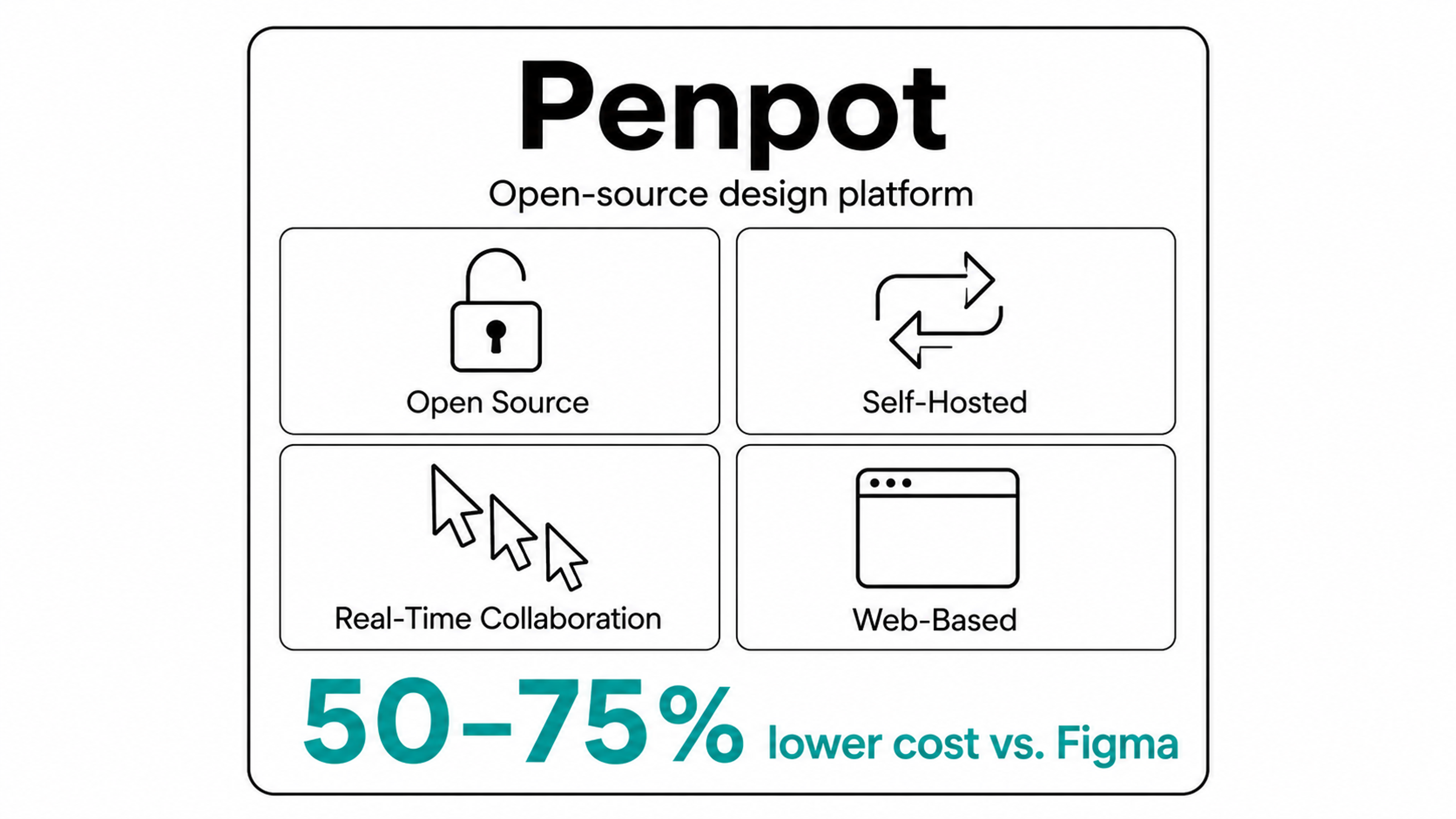
Penpot
Penpot is the open-source alternative gaining traction with privacy-conscious teams and organizations that want to self-host. It runs on web standards, offers similar functionality to Figma at a reportedly 50–75% lower cost, and has matured significantly since 2024.
Penpot
Balsamiq
Balsamiq deliberately stays in the wireframing lane. Its hand-drawn aesthetic keeps stakeholders focused on structure rather than polish. Good for early concepting, terrible for final mockups, which is the point.
Axure RP
Axure handles complex, conditional logic that other tools choke on. If your mockups need dynamic content, branching logic, or near-prototype interactivity baked into the static deliverable, Axure earns its learning curve. Enterprise teams with complex workflows still rely on it.
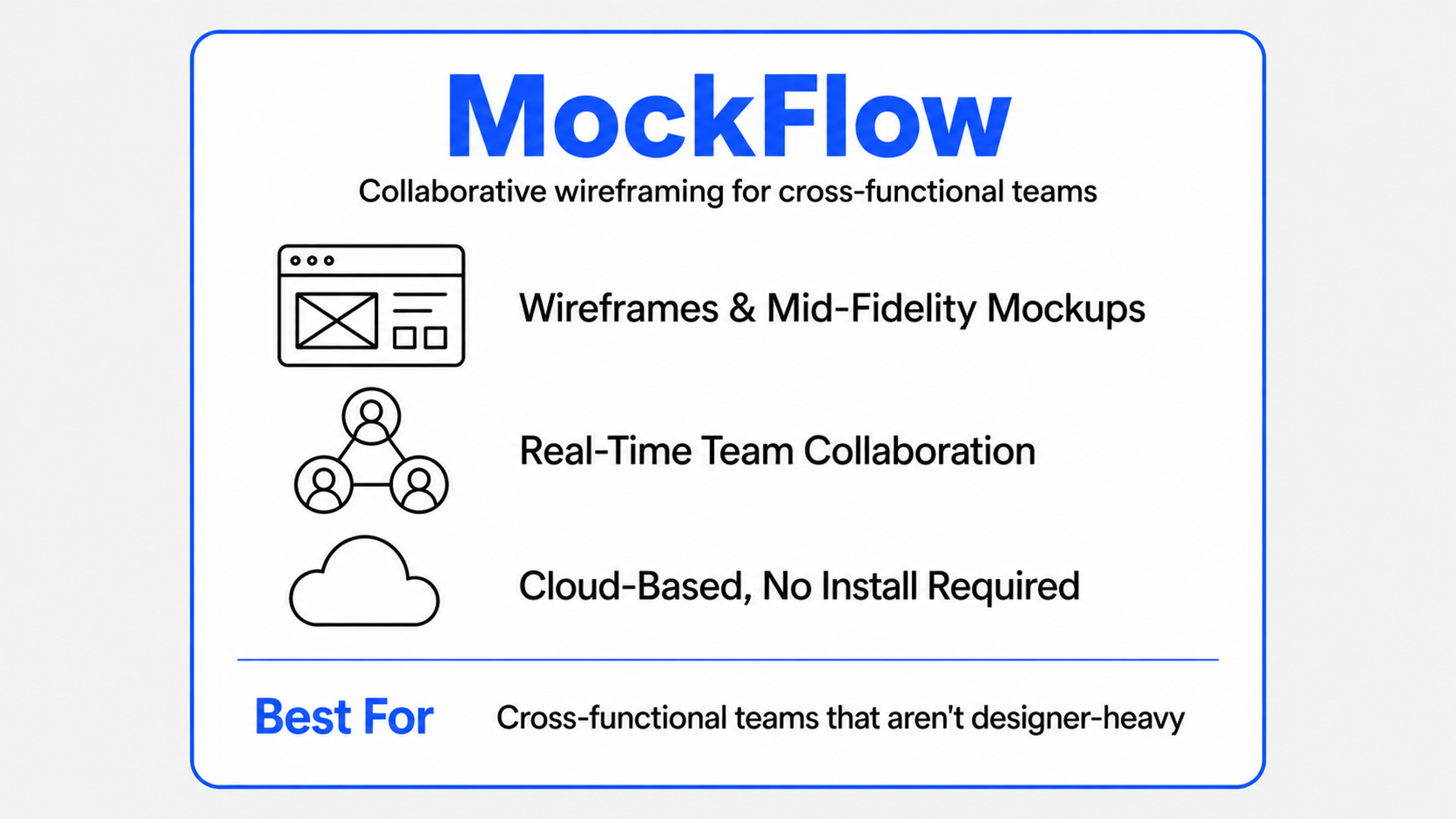
MockFlow
MockFlow sits between Balsamiq and Figma, with a focus on collaborative wireframing and lightweight mockups. It's a fit for cross-functional teams that aren't designer-heavy and need something simpler than full Figma.
Mockflow
The honest answer: most teams should start with Figma and only branch out when they hit a specific limit that it can't solve.
How AI Is Changing Mockup Workflows
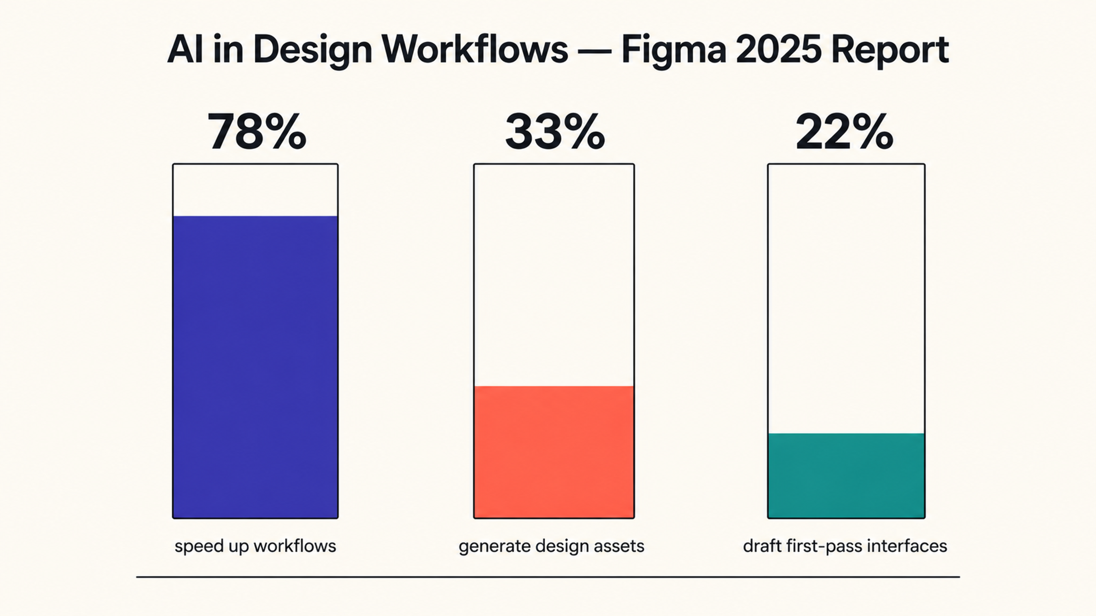
AI hit design tools harder in 2025 and 2026 than most designers expected. According to Figma's 2025 AI report, 78% of designers and developers say AI tools meaningfully speed up their workflows, 33% of designers now use AI to generate design assets, and 22% use it to draft entire first-pass interfaces.
Figma 2025 Report Figures
Where AI helps in mockup work: generating filler imagery that looks better than stock photos, drafting initial layouts from a brief, suggesting color palettes from a brand reference, and writing realistic placeholder copy that surfaces real-content edge cases. Tools like Figma's Make 2.0, Galileo AI, and Uizard now produce passable first drafts in seconds.
Where AI doesn't replace designers: hierarchy, accessibility, brand voice, and the strategic judgment about what to emphasize. AI generates candidate designs; the designer decides which one is right and why. The mockup is still a human artifact. AI just speeds up the boring parts.
One caveat worth holding onto: only 58% of designers say AI improves the quality of their work, even though most agree it speeds it up. Faster isn't automatically better. Use AI to remove friction, not to outsource design decisions.
Read more
FAQ
What's the difference between a UX mockup and a UI mockup?
In practice, the terms get used interchangeably, but there's a nuance. A UI mockup focuses purely on visual interface elements: what buttons, panels, and components look like. A UX mockup tends to imply the visual is also evaluated against user goals, journey context, and overall experience. Most designers don't distinguish between the two in casual use.
How long should it take to create a UX mockup?
For a single screen at high fidelity, anywhere from two to eight hours, depending on complexity, brand maturity, and how solid your design system is. A full app's worth of mockups can take a week or two for a single designer working from approved wireframes. If it's taking dramatically longer, the wireframe stage probably wasn't thorough enough.
Can I skip wireframes and go straight to mockups?
Technically, yes, practically, no. Skipping wireframes shifts every structural decision into the high-fidelity stage, where each change costs more time. Senior designers occasionally skip wireframes on simple screens they've designed dozens of times, but treat that as the exception, rather than the workflow.
Are mockups the same as design comps?
Yes, mostly. "Design comp" (short for composition) is an older language from print and early web design that survives in some agencies and at older companies. Functionally, a comp and a high-fidelity mockup describe the same artifact.
Do I need a designer to create a UX mockup?
Not necessarily. Tools like Figma, Penpot, and Uizard have lowered the barrier enough that founders, PMs, and developers can produce serviceable mockups for early validation. For anything customer-facing or brand-critical, a trained designer still brings significantly more polish and strategic judgment.
What file formats do mockups come in?
Native files in Figma (.fig), Sketch (.sketch), and Penpot (.penpot). For sharing with non-designers, exports as PNG, JPG, or PDF are standard. Developers usually work directly inside Figma or Sketch via dev mode rather than relying on flat exports.
How detailed should a low-fidelity mockup be?
Detailed enough to communicate hierarchy and rough visual direction, vague enough that no one mistakes it for the final product. A good rule: include real layout and grayscale typography, but skip imagery and final color choices.
Can mockups be used for usability testing?
Yes, with caveats. Static mockups can surface visual hierarchy issues, label confusion, and basic comprehension problems. They can't test interaction flow, for that, you need a prototype. Tools like Maze and UserTesting support both.
How many mockup iterations are normal before approval?
Two to four rounds of feedback are typical for a small project. Larger projects with multiple stakeholders can run six or more. If you're past round eight, the issue is usually unclear stakeholder alignment rather than the mockup itself.
What's the biggest mistake designers make with mockups?
Going to high fidelity too early. Polishing a direction before it's been validated cheaply means every revision costs the full polished version's worth of time. Always confirm direction at low fidelity first.
Should mockups include hover states and animations?
Static mockups can show key states (default, hover, active, disabled) as separate frames. Actual animations belong in prototypes. Including too many state variations in the mockup itself muddies the document - keep it focused.
Are AI-generated mockups good enough to use professionally?
For early drafts and exploratory work, yes, they're a real productivity unlock. For final, brand-critical, customer-facing designs, AI output still needs significant human refinement. Treat it like a junior designer's first pass, not a finished deliverable.
How do I present mockups to stakeholders without getting derailed?
Frame the conversation before showing the screen. State what decision you're seeking ("we need approval on visual direction, not on copy"), what's locked, and what's still open. Mockups invite opinions on everything; structured presentations narrow them productively.
Do mockups need to match the design system exactly?
Yes, if a design system exists. Off-system components in mockups become off-system components in production, which becomes technical debt. If something genuinely needs to break the system, flag it explicitly so the system can evolve to include it.
What comes after the mockup is approved?
Either prototyping (to validate interaction and flow) or developer handoff (if interaction is straightforward and the mockup carries enough detail). Most teams do both: prototype the complex flows, hand off the rest directly.
Closing Thought
A mockup isn't a deliverable. It's a forcing function. Building one makes you commit to choices that wireframes let you avoid: color, typography, voice, density. Showing one to stakeholders forces them to react to something concrete instead of imagined.

About Clay
Clay is a UI/UX design & branding agency in San Francisco. We team up with startups and leading brands to create transformative digital experience. Clients: Facebook, Slack, Google, Amazon, Credit Karma, Zenefits, etc.
Learn moreAbout Clay
Clay is a UI/UX design & branding agency in San Francisco. We team up with startups and leading brands to create transformative digital experience. Clients: Facebook, Slack, Google, Amazon, Credit Karma, Zenefits, etc.
Learn more