

The footer is where people go when they're lost. They've scrolled past your hero, skimmed the body, and still haven't found the phone number, the returns policy, or the careers link. The bottom of the page is their last stop before they leave.
Most footer advice treats the section like a junk drawer: cram in every link, add some social icons, call it done. That's how you end up with a footer that's technically complete and practically useless. A footer earns its place by helping people finish a task, not by listing everything your site contains.
Nielsen Norman Group put the upside plainly in its footer research: because a footer never blocks users who found what they needed higher up, it can help but it can't hurt, as long as you don't bloat it.
So how do you design a website footer that actually works? It comes down to a handful of decisions: what belongs in a footer, what to keep out, which footer pattern fits your site, and how to build one that holds up on a phone and passes a basic accessibility check.
If you're building a site from scratch or sharpening one you already have, this is the part of the page worth more attention than it usually gets.
Key Takeaways
- Users reach the footer in two ways: they scroll there on purpose looking for expected items like contact details, or they hit the bottom frustrated and use it as a last resort. Design for both.
- The single most common footer mistake is volume. More links dilute the ones people came for and spread your internal link value thin.
- Low-contrast footer text is an accessibility failure, not a style choice. In 2026, 83.9% of home pages have low-contrast text, the web's most common WCAG violation.
- How much a footer holds should follow site type. A publisher needs a different footer than a portfolio, and a site with infinite scroll needs a different approach entirely.
- On mobile, collapse navigation into accordions if you must, but never hide contact info or legal links, and never shrink the footer to the point of illegibility.
What a Website Footer Does
A footer is the strip of content at the bottom of a page, below the main body, that repeats across the site. That's the boring definition. The useful part is understanding why people go there, because that dictates what you put in it.
Users reach the footer for two distinct reasons, and NN/G's research separates them clearly. Some scroll down on purpose, expecting to find specific things: contact information, company details, social links, or a way to keep browsing.
Others arrive at the bottom by accident or frustration. They read the page, didn't find what they needed, and treat the footer as a second chance. A visitor who decided not to sign up might still notice your other services down there.
What a Website Footer Does by Clay
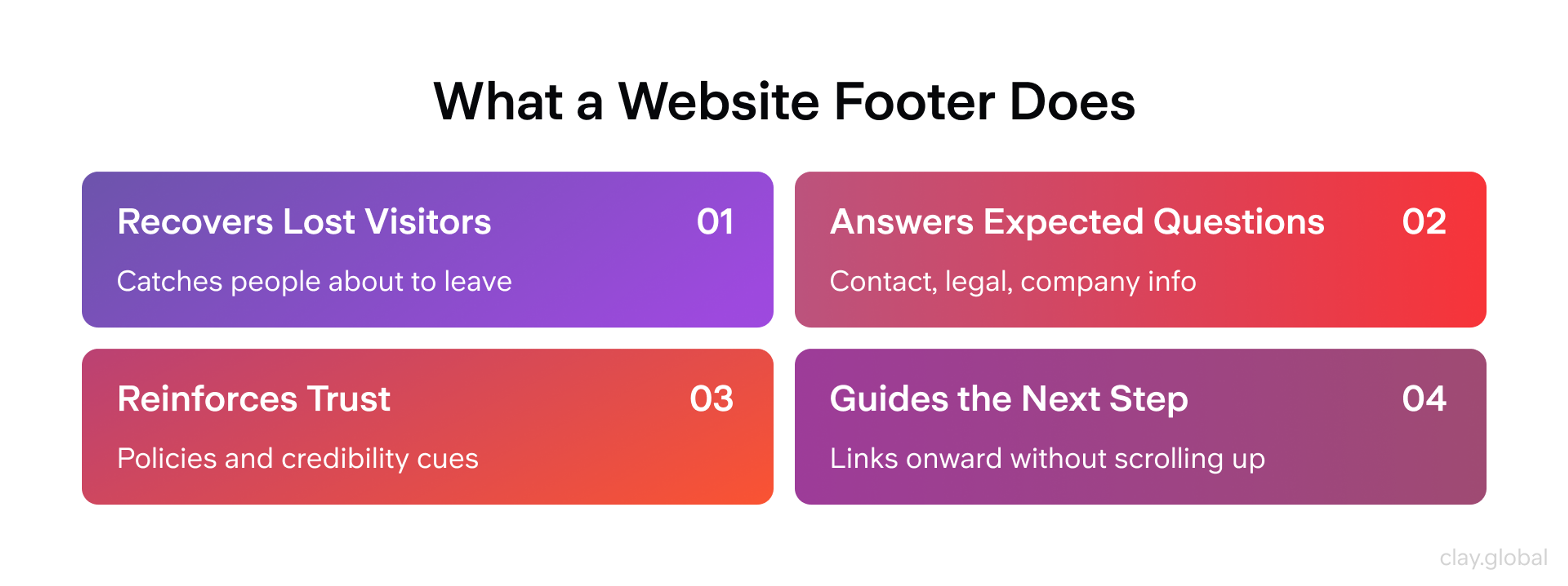
Someone who can't find a careers page in the main menu will look for it in the footer, because that's where secondary tasks tend to live.
Both behaviors point to the same rule. Footer content has to be predictable and consistent across pages. People rely on convention here more than anywhere else on your site.
When they scroll to the bottom, they're not exploring. They're checking a location they already trust to hold certain things. Break that expectation and the footer stops working, quietly, without anyone filing a complaint.
What to Include in a Website Footer
Start with utility links, because almost every site needs them and users look for them first. That means contact information, a privacy policy, terms of use, and a route to customer support. Even if these already sit in your top navigation, repeat them in the footer.
The footer is where people instinctively go for a phone number or an address, and making them scroll back up is a small tax you don't need to charge.
What to Include in a Website Footer by Clay
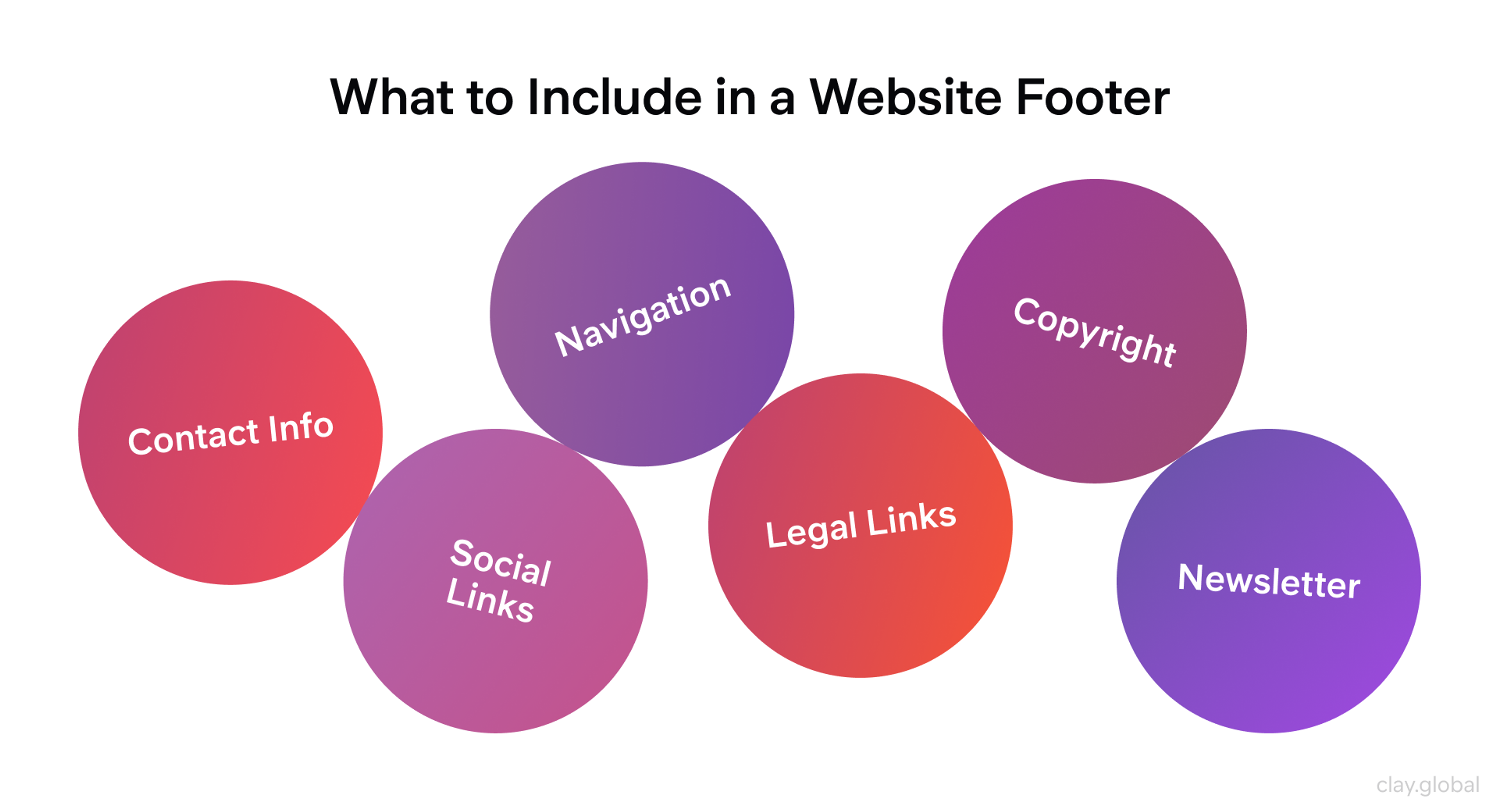
Beyond utilities, a few elements pull their weight for most sites:
- Navigation links. A trimmed set of your most important pages, grouped and labeled clearly. This gives people who've reached the bottom a way to move on without scrolling back to the header.
- Social media links. A path to your active profiles. Link out rather than embedding a live feed unless you post often enough to keep that feed fresh. A stale embedded feed reads as neglect.
- A copyright notice. Useful as a date marker and a signal of an actively maintained site. Worth knowing: copyright protection is automatic the moment you publish original work. The notice doesn't create the right, it just advertises it, so set the year to update automatically and move on.
- A newsletter signup. One of the higher-converting footer elements when the offer is clear. People who reach the footer are often more engaged than average, which makes it a reasonable place to ask.
- Trust signals where they fit. Security badges, certifications, payment icons for ecommerce, or a genuine award. Use these sparingly. A footer stacked with badges reads as insecurity, not credibility.
- A language or region selector for global sites. If you serve multiple markets, the footer is the conventional home for switching language, region, or currency. Users look there for it, which keeps the choice available without cluttering your primary navigation.
The mistake isn't picking the wrong elements. It's picking all of them. Which brings us to the harder discipline.
What Not to Put in Your Footer
A footer fails more often from too much than too little. NN/G's own catalog of footer pitfalls reads like a list of things designers add with good intentions and users quietly ignore. Four are worth calling out.
Too many levels of hierarchy. Dumping an entire sitemap into the footer feels thorough. In practice, it buries the links that matter under the ones that don't.
As the NN/G researcher's mother reportedly put it, if everything is important, nothing is. Show first and second-level pages. If one deeper page genuinely deserves a spot, surface that single link rather than every level beneath it.
Vague link labels. "Resources," "Company Info," and "Help" are the ghosts of footers past. People scanning for a way to reach you want "Contact Us," not a mystery category they have to click to decode.
Use plain, conventional labels. If your team can't agree on a term, that's a signal to test it, not to invent a clever one.
What Not to Put in Your Footer by Clay
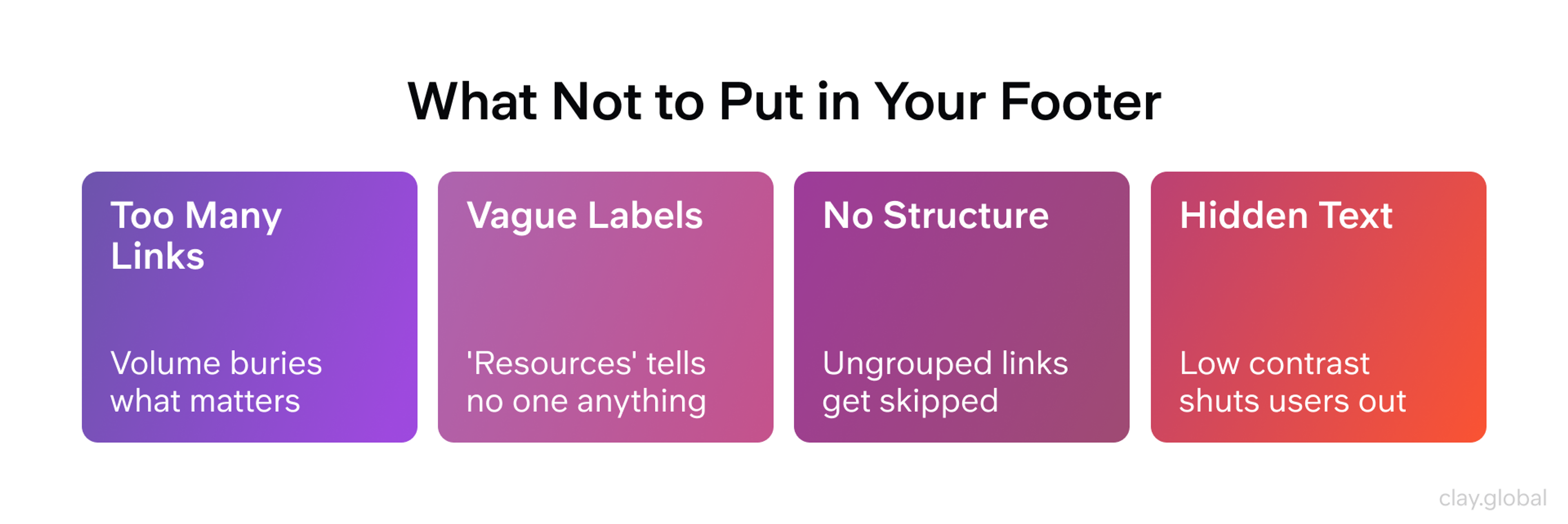
No visible structure. A footer with no grouping becomes a pile of orphaned links. Users either scan it exhaustively or skip it entirely, and neither is the outcome you want.
Group related links under clear headings and use weight or spacing to show which items are primary. A footer should be scannable in a second, not decoded in ten.
Hidden or illegible footers. This is the one that crosses from clutter into real harm. Shrinking footer text to fit more links, or collapsing the whole footer into a decorative accordion that's closed by default, makes the content technically present and functionally invisible.
People still use footers. Don't make them fight to see one.
That last point isn't just a usability preference. It's where footer design collides with accessibility, and the data there is worth taking seriously.
Designing for Mobile and Accessibility
Footer text has a reputation for being the least legible content on a page, and the numbers back it up. In WebAIM's 2026 audit of a million home pages, low-contrast text was the single most common accessibility failure, present on 83.9% of pages, up from 79.1% the year before, with an average of 34 separate instances per page.
Footers are a prime offender, because the instinct to make them recede visually often means gray text on a slightly less gray background. That fails WCAG contrast minimums, and it fails plenty of sighted users too.
The fix is not complicated. Footer body text still needs to clear the WCAG AA contrast ratio, roughly 4.5 to 1 against its background. A footer can be visually quiet without being unreadable. Dark background with light text works.
So does a mid-tone background with genuinely dark text. What doesn't work is the gray-on-gray default that so many templates ship with.
Footers & Accessibility by Clay
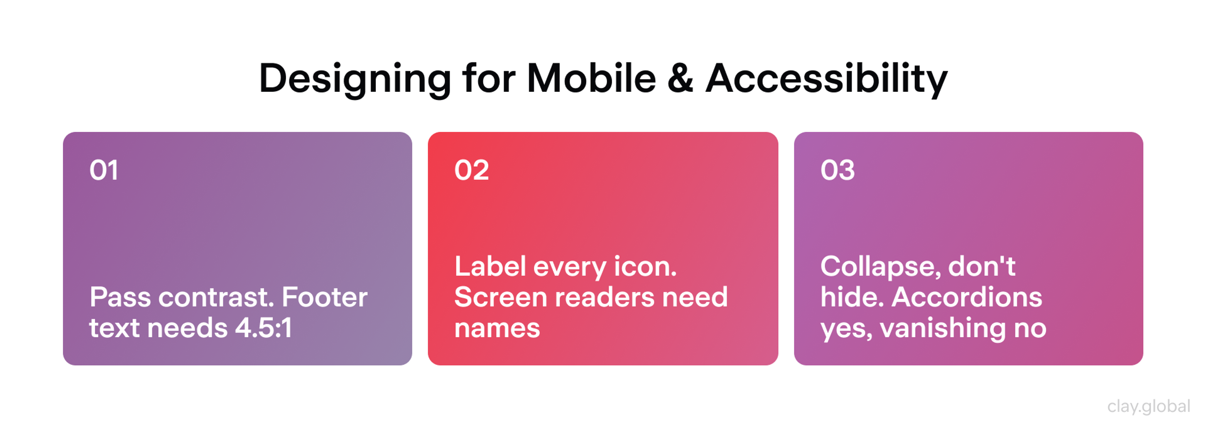
A few more accessibility basics that footers routinely miss:
- Label your icons. Social icons and other icon-only links are invisible to screen readers without an accessible name. Add an aria-label or visually hidden text so "LinkedIn" is announced, not silence.
- Size your tap targets. On a phone, footer links crammed into a tight stack are hard to hit without zooming. Give them room.
- Keep contact and legal reachable. If you collapse footer columns into accordions on mobile, that's fine for navigation groups. It's not fine for your contact details, privacy link, or terms. Those should stay visible.
Mobile is where most of your traffic already lives. Mobile devices account for a majority of global web traffic, and that share has held above half for years. A footer designed only for a wide desktop layout will crush its columns into an unusable ribbon on a small screen.
The accordion pattern solves this well: stack your link groups, let each expand on tap, and keep the essentials always visible. What you should never do is what NN/G explicitly warns against, which is hiding the footer entirely because it's inconvenient to lay out.
With 10+ years of experience, we at Clay Global handle them all. Explore our web design work here.
What Are the Different Types of Footers?
Footers are best understood not as one fixed taxonomy but as a set of recognized patterns you can combine. Your site type decides which ones you lead with.
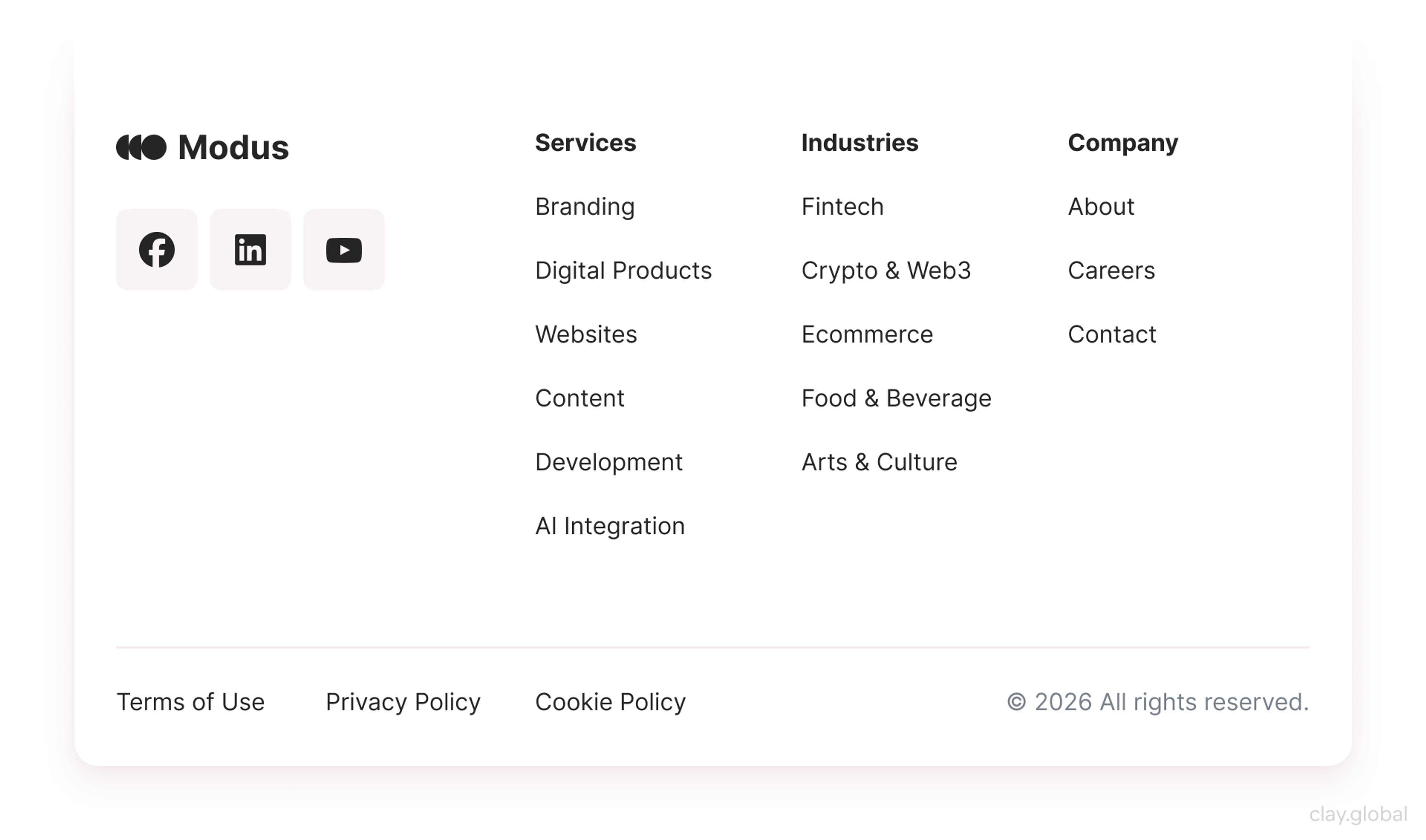
Rich (Fat) Footer
A rich footer, more often called a fat footer, pulls deep navigation, secondary links, a signup prompt, and social into one large, dense block. It's the established term for the heavy end of the scale. It suits content-heavy sites, publishers, and large ecommerce, as long as you keep link counts disciplined so you don't dilute internal link value or overwhelm the scan.
Rich Footer Example by Clay
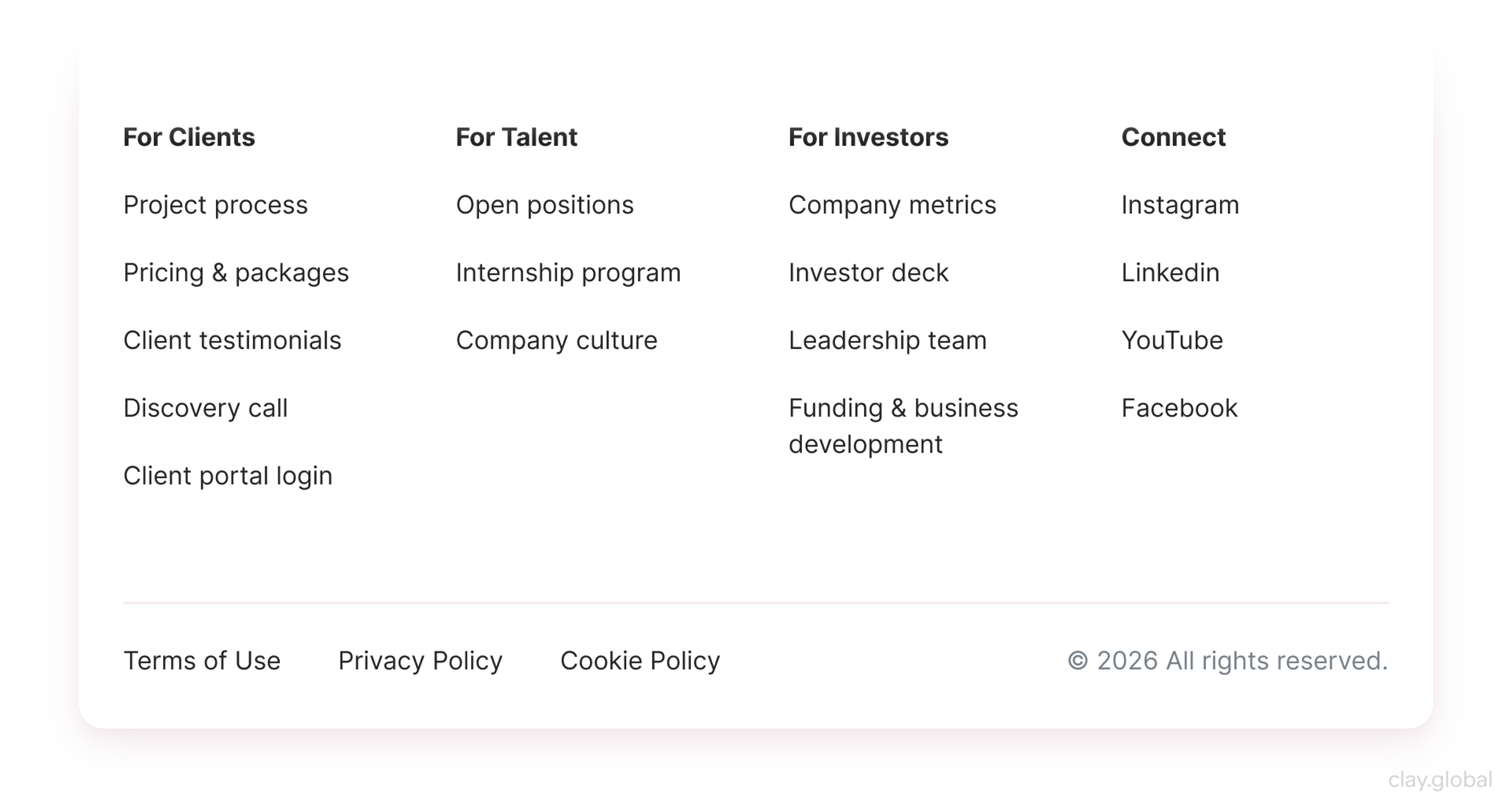
Secondary-Tasks Footer
This footer surfaces tasks that don't fit the main navigation, like careers, investor relations, press and media kits, documentation, or affiliate programs. It works best on sites with several distinct audiences whose needs sit outside the primary user journey, giving each group a reliable place to find what it came for.
Secondary-Tasks Footer Example by Clay
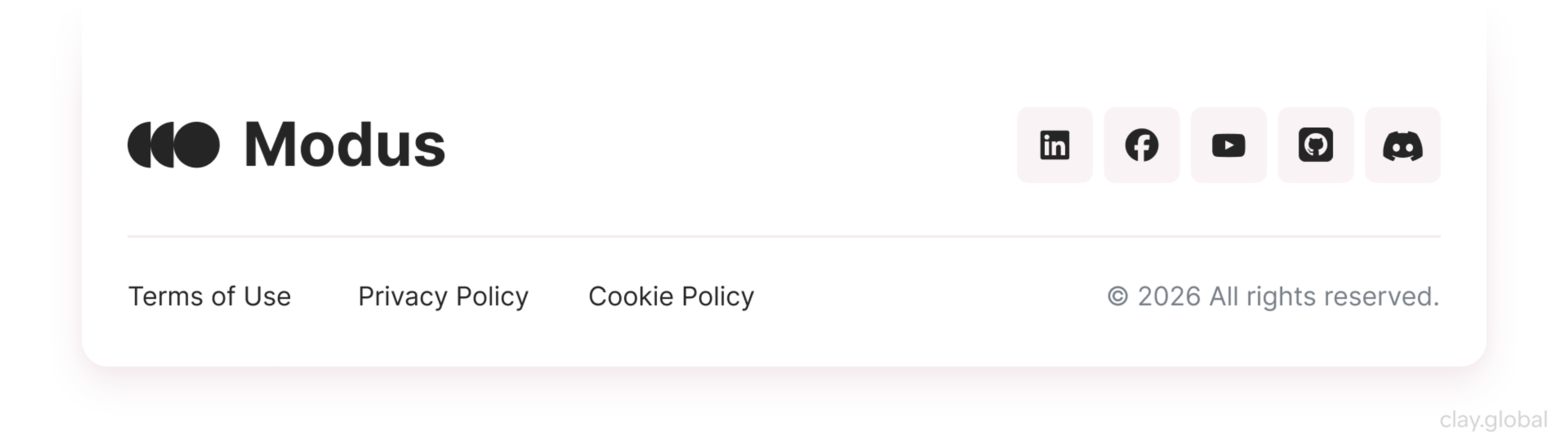
Utility Footer
The near-universal baseline: contact information, customer support, a privacy policy, and terms of use. Users head straight to the footer for these even when the same links sit up top, so always repeat them here. It's right for every site, and it's often all a portfolio or landing page needs.
Utility Footer Example by Clay
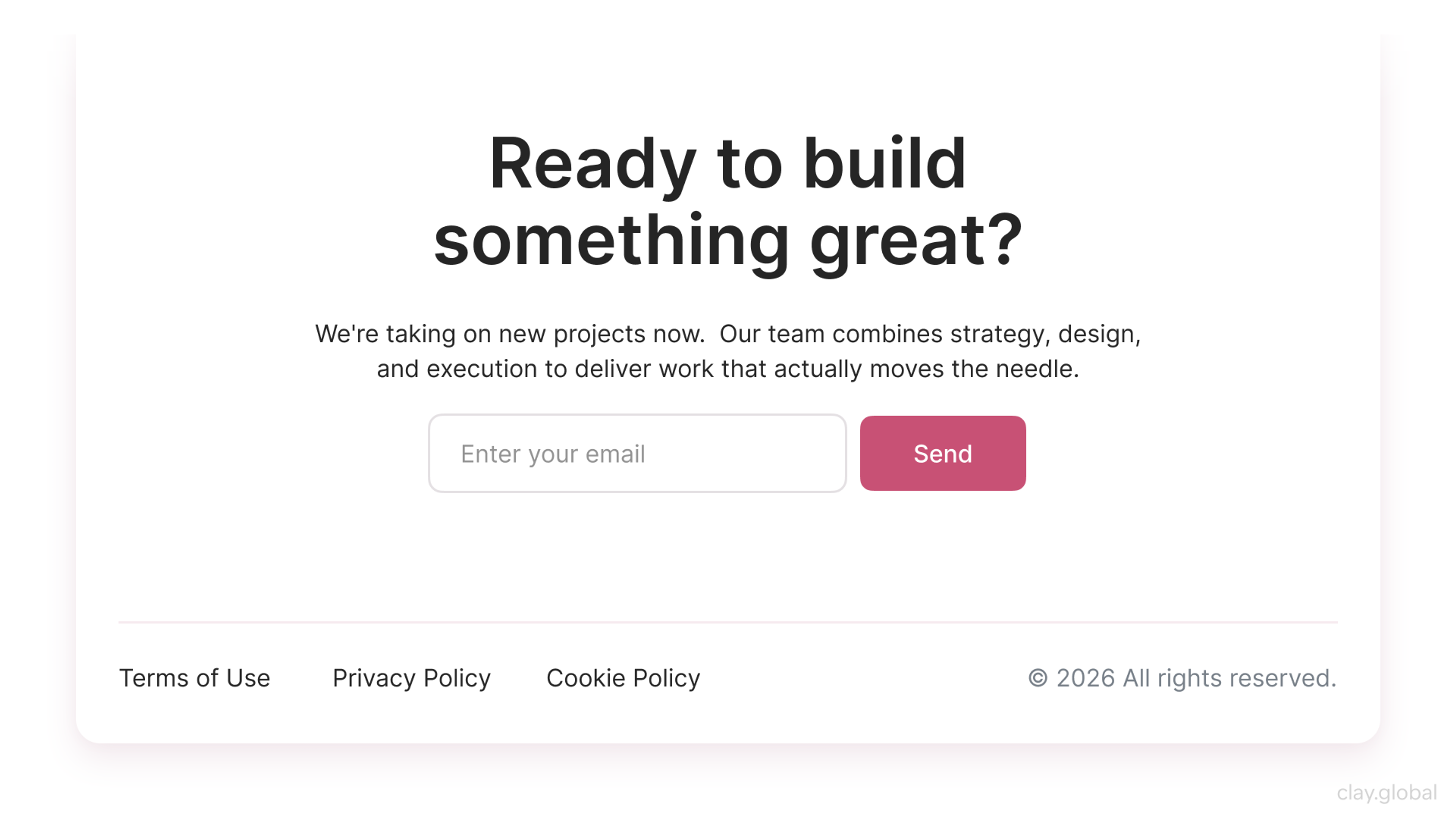
CTA Footer
A footer built around a single conversion, like a newsletter signup, a demo request, or a contact prompt. It treats the bottom of the page as a second chance to win over someone who read all the way down. It fits lead generation, SaaS, and newsletter-driven sites where one clear action matters more than broad navigation.
CTA Footer Example by Clay
Fixed Footer
Unlike the others here, this one describes position rather than content. It stays pinned to the bottom of the screen as you scroll, so it's always visible. Reserve it for a slim utility bar, because a full fixed footer covers content and eats mobile screen space.
Fixed Footer Example by Clay
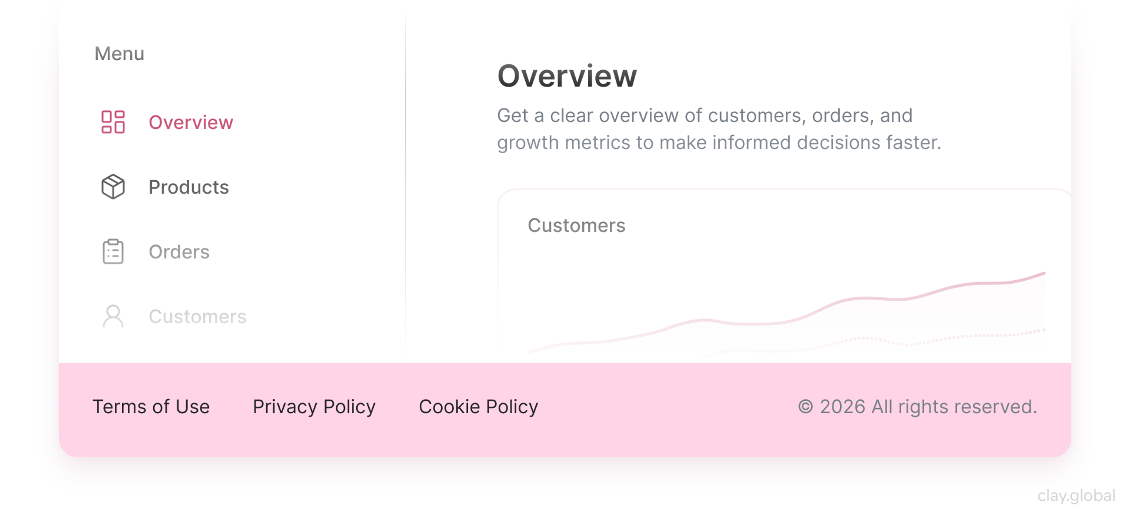
Doormat Navigation
This pattern repeats the global navigation at the bottom of the page, so it greets users on arrival and again on the way out. It helps on long pages where scrolling back to the top nav is a chore, though a sticky header often does the same job now.
Doormat Navigation Footer Example by Clay
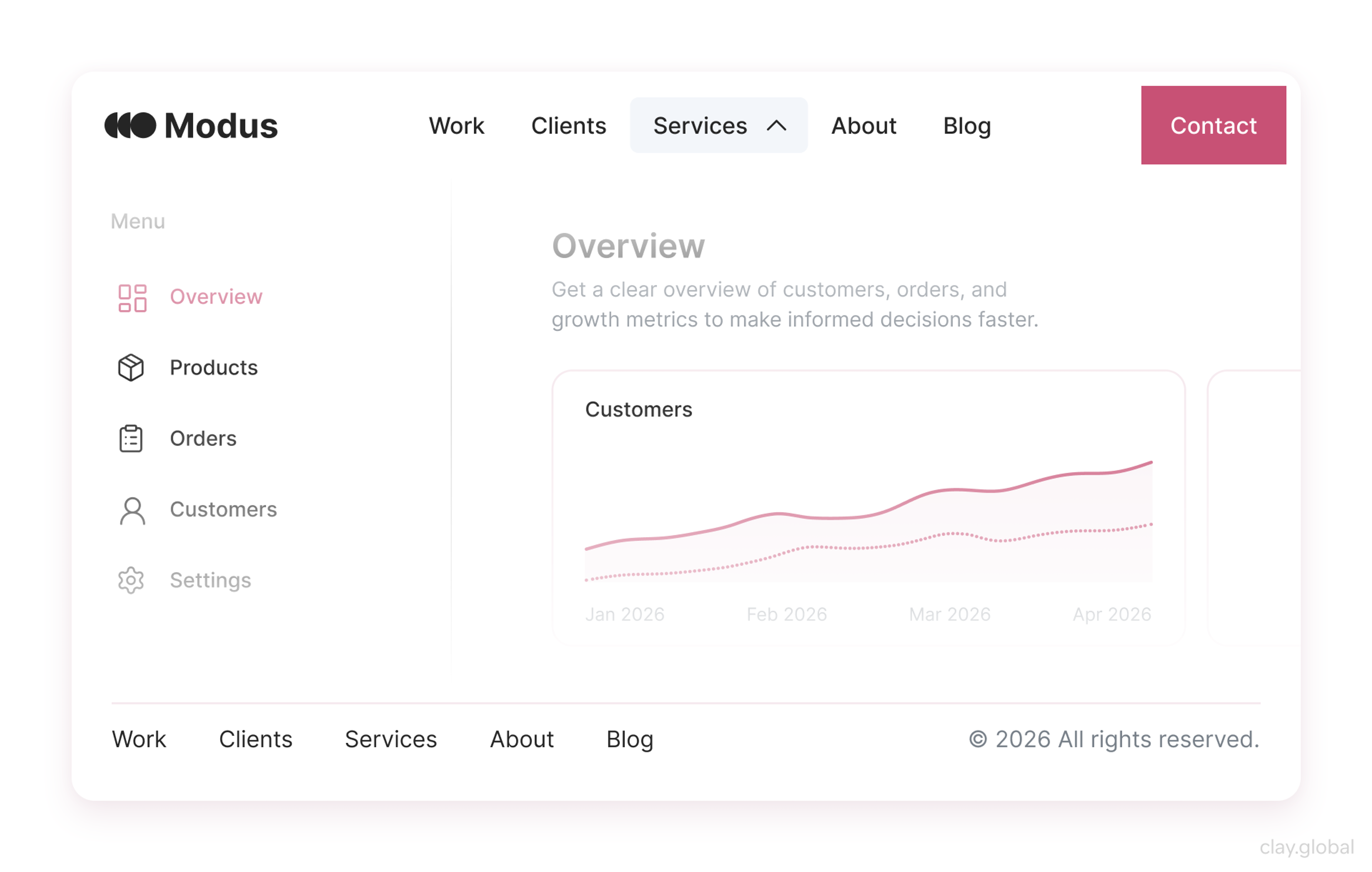
Most real footers blend a few of these. A publisher's rich footer usually folds in secondary tasks and a utility row, and any of them can carry a CTA. Decide which job the bottom of the page needs to do, then combine the patterns that serve it.
Skipping the footer entirely is a real option, but a narrow one. It suits immersive, single-focus experiences like a product launch or an interactive story. Even then, you lose a reliable home for legal links and contact details, so treat "no footer" as a deliberate tradeoff rather than a minimalist reflex.
Best Practices That Change the Outcome
Plenty of footer advice is filler. These are the practices that actually move the needle.
Group and prioritize. A footer should communicate its own structure at a glance. Cluster related links, give each cluster a clear heading, and use visual weight to separate primary links from secondary ones. Scannability beats completeness every time.
Match your brand, quietly. The footer is still your site. Colors, type, and logo treatment should stay consistent with the rest of your brand identity so the bottom of the page doesn't feel like it belongs to a different site. Consistency here reinforces trust at the exact moment people are deciding whether to act.
Add a back-to-top button only when the page earns it. On a long page, past roughly two or three screen heights, a back-to-top control is a genuine convenience. On a short page, it's clutter that solves a problem nobody has. Let page length decide.
Footer Best Practices by Clay
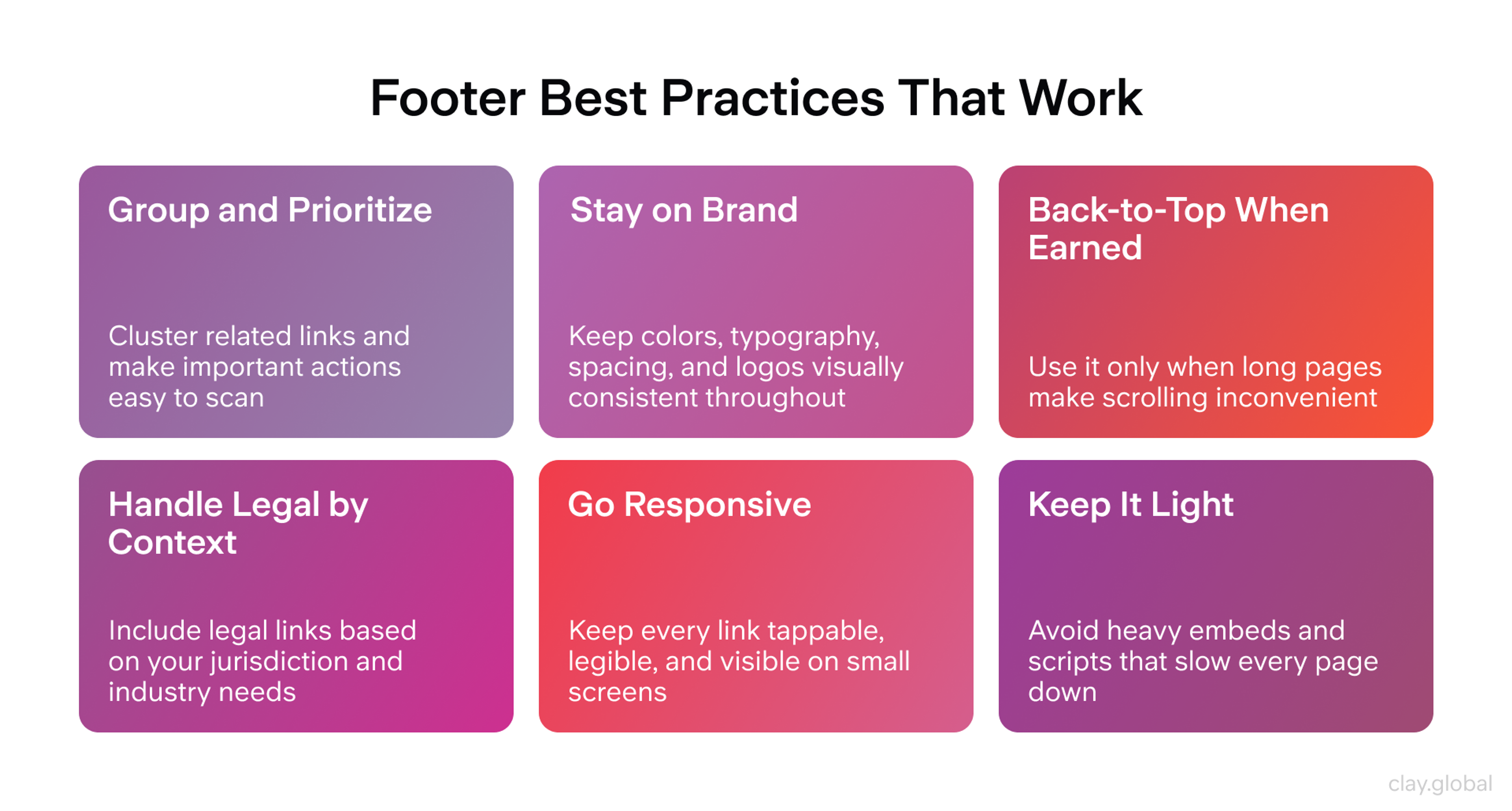
Handle legal by context, not by template. A privacy policy and terms links are the baseline. Depending on where you operate and what you do, you may also need cookie consent for GDPR, an accessibility statement, or newsletter compliance language. Match the requirements to your jurisdiction and industry rather than copying a generic set.
Respect responsive behavior. Test the footer at the smallest screen you support, not just on desktop. Every link should be tappable, every piece of text legible, and nothing important should disappear.
Keep it light. The footer loads on every page, so its weight is a site-wide cost, not a one-off. Embedded social feeds, map widgets, and heavy scripts down there quietly tax load time across your whole site. Favor plain links over live embeds unless the embed genuinely earns its keep, and your Core Web Vitals will thank you.
Footer Design in Practice: Clay Case Studies
Principles are easier to trust when you can see them applied. Three projects from our own work show how the bottom of the page changes depending on who's using it, each one lining up with a different footer pattern from the section above.
Serena & Lily is a luxury home furnishings retailer, and when we overhauled their ecommerce experience, the whole customer journey was in scope, from an immersive product feed to a checkout flow rebuilt for conversion. That's the context a fat, utility-rich footer is built for.
Serena & Lily Footer
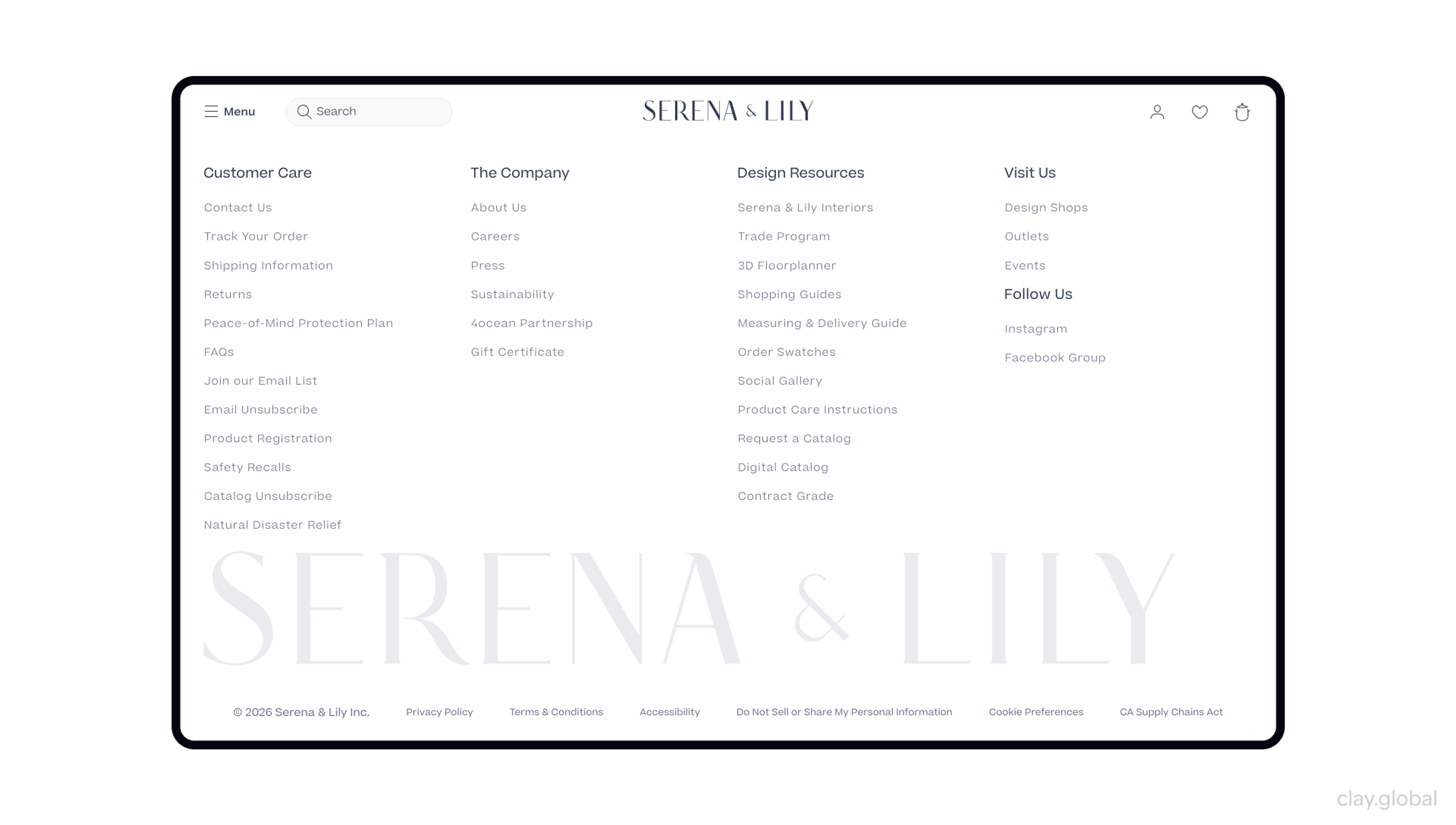
On an ecommerce site, the bottom of the page carries real weight: shipping and returns policies, customer support, account links, and payment trust signals are exactly what a hesitant shopper scrolls down to confirm before they commit. The lesson is that footer content should mirror the buying journey, not sit apart from it.
Grayscale, the world's largest crypto asset manager, sits at the other end of the spectrum. Across a multi-year partnership, we redesigned its main site and a dedicated ETF subdomain, organizing an expanding portfolio of products, a crypto education library, and the legal weight that comes with heavily regulated finance. That's a fat, sitemap-style footer.
Grayscale Footer
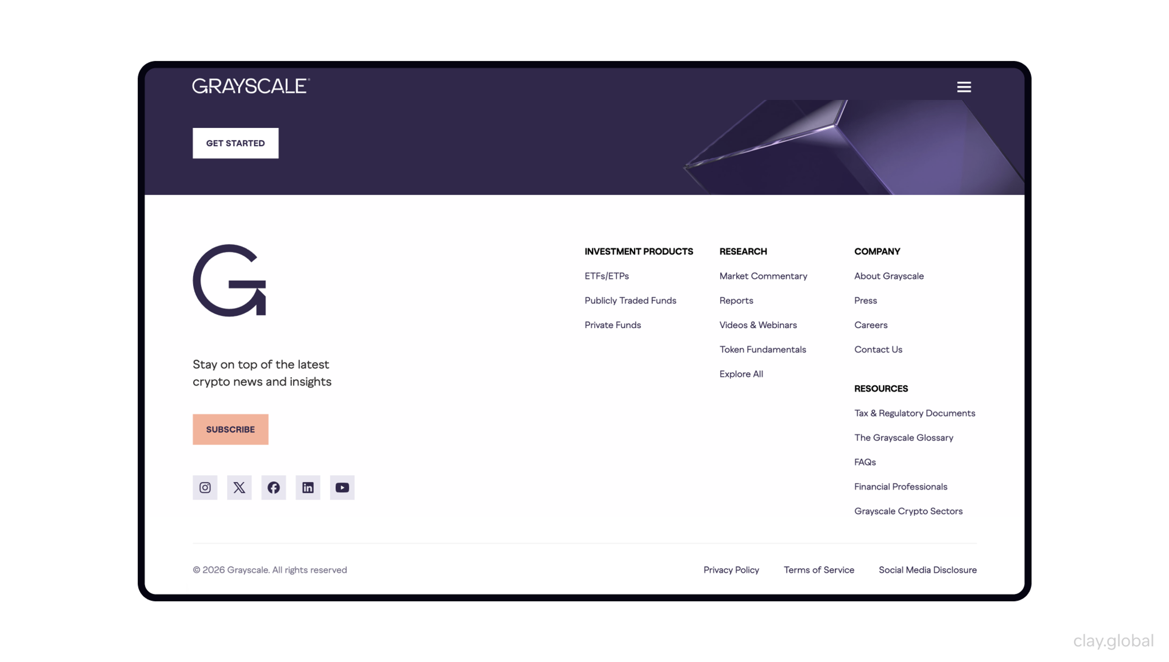
When a site keeps growing, and nearly every page carries disclosures, the footer becomes the stable index that holds the sprawl together, and the only way to keep it consistent as the catalog expands is to build it from reusable components instead of hand-placing links. The lesson: on a large, fast-changing site, treat the footer as a system, not a static block.
Echo Street, an immersive site for a tech-forward investment firm, went the opposite direction on purpose. For a company where clarity and trust matter more than density, we kept the experience uncluttered so users could move through it without friction, with the layout holding consistent across every device. A minimal footer fit the brief. The lesson: the right footer for your audience might be the simplest one, not the fullest.
Echo Street Footer
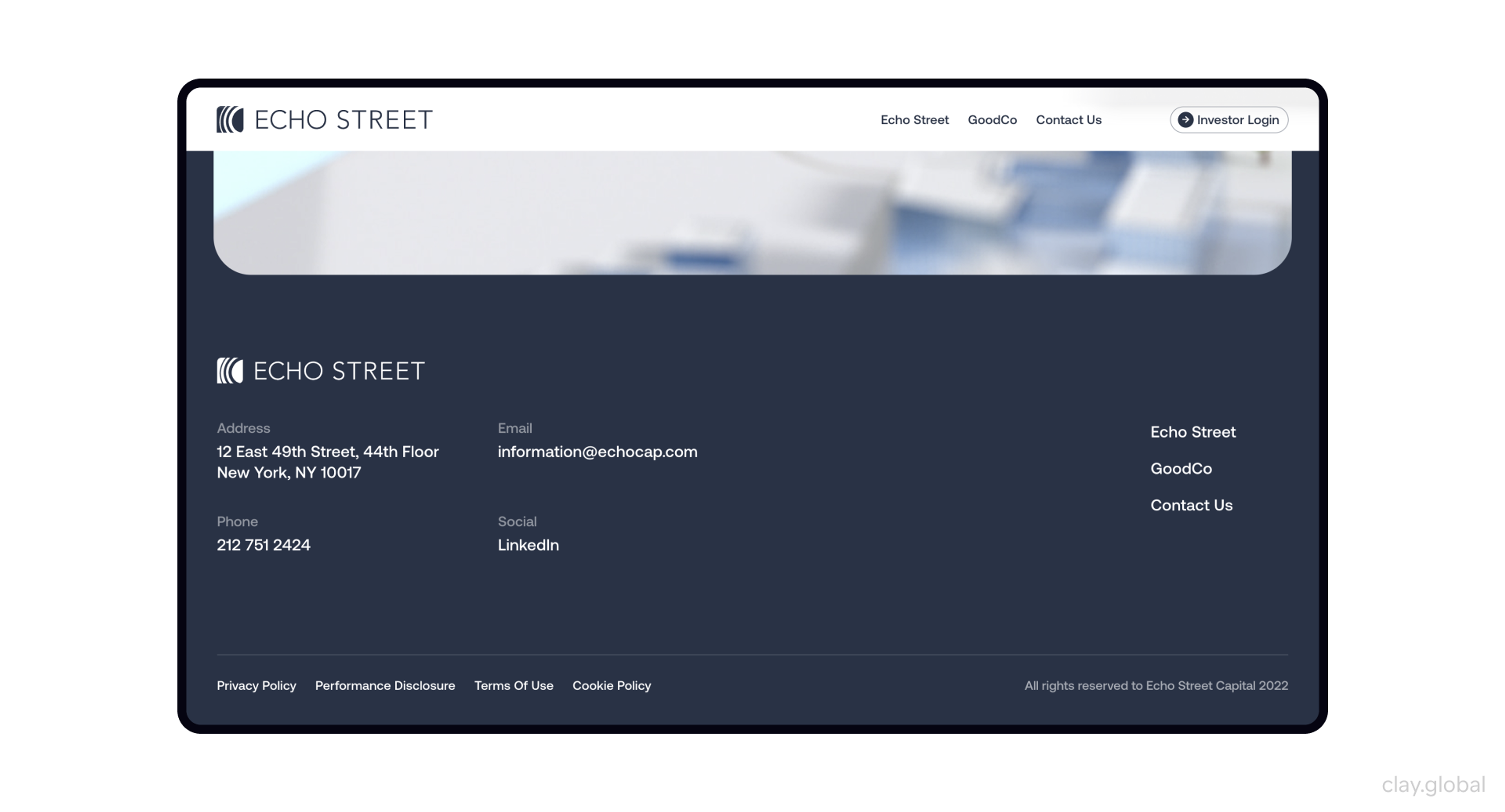
The common thread is intent. None of these is a dumping ground. Each reflects a decision about what its specific users need at the bottom of the page, which is exactly the decision most footers skip.
We've built comprehensive web experiences for Slack, Stripe, Grayscale, and Marqeta - companies that needed more than a pretty site. If yours does too, let's talk.
Read more
FAQ
Why is footer design important?
The footer is often the last thing a user interacts with before leaving, and it's where people look for contact details, legal pages, and links they couldn't find elsewhere. A well-built footer recovers visitors who were about to bounce, reinforces trust, and supports navigation without ever getting in the way of users who found what they needed higher up.
What should every website footer include?
At minimum: contact information, a privacy policy, terms of use, and a route to support. Most sites also benefit from a trimmed set of navigation links, social profiles, a copyright notice, and often a newsletter signup. The exact mix depends on your site type, but utility links are the near-universal baseline.
How many links should a footer have?
Fewer than instinct suggests. There's no magic number, but the guiding principle is that every extra link dilutes the ones people actually came for and spreads your internal link value thinner. Show your most important first- and second-level pages, group them clearly, and resist the urge to include everything.
Should the footer be the same on every page?
Generally yes. Consistency is what makes footers usable, because people rely on finding the same things in the same place. The main exception is a contextual footer on sites with different user roles, where the footer adapts to whether someone is a member, a subscriber, or a first-time visitor.
How does the footer affect SEO?
A footer with clean internal links to important pages helps search engines understand and crawl your site. The risk is overdoing it. Stuffing the footer with dozens of links or keyword-loaded anchors dilutes link value and can look manipulative. Keep footer links purposeful and human-readable.
What is a fat footer?
A fat footer is a large, multi-column footer packed with navigation, contact details, social links, and often a signup form. It suits content-heavy sites like publishers and large ecommerce stores that need to expose a lot of navigation. The tradeoff is that it demands careful grouping to stay usable and disciplined link counts to protect SEO.
Can I remove the footer on mobile?
You can simplify it, but you shouldn't remove it. Collapsing navigation groups into accordions is fine. Hiding contact information, privacy links, or terms is not, because those are exactly the items mobile users scroll down to find. A well-structured responsive footer adapts rather than disappears.
Is low-contrast footer text really a problem?
Yes, and it's the most common accessibility failure on the web. WebAIM found low-contrast text on the large majority of home pages in 2026. Footer text that's too faint fails WCAG contrast standards and is hard to read for users with low vision, color vision differences, or just a bright screen outdoors. Footer copy should clear the same contrast bar as the rest of your page.
Where should social media links go in a footer?
Group them together, typically near the bottom alongside the copyright notice or in their own clearly labeled cluster. Link out to your profiles rather than embedding a live feed, unless you post frequently enough to keep an embedded feed current. Always give icon-only social links an accessible label for screen readers.
Do I need a back-to-top button?
Only on long pages. Past roughly two to three screen heights, a back-to-top button is a real convenience that saves users a long scroll. On short pages, it adds visual noise without solving a real problem. Let the length of your typical page decide.
What's the difference between a footer and a sitemap?
A footer is a design element at the bottom of every page that holds a curated set of links and information. A sitemap is a complete list of your pages, either an HTML page for users or an XML file for search engines. A footer can link to a sitemap, and a small site's footer can act like one, but on large sites the two should stay separate so the footer doesn't become unwieldy.
What's the difference between a sticky footer and a fixed footer?
They describe how the footer sits on screen, not what it contains. A sticky footer docks to the bottom of the viewport when a page is too short to fill it, then sits below the content on longer pages, which fixes awkward whitespace. A fixed footer stays pinned to the bottom as you scroll, so it's always visible. Use a sticky footer freely, but keep fixed footers to a slim bar, since a full one covers content and eats mobile screen space.
What footer works best for a small business site?
For most small businesses, a minimal footer is the right call: contact details, a couple of key navigation links, social profiles, and legal links. It's fast to build, easy to read, and covers what visitors actually look for. Add a newsletter signup or trust badges only if they serve a real goal.
How does a footer handle infinite scroll?
Traditional footers break on infinite-scroll pages because the content never stops loading, so the footer keeps getting pushed down. The standard solution is a mini footer: relocate the essential links to a sticky right rail or an expanded navigation menu so users can reach them without chasing a footer that keeps moving.
What legal links does a footer need?
At a minimum, a privacy policy and terms of use. Beyond that, it depends on your context. You may need cookie consent under GDPR, an accessibility statement, or specific disclosures for your industry. The right approach is to match your legal links to where you operate and what you do, rather than copying a boilerplate set.
The Bottom of the Page Deserves Better
A footer isn't the flashiest part of a website, and it shouldn't try to be. Its job is quieter and more durable: catch the people who are almost lost, hand them what they came for, and leave a clean last impression.
That job gets done through selection, not accumulation. The strongest footers include fewer things, arrange them clearly, and stay readable on every screen.


About Clay
Clay is a UI/UX design & branding agency in San Francisco. We team up with startups and leading brands to create transformative digital experience. Clients: Facebook, Slack, Google, Amazon, Credit Karma, Zenefits, etc.
Learn moreAbout Clay
Clay is a UI/UX design & branding agency in San Francisco. We team up with startups and leading brands to create transformative digital experience. Clients: Facebook, Slack, Google, Amazon, Credit Karma, Zenefits, etc.
Learn more