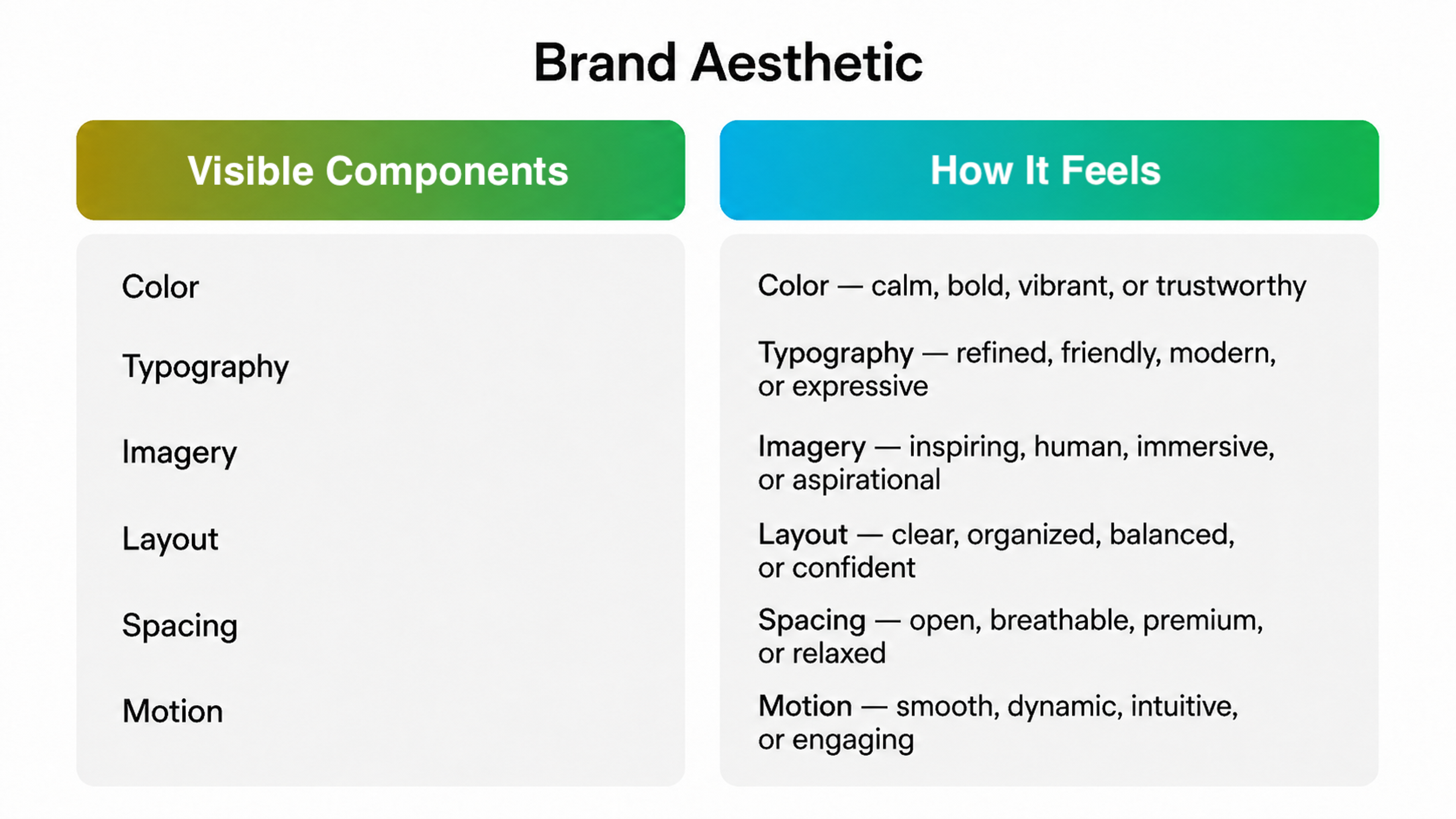
Brand aesthetics covers every visual decision a team makes, from the color tokens in a design system to the easing curve on a button animation.
When those decisions are documented, consistent, and built to adapt across formats, the brand stays recognizable at volume. When they aren't, drift sets in quietly and compounds fast.
Key Takeaways
- Brand aesthetics in 2026 functions as a visual grammar, built on design tokens, motion principles, and documented rules for every channel.
- Audience research and competitor analysis should underpin every sound aesthetic decision you make.
- Color is your most cognitively powerful tool. It shapes snap purchase decisions faster than any other visual element and lifts brand recognition when applied consistently.
- Typography shapes how readers perceive content before they've consciously engaged with a single word.
- AI accelerates brand visual production at scale, but without clear guardrails, it creates drift faster than any human team would.
- A practical aesthetic kit requires documented rules for every visual layer your brand touches.
What Is a Brand Aesthetic?
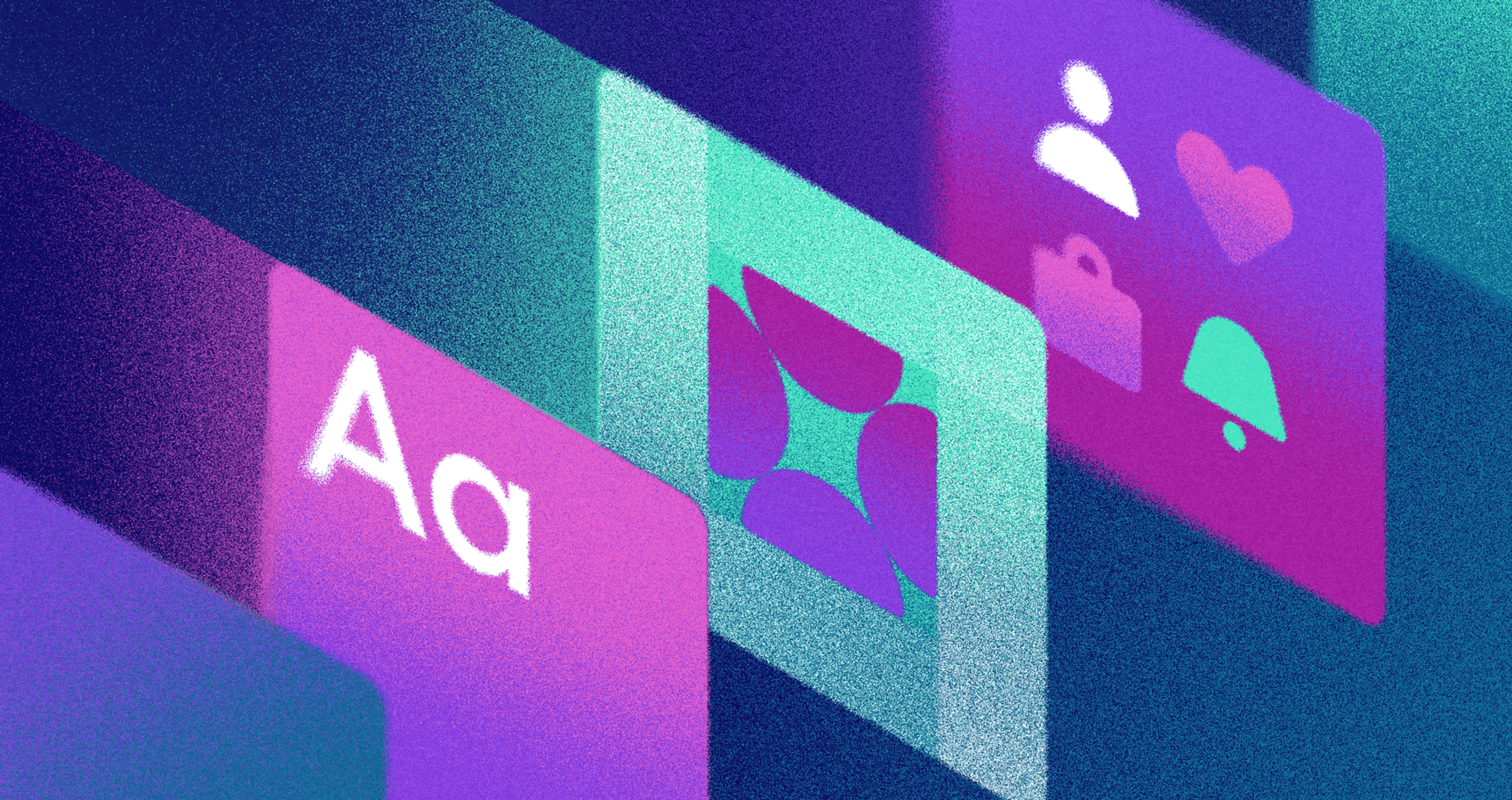
Brand aesthetics is the sensory expression of a brand. It's everything a person sees and feels before they've read a single word, including color, typography, imagery, illustration, iconography, layout, spacing, and motion.
Brand Aesthetic Components
The stakes are even higher in trust-sensitive categories like fintech, healthcare, and Web3, where a visual inconsistency reads as a warning sign.
Trends Shaping Brand Aesthetics in 2026
Two structural shifts pushed aesthetics from style into the system over the past few years.
- The first is that brand experiences now live inside products as much as in marketing. Every interface interaction shapes perception more than hero images do. Users spend far more time inside your product than they spend looking at your ads.
- The second is that scale is unavoidable. Brands publish across more channels, formats, and variants than any design team can keep up with. Personalization is widespread, motion is expected, and accessibility standards have no flex. A static PDF style guide can't handle that complexity.
Both shifts prove that aesthetics needs to be built like a system more than ever.
The Role of AI Tools in Shaping and Scaling Visuals
AI is now a normal part of brand visual production, freeing designers to focus on judgment and craft rather than repetitive production work.
The problem is that AI also scales mistakes. Without clear guardrails, teams end up with brand drift, tonal inconsistency, and legal exposure they could have avoided.
The right approach in 2026 is to define your visual grammar first, then use AI to explore within that sandbox, with people reviewing and signing off at each stage. The creative range grows without the brand drifting.
6 Steps to Design a Brand Aesthetic
Analyzing Your Target Audience and Competitors
Every aesthetic decision starts with research.
Start with your audience. Understand the visual language they already trust in adjacent categories. Conduct interviews, run surveys, and dig into your analytics and social channels. You're trying to understand the visual vocabulary they already fluently speak, so you can work within it.
Then move to competitor mapping. Plot your category's aesthetic landscape honestly. Where do most brands cluster visually? What conventions have become invisible because everyone uses them? What's clearly missing? The goal is to find territory that's both authentic to your brand and genuinely unoccupied.
Building Brand Identity
Before you touch a color picker or typography scale, you need to be clear on what you're actually expressing. Your visual identity translates your brand, and you can't do that without defining it first.
Start with your brand's mission, vision, values, and personality. Ask what the brand believes, what it's against, and what tone it naturally speaks in. These answers are the brief for every visual decision downstream.
Consistency is where most brands fail, because visual style rarely survives the pressure of scale. Brands with a consistent presence across all channels can expect an average revenue increase of 23%. Those gains grow further when you factor in the production costs a well-documented system avoids. That's a business case for doing this properly, and a reliable way to grow awareness over time.
Consistency Across Platforms by Clay
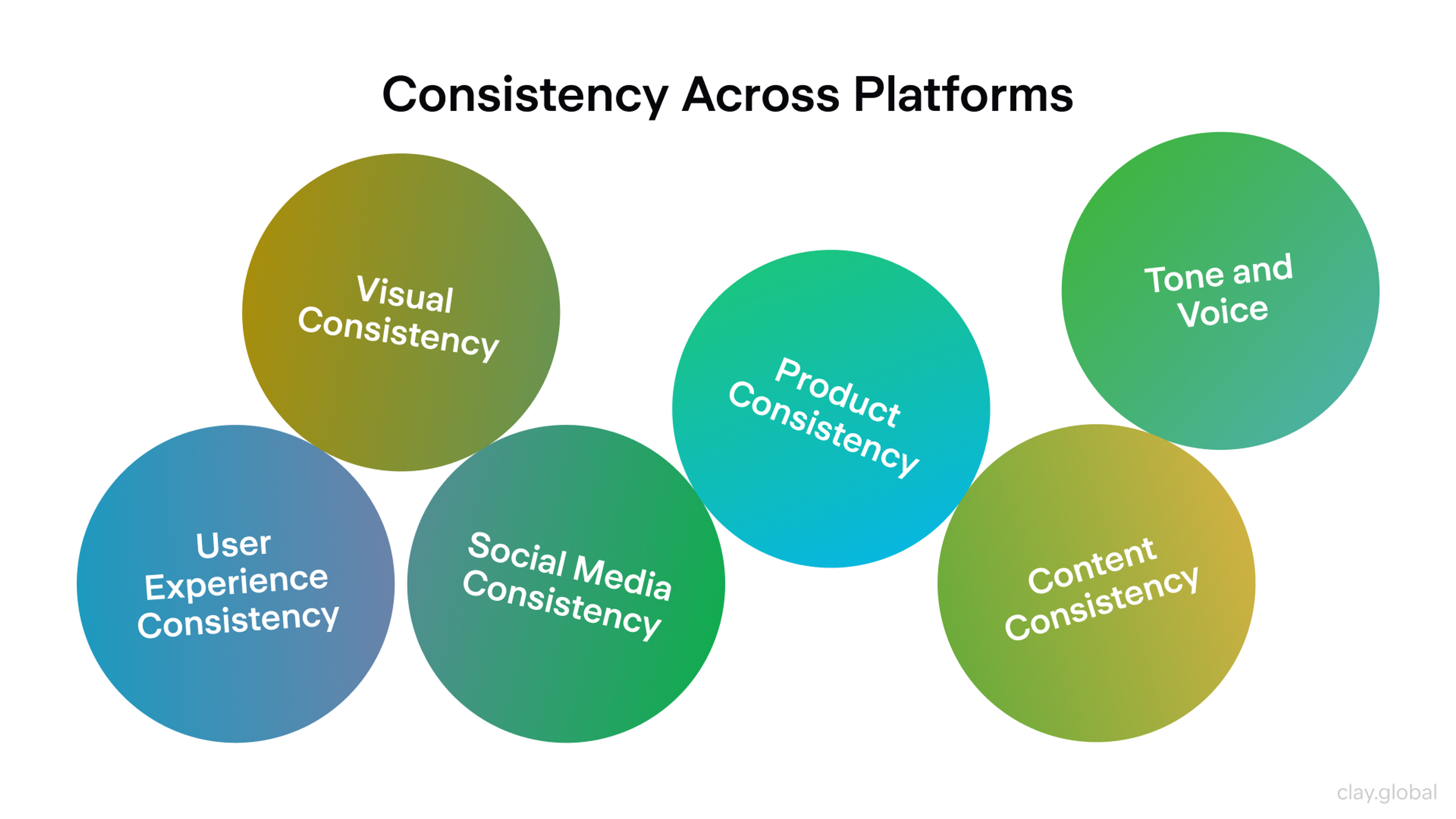
Consistency also compounds in another way. The more reliably your brand shows up the same way across every touchpoint, the faster it grows awareness and embeds itself in memory. That's a business case for doing this properly.
Keep your brand fresh without destabilizing it. Visual evolution is legitimate, as long as the core identity elements remain anchored.
Understanding Different Design Styles
Design styles vary widely in what they communicate and who they're speaking to.
- Minimalism signals clarity and confidence. It works best for brands that want users to focus on the product rather than the packaging.
- Maximalism suits brands where the experience itself is the point, communicating richness through every layer.
- Vintage and retro aesthetics build emotional connection quickly in categories where trust is hard-won, trading on nostalgia.
- Geometric precision sits at the other end, where the visual language communicates structure and technical credibility.
Your audience is the filter. A Web3 protocol built for sophisticated developers reads completely differently from a consumer wellness brand aimed at first-time users. The same clean sans-serif that signals credibility in one context reads as cold and impersonal in another.
Put Baroque layering into a SaaS product dashboard, and it becomes noise. The same visual richness that works for luxury skincare turns chaotic the moment the product is a tool.
The output of this step is a clear aesthetic stance that covers the visual space you occupy, what you borrow from, and what you deliberately exclude.
Choosing the Right Color Palette
Color is the fastest channel your brand has. Before anyone reads a word, they've already processed your color. It creates instant emotional associations, cues trust or skepticism, and tells people whether you belong in a category or are actively stepping outside it.
Color Wheel Illustration by Clay
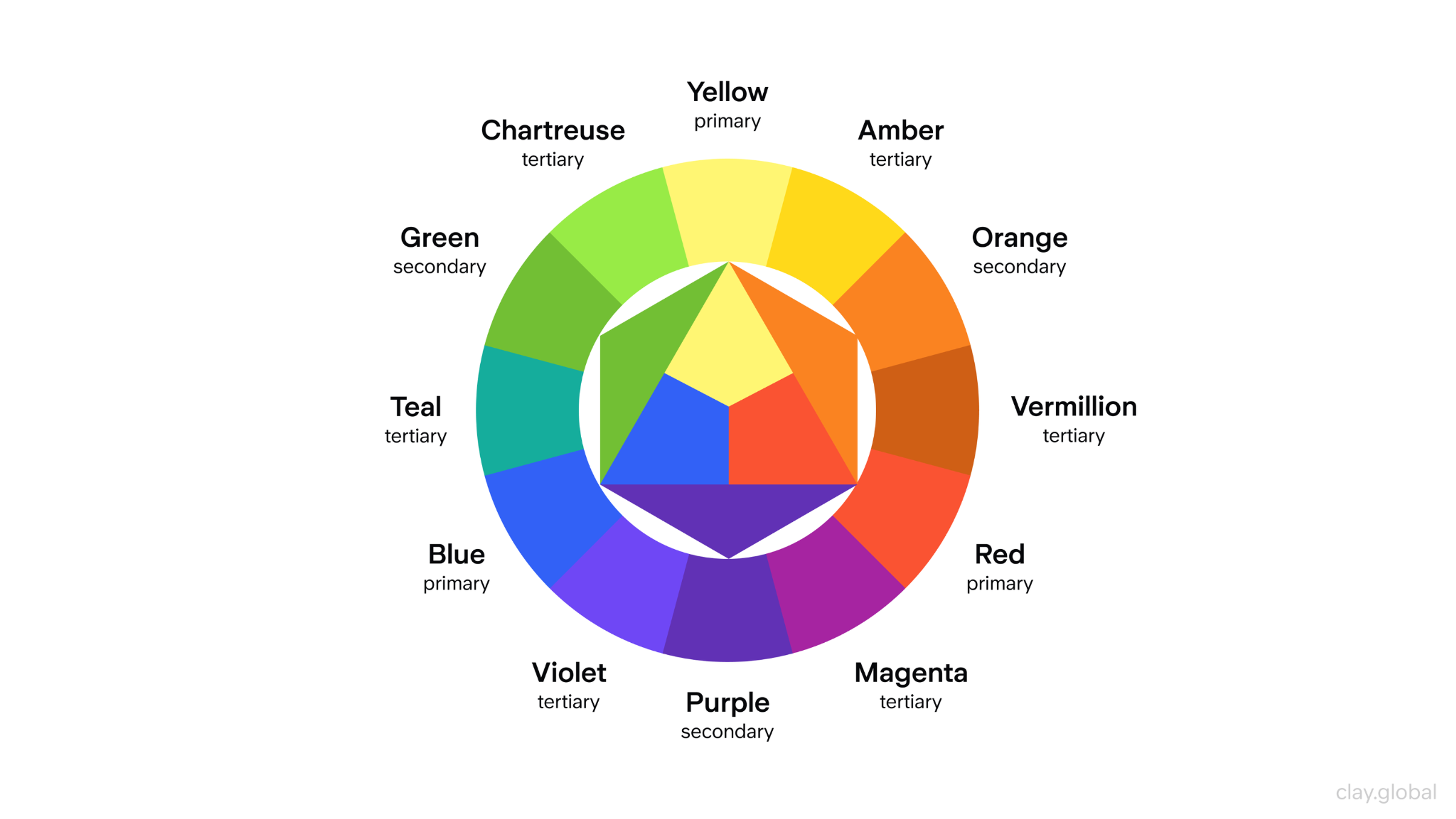
Practically, your palette needs to do several jobs at once.
- Primary colors carry brand personality and drive recognition.
- The secondary palette is there to add variety to the content. It keeps things visually interesting without fracturing the identity.
- Semantic UI colors, the ones covering success, warning, error, focus, and disabled states, handle interface feedback and need their own dedicated roles.
All of it needs to work without collision, and all of it needs to pass accessibility contrast requirements for the contexts you're in.
The common mistake is under-specification. Brands pick three hero colors and call it done, then discover that there's no guidance for interactive states, data visualizations, or dark mode, and every team solves it differently. Build your palette with enough range to cover the real complexity of your day-to-day work.
Cultural context matters, too. Blue reads as trustworthy across most Western markets but carries associations of mourning in some Eastern European contexts. Green is closely associated with health and sustainability, but its meaning shifts significantly across Middle Eastern markets.
Picking the Typography
Typography is the part of brand aesthetics most companies underestimate. It carries tone, establishes hierarchy, signals whether content is trustworthy or casual, and does more work than any other single visual element wherever text appears.
The serif versus sans-serif decision matters, but it's also a simplification. What matters more than typeface choice is fitness for context.
A headline typeface and a dense data table have fundamentally different jobs, and a single typeface family won't serve both equally well. Design your typography system to cover the full range of contexts your brand actually operates in.
Accessibility is also a design criterion. A typeface should work for users with low vision and hold up across poor screen conditions.
Engaging in Storytelling
Visual storytelling is how aesthetics become memorable rather than just recognizable. How you frame a photograph, the mood of your illustration style, the energy of your motion, each signals something specific about what your brand believes and who it's for.
Benefits of Storytelling by Clay

Think through the emotional arc your brand wants to create.
- Light, open compositions suggest possibility and freedom.
- Dense, detailed work goes deeper and reads as craft and considered effort.
- High-contrast imagery communicates urgency and directness.
- Desaturated, textured visuals pull in the opposite direction, suggesting maturity and restraint.
They're all choices, and the best ones are made with a specific audience and message in mind.
55% of a brand's first impression comes from visuals alone. That means the emotional story your aesthetic tells in the first few seconds is doing more persuasive work than most brands give it credit for.
Keep your audience at the center of every storytelling decision. The visual metaphors, emotional cues, and cultural references that resonate for one audience may fall completely flat for another.
Your brand aesthetic is a serious investment. Getting it right from the start saves years of correction. Tell us about your project, and we'll take it from there.
What to Include in a 2026 Brand Aesthetic Kit
If you build only one thing, build something people can actually use consistently under pressure. A beautiful brand deck that no one can apply is worthless.
Your core tokens come first, including color values with defined usage roles, a full typography scale and spacing system. Typography rules should address each distinct context, including headlines, body copy, dense UI, and captions, separately.
Define imagery rules with enough detail to guide someone who hasn't seen your existing work. Document icon style, illustration principles if relevant, and motion guidelines including reduced-motion behavior.
Brand Deck Essentials
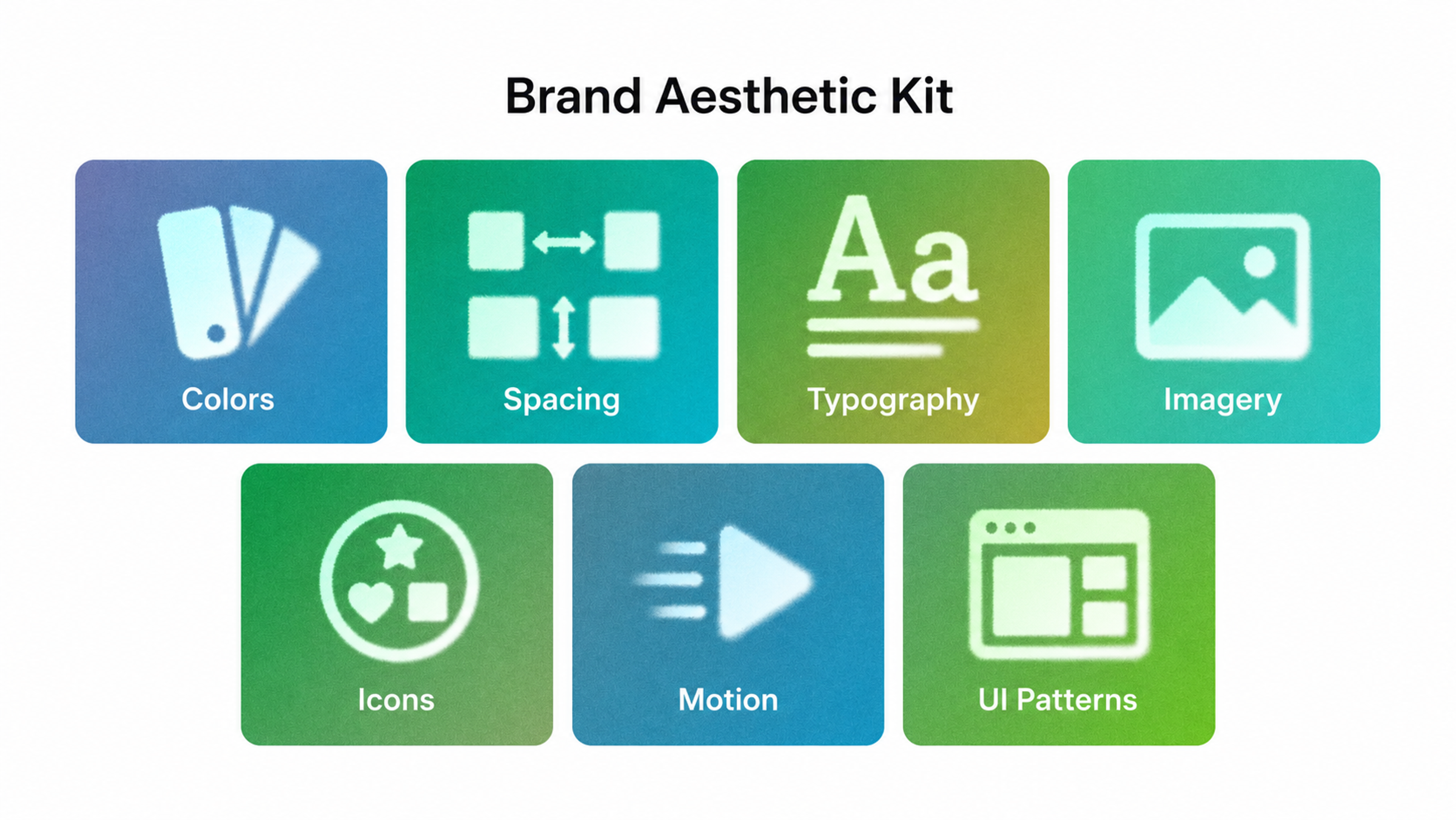
Include component snapshots for your most common UI patterns and trust-sensitive screens. If AI tools are part of production, add a brief visual policy covering approved tools, required review steps, output storage, and what's off-limits.
A quick lifehack is to check what agencies focusing on branding include in their deliverables to get a clear picture of what a complete aesthetic kit requires.
Brand Aesthetic Examples
Companies With Memorable Brand Aesthetics
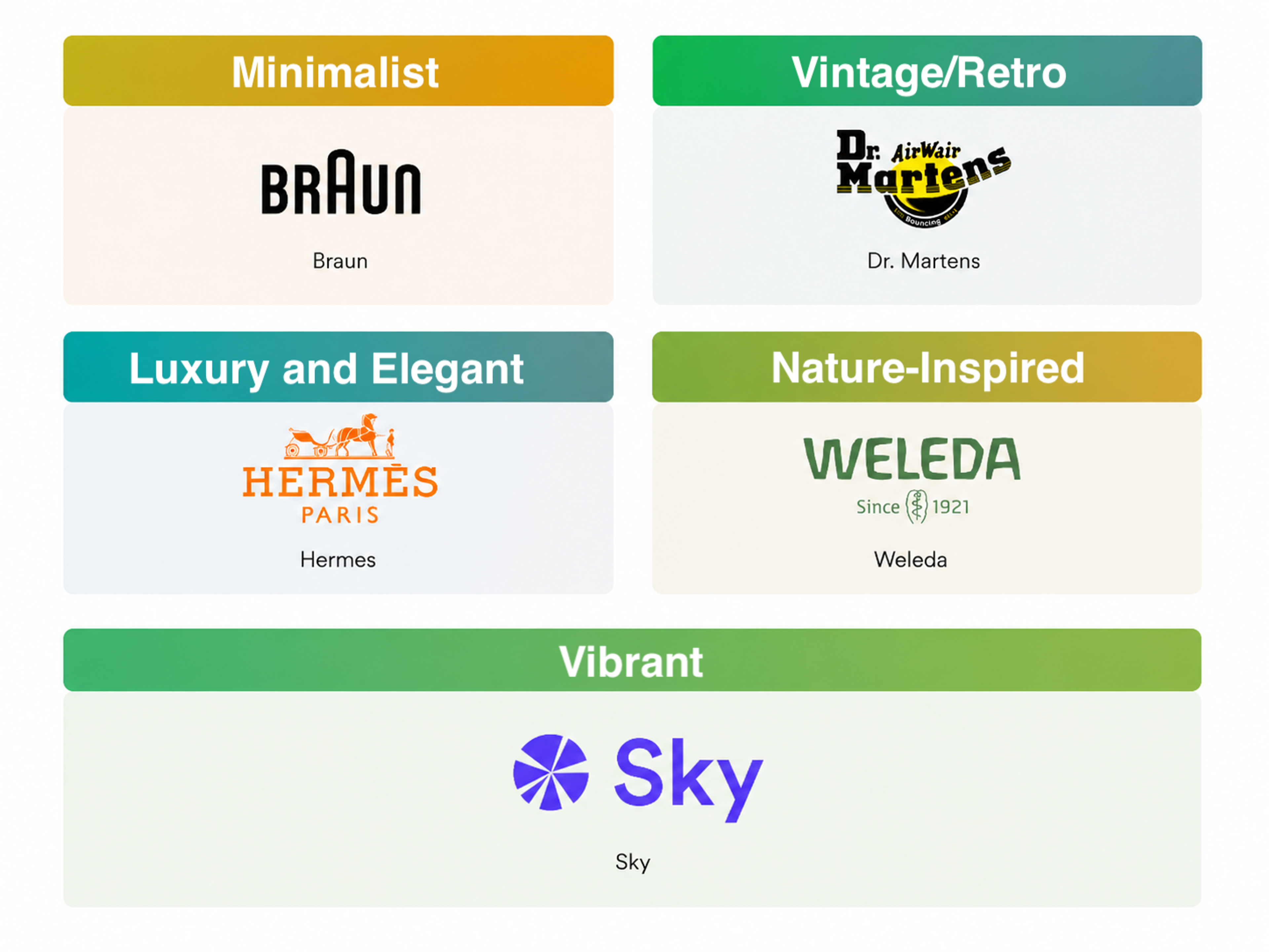
Minimalist
Braun built its identity around the idea that the object should explain itself. Grey and white surfaces, no decorative detail, typography that stays out of the way. They pushed this so consistently across every product that the aesthetic outlasted the era it came from.
It still reads as current, and its fingerprints are on more software and hardware design than most people realize.
Vintage/Retro
Dr. Martens' visual identity runs on subcultural tension. Gritty photography, heavy typography, high-contrast compositions that feel more like a zine than an ad campaign.
The brand has cycled through punk, post-punk, grunge, and streetwear without ever losing its footing, because the aesthetic was never tied to a specific decade. It was tied to a specific attitude.
That's what keeps it recognizable across generations of wearers who have nothing in common except the boots.
Luxury and Elegant
Hermès has never needed to announce itself. The equestrian motifs, the burnt orange, and the hand-stitched leather goods are shown without context.
Every visual decision assumes the audience already knows, which creates a kind of quiet exclusivity that no amount of advertising spend can manufacture.
The brand moves slowly by design. New campaigns feel like variations on something that has always existed. That restraint, applied consistently across every touchpoint for decades, is what luxury actually looks like when it stops trying to prove itself.
Nature-Inspired
Weleda has looked the same for over a century, and that consistency is the whole point.
Botanical illustration, muted earth tones, glass and aluminum packaging that sits closer to an apothecary shelf than a beauty counter. The visual language borrows from herbal medicine rather than wellness marketing, which gives it a weight that newer natural brands spend years trying to build.
Vibrant
The branding and visual identity of Sky, an innovative DeFi platform, are built around gradient-rich backgrounds, volumetric cloud simulations, and a geometric logo, creating a vibrant celestial feel.
A Banner That Reflects Sky's Brand Aesthetic

As one of our clients, Sky needed a visual identity as ambitious as the ecosystem behind it, so we at Clay Global built it around bold visual layering that makes the brand as vibrant on screen as the platform it represents.
Ready to build a brand aesthetic that actually holds together? Let our team handle all the work. Get in touch.
Read more
FAQ
What's the difference between a brand aesthetic and a brand identity?
Brand identity is the complete picture, covering everything from your logo and positioning to your voice and values. Brand strategy sits behind it, defining why the brand exists, who it speaks to, and what it stands for.
Brand aesthetics is specifically the sensory and visual layer of that identity, covering color, typography, imagery, motion, and composition.
Identity is the whole, and aesthetics is what people directly see and feel.
How many colors should a brand palette include?
A well-structured brand palette typically includes three to five primary colors, a secondary supporting palette of three to six colors, and a set of semantic UI colors for buttons, alerts, and feedback states.
The exact count matters less than having clear roles for each color, covering what it's used for, when it's used, and what it's never used for.
How do you keep brand aesthetics consistent across a large team?
Publish design tokens in the tools teams actually use. Rules that live only in a PDF get ignored. Pair that with a review step for creative before it goes out to catch drift before it compounds.
When should a brand consider refreshing its aesthetic?
Useful triggers include significant audience expansion, product or category pivots, acquisition, or visible drift from the original system.
A refresh is also a natural moment to extend your brand into new territory, as long as it protects the recognition you've already built.
What makes an aesthetic work in both product UI and marketing contexts?
A shared token layer. When marketing and product reference the same underlying color, spacing, and type values, both contexts feel like the same brand no matter how differently they look on the surface.
How do you build a brand aesthetic for a startup with no existing visual equity?
Define your aesthetic territory through audience and competitor research first, then build the smallest token set that actually works.
Start with one primary color, one secondary, a neutral range, and one typeface family. Launch and expand as the system proves itself.
What's the biggest mistake brands make with typography?
The most common mistake is choosing typefaces for hero moments with no plan for density.
A display font that looks beautiful in a hero headline often falls apart at 12px in a data table or mobile navigation.
Build your type system from the most constrained context first, then work up to the expressive end, not the other way around.
How should a Web3 or crypto brand approach aesthetics differently?
Trust is harder to establish and easier to lose in crypto, so prioritize consistency over novelty.
Interface aesthetics carry more weight than campaign visuals because users spend most of their time inside wallets and dashboards, not looking at marketing.
Can small businesses build a scalable aesthetic system without a design team?
Yes, scope it tightly. One typeface family, a four-to-five color palette with documented usage rules, basic imagery guidelines, and templates for recurring formats.
That's enough to hold consistency without a dedicated design team.
What role does motion play in a brand aesthetic?
Motion carries an emotional tone in ways static design can't. A slow ease reads as calm and premium, and a snappy cut reads as urgent.
Brands that define motion as an afterthought consistently produce interfaces that feel disjointed, even when every static element is on-brand.
How do you audit an existing brand aesthetic for drift?
Pull branded materials from the past 12 months across every channel and compare them against your guidelines.
Where output diverges from spec, document the pattern. It's usually a signal of unclear guidance or a process gap, not just an individual error.
What should an AI visual policy include in a brand context?
Cover approved tools and a mandatory review step before anything goes out publicly.
Add prompt construction guidance and output storage rules to provide a paper trail for ownership questions.
Be explicit about what's off-limits, including AI-generated images of real people, undisclosed AI campaign content, and visuals used in regulated industries. Without a policy, teams fill the gap with individual judgment, which is almost always inconsistent.
Final Thoughts
Brand aesthetics is a system that earns its value over time through consistent application, honest audits, and the discipline to evolve without losing what makes the brand recognizable.
The brands that get this right share one quality. They treat every visual decision as part of something that communicates brand aesthetics directly.

About Clay
Clay is a UI/UX design & branding agency in San Francisco. We team up with startups and leading brands to create transformative digital experience. Clients: Facebook, Slack, Google, Amazon, Credit Karma, Zenefits, etc.
Learn moreAbout Clay
Clay is a UI/UX design & branding agency in San Francisco. We team up with startups and leading brands to create transformative digital experience. Clients: Facebook, Slack, Google, Amazon, Credit Karma, Zenefits, etc.
Learn more