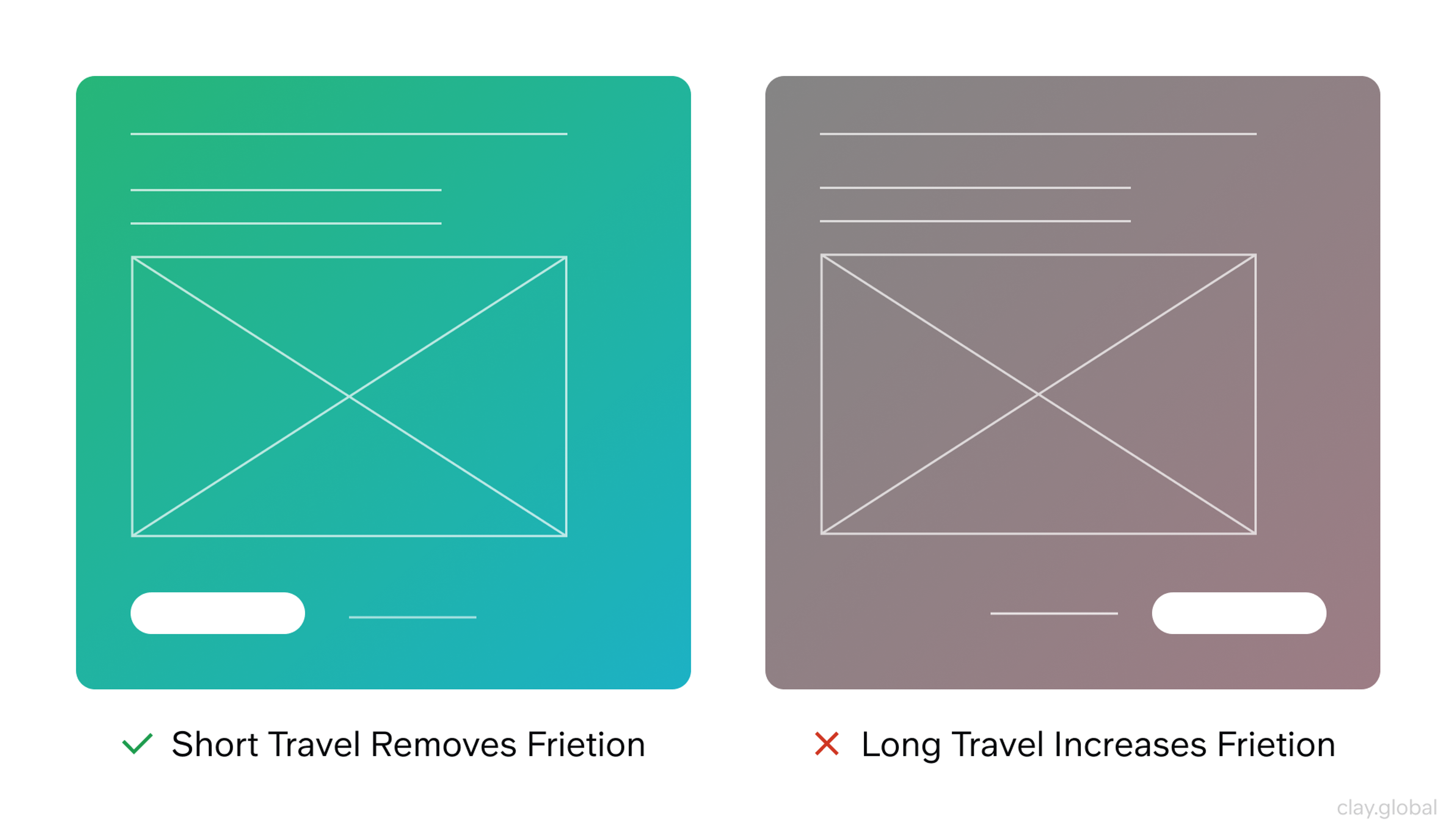
A button is the smallest decision point in your interface, and one of the costliest to get wrong. When a button feels clear, users act without hesitation. When it doesn't, they pause, second-guess, and sometimes leave. That hesitation is not a UX statistic. It is a real moment where confidence either holds or breaks.
Most button problems are not visual. They are semantic. The wrong element, the wrong label, or a missing state, and suddenly users can't tell what's going to happen next. That uncertainty is friction, and friction compounds.
Key Takeaways
- Use
<button>for actions and<a href>for navigation. Mixing them creates unpredictable behavior and accessibility problems. - Limit primary buttons to one per decision point. More than one force users to prioritize what the interface should have already decided for them.
- Generic labels like "Submit" or "OK" hide the outcome. Specific labels like "Save changes" or "Delete project" tell users exactly what happens next.
- Design and ship all six states: enabled, hover, focus, pressed, disabled, and loading. Missing states break trust at the exact moment users need feedback.
- Destructive actions deserve their own visual treatment, and not just a quieter secondary style, but a distinct semantic variant that makes the risk unmistakable.
- Touch targets below 44×44px create friction on mobile. Generous padding is not decoration; it is usability.
Button or Link?
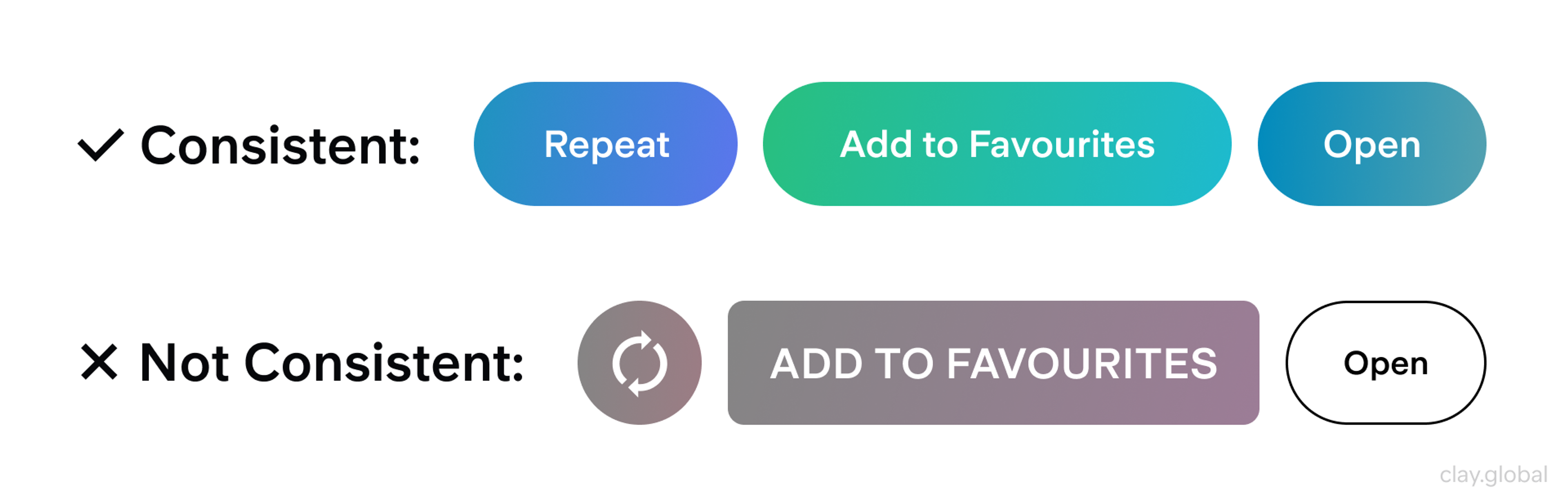
Users arrive at your interface with expectations built from years of browsing. Buttons trigger actions. Links navigate somewhere.
When you blur that line, for example, a <div> styled to look like a button, a <button> used to jump to another page, you create a small but persistent confusion that adds up across every interaction.
This is a semantic choice, not just a visual one. Native <button> elements carry built-in keyboard behavior, screen reader support, and browser compatibility you don't have to engineer from scratch.
Use <a href> for navigation: "View pricing," "Read the documentation," "Back to homepage."
Use <button> for actions: "Save," "Submit," "Delete," "Apply filters."
When these roles remain consistent, users can predict what will happen before they click. That predictability is its own form of design quality.
Button vs Link by Clay
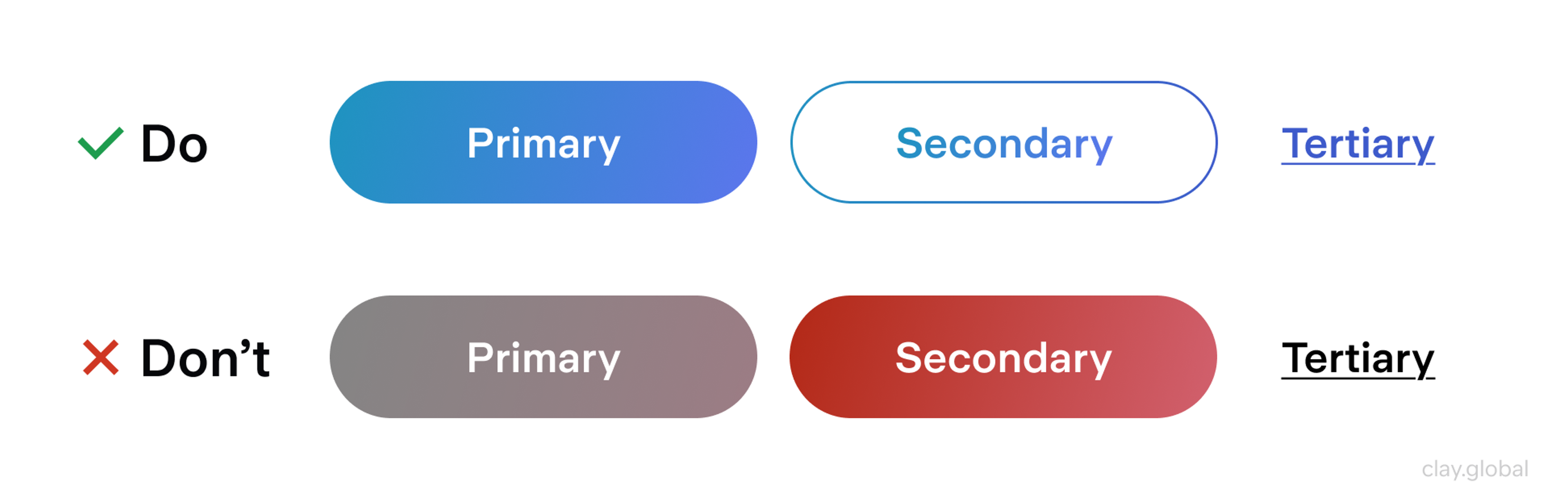
Building a Button Hierarchy That Does the Work For You
The goal of the button hierarchy is to answer one question at a glance: what should I do next? When the visual weight is distributed correctly, users don't have to deliberate. The interface has already made the priority clear.
Most interfaces need three tiers:
- Primary is the main commitment at this step: signing up, confirming a purchase, and submitting a form. There should be one per decision point, whether that's a modal, a form, or a clear section of the page.
- Secondary supports or escapes that commitment: "Back," "Cancel," "Skip".
- Tertiary handles optional or exploratory actions ("Learn more," "View details") without competing for attention.
Hierarchy and state are not the same thing, and mixing them up creates inconsistency that's hard to diagnose.
Hierarchy is about the visual weight of a button's role: primary, secondary, or tertiary.
State is about what's happening right now: enabled, focused, pressed, loading.
Buttons Hierarchy by Clay
When teams conflate these, they end up redesigning primary styles when they actually needed clearer focus states, and users experience the result as an interface that keeps changing on them.
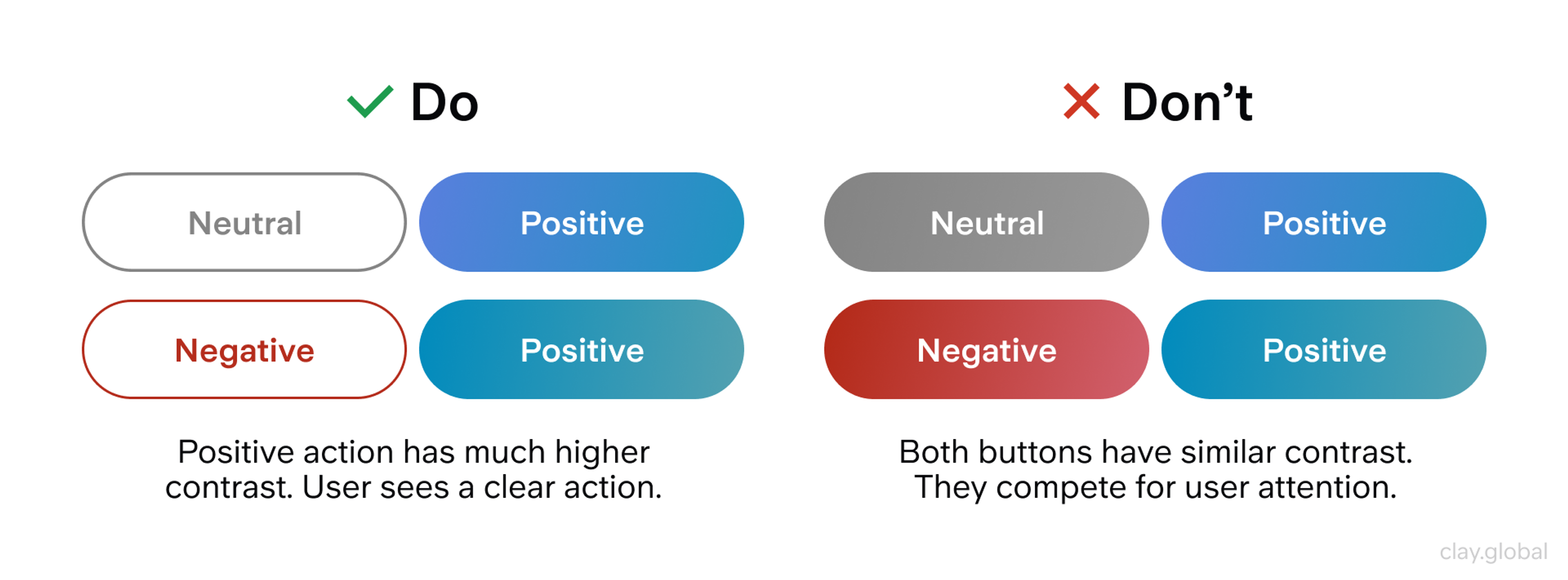
Destructive actions sit outside this three-tier model. "Delete project," "Remove account," "Clear all data" should not look like a quieter secondary button. They deserve their own semantic variant (a danger or destructive style) that signals risk at a glance.
According to Baymard Institute's usability research, interfaces that fail to visually distinguish destructive from non-destructive actions show significantly higher accidental deletion rates in usability testing. When the risk is clear, users pause and confirm. When it's not, they click and regret.
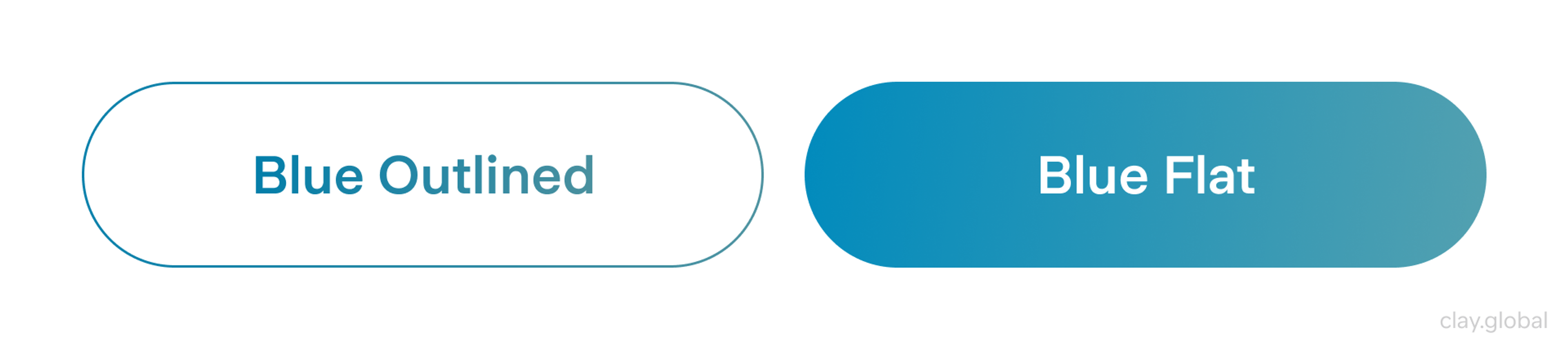
Outlined vs Flat Button by Clay
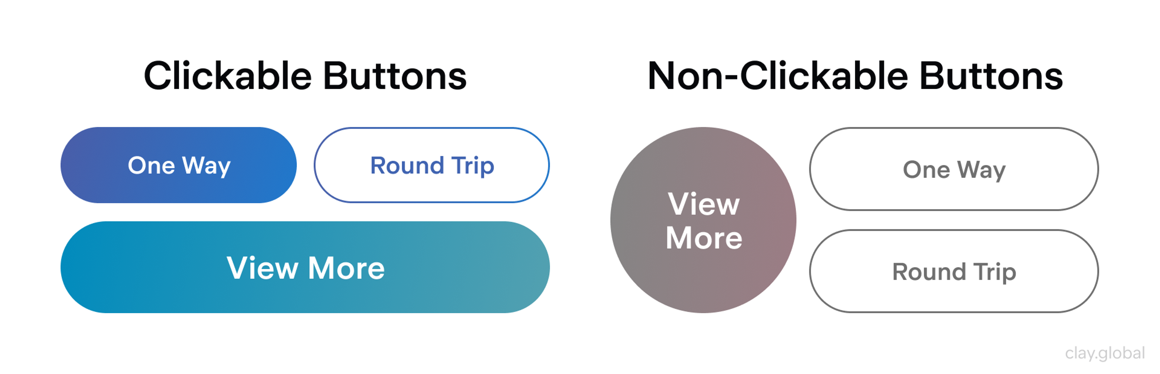
What Makes a Button Look Clickable
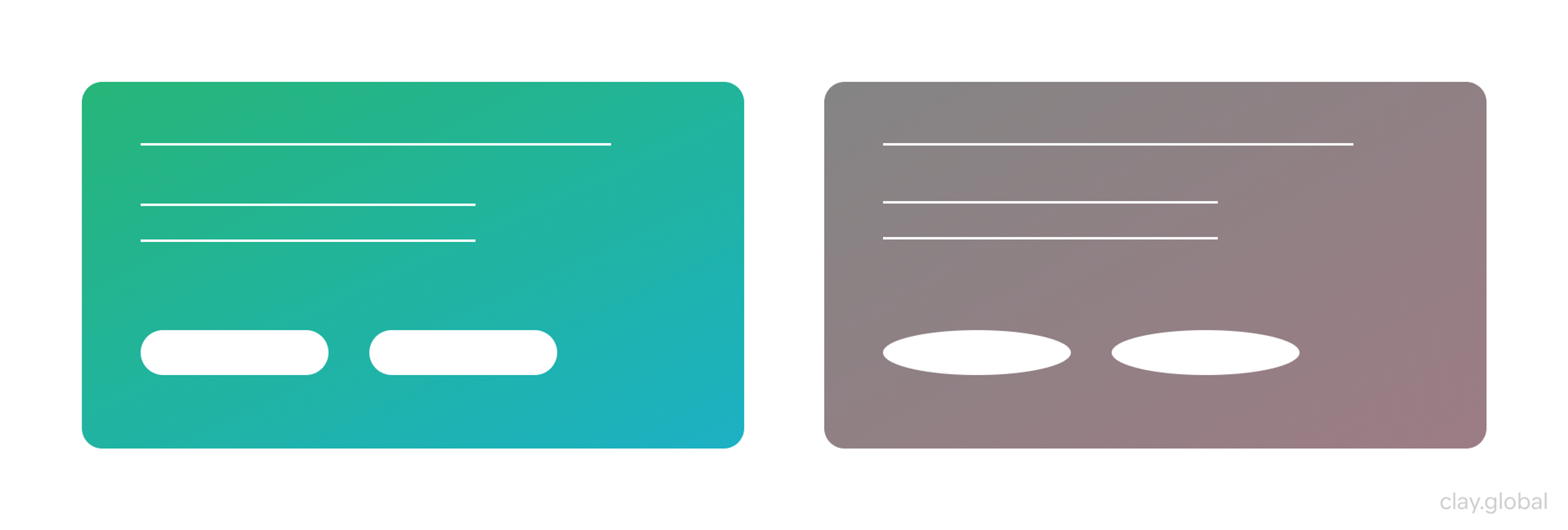
Users scan screens in under a second, looking for signals that say "this is interactive." Shape, color contrast, and clear boundaries do most of that work.
A button that blends into the background (or that looks indistinguishable from body text) doesn't register as a control. Users skip it, miss it, or hesitate.
A few signals carry significant weight:
- Shape and containment: A visible boundary (whether a filled background, an outline, or a distinct pill) tells users the element has an edge they can press.
- Color contrast: WCAG 2.2 requires a contrast ratio of at least 3:1 for UI components against their background. That's a floor, not a ceiling. In practice, the best buttons hold their readability in dark mode, on OLED screens, and with accessibility settings applied.
- Consistent spacing: Padding isn't decoration. It creates a comfortable hit area and ensures the label doesn't feel crammed. On mobile, targets below 44×44px measurably increase mis-taps and slowdowns.
Where designers go wrong is in prioritizing visual interest over clarity. A button can be beautiful. It still has to read as pressable in half a second. When styling gets too clever (too subtle, too flat, too minimal), users hesitate. That pause is friction, and friction costs conversions.
Clickable vs Non-Clickable Buttons by Clay
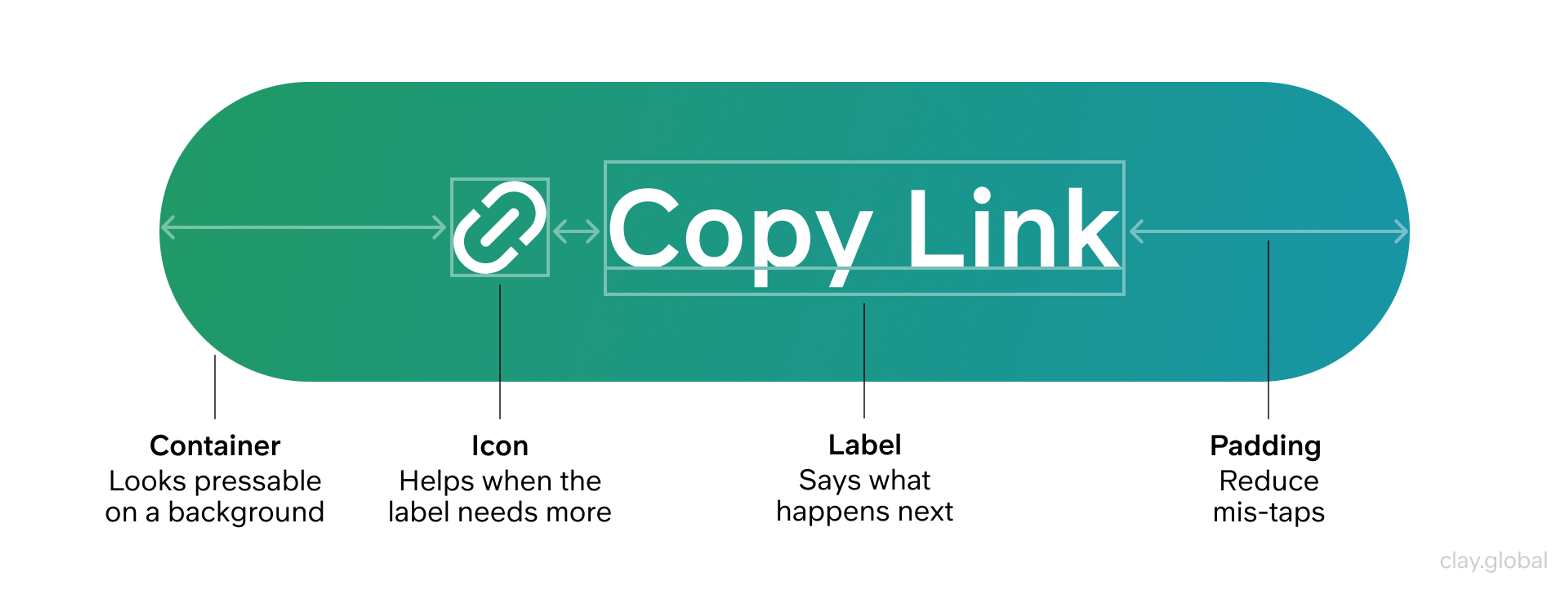
The Anatomy of a Button
Every button is made of three things:
- a label
- a container
- optional supporting elements like icons
Each part sends a signal.
The label is a promise. It should tell users what happens next, not describe the action in the abstract.
"Submit" describes that you're submitting something. "Send application" tells you what you'll have done when you click. One is a generic mechanism. The other is a confirmation of intent.
The container is the handle. It should look pressable on real backgrounds, and not just on a white canvas in Figma, but on a photograph, a dark sidebar, a light gray card.
The container communicates interactivity. If it disappears into the background, the promise becomes invisible.
Icons help when they add meaning that the label doesn't already provide. A download arrow reinforces "Download report." An envelope icon next to "Send message" is redundant. Use icons to disambiguate, not to decorate.
Keep all three elements consistent across your product. Users shouldn't have to re-learn what a primary button looks like on the settings page versus the dashboard. Recognition builds speed, and speed builds confidence.
Button Anatomy by Clay
Where to Put Buttons So Users Don't Have to Hunt
Users expect the primary action to appear at the end of the thinking path.
In a multi-step form, that's after the final field.
In a modal, it's after the decision text.
In a product page, it's after the key value information.
When the button appears before users have finished processing, or in a corner that has nothing to do with the task, people have to scan back, reorient, and find it again. That extra effort introduces doubt.
Buttons with Interactive Labels by Clay
On mobile, sticky action bars can be genuinely useful for keeping primary actions within thumb reach. They become a problem when they obscure content, error messages, or the currently focused element.
A sticky button that covers a validation error is an interface that actively prevents users from completing their task.
Leave enough white space around buttons to reduce accidental taps and give each action visual breathing room. Density is not efficiency. Crowding primary actions with secondary ones (especially on touch screens) invites mistaps that erode trust.
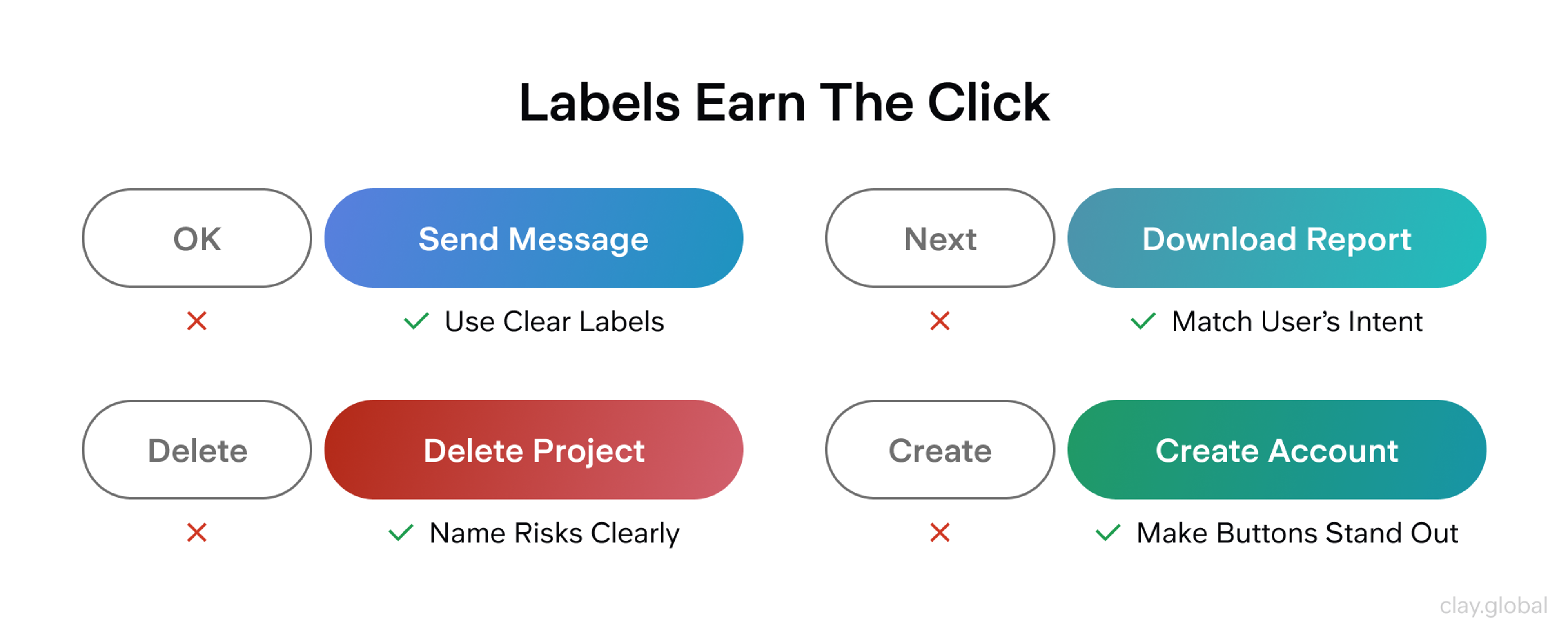
Writing Button Labels That Earn the Click
Design gets attention. Labels earn the click.
The most common label mistake is vagueness. "Continue," "OK," "Submit," and "Next" describe a mechanism, not an outcome. If the label could appear on any page of your site without confusion, it's too generic.
The fix is almost always to add the object: "Continue to checkout," "Confirm booking," or "Submit application."
Match the label to the user's current moment. If someone has just reviewed a plan summary, the next action shouldn't say "Proceed."
It should say "Start your plan" or "Activate subscription" - language that confirms what they're actually about to do. Research from Nielsen Norman Group consistently shows that specific, outcome-oriented labels outperform generic ones for both comprehension and conversion.
For destructive actions, name the risk directly. "Delete project" is clearer than "Delete." "Remove all members" is clearer than "Remove." If you can offer undo or a confirmation step, do so, especially for irreversible actions. The label is your last chance to make the consequence clear before it's too late.
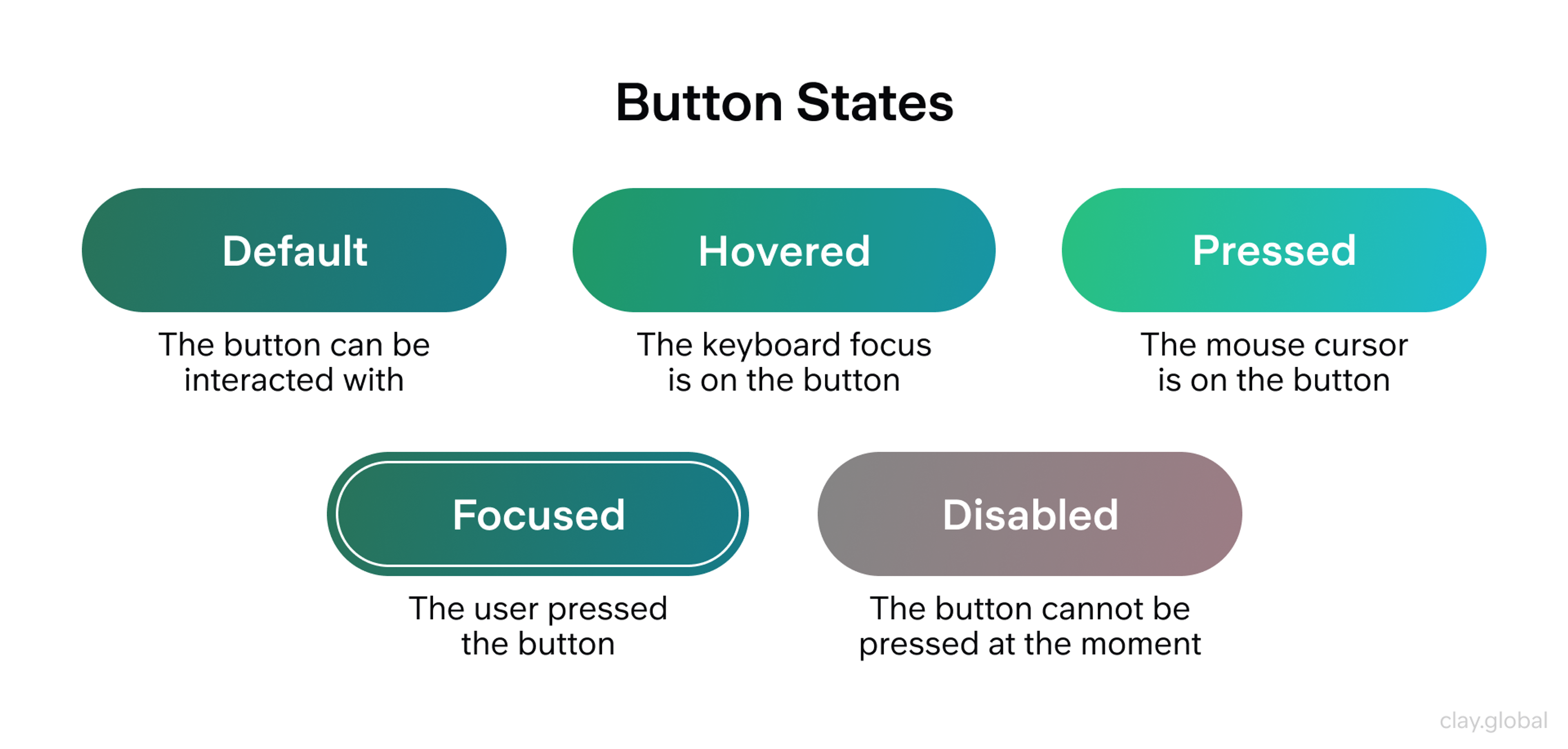
Designing Button States That Build (or Break) Trust
Users don't remember your border radius. They remember whether the interface responded.
State design is where trust lives. Every interaction has a moment (the hover, the click, the wait) where the interface either confirms what's happening or goes silent.
Silence reads as broken. At a minimum, design and ship these six states for every button:
- Enabled
- Hover
- Focus
- Pressed
- Disabled
- Loading
Button States by Clay
Timing matters as much as appearance. Hover responses should feel immediate but not hair-trigger. Focus states need to appear the instant a keyboard user tabs to the control (WCAG 2.2's "Focus Not Obscured" requirement means sticky headers, cookie banners, and bottom bars can't cover the focused element). Pressed states should feel instantaneous so users don't double-click out of uncertainty.
Two-state mistakes quietly destroy trust more than any visual misstep.
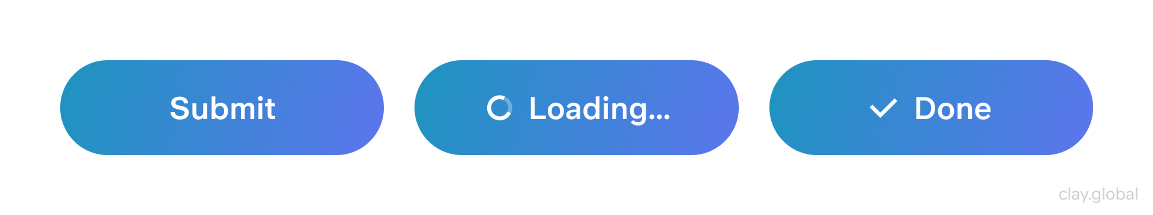
The first is a disabled button with no explanation. When users can't figure out why the main action is unavailable, they feel blocked by the interface rather than guided by it. If the reason isn't immediately obvious from context, add helper text. "Complete all required fields to continue" is a small addition that turns frustration into direction.
The second is a loading state that removes context. Replacing a label with a spinner and nothing else forces users to remember what they clicked and wonder if it worked. Keep the action recognizable: "Saving…," "Processing payment…," "Sending message…" gives users something to anchor to while they wait.
Advanced Patterns Worth Using in 2026
As products grow, the temptation is to add more button variants. Usually, better patterns solve the problem without expanding the system.
Split buttons and dropdown action menus handle cases where there's a clear default plus meaningful variants: "Export" with options for CSV, PDF, or XLSX, for example. This keeps the interface calm while preserving the capability that would otherwise require separate buttons or an extra step.
Consistency in Buttons by Clay
For long-form pages on mobile, a persistent bottom action bar keeps the primary action accessible without requiring users to scroll back up. The key constraint is that it must never cover content, error messages, or keyboard input when a field is active.
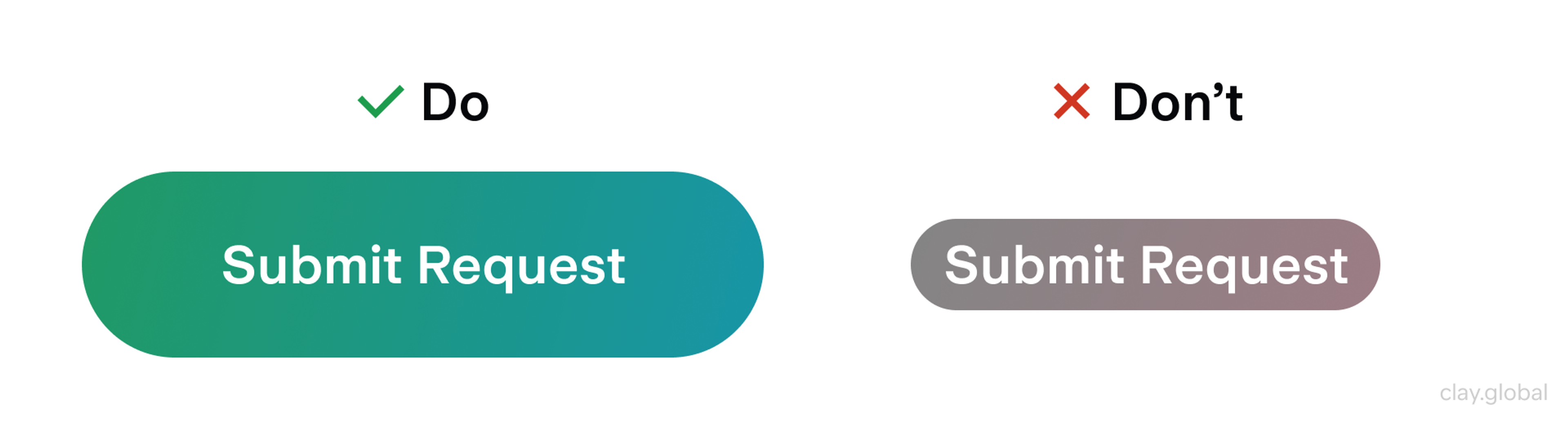
Reset and clear buttons (especially when they're irreversible) should sit visually apart from the primary action and be protected by confirmation or an undo mechanism. Google's Material Design guidelines recommend a minimum of two distinct visual steps before a destructive action completes, with no undo available. Treat these as safeguards, not as equal options to the primary action.
Do and Undo Buttons Example by Clay
Accessibility That Works by Default
Accessibility in button design is mostly about using the right tools correctly.
Start with native <button> for actions. It comes with keyboard behavior, screen reader semantics, and ARIA roles already built in, meaning less manual implementation and less chance of getting it wrong. Custom button elements (<div role="button">) require you to recreate everything the browser would have handled for free.
Keyboard behavior needs real attention: logical tab order, visible focus style, and activation on both Enter and Space. A focus style that matches your brand is far better than the default browser outline, which often gets removed without a replacement.
For toggle buttons, use aria-pressed to expose the state to screen readers. For disabled buttons, prefer the native disabled attribute, if you use aria-disabled instead, note that it doesn't prevent interaction on its own; you'll need to handle that in code.
The detail most teams miss: WCAG 2.2's "Focus Not Obscured" criterion means your sticky header, chat bubble, or consent banner must never overlap the focused control. Test your button states with keyboard navigation, not just with a mouse.
Good and Bad Button Example by Clay
Good Examples of Buttons
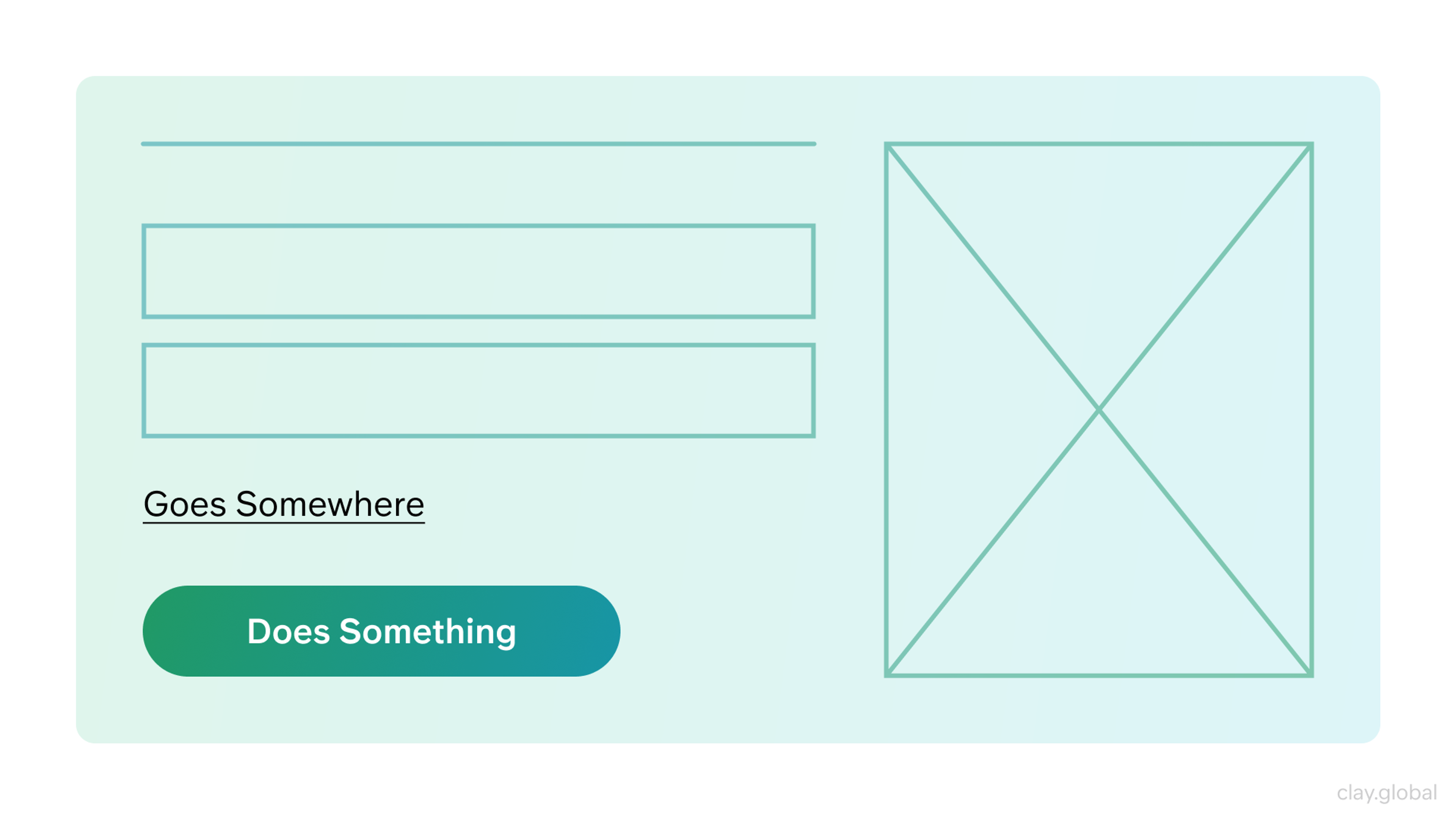
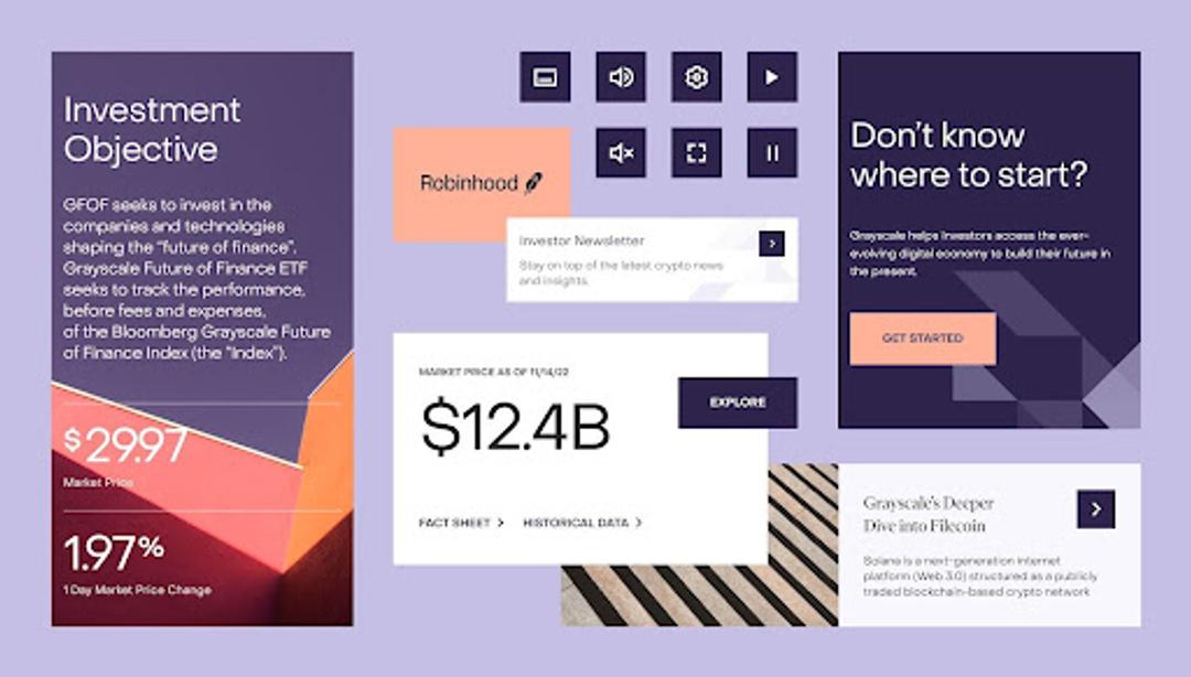
Grayscale
A helpful example of a button system in our Grayscale case is used across different components. You can see a primary action ("GET STARTED"), a supporting action ("EXPLORE"), and small icon controls. The labels are direct, the spacing feels comfortable, and the main action stays visible in a dense layout.
Grayscale UI Kit by Clay
Bad Examples of Buttons
Contact Form
When the main button sits in a random corner or far from the fields it controls, people hesitate. They have to scan, scroll, and "re-find" the next step, which adds friction and raises doubt.
A simple fix is to place the primary action right where the user finishes the task, near the last input, and keep secondary actions close but quieter. The UI feels faster because the next step is obvious.
Buttons Best Practices by Clay
Publish
The buttons on the right feel out of place because their soft pill shape does not match the more structured layout of the modal. This creates visual inconsistency and makes the interface feel less polished. In an important moment like publishing, button styles should support clarity and confidence, not introduce a mismatched tone.
Button Shape Examples by Clay
Read more
FAQs
How many primary buttons should a page have?
One per decision point: a modal, a form, a distinct page section. If you feel the need for two, that's usually a signal that the decision itself needs to be redesigned, not that two primary buttons are the answer.
What's the difference between a button variant and a button state?
Variants define hierarchy and role: primary, secondary, tertiary, and destructive. States describe what's happening right now: enabled, hover, focus, pressed, disabled, loading. Conflating them leads to inconsistencies that are difficult to debug and jarring for users.
When should I use an icon in a button?
When it adds meaning that the label doesn't already provide. A trash icon next to "Delete" adds nothing. A download arrow next to "Export report" adds context. Default to labels alone unless the icon genuinely helps users identify the action faster.
What makes "disabled" buttons so problematic?
The problem isn't the disabled state: it's the missing explanation. Users can accept that something isn't available. What they can't accept is not knowing why. Always pair a disabled primary action with helper text or an inline explanation.
How should loading states be designed?
Keep the label visible and relevant. "Saving…" or "Sending…" tells users what's in progress. A spinner alone forces them to remember what they clicked and leaves them wondering if it worked.
Should I use pill-shaped or rectangular buttons?
Either can work. What matters more is consistency. Choose one style for your primary actions and commit to it across the product. Users adapt to conventions: the problem comes when the convention keeps changing.
What's the minimum touch target size for mobile?
Apple's Human Interface Guidelines recommend 44×44pt as a baseline. Google recommends 48dp. The specific number matters less than the principle: buttons need enough physical space to hit reliably with a thumb.
When is a floating action button (FAB) appropriate?
FABs suit app-like interfaces (dashboards, editors, messaging) where one action is clearly dominant and must remain accessible as users scroll. They're usually a poor fit for marketing pages, where they can obscure content and create visual noise without a clear benefit.
How do I handle destructive actions without hiding them?
Use a distinct visual variant (a danger or destructive style, typically red or high-contrast) that signals risk without burying the option. Place it away from the primary action, and for irreversible operations, require a confirmation step or provide undo.
What WCAG requirements apply specifically to buttons?
Color contrast must meet at least 3:1 for the button UI component against its background (non-text contrast, WCAG 1.4.11). Labels need a 4.5:1 contrast ratio for normal text. Focus states must be visible and must not be obscured by other elements (Focus Not Obscured, WCAG 2.4.12 under 2.2).
Is it ever acceptable to use a <div> as a button?
Technically possible, practically inadvisable. You'll need to add role="button", tabindex="0", keyboard event handlers, and ARIA state manually - all of which native <button> handles automatically. There's no meaningful advantage.
What's the fastest way to audit my existing button system?
Run through your product with keyboard-only navigation. If focus states are invisible, if tab order feels random, or if any button doesn't activate on Space and Enter, you've found your priorities. Follow with a contrast check on disabled and loading states, which are often overlooked.
How should I handle buttons in dark mode?
Don't just invert your light mode values. Test each state (enabled, hover, focus, disabled) explicitly against dark backgrounds. Borders and outlines that rely on subtle shadow effects often disappear entirely. Build dark mode button tokens as first-class values, not afterthoughts.
Conclusion
Buttons fail when they're treated as an afterthought. They work when they're treated as a communication system: every variant, state, label, and placement is a message to the user about what's possible and what happens next.
Start with the fundamentals: the right element, one primary action per decision point, specific labels, and all six states. Build from there.

About Clay
Clay is a UI/UX design & branding agency in San Francisco. We team up with startups and leading brands to create transformative digital experience. Clients: Facebook, Slack, Google, Amazon, Credit Karma, Zenefits, etc.
Learn moreAbout Clay
Clay is a UI/UX design & branding agency in San Francisco. We team up with startups and leading brands to create transformative digital experience. Clients: Facebook, Slack, Google, Amazon, Credit Karma, Zenefits, etc.
Learn more