Why Psychology Powers Great UX
Good interfaces feel obvious. This feeling comes from aligning design with how people think, decide, and feel. Psychology helps UX teams understand these patterns and create better products. Basic psychology and cognitive psychology provide the foundation for understanding user behavior in UX design.
When designers understand perception and attention, they reduce friction. Psychological principles guide how users perceive, focus, and interact with interfaces, shaping motivation and emotion to build engagement. When they know how memory and learning work, they create products that stick.
Psychology also reveals a truth: humans aren’t rational machines. Human psychology shapes the mental shortcuts and habits we rely on. We feel more than we calculate. Designing with these truths creates simpler, more effective interfaces.
How the Mind Processes Screens
Every screen competes for attention. The visual system processes contrast, grouping, and motion in milliseconds, allowing the brain to rapidly process information and visual elements as visual information. If your layout fights these automatic processes, users work harder to understand it.
Different Types of Layout Structures by Clay

Attention is limited. Multiple focal points, unnecessary motion, or dense text blocks overload the system. Cognitive load rises when users must remember too many steps, exceptions, or unfamiliar terms.
Short-term memory and working memory have limited capacity, as described by Miller's law, so structuring information architecture thoughtfully reduces cognitive load.
The solution is structure. Keep one clear visual hierarchy. Place the primary action where eyes naturally land. Use concrete, short labels. Break complex flows into steps and show progress - clear information architecture and purposeful visual elements reduce cognitive load and help users process information more efficiently.
Memory favors recognition over recall. Menus, labeled icons, and visible system status support recognition. Hidden gestures and cryptic acronyms demand recall. When you convert recall to recognition, interfaces feel lighter.
Mental Models Shape Experience
Users arrive with mental models, their beliefs about how things should work. According to schema theory, users' mental models are built from prior experiences and knowledge structures, which shape their expectations for how information is organized and presented. Your product has a conceptual model, how it actually works. Friction appears when these do not match.
Detect people’s mental models early. Reflect them in language, navigation, and feedback. If your app is a document, show clear Save and Share options. If it’s a conversation, show replies and history.
When you break expectations, show explicit status. Autosave systems should display “Saved just now” so users can update their model with confidence.
Motivation Drives Product Use
People open products to reduce tension: finish a task, feel competent, connect with others, or avoid loss. Designs that support autonomy, competence, and connection sustain engagement.
User motivation and behavioral psychology inform the design of reward systems and engagement strategies, helping to encourage active participation and sustained user engagement.
Autonomy means meaningful choices without overload. Competence means clear goals, feedback, and visible progress. Connection means social acknowledgment or contribution to something bigger.
Applying behavioral economics can help design choices and rewards that increase user engagement by accounting for how people value immediate versus delayed rewards.
Emotion guides behavior faster than logic. Friendly messages, timely celebrations, and compassionate error handling lower stress and increase persistence.
Understanding user psychology is crucial to create emotionally resonant experiences that drive engagement. The right tone turns “failed upload” into “We could not upload that file yet. Try again, or contact us for help.”
How People Make Decisions
People rely on mental shortcuts, which are influenced by cognitive processes and cognitive biases that shape the decision making process in UX. Several matter in UX:
- Default effect: Users often choose the preselected option. Choose defaults carefully and ethically.
- Loss aversion: Losses hit harder than gains. Frame messages as “Keep my progress” rather than “Discard changes?”
- Anchoring: The first number shapes perception of later numbers and influences subsequent judgments. Order pricing options intentionally.
- Choice overload: Too many options reduce action. Curate choices and provide filters.
- Framing: Word choice matters. Pick frames that match user goals and truth.
Use these patterns to reduce friction and help people make decisions that match their intentions. People tend to follow familiar paths and rely on these decision making processes, so understanding these tendencies can improve user experience.
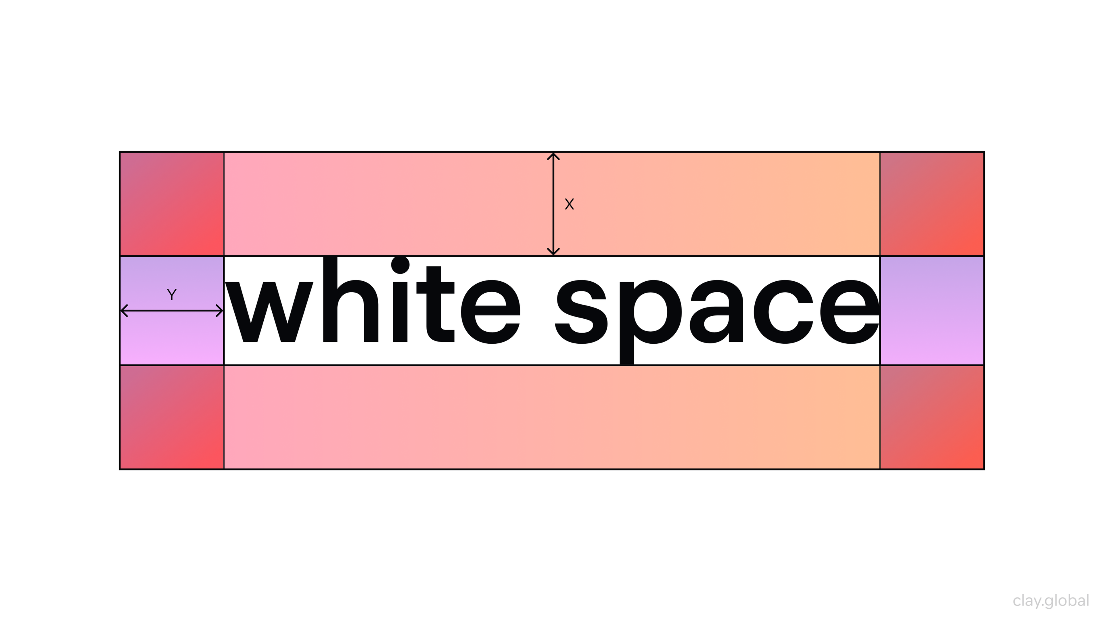
Visual Organization Reduces Cognitive Load and Creates Meaning
Brains group elements by proximity, similarity, continuity, and closure. These are known as gestalt principles, rooted in gestalt psychology, which explain how we naturally organize and interpret visual elements into coherent wholes.
Use proximity to cluster related fields. Use similarity in color and shape to show items that belong together. Align elements along clean lines for effortless scanning, and incorporate negative space and thoughtful design elements to guide visual perception and focus user attention.
White Space Illustration by Clay
The information hierarchy answers “What should I see first?” Size, contrast, weight, and space are your tools. Start with one dominant headline or action per view.
Support it with a clear secondary path. De-emphasize everything else. A visually appealing hierarchy leverages visual elements to improve user comprehension and retention.
A crisp hierarchy cuts bounce rates more than any flourish.
Making Interfaces Feel Quick
Two principles help interfaces feel fast:
Fitts’ Law: Time to reach a target depends on distance and size, and is calculated based on the target divided by the distance and size. For example, the time it takes for a user to move the mouse cursor to a button increases if the button is smaller or farther away. Make primary actions big and close to where the cursor already is.
Hick’s Law: Decision time grows with choice complexity. Using drop down menus can help design interfaces that simplify choices and reduce decision time by presenting only relevant options. Break complex tasks into steps. Show basic options first, advanced options on demand.
When actions are risky, add confirmation. But design it to be low-effort and clearly different from the initial action. Undo is often better than “Are you sure?” because it protects without interrupting flow.
Building Learning and Habits
Interfaces should teach without feeling like school. Early moments benefit from scaffolding: guided tours, examples of what good looks like, and small early wins.
According to retention theory, presenting information in manageable amounts helps users retain knowledge and improves learning and memory. As skill grows, remove scaffolding and make advanced paths discoverable.
Habits form when a cue triggers a routine and produces a reward. For daily check ins, create predictable cues that users control, a short routine, and a meaningful payoff such as insight, progress, relief, or acknowledgment. Recognizing incomplete tasks can create cognitive tension that encourages users to return and complete actions.
Handle variable rewards carefully. Inconsistency that exploits compulsion isn’t good UX. The mere exposure effect shows that repeated exposure to interface elements can increase user comfort and preference over time.
Trust and Credibility Matter
Humans copy what similar others do, especially under uncertainty. Social proof, such as reviews, usage numbers, and endorsements, influences user experiences and builds trust by reducing perceived risk when genuine and specific.
Trust grows through clarity, predictability, and care. Show system status like “Syncing… Done.” Explain why you ask for permissions in plain language. Make privacy choices reversible. Consistent usage of design elements further reinforces credibility.
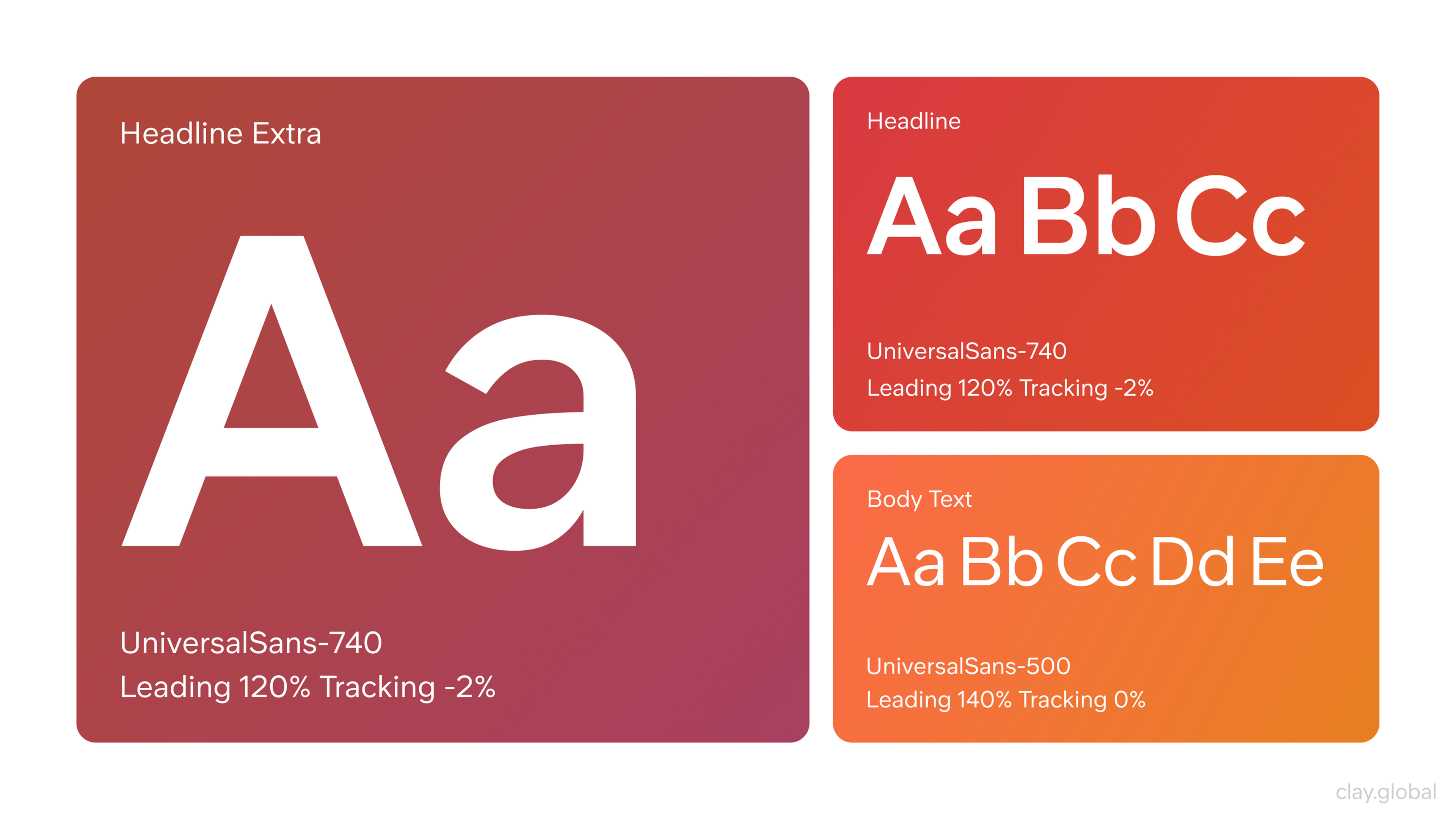
Visual trust also matters. Consistent typography, tidy forms, and accessible color contrast signal professional reliability. A positive user experience is built on trust and reliability.
Typography Illustration by Clay
Ethics in Psychological Design
Psychology gives teams power. The ethical test is simple: does this design help users achieve their goals on fair terms? Integrating psychological insights into your design strategy has practical implications. By applying the latest psychological theories, teams can create ethical, user centered experiences that are both effective and respectful.
Nudges like prefilled fields, helpful defaults, and progress indicators serve the user. Dark patterns, such as sneaking items into carts, hiding opt out, and guilt tripping messages, extract value at the user’s expense.
Add an ethics checkpoint to design reviews. Name the user goal, name the business goal, and verify the design supports both without coercion.
Designing for Everyone
Accessibility is psychology at scale. People vary in vision, motor ability, attention, memory, language, and sensory sensitivity. Principles from human-computer interaction inform the creation of user friendly designs that accommodate diverse users, ensuring interfaces are intuitive and accessible.
High color contrast and sufficient font sizes reduce visual strain. Clear focus states and large touch targets serve motor and keyboard users. Plain language reduces cognitive effort for everyone, especially under stress or on small screens.
Motion sensitivity is real. Allow users to reduce motion and keep animations purposeful and brief.
Designing for neurodiversity with clear structure, options to reduce distractions, and predictable navigation benefits all users. When in doubt, simplify, and consider human interaction patterns to further enhance accessibility.
Accessibility Elements by Clay

Culture Shapes Experience
Color meanings, idioms, and reading patterns differ by culture. Left-to-right versus right-to-left reading changes scan paths. Symbols can misfire across regions. Humor and assertive tones land differently.
Validate names and addresses for local formats. If your product spans cultures, build for adaptability: right-to-left support, regional imagery, flexible date formats, and content that can be localized without breaking layouts.
Research Reveals What Matters
Qualitative methods reveal the why. Quantitative methods show the how often. Use both. User testing is essential to validate psychological hypotheses and ensure that design decisions are grounded in real user behavior.
Contextual inquiry and interviews uncover mental models, vocabulary, and anxieties. Think aloud usability tests expose cognitive load by showing where users hesitate, backtrack, or guess. Diary studies reveal habits and breakdowns in real life, while understanding psychological phenomena helps interpret user behavior during research.
On the quantitative side, funnels and event streams reveal where attention drops. Tests validate whether a psychological hypothesis actually improves completion. Foundational studies published in psychological review provide key insights that inform effective UX research methods.
UX Research Process by Clay

Triangulate findings. If interviews say a form feels long and analytics show abandonment spikes at one section, simplify that section first.
Measuring What Matters
Metrics should map to human experience, not just clicks.
Task success rate and time-on-task reflect effectiveness and efficiency. Measuring the mental effort required for key tasks can enhance user experience by identifying friction points and opportunities for simplification. Error rate indicates comprehension. Usability scores capture perceived usability without over-surveying.
Customer support themes are qualitative gold. Recurring confusion is a design bug, not a user bug. Understanding where users spend most of their time on other websites can inform design improvements and help align with familiar patterns.
Make metrics specific to the psychological goal. If you’re reducing cognitive load on a form, measure field-level completion time. If you’re building habit, measure voluntary return rate at meaningful intervals.
Integrating Psychology into Design Process
Start each initiative by writing a problem in human terms: who is stuck, at which moment, and why? Name the psychological barriers: ambiguity, overload, fear of loss, lack of progress.
UX designers aim to design interfaces that address these barriers by simplifying choices and prioritizing relevant options, ensuring the design aligns with psychological goals and user needs.
Turn those into testable ideas. Designers aim to explore multiple ways to satisfy the same psychological goal, using their understanding of user behavior and design principles.
Reviews evaluate the experience: Is the primary action unmistakable? Does copy match the user’s mental model? Are defaults ethical? Does the flow protect attention? Are errors recoverable?
Ship with measurements that match your ideas. Plan the next learning step before you launch.
FAQ
Is UX Design Related To Psychology?
Yes. UX uses cognitive and behavioral psychology to make products intuitive and satisfying.
Can I Get Into UX Design With A Psychology Degree?
Yes. Add a portfolio with user research, usability tests, wireframes, prototypes in Figma, and case studies that connect insights to design choices.
Is UX A Dead Field?
No. Demand is strong across SaaS, finance, healthcare, and AI. Roles evolve toward data literacy, content design, and design systems.
Is There Psychology In UI?
Yes. UI relies on perception and attention principles such as contrast, hierarchy, color, motion, and clear affordances to guide focus.
Which Psychology Principles Matter Most In UX?
Mental models, Hick’s Law, Fitts’s Law, Gestalt grouping, cognitive load management, social proof, and timely feedback loops.
Read more:
Building Better Products
Psychology turns good intentions into reliable patterns. It explains why hierarchy matters, why defaults carry weight, why progress feels motivating, and why ethics must guide persuasion.
When teams share this lens, decisions become faster and kinder. The result is software that respects attention, supports competence, and earns trust. People return to these products because they feel understood.

About Clay
Clay is a UI/UX design & branding agency in San Francisco. We team up with startups and leading brands to create transformative digital experience. Clients: Facebook, Slack, Google, Amazon, Credit Karma, Zenefits, etc.
Learn moreAbout Clay
Clay is a UI/UX design & branding agency in San Francisco. We team up with startups and leading brands to create transformative digital experience. Clients: Facebook, Slack, Google, Amazon, Credit Karma, Zenefits, etc.
Learn more