With time, the understanding of web design has improved. It has moved from a busy text-based interface to a more appealing, user-centered approach.
In the past, the internet was furnished with loads of pages featuring moving visuals, songs that automatically played, and unmanageable menus.
A 'good simple' website effectively communicates a brand's message through clear and simple design elements like color and shape, making it easier for potential customers to engage with the content.
What “Simple” Really Means
A simple website is focused. It helps users do one thing at a time. It makes the next step obvious.
It uses clear hierarchy. It limits choices. It keeps patterns consistent. It performs well on mobile. It loads fast.
A simple site also carries a brand. Color, type, spacing, and shape do the work. Users should “get it” within seconds.
Building Simple Designs with Code
- Strong HTML foundations: Use semantic HTML for clear structure. Headings set hierarchy, lists group content, and landmarks like
navandmaindefine sections. Use correct form inputs. - Progressive enhancement: Start with solid HTML, add CSS, then layer JavaScript. The site should still work without scripts.
- Modern CSS for clean layouts: Use Grid for page structure and Flexbox for components. Use CSS variables to keep styles consistent.
- Mobile-first responsive design: Design for small screens first. Choose breakpoints based on content. Use relative units and keep pages light.
- Speed and performance: Load key content fast. Inline critical CSS, defer the rest. Compress and lazy-load images, remove unused CSS, and load JS asynchronously. Set performance budgets.
The Scientific Reasons of Why Simple Website Design Is The Best
Cognitive Load Theory
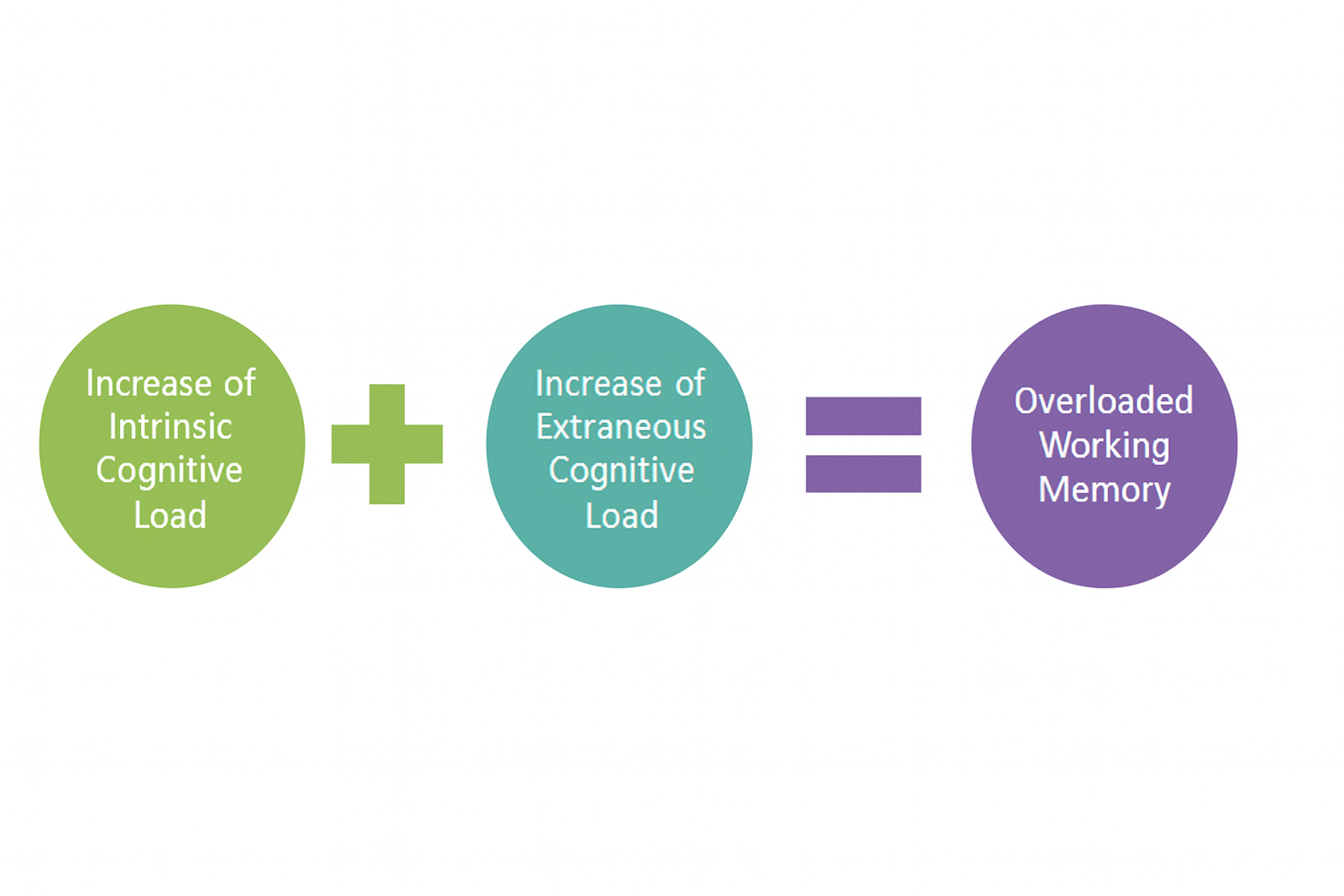
Cognitive Load Theory, created by John Sweller, indicates the quantity of working memory resources required to complete a specific task.
As a case, every time a user navigates a web page, they interact with several components, including images, text, and navigational elements.
Strategic use of design elements, such as color and layout, can reduce cognitive load by enhancing website recognition and navigation.
Source: EDUC320neeb, CC BY-SA 4.0 via Wikimedia Commons
In that case, the end-users may become unengaged or even quit the site with a cognitive load-to-frustration ratio that is not worth overcoming the complexity they are confronted with.
It has been studied that people have limited cognitive processing, which inevitably affects how effectively information forwarded to them can be processed.
Main Points:
- Definition and Importance: Cognitive Load Theory fixates on the scarcity of human cognitive capability resources, especially in interaction with content on the Web.
- Research Evidence: Research studies have shown that people fail to process information effectively when there is an overload of information in complex presentations, making it necessary to look for simple designs.
- Reduction of Mental Effort: All that users can interconnect on the websites can be accomplished pleasingly with needful messages only through basic website designs.
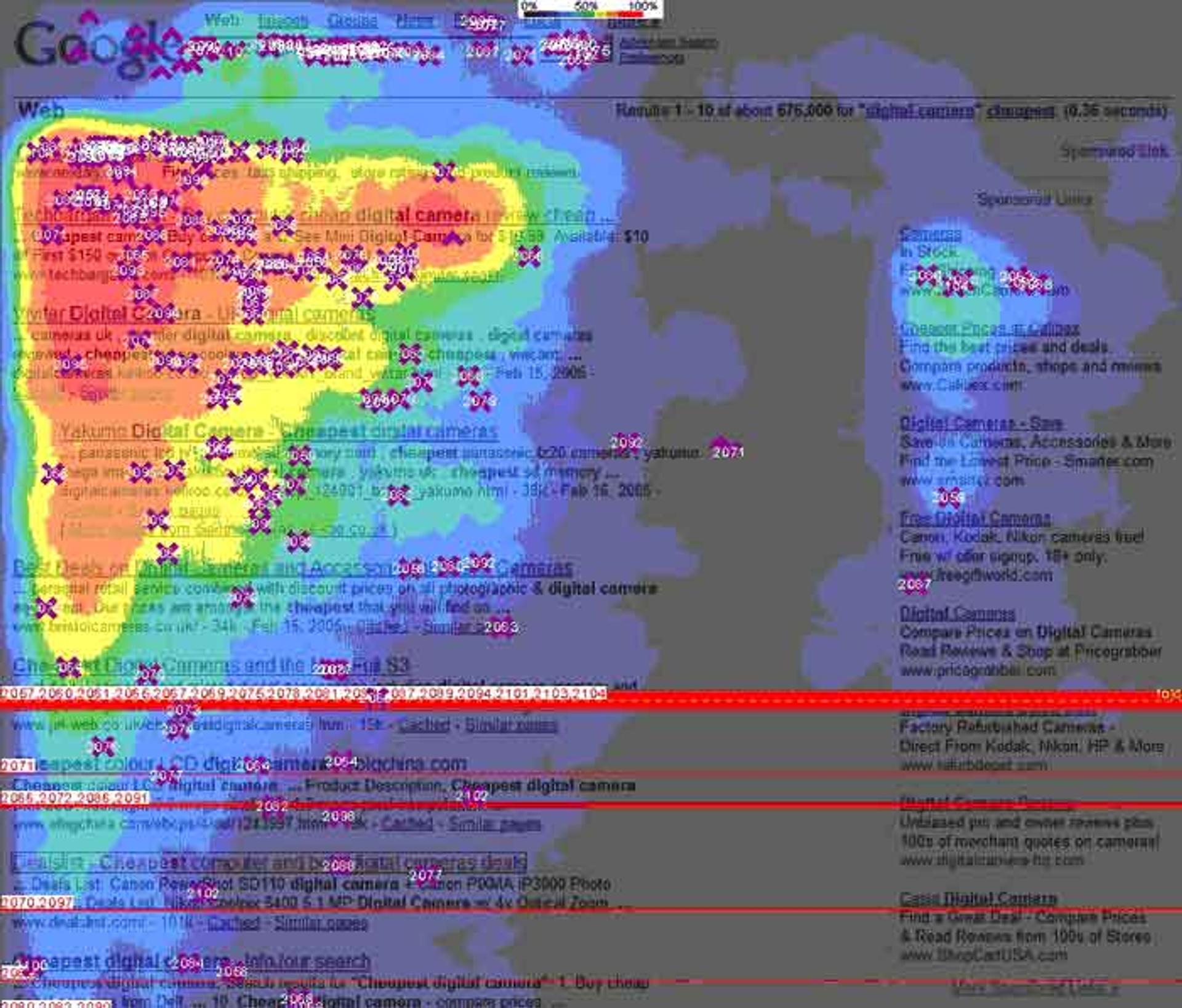
Case Study
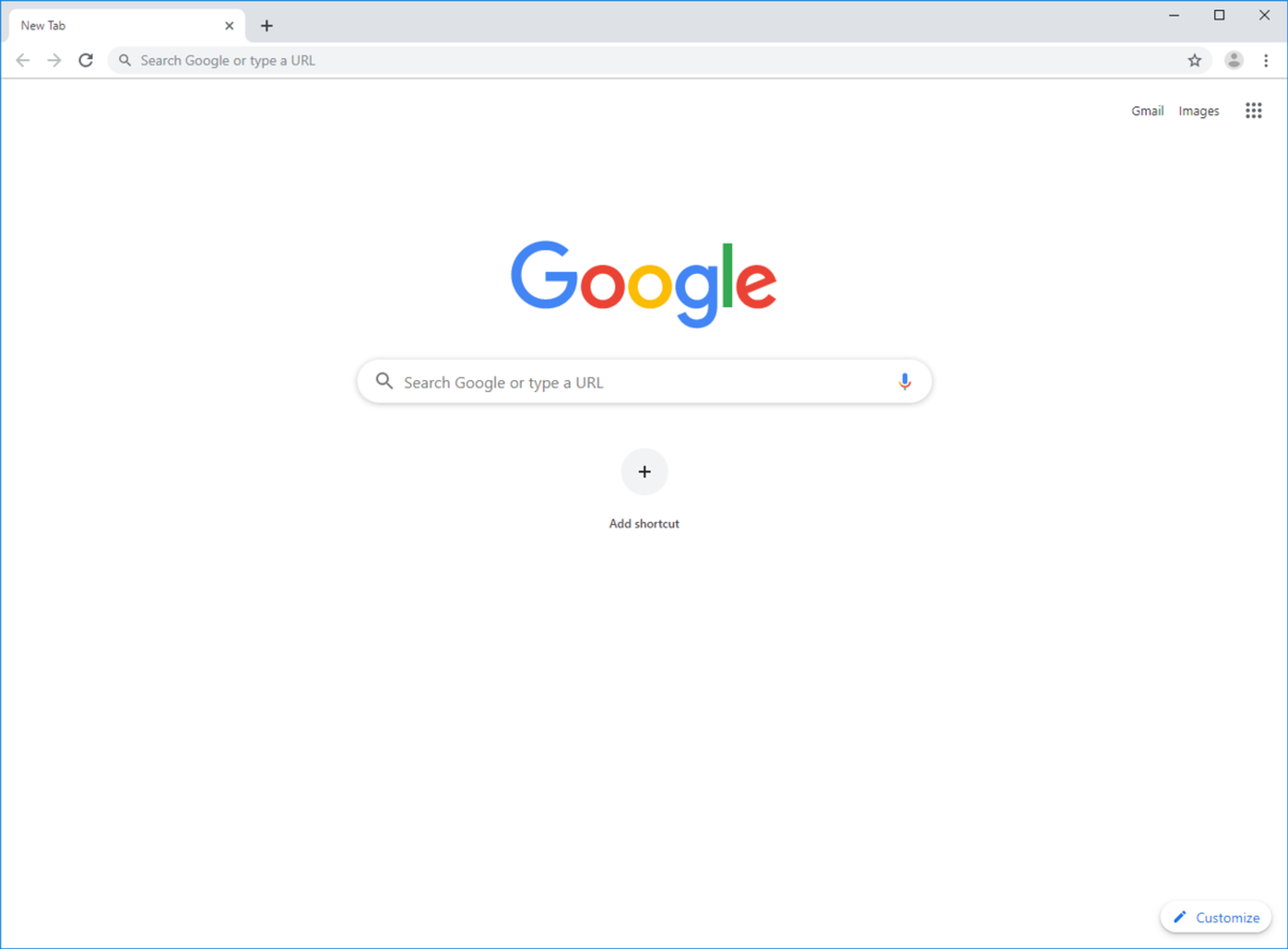
One of the best simple website examples is the Google search engine, which has been adopted widely across the globe due to its simple search interface. With only the relevant interface features, users can search for the information they require within the shortest time possible and within a very intuitive design.
Source: google
Decision Paralysis and Choice Overload
Decision paralysis happens when users face too many choices, also known as the paradox of choice.
Too many menus, products, or CTAs can frustrate people and lower conversions.
A well-structured landing page reduces this by highlighting essentials and using one clear, primary call to action.
Main points:
- Paradox of Choice: It explains that having too many options could be a problem since it makes it difficult for users to select an option.
- Research Findings: It has been proven scientifically that too much website extensionality leads to many different conversion rates. Users get used to uncertainty and may need to complete the target before they exit the website.
- Impact of Visual Clutter: There are too many visual elements on websites, and competing with one another can also annoy customers instead of assisting them with their decision-making.
Case Study
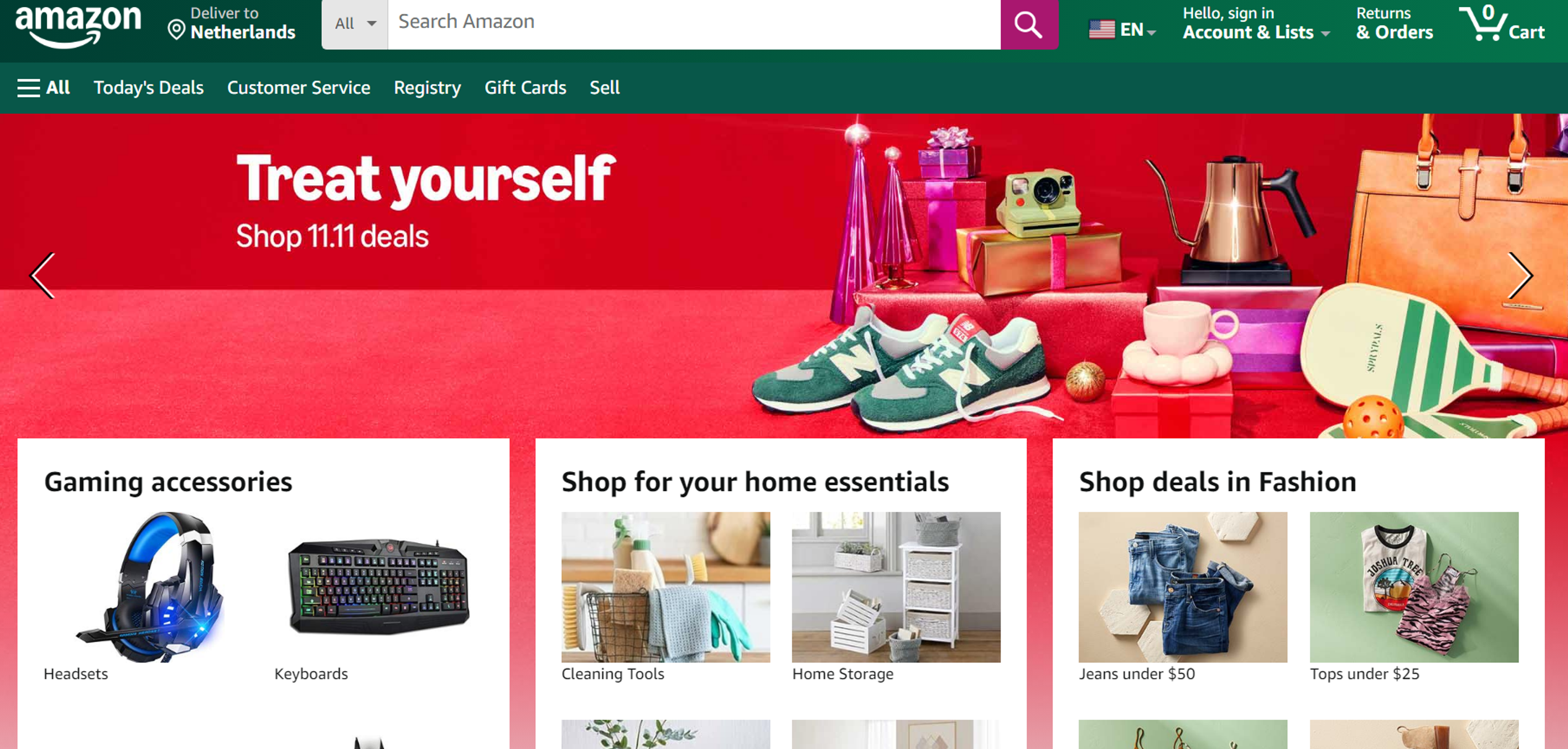
When purchasing from Amazon, there are few distractions along the way, and the rapidly changing page guides you to the point where you need to opt for a choice as quickly as possible.
As a general rule, the higher the number of steps, the lower the chances of negating. Thus, focusing on simplicity while maximizing potential conversion points makes perfect business sense.
Source: amazon
Processing Fluency and Aesthetic Appreciation
Processing fluency is how easy something is to understand. In web design, clear, well-organized layouts feel better, look more appealing, and improve user satisfaction.
Main Points:
- Scientific Explanation of Processing Fluency: Processing fluency refers to the effort involved in producing or comprehending visual and textual information, which is conducive to user satisfaction.
- Correlation Between Spared Efforts and Simplicity: Past investigations show that aesthetic appeal, mainly simplicity, is naturally preferred because appealing users often choose simple designs.
- Role of White Space: The efficient application of white space contributes positively to visual processing, giving readers' eyes a break from critical attention and improving processing fluency.
- First Impressions: It is proven that users make up their minds about a website in less than 50 milliseconds. This clearly demonstrates the significance of the first impression and the supporting facts of having a simple and seamless fluid design.
Speed and Performance Benefits
Minimalist design usually loads faster because it uses fewer assets and less code.
Faster pages reduce bounce rates. Slow pages frustrate users and make them leave.
Main Points:
- SEO Advantages: In line with this, Google's search engine algorithm consistently ranks sites that are fast and responsive higher, as this is one of the ranking factors.
- With leaner and simpler designs, a website's performance is improved, leading to a better user experience and performance metrics, which results in improved ranking.
- Faster Load Times: The design uses fewer media assets and streamlined code, which leads to faster page loading and better website performance.
- Impact on Bounce Rates: Some empirical data shows that internet users are likelier to engage with faster-loading and optimized funnels. Thus, they will spend more time exploring and are much more likely to convert and stay on the page after gaining entry.
- Mobile Performance: Mobile browsing use is rapidly rising and continues to increase while desktop usage decreases. Due to this, lean designs ensure that sites load smoothly across mobile devices.
User Behavior Research
User research matters. Eye-tracking shows people complete tasks faster on simpler pages. Social proof (logos, testimonials, case studies) boosts trust and credibility.
Main Points:
- Eye-Tracking Studies: A study using eye-tracking shows that users tend to gravitate towards and perform nicely with more straightforward pages because they can locate what they are looking for faster and with less work.
- Heat Map Data: Heat map research highlights users' focus on specific areas of web pages, showing which sections they have interacted with for longer periods. More straightforward layouts can also help promote shorter and stronger forms of interaction.
- F-Pattern Reading: Based on research from Exit Surveys, people who analyze more complex web pages tend to ignore a major portion of technical communications. F-shaped patterns point out how reading, clicking, scrolling, and navigation are carried out on web pages.
- User Attention Spans: Contents-era drivers will demand fast automation and effectiveness in digital designs due to consumers' attention spans worsening.
Neurological Evidence
Simple designs require less mental effort than complex ones. That makes content easier to process, improves understanding, and supports clearer brand storytelling.
Main points:
- Neuroimaging: The brain activates 'some' neural mechanisms depending on the complexity of the design, attracting the viewer's attention to areas with greater complexity. Such slaved activities increase cognitive load, which is unfavorable to the viewer.
- Aesthetic preferences and neural response: Studies on whether users have the required aesthetic voices tend to be supported by certain regions of the brain associated with pleasure and satisfaction. When given the chance, most humans like vast amounts of information that is not filled to the brim and neat in design.
Source: velvethammer.net
- Evidence regarding memory and recall: Utilizing some of the previously perceived strategies enhances recall, retention of memories, and credibility of content memory in primary sourcing since it addresses cognitive factors that are pillars of understanding and breakdown of information.
Business Impact
Simple, consistent design improves UX and makes key actions easier, which can raise conversions.
It also strengthens brand trust and loyalty across many website types.
Main Points:
- Conversion Rate Studies: Research has illustrated that conversion rates can be improved through the use of simple websites. These websites simplify the overall processes, lowering the friction to perform an action that takes a short period to decide.
- Brand Perception Research: Simple and intelligent-looking websites are promotional tools that offer constructive information to customers, which is essential in a business's brand positioning.
- Cost Benefits of Plain Design: Website designs that are basic in approach also reduce development and maintenance expenditures. They are cheaper to construct, develop, update, or change and, hence, are more cost-effective for firms.
- Maintenance and Updating Benefits: The primary design contours the maintenance and update activities. The less complex the design, the more indentation there is for faster diagnosis and execution of system changes to keep the site current and working properly with minimum outage time.
Suppose businesses emphasize a simple design. In that case, they can derive some real monetary benefits automatically while delighting the system users and creating an excellent corporate image, thus improving their competitiveness in the market.
Characteristics of Effective Simple Websites
Effective, simple websites share certain characteristics that contribute to their success. These characteristics include:
Prominent Calls-to-Action: Simple websites often feature prominent calls-to-action (CTAs) that guide visitors towards a specific action, such as signing up for a newsletter or making a purchase. These CTAs are strategically placed and visually distinct, ensuring they catch the visitor’s eye.
Minimal Distractions: Simple websites avoid distractions such as excessive animations, pop-ups, and cluttered layouts, allowing visitors to focus on the content and message. This approach helps maintain user attention and improve the overall user experience.
Our website for Art Bridges prioritizes simplicity, minimizing distractions to maintain user focus on content and mission. By avoiding excessive animations and clutter, the site allows users to engage fully with the artwork and message.
The design centers around high-quality visuals and an intuitive layout, enhancing user experience and showcasing Art Bridges' offerings without overwhelming users.
Art Bridges by Clay
Consistent Branding: Simple websites often feature consistent branding, including a clear and recognizable logo, typography, and color scheme. This consistency helps in building brand recognition and trust.
FAQ
What Is the Easiest Website to Create?
The easiest website to create is a simple one-page site using drag-and-drop builders like Wix, Squarespace, or Canva. These require no coding and let you publish quickly.
Can ChatGPT Actually Create a Website?
ChatGPT can generate website code (HTML, CSS, JavaScript) or content, but you’ll need a platform or developer tools to host and publish the site.
What Kind of Website Should I Make as a Beginner?
As a beginner, start with a personal blog, portfolio, or small business site. These have simple structures and help you learn design basics.
Can I Build a Website with No Experience?
Yes. Website builders like Wix, WordPress.com, and Canva allow anyone to create and publish a site without coding skills.
Read more:
Conclusion
As the web keeps evolving, the case for simple design is getting stronger. User-friendly, visually clear sites improve UX, strengthen brand perception, and can lift conversions.
Design trends also point toward minimalism with more focus on accessibility and responsive layouts. Simplicity makes navigation easier and reduces development and maintenance costs.
To stay competitive, companies should review their current design and remove what adds friction. Clear structure, fewer distractions, and faster pages help teams capture these benefits.

About Clay
Clay is a UI/UX design & branding agency in San Francisco. We team up with startups and leading brands to create transformative digital experience. Clients: Facebook, Slack, Google, Amazon, Credit Karma, Zenefits, etc.
Learn moreAbout Clay
Clay is a UI/UX design & branding agency in San Francisco. We team up with startups and leading brands to create transformative digital experience. Clients: Facebook, Slack, Google, Amazon, Credit Karma, Zenefits, etc.
Learn more