The UI design process is how you turn product goals into clear screens that users can understand and complete tasks with.
In 2026 the core steps are the same, but teams move faster. AI helps with drafts, variations, and QA checks. Design systems carry more weight. Accessibility is expected, not optional.
This guide walks through the UI design process step by step. For each stage you will see what to do, what to produce, and what to avoid.
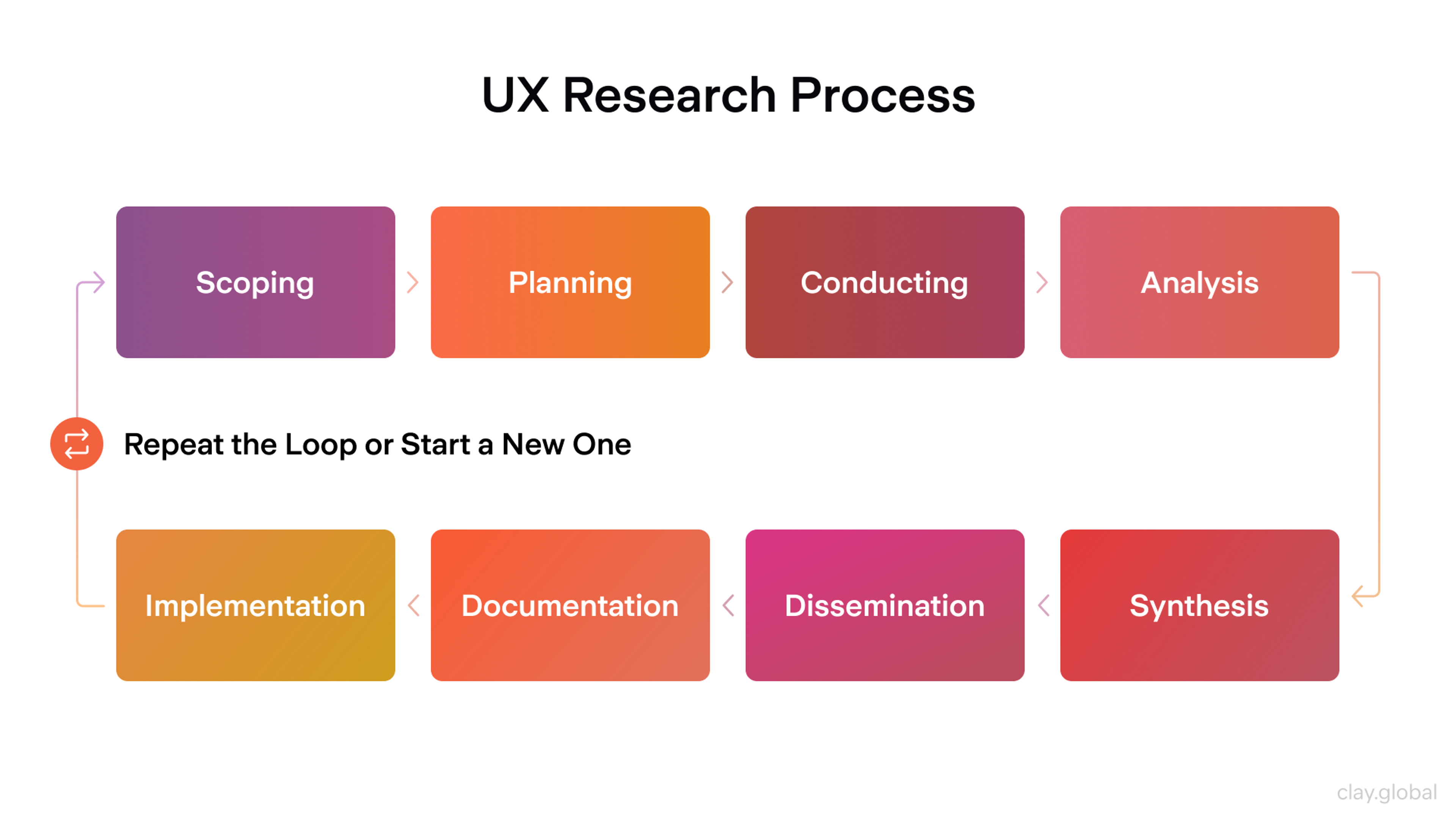
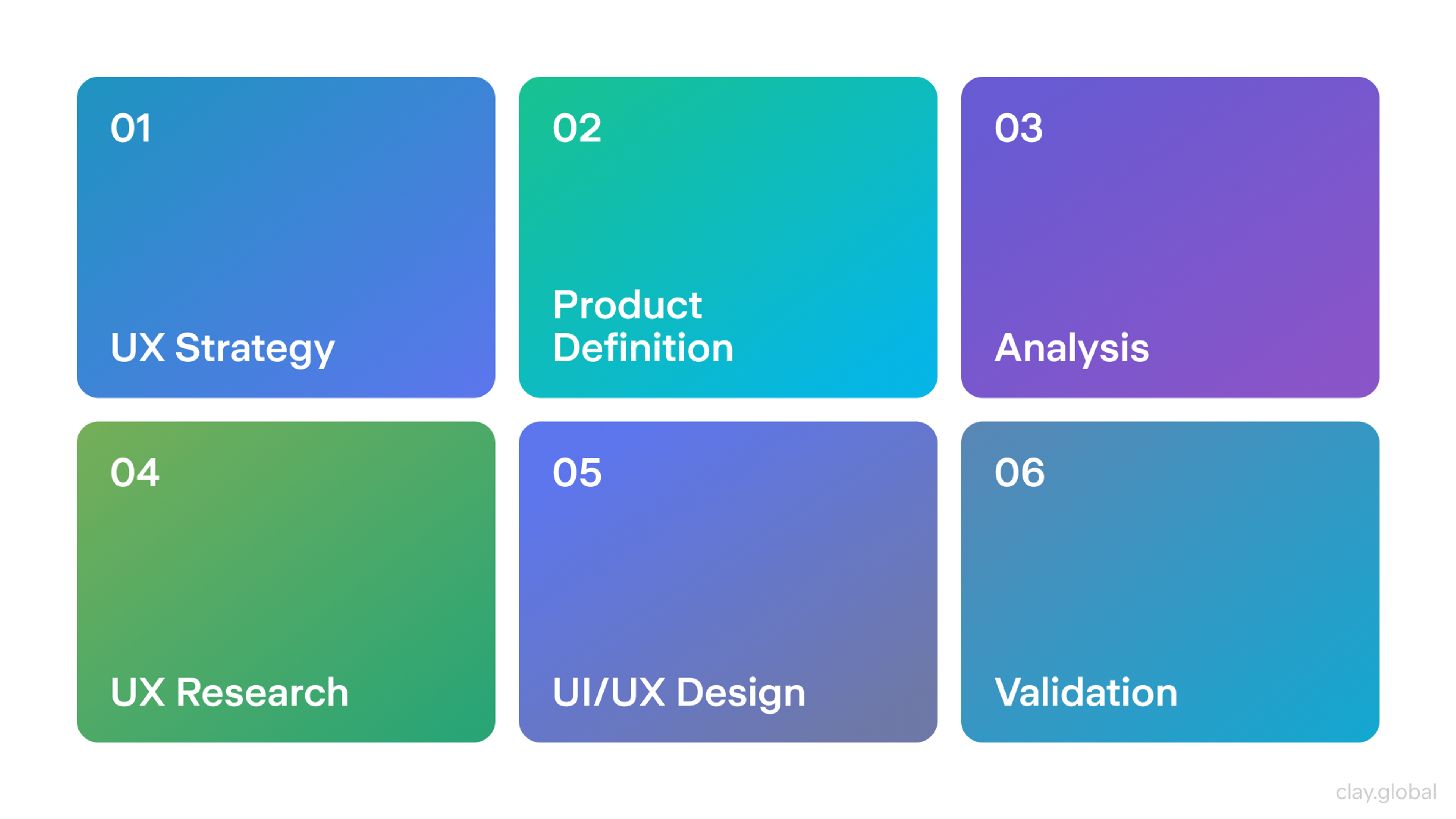
UI Design Process Steps
This step-by-step UI design process teaches you the essentials of crafting user-friendly interfaces. It's perfect for beginners and pros alike:
- Define Goals, Scope, and Success Metrics
- Visual Design and Design System
- Testing and Iteration
- Development Handoff and UI QA
User Research
Goal: Understand what users are trying to do and what gets in their way.
Good UI starts with real tasks. You do not need months of research, but you do need clarity. Who is the user? What goal do they have? What context are they in? What makes them abandon the flow?
What you do
- Review existing data, support tickets, and feedback
- Run short interviews or surveys to confirm user goals
- Identify key tasks and decision points
- Define constraints like devices, environments, and accessibility needs
Outputs
- Primary user goals and top tasks
- Pain points and drop-off reasons
- Simple journey notes for critical flows
Common pitfalls
- Research that collects opinions, not behavior
- Too many personas and not enough real tasks
2026 note: AI can speed up synthesis. It can cluster themes and draft summaries. Still validate with raw quotes and sessions.
User Research Process by Clay
Define Goals, Scope, and Success Metrics
Goal: Align the team on what you are building, for whom, and what success looks like.
Scope is what keeps UI work from drifting off course. This is where you decide what is in and what is out. You also set the rules for decisions later. If a screen looks nice but hurts conversion, you know what wins.
What you do
- Write the problem statement in plain language
- Define the core user flows for this release
- Agree on constraints like timeline, platforms, and tech limits
- Set success metrics and acceptance criteria
Outputs
- Clear scope and release boundaries
- Flow list with priorities
- Success metrics tied to user outcomes
Common pitfalls
- Vague goals like “improve UX.”
- No agreement on tradeoffs, so every review becomes a debate
2026 note: AI planning tools can help draft requirements and edge cases. Use them as a checklist, not as the source of truth.
Wireframing
Goal: Create a structure quickly, before investing in visuals.
Wireframes enable you to resolve layout and hierarchy issues early. You map where content goes, what is primary, and what users should do next. Please keep it simple. The goal is clarity, not polish.
What you do
- Sketch key screens for the main flows
- Define information hierarchy per screen
- Check navigation and states at a basic level
- Review with the team early and often
Outputs
- Low-fidelity screens for core flows
- Basic layout rules and content blocks
- Early feedback and quick revisions
Common pitfalls
- Jumping into high-fidelity too soon
- Designing screens without mapping the flow between them
2026 note: AI can generate layout variations. Use it to explore options, then choose based on your hierarchy and user goals.
Mockup vs Wireframe vs Prototype by Clay

Prototyping
Goal: Make the experience feel real so that you can test it.
A prototype turns screens into a flow. It reveals issues that wireframes hide. Missing states, unclear steps, awkward transitions, and dead ends become obvious.
What you do
- Connect screens into realistic paths
- Add key interactions and states
- Cover edge cases that users will hit
- Prepare scenarios for testing
Outputs
- Clickable prototype for primary flows
- State list for critical interactions
- Test-ready scenarios
Common pitfalls
- Prototypes that look good but skip real logic
- No error states, empty states, or loading states
2026 note: Prototyping is faster now, but the risk is shallow coverage. Speed is excellent if the prototype still includes the messy parts.
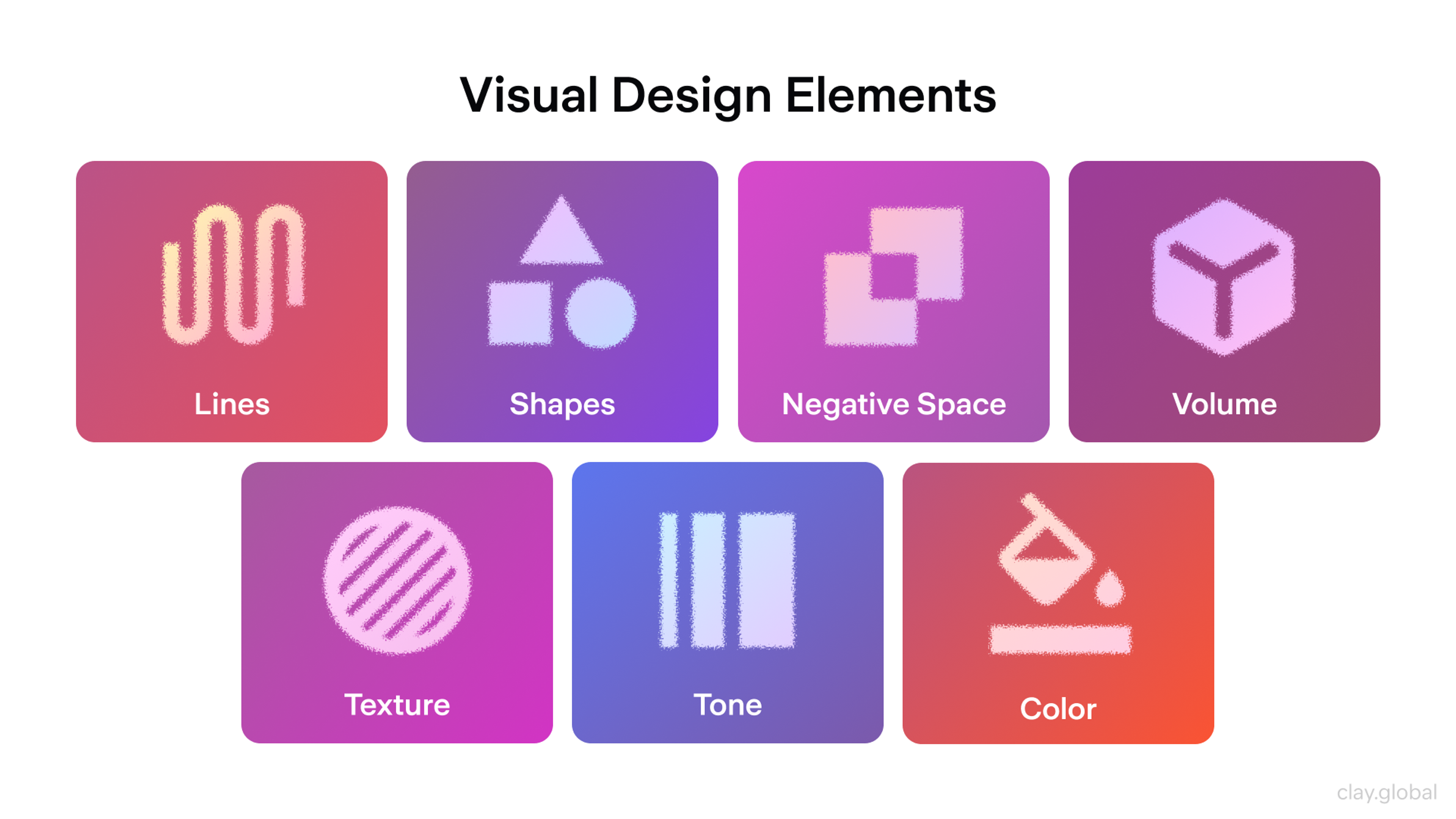
Visual Design and Design System
Goal: Make the UI consistent, readable, accessible, and on brand.
This is where you turn structure into a polished interface. Good visual design is not decoration. It makes hierarchy obvious. It reduces mental load. It helps users feel confident.
What you do
- Set typography, spacing, and grid rules
- Build or extend a component library
- Apply color with accessibility in mind
- Define states, variants, and responsive behavior
- Use motion and micro-interactions only where they help
Outputs
- High-fidelity screens
- Components and variants
- Tokens for color, type, spacing, and radius
- Accessibility checks for contrast and focus
Common pitfalls
- Inconsistent components across screens
- Styling that hides hierarchy or hurts readability
- Animations that distract instead of guide
2026 note: AI can help generate visual assets and explore style directions. Treat it as a draft engine. Your system rules still matter most.
Visual Design Elements by Clay
Testing and Iteration
Goal: Verify the UI works, and fix what fails before shipping.
Testing is about whether the UI behaves correctly. Validation is about whether it solves the right user problem. Both matter. In UI work, the fastest teams run small tests early, then iterate.
What you do
- Run usability tests on the prototype or build
- Check accessibility with keyboard and screen reader basics
- Review performance signals like perceived loading and layout shifts
- Test edge cases, errors, and empty states
- Iterate in small cycles and re-test
Outputs
- Prioritized issue list
- Updated designs and states
- Clear “ready to build” criteria
Common pitfalls
- Only testing happy paths
- Testing too late, when fixes are expensive
2026 note: Automation can help with UI checks and regression. It will not replace usability feedback.
UX Design Process by Clay
Development Handoff and UI QA
Goal: Ensure implementation accuracy and predictability, then verify that the final UI matches the design.
Handoff is not “send a file and hope.” It is a transfer of intent. Developers need specs, states, and rules. Designers need time for UI QA after the build.
What you do
- Deliver specs for layout, spacing, typography, and behavior
- Provide tokens, components, and usage rules
- Define responsive behavior and breakpoints
- Document states and interactions
- Review the implemented UI and log issues
Outputs
- Handoff package with screens, components, and tokens
- Interaction notes and state coverage
- UI QA checklist and fixes list
Common pitfalls
- Missing states, so developers guess
- No post-build QA, so minor issues ship
2026 note: Design-to-code is improving, but it still needs human review. Treat it as acceleration, not automation.

Which Tools Are Used by UI Designers?
UI designers rely on a variety of tools to create user-friendly and visually appealing interfaces. These tools help with everything from wireframing and prototyping to design and collaboration, enabling designers to bring their ideas to life efficiently and effectively. Let's explore some of the most commonly used tools in UI design.
- Figma: Figma is a cloud-based UI/UX design tool known for its real-time collaboration, vector editing, and prototyping features. It allows designers and teams to work seamlessly on projects from anywhere, making it a popular choice for interface design, wireframing, and interactive prototyping.
- Framer: A tool with a strong focus on prototyping and animation capabilities, allowing designers to create interactive prototypes with custom code.
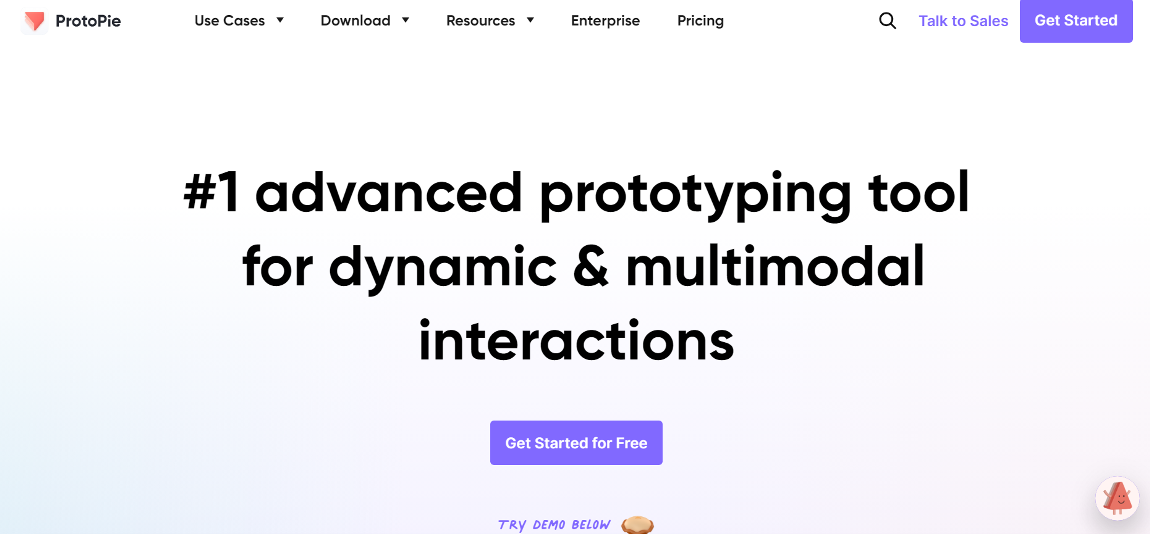
- ProtoPie: A high-fidelity prototyping tool that allows designers to create complex interactive prototypes without coding. With features like conditional logic, sensors, and variable-based interactions, ProtoPie helps bridge the gap between design and development, making prototypes feel more like real products.
Source: ProtoPie
- Miro: Miro is a collaborative online whiteboard platform designed for brainstorming, diagramming, and team collaboration. It enables users to create mind maps, wireframes, and workflows in real time, making it an essential tool for remote teams, product design, and agile project management.
- Adobe Photoshop: Adobe Photoshop is a powerful image editing and graphic design software used for photo manipulation, digital painting, and UI design. With advanced tools for layer-based editing, retouching, and compositing, it’s the go-to software for creatives in photography, web design, and digital art.
- Adobe Illustrator: Adobe Illustrator is a vector-based graphic design software used for creating logos, icons, illustrations, and typography. With precision tools for scalable designs, advanced typography, and detailed artwork, it’s a top choice for branding, digital illustrations, and print media.
User Interface Design Process Tips and Best Practices
Comprehend Your Users
Remember that users will not engage with your product if you do not understand them. The very first step while designing a user interface is understanding the users' needs and preferences of your target audience. Doing user interviews, surveys, and usability tests can provide insights into what elements and features will appeal to your audience.
Keep Consistent Design Patterns
Consistency is the soul of a well-designed user interface. Remember that an interface should be as simple as possible to navigate and use. Consistency, or set rules, on what patterns to use on typography, colors, and icons, ensures a harmonious design.
Give Importance to Design Elements
Visual hierarchy refers to the arrangement of elements on a page in order of importance, helping to create interfaces that are both functional and visually appealing.
Users will find information and other elements internally attractive. Information can be made more important by employing techniques like size, spacing, and color.
Keep Industry Changes in Mind
If the UI/UX design industry appreciates new trends, consider adopting them in your designs. Remember not to follow every trend blindly. It is very important to make sure they suit your brand and target market.
Work Collaboratively and Efficiently
Collaboration facilitates communication and teamwork among designers, developers, and other stakeholders working on the product. Successful UI design requires a collaborative approach. Use the collaboration tools mentioned before.
Read more:
Conclusion
The future of user interface design is exciting and full of opportunities, but it requires designers to stay adaptable and forward-thinking. Developing essential skills, such as user-centered design and proficiency with modern tools, is critical for success in this ever-evolving field.
By preparing for upcoming challenges and leveraging resources for continued learning, UI designers can remain ahead of the curve and create impactful, innovative experiences.

About Clay
Clay is a UI/UX design & branding agency in San Francisco. We team up with startups and leading brands to create transformative digital experience. Clients: Facebook, Slack, Google, Amazon, Credit Karma, Zenefits, etc.
Learn moreAbout Clay
Clay is a UI/UX design & branding agency in San Francisco. We team up with startups and leading brands to create transformative digital experience. Clients: Facebook, Slack, Google, Amazon, Credit Karma, Zenefits, etc.
Learn more