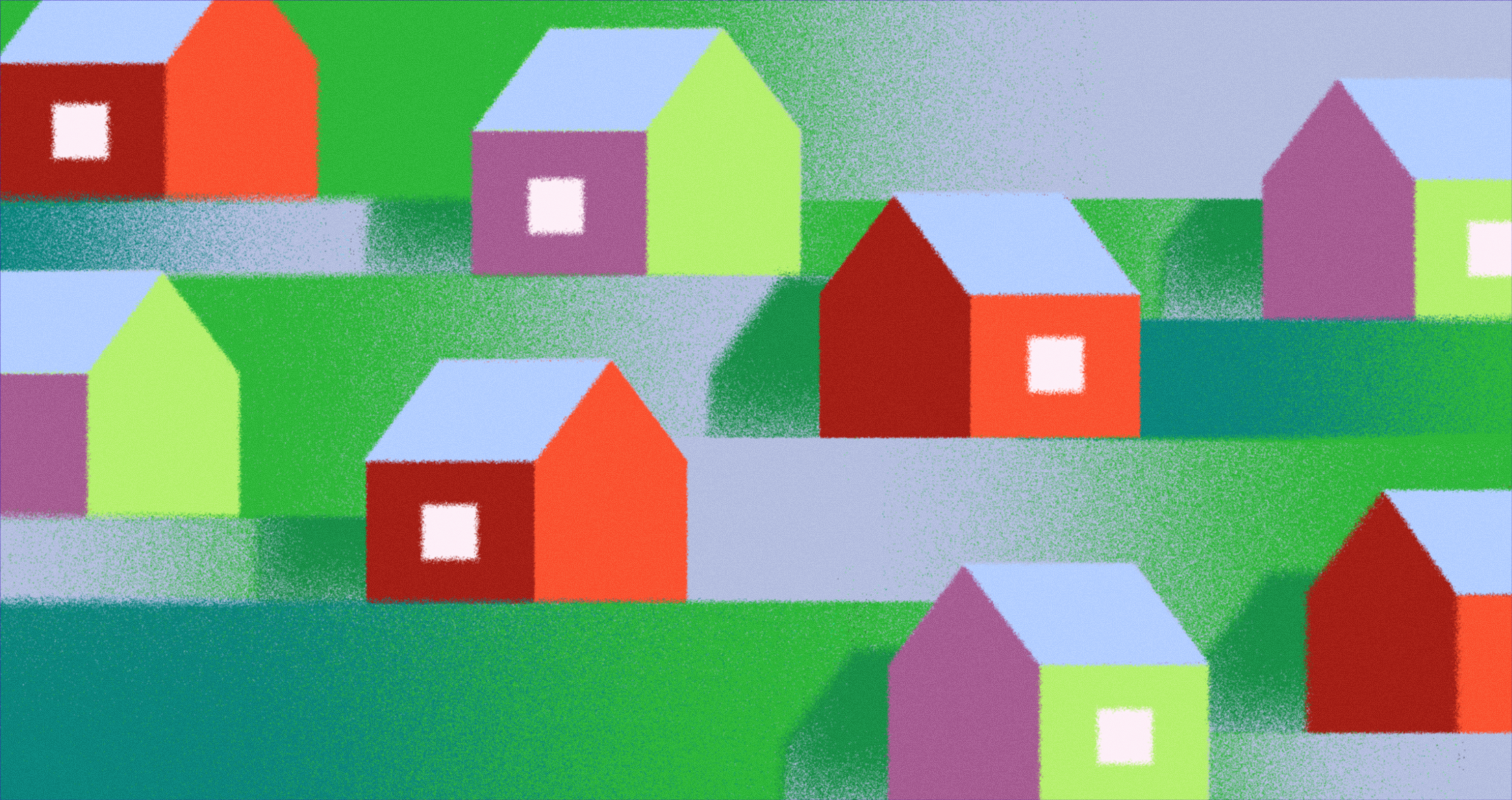
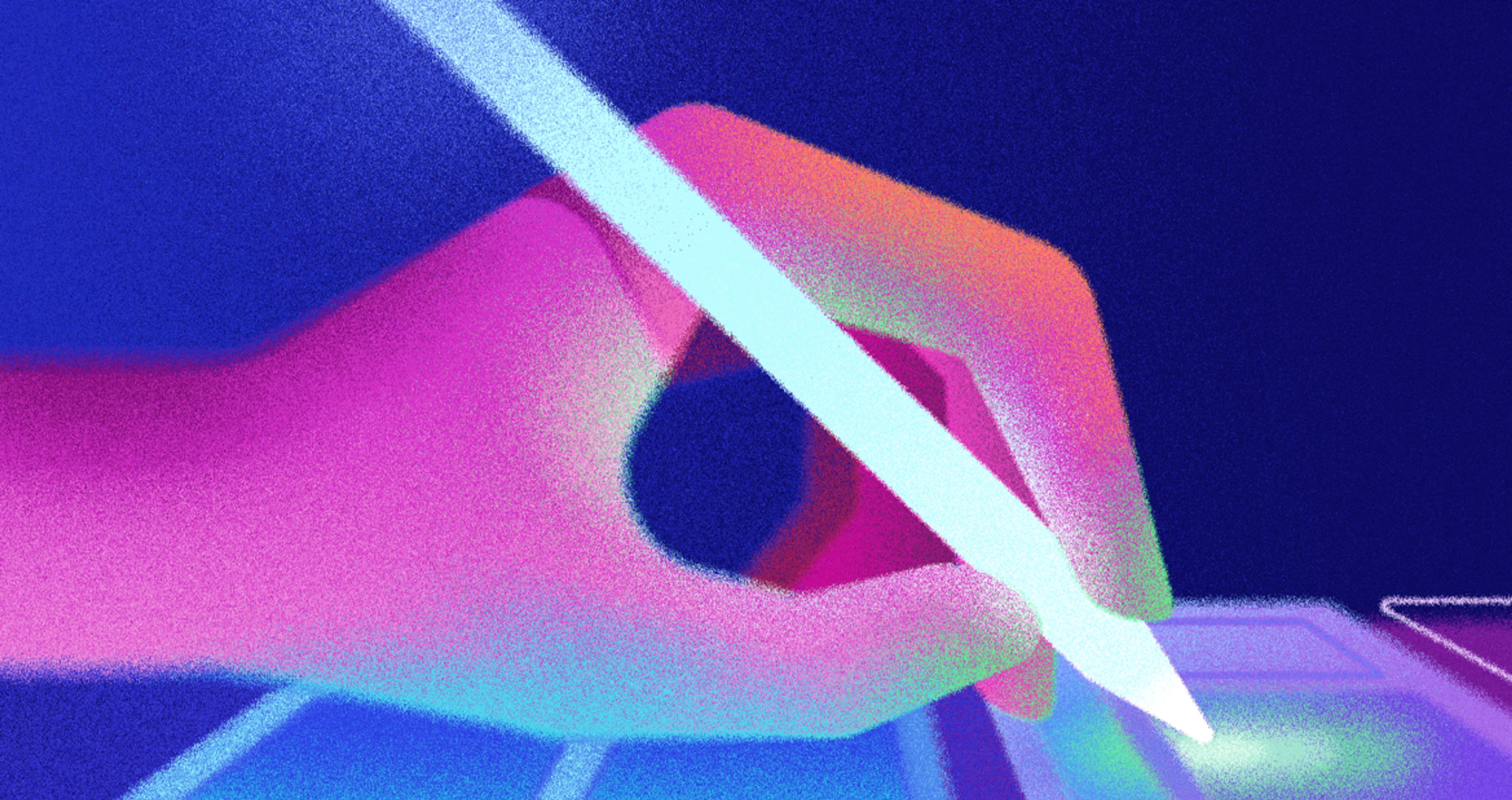
A front page with little visual personality looks like every other one. Swap in one hand-drawn scene, and the layout suddenly reads like a real brand with a point of view.
That shift is why illustrations in web design have moved from decorative afterthought to strategic choice.
The key is choosing illustrations with intent, with a clear sense of when and why they earn a spot on the page.
Key Takeaways
- A drawn scene builds an emotional connection that's hard to get from text alone.
- Custom illustrations strengthen brand recognition in a way competitors can't simply copy and paste.
- AI tools speed up production, though they work best as support rather than a full replacement for a considered identity.
- Ready-made libraries solve budget problems quickly, provided you check the license before anything goes live.
- Flat illustrations remain a cheap, fast-loading baseline, though 3D and hybrid styles are gaining ground fast.
- Vector formats keep file sizes down, which protects load speed, SEO, and eventually conversion.
Why Use Illustrations in Web Design
Good artwork pulls real weight on a page, and it shows up in the numbers too. 63% of marketing professionals rank visual content as the most effective way to engage an audience.
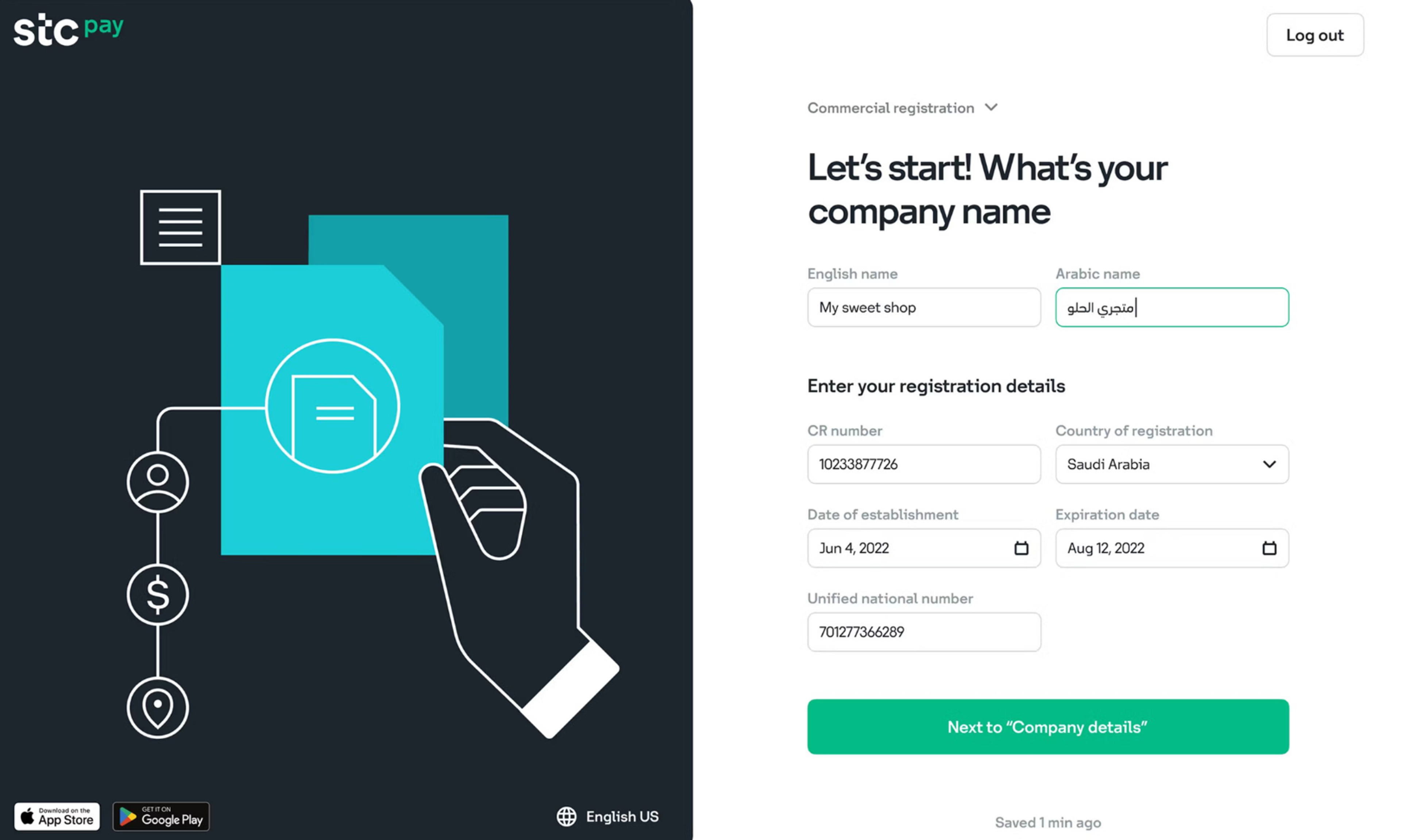
STC Bank's Website Design by Clay Global
Here's what illustrations deliver:
- Adds warmth, not friction. Web design illustrations built with intent handle plain communication problems better than words alone, turning a stalled loading state or an empty cart into a small moment of warmth instead of friction.
- Tells the story visually. Illustrated sequences carry their own storytelling function, walking a visitor through a workflow clearly.
- Builds lasting recognition. Repeat the same character or linework across a homepage, a 404 screen, and an empty state, and a brand starts to feel genuinely memorable instead of just competent.
- Simplifies complex ideas. Real photos work well for plenty of pages, but for genuinely complex concepts, like a multi-step process or a layered pricing model, one clear drawing can explain in a glance what several paragraphs would struggle to make clear.
- Shows brand personality precisely. A tailored visual approach can convey a much wider range of ideas than photos or other page elements, since illustrations can show things that don't exist yet, exaggerate an emotion, or invent a shape purely to match a brand's visual style and personality.
When to Use Illustrations
Across real projects, requests for illustration tend to cluster around the same handful of business objectives, whatever the site or the industry behind it.
When to Use Illustrations on Your Website
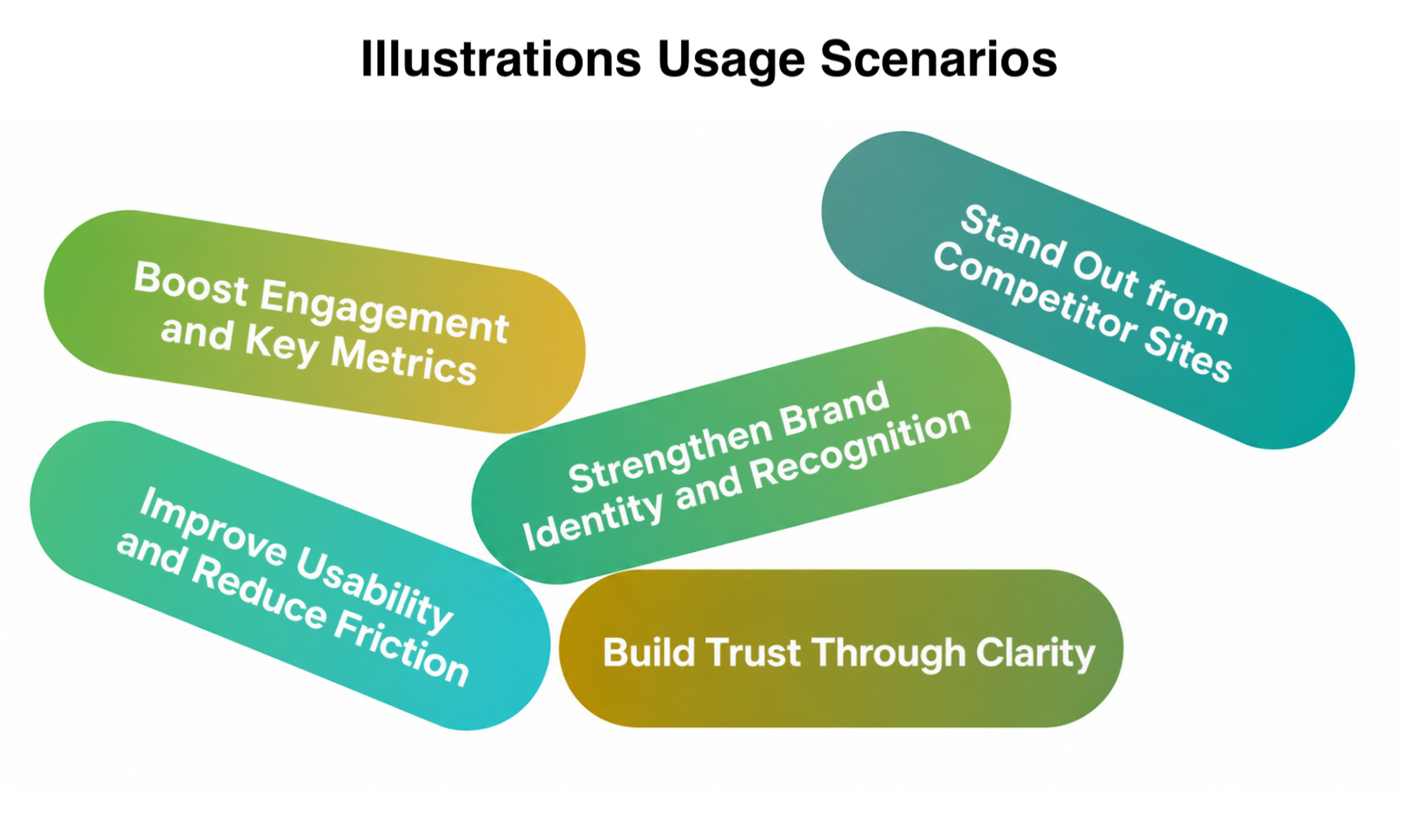
- To boost engagement and key metrics. Original artwork holds attention in a way a generic layout doesn't, which shows up directly in time on page and scroll depth, so whenever a team sits down to create new site assets from scratch, illustration deserves a line item in that first planning conversation rather than an afterthought.
- To stand out from competitor sites. The homepage is usually where this matters most, since that's the first place a visitor compares one company to the next, and distinctive illustration acts as instant shorthand for being different.
- To strengthen brand identity and recognition. Bringing illustration into a fresh visual identity is a natural step when onboarding a new client, since a consistent character or icon set gets remembered, while decorative elements and icons scattered wherever there's empty space rarely do.
- To improve usability and reduce friction. Error states, empty states, and loading screens are the exact spots where plain functionality falls short of explaining itself, and a simple illustration fills that gap by turning confusion into a guided interaction.
- To build trust through clarity. A simple illustration or diagram can walk a visitor through exactly how something works, like a service process or what happens to their data, which builds confidence precisely.
These goals rarely show up in isolation. A single illustration might boost engagement, signal differentiation, and reinforce recognition all at once.
So, treat this list as a set of lenses to weigh together rather than a checklist to work through one at a time.
Types of Illustrations in Web Design
The illustration styles available to a project go well past the flat, single-color figures that dominated the mid-2010s.
Picking the right one is less about the latest trend and more about the mood a site needs for the site.
Flat Illustrations
Flat design built its popularity on speed and simplicity.
Solid colors, minimal shading, and clean shapes kept production cheap and pages fast, which is exactly why so many SaaS products adopted the look during their early growth years.
Yahoo Games Website Design by Clay Global
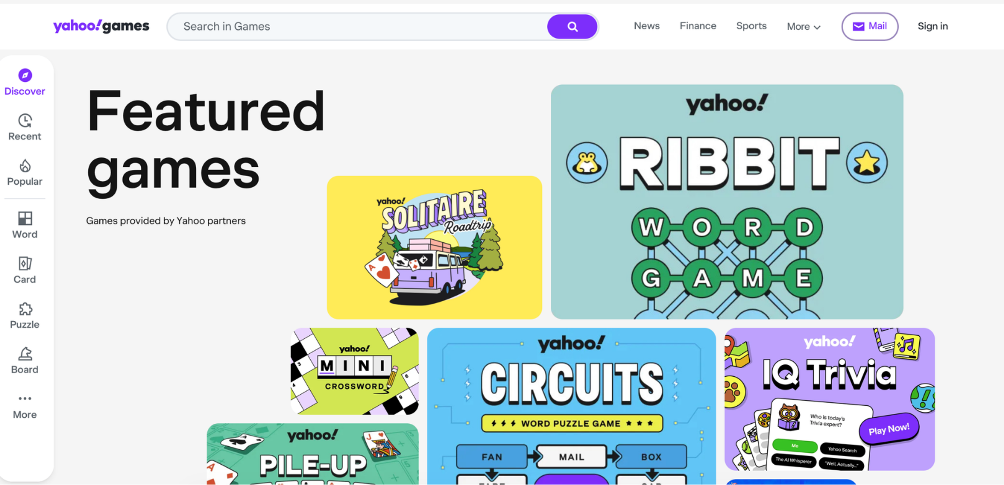
That approach has since evolved into semi-flat, a blend that keeps the 2D simplicity but layers in soft shadows and subtle gradients for a sense of depth, giving a page visual hierarchy without dragging down performance the way heavier renders would.
3D and Isometric Illustrations
3D illustrations have made a real comeback recently, helping sites stand out while competitor sites are still running flat visuals.
Isometric artwork is also included here, which is especially good at turning complexity into simpler visual ideas.
Echo Street’s Website Design by Clay Global
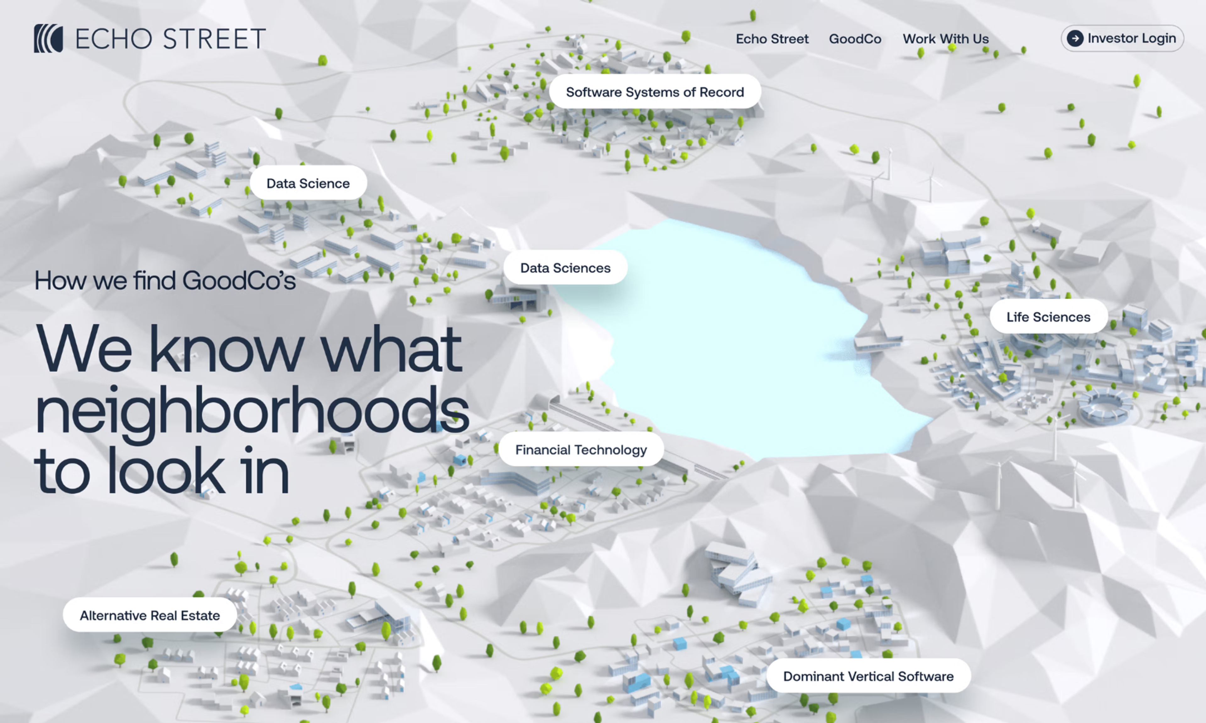
The tradeoff for either approach is heavier files and a production process that typically costs more than a basic illustration toolkit can cover.
Line and Hand-Drawn Illustrations
Sparse, single-weight line illustrations carry plenty of personality while staying light on the page.
The rougher hand-drawn look, built from imperfect strokes rather than clean vectors, has come back into favor too, largely as a counterpoint to polished, AI-generated visuals.
Wealth's Website Design by Clay Global
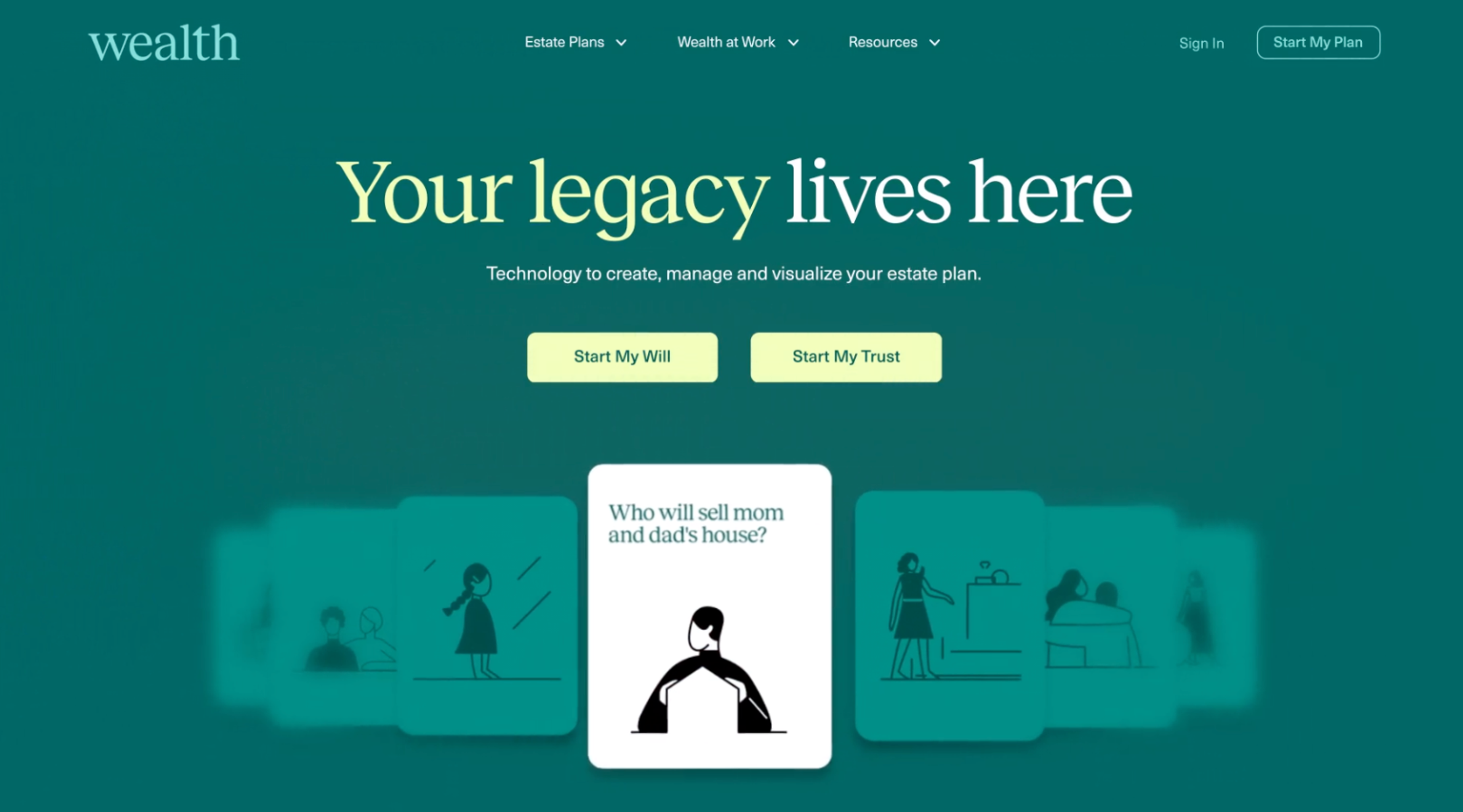
Both fit well on editorial pages, documentation, and anywhere a slightly more human touch suits the site.
Character and Mascot Illustrations
A recurring character or mascot gives a site a face without the expense of a real spokesperson, and it's one of the fastest ways to make welcome flows, empty states, and error pages feel less formal.
Cornerstone’s Website Design by Clay Global
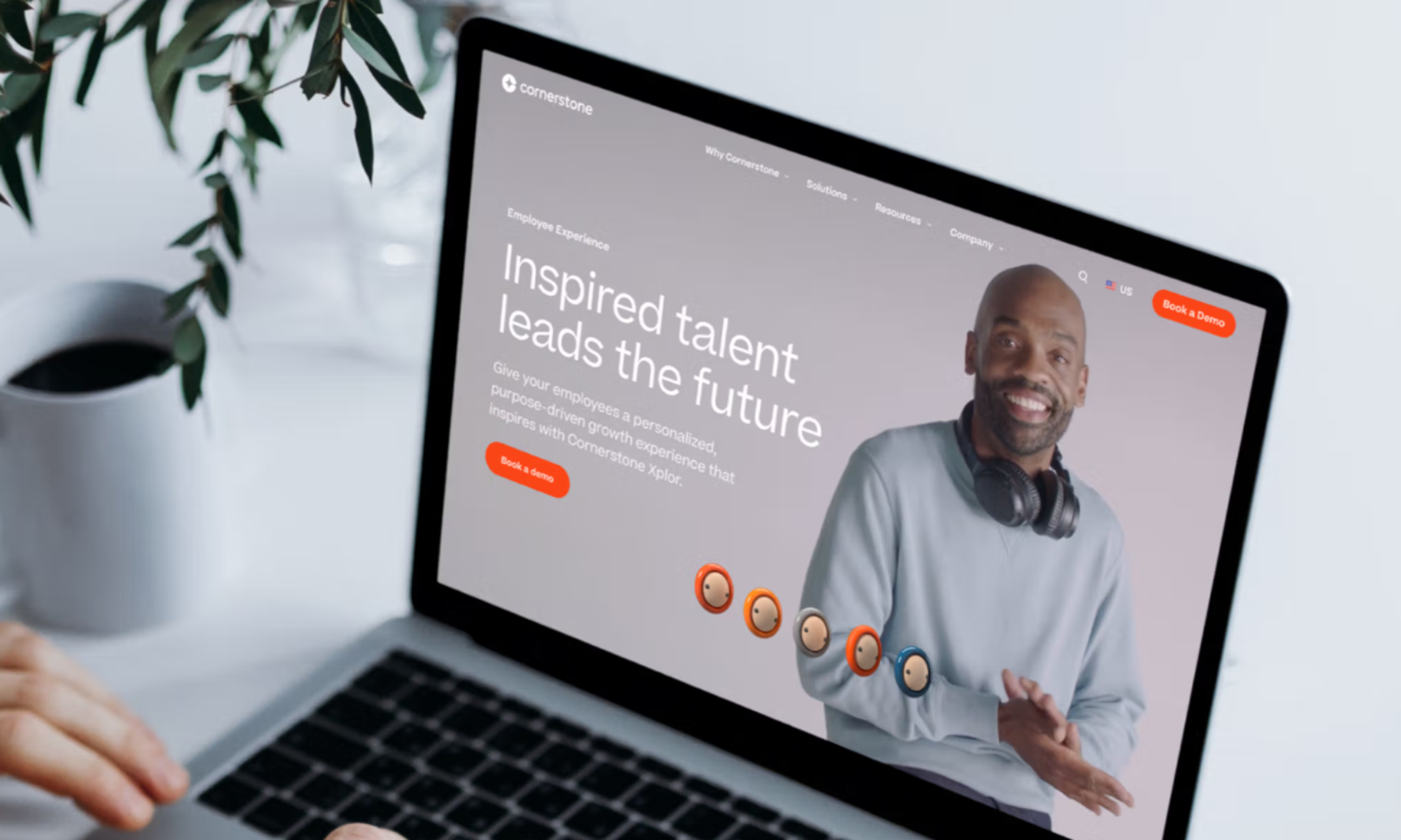
The look can range from a simple line figure to a fully rendered 3D character, depending on budget and tone.
Geometric and Abstract Illustrations
Built from clean shapes rather than figures or scenes, geometric and abstract illustrations tend to suit sites that want a more corporate or technical feel.
Illustrated Web Design for Sky by Clay Global
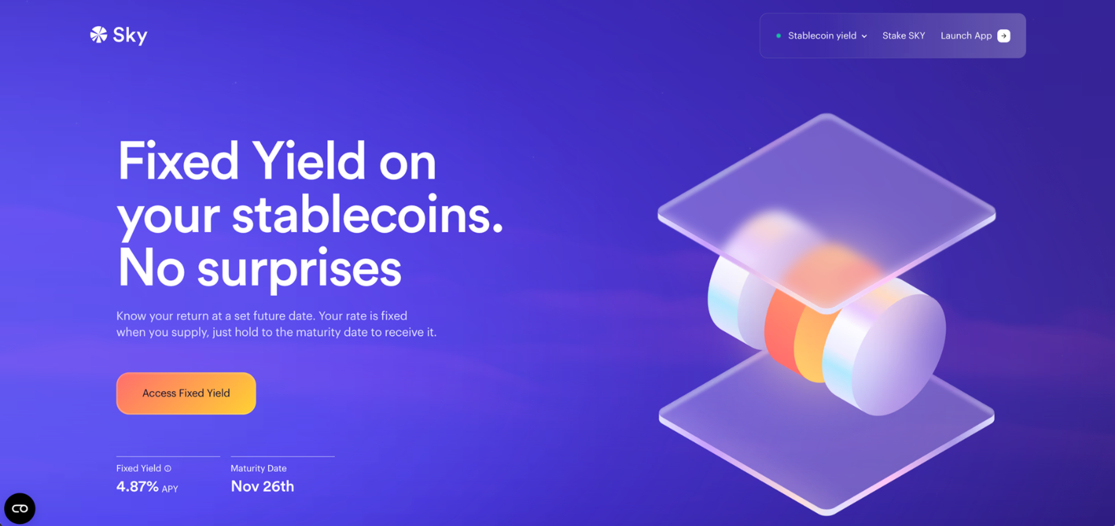
Maximalist illustration sits at the opposite end of this same family, leaning into dense detail and bold geometric shapes rather than restraint, and it works well for sites that want to feel expressive and a little loud on purpose.
Format matters just as much as visual approach, though not every look has a real choice here.
Flat, geometric, and character work often export cleanly as SVG, a vector format built from mathematical paths rather than pixels, which keeps vector illustrations sharp at any screen size while keeping files small.
3D renders and textured hand-drawn work, on the other hand, are usually locked into raster formats like PNG or JPG, since both come out as pixels from the start, whether from 3D software or a scanner.
That difference in file size feeds directly into load speed, which in turn feeds straight into SEO rankings and conversion rates.
With 10 years in web design, Clay Global knows exactly where illustration fits. Explore what we offer here.
Custom vs. AI-Made vs. Ready-Made Illustrations
There are three real paths to getting illustrations onto a site, and each one solves a different problem.
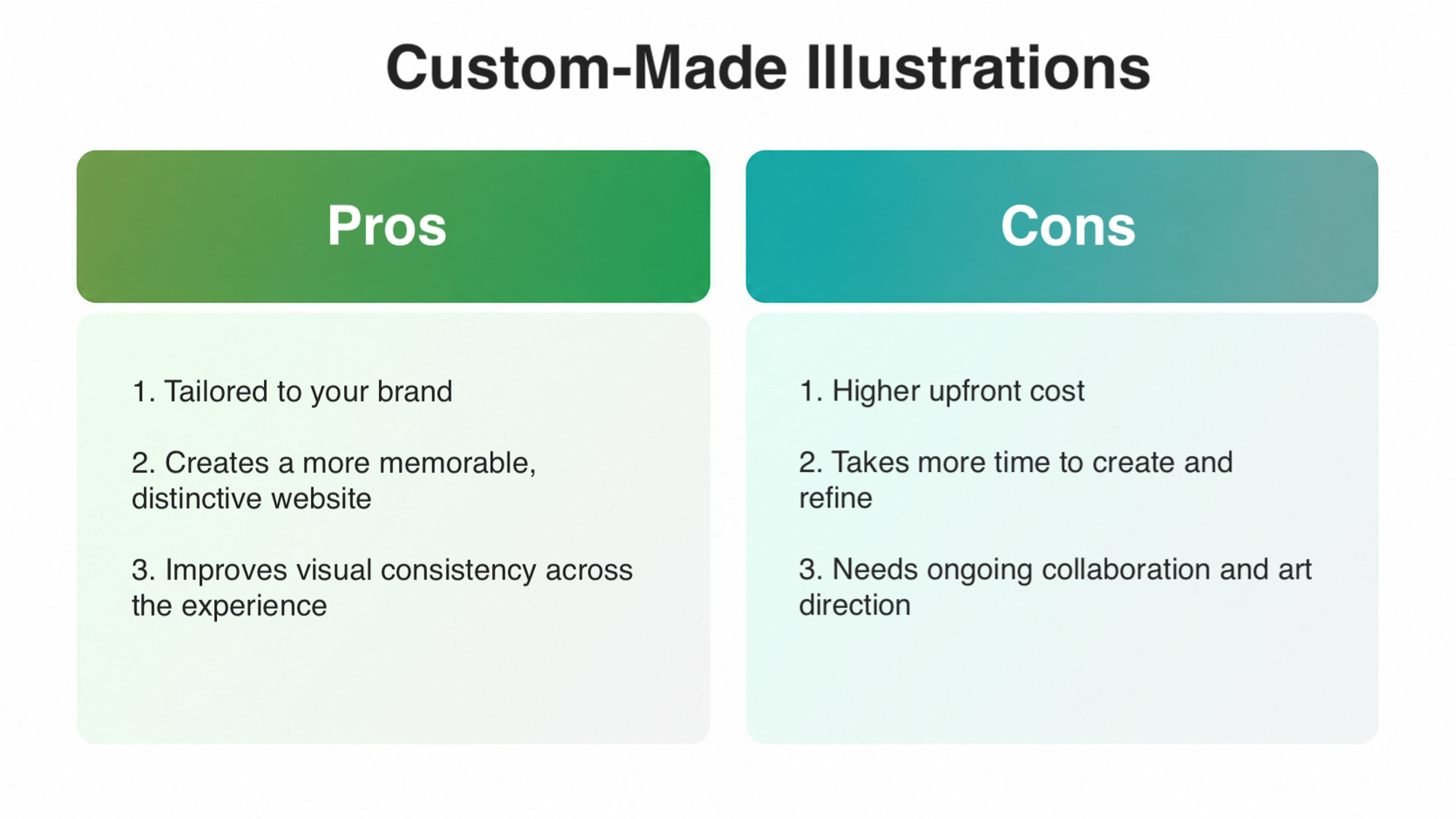
Custom-Made Illustrations
An in-house designer, a hired freelance illustrator, or a design agency builds work from the ground up to align with a brand's identity.
Nobody else has the same character set, color logic, or line weight.
Custom illustrations can also layer in animated and cursor-driven moments on top of static scenes.
The real cost is worth budgeting for upfront.
Custom illustration commissions typically run $150 to $2,000 per project, or $25 to $150 an hour, with a signature brand character landing at $2,000 to $10,000 and full campaign-level work reaching $5,000 to $20,000+, depending on scope and how many illustrations the project actually needs.
Pros and Cons of Custom-Made Illustrations
AI-Generated Illustrations
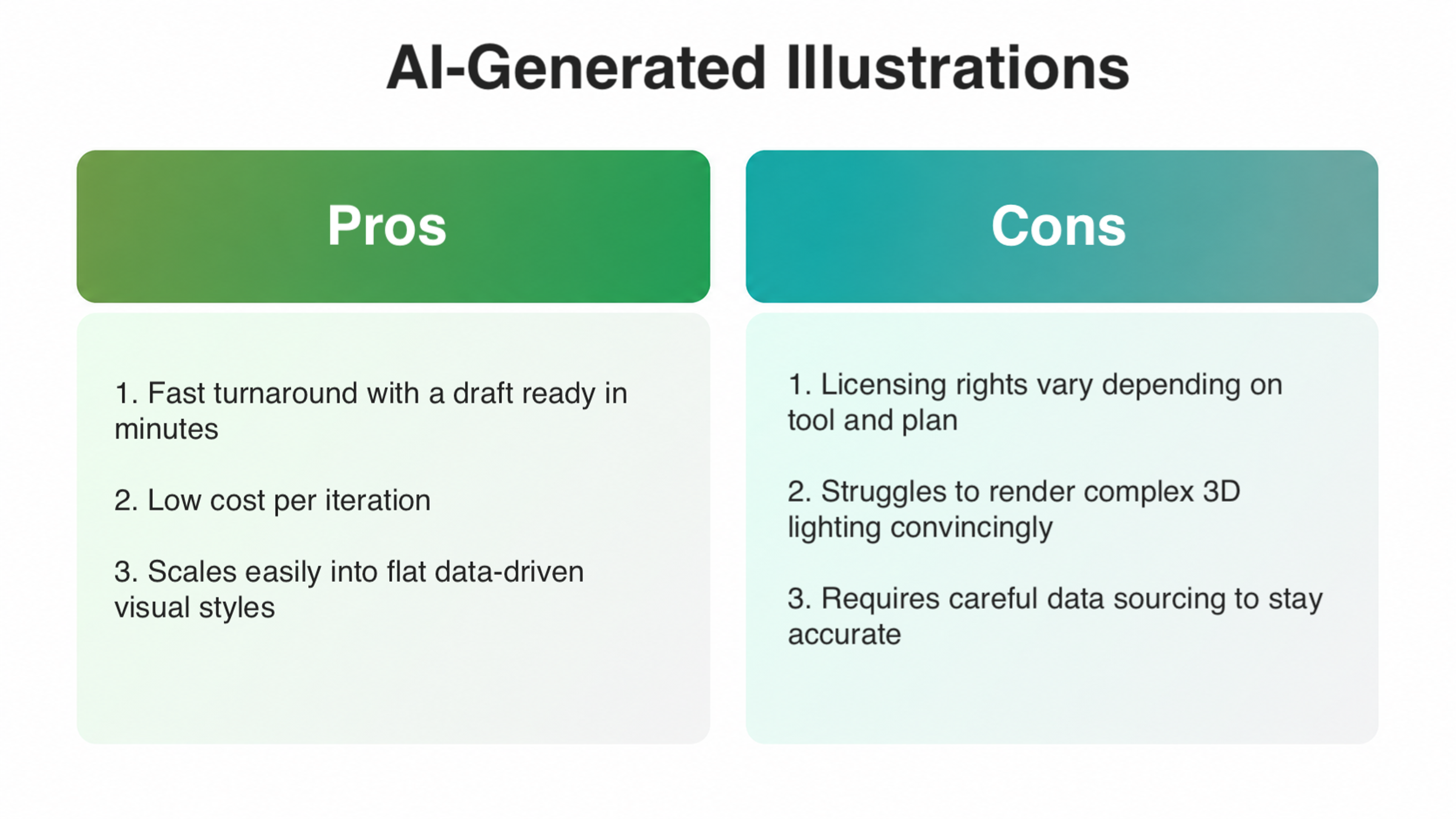
A tool built to create with AI can turn a vague brief into a usable draft within minutes rather than days. That speed makes AI genuinely useful for early concepting or lower-stakes assets where a fully custom piece isn't worth the spend.
It renders flat design convincingly since flat shading is far simpler for a model to fake than complex 3D lighting.
Roughly 58% of designers already use AI tools for generating imagery or media, and that share keeps climbing as the tools mature.
The catch is licensing. The rights attached to a given output vary by tool and plan tier, so checking usage terms before publishing anything commercially matters more than it seems.
Pros and Cons of AI-Generated Illustrations
Ready-Made Illustration Libraries
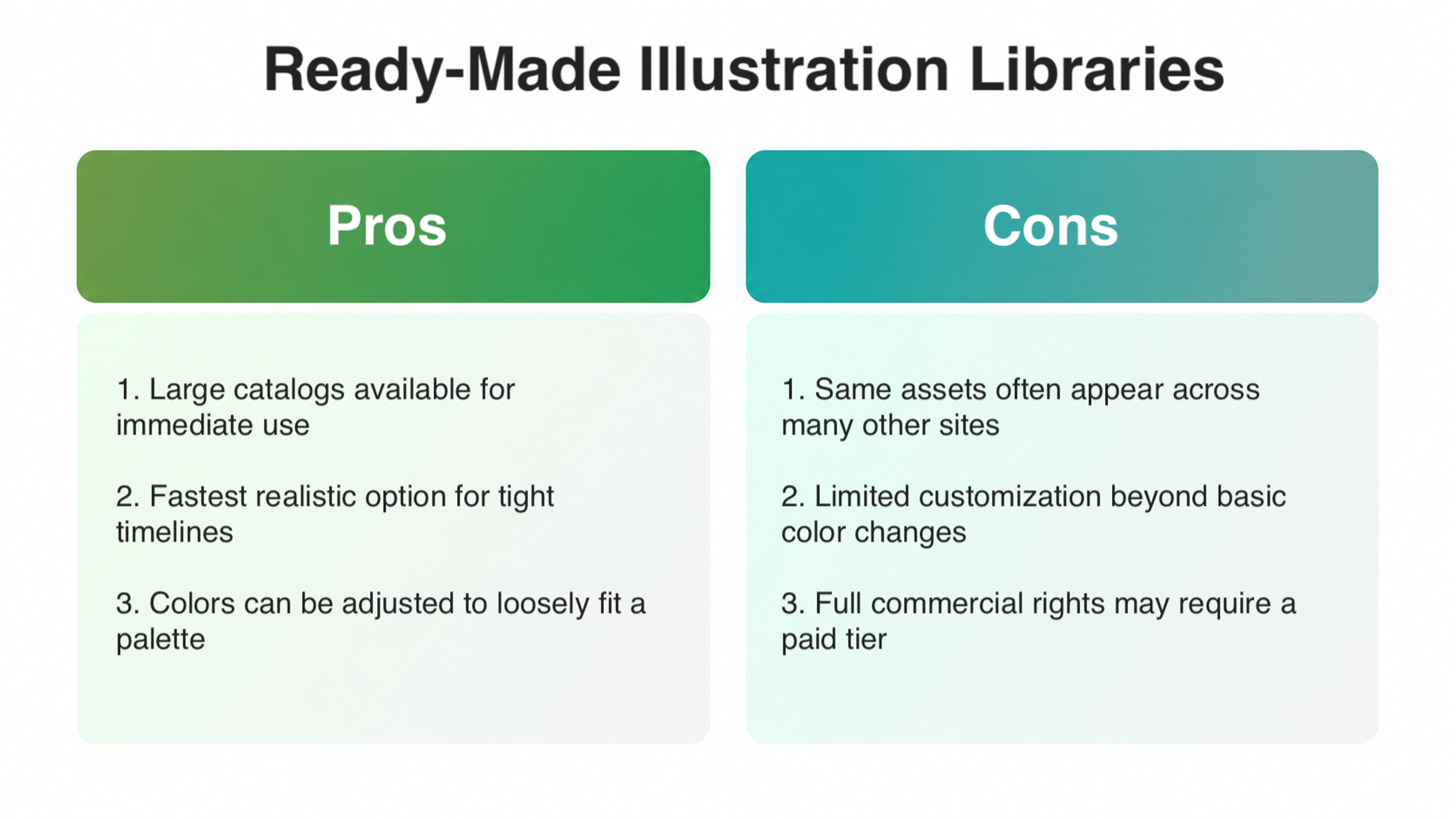
Sites like unDraw and Blush sit in the middle, offering large catalogs of pre-made artwork that can be recolored to loosely match a site’s palette.
For teams hunting for free illustrations for web design on a tight timeline, these libraries are often the fastest realistic option.
Several go further with paid tiers that unlock broader commercial rights and less common assets.
Pros and Cons of Using Ready-Made Illustration Libraries
How to Use Illustrations on Your Site
Once the decision is made, the details determine whether artwork helps a site or just adds weight.
Default to vector illustrations whenever the art is simple enough to support it, since they stay sharp on any device without ballooning page weight, and save PNG for pieces with genuine transparency or complex shading. A scaled-up PNG turns fuzzy fast, so even simple line drawings hold up better as vector art.
Staying responsive matters too. Rendering quirks on older phones can quietly break a graphic that looks flawless on a designer's screen, which is exactly why every illustration needs testing on real devices.
Consistency across the illustration toolkit matters more than any single graphic. Pick one look, whether flat, semi-flat, or a specific line weight, and hold every asset to it, because a page mixing three unrelated approaches reads as unplanned. Icon complexity deserves the same care at small sizes, as a busy icon built from too many geometric shapes turns to mush at 24 pixels.
The same logic applies to color. A combination of color schemes pulled directly from the existing site’s palette will always look more considered than artwork sourced separately and adjusted later.
Motion needs the same planning. Interactive illustrations that react to a scroll position or a cursor need extra QA time across breakpoints, since a hover state that looks great on a desktop can behave strangely on a touchscreen.
Examples of Illustrations in Web Design
Notion
The product pages lean on a warm, custom illustration system built from pastel colors, soft shapes, and small character moments that make a productivity tool feel approachable instead of corporate.
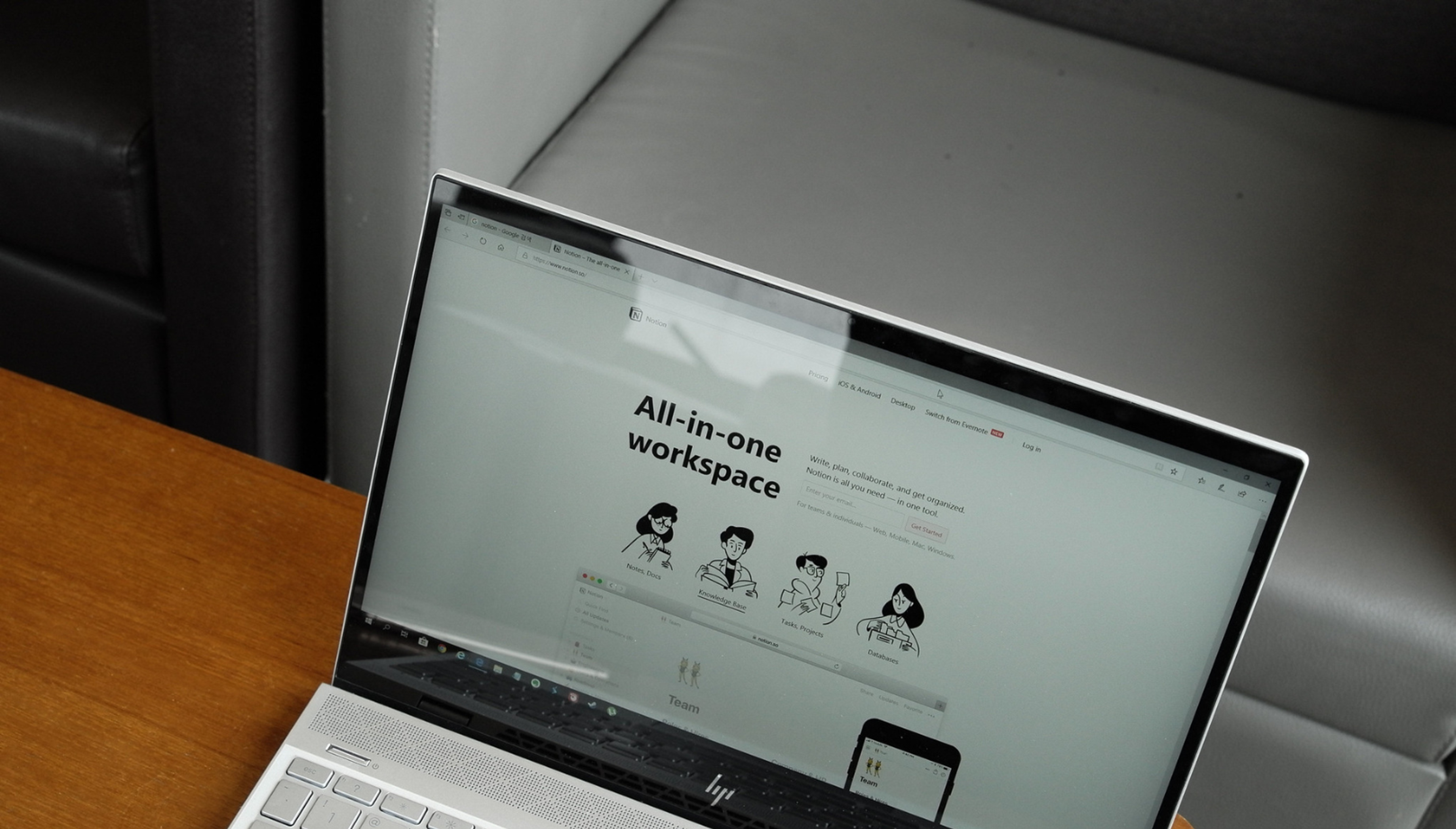
The same characters carry through onboarding, templates, and campaign pages, which is exactly the kind of repetition that builds recognition over time.
Quora
The login and signup screen runs one continuous, densely populated scene packed with illustrations of people mid-activity, from surfing to stargazing to painting, which visually echoes the platform's own pitch of sharing knowledge across every kind of perspective.
Photo by Zulfugar Karimov on Unsplash
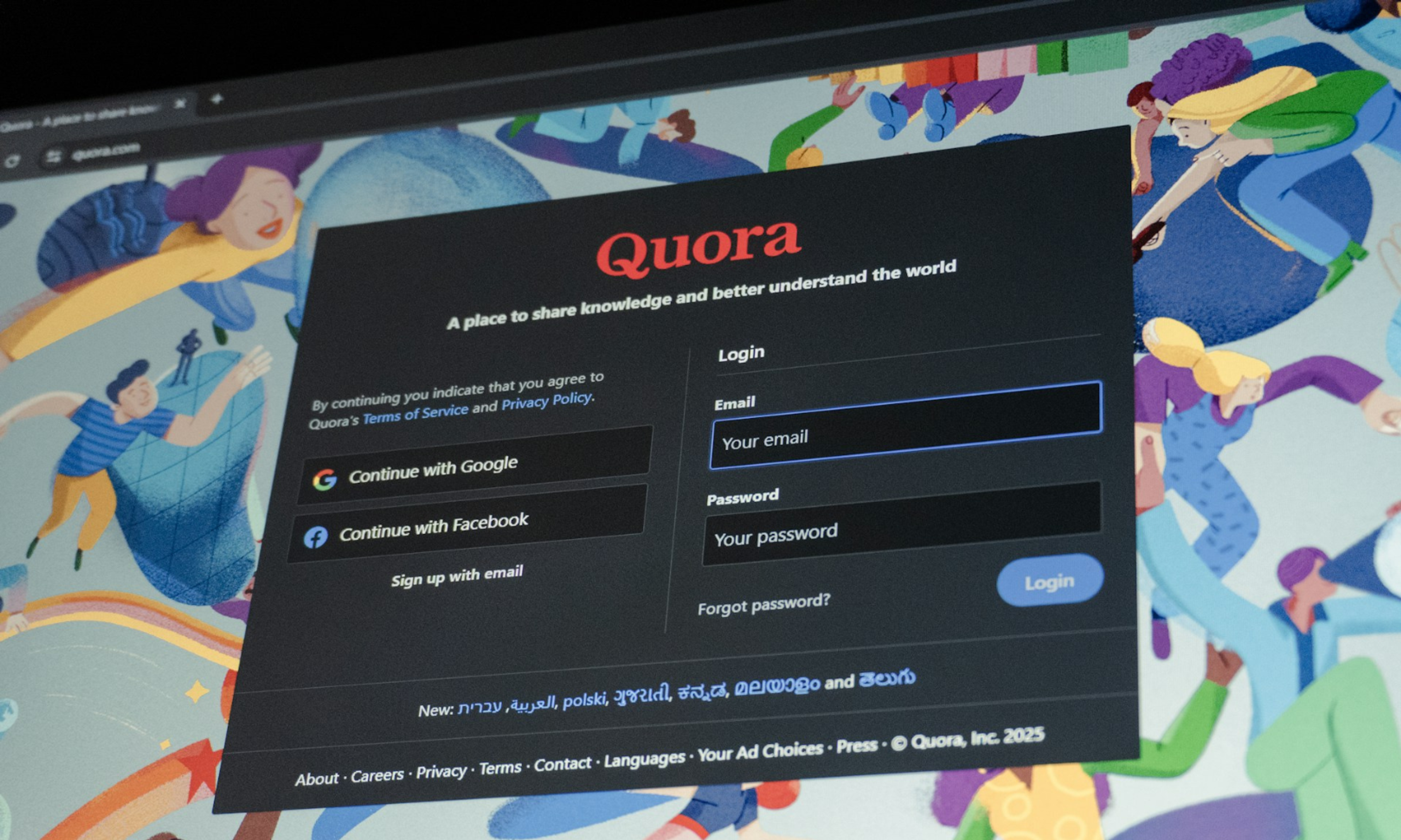
It's a good example of web design illustrations working as a single unified canvas to make even a purely functional screen, like a login form, feel like an invitation into a bigger, more welcoming world.
Partstack
Partstack's search engine connects buyers and sellers of microchips and other board-level microelectronic components, and the site redesign built a full illustration system to match.
The illustrations blend clean linework, clay renders, and realistic product renders into a precise, expressive visual language drawn from engineering schematics and hardware aesthetics.
Website and Illustration System for Partstack by Clay Global
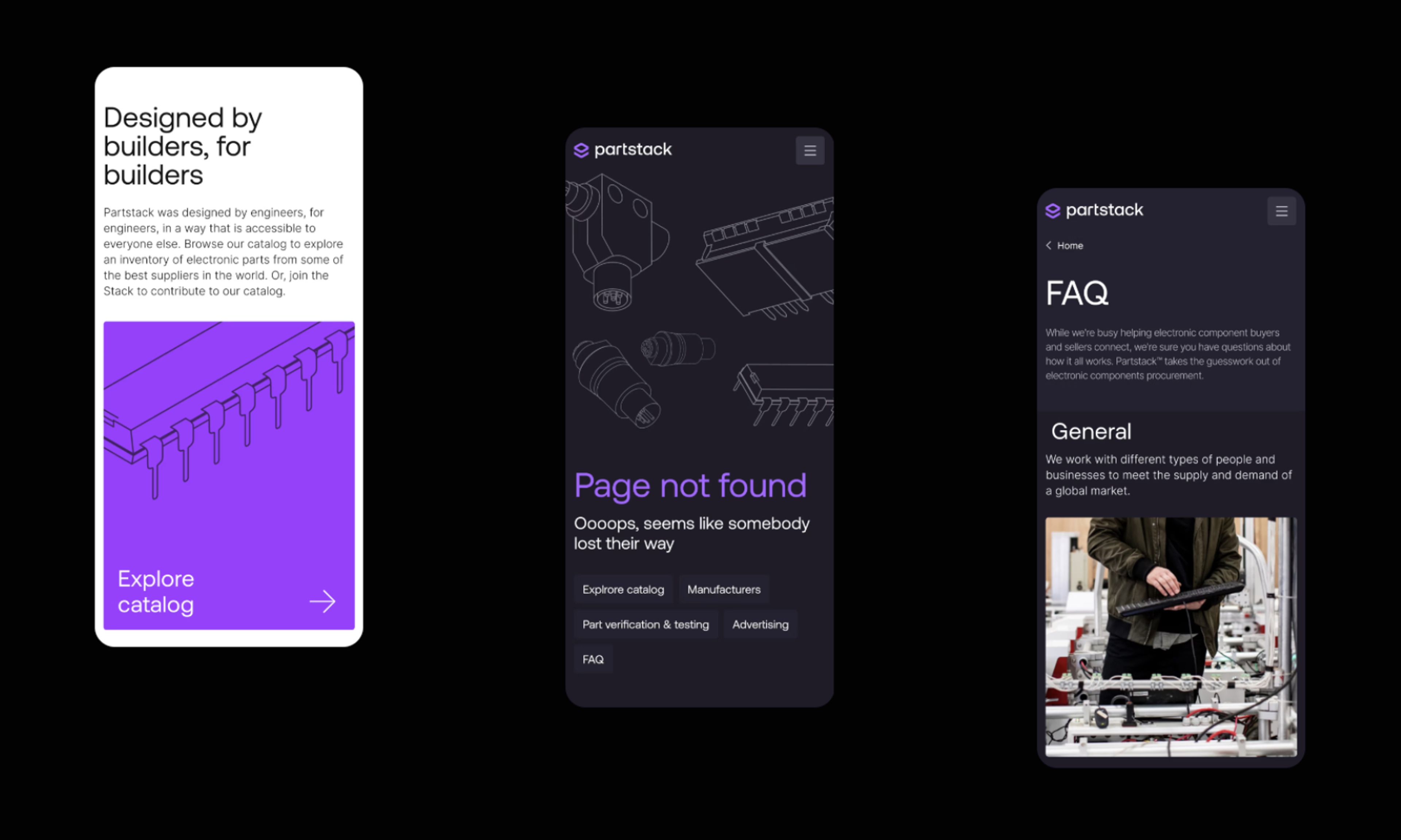
The icon set follows the same logic as the illustrations, simple, modular shapes with consistent lines and balanced proportions, so illustration and iconography read as one unified, engaging system.
Even fintech, crypto, and B2B sites need more than charts and screenshots. We've made illustrations work for some of the most demanding industries. Yours could be next.
Read more
FAQs
Does adding illustrations slow down a website's load time?
Illustrations only slow things down when they're handled poorly. Vector formats like SVG stay lightweight regardless of size, and even raster illustrations compress well with modern formats like WebP.
The bigger risk is stacking too many large files on one page rather than the illustrations themselves.
Should a site use different illustrations for mobile and desktop?
Usually the same illustration works across both, scaled and cropped as needed, since redrawing a whole approach for each screen size rarely pays off.
What does need attention is file size and layout, since a large illustration that looks fine on a desktop can crowd a small screen or slow down a mobile connection.
What's a reasonable number of illustrations to use on one page?
Fewer than most teams assume. A hero graphic, a couple of feature icons, and maybe one empty-state scene usually covers a page without it feeling cluttered.
Adding more just to fill space usually dilutes the ones already doing real work.
How do I actually put illustrations to work on a website?
Start with the pages that carry the most weight, decide on one visual approach before sourcing anything, and only add a graphic where it clarifies something or fills a genuine emotional gap.
If a section reads clearly without it, leave it out.
How do I choose between flat, 3D, and hand-drawn illustrations for a new site?
Fit the choice to the tone a brand needs its site to carry.
A flat look suits a lean, fast-moving site, dimensional or hybrid 3D work suits a brand chasing a premium feel, and hand-drawn or character-based art suits anything that wants to feel warm and personal.
Most sites settle on one primary look and use a second sparingly, rather than mixing three or four.
Are flat illustrations still a smart default in 2026, or should a site go 3D?
Flat still wins on cost and load speed, which makes it a safe default for most small and mid-size projects.
3D and hybrid styles are worth the extra spend mainly when a site needs to stand out from a category where flat has become the norm.
Is it safe to use free illustrations from sites like unDraw or Blush on a commercial site?
Usually yes, but license terms vary by asset and by plan, so check the specific terms yourself, thoroughly, before anything goes live on a client or company site.
What are the risks of using paid AI-generated illustrations commercially?
The main risk is licensing clarity, since ownership and commercial-use rights for AI output differ by platform and sometimes by subscription tier.
It's worth confirming the exact terms first rather than assuming a paid plan grants full commercial rights.
What illustration trends are worth watching right now?
Short, looping animation is turning static graphics into something closer to a brand moment, and interactive illustrations that respond to a cursor or a scroll push that even further.
Sites are also blending illustration styles within one project instead of locking into a single rigid system, and AI is speeding up early production without replacing custom work.
Final Thoughts
Illustrations earn their place by solving a real problem for your site. Getting to a well-illustrated result, whether through an in-house team, an AI-assisted draft, or a ready-made library, comes down to budget, timeline, and how much differentiation the site actually needs.

About Clay
Clay is a UI/UX design & branding agency in San Francisco. We team up with startups and leading brands to create transformative digital experience. Clients: Facebook, Slack, Google, Amazon, Credit Karma, Zenefits, etc.
Learn moreAbout Clay
Clay is a UI/UX design & branding agency in San Francisco. We team up with startups and leading brands to create transformative digital experience. Clients: Facebook, Slack, Google, Amazon, Credit Karma, Zenefits, etc.
Learn more