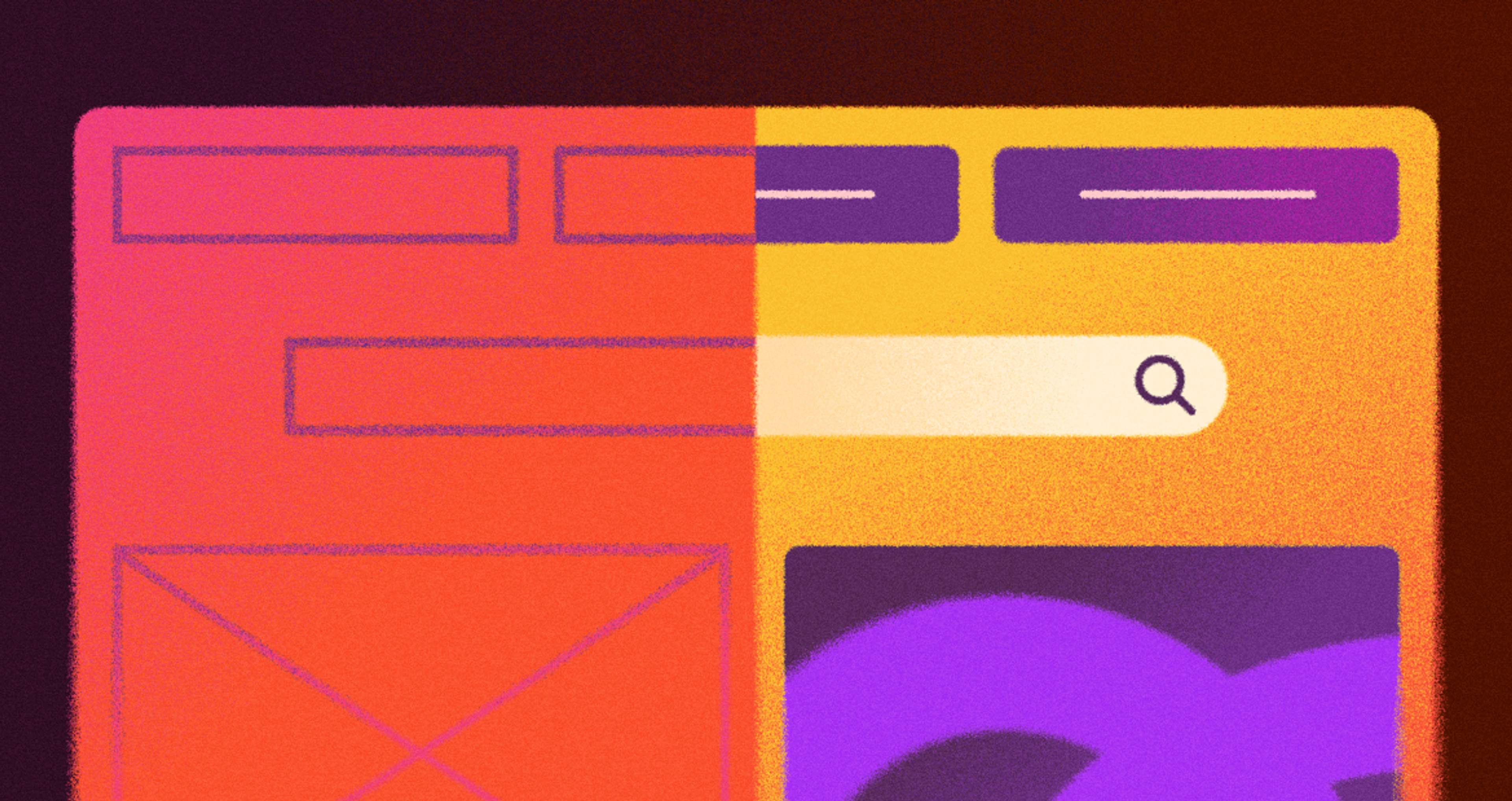
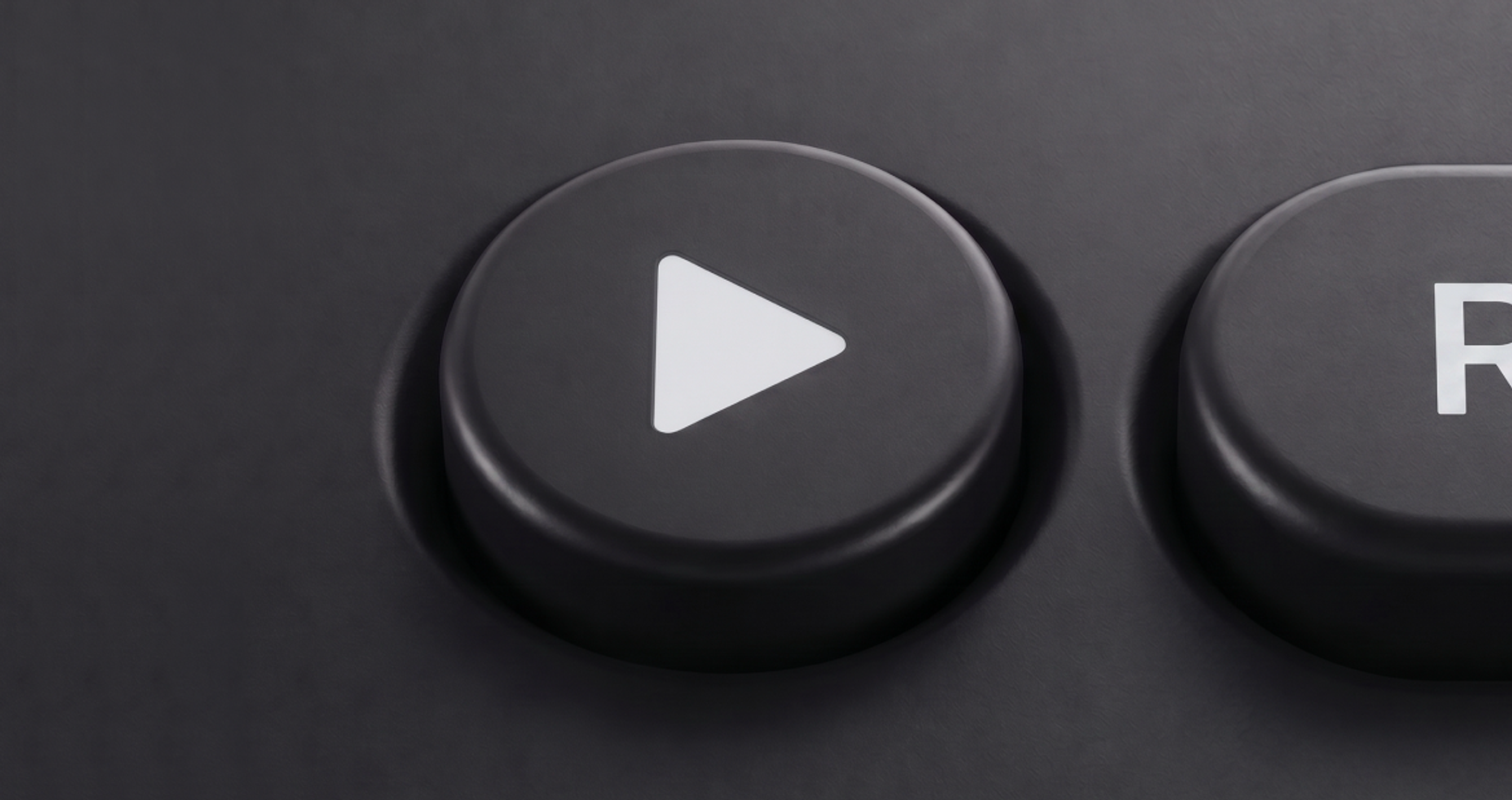
Open your phone and look closely at the icons. Some are flat-colored shapes, while others have shadows, shine, and depth. That second family of icons goes by skeuomorphism, a style that sat out the last decade and now sets the tone for interfaces again.
That comeback matters for anyone shipping products in 2026 because realism is now a precision instrument.
Designers who know when to imitate physical objects and when restraint serves better build interfaces that feel warmer and convert better.
Key Takeaways
- Skeuomorphism is a design approach in which on-screen elements borrow the look, texture, and behavior of their real-world counterparts.
- The style flattened the learning curve of early graphical user interfaces, and it has found new relevance today.
- Modern usage is selective. Depth goes on icons, hero moments, and primary actions, while dense screens stay flat.
- Skeuomorphic and flat design work best as partners. The strongest interfaces of 2026 blend both.
- Overdone realism adds visual noise, slows rendering, and can distract users from the task at hand.
- Accessibility, restraint, and consistency separate the modern version of the style from its early-2010s ancestor.
What Is Skeuomorphism?
Source: Le Paragone, CC BY-SA 4.0, via Wikimedia Commons
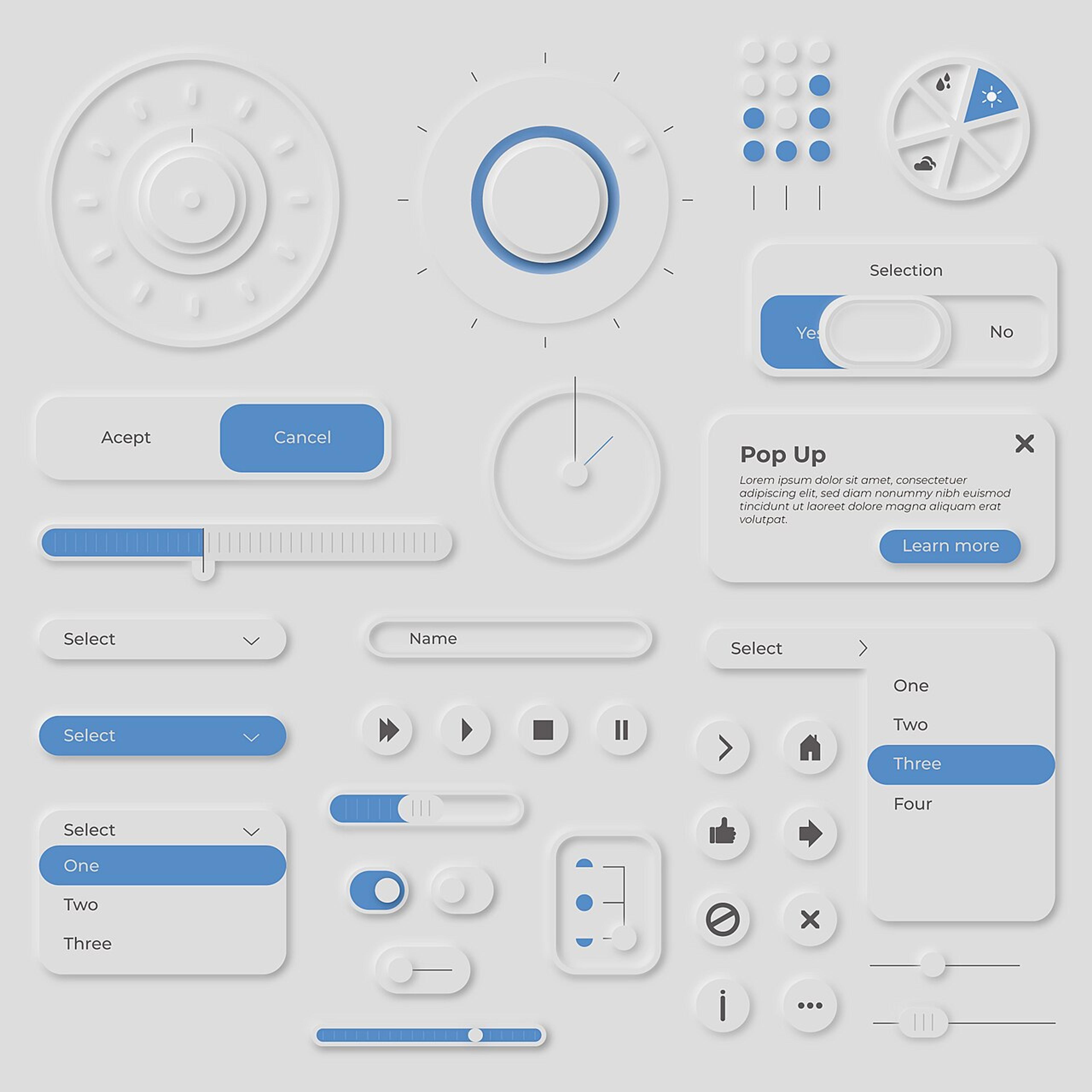
The name refers to a design style in which digital objects wear the appearance and behavior of their physical counterparts. A few examples:
- A notepad tool with lined paper texture
- A toggle built like a real switch
- Calculator buttons that visibly sink when pressed
- A clock icon with sweeping analog hands
- A wallet with cards fanned like plastic
Long before software, craftsmen applied the idea to material objects. Ancient Greek stone temples copied the joinery of their wooden predecessors, and early electric lamps mimicked candle flames to calm wary buyers. New inventions feel safer when they resemble familiar objects we already trust.
Skeuomorphism UI features realistic lighting, detailed textures, and a three-dimensional effect that makes interface elements look touchable.
Skeuomorphs are usually rendered with depth on purpose, since dimensionality underscores the link between pixels and their real-life counterparts.
Why Skeuomorphism Matters in 2026
Flat minimalism dominated for a decade because it was fast, scalable, and instantly readable. In its early days, it felt fresh too.
Then the novelty wore off, flat screens came to feel emotionally cold, and the generation that grew up after 2013 met depth as novelty rather than memory. The answer arrived through design elements with texture, light, and real dimension.
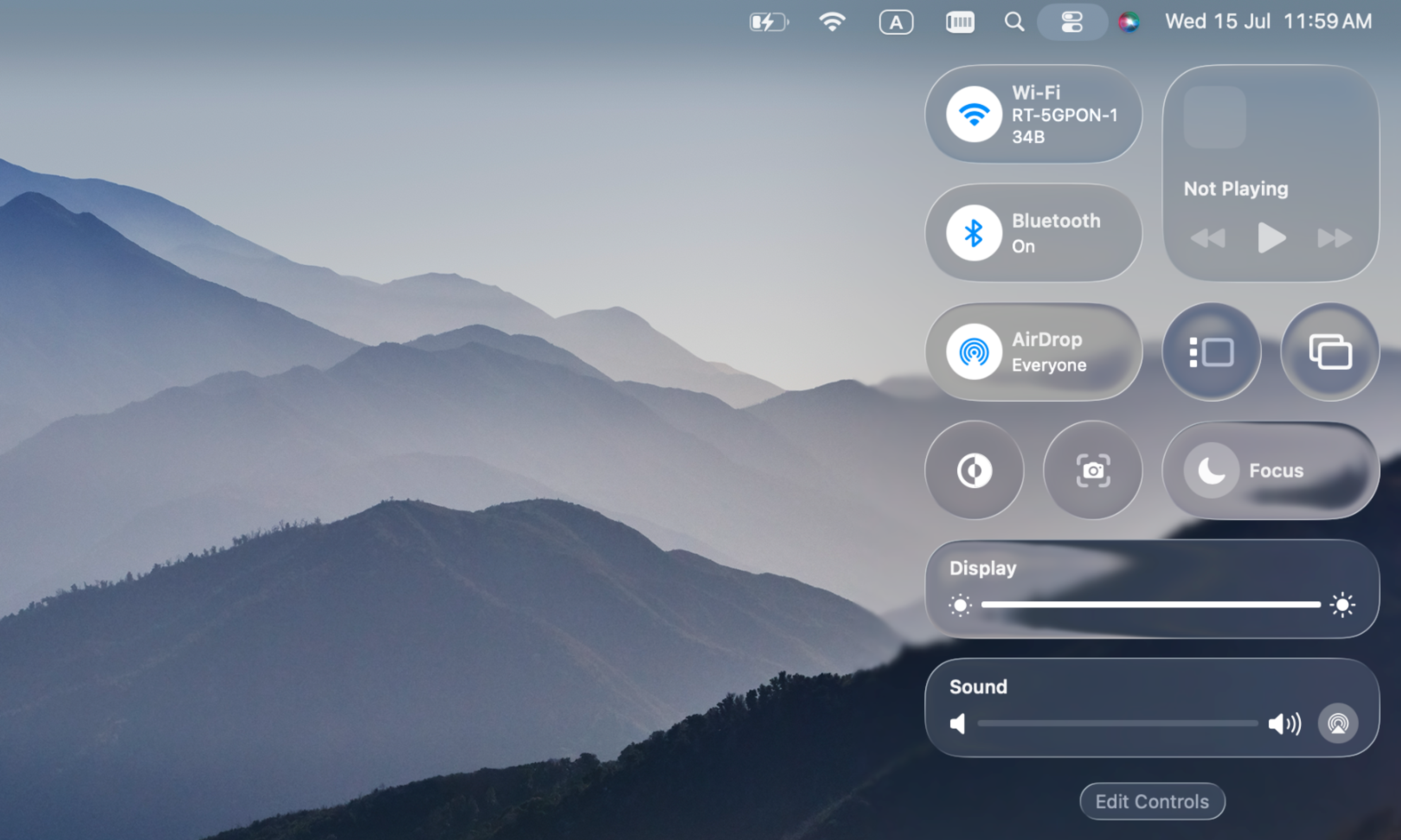
Apple made the shift official. Liquid Glass, announced in 2025, reintroduced real-time rendered depth across iOS 26 and macOS Tahoe. All are built on one old instruction, making pixels behave like real objects. The move revived realism in a modern form, with light and physics instead of the old leather and felt.
Apple's Liquid Glass UI
Spatial computing and AR matter even more. They put user interface design into literal space, where screens merge with the physical world.
Real-world elements woven into a clean layout give people a reason to stop and look. Shopify's own merchant data shows an average 94% lift in conversions when stores add interactive 3D content to product pages.
The modern wave blends skeuomorphic elements with the grid discipline and typography of flat minimalism, one glassy button on a calm screen rather than a wood-paneled den.
The revival even splintered into named sub-styles under the umbrella of neo-skeuomorphism.
- Neumorphism extrudes buttons from a single-color surface, making them look pressed from the same clay.
- Glassmorphism layers frosted, translucent panels over blurred content, and Apple industrialized that branch as Liquid Glass.
- Claymorphism inflates icons into rounded, toy-like 3D miniatures, the look that swept consumer brands in 2025.
Each borrows a different slice of the physical and works best in small doses on a flat foundation.
A Short History of Skeuomorphism
Digital design has leaned on borrowed forms from the very start.
The story begins with the personal computer. In the early days of computing, most people had never touched a mouse, and software makers needed graphical user interfaces that a complete novice could parse.
Xerox PARC sketched the desktop metaphor first, and Steve Jobs popularized skeuomorphism with the Apple Macintosh in 1984, building UI elements straight out of office supplies.
The company pushed the metaphors hardest on mobile. When Apple introduced the first iPhone in 2007, touchscreens were alien technology, and skeuomorphism did the translation work in early UI design.
Notes looked like a yellow legal pad, iBooks displayed physical bookshelves made of virtual wood, and Game Center wore green felt, like a casino table.
Photo by Jonas Vandermeiren on Unsplash
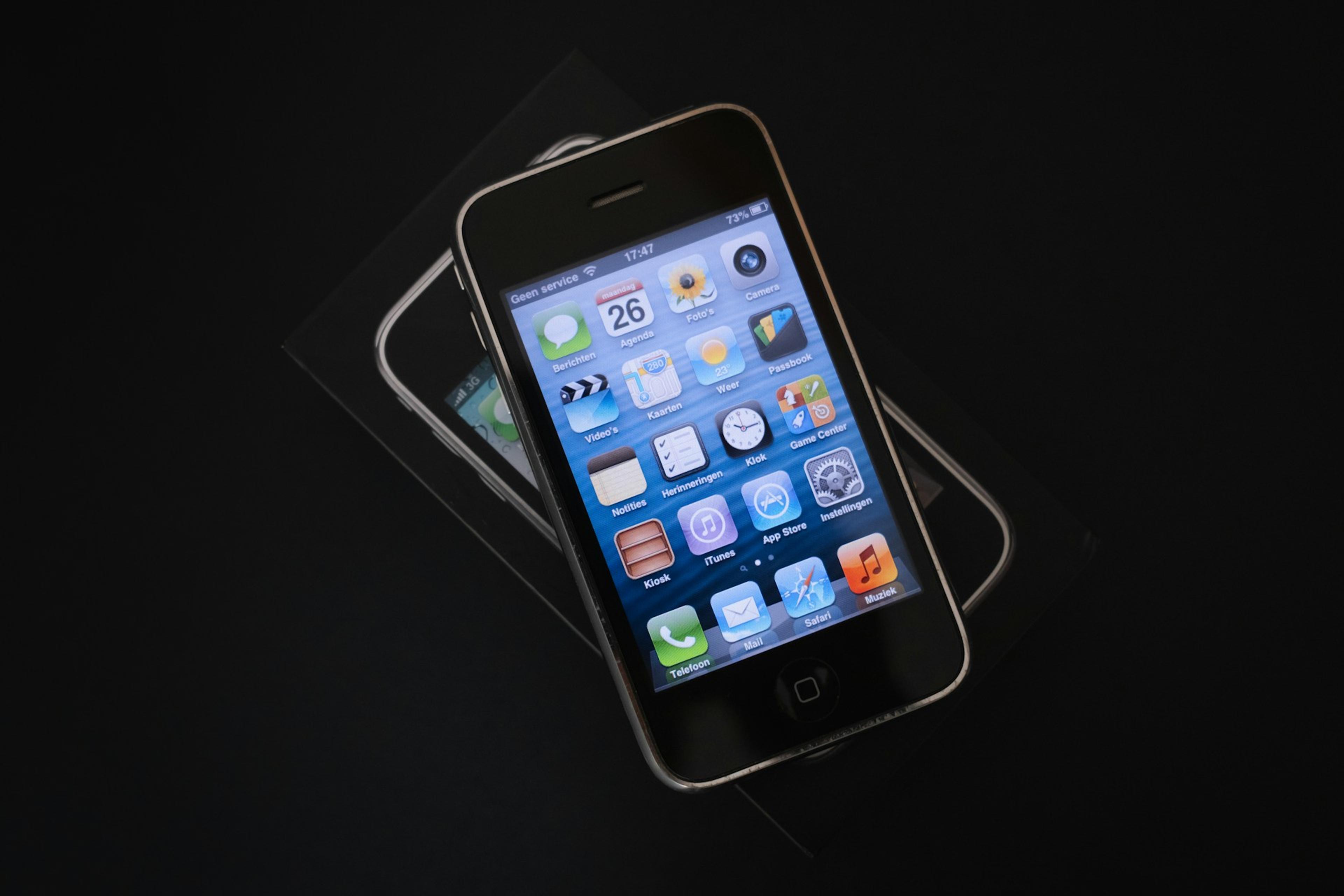
Each of those choices mimicked real-world objects so that people would know what to do without a manual.
Skeuomorphism design peaked in the early 2010s, and the decline followed quickly. Digital novices had become digital natives who no longer needed a compass drawn as a brass instrument.
Flat design emerged around 2012 as a response to the style's limitations, with Microsoft Design Language (formerly known as “Metro”) at the forefront. In 2013, iOS 7 flattened the whole operating system, and the industry followed. Google turned the new restraint into a Material Design system, keeping only a paper metaphor and subtle shadows to signal hierarchy.
For a decade, texture was treated as clutter. The revival started small in 2019 with neumorphism, a blend of skeuomorphism and flat design that designers nicknamed soft UI, and accelerated as screens, GPUs, and 3D tooling made realism cheap to render.
By 2025, the design community had watched dimensional icons and glassy layers spread across the board.
Pros and Cons of Skeuomorphism Design
Skeuomorphic interfaces trade benefits against costs, like any design approach.
Pros and Cons of Skeuomorphic Design
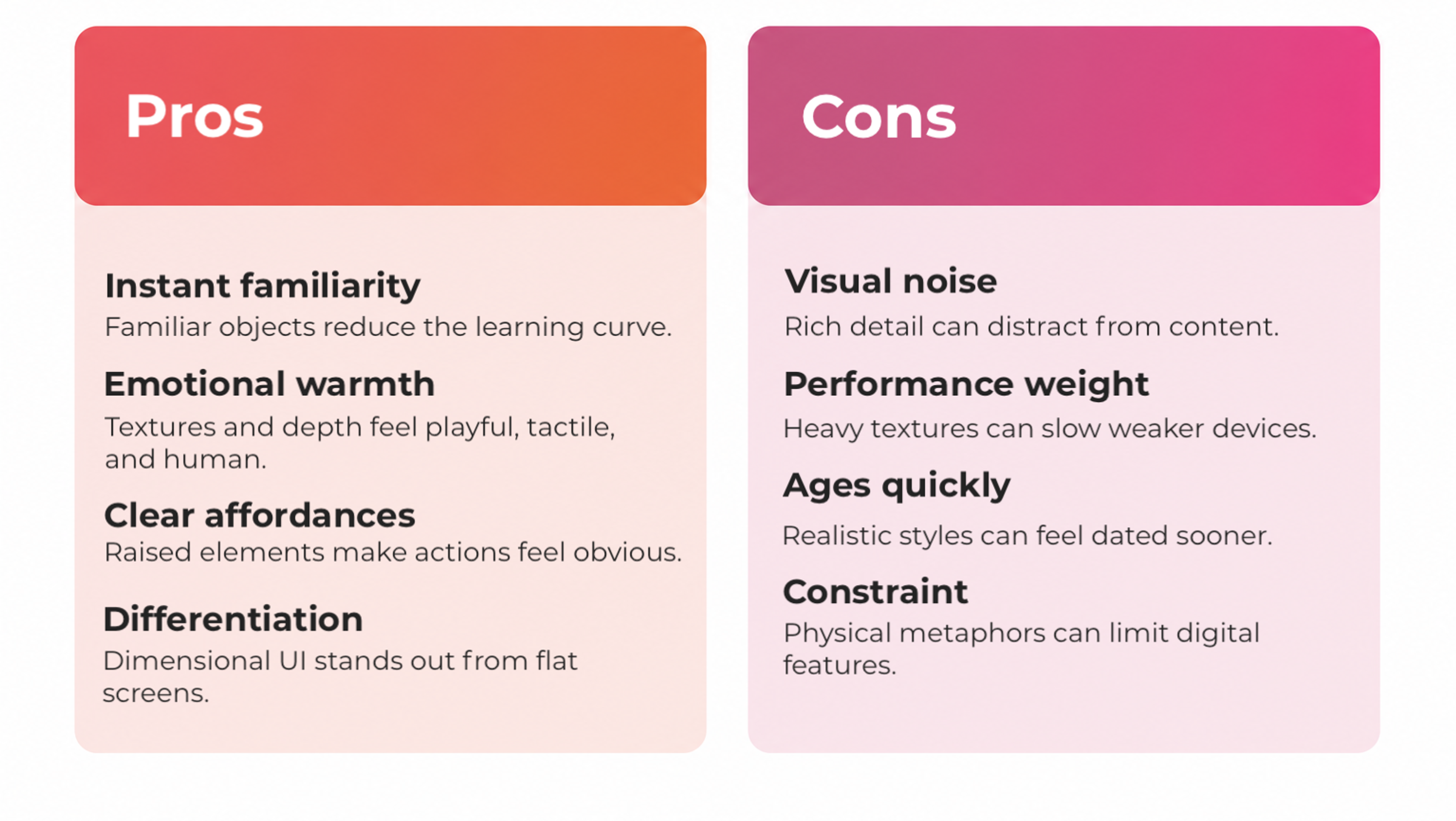
The Pros
Instant familiarity. Interfaces built from familiar objects need less explanation. The learning curve drops because everyday experience does the teaching, which is exactly why the style dominated when technology was new to everyone.
Emotional warmth. Detailed textures and dimensional light create an interface feel that flat grids struggle to match. People describe skeuomorphic products as playful, tactile, and human. That reaction is worth real money.
Clear affordances. A button with depth looks pressable, and a raised card looks draggable. Good interaction design starts with cues like these. Skeuomorphic elements communicate available actions without labels, improving usability for novices and anyone navigating unfamiliar flows.
Differentiation. In a market drowning in identical minimalist screens, dimensional work feels expensive. It signals effort, and users notice.
The Cons
Visual noise. Rich rendering competes for attention. On dense screens, decorated interface elements can distract users from content and slow decision-making.
Weight. Incorporating realistic textures costs pixels, memory, and rendering budget. Heavy assets drag on low-end digital devices, and even Apple felt it when early Liquid Glass builds drew complaints about lag on older iPhones. Performance is a user-experience metric, whether we like it or not.
Aging. Realism dates fast. Material objects become obsolete, and an interface tied to them needs redesigning sooner than a neutral one does.
Constraint. When a digital tool imitates its physical counterparts too faithfully, it inherits their limits. A calendar drawn as a paper desk pad resists features paper never had.
So the style is a valuable tool with a narrow ideal dose. The failures of the early 2010s came from applying it everywhere. The wins of 2026 come from applying it precisely.
With 10+ years of experience, we at Clay Global know how to balance modern flat designs with nostalgic depth. Explore what we offer here.
Flat Design vs Skeuomorphism
The two styles fueled a decade of industry writing, and the argument is worth settling properly.
Flat and Skeuomorphic Design Comparison
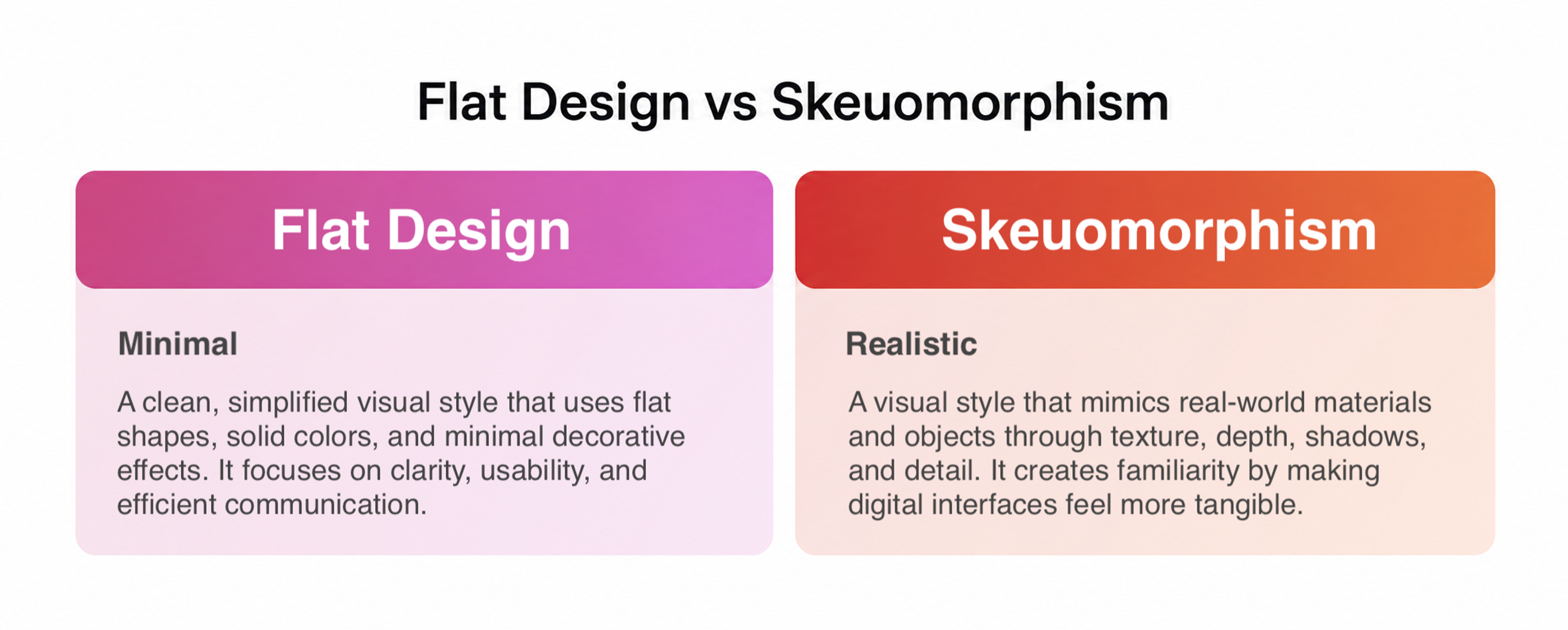
Flat interfaces strip away texture, gradients, and depth in favor of solid shapes, rounded edges, colors, and typography.
Not a single pixel points back to real-world counterparts, which keeps rendering cheap. They render fast, scale across screen sizes, and keep attention on content.
The weakness is ambiguity. When every surface is flat, people cannot always tell what is tappable, and click hesitation becomes a hidden tax on every task.
Skeuomorphism sits at the opposite pole, loading design elements with maximum affordance, personality, and cost.
Every strength of one style is the other's weakness, which is why the two were framed as enemies for years.
In 2026, that framing is dead, and digital interfaces prove it daily. Skeuomorphic and flat design now coexist inside single products, and the split follows a simple rule. Flat handles density, depth handles emphasis.
Blending Skeuomorphism and Flat Design
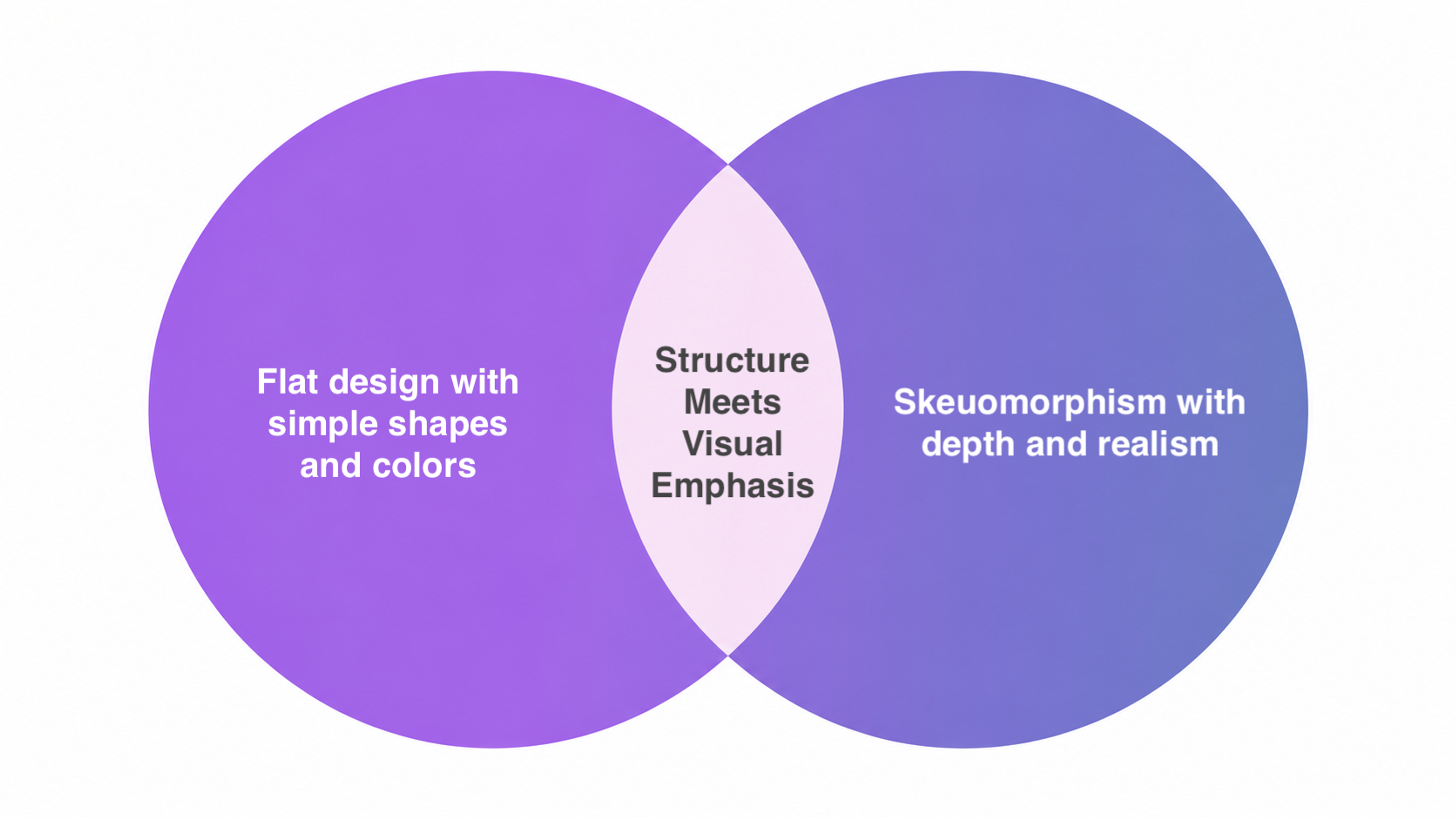
Dense workhorse screens stay plain because dimensional detail becomes noise at small sizes, while the few moments that carry recognition and emotion earn the richer treatment.
There is data behind the restraint. Across 208,000 real design generations tracked in the first half of 2026, full-blown realism never topped 0.1% of prompts. Teams want dimensional accents.
Treat the two as ingredients rather than ideologies and the debate settles itself in your product work.
Skeuomorphism Design Best Practices for 2026
The rules assume you are adding realism to a modern product, and each one exists to head off a mistake the first skeuomorphic wave already made.
Start With Purpose
Every dimensional detail should answer one question. What knowledge does this transfer?
A thermostat dial in smart home software carries over muscle memory from its real-world counterparts.
A glassy layer in spatial UI does the same job for depth perception. If a texture transfers no knowledge, cut it.
The original sin of early skeuomorphism design was ornament without function, like stitched leather on a calendar that no one actually used.
Put Depth Where Attention Belongs
Reserve the three-dimensional effect for moments that deserve focus. Icons, hero sections, buttons, empty states, onboarding illustrations. Toolbars, tables, and settings never make that list.
Keep the surrounding chrome muted and let soft shadows carry the depth, so the dimensional piece reads as a highlight rather than wallpaper.
No guideline in modern skeuomorphism UI work is more reliable than that rule, and it is where the hybrid mindset earns its keep.
Get the Light Right
Modern realism is built from light physics rather than detailed textures scanned from photographs.
Soft shadows with large blur radii, a consistent top-left light source, and gentle specular highlights create believable form without kitsch.
Both glass-style refraction effects and neumorphic extrusion get their effect from lighting logic rather than surface detail.
On modern devices, translucent materials are often rendered in real time on the GPU, so highlights shift as the device tilts and the depth reads as material rather than decal.
Respect Performance Budgets
Price your realism before incorporating realistic textures anywhere.
Use CSS gradients and SVG noise instead of bitmap files where possible, lazy-load heavy hero renders, and test on mid-range digital devices.
Key Elements of Interface Performance
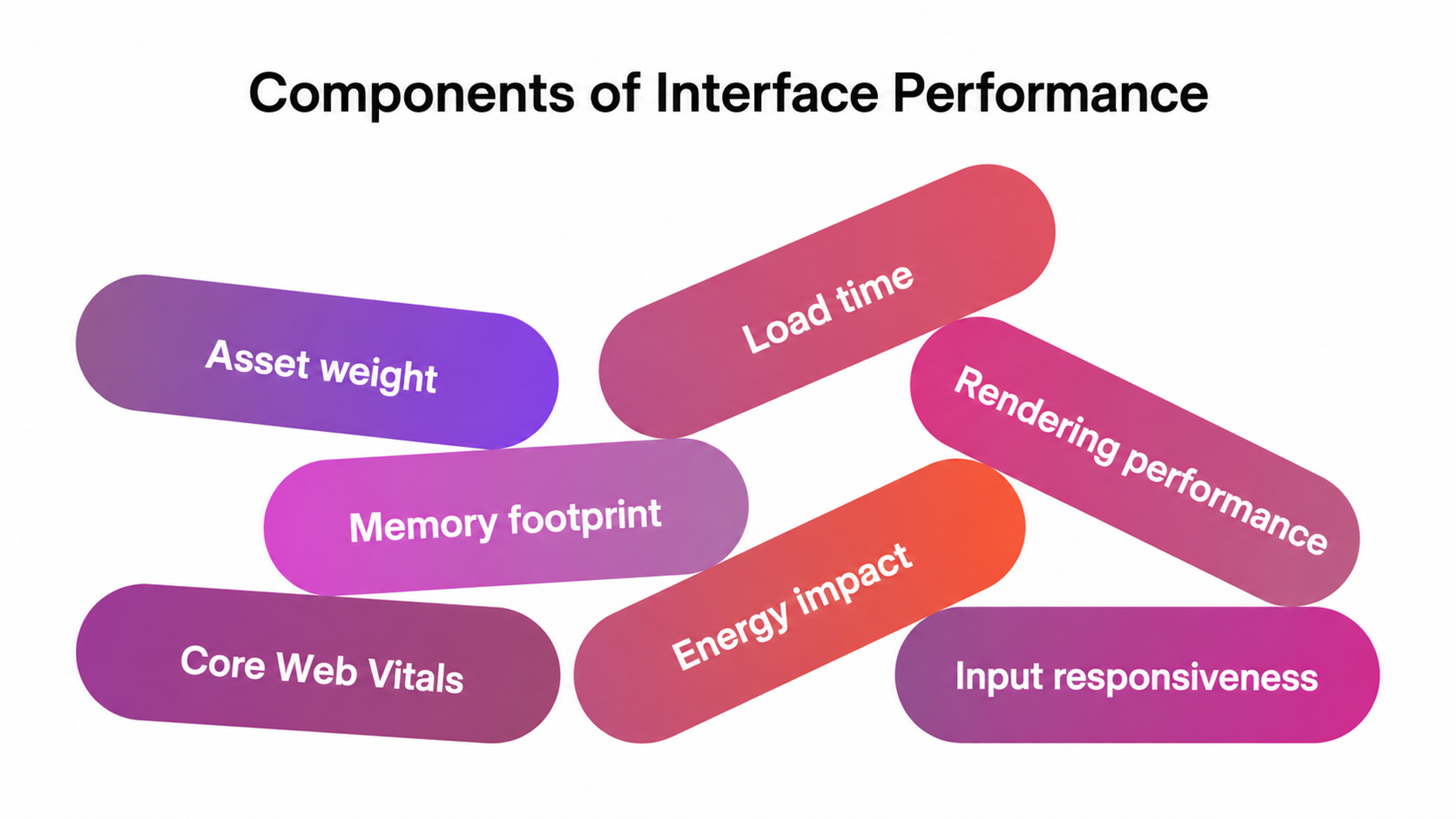
An interface feel that depends on dropped frames is not worth having. Depth has failed at its own game once it costs you sixty frames per second.
Let Motion Confirm the Design
Interaction design carries half the illusion. If a control looks raised, it should visibly depress on tap. A card styled as paper needs to move with the believable inertia of its physical counterparts.
Pair the visuals with micro-animations and haptic feedback so the behavior keeps the promise the pixels make.
Broken physics feels worse than no physics, because mismatched cues force people to rebuild their mental model mid-task.
Put Accessibility First
Neumorphism already showed how this goes wrong. Its low-contrast extruded surfaces looked gorgeous on Dribbble and failed WCAG checks in production.
Accessibility Elements by Clay
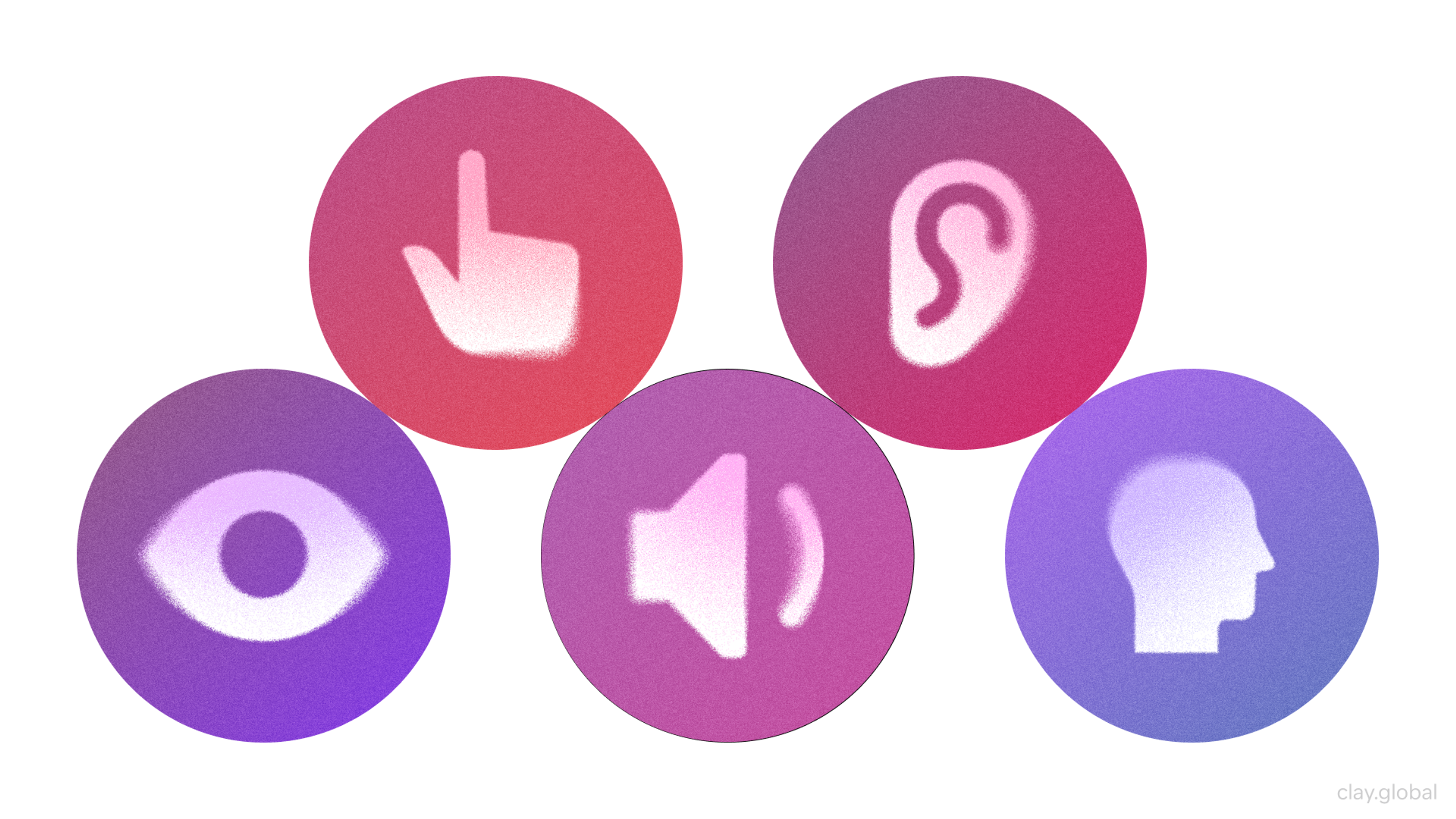
Liquid Glass repeated the lesson at scale in 2025, when legibility complaints pushed Apple to ship frosted variants and point users toward its Reduce Transparency setting.
Whatever depth you add, verify contrast ratios, preserve focus states, and ensure affordances remain accessible to people with low vision. Rounded edges and subtle shadows should support hierarchy.
Good visual design holds up in grayscale, and a lasting focus on accessibility keeps it that way through every redesign.
Match Metaphors to Reality
Design for the digital world your audience actually inhabits.
A voice memo tool, for example, can reference a microphone because microphones still exist. It should not reference a cassette deck, something nobody uses or sees daily anymore.
Before you create a new metaphor, test whether your users actually recognize the source, the way careful UI/UX design studios run quick recognition checks.
If the hardware predates your audience's daily experience, the reference will not land, and a metaphor nobody decodes is just noise.
Stay Consistent
Mixing dimensional and flat treatments works only when your UI design makes the split systematic.
Define which component tiers get depth, document the lighting model in your design system, and apply it everywhere.
One glossy button inside otherwise flat surroundings is the cheapest look in the book, because inconsistency reads as accident rather than intent.
Audit your UI elements every few months, since dimensional treatments drift as teams grow, and put your skeuomorphic design principles in writing to keep new hires honest.
Skeuomorphism Examples From Real Brands
Theory is easier to trust when you can open a live product and see the style at work. Three current cases stand out.
Duolingo
The website gives its buttons soft curves, dimensional shading, and darker lower edges, so they resemble physical controls waiting to be pressed.
Source: Duolingo

The treatment follows the core principle of skeuomorphism, where digital elements imitate the appearance and behavior of familiar real-world objects.
The tactile treatment creates clear visual affordance while supporting the website's playful and approachable character.
Poolsuite
The cult internet radio station renders its entire site as a vintage Mac desktop, rounded windows, bevels, and a working cassette player included.
Source: Poolsuite
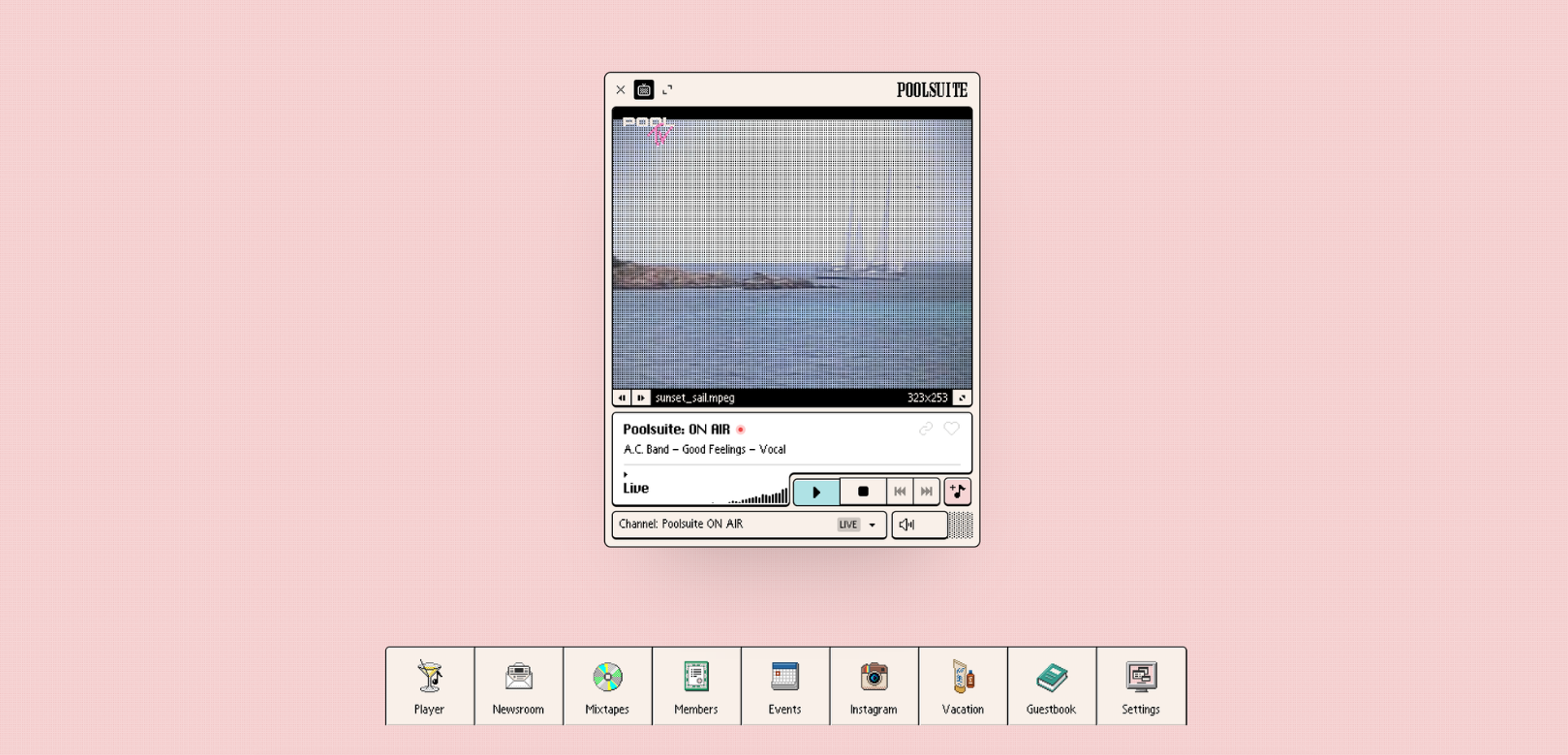
The 2025 version doubled down with CRT screen effects and interface details borrowed from vintage consumer electronics. The retro metaphor doubles as onboarding, since anyone who has ever used a computer already knows where to click.
Few products anywhere sustain full skeuomorphism across an entire experience, and Poolsuite proves the commitment can carry a brand.
Vantara
Our team at Clay Global designed and developed the website for Vantara, a landmark animal rescue, conservation, and rehabilitation center in India.
Source: Vantara

The clearest statement of the style sits in the header. Navigation lives inside a rounded capsule of frosted glass that floats over full-screen forest video. The panel blurs and warms the greenery behind it, so the bar reads as a material surface rather than a drawn rectangle.
The earliest interfaces mimicked real-world objects to comfort new users, and the Vantara header does it for atmosphere, borrowing the calm of real glass in a living forest.
Want to add some skeuomorphism to your project? Get professional UI/UX design services from our team. Let's talk.
Read more
Frequently Asked Questions
What is skeuomorphism in simple terms?
It is a way of making pixels look and behave like the real objects they replace. A switch drawn like a wall switch is a skeuomorphism.
The goal is instant recognition, digital elements that need zero instructions.
Is skeuomorphism UI back in 2026?
Yes, in a refined form.
The Liquid Glass material Apple introduced in 2025 leans on realism again, along with dimensional icons and spatial computing.
The design community treats the style as an accent this time, applied with restraint.
What are the most famous skeuomorphism examples?
The trash can for deleted files, the floppy disk save icon, and the envelope for email on the first iPhone that mimicked real-world objects. Steve Jobs insisted on those metaphors personally.
Why did Apple abandon the style in 2013?
There are three reasons.
Incorporating realistic textures costs screen space and rendering budget, the look dated quickly, and by then people understood touchscreens without borrowed metaphors.
Jony Ive's iOS 7 made flatness the default, and most of the industry followed within two years.
What is the difference between skeuomorphism and neumorphism?
Skeuomorphism is the older style that imitates specific real objects and materials with strong contrast, such as leather or brushed metal.
Neumorphism, also called soft UI, is its minimalist descendant. Surfaces remain monochrome and seem to extrude from the background, with twin shadows above and below, with no textures and famously weak contrast.
Does skeuomorphic design improve usability?
It can, in the right context. Strong affordances borrowed from physical objects help novices, children, and anyone facing unfamiliar flows.
This is a human factor win in any UX design playbook. But in dense expert tools, the effect flips, because ornament competes with information.
Is the style bad for accessibility?
Not inherently. Classic skeuomorphic elements usually carry strong contrast.
The risk sits with softer descendants, where faint depth cues fail WCAG checks.
Verify contrast and focus states regardless of the design style you pick.
Which products benefit most from realism in 2026?
Music production, photography, children's education, VR, and premium consumer brands.
Anywhere hardware muscle memory exists, or where allowing users to lean on familiar objects noticeably shortens onboarding.
Real-world elements also anchor VR spaces that would otherwise feel abstract.
How is skeuomorphism used in user interface design today?
Mostly as an accent layer. Teams keep layout and navigation flat, then apply dimensional treatment to icons, illustrations, and the spots that deserve emphasis.
Full realism survives mainly in niche creative tools, where it mirrors the physical world of studios and darkrooms on purpose.
Strictly speaking, many designers now file the broader depth revival under dimensional design and reserve the skeuomorphism label for direct object imitation.
Can skeuomorphic and flat design live in one product?
They should. The dominant pattern is a flat structure with dimensional emphasis, allowing users to scan while still encountering details worth a second look.
The two approaches solve different problems, so combining them covers more ground than either alone.
Every major digital design system shipped since 2024 shows this blend in action.
What tools help create modern skeuomorphic assets?
Designers still reach for Blender, Cinema 4D, and Spline for manual 3D work, plus Figma for compositing.
AI generators now produce dimensional icons in seconds, which has cut the cost of the look dramatically.
For small teams, AI generation has become the most valuable tool in the whole UX design stack.
Will realism replace flat interfaces again?
Unlikely. Flat remains the efficient default for dense digital interfaces. Expect the accent-based hybrid to hold.
Depth will expand as spatial computing grows, and bright colors alone will lose their power to differentiate a brand. Modern web design trends already point that way.
How do I know if my product needs skeuomorphic elements?
Ask two questions. Do my users carry muscle memory from real-life counterparts this product replaces? And do I need to stand out emotionally in a crowded market?
Two “yes” answers justify depth.
Two “no” answers mean flat serves you better, whatever modern design trends happen to say.
Final Thoughts
The style behind skeuomorphism earned a decade of mockery, but the idea behind it kept working.
Depth still helps people understand and feel something when it's used with restraint, and it turns into noise the moment it's used everywhere.
The digital world runs on borrowed forms, and interfaces built on the familiar feel easier to learn. Design will keep swinging between flat and dimensional styles, and good judgment is what survives every swing.

About Clay
Clay is a UI/UX design & branding agency in San Francisco. We team up with startups and leading brands to create transformative digital experience. Clients: Facebook, Slack, Google, Amazon, Credit Karma, Zenefits, etc.
Learn moreAbout Clay
Clay is a UI/UX design & branding agency in San Francisco. We team up with startups and leading brands to create transformative digital experience. Clients: Facebook, Slack, Google, Amazon, Credit Karma, Zenefits, etc.
Learn more