Your website is doing a job before a single person on your team speaks to a prospect. Visitors decide whether to stay or leave in roughly 50 milliseconds - that’s less time than it takes to blink. And 94% of those first impressions are based entirely on design.
That's a lot riding on a layout.
Web design in 2026 is not just about aesthetics. It's about trust, performance, and guiding someone from "just browsing" to "I need this." If you'd rather work with specialists, browsing a curated list of top web design agencies is a good starting point for finding the right partner for your project.
A cluttered homepage loses customers. Slow load times lose revenue. Poor mobile design loses the majority of your audience, because 62.66% of all global web traffic now comes from mobile devices.
Our guide covers every layer of the discipline: principles, process, visual execution, and best practices, whether you're building your first site or redesigning an existing one.
Key Takeaways
- First impressions happen in 50 milliseconds and are almost entirely visual, which means that design quality directly affects perceived credibility.
- Mobile-first is not a trend. It's the default. Over 62% of web traffic comes from phones.
- Good web design combines visual hierarchy, performance, accessibility, and clear conversion paths.
- A structured design process (define purpose, map structure, prototype, test, launch) produces better results than diving straight into visuals.
- Page speed is both a UX issue and an SEO ranking factor - a one-second delay cuts conversions by 7%.
- Accessibility and SEO are not separate concerns - building for inclusivity improves discoverability.
What Is Web Design?
Web design is the discipline of creating and organizing the digital experience a user has on a website. That includes visual design, layout, typography, navigation, content structure, and performance.
It also includes the less visible work: information architecture, conversion optimization, accessibility compliance, and the decisions that determine what loads first and why.
Good web design disappears. The user doesn't think about the design. They find what they need, understand what to do, and instinctively trust the brand. Bad design is the first thing they notice, and usually the primary reason they leave.
The web design services market is growing at a 4.8% CAGR through 2032, driven by rising investment in responsive, conversion-focused digital experiences.
The U.S. market alone was valued at $48 billion in 2025. That growth reflects a broader recognition: for most businesses, the website is the product, the storefront, and the salesperson combined.
Why Web Design Matters?
Most companies treat web design as a brand exercise. Get the colors right, pick a clean layout, and make it look professional. That's a reasonable starting point, but it undersells what design actually does.
75% of consumers judge a business's credibility based on its website design. Not its product, not its reviews, not its pricing - purely its design. That snap judgment happens before a visitor reads a single sentence of copy. A poorly designed site signals that the business can't be trusted, and users act accordingly.
The purchase behavior data is just as stark. 50% of consumers say they won't consider buying from a brand without a well-designed mobile site. That's half your potential customers filtered out before your product ever gets a fair hearing.
Good design does several things at once:
- It builds brand recognition by creating a consistent visual identity that users can remember and return to
- It helps you reach the right audience by structuring content around their needs rather than your internal org chart
- It increases conversions by removing friction from the path to purchase or sign-up
- It makes your site more accessible to people with disabilities, which both broadens your audience and keeps you aligned with WCAG accessibility standards
None of that happens by accident. It happens because design decisions were made with a purpose beyond aesthetics.
Website Design Fundamentals
Before touching a tool or template, understanding the principles that underpin good design makes every decision easier.
Visual Hierarchy
Visual hierarchy is how you tell the eye where to look first. Size, weight, contrast, textures, and position all communicate importance.
A headline set at 64px and a body copy block at 16px tell the reader immediately what matters. A bold CTA button surrounded by white space says "this is the action."
Every page has a goal. Visual hierarchy is the mechanism that moves users toward it. When hierarchy breaks down (when everything competes for attention at once), cognitive overload follows, and users disengage.
Color Theory
Color is not decoration. It shapes perception, signals brand identity, and directs attention:
- Warm colors like red and orange create urgency
- Blues communicate trust
- Greens are often used in health and finance contexts for their calming associations
Color Wheel by Clay
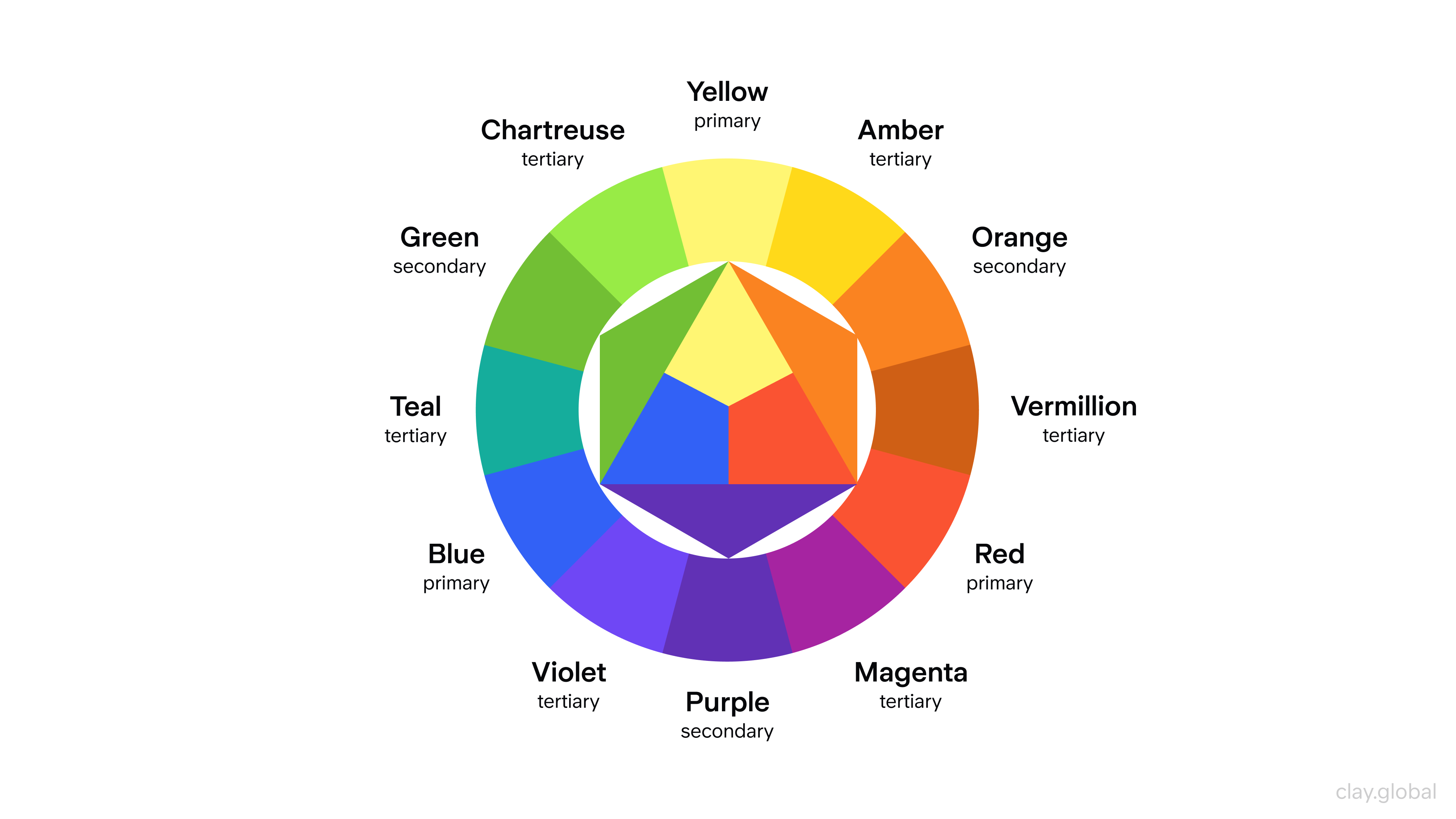
When building a color palette for a website, pick harmonious combinations that reinforce your brand positioning. Use contrast deliberately, for example, a high-contrast CTA button against a neutral background draws the click.
Ensure sufficient contrast ratios between text and backgrounds to meet WCAG accessibility guidelines, which also improves readability across all users, not just those with visual impairments.
Typography
"95% of web design is typography," designer Oliver Reichenstein famously noted.
That's not hyperbole. Typography governs readability, tone, and pacing. A site using a poorly chosen font at an inconsistent size signals unprofessionalism before a single word is read.
Web Fonts Examples by Clay
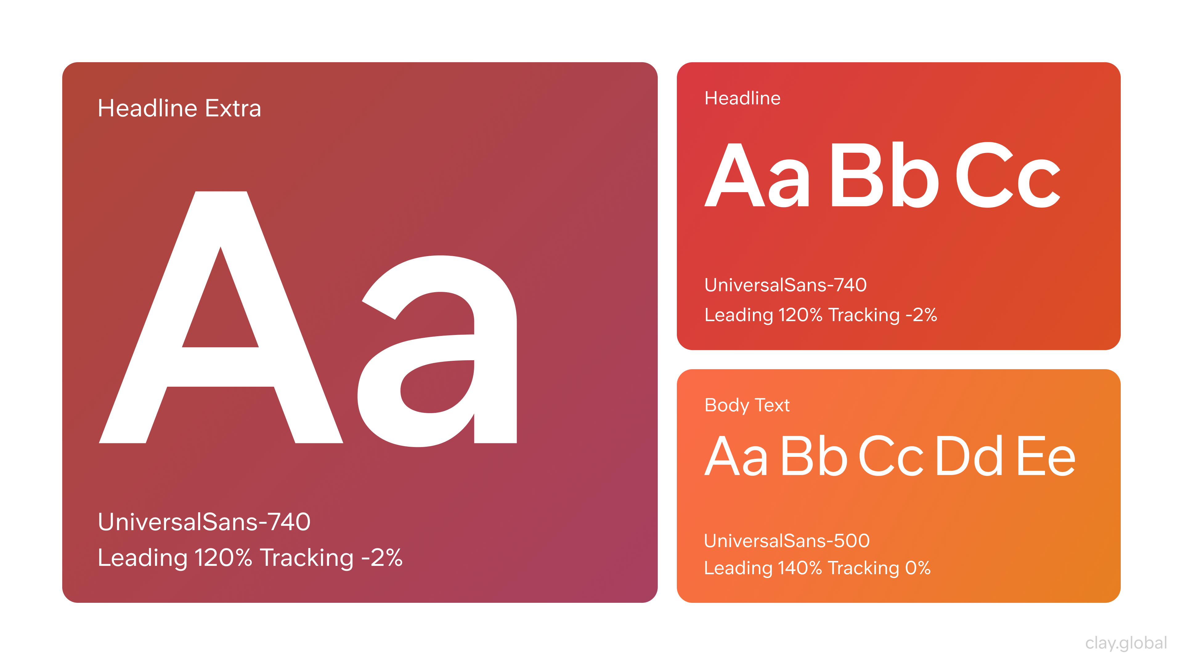
Choose typefaces that render cleanly at all screen sizes. Use a maximum of two type families - one for headings, one for body. Keep line heights generous (1.5 to 1.7 for body copy) and avoid line lengths beyond 70-80 characters per line. Consistent font sizing across pages prevents the visual whiplash that frustrates visitors on longer sessions.
The Partstack project shows this pairing in practice. Aeonik handles headings and display copy, bringing structure and a modern, slightly industrial feel. Inter carries the interface copy, ensuring legibility across dense data views.
Together, they create a system that's both functional and distinctive, which is the right combination for a fast, content-rich platform where clarity can't be compromised.
Partstack by Clay
White Space
White space is not emptiness, as one might think. It's the structure: margins, padding, and the gaps between elements allow the eye to rest and the brain to process information in chunks.
Designs that lack breathing room feel cluttered regardless of how good the individual components are.
White Space by Clay
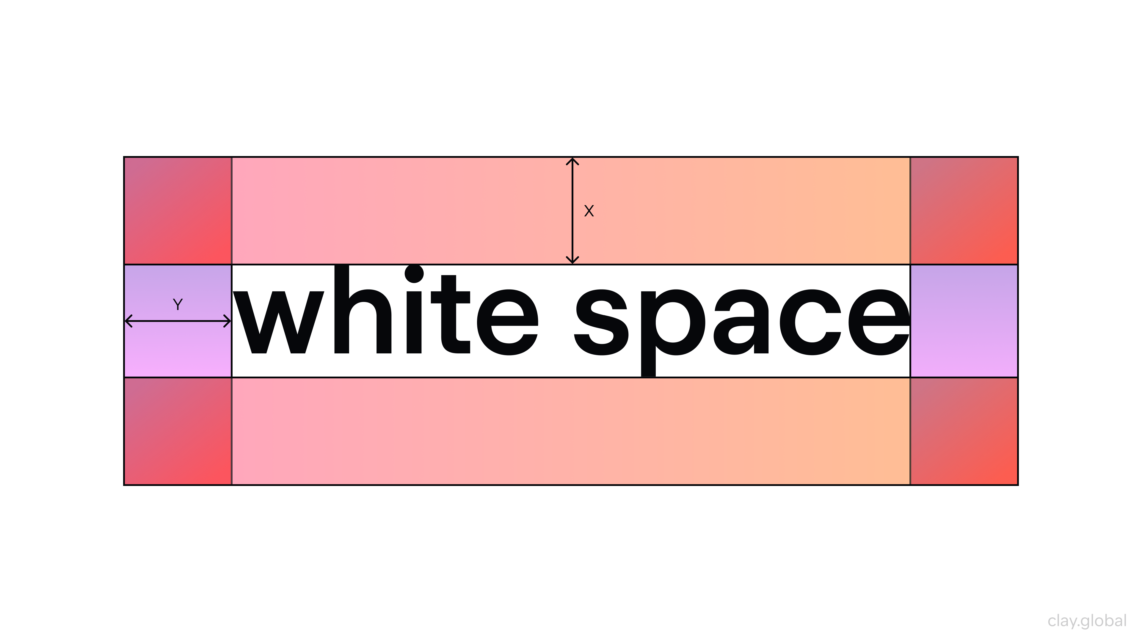
84.6% of small business websites make the mistake of crowded layouts, according to a recent analysis. Using white space intentionally separates sections, focuses attention, and signals a premium brand aesthetic.
Scrolling in Web Design
Scrolling is one of the most natural interactions on the web, and how you design for it shapes the entire reading experience. It can create momentum (if done right) or confusion about where content ends and what users are supposed to do next (if done poorly).
Different Scroll Techniques by Clay
Parallax scrolling uses layered elements moving at different speeds to create depth as the user scrolls, adding visual interest without requiring additional pages. It works best for storytelling-led sites and single-page experiences where guiding the user through a narrative is the goal.
Long scrolling organizes content into a continuous vertical flow, keeping users in a single context rather than fragmenting information across multiple pages, which is a pattern that works particularly well on mobile, where tapping between pages is more disruptive than scrolling.
Grids in Web Design
A grid is the invisible structure that keeps a layout from feeling arbitrary. It defines column widths, spacing between elements, and the margins that frame the page, giving designers a consistent system for placing elements rather than positioning everything by eye.
Common Grid Structures in Websites and Interfaces by Clay
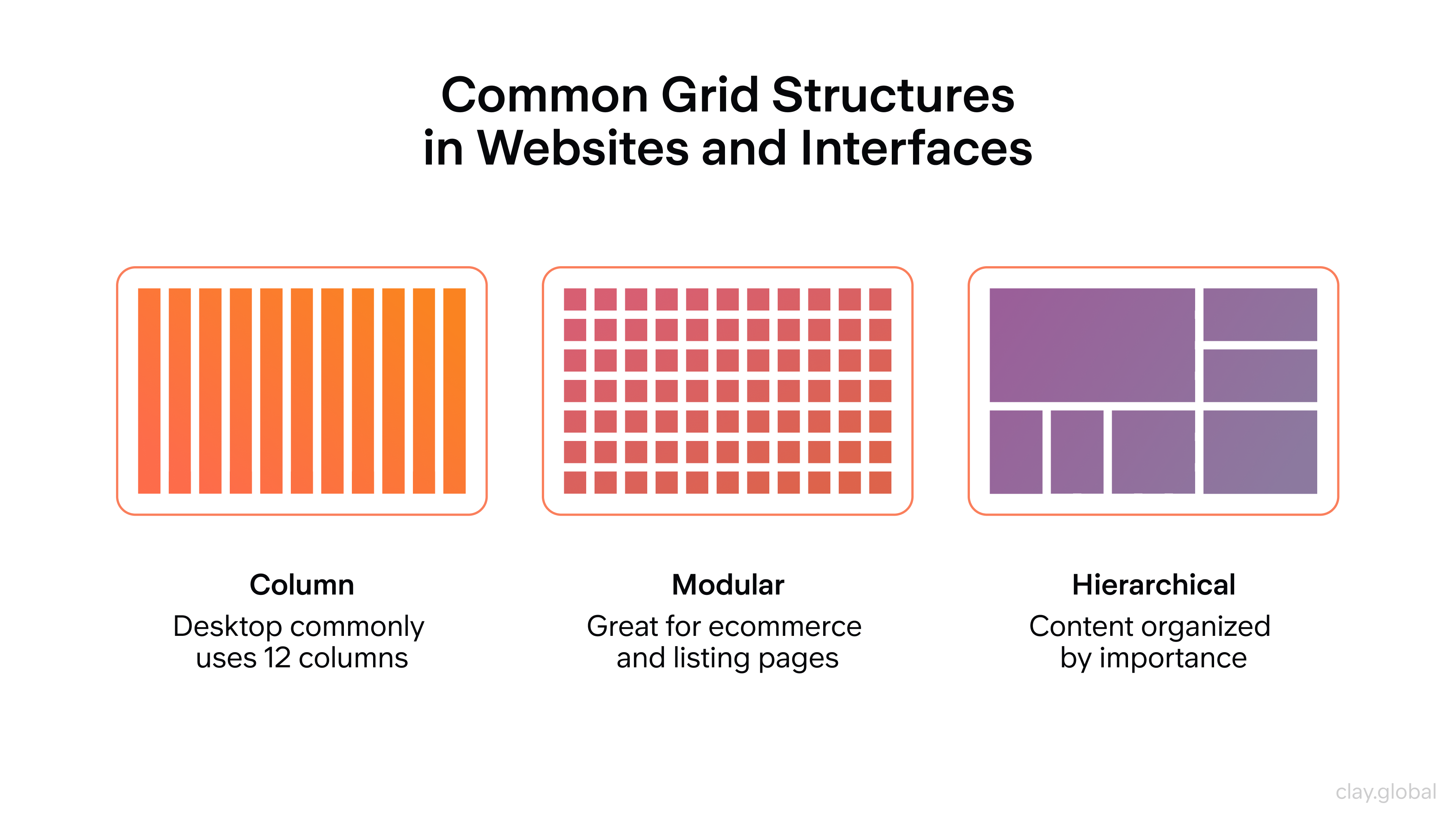
Grid systems bring visual order to complex pages and make responsive design more predictable. When you define a 12-column grid, for example, elements can span different column counts at different breakpoints without the layout breaking.
Gutters (the spaces between columns) give the design room to breathe and prevent elements from crowding each other.
Web Layouts
Layout is how all the elements on a page (text, images, buttons, navigation) are arranged in relation to each other. A strong layout creates a clear reading path, communicates hierarchy, and makes the page feel balanced without being static.
Common web layout patterns include:
- The single-column layout (clean and mobile-friendly, works well for editorial content)
- The multi-column layout (useful for dashboards, product listings, and content-heavy pages)
- The card-based layout (modular and flexible, standard for portfolio and e-commerce grids)
- The hero layout, where a large image or statement occupies the top of the page before content begins, is ubiquitous for marketing and landing pages.
Different Types of Layout Structures by Clay

Web Design Content Strategy
Content strategy is the planning behind what goes on a site, how it's organized, and how it serves users at each stage of their journey.
Design and content are inseparable because a beautiful layout filled with vague or disorganized copy fails the user just as completely as a poorly designed page with strong writing.
Start by mapping your content to user intent. What is someone trying to accomplish on each page? What information do they need, and in what order?
Hierarchical organization (using clear sections, descriptive headings, and logical page flow) helps users scan efficiently and find what they need without effort.
11 Types of Website Content by Clay
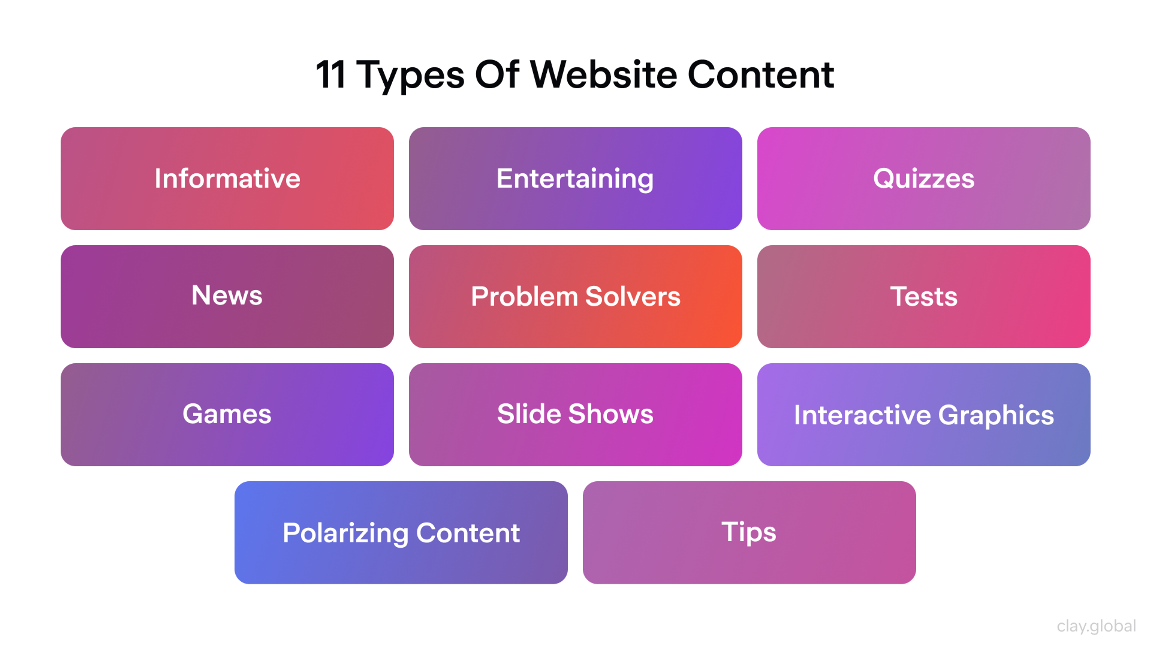
Content should also be structured with search in mind. Clear heading hierarchy, descriptive page titles, and copy written around the terms your audience actually searches for all contribute to organic discoverability without compromising readability.
The best content strategy serves users first and search engines as a consequence.
Headers and Footers in Web Design
Headers and footers frame every page on a site. They're persistent elements that users rely on for orientation and navigation, which means they carry more functional weight than their position at the edges of the page might suggest.
A header typically contains the logo, primary navigation, and a top-level call to action - the elements users expect to find immediately when they land on any page. It should load fast, stay readable at all viewport sizes, and make the most important action on the site easy to reach.
On mobile, headers often collapse into a hamburger menu, and the priority is that navigation remains accessible without dominating the small screen.
Footers serve a different function. They're where users go when they haven't found what they need from the main content: contact information, secondary navigation links, legal pages, social media links, and newsletter sign-ups all belong here.
A well-designed footer isn't an afterthought! It's a safety net for users at the bottom of the page who still need somewhere to go.
The Web Design Process
Good websites follow a process that moves from strategy through structure to visual execution and testing.
Web Design Process by Clay
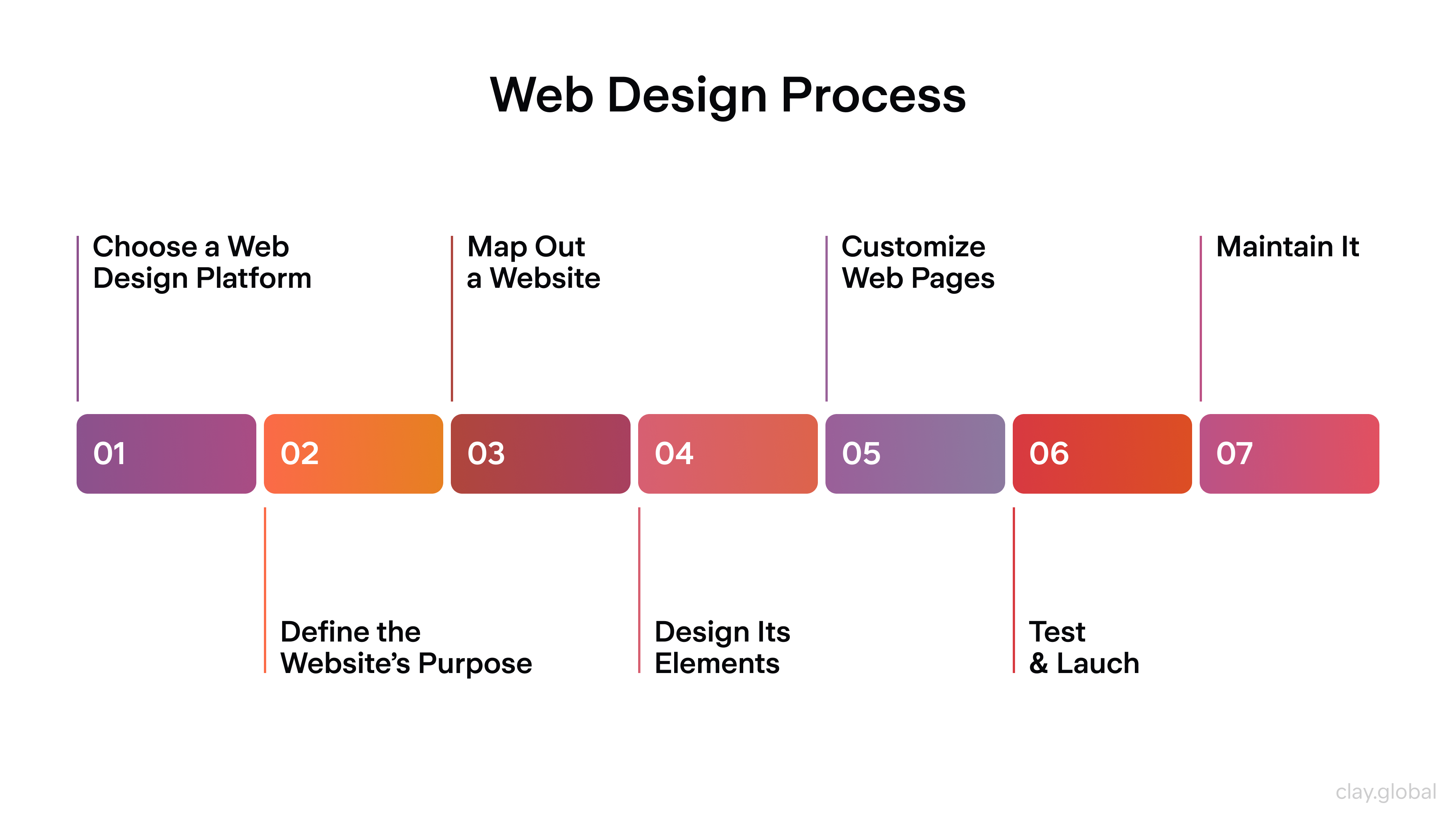
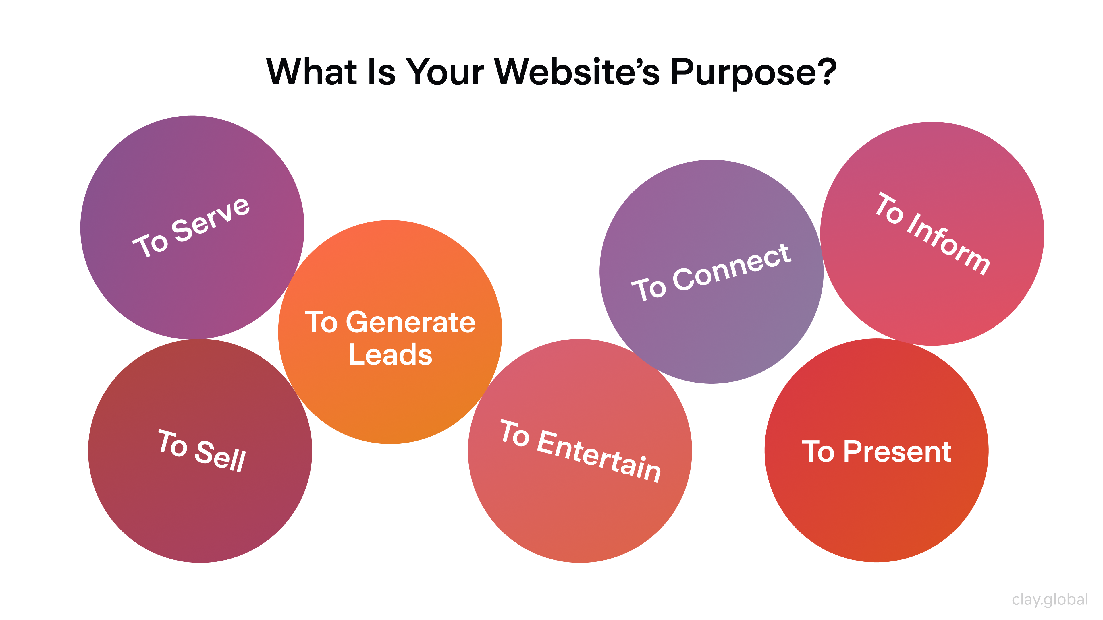
Step 1: Define the Purpose
Start with one clear question: what should this website make happen? Sell a product, generate leads, build an audience, explain a service, establish credibility.
The answer to that question should drive every subsequent decision, from information architecture to button copy.
A site without a defined purpose tends to become a site about everything, which usually converts nothing. Align the purpose with your target audience and brand identity before opening a design tool.
7 Types of Website's Purpose by Clay
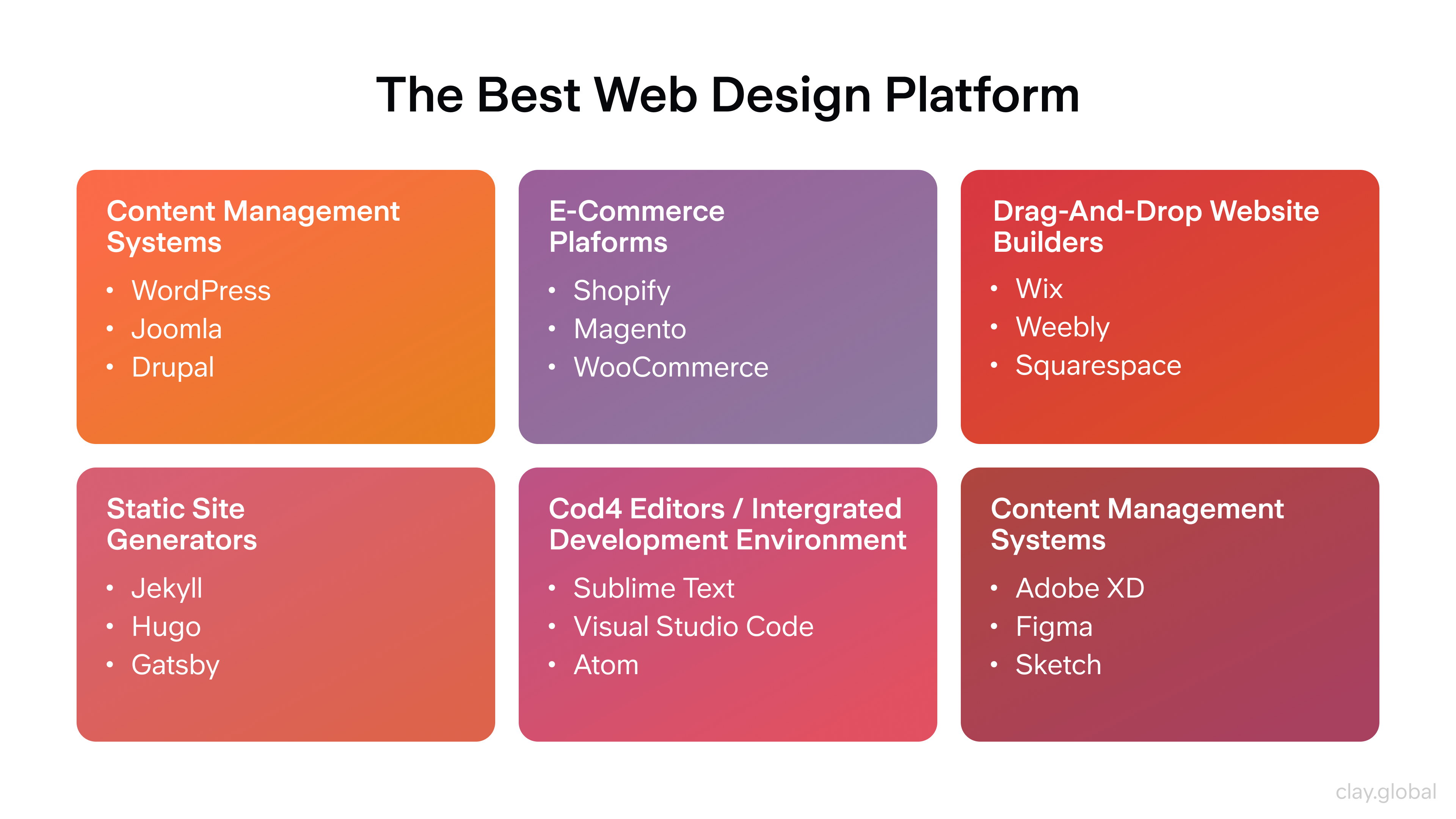
Step 2: Choose Your Platform
Platform choice shapes flexibility, maintenance workload, and what's technically possible.
For most businesses, a CMS like WordPress or Webflow offers the right balance of customization and usability:
- E-commerce projects generally benefit from Shopify's ecosystem
- Startups and technical teams sometimes prefer headless architectures (Next.js with a CMS like Sanity or Contentful) for performance and flexibility at scale
- Beginners who need speed over customization can get a site live quickly on Squarespace or Framer.
The platform is a tool, rather than a strategy. Pick it based on your actual requirements, not what's trending.
The Best Web Design Platforms by Clay
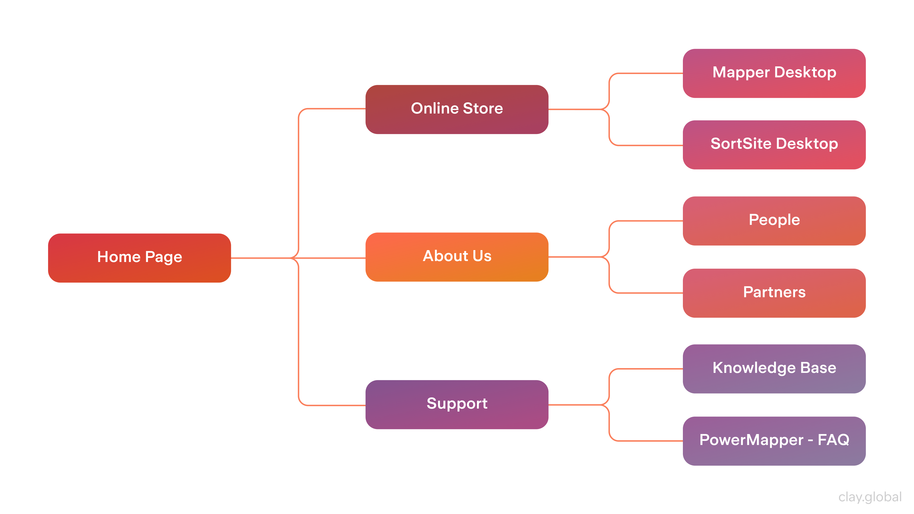
Step 3: Map the Site Structure
Site mapping is the step most beginners skip and most experienced designers never do without. Before any visual design, map out the full page hierarchy: what are the top-level sections, what lives beneath each, and how do users navigate between them?
This is information architecture in practice. A well-structured site reduces bounce rates, improves internal linking for SEO, and makes the development phase more predictable. It also exposes gaps - content you thought you had but don't, or navigation paths that don't logically connect.
Website Map Example by Clay
Step 4: Wireframe, Mockup, Prototype
These three phases are distinct and all essential.
Wireframes are structural sketches: where does the headline go, where does the image sit, what's the rough layout of each page? No color, no final typography. Just boxes and logic.
Mockups apply the visual layer: brand colors, real type choices, imagery, and UI components. This is where the design starts to look like the finished product.
Prototypes add interaction. Clickable flows through key user journeys (homepage to product page to checkout, for example) reveal UX problems before a single line of code is written.
Testing with real users at the prototype stage is dramatically cheaper than fixing the same issues after launch.
Mockup vs Wireframe vs Prototype by Clay

Step 5: Build and Code
HTML provides structure, CSS controls visual styling, and JavaScript adds interactivity. These three languages work in combination on every modern website.
CSS frameworks like Tailwind or Bootstrap accelerate layout work. JavaScript frameworks like React or Vue power dynamic, data-driven interfaces.
Design handoff to development is a common friction point. Detailed design specs, consistent component documentation, and tools like Figma's inspect mode or Zeplin reduce misinterpretation and rework. The cleaner the handoff documentation, the closer the built product is to the intended design.
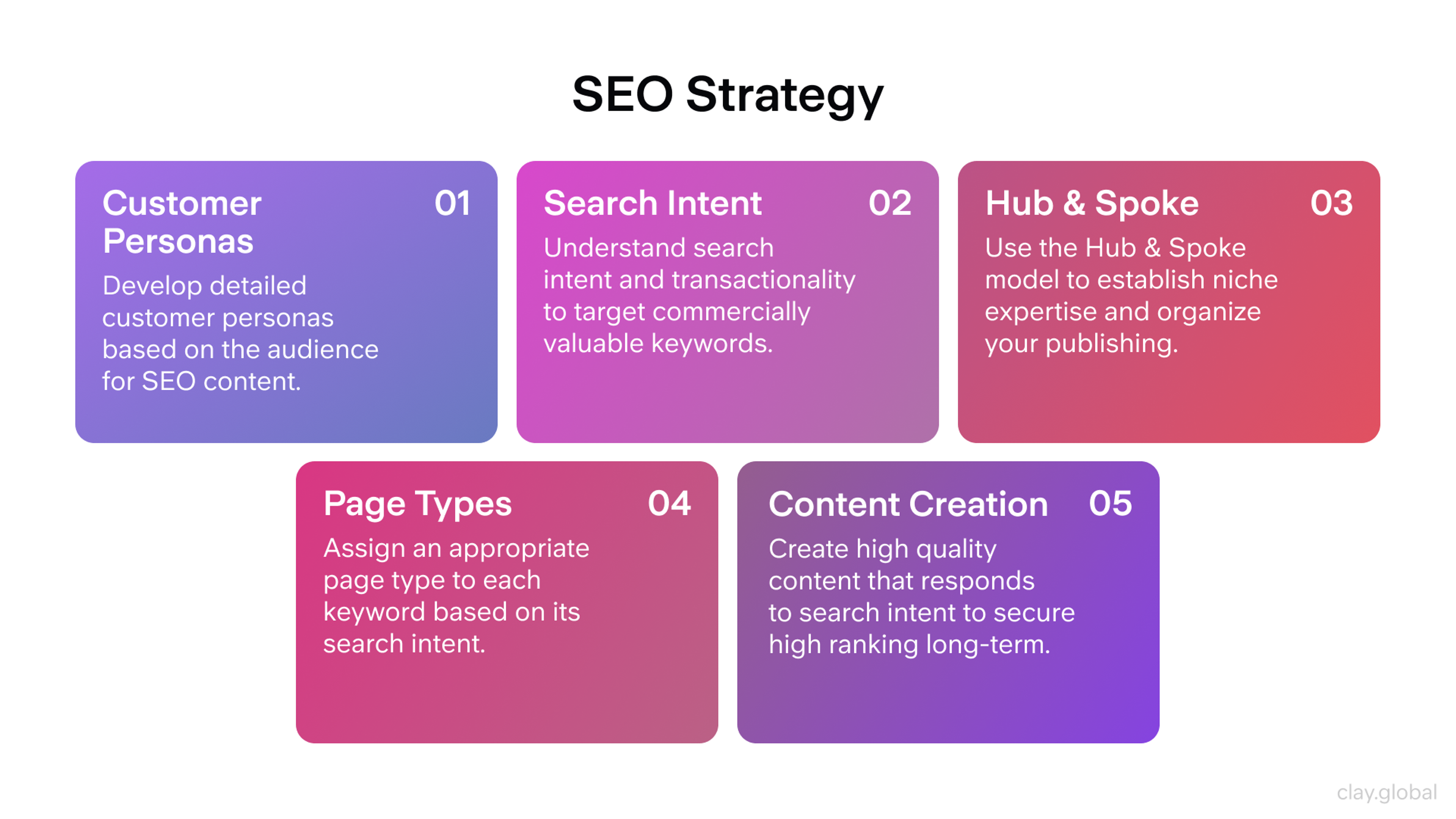
Step 6: Optimize Content for SEO
Content and design need to work together. Well-structured HTML (semantic headings, clean URL structure, meaningful alt text) signals to search engines what a page is about. 75% of users never scroll past the first page of search results, which means ranking matters significantly for SEO organic traffic.
Write copy for humans first, then layer in keyword strategy. Keyword stuffing destroys readability. Natural integration of relevant terms, supported by strong internal linking and descriptive meta tags, produces better long-term results.
SEO Strategy by Clay
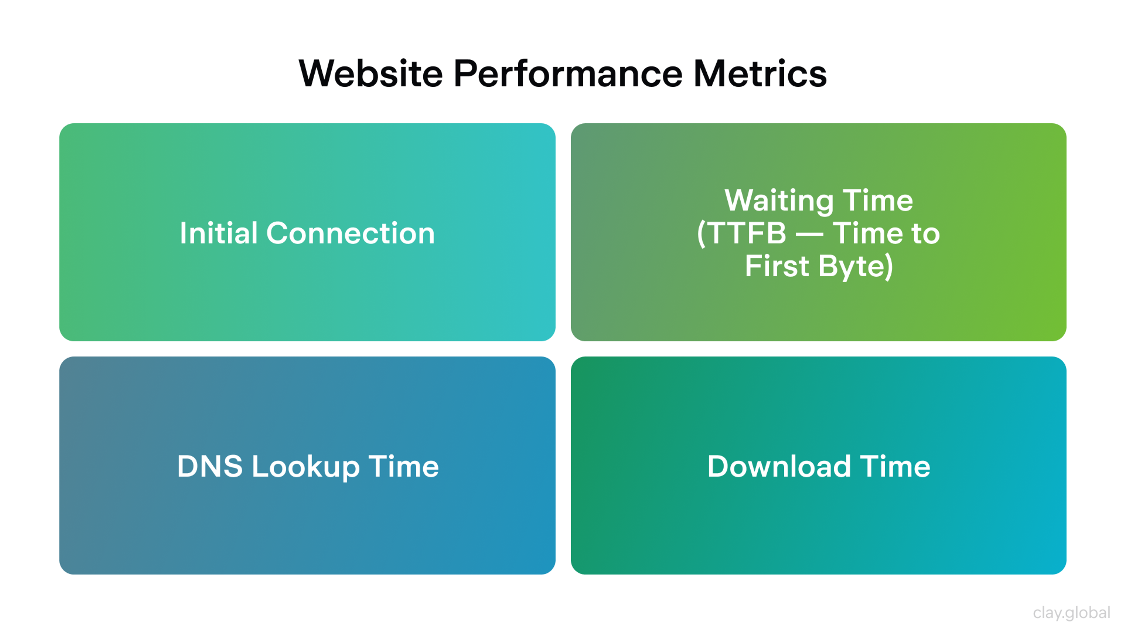
Step 7: Test Before Launch
Test across browsers, devices, and connection speeds. Chrome, Firefox, and Safari render CSS differently in edge cases. Mobile Safari has its own quirks. Test on actual devices, not just browser emulators.
Run usability tests. Watch real users navigate the site and pay attention to where they pause, where they click by mistake, and where they stop. Those friction points are design problems, not user errors.
Check Core Web Vitals: Google's performance benchmarks for Largest Contentful Paint (LCP), Interaction to Next Paint (INP), and Cumulative Layout Shift (CLS). Only 47% of sites currently meet all three thresholds. Sites that do consistently outperform on both rankings and conversion.
Website Performance Metrics by Clay
Step 8: Launch and Iterate
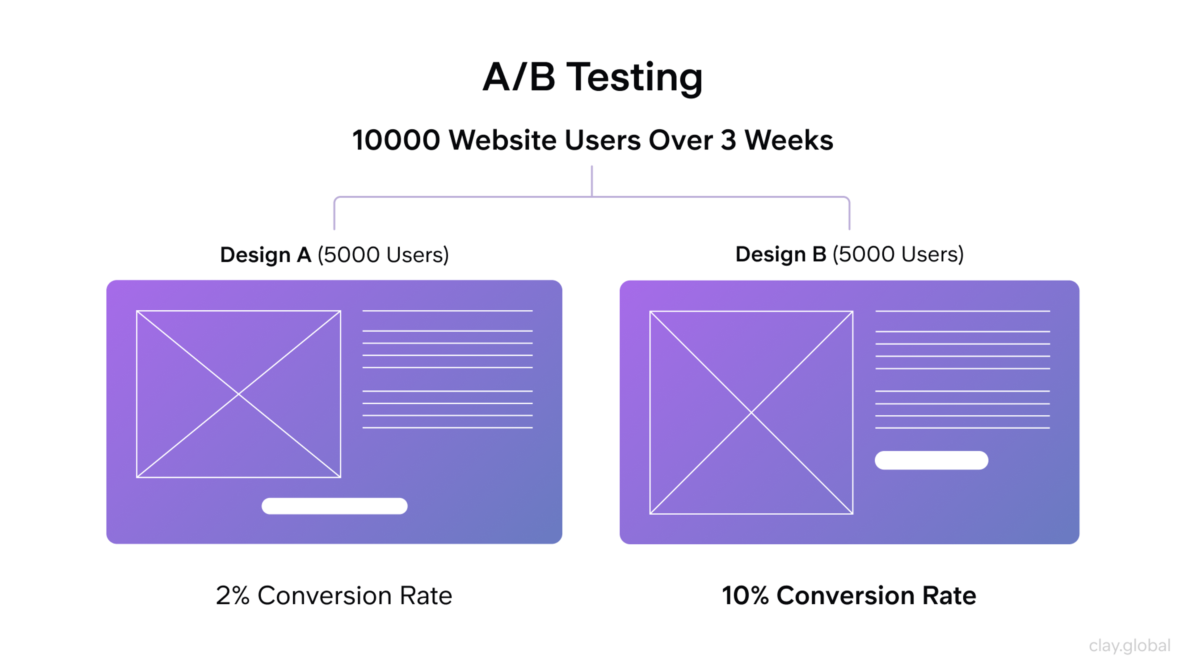
Launch is not the endpoint. It's the beginning of the feedback loop. Analytics tools like Google Analytics 4 and Hotjar reveal how users actually behave on the live site. Heatmaps show where people click. Session recordings reveal where they drop off. Conversion data tells you whether the design is working.
The best websites improve continuously. A/B test CTAs, test headline copy, test layout variations. Let data inform design decisions rather than preference or assumption.
A/B Testing Example by Clay
From e-commerce redesign to immersive 3D experiences, we know that no two websites should feel the same. Tell us what yours needs to do.
Best Web Design Practices for 2026
Responsive and Mobile-First Design
Mobile-first is not optional anymore. 62.66% of all global web traffic now comes from mobile devices, and that share continues to grow. 88% of users won't return after a bad website experience, and most of those bad experiences occur on mobile devices.
Mobile-first design means designing for the smallest screen first, then expanding for tablet and desktop. This discipline forces clarity. You can't include everything on a 390px screen, so you prioritize what actually matters. The result is a leaner, more focused experience across all devices.
Responsive Web Design by Clay
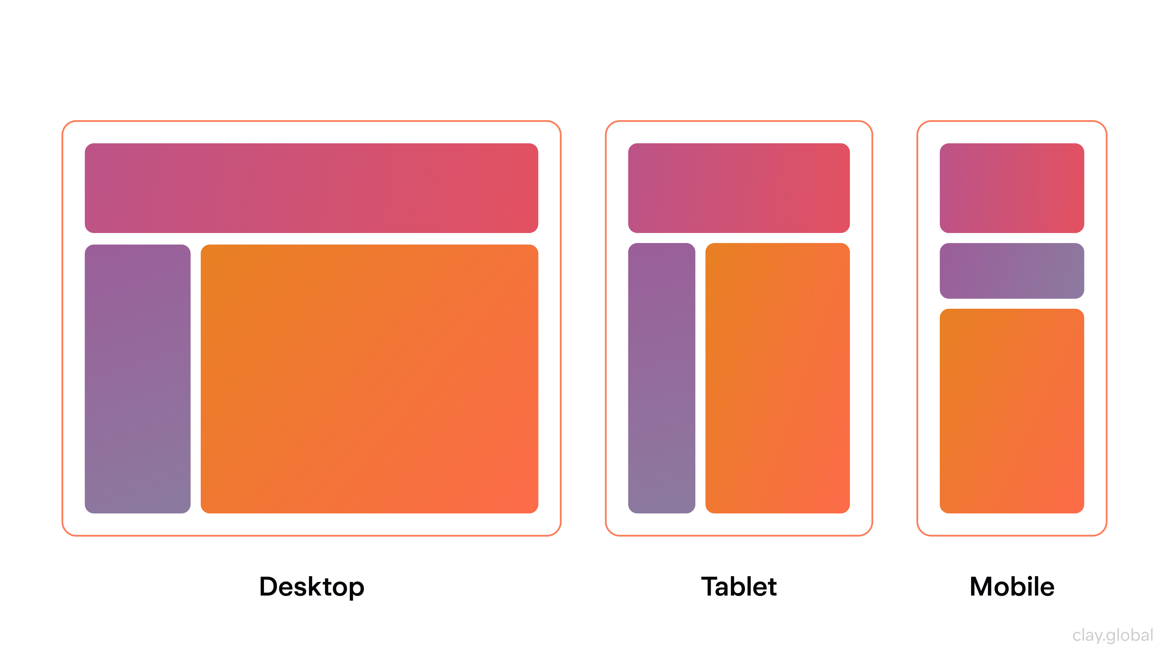
Responsive design uses flexible grid systems, scalable images, and CSS media queries so layouts adapt fluidly to any viewport. The goal is not a separate "mobile version" of the site, but a single design system that responds to context.
Navigation elements should be touch-friendly (minimum 44px tap targets), text should be readable at default zoom, and critical CTAs should never be buried below the fold on smaller screens.
Sites optimized for mobile see 32% higher average page views per visit, and tap-friendly UI elements increased mobile user retention by 19%.
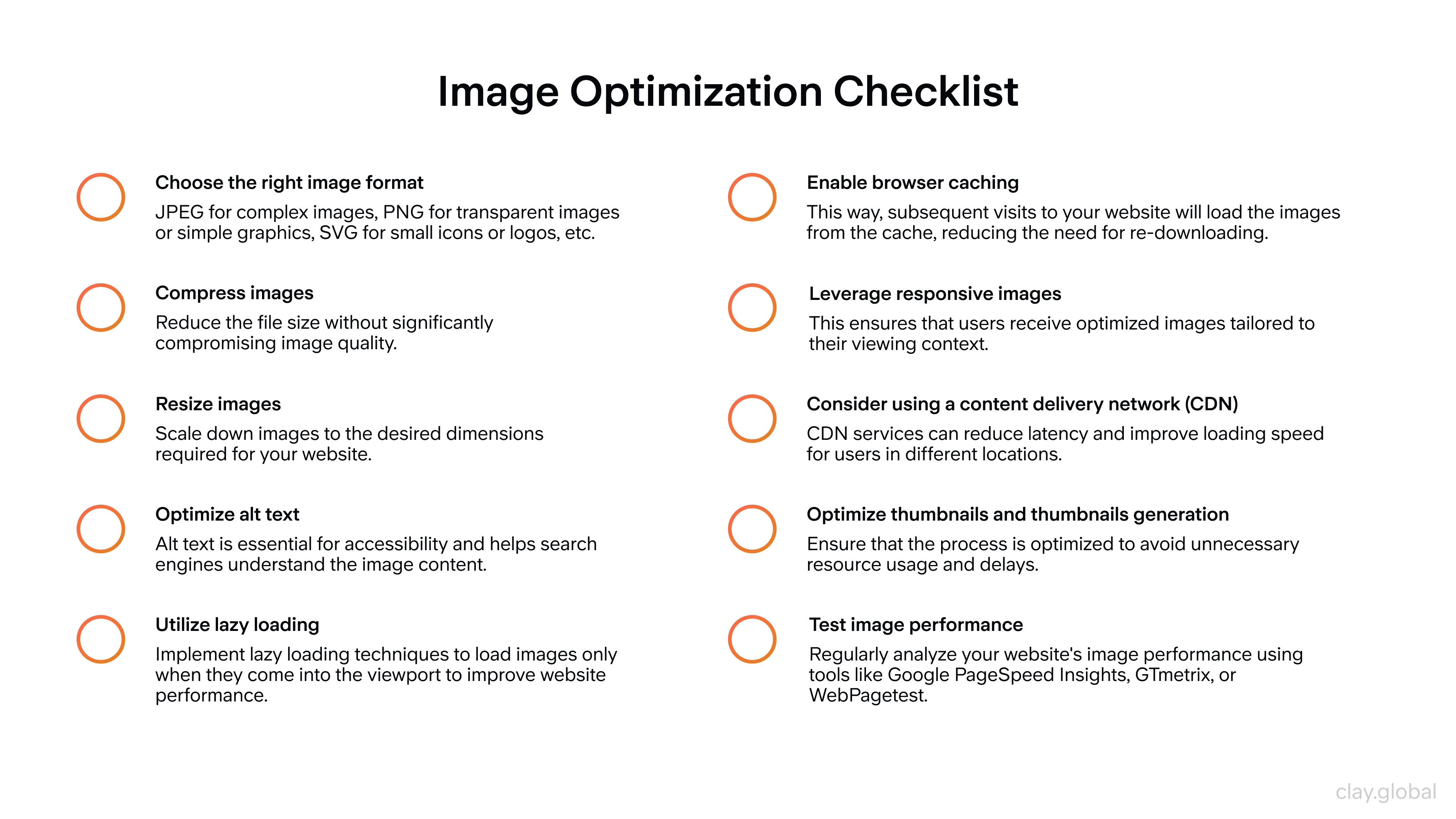
Page Speed and Performance
Page speed is both a user experience issue and an SEO ranking factor. A site that loads in one second converts at a rate 2.5x higher than one that loads in five seconds, and mobile sites taking more than three seconds to load lose 53% of their visitors before the page even finishes rendering.
Practical performance improvements include:
1.
Compress images aggressively2.
Use modern formats like WebP or AVIF3.
Lazy-load images below the fold so they don't block initial page render4.
Minify CSS and JavaScript files5.
Use a Content Delivery Network (CDN) to serve assets from servers geographically closer to your users6.
Enable browser caching so returning visitors don't reload unchanged assets.
Understanding the Importance of Performance Optimization by Clay
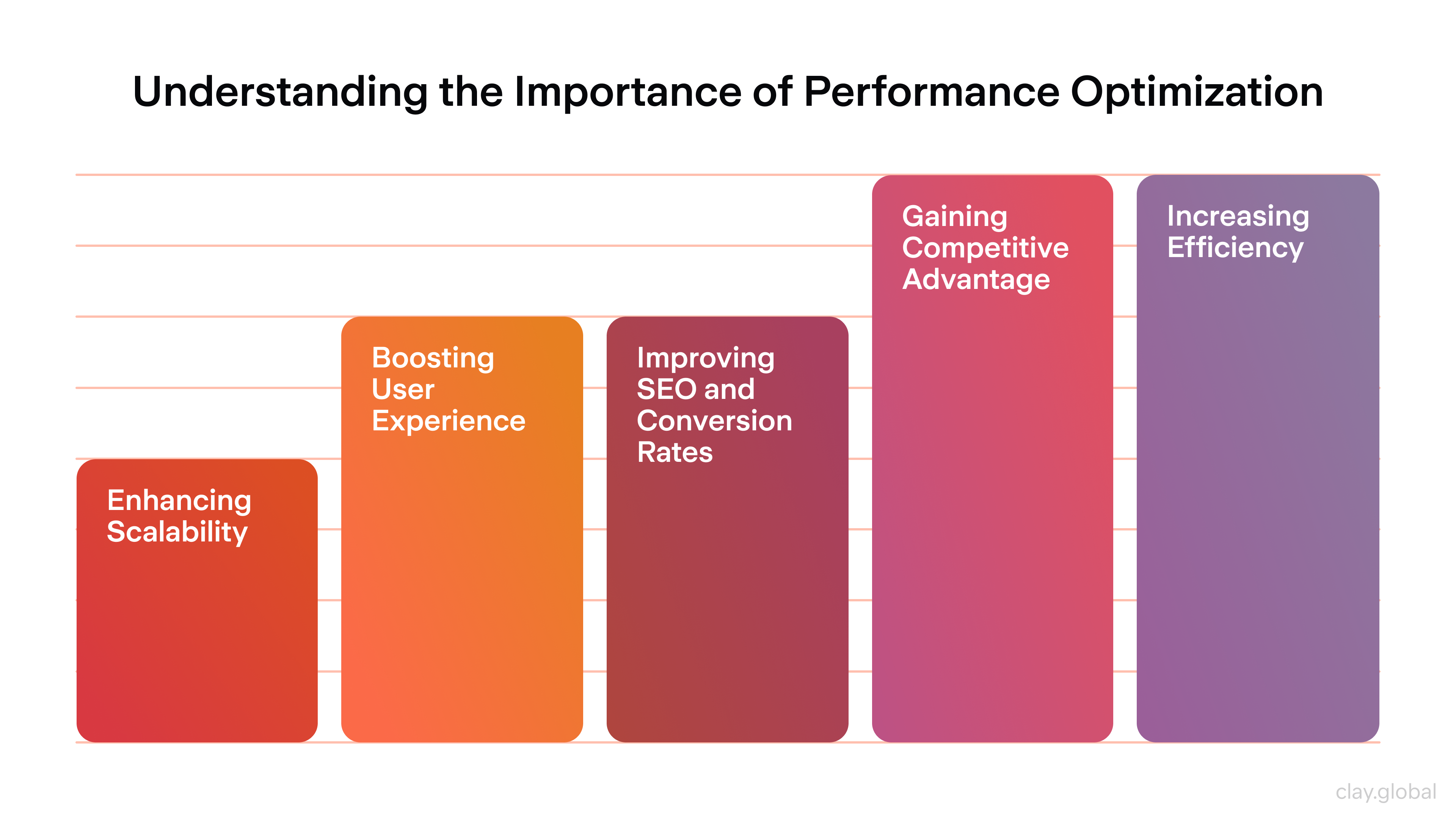
For perceived performance, loading states matter as much as actual load time. Skeleton screens, progress indicators, and optimistic UI updates keep users engaged during short waits.
A blank screen for two seconds feels broken, even if the page loads on time.
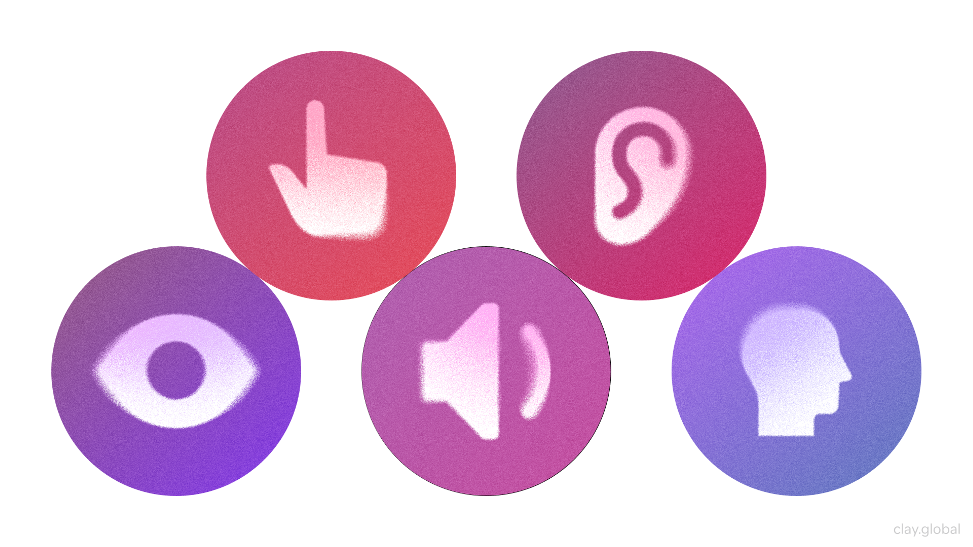
Accessibility and Inclusivity
Accessibility is not a checkbox or a legal compliance exercise. It's good design. Building websites that work for people with visual, auditory, motor, or cognitive impairments makes them better for everyone.
Follow WCAG 2.2 guidelines:
- Ensure sufficient color contrast ratios (4.5:1 for body text)
- Provide alt text for all meaningful images
- Make interactive elements keyboard-navigable
- Never rely solely on color to convey information
- Captions on video content, clear focus states for keyboard users, and logical heading hierarchy all contribute to an inclusive experience.
Accessibility Elements by Clay
From an SEO standpoint, many accessibility best practices overlap directly with search engine signals:
- Descriptive alt text supports image indexing
- Semantic HTML improves content parsing
- Fast-loading accessible pages rank better in Core Web Vitals assessments
Web Design for Conversion
Design that doesn't convert is decoration. Every element on a page either moves a user closer to the intended action or gets in the way of it.
Effective conversion design relies on a few fundamentals:
- Clear, prominent CTAs with specific, action-oriented copy ("Start your free trial" outperforms "Click here")
- Landing pages built around a single goal, with distractions removed
- Social proof (testimonials, client logos, review counts) placed near decision points to build confidence before asking for commitment.
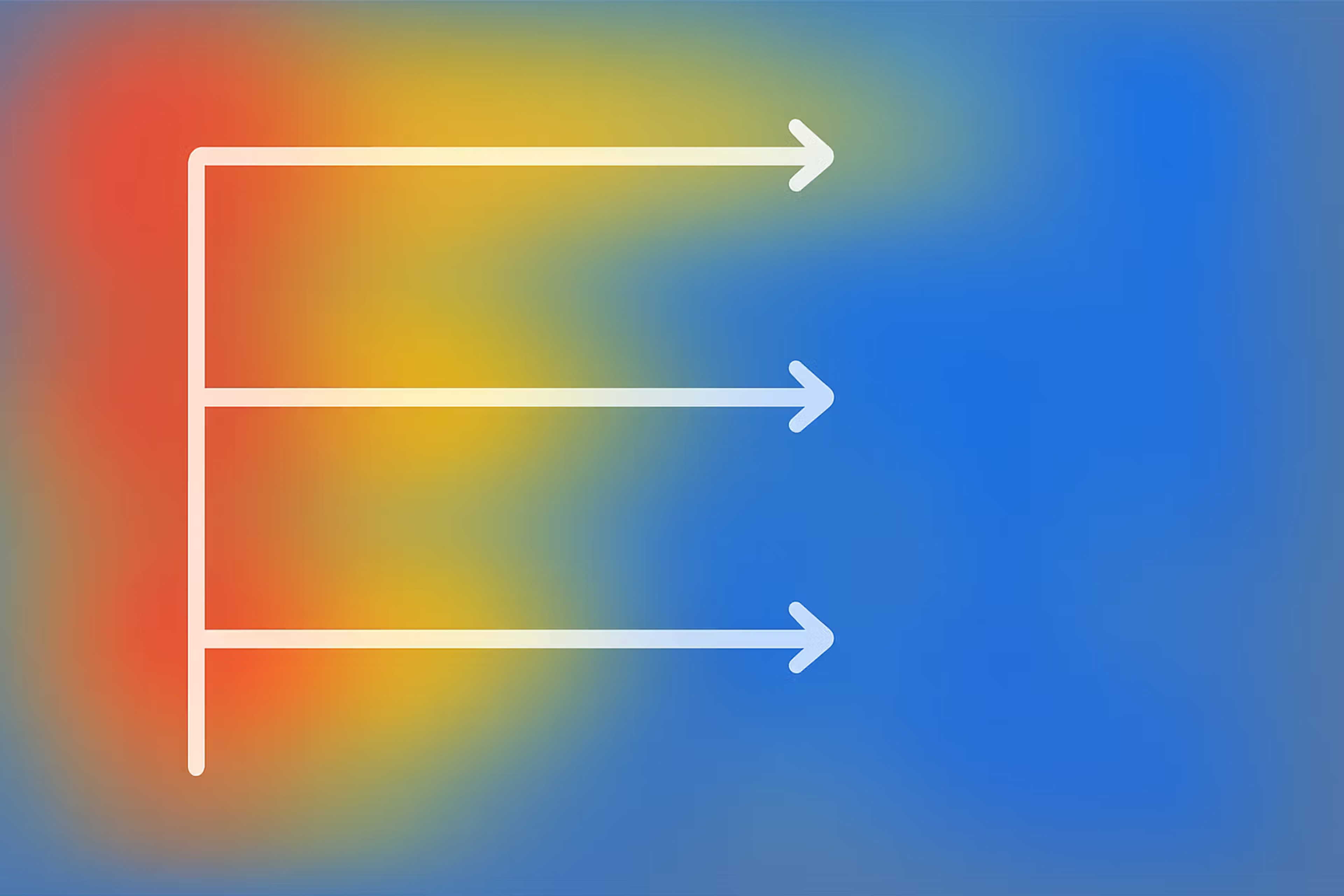
Layout should guide the eye naturally toward the desired action. F-pattern and Z-pattern reading behaviors are well-documented: users scan horizontally across the top of a page, then move down.
Placing your primary CTA in those high-attention zones significantly increases visibility.
F-Pattern Example
Test relentlessly. What works for one audience, product, or price point may not work for another. The only way to know is data.
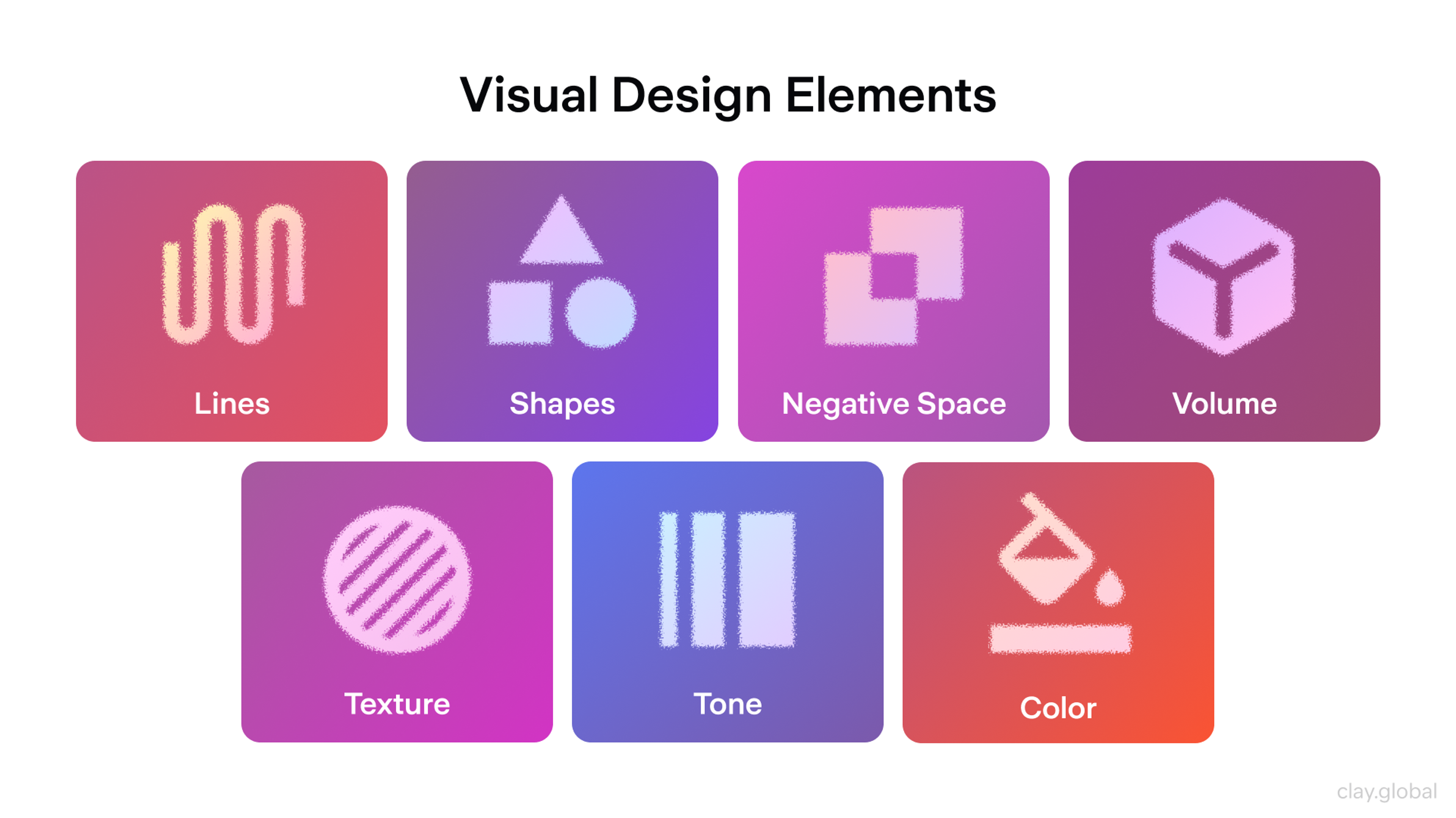
Visual Design: Imagery, Illustration, and Animation
Visual content shapes the emotional tone of a website before any copy is read. Choosing the right visual treatment is a strategic decision, not a cosmetic one.
Photography should be high resolution, on-brand, and purposeful.
Image Optimization Checklist by Clay
Stock imagery that looks generic undermines credibility, while custom photography or high-quality licensed assets communicate authenticity.
For technical or complex subjects, custom illustration and iconography can make abstract concepts tangible and navigable.
Visual Design Elements by Clay
Animation has a specific job: to guide, explain, or delight, rather than to impress for its own sake. Scroll-triggered animations, micro-interactions, and hover states add life to an interface and provide feedback that helps users understand what's happening.
Scroll-triggered animations appear in 52% of modern designs and improve interaction rates by 27%. The failure mode is overuse: animations that delay content, compete with one another, or trigger motion-sensitivity issues detract from the experience rather than enhancing it.
The Eden project demonstrates how illustration can carry brand meaning beyond decoration. The illustration system balances fine detail with clean composition, reinforcing a dream metaphor while evoking the calm imagery of paradise gardens.
Eden by Clay
It connects the brand to a specific emotional register (timeless, aspirational, calm) in a way that photography or UI patterns alone couldn't achieve.
Icons work when they're instantly recognizable. A magnifying glass, a cart, a home icon - all of these work because they're universal. Custom or abstract icons require labels.
Never assume an icon is self-explanatory without testing whether real users interpret it correctly.
Icons Examples by Clay
Navigation and Information Architecture
Navigation failure is one of the leading causes of site abandonment. When users can't find what they're looking for within a few seconds, they leave.
Good information architecture starts with understanding how your users think about your content, not how you think about it. Card sorting and tree testing are useful research methods for validating navigation labels and structure before building. Organize navigation by user task, not by internal company structure.
Website Navigation Design by Clay
Keep primary navigation to five to seven items. Use clear, descriptive labels. Avoid clever navigation labels that sacrifice clarity for personality. If a user has to guess what a navigation item means, it's too clever.
Breadcrumbs improve navigation on content-heavy sites. Search functionality is non-negotiable once a site exceeds a few dozen pages.
On mobile, navigation patterns should prioritize thumb-friendly zones: the bottom of the screen is far more accessible than the top-left corner on a large phone.
The Vantara project is a strong example of navigation serving a content problem. To make the territory clear and explorable, the team built detailed 3D maps of Vantara's infrastructure, animal habitats, and research zones.
The maps aren't purely decorative, but also a part of the navigation system, giving visitors an immediate sense of scale and helping them find their way through a site whose subject matter is inherently spatial.
Vantara by Clay
Cognitive Load
Every extra decision a user has to make costs attention. Too many navigation options, too many CTAs, too much competing content - all of these increase cognitive load and reduce the chance of conversion.
Design around familiar patterns:
- A magnifying glass means search
- A shopping cart means checkout
- A hamburger icon means the menu
When your design conforms to what users already know, navigation becomes effortless. When it doesn't, users have to think, and thinking creates friction.
Design Systems and Scalability
As websites grow, ad hoc design decisions accumulate, leading to inconsistency. A design system solves this by establishing a shared library of components, patterns, and rules that every designer and developer works from.
Component-based design, using reusable UI elements like buttons, cards, modals, and form inputs, ensures consistency while dramatically reducing the time required to design and build new pages.
Form Input Example by Clay
Tools like Figma, combined with a well-maintained component library, allow teams to iterate quickly without having to make decisions from scratch.
Design tokens (named variables for values like colors, spacing, and typography sizes) make it straightforward to update a design system globally. Change one token, and every component that references it updates across the entire product.
Documentation matters. A design system without clear usage guidelines will be used inconsistently. Every component should include intended use cases, accessibility requirements, and examples of what to avoid.
Insights for Web Designers (Beginners and Pros)
Web Design Tools Worth Knowing in 2026
The tools a designer uses shape how they think. Choosing the right stack speeds up every phase of the process, from early wireframes through to developer handoff.
Design and Prototyping
Figma remains the dominant tool for UI design and prototyping. Its collaborative model, component libraries, and developer handoff features make it the default choice for teams of any size.
Benefits of Prototyping by Clay
In 2026, Figma's AI capabilities have expanded significantly: First Draft generates initial UI layouts from a text prompt, Replace Content populates prototypes with realistic copy, and Figma Make allows designers to build and iterate on full websites with AI assistance without leaving the tool.
72% of designers now use generative AI in their workflows, and 91% report that AI tools improve the quality of their outputs.
Sketch is still used in some Mac-centric teams but has lost ground to Figma. Adobe XD is largely deprecated in favor of Figma. For high-fidelity interaction prototyping, Principle and ProtoPie remain useful for complex animation sequences that Figma's native prototyping doesn't cover cleanly.
No-Code and AI Site Builders
Webflow gives designers precise control over responsive layouts without writing code, and its CMS makes content-heavy sites manageable. Framer has gained significant traction for marketing sites, with AI-assisted layout generation built in.
For teams who want to go from prompt to deployed site quickly, tools like Framer AI and Figma Make have changed what's possible at the early ideation stage.
These tools are genuinely useful for fast prototyping and lower-complexity sites. For complex product experiences or custom functionality, they hit limits, and that's where custom development still wins.
Development Tools
Visual Studio Code is the standard code editor, with extensions for HTML, CSS, JavaScript, and most modern frameworks. For front-end work, browser DevTools (Chrome or Firefox) are indispensable for inspecting layouts, debugging CSS, and testing responsive behavior in real time.
For AI-assisted coding, tools like GitHub Copilot and Cursor have become part of many front-end developers' daily workflows, generating component code, writing utility functions, and catching bugs. The practical reality is that developers who use these tools are shipping faster, because the skill is in knowing when to trust the output and when to rewrite it.
Accessibility and Performance Auditing
Lighthouse (built into Chrome DevTools) audits performance, accessibility, SEO, and Core Web Vitals in one report. Axe is the most widely used accessibility checker, available as a browser extension and integrated into many CI pipelines. Both should be part of every pre-launch checklist.
Design Frameworks and Methodologies
A framework is not a simple constraint - it's a shared language. Teams that work from a common methodology make faster decisions, produce more consistent output, and spend less time relitigating the same questions.
Atomic Design
Atomic Design, developed by Brad Frost, organizes UI components hierarchically:
- atoms (single elements like buttons or input fields)
- molecules (small groups of atoms that function together)
- organisms (larger interface sections like a navigation bar)
- templates (page-level layouts)
- pages (specific instances of templates with real content)
It maps cleanly to component-based development in React or Vue, which is why it's remained one of the most practical frameworks for design systems work.
Design Thinking
Design Thinking is a problem-solving process centered on the user rather than the solution. The five stages (empathize, define, ideate, prototype, test) are not a strict linear sequence. Teams often move back and forth between them as new information surfaces.
The value of Design Thinking is that it front-loads user research before significant resources are committed to building. Assumptions get tested early, when changing direction is still cheap.
Lean UX
Lean UX strips design down to its minimum viable form: make an assumption, design the smallest thing that tests it, get feedback, iterate. It's borrowed from Lean startup methodology and works particularly well for product teams running short sprints.
The risk with Lean UX is skipping research in the name of speed, because the "lean" part refers to design artifacts rather than user understanding.
Jobs-to-be-Done
Jobs-to-be-Done (JTBD) is a framework for understanding user motivation: people don't buy products, they hire them to do a job. Applying JTBD thinking to web design means asking what job each page is being hired to do, and whether the design lets users complete it efficiently.
It's especially useful for redesign projects where existing analytics show what's happening but not why.
AI in the Design Process
AI has moved from novelty to an integral part of design workflows. According to Figma's State of the Designer 2026 report, 89% of designers say they're working faster with AI tools, and 80% report better team collaboration. Practically, AI is being used to generate first-draft layouts, write and iterate copy, produce design assets, run accessibility audits, and assist with code generation during handoff.
Figma on LinkedIn, 2026 - "Design doesn't die. It is not a trend to be disrupted or a technology to be replaced."
The tension worth naming: only 58% of designers say AI improves the quality of their work, even as the majority report speed gains. AI accelerates the "how" (layout generation, asset creation, code scaffolding), but still depends on human judgment for the "why."
Why does this interaction feel wrong?
Why does this color undermine trust in this particular product?
That's not a prompt engineering problem. It's design experience.
How to Become a Web Designer in 2026
Web design is one of the few creative fields where a portfolio outweighs a degree.
74% of executives hiring in 2025 said college degrees are irrelevant when vetting freelancers, prioritizing proven expertise instead. What you've built matters more than where you studied.
If you want to start a career in web design, learn about the essentials.
The Technical Foundation
You don't need to be a developer, but you need to understand the medium. Learn HTML and CSS well enough to know what's easy to build and what's expensive.
Understand how responsive layouts work, how the box model behaves, and how CSS Grid and Flexbox handle alignment and spacing. This knowledge directly improves the quality of your design decisions and makes handoff conversations with developers far more productive.
JavaScript is optional but valuable. Understanding how component-based frameworks like React think about UI makes you a more effective design partner on product teams.
Design Skills
Learn the fundamentals before the tools: visual hierarchy, color theory, typography, layout, and accessibility. These principles don't change when Figma releases a new feature.
Hard and Soft Skills for a Designer by Clay
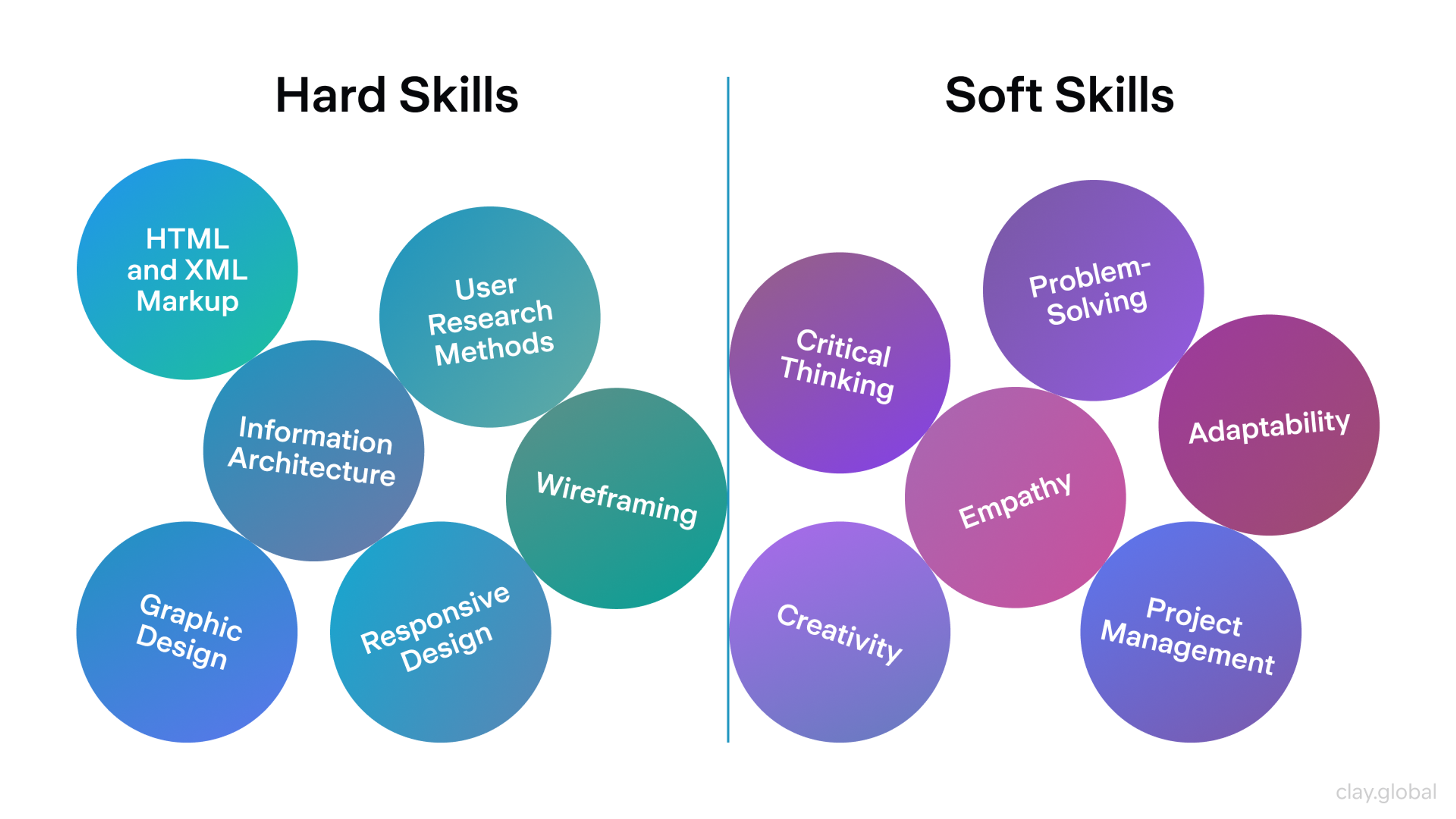
Then get fluent in Figma: it's the industry standard, and the tool most job descriptions require. Practice building component libraries, working with auto-layout, and producing clean developer handoff files.
Study real interfaces critically. Not just what looks good, but why specific design decisions were made. Read case studies. Follow designers who explain their reasoning, not just their outcomes.
Building a Portfolio
Your portfolio is the interview. Three to five well-documented case studies that walk through a problem, your process, the decisions you made, and the outcomes you produced are more persuasive than twenty polished final screens with no context.
Employers and clients want to understand how you think, not just what you can make look nice.
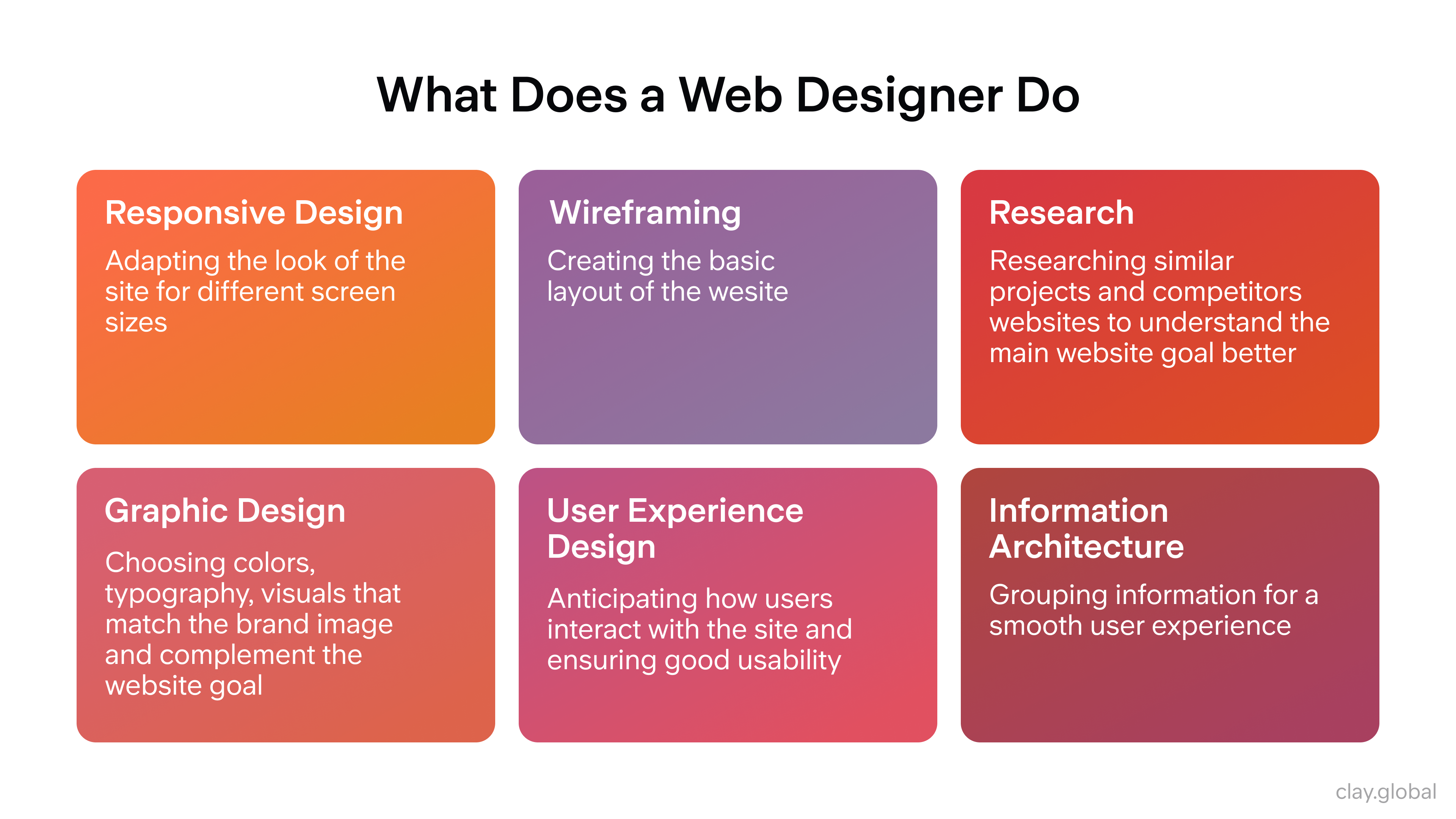
What Does a Web Designer Do? Overview by Clay
If you're starting out without client work, redesign something real. Pick a product or website with obvious usability problems and document your process of fixing them. The thinking is what demonstrates skill.
Staying Current
The field moves fast. Follow Figma's blog and release notes. Read design publications like UX Collective, Nielsen Norman Group's research, and Smashing Magazine.
Pay attention to how AI is changing workflows, as designers who can direct AI tools effectively are already outperforming those who ignore it. The web design job market is growing at approximately 9% annually, and the roles commanding the highest rates in 2025 and 2026 are those combining strong design fundamentals with AI fluency and systems thinking.
When Web Design Templates Work and When They Don't
Templates have a reputation problem. They're associated with generic-looking sites that all feel the same. That reputation is partly deserved, but the right template, used correctly, is a legitimate starting point for a well-designed site.
What Templates Are Good For
Speed and cost. A quality template from a provider like ThemeForest, Envato, or a platform-native marketplace (Webflow, Framer, Shopify) gives you a tested, responsive layout with pre-built components that would take days to design from scratch.
For businesses that need a professional web presence quickly and don't have the budget for custom design, a well-chosen template is a sound decision.
Modern templates are also built mobile-first by default. The structural work (responsive grid, tested breakpoints, accessible navigation patterns) is already done. You're customizing, not building.
What Templates Can't Do
A template can't carry brand identity. The moment a site looks like a template, it loses the distinctiveness that makes a brand memorable. Users may not consciously recognize the template, but they feel its genericness.
Templates also don't solve information architecture problems. A template gives you a layout, but it doesn't tell you what content to include, how to organize it, or what your primary conversion path should be. Those decisions still require design thinking.
Using Templates Intelligently
Treat a template as a structural scaffold, not a finished design. Customize typography to match your brand, replace stock imagery with original photography or custom illustration, adjust the color palette, and restructure the navigation to fit your actual content hierarchy. The more you customize, the less it looks like a template.
For high-growth startups or brands where differentiation is a competitive factor, custom design is worth the investment. For early-stage products, internal tools, or sites where speed to market matters more than visual distinction, a well-customized template does the job.
Read More
- Clay Global’s Web Design Case Studies
Frequently Asked Questions
How long does it take to design a website?
A simple informational site with fewer than ten pages can be designed in several days to two weeks. A complex product or e-commerce site with custom functionality and extensive content typically takes six to sixteen weeks, depending on scope, stakeholder feedback cycles, and how much content is ready at the start. The biggest delays usually come from undefined scope and late-stage content delivery.
What's the difference between web design and web development?
Web design covers the visual, structural, and experiential decisions: layout, typography, color, navigation, and user flow. Web development translates those decisions into working code. Front-end development handles what users see and interact with; back-end development handles servers, databases, and application logic.
On smaller projects, these roles often overlap. On larger teams, they're usually distinct specializations with dedicated handoff processes.
Do I need to know how to code to be a web designer?
Not necessarily, but understanding the basics of HTML and CSS makes you a better designer. Knowing what's possible and what's expensive to build changes how you approach design decisions. Many strong web designers work entirely in tools like Figma and Webflow without touching raw code. Those who understand code tend to produce designs that are easier and cheaper to implement.
What is mobile-first design and why does it matter?
Mobile-first design means starting the design process at the smallest screen size and scaling up rather than designing for desktop and adapting down. It matters because the majority of web traffic comes from mobile devices, and designing for constraints first produces cleaner, more focused experiences. It also aligns with how Google indexes sites, since mobile performance directly influences search rankings.
What are Core Web Vitals, and do they affect my ranking?
Core Web Vitals are Google's performance benchmarks: Largest Contentful Paint (LCP) measures loading speed, Interaction to Next Paint (INP) measures responsiveness, and Cumulative Layout Shift (CLS) measures visual stability.
Google uses these as ranking signals, particularly when content quality is comparable across competing pages. Sites meeting all three thresholds see measurably better performance in both rankings and conversions.
How do I choose colors for a website?
Start with your brand identity and the emotional associations you want to create. Blues suggest trust and stability; oranges convey energy; greens are used in health and sustainability contexts. Build a primary palette of two to three colors and a neutral set for backgrounds and body text. Verify that all text-to-background combinations meet WCAG contrast ratios (4.5:1 minimum for body copy). Test the palette at different screen sizes and in different lighting conditions.
What makes a landing page convert well?
A high-converting landing page focuses on a single goal, has a clear and specific headline that addresses the visitor's core concern, provides evidence (testimonials, case studies, or data) near the point of decision, and places a prominent CTA above the fold. Removing navigation and unrelated links from landing pages reduces distraction and keeps users focused on the intended action. Regular A/B testing of headlines, CTA copy, and page structure drives incremental improvement.
How important is typography to web design?
Typography is foundational. It affects readability, brand perception, and pacing. Poor font choices or inconsistent type sizing create subconscious friction that makes content harder to consume. Choose typefaces designed for screen rendering, maintain consistent sizing and line height across all pages, and never sacrifice readability for aesthetic novelty. Two type families (one display, one body) are usually sufficient for most websites.
What is a design system, and when do I need one?
A design system is a shared library of reusable components, patterns, and design rules that keeps a website or product visually and functionally consistent as it scales. You need one as soon as more than one person is making design or development decisions, or when the site has enough pages for manual consistency to become unreliable. Figma with a well-documented component library is the most common setup for design systems in 2026.
How do I make a website accessible?
Follow WCAG 2.2 guidelines. Practically, this means ensuring sufficient color contrast, writing descriptive alt text for images, making navigation keyboard-accessible, providing captions for video content, using semantic HTML headings in logical order, and avoiding content that relies solely on color or motion to convey meaning. Run automated accessibility audits with tools like Axe or Lighthouse, then follow up with manual testing.
How does web design affect SEO?
Significantly. Site structure determines how search engines crawl and index pages. Page speed is a direct ranking signal. Mobile optimization affects how Google's mobile-first crawler indexes the site. Clean semantic HTML helps search engines understand content hierarchy. Images with descriptive alt text support image search and general relevance signals. Design decisions that improve user experience (lower bounce rates, longer session times, higher engagement) also correlate with better organic rankings.
What should I test before launching a website?
Test functionality (all links, forms, and interactive elements), responsiveness across device types and viewport sizes, cross-browser compatibility, page speed via Lighthouse or PageSpeed Insights, accessibility via Axe, and the full user journey for key conversion paths. Have at least a few people unfamiliar with the project navigate the site and attempt to complete core tasks. Their confusion reveals design problems that internal reviewers miss because they know too much.
What web design mistakes should I avoid?
The most common are: no clear visual hierarchy, no obvious CTA, slow load times, inconsistent typography and spacing, navigation that doesn't match user mental models, poor mobile experience, images without alt text, and launching without any analytics tracking in place. On the copy side, avoid being clever at the expense of being clear, because users should immediately understand what a page is about and what you want them to do.
How do I use animation effectively on a website?
Use animation to communicate, not to decorate. Hover states give feedback that elements are interactive. Scroll-triggered reveals guide users through content progressively. Loading animations reassure users that the site is responding. The tests are: does this animation help the user understand or navigate, or does it just look good? And does it slow the page down? Respect user preferences, as some visitors have motion sensitivity and use the OS setting to reduce motion. Your site should honor that preference.
What's the best way to find web design inspiration?
Curated showcase sites like Awwwards, Dribbble, and Mobbin are good starting points. Beyond those, pay attention to apps and digital products you use daily and notice what feels effortless. Read design critiques and case studies that explain the reasoning behind design decisions, not just the final output. Borrowing a visual idea without understanding why it works usually produces derivative results. Understanding the problem a design was solving makes the inspiration genuinely useful.
Final Thoughts
Web design is ultimately about reducing the distance between a person and what they need. Every principle, every tool, and every decision in this guide serves that single goal. The sites that do it best don't draw attention to themselves. They just work.
If you're evaluating whether your current site is doing that job, Clay works with startups and established brands on web design that converts, from strategy through to launch.

About Clay
Clay is a UI/UX design & branding agency in San Francisco. We team up with startups and leading brands to create transformative digital experience. Clients: Facebook, Slack, Google, Amazon, Credit Karma, Zenefits, etc.
Learn moreAbout Clay
Clay is a UI/UX design & branding agency in San Francisco. We team up with startups and leading brands to create transformative digital experience. Clients: Facebook, Slack, Google, Amazon, Credit Karma, Zenefits, etc.
Learn more